Sunday, July 3, 2022

Original Art Sundays No. 299: Sharp Invitations: Curt, p. 38

 Another page into the fray.

I was originally doing a second page for this week, as a bridge to next week's action, but I did a very similar page to the one planned earlier in the story (the page about him dating me because, as  trans woman, I couldn't get pregnant), so decided to forego.

 
 I do like doing these quick gag strips on occasion. They're a nice break. So fast and loose! They're freeing, and a good way to advance the story by small anecdote. Aside from light cleanup in Photoshop, this is pretty much the original. At one point, I considered doing the whole book this way. I shied away from it because that's the not the kind of work I like doing most of the time, and because Sophie LaBelle already does it so deftly over at Assigned Male Comics!
The astute reader will recall that Curt prided himself on being logical. The incongruity in his opinions on this was a shocker and a bit of a road into his mindset. Also, I love musicals, so this hit me in the gut.
We're entering a period of relative calm before the final storm, so something lighter is called for.
Very simple tools this week.
  • Printer paper
  • 3B Cumberland Derwent pencil, tech pencil
  • Ames lettering guide
  • Staedler Mars plastic eraser
  • Ballpoint pen
  • Photoshop
  • Scan done with IPhone 12
That's it! 
Next: the calm ends, the storm starts.

Sunday, June 26, 2022

Original Art Sundays No. 298: Sharp Invitations: Curt, pp. 36 and 37

 Hello again!

Two pages this week instead of one! I was having fun with it and decided to push a bit. 

This is my response to Curt's reaction to my attempt to slit my wrists.


Well, out of the fire and into surrender! Really, I tried running away, I tried escaping into death (however halfheartedly). The only thing left to try was surrender. Plus, part of me always wanted to be the little housewife. I don't think it's every trans woman's dream, but it was one of mine. However, I myopically believed I wouldn't have to surrender my autonomy to fulfill it.

Also, as anyone who's been involved in domestic abuse will tell you, it's a labyrinth, a tangled mess of conflation and subversion. It's jarring to live through, but excessive detail on such things makes for a convoluted and uninteresting story. Better to condense and summarize.

Soliloquy and paper dolls seemed a good way to sum up this turn of events. This story is a bit heavy, and an occasional respite is called for. Plus- paper dolls, what fun! I've done paper dolls of most of my other characters, so why not me? In my research, I discovered that the Cleavers' home town of Mayfield isn't in a specific state, hence the USA locale. All the costumes are period, evoking the 1960s housewife cliche, except the Omaha lingerie, which is there in homage to sensei Reed Waller. They're also all things I really enjoy.

Layout is pretty direct on these. I've done soliloquy pages earlier in this story, and followed the same pattern of reversal/reversal. I love the high five in the last panel on that page. 

Tools for these two pages:

  • Canson Bristol Board, tracing paper
  • Pencils: Tech pencil, 2B Ticonderoga, 3B and 6B Cumberland Derwent, 4B Graphite stick
  • Holder & Nib, ballpoint pen
  • Triangle, straightedge, T-square
  • Dr. Martin's Black Star Matte ink
  • Brushes: Blick #6 Synthetic Round, Escoda Kolinsky Sable Flat #4. Tight Spot for corrections
  • Microns: .03, .05, .08, Brush Tip
  • FW Artist's Acrylic White
  • Photoshop

Next: Domestic tranquility moments, the calm before the final storm.

Sunday, June 19, 2022

Original Art Sundays No. 297: Curt, p. 35

 Once more into the breach, dear friends.

When we left our heroine (me), the half-assed suicide attempt was truncated by a neighbor's phone ringing. Before I could clean up, Curt came home. How will he react to the woman he claims to love attempting such a thing?

Well, there you have it. As was noted by one of my Beta readers, knives are intended for cutting meat, so his asinine wrath was also factually inaccurate. This is what happened, but I condensed events slightly for narrative flow. But even with the danger implicit in living in this situation, it starts to seem absurd at some point. Abusers often pride themselves on reason, but are often irrational in their micromanagement and rage. The challenge is to navigate their anger and feed into their egos.

Again, no overt trans content on this page, other than it being a trans woman's story.

Technical notes: The layout is pretty direct and flows well. I particularly like the tight shots of Curt's eyes framing his gaze down the cut arm to the bloody knife. At one point, I had divided that long panel in thirds, but it seemed more of a distraction than a dramatic effect. I hand-rendered the text, but reworked it in Photoshop. Lower energy, but it reads better. A sense of place is crucial to this page. Perspective is key on the first panel. I seldom do such detailed work on environments, but this is a time where it's necessary to ground the space. Looking at it now, the page still needs a couple minor corrections, but it's 95% there.

The gray values on the ceiling in Panel 1 are a simple gradient.

Instead of scanning, I tried a photo with my iPhone 12. I'm not 100% happy with this method. Too much work in post to get the levels right. If my other option, using the document capture in Notes, yields similar results, I'll just go back to scanning. 

I used my favorite scumbling brush with masking tape on panel 3 (the arm). Don't you love simple production tricks? I got this fascinating sort of dry brush smear by accident on my drawing board, and it's inspired me for a page down the line. A pen nib and a brush marker died creating this page. We will now observe a moment of silence.

Tools:

  • Canson Bristol Board
  • Pencils: Ticonderoga 2B, Paster Classics 6B, 4B graphite stick
  • Erasers: Staedtler Mars Plastic, kneadable eraser, erasing guide
  • Brushes: Blick #2 synthetic Masterstroke, Blick #6 Synthetic round
  • Pen nib and holder
  • Microns: .005, .02, .05, .08, 1.0 and brush
  • Photoshop

Next: survival strategies.


Sunday, June 12, 2022

Original Art Sundays No. 296: Sharp Invitations: Curt, p. 34

 Hi, all. Here we go with the next page.

Last time we saw our heroine (me), she was in the tub, high on booze and prescription meds and bleeding out of her cut wrist.

Here's what happened next.

It's often something mundane that stops these attempts. I read a writer's account of their own attempt (I'm embarrassed to say I can't recall whose). They were all ready to do it, to end their lives, staring at the gun, when they got a casual call from a friend who was unaware of the crisis, inviting them to a ball game. They went but never told the friend what that friend had done for them. 

One little thing. That's all it takes sometimes.

In my case, someone else's phone rang. I went on automatic pilot to answer the phone. Can't be rude, you know.

This page also serves as a reminder of some of the small and not so small things that drove me to the attempt in the first place. Curt not trusting me to do something as simple as carrying on a phone call, me being so afraid of his reaction to anything I was doing.

Technical aspects: we're back to a pretty standard grid this week. Just advancing the narrative panel by panel. I'm in every panel, but not full face shot until the last panel, my shocked reaction to his return home. 

Nothing overtly about trans identity on this page, but it's one of the core elements of the story, so its presence or absence must needs be noted.

I'm back to rendering background textures in wash and grease pencil. It seems to serve me well as my style continues to evolve. There's a little #2 pencil texture on the tub surface. I continue to grow my relationship to backgrounds/environments, following Ursula Murray Husted's encouragement to think of the environment as a character. I balance that against a line that sticks with me from David Chelsea's Perspective for Comic Book Artists, in which one of his characters describes the function of perspective not as mechanical accuracy, but as a desire to "make things more or less plausible." Think about it. Realistic mechanical rendering isn't always necessary or desirable, in that it doesn't always serve the story. And one should always do what serves the story. It doesn't have to look precise, but it does have to look real, in the context of the story.

The last panel really got away from me in early attempts! The first inked version had a distorted, elongated face with a mouth one might find on a blow-up doll. So back to tracing paper, whiteout, and re-rendering. The final panel was still messy. I cleaned it up in Photoshop, then put some of the mess back for effect. I might do just a bit more correction on this before going to press, but it's pretty much there. It was fun drawing a body just out of the tub and not toweled off. Those little drippy effects are exciting to play with.

Tools for this page:

  • Canson Bristol Board
  • Pencils: 2B Ticonderoga, Lead holder and 3B lead, 4B graphite stick
  • Erasers: Steadler Mars plastic eraser, kneadable eraser
  • Dr. Martin's Black Star Matte Ink
  • FW Artist's Acrylic White
  • Plastic painting palette for washes
  • Tight Spot brush for corrections
  • Pen nib and holder
  • Brushes: Blick No. 6 round synthetic, Reeves No. 8 nylon flat for washes
  • Photoshop

Next: will Curt be sympathetic and supportive? What do you think?


Sunday, June 5, 2022

Original Art Sundays No. 295: Sharp Invitations: Curt, p. 33

 Hi, all.

After numerous delays, here is the next page.

This one was a huge challenge. The actual layout and illustration was relatively easy. The art and layout only took a day or two. But in doing it, I had to face my own stupidity and relive some stuff I've long put behind me. 

I'm not that person any more, and revisiting her was anguish. Still, memoir demands honesty, so here we are. My challenge remains the same: show these events honestly without romanticizing or sensationalizing them. I'm not doing violence porn.

When we left off, I had taken a few too many prescription meds, washed them down with liquor, grabbed a knife and headed for the bathroom. What happened next is pretty predictable.

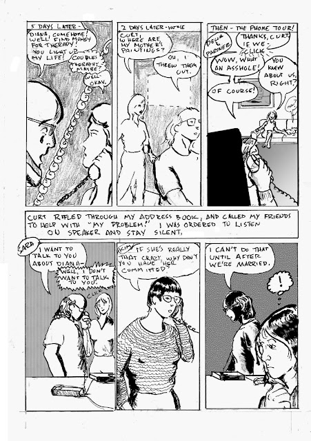
I had drawn this conventionally, using conventional tools. When the art was done, I realized that this page would be more effective reversed out, so Photoshop to the rescue again! I penciled the borders with a straightedge and inked them freehand to get that ragged effect I use from time to time. 

The tub panel is a variation on a panel I used in a similar storyline in my old Tranny Towers strip.

Thoughts: the bathtub looks like a coffin. I wasn't overtly aware of that until I worked on this page. Also, since that day, I've preferred showers to baths. It's still hard for me to relax in the tub. I didn't make that connection until this.

Abuse victims are prone to depression and suicide attempts, especially while it's going on. This is not unique to trans people. I contend that our suicide rate is higher, not because we're more unstable (we're not), but because so many people seem to want to make our lives harder, either for "our own good" or for their own venal, perverse amusement. When supported and encouraged to live full lives, trans people tend to thrive. Yes, some of us are messed up, but you could say the same about cis people. That just makes us human. As noted in the "Get A Job" chapter of this book, when I came out to my boss, I was told that they would be watching my work more closely, even though I was the same person doing the same job. Think about that for a minute. When you come out, your relationships, family, home and safety are threatened. Great time to add stress to the job! Thanks, boss!

That approach has improved in a lot of companies and organizations over the ensuing years. The narrative now is, more often than not, "what can we do to help?" Likewise, many families and loved ones are now much more supportive of trans people in their lives. Again, far from everyone, but it's better.

I am grateful that at least some of the world is behaving more humanely about trans issues.

A few years ago, I had the opportunity to volunteer at the Sexual Violence Center. I suppose I still do, but I don't think I'm really strong enough for that. Maybe. Another day. Not to minimize my experience, but compared to some abuse victims, I got off fairly easy. I always want to help, but... well, I still have emotional limits, I suppose.

There's a bit more of this chapter of the story to complete, and some pages from it will be shown at the Minneapolis College of Art & Design's Faculty Biennial exhibition this fall. I'll keep you posted.

Tools for this page:

  • Canson Bristol board
  • Graphite stick, lead holder with 3B leads, Ticonderoga 2B classic pencil
  • China marker/ grease pencil
  • Windsor & Newton eraser, kneadable eraser
  • Straightedges and T-Squares
  • Dr. Martin's Black Star ink
  • FW Artist's Acrylic white
  • Photoshop

Next: Will I get out of the tub in time? Will I bleed to death as I pass out? Will an ambulance be called? Find out next week.

Sunday, April 10, 2022

Original Art Sundays No. 294: Sharp Invitations: Curt, p. 32

 Wow, what a rough page! 

Every panel went through a dozen permutations. I tried collage, reversing, visual metaphors, tons of dialogue. Nothing was working. So it was back to the basics.

This page also has a strong emotional resonance. Or so I hope.


Well then.

Here's our heroine (me) taking a handful of prescription meds, washing them down with hard liquor, grabbing a sharp object and heading for the bathtub.

In terms of storytelling, I opted for pure image. Sometimes I think I rely too much on text. Let the pictures tell the story!

There's only two full face shot on this page, and even those are obscured partially. The intent here is to convey story and emotion through action.

Top tier is white on black. I used China marker for the background texture. Still finding balance between detail and solid fields of tone for backgrounds, as I go. Note that the second tier is black on white, again popping some of my reliable silhouettes. The bottom splash tier is pretty straightforward. I had some fun playing with textures on the tiling. I also took a few liberties. Our bathroom was nowhere near that big or nice!  I hope the little floating icons in panel 6 convey the effect of being slightly buzzed, as we used to say. I didn't want to overdo it, to drag the page into the realm of silliness.

I went through a lot of old, painful stuff preparing this page. I also debated its merits in larger terms. Self-harm is a real concern in trans and nonbinary communities, and deserves to treated as such. But there are a couple cautions associated with that. The first is the issue of "violence porn". I don't want to create a page where adrenaline junkies are getting their fix off my work. At the same time, I don't want to soft-pedal what's going on. 

The other issue is that although it's true, although it's a real concern, self-harm is in so many trans narratives that it's almost a cliche. I don't mean in any moral or empathetic sense, but just from a standpoint of storytelling. It feels like lazy storytelling, and it feeds into the uninformed cliches about who we are and how our lives work. It's also a common side effect of domestic abuse, both in trans and cis worlds.

So I think the answer is to just tell what happened, without aggrandizing or diminishing it, and trust that a discerning reader will see it for what it is- a rough moment in a bad part of my life, that should have been much better.

The usual tools:

  • Canson Bristol board
  • 2B, 3B and Ebony pencils
  • Lead holder with 3B lead
  • Kneadable eraser and Canson eraser
  • Ames lettering guide
  • Micron .02, .03, .05, 1.0 and brush tip
  • Dr. Martin's flat black ink
  • FW Artist's acrylic white
  • Brushes: Richeson no. 6 synthetic, Kingart no. 4 sable/synthetic hybrid, Tight Spot for corrections
  • Minimal Photoshop

Next: making the cuts.

Sunday, March 6, 2022

Original Art Sundays No. 293: Sharp Invitations: Curt, p.31

 Here we go with a new page.

When we left our heroine, Curt was being nice. Who's taking odds on that continuing?

Notes:

This shows the emotional turmoil of being with an abuser. Here it's taking its toll. Things are all right, then they're not, for no apparent reason, and you're told it's your fault. We had one good night after I failed to have myself committed, then it got worse again almost immediately. Trans issues appear on this page as a matter of course.

There are 3 actions on this page. He leaves without a reason. I look out into the rain. I arrive at a conclusion. We'll see the result next week.

Layout considerations: still loving the ink wash for backgrounds and flexing my muscles, using it as a rain device. The head shot coming out of silhouette in the text heavy panel has just a hint of dry brush work, something else I love to play with.

This will need to be rescanned. For the moment, it serves. I need to get some pages together and spend a day rescanning, possibly over spring break next week.

We'll see. I treated myself to a new brush this week, and I'm pretty pleased with it!

Tools:

  • Canson Bristol Board
  • Lead holder and #3B leads
  • Ticonderoga 2B pencil
  • Tech pencil
  • Kneadable eraser and Faber Castell dust free eraser
  • Nib and holder
  • Brushes: Blick 6 round synthetic, Richeson 777 Kolinsky (the new one!), beat up ancient Grumbacher no. 4, tight spot for corrections
  • Micron Numbers .02, .03, .05, .08 and brush tip
  • FW Artists Acrylic White and Dr. Martin's Black Star Matte Ink

Next: Things get bad, really bad. Sorry, but they do.


Sunday, February 20, 2022

Original Art Sundays No. 292: Arrowsmith sketch cover

 Hi, all.

I had a better idea for the next page partway into it. I was planning a single page gag filler, because I had a great one and haven't done one in a while.  But then I was re-reading Buseik and Pacheho's Arrowsmith: Behind Enemy Lines #1, and I noticed that there were almost no women in it. 

Busiek has written some very good stories with women in prominent roles, so I wasn't particularly offended by this. And it's been a while since I read the first series, so I didn't remember if this was addressed there. But since the copy I picked up was a sketch cover, I decided to give it a whirl.


Okay, I'm pretty happy with this. Just a #2 Ticonderoga pencil, a kneadable eraser and a bit of Photoshop tweaking. Photoshop was just levels and threshold, and some use of the Fade command, which I love. That's the whole tool list!

I thought about inking, or adding color, or putting in a background. But I enjoyed it so much the way it is, I decided to leave well enough alone. I had real fun drawing the little dragon! Not usually my thing, but once in a while...

I do enjoy these sketch covers, though I almost never buy floppies any more. 

Next: back to our story.


Sunday, February 13, 2022

Original Art Sundays No. 291: Sharp Invitations: Curt, p. 30

 Once more into the breach, dear friends!

When we left our heroine, she was trying to get herself committed, thinking Curt might just be right about her.

Read on.

Well, that was unexpected.

It's important to remember that abusers can be really nice, positively charismatic, at times. That's how they keep you coming back, or sticking around. But when you're in the middle of it, you can't see it that clearly. All you see is the contradictions, which must, after all, be your fault.

Layout considerations: no dialogue necessary on the top tier. Let the poses and expressions do the talking. Second tier: pretty straightforward. Re-establishing shot, and tighter as the subject moves into the room. The outline indicating the absence of my Mother's painting that he thre away, always present.

Again, in facial expressions and body language. the reactions say more than words could.  I like the absence of a hard outline on the word balloon in panel 5.

Third tier: he's a Sphinx here. Sidebar: he could barely cook eggs, which is what we had for supper.

Again using wash, lines and solid black shapes to define background elements. I considered adding a wood texture to the door but thought better of it. I'm liking the wash backgrounds, but am cautious about getting into a rut.

Quick fairly clean page.

Tools:

  • Canson Bristol Board
  • Ticonderoga no.2 pencil, 3B lead in lead holder
  • Triangle, T-Square and straightedge
  • Micron Nos. .02, .03, .05, .08, 1.0 and brush tip
  • Plastic watercolor palette
  • Dr. Martin's Black Star Matte black india ink
  • FW Artist's Acrylic White
  • Nib and holder
  • Princeton no. 10 synthetic brush, Blick no. 6 synthetic brush and Tight Spot for corrections
  • Gum eraser and Faber Castell Dust Free eraser
  • Just a touch of Photoshop

Next: closing in on the inevitable.


Sunday, January 30, 2022

Original Art Sundays No 290: Sharp Invitations: Curt, p. 29

 Taking a break from Comics History class prep to post this week's page.

This one came together pretty quickly and went pretty well.

As you recall, Curt reluctantly agreed to therapy, provided he get tapes of the sessions to review afterwards for "inaccuracies and lies". Needless to say, this arrangement wasn't conducive to good therapy and led to this.

This is common in an abusive situation. Abusers take perverse joy in manipulating someone's thoughts, making them doubt themselves. Why are people so shocked after the fact to learn that it worked?

Again, aside from being a trans woman's story, no overt trans content on this page.

Lots to like about this page. Sometimes I really struggle with pages, but this one just fell together. The layout device is inspired by several things. I thought the story was getting a little claustrophobic, with all the interiors (physical and mental), and I wanted to break it up a little. It's also important to remind the reader that even in this confining situation, the rest of the world is still out there waiting. It makes the denial of the world to the abused all the more poignant.

I wanted to play with rendering parks in gray scale after reading Alison Bechdel's Secret of Superhuman Strength (which I'm teaching in Graphic Novel class this semester). And I'm not sure where I encountered the idea of slice panels inside a larger panel to imply a motion path, but I like it. The borders of the primary panel were rendered in pencil and drawn freehand with a brush tip marker, a device I used on A Private Myth about a hundred years ago.

The bottom tier is all about expression and pose. I always want more heavy blacks than I end up using in such situations, but it's working. Minimal Photoshop corrections on this one.

More and more, I'm coming to think of my poses and characters as Hitchcock actors. Hitchcock is famous for saying he trusted his actors would know to move and act like their characters. So it is with my art. I trust that as long as I give them my best, my characters will look and pose the way they should. A bit disingenuous, but useful. Trusting your own art is vital.

Tools used:red

  • Canson Bristol Board
  • Lead holder, tech pencil, solid lead #3B and Ticonderoga pencil #2
  • Kneaded eraser and Faber Castell dust free eraser
  • 10 well inking/watercolor dish
  • Dr. Martin's Dark Star Matte black ink
  • FW Artist's Acrylic White
  • Brushes: Princeton #10 Round Synthetic, Blick #6 round synthetic, Renaissace Silver Sable #2 Cat's Tail
  • Tight Spot Detailer for corrections
  • Photoshop 2019

Next: closer to the main event.


Sunday, January 23, 2022

Original Art Sundays No. 289: Sharp Invitations: Curt, p. 27

 As promised, here's a fill-in page to clarify some stuff from the last page.


After my page discussion, I will re-post the three pages in this scene in proper reading order. I should probably do that more often anyway. A week is a long time to wait to see what happens, and we all have full lives.

When the story left off, I had agreed to return to Curt. One of the things that came up was the possibility of therapy, which leads us to the events of this page, followed by the events of the page posted last week.

For this layout, I wanted the page to feel off balance, yet be legible. Hacking off the edges, first alternating, then both, seemed an effective tool to accomplish this. It's a straightforward dialogue page. I kept it visually interesting by just moving the "camera" in. I dropped Photoshop gradients in the first two panels. The astute reader will note the continued absence of my mother's art and the presence of a replacement guitar.

This page got really messy! I don't mean the art itself, though that was hit and miss. For some reason, the art itself got very smeared and dirty. A bit frustrating, since I didn't work it any differently than my usual process. Ah well.

I kept the facial expressions very simple. While I like complexity, my style does seem to lend itself to simplicity. No overt influences on this page, just telling the story.

Here are the three pages in proper order.


Well, I hope that clears things up. I don't often step back and look at the book in progress. It's actually helpful.

Not much brush work on this page. Tool list:

  • Canson Bristol board
  • tech pencil, #2B lead
  • Ames Lettering guide
  • Lead holder, #3B lead
  • Good old Ticonderoga #2B pencil
  • Straightedges, triangles, curves
  • Micron pens .005, .02, .05, .08, 1.0 and brush tip
  • Pen nib and holder
  • Dr. Martin's Black Star Matte ink
  • FW Artist's Acrylic White
  • Faber Castell eraser and kneadable eraser
  • Blick #6 synthetic brush
  • Tight Spot brush for corrections 
  • Photoshop 2019

Next: a stroll through the park.

Sunday, January 16, 2022

Original Art Sundays no. 296: Sharp Invitations: Curt, p. 28

 Here we go again...

The astute reader might notice that I skipped a page in numbering the story pages this week. Last week was p. 25, and this week is p. 27. I showed this page to a Beta reader whose opinion I respect highly. It made no sense to her. I realized that I left out a significant bit of exposition. I will do the missing page for next week. If I can manage it, I will do an extra page for next week as well. We're coming up on a crucial event or two, and it's vital to have things coherent, especially when reporting on an incoherent time. But I'm still eager to resolve this book.

When we left the story, I had agreed to return to Curt in the hope of entering couples therapy and healing our relationship. Read on.


So much to unpack here. First, layout and design considerations. I have wanted to do a reversed out page for some time, and having just finished Alison Bechdel's The Secret of Superhuman Strength, was also reminded of the device of overlaying slices on a master image. I don't think I've done that before, so like you think, you do. This is hand work as far as the reversal- just ink and ink and ink. I wanted to give a sense of the darkness of the time and of his bleakness. The slice panels may be a bit too simplistic, but I didn't want much detail on them. Some of my hand lettering went south in the third panel, so was redone in Photoshop. I considered redoing all the lettering digitally for consistency's sake, and decided against it.

One of the slice panels has a line texture background, and the others are washes. I don't want to overuse wash backgrounds as a crutch, but they work here. Simple guideline: larger panels, more detailed environments. Smaller panels, not so much. Next page (the missing page) will be three banner panels, so more of a chance to explore the environments. After the Curt chapter of this ends, there will also be a chance to draw some outside stuff. So much has been indoors!

Again, I've condensed some events for narrative flow, but everything I'm showing really happened. Him telling a therapist to drop dead was a shocker, even for him. Other than it happening to me, no overt trans content this week. 

One thing a lot of readers ask is why I went along with his demands. So many years later, I still don't have a good answer. I may never have an answer, other than primal emotions. He played on my fears of solitude and being undesirable, and I let him. No excuses, just fear and stupidity.

Pretty bleak, huh? Well, like I told a friend who was learning about this for the first time through this work, it gets a lot worse and then it gets better.

Tools for this page:

  • Canson Bristol board
  • Mechanical pencil
  • Ames lettering guide
  • Lead holder and #3B leads
  • Kneadable and Faber Castell dust free erasers
  • Pen holder and nibs (breaking in a new one - fun!)
  • Misc. triangles, t-squares and straightedges
  • Micron # .02, .03, .05, .08, 1.0 and Brush tip
  • Dr. Martin's Black Star Matte Ink
  • FW Artist's Acrylic White
  • White colored pencil 
  • Plastic paint palette for washes, 12 wells
  • Brushes: Princeton Synthtetic  round No. 10, Blick Wonder White Synthetic round No. 6, Silva Renaissance Sable Cat Tongue No. 2, and Tight Spot for corrections

Again, the astute reader will note some small amendments to past tool lists. I allowed myself a small pilgrimage to the art supply store and was glad I did!

Next: the missing page, then on into the fray.


Sunday, January 9, 2022

Original Art Sundays No. 295: Sharp Invitations: Curt, p. 26

 Hi, all. I hope you got something out of the little piece I did on 1/6 (arguably as important as 9/11, both days when our proud nation was attacked). We're back into it with a challenging page.

At the end of the last page, our heroine was evicted from hearth and home. Read on.

I may have made this page harder than it needed to be, but I'm fairly happy with the result. I played with numerous layout options before deciding on two tiers with exposition block in between. The one drawback is the last panel on tier one comes before the exposition. But I decided there was sufficient context to pull it off.

Strategic considerations: the challenge of land line phones! Though the first hand held independent phone unit was patented in France in 1917 (!), they weren't in common use until many years after the events chronicled here happened. So I used the old saw of phone cords and answering machines, hoping there is sufficient visual context for a modern reader. I also had the issue of showing a missing painting. I opted for a blank wall space with dotted outline. In reality, it didn't look anything like that. I know this page minimizes the impact of someone deliberately destroying family art, or some destroying art in general, but we must choose our moments in this drama. In the third panel, I used the conceit of popping in one of my favorite Surrealist Cowgirls characters. The area needed some weight, so I opted to have some fun with it. The weight in the bottom tier mostly comes from Photoshop patterns and fills. My emotional response to the suggestion that he would have me committed after we were married was not that drastic at the time. I was becoming convinced he was right about me. But I just LOVED Sara's response, just hanging up on him! He made 5 or 6 more calls not included in this page. Going into meticulous detail over such things would bog down the narrative.

The initial panel strategy for this page was so boring! Head shot, head shot, head shot.... blah... then I was re-reading the first run of Paul Chadwick's Concrete, and found a page of phone conversations that used some brilliant and simple visual devices (page 19 of The Complete Concrete). Inspired, I created new layouts for panels 3, 4, 6 and the text block, and popped them in using Photoshop. So this page took two full pages to do! I'm going to tweak a couple little things before this book goes to press, as we used to say.

Not as much pen and brush work as on some pages, but it's always about balance and doing what the page calls for.

Tools used:

  • Canson Bristol (2 sheets)
  • Nib holder and pen nibs
  • Lead holder and no. 3B leads
  • 4B graphite stick
  • Magic Rub eraser
  • Micron No. .02, .03, .05, .08, 1.0 and brush tip
  • Tight Spot for corrections
  • FW Artists White Acrylic 
  • Doc Martin's Black Star Matte India Ink
  • Photoshop. Mountains of Photoshop.
  • Renaissance # 2 Sable Cats Tongue Brush

I picked up a few new tools while I was preparing for next semester's classes, and am eager for the next page, despite the dire place the story is going.