Hi, all. I hope you got something out of the little piece I did on 1/6 (arguably as important as 9/11, both days when our proud nation was attacked). We're back into it with a challenging page.
At the end of the last page, our heroine was evicted from hearth and home. Read on.
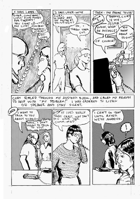
I may have made this page harder than it needed to be, but I'm fairly happy with the result. I played with numerous layout options before deciding on two tiers with exposition block in between. The one drawback is the last panel on tier one comes before the exposition. But I decided there was sufficient context to pull it off.
Strategic considerations: the challenge of land line phones! Though the first hand held independent phone unit was patented in France in 1917 (!), they weren't in common use until many years after the events chronicled here happened. So I used the old saw of phone cords and answering machines, hoping there is sufficient visual context for a modern reader. I also had the issue of showing a missing painting. I opted for a blank wall space with dotted outline. In reality, it didn't look anything like that. I know this page minimizes the impact of someone deliberately destroying family art, or some destroying art in general, but we must choose our moments in this drama. In the third panel, I used the conceit of popping in one of my favorite Surrealist Cowgirls characters. The area needed some weight, so I opted to have some fun with it. The weight in the bottom tier mostly comes from Photoshop patterns and fills. My emotional response to the suggestion that he would have me committed after we were married was not that drastic at the time. I was becoming convinced he was right about me. But I just LOVED Sara's response, just hanging up on him! He made 5 or 6 more calls not included in this page. Going into meticulous detail over such things would bog down the narrative.
The initial panel strategy for this page was so boring! Head shot, head shot, head shot.... blah... then I was re-reading the first run of Paul Chadwick's Concrete, and found a page of phone conversations that used some brilliant and simple visual devices (page 19 of The Complete Concrete). Inspired, I created new layouts for panels 3, 4, 6 and the text block, and popped them in using Photoshop. So this page took two full pages to do! I'm going to tweak a couple little things before this book goes to press, as we used to say.
Not as much pen and brush work as on some pages, but it's always about balance and doing what the page calls for.
Tools used:
- Canson Bristol (2 sheets)
- Nib holder and pen nibs
- Lead holder and no. 3B leads
- 4B graphite stick
- Magic Rub eraser
- Micron No. .02, .03, .05, .08, 1.0 and brush tip
- Tight Spot for corrections
- FW Artists White Acrylic
- Doc Martin's Black Star Matte India Ink
- Photoshop. Mountains of Photoshop.
- Renaissance # 2 Sable Cats Tongue Brush
I picked up a few new tools while I was preparing for next semester's classes, and am eager for the next page, despite the dire place the story is going.

No comments:
Post a Comment