Showing posts with label Strangers in Paradise. Show all posts

Sunday, August 20, 2023

Original Art Sundays No. 368: Sharp Invitations: Esther's Hands, p.10

 Time for the next page!

When we left, our heroine (me) was about to have The Talk with Mother.

Read on...

Well, isn't that the way we all hope it goes? Genuine unconditional acceptance.

To unpack (so to speak) the contents of this page: Coming out to family is one of the scariest things a trans person can do. Though I waited to (ostensible) adulthood and was at no risk of being expelled from my home, as happens to many of us, there's always the risk of losing family. I was lucky. I managed to hold onto much of my family. 

It's always a bit disturbing to draw my old self - "cosplaying male," as someone dear to me says. At this point, I'm beginning to transition, so it's not as unnerving. But it's part of the story and it needs to be told, so that's that.

These moments are so spartan that backgrounds disappear. I considered doing loose pencil backgrounds to give a sense of space, but elected to go sparse instead. This must be the 20th time I've drawn people on the phone, and the hands always give me fits! The thing to remember is that the hand is planar. The bulk of the palm is a big wedge. When you're holding something phone-ish, that plane follows that shape. I got a little carried away with inks on the last panel. That depth shadow on the cheek doesn't read quite right, but I can live with it. Might add it to the list- go back and change later. There were some artifact castes in the image capture- again with the gray tones from the paper! I chose to leave them in on that last panel.

The large black area in panel one is another approach to the challenge of drawing a phone call. I want to imply distance without overusing the old saw of the dividing phone cord- same problem as last week. This solution is new to me. While it gives the panel, and the page, good weight, I don't think it's a visual device I'll be using often. I do like what I've come to call the "Terry Moore arc"- an arc over two panels with a solid area or a texture. He has fallen away from it as a default device, but he used it reguarly in early Strangers in Paradise issues.

I chose to leave in some of the pencil lines. I like the rougher textures sometimes.

I enjoyed scumbling with a bit of dry brush on the hair. I find that technique shows up more and more in my work. I continually sense a potential breakthrough in my work. I'm most happy with my work when it's most flowing and fluid. If I could just have a breakthrough moment! Closer, closer...

Tool list:

  • Papers: tracing paper, various sketchbooks, Canson Bristol board
  • Pencils: Lyra 2B graphite stick, 4B lead and holder, 2B Ticonderoga classic, tech pencil and 4B lead
  • Erasers: kneadable, vinyl eraser, Click eraser
  • Hand Tools: 6" and 14" straightedge, triangle, T-square, French curves
  • Inking tools: Dr.Martin's Black Magic ink, nib and holder, Princeton Deerfoot 1/4" mini detailer brush (love this brush!), Escoda Kolinsky no. 4 brush, Alpine Series 7 Onyx .000
  • Markers: Micron 0.25, 0.5, 0.8, and Copic 0.25, Copic Brush and Micron small brush
  • And of course, Photoshop
Next: support and a caution.


Sunday, November 14, 2021

Original Art Sundays No. 288: Inktober, Week 2

 Next page of Sharp Invitations is about 3/4 done. Rather than skip a week of posting art, here's some more work from this year's Inktober.

I may make a booklet of these.

 Day eight: Zorro.

So many great inkers have worked on Zorro. I've always been partial to Jesse Marsh, Tom Yeates (there's a definitive collection of the Yeates/McGregor Zorro strip soon- hooray!) and of course, Alex Toth. A perennial favorite, Russ Manning, even did a couple tryout strips! 

Such a great character, romantic and driven by justice.

This is loosely inspired by the recent McGregor Kickstarter comic. Almost no under-drawing here, just some brush work. I do love working with dry brush techniques. One of my goals for this year was to improve my versatility and craft.


Day nine:

Another work in walnut ink. I got this really cool catalog of fashion for the more zaftig woman, and she was the cover and one of the interior pages. 

A little more time on the under-drawing this time. Mostly brush work, but a bit of crow quill. I think the outline on the figure could be a bit more consistent. This is always the question: when does one ink right up to the figure, and when does one leave a silhouette? For me, it's about the quality of the figure's holding line. If I'm pleased with that line, I want to preserve it, and the best way to do that is to leave the ghost space.


Day Ten:

This is my character Blue Wild Abandon, who has never appeared outside my sketchbooks before. She's an intergalactic bounty hunter and seeker of justice. Her symbol is the Jungian icon for hero. I will render it more tightly in her first adventure, tentatively titled "No Beast so Fierce". It will be a while before we see it, since I have two stories ahead of it in the queue!

She looks slightly different from one drawing to another. She's been showing up in my sketches for years, but I only recently realized who she is. Then I tied her to an SF story outline I wrote decades ago, and it clicked.


Day Eleven:

Inspired by Trina Robbins' recent wonder, Flapper Queens: Women Cartoonists of the Jazz Age, I decided to try my hand at fashion illustration.

The proportions are weird. The face is sparse.

But boy, was this fun!

Quick pencil sketch, many corrections on the ink. This was was a little Micron, a lot of crow quill, and a BIG brush for the few heavy inks.


Day Twelve:

Athena from my old Tranny Towers strip.

I haven't drawn her for years.

I would love to do a collection of that strip, and include the related work that appeared at the time- my Gay Comics pages using the characters, the self- published work with her from around that time, my editorial cartoons for 90s trans political magazines. Also some paper dolls I was working on and some background sketches and sundries. Make a nice little book.

But in today's political climate, trans people can't even call themselves tranny without someone taking offense. It makes me sad, but I think I've talked myself out of the collection for now. 

Athena's bra and panty set is inspired by Francine in Terry Moore's Strangers in Paradise #1.


Day Thirteen:

Ray Shulman of Gentle Giant. Taken from a photo in the Italian Super Star compilation album booklet!

Much as I love the band, I seldom draw or write about them. Back when I first started posting my work, about a million years ago, I posted some pages from a comic adaptation of the GG song Little Brown Bag. Gentle Giant comics came up in a discussion of a proposed documentary online recently, so that project, an anthology titled Gentle Giant Comics and Stories, could see life again.


I do already have a lot of projects, but my enthusiasm does not abate.


Day Fourteen:

Usagi Yojimbo

This was just fun to draw. Stan Sakai has a style that is deceptively simple. But when you take a closer look at his technique, it's clear he's a master. Subtle variations in line weight, and facial expressions that tell the whole story.

I tell my writing students that knowing what to leave out is as important as knowing what to put in. Sakai is the master there.

That's all for now. I'll save the last 17 Inktober sketches in case I need them to meet a Deadline Doom here, as the Marvel editors used to call it.

Next: back to Sharp Invitations.


Sunday, November 7, 2021

Original Art Sundays no. 287: Sharp Invitations: Curt, p. 21

 Here we go with the next page!

As you may recall, our heroine (moi) had just arrived at her new home, 600 miles from her old one, and was greeted with less than a ticker tape parade.

Read on.

The events of this period are such a jumble, for reasons that will become obvious on the next page (if they're not already).

Backgrounds were kept sparse deliberately. The encroaching black from panel to panel is a visual cue as to what's going on in this descent.

Beyond me being trans, there's no overt trans content on this page, other than the only slightly veiled "someone like you" comment in the last panel.

Curt's figure gets larger as the panels progress, while mine gets smaller. That's pretty blatant symbolism.

Figures are also kept simple, echoing some of Terry Moore's work on Strangers in Paradise, specifically the sequence where Katchoo is talking to the detective. Figures are stripped down to essentials, and eyes are often just dots. He did the same thing in the panel where Tambi says "I hate working with men!"

It's fascinating how much I emulate Terry's techniques. His work is a Master class in style and emotional resonance. Plus, he tells cool stories.

Timeline: This didn't happen week by week, but it seemed the best way to efficiently indicate the slow burn of someone taking over your life.

This one was mostly ink, very little marker.

Tools:

Bristol board

Lead holder, #3B leads, various erasers

Pelikan Ink

Crowquill nib and holder

Richeson #10 Synthetic brush, #4 synthetic

Micron .05, .08

Next: At the very least, the next page. I have three works worth of Inktober stuff I haven't posted here yet, much of which has made me proud. Either way: back soon!


Sunday, July 1, 2018

Original Art Sundays: Sharp Invitations: Curt, p. 16

Finally back.
I won't waste time saying why it took me so long to get this page done. It's unprofessional to kvetch, and nobody wants to hear it (and I don't blame them). Suffice to say it's been a tough couple months, with some days of bliss in the mix. I've been spending creative energy on music and writing, plus a whole slew of sketchbook stuff. I'll post some of that soon. For now, it feels so good to get back to The Work, my graphic memoir, Sharp Invitations.
As always, please keep clicking the "older posts" button at  the bottom of the page for more work, or just hit the "Sharp Invitations" label if you want to check out more of The Work.
When we left our heroine (moi), she was in bed with Curt, who had begun choking her as part of their lovemaking. This came directly on the heels of her meeting a trans lesbian, Sara, with whom she developed an immediate fascination. So much to sort out, and being a meat and potatoes guy, Curt's response was...
Read on.
The usual notes, personal and craft.
Personal: Curt had no clue I was afraid after his hands found my throat. He also had no idea about Sara. For my part, I was running blind, still desperately afraid of my own truth, even after surgery, for reasons I'll spell out in greater detail towards the end of this chapter (anticipated in another 7 pages, but it could run a bit longer in a 4th rewrite).
Craft notes: Minor scanning issues per usual. I will rescan everything upon completion of the book and those issues will be resolved.
Let's speak to timing. The part that hung me up was the first panel of the last tier. I toyed with going all silhouette on its ass, but I don't want to overuse that trick. There are some pages in this book that are nothing but silhouette. My mantra from The Wizard of Oz applies. These things must be done delicately or you hurt the spell.
I'm constantly torn between doing something innovative and ornate and just nuts and bolts layouts. I love ornate layouts, but I'm reminded of a favorite comic book history student who loathed J.H. Williams' work on Batwoman. He said it was so decorated that he couldn't see the story. He had a point. I think this page is a good balance between the two, and advances the story reasonably well. I kept the figures lighter and concentrated the blacks and grays in backgrounds and textures. The linear background on the second tier is a trick I picked from Terry Moore's Strangers In Paradise. I was re-watching Terry's DVD last night, trying to garner some fresh insight, or rekindle old insights. My "big takeaway": just keep doing the work.
Well, duh.
For spotting blacks on the bottom tier, I'm rekindling my fascination with dry brush, something American comic artists have underused historically. I do love the way it shows up in British work, especially from the late 80s. The challenge in dry brush is to get all the texture you want before your meager ink supply dries up.
Tools and supplies on this page:
Canson Recycled Bristol Board, rough finish side used.
Lead holder with #4B lead
#4B solid lead pencil
Miscellaneous straightedges, templates and triangles
Crow Quill and nib
#4 Richeson Snapi round synthetic brush
Tight Spot angled brush for corrections
Dr. Martin's Black Star Walnut Ink
FW Acrylic White
Magic Rub eraser
pretty much the stuff I usually use.
I have a HUGE bottle of Yasumoto Sumi Ink. Perhaps I'll give that a go on a page soon, but I do so love the Walnut Ink.
Next: sketchbook pages, then more memoir.

Tuesday, January 7, 2014

Best Comics of 2013, no. 11: Mars Attacks Popeye

This one-shot really grabbed me. Part of a series expanding the Mars Attacks card line from the early 1960s, Mars Attacks Popeye was the first chapter of this crazy opus. Subsequent entries featured Kiss, the Real Ghostbusters, Transformers and Zombies vs. Robots. But the Popeye issue was the only one that interested me!
Page One of my copy, with signatures of Martin Powell and Terry Beatty sketch!
There just seemed such a charm to this idea when applied to Popeye. I've spoken previously of my respect for Roger Landridge's work on IDW's Popeye, but here IDW turns the writing chores over to The Goon creator Martin Powell (annotation: I was reminded by Terry Beatty that Martin Powell was not the creator of The Goon. That was Eric Powell. Sloppy research on my part, sorry!), who captures the spirit of the character admirably. While many see Segar in this issue, and there's plenty of that to see, I interpret it as more of an homage to the Bud Sagendorf stories- a bit longer and more wildly colored, with the limited palette and (in this case, simulated) sloppy production techniques associated with pre-1970s comics.
Terry Beatty's art delights throughout. The poses and layouts are classic Sagendorf. Much as I revere the work of Segar, his layouts were pretty straightforward, and mostly intended for daily or Sunday papers. While this does adhere to a fairly conventional grid, it's more akin to a comic book page than to a strip page, and Segar worked almost exclusively on the strips.
The 2 x 3 grid is a classic for humorous adventure strips. As Reed Waller once pointed out to me, the 2 x 4 grid is somehow more effective for humor books, but this works. 
It's great to see the Thimble Theater cast working through their paces in this, although I was disappointed by the slight use of the Jeep. Then again, if he were used to full potential, the Jeep would make Popeye's presence unnecessary. 
The use of Sea Hag as collaborator with the Martians is reminiscent of the Plunder island story. Another irritant: I would have liked to see a bit more of her pet vulture, Bernard.
But these are minot quibbles. The story is there. The excitement is there. And the energy is certainly there!
Yeah, I left this page crooked. Somehow it seemed right.

The front covers of these books simulated cards from the series, and the back covers were the backs of the cards- a very fun touch!
A few years ago, there was a Starman/Congorilla team-up from DC- a fun book that touched on something larger. Mars Attacks Popeye is right in the ballpark with that. 


It needs to be noted that every issue of the Mars Attacks crossover series had alternate covers featuring other characters and titles. The alternates for the Popeye volume were a mediocre cover featuring the unnecessarily revived Miss Fury and a very fun Mars Attacks Opus by Berke Breathed. Other alternative covers of note included Mars Attacks Chew and Mars Attacks Strangers in Paradise!
Next: a Best of 2013 entry that will make you purr with joy.

Monday, January 14, 2013

Original Art Sundays No. 147: The Source Cards

Back to post some art in the midst of the final Best of 2012 posts.
And as promised, it's new work, though possibly not what you expected.
At MN's SpringCon last year, the organizers gave creators cards to illustrate. This year being an anniversary, the 25th, they wanted to put together a set of cards. These will be redistributed randomly to attendees. They did this five years ago for the 20th- it's a lot of fun!
So I did my part.
After leaving the card blanks laying on the drawing table to annoy me for months while I completed other work, I finally just sat down and did them right at the turn of the year.
The work is loose and sketchy- hey, they ARE sketch cards- and colored in pencil, though it looks like marker in the scans. I considered correcting the colors and doing some fancy footwork in Photoshop (what we used to call "production art"), then thought, "naaah."
I decided on four of my favorite characters.
First, Dr. Strange.
I was going for a more urgent tone than this conveys. It's OK, but more mood would have been good. Possibly grayscale/monochrome if I work with the Doctor again?
Next, Omaha, of course.
I might like this one best. While it's much looser than Reed's best work, or even some of my own scattered pieces using the character, I think the tone is right. I freely stole the design and palette from one of the final cover variants of Terry Moore's Strangers in Paradise.

Next, Concrete.
Mildly frustrated by this one. I included the title since not everyone knows the character and the cards are being distributed randomly to attendees, but I think it really hampers the overall tone of the piece. The lettering is too cartoony/ baloony. I deliberately left in most of the pencil marks. I think the intent of the cast shadow in the floor stones doesn't work as well as it might.
Still, I've begun to see Concrete as something of a Buddha figure, and this plays into that, obviously.
The whole thing is grayscale, though it looks blue in the scan.
Finally, CHEW!

The Omaha card elicits the strongest idyllic expression from me, but this just makes me smile! I'm about three issues behind, but CHEW remains one of the funniest and most demented comics out there. The earth tones got seriously bumped into the red in the scan. It was much browner in the original. So be it.
Join us tomorrow (actually later today) for the final installment of Best Comics of 2012.

Sunday, May 6, 2012

Original Art Sundays No. 121: A Private Myth, p. 24

Finally.
I've been wrestling with this page for a month now.
Here's why. Take a look at the page rough.
Working up the rough, I was never happy with the first panel. I wanted the page to move through a lot of action very quickly, beginning with the moment to which this has been building.
I tried the slap from several angles and was happy with none. It just didn't work!
Her reaction was never quite powerful enough, there was no indication of the emotions of the aggressor. It was all too static.
But I didn't realize that.
I got hung up on getting the physical dynamics of the slap right.
I like looking to other artists and comic creators for suggestion and inspiration. It's an excuse to use my collection as a swipe file.
But there are very few slaps in comics, much to my surprise.
I looked at some 40s crime stuff, my copy of Romance Without Tears, and some superhero stuff. Lots of slugfests, even some planets being tossed about, but not slaps.
In frustration, I started re-reading Strangers in Paradise to take my mind off the problem.
And there it was.
But I still couldn't make it quite work.
That's when I  realized, as my Dad used to say, I was putting the ac-CENT on the wrong syl-LA-ble.
The crucial thing wasn't the technical accuracy of the slap, but the slap itself.
It's a big moment, and I had it crammed into a corner.
So worrying less about detail, I turned the Bristol over and drew the final.
Better. Not perfect, but better.
The energy comes through, and the poses and expressions are, if not spot on, plausible. As David Chelsea observed in his book on perspective in comic art, it gives a sense of where things are, physically and emotionally.
This was an emotionally difficult page, but since it's been almost two decades since I endured something similar, it was a tad easier this time than it was as a story element in an earlier Tranny Towers strip.
This is also the first full splash page I've used in this story. Since it's such a key moment, I think that's apropos.
My classes end Tuesday night, my final grades are due at the Records office next Monday. I have  a bit more time to work on my storytelling, though the deadline for the next volume of the Comic Encyclopedia looms large.
Long and short, new art next week.
And as I tell my students, thank you for your time and indulgence.

Friday, January 13, 2012

Best Comics of 2011: No. 11: Terry Moore's work

A day late, due to illness, both my own and that of the home Net connection. Now at work and trudging ahead.
The next entry is in two parts. First up is Terry Moore's new book, Rachel Rising.
Like his past works, ECHO and Strangers in Paradise, this work has a female lead.
Unlike those works, this is a horror story.
For a while it seemed like Moore's work, good as it's been, might all be variations on a theme. After all, Both Strangers and ECHO are about two women who pair with varying degrees of reluctance, albeit in very different circumstances and with very different goals.
However, in both books, there's always been an unrelenting tension that drives the plot, as much as the strong characters. Moore's understanding of motivation may be the strongest aspect of his work. And anyone who's read all of either of his previous works knows that Moore is not adverse to blood letting in the furtherance of his plot at times.
So when he announced his next book would be a horror story, I envisioned a smart Mario Bava outing with lesbian overtones.
I was so wrong.
 Rachel Rising is tense and involving, with an uneasy creepiness, owing more to Nicholas Roeg than Bava.
This is not to say the story of Rachel trying to find out if she's dead or not, and who buried her, is bloodless, as this spread from issue 2 demonstrates.
And Moore hasn't lost his trademark wit, although the term "gallows humor" was never more spot on.
I'm a couple issues behind, but despite Moore's annoying tendency to put out truly spiffy collections of his stories on their completion, I'll keep picking up Rachel Rising.
This year, Moore also began his sporadic How to Draw... series.
These are more pragmatic than many drawing books. Moore covers the basics, but in the same tone as McCloud's books on comics. They're more about WHY to draw something or someone in a certain way than HOW to do it.
In my mind, this approach is much more useful than "the leg bone's connected to the thigh bone". You can always expand your understanding of the mechanics. Understanding the psychology and philosophy of your art is vital!


Now that I'm well enough to leave the house, the iffy Net connection will not stop me from continuing my 2011 review.
Next: more lesbians. What, again? Wait for it....

Sunday, May 15, 2011

Inspiration: Batman and Strangers in Paradise

The comments contest is still going on, so comment away!
This is NOT an Original Art Sunday, just a piece I've been playing with for a couple weeks.
Inspired by my friend Ross over at the Brave and the Bold: the Lost Issues, I took a shot at a pastiche cover!
Here's Batman and the Strangers in Paradise girls!
Not completely satisfied with this, but reasonably so. The soft Nick Cardy "painterly" image of the source cover is a bit jarring when juxtaposed with the hard line art of Terry Moore, but here the Match color command is our friend. Katchoo and Francine look more like they "belong" as the colors are more consistent with that palette.
Thematically, this plays on the whole crime lord thing that was one of the less plausible, but quite compelling, subplots of Strangers.
I might take another shot at this with different images sometime down the line, perhaps even draw one from scratch. But I like the collage/pastiche thing a lot too.
These are frustrating, but they are also fun, and serve to keep my chops current between infrequent assignments. Most of my art is traditional line art these days, and it's important to not let any skills atrophy. That's why I still practice my guitar, even though the lump sum of income I've generated in my life as a musician is one dollar.
Of course, there's the whole joy of doing it thing too.
Still have just a touch of inking to do on the next page of the Surrealist Cowgirls, and I will be able to get it done today. Presuming scanner access, look for another post sometime before midnight Central Standard Time.

Monday, February 14, 2011

Love and pain and the whole damn thing

Ah, Valentine's Day.
Another day of stresses and celebrations. Whether you're alone or coupled (or more, depending on your chosen life), the day has stresses, strictures, real and perceived obligations, all tied to a biological, societal and personal imperative to share our lives with one another at different levels of intimacy.
As to St. Valentine, stories vary, but most hold him to be a martyr and savior of persecuted Christians. Small wonder that he's embraced over the much more personally sacrificing (at least in contemporary material terms) St. Francis. After all, how could you merchandise the story of one who took a vow of poverty?
While the connection between St. Valentine and romance is tenuous at best, it's also moot. The day is what it is. The cultural connotation is not be be undone.
In comics, several images come to mind.
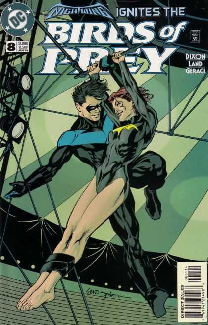
First, this Birds of Prey cover.
I'm not much on Chuck Dixon's writing. All that smug macho nonsense leaves me cold. Battleaxes was the least entertaining comic I'd read in years. I have the same problem with Beau Smith's work, and on occasion that delightfully irriataing Mike Baron.
But I did really like Dixon's work on this series.
I also rather enjoyed the TV series, even with its flaws. You can watch the whole thing on HULA now for free, You have to put up with a few commercials, but he, that's what the mute on your laptop is for, right?
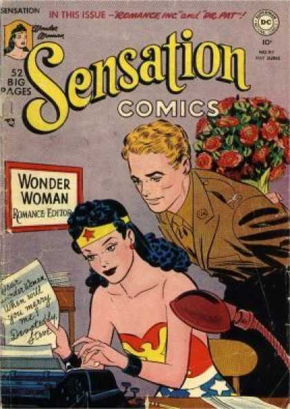
The cover below also comes to mind in terms of romance, even though that's not exactly what's going on here.
Such a smart book!
I find it interesting that books about women and superheroines invariably come around to the romance stuff, while it doesn't seem to surface nearly as frequently in "guy" superhero narratives. There are notable exceptions, but the superhero scared of romance in the 1950s mode remains the default for many comics.  One wonders if that's still the presumption of the marketing folks (that this is what the readership wants) or if that's where the writers are at. In some cases, I suspect the latter- smug little bully boys who are ascairt of girls.
There are many emotionally mature writers working in comics. And it's possible to write strong men without resorting to this macho garbage. Bill Loebs, Warren Ellis, Alan Moore (whose characters all seem injured in some way anyway), even some aspects of Mike Baron's writing succeed in this arena.
Surprisingly, many of Neil Gaiman's love stories  involve his characters behaving very poorly towards one another, in different ways. Consider Morpheus imprisoning his lover in Hell for ten thousand years, for the "crime" of rejecting life with him. Or the poorly defined manipulative behavior of Miraclewoman in Gaiman's Miracleman run- an act of jealousy, as the last panel imples, or a mistake pure and simple?
The narrative of Foxglove and Hazel is just as messed up. A naive lesbian gets preggers, and her abuse-surviving girlfriend sticks with her, grumbling the whole way. But that has a happier ending, or if you prefer, a resolution, since they get to go on.
That's the thing about love stories. If they're going to be realistic, they're messy.
There's only a small percentage in hearts and flowers. Most of us have to deal with the messy aspects of trying to understand one another. If doesn't matter if you're gay, straight, bi or polyamorous, though the latter relationships have far greater complications (but when they succeed, they're great!). People are complicated, screwy and self-contradictory. We want someone to love us forever, and when we get them, we want time to ourselves, or we're let down that they're who they are and not who we expected/hoped them to be.
It's a balancing act that never stops.
In comics, the love story as primary plot is becoming more prevalent. I can think of two splendidly successful narratives of the last 20 years.
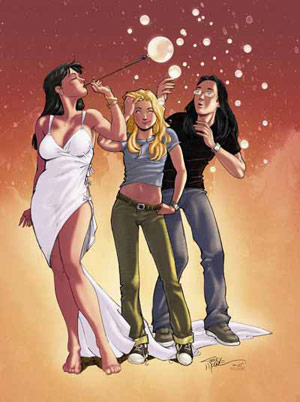
First, the remarkable Strangers in Paradise.
Never mind that there are some incredibly implausible aspects to the story, and some wild inconsistencies. Is Katchoo an alcoholic, as mentioned in a couple issues, or not, as indicated by her apparently controlled drinking in subsequent issues? How could Casey be in the employ of her true boss and be such a ditz? Sometimes it felt like a Tezuka narrative- the character playing a variety of roles, some of which contradict the roles played by the same "paper actor" in another story. You also see this phenomenon in Barks' Duck stories, and it's worth noting that Barks was irritated,  bordering on insulted,  by Don Rosa's attempts at imposing a unified narrative on the loose aggregate of Barks tales.
That aside, Strangers works despite its occasional implausibilities. This is because:
a) Moore is a strong enough storyteller that he was able to pull it together in a way that worked, and
b) No matter what else it is, it's a love story first and foremost. The issue is not that the people love one another despite all this stuff happening. It's that their love sees them through this stuff, even when they're at one another's throats over real or perceived wrongs.
The last comic to consider on this day dedicated to the ideal of romantic love (and to the sale of cards, flowers and chocolate) is True Story, Swear to God.
There's this guy, Tom. Nice guy, comic book nut.
Takes himself a vacation to Disney World. Meets a Puerto Rican woman at a bus stop. They fall in love instantly. He moves to Puerto Rico to be with her.
It's true. Every last bit of it. Tom has photos and everything to prove it.
The story is about all of the above: miscommunication, frustration, dealing with life, trying to understand each other. It's told simply and cleanly, with honesty that avoids being maudlin.
Tom published about a dozen issues himself, then took the book to Image, where it has currently run 12 more issues. The book deals with everything from a Californian living in Puerto Rico during 9/11 to his spouse wanting to shave her head in support of her cancer afflicted sister. This is what comics can do best- say something about our lives.
I've deliberately not discussed the other great comic book romance that affected my life, Omaha, tonight. Too many memories, not all of them good for this particular day. But I do hold the book and its creators in a treasured place, and will write about them again when appropriate.
For right now, let's just leave it at the default optimistic thought:
Ain't love grand?


Friday, January 1, 2010

Top 10 Comics of 2009: # 10: ECHO

I'll post one of these a day until I've reached #1. That will give me a bit of time to think about my choices. I have them chosen, but I do want to review, since I can read a lot of comics in a year!
#10 is the most recent issue of Terry Moore's ECHO.
For those not in the know, ECHO is the story of a broke photographer who happens onto a weapon test site, and is deluged with refuse from said weapon. This refuse attaches itself to her skin, seemingly irrevocably. The material also contains some of the consciousness of its inventor. Many people are trying to kill our photographer. Alliances are formed and a chase ensues. Pieces of the puzzle are doled out to our heroine (and her reluctant partner, the boyfriend of the late inventor) on the run. That's a very stripped down version of the plot.
The current issue, #17, takes the storyline into uncharted territory as this smart, soulful adventure book delves into areas of physics, human evolution, philosophy, and tells us the connection between the hydrogen bomb and art forgery. All this happens in a cafe conversation over a salad and a glass of water.


I was so disappointed when I saw this cover. This has been an intriguing read, but I was starting to feel like  I did around the middle of Strangers in Paradise- great story, but get on with it already. And this cover looked to me like a good Marvel cover- lots of pyrotechnics, but not about anything, really. Boy, was I wrong! It's been a while since a comic was so good that I was frustrated to not be able to read the next issue right away. So it was with this one. So many ideas and emotions crammed into a scant 24 or so pages, and let's add, a backstory that pulls previous events together in a way that, while not completely unexpected, is at least unorthodox and so heartfelt.
I don't know if Terry Moore lost his steam for a while or I just got frustrated. Whichever it was, he's back in full force with this issue, and this book is a high point for the year.
Tomorrow, #9, with a silver bullet!

Sunday, September 6, 2009

Original Art Sundays, No. 10: Surrealist Cowgirls, p. 9

The Bugs Bunny moment. "Of course you know this means war!"
Fixed a few late night errors on this one- corrected some funny-shaped word balloons, popped vest textures into the last panel.
This one uses one of my favorite visual devices, the Holding Arc of Darkness, a spot black that spans multiple panels on a single tier. I don't know if it's his creation, but I first became aware of it in Terry Moore's Strangers In Paradise.

Saturday, May 23, 2009

The Terror of The Magnum Opus!

As I break from working on my book/grant proposal, my thoughts turn to creators who have inspired me in different ways.
Today's venture takes two turns, beyond the already posted notes on the human tornado called Ellison.
Next up is Jeff Smith, creator of Bone, the much neglected Shazam and the Monster Society of Evil, and the sporadic but worthwhile RASL. All Jeff's work deals in themes of common beings surviving their roles in large, mythic battles a la Tolkien or Eddison.
Well, turns out there's a documentary on Jeff.


Then there's Terry Moore.
His Strangers in Paradise is now collected in an Omnibus edition. How he managed to do this and keep on schedule with his new book, ECHO, is beyond me, but he did it.
This invites the next issue.
A Magnum Opus can kill you if you let it.
The idea of creating a single work of such weight and import can be such a heavy burden that it renders the work insurmountable. If you let it be that.
I suspect the way through this is twofold.
First, don't try to create something big. Create pieces of the big thing. Just say what you have to say, using the time you have to say it as well as you can. The 2200 pages of Strangers and the 1400 pages of Bone were all done page by page, the only way it can be done.
It took me 6 months to do a page once, and I did 12 pages in 14 hours another time. It takes the time it takes.
Second, while you must keep at it (or in my case, all the various "it"s), you can't punish yourself if you lose pace. Self-recrimination takes time too, and burns up, wastes, energy that could go into the work.