Showing posts with label CHEW. Show all posts

Tuesday, January 7, 2014

Best Comics of 2013, no. 11: Mars Attacks Popeye

This one-shot really grabbed me. Part of a series expanding the Mars Attacks card line from the early 1960s, Mars Attacks Popeye was the first chapter of this crazy opus. Subsequent entries featured Kiss, the Real Ghostbusters, Transformers and Zombies vs. Robots. But the Popeye issue was the only one that interested me!
Page One of my copy, with signatures of Martin Powell and Terry Beatty sketch!
There just seemed such a charm to this idea when applied to Popeye. I've spoken previously of my respect for Roger Landridge's work on IDW's Popeye, but here IDW turns the writing chores over to The Goon creator Martin Powell (annotation: I was reminded by Terry Beatty that Martin Powell was not the creator of The Goon. That was Eric Powell. Sloppy research on my part, sorry!), who captures the spirit of the character admirably. While many see Segar in this issue, and there's plenty of that to see, I interpret it as more of an homage to the Bud Sagendorf stories- a bit longer and more wildly colored, with the limited palette and (in this case, simulated) sloppy production techniques associated with pre-1970s comics.
Terry Beatty's art delights throughout. The poses and layouts are classic Sagendorf. Much as I revere the work of Segar, his layouts were pretty straightforward, and mostly intended for daily or Sunday papers. While this does adhere to a fairly conventional grid, it's more akin to a comic book page than to a strip page, and Segar worked almost exclusively on the strips.
The 2 x 3 grid is a classic for humorous adventure strips. As Reed Waller once pointed out to me, the 2 x 4 grid is somehow more effective for humor books, but this works. 
It's great to see the Thimble Theater cast working through their paces in this, although I was disappointed by the slight use of the Jeep. Then again, if he were used to full potential, the Jeep would make Popeye's presence unnecessary. 
The use of Sea Hag as collaborator with the Martians is reminiscent of the Plunder island story. Another irritant: I would have liked to see a bit more of her pet vulture, Bernard.
But these are minot quibbles. The story is there. The excitement is there. And the energy is certainly there!
Yeah, I left this page crooked. Somehow it seemed right.

The front covers of these books simulated cards from the series, and the back covers were the backs of the cards- a very fun touch!
A few years ago, there was a Starman/Congorilla team-up from DC- a fun book that touched on something larger. Mars Attacks Popeye is right in the ballpark with that. 


It needs to be noted that every issue of the Mars Attacks crossover series had alternate covers featuring other characters and titles. The alternates for the Popeye volume were a mediocre cover featuring the unnecessarily revived Miss Fury and a very fun Mars Attacks Opus by Berke Breathed. Other alternative covers of note included Mars Attacks Chew and Mars Attacks Strangers in Paradise!
Next: a Best of 2013 entry that will make you purr with joy.

Monday, January 14, 2013

Original Art Sundays No. 147: The Source Cards

Back to post some art in the midst of the final Best of 2012 posts.
And as promised, it's new work, though possibly not what you expected.
At MN's SpringCon last year, the organizers gave creators cards to illustrate. This year being an anniversary, the 25th, they wanted to put together a set of cards. These will be redistributed randomly to attendees. They did this five years ago for the 20th- it's a lot of fun!
So I did my part.
After leaving the card blanks laying on the drawing table to annoy me for months while I completed other work, I finally just sat down and did them right at the turn of the year.
The work is loose and sketchy- hey, they ARE sketch cards- and colored in pencil, though it looks like marker in the scans. I considered correcting the colors and doing some fancy footwork in Photoshop (what we used to call "production art"), then thought, "naaah."
I decided on four of my favorite characters.
First, Dr. Strange.
I was going for a more urgent tone than this conveys. It's OK, but more mood would have been good. Possibly grayscale/monochrome if I work with the Doctor again?
Next, Omaha, of course.
I might like this one best. While it's much looser than Reed's best work, or even some of my own scattered pieces using the character, I think the tone is right. I freely stole the design and palette from one of the final cover variants of Terry Moore's Strangers in Paradise.

Next, Concrete.
Mildly frustrated by this one. I included the title since not everyone knows the character and the cards are being distributed randomly to attendees, but I think it really hampers the overall tone of the piece. The lettering is too cartoony/ baloony. I deliberately left in most of the pencil marks. I think the intent of the cast shadow in the floor stones doesn't work as well as it might.
Still, I've begun to see Concrete as something of a Buddha figure, and this plays into that, obviously.
The whole thing is grayscale, though it looks blue in the scan.
Finally, CHEW!

The Omaha card elicits the strongest idyllic expression from me, but this just makes me smile! I'm about three issues behind, but CHEW remains one of the funniest and most demented comics out there. The earth tones got seriously bumped into the red in the scan. It was much browner in the original. So be it.
Join us tomorrow (actually later today) for the final installment of Best Comics of 2012.

Tuesday, January 11, 2011

Best comics of 2010: No. 5: Chew


Another one that eluded me at first. Hence its presence on the 2010 list, not the 2009.
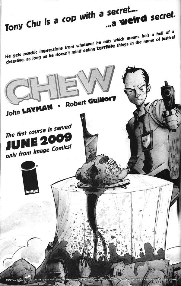
CHEW is about a cibopath. For those not "in the know" that means that Detective Tony Chu gets psychic impressions from every food he eats.
Except beets.
As the series begins, he's working vice in Philly. His brother's an ex TV chef who had a psychotic episode on the air concerning the "chicken conspiracy" (more on that below).
While on stakeout, Tony and his partner John Colby observe Tony's  brother on infra-red. He's packing. Not heat, but meat. Turns out chicken has been made illegal due to a bird flu epidemic, and the FDA now has more power than the FBI. As a result of this, there's a huge bootleg traffic in chicken parts.
Well, that's a summary of the first 6 pages of issue 1.
After a preview in The Walking Dead no. 61, the book took off. It remains one of the few books to demand any sort of coin on the back issue market, despite numerous reprints and a couple very tasteful (sorry) TPBs. 
(House ad from Walking Dead No. 60)
Ahem. Back to issue 1.
Tony and Colby are having lunch, when Tony's gift/curse reveals that one of the sous chefs is a serial killer who eats his victims and cooks with them, serving the results to restaurant customers.  They confront him. Colby gets a hatchet upside his head for his trouble.
At the end of issue, Chu becomes an FDA agent. He works on cracking the conspiracy behind the bird flu scandal. Colby becomes his reluctant partner, following a facial reconstruction that leaves him looking like a poor man's Terminator.
As the story twists the readers into abstract sculptures, Tony finds a girlfriend, a food critic whose reviews are so well written that they make people taste the food.
It's also revealed that Chu is one of three cibopaths.
Who are the others?
What is happening with the mysterious octopus-pineapple-chicken plant thing in issue 6?
It might seem like this facile device would wear out in short order. After all, the bit only works if you keep putting food with criminal ties of some kind on the protagonist's plate.
Surprisingly, writer John Layman and artist Rob guillory manage to keep it fresh (there's really no way to avoid food puns on  this one, so let's just muddle through, shall we?).
The book has been optioned for a TV series. The production company is the one responsible for The Walking Dead show on AMC, which is quite good, so I have hopes that the material will translate successfully.

The comic's writing is action-driven, but not the expense of intelligence. A book based on an idea this wild could be terminally stupid. This is not. There's a delightful balance of humor, empathy and the macabre.
Not so surprising when you think about it. Some of the best horror stories are also comedies.  Perhaps instead of whistling by the graveyard, we ought to chuckle.


As with Meta4, kudos to Image for putting out such an unusual and delightful book. It's also to their credit that these books have such different styles and, one presumes, different core audiences. But then, I'm reading both, so possibly not so different.
Perhaps the difference, if there is one, is in the core readership for each book. People who read Meta4 might be more willing to give CHEW a chance than vice versa, akin to Clockwork Orange fans being more accepting of Singin' in the Rain than the reverse.
I hope the pop culture references in CHEW don't wear thin over the years. I'd like to see this book become one of those comics that is recommended for decades.
Hm. Maybe this cover really is timeless at that.

Tomorrow: Best of 2010, no. 4: it burns!