Showing posts with label pen and ink. Show all posts

Sunday, October 6, 2024

Original Art Sundays No. 375: Inktober '24, part 1


Crossposting this from my Substack. 

We’re in the throes of Inktober!

3 of the last 4 years, I’ve made it through the entire month. Two of those years have been compiled in the book Spatters. I have 7 copies left, and it will be available at Queer and Trans Zine Fest next weekend.

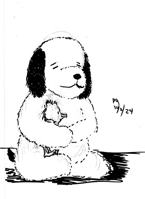
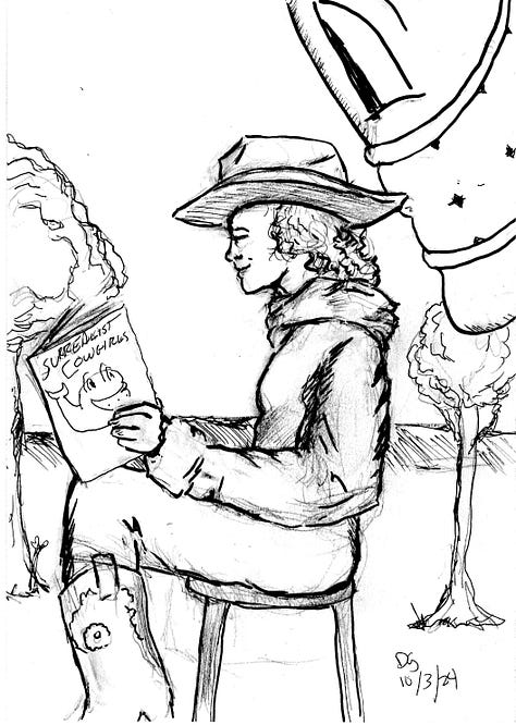
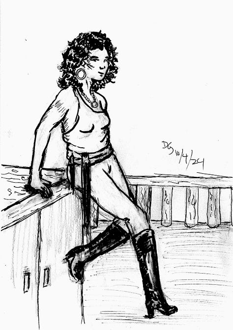
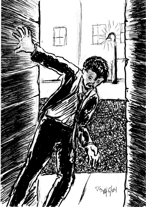
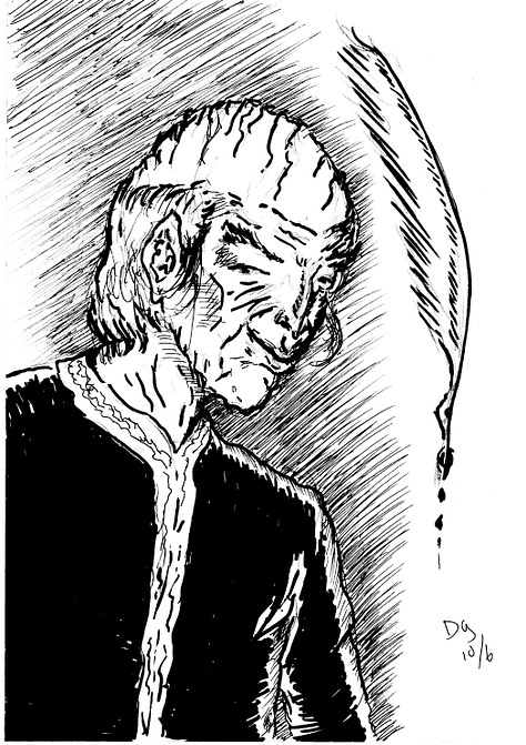
Here are this year’s Inktober drawings so far.
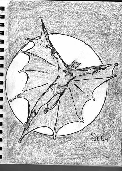
  • Day One: Batman inspired by John Cassaday

  • Day Two: my stuffed Snoopy (that I got the day I met the man) in honor of Charles Schulz’s birthday.

  • Day Three: an unusual take on my favorite creations, the Surrealist Cowgirls.

  • Day Four: Pirate girl, inspired by my love of Gil Elvgren’s inviting poses.

  • Days Five and Six: Moments from the work in progress Captives of Imagination.

I do love Inktober. I never follow the prompts. To me, it’s an opportunity to stretch as an inker, and I don’t like having too many terms dictated to me. However, it does offer something very useful, almost invaluable: deadlines.

Deadlines get things done.

Lecture is given on Wednesdays. Next lecture is on Fridays. Midterm grades are due soon. Zine Fest happens on October 19 and 20. Inktober is every day of the month. If the book is to be done by the holidays, there are printing deadlines.

Deadlines will drive one crazy, but they are so valuable. As Palpatine said about anger and the Dark Side, it gives you focus. And if you have something that has to be done today and a long project with no deadline, you tend to give your time and energy to the former.

But they can be traps too. If one has too many deadlines, everything collapses. I’ve gone through that a couple times. For me, the razor’s edge is having just a LITTLE more to do than I can handle.

However, it’s not just about methodically doing the work and dutifully meeting the deadlines.

A couple days ago, I picked up a copy of Harlan Ellison’s Last Dangerous Visions, published poshtumously, with final edits completed by J. Micheal Straczynski.
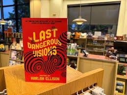
The Last Dangerous Visions is finally here , six years after Harlan  Ellison's passing, spearheaded by J. Michael Straczynski, & featuring a  bunch of rad stories from folks like Cecil Castellucci. Insta-buy.

I sat up and read JMS’s Introduction and Exegsis, in which he gives personal insights into his relationship to Harlan and into Harlan’s private life, in a respectful but honest way. He revealed Harlan’s mental challenges over his lifetime, and how those challenges inhibited the creation of this volume for five decades.

This shook me. I had the honor of meeting and speaking with Harlan twice, and while I’m sure he wouldn’t know me from Eve, I clung to the conceit of calling him a friend. Some of that also stems from the artifice of intimacy resulting from liking someone’s work. Much of Harlan’s writing was brutally honest, and left the reader feeling like an invitation into the writer’s mind and heart had been offered and accepted. Ellison often wrote of such presumed familiarity as inappropriate, to say the least. I got that, but I still felt it. As such, I was shocked to discover that he wasn’t who I thought he was - or perhaps who HE thought he was. Mental illness is like that, I suppose.

But by choice or design, he got in his own way in completing this work, a work he saw as so important. Too many deadlines, not enough Harlan to meet them. And he took himeslf to task for that, in rather severe terms.

Do we all do that? Mental health is clearly a factor, but I think it’s not the only factor involved. Even creators without mental health issues face what Marvel used to call the Dreaded Deadline Doom.

I hold great rerevence for creators who methodically produce smart, impassioned work. As I discussed previously, I often hold the work in such reverence that I’m afraid to get it done. Sometimes that’s a conceit or an excuse. The deadline comes and you meet it (well, most of the time. I’ve missed more than a few, but made most).

I suspect that my truth is like that of many other creators. The Work is never as good as I aspire to it being, but it’s often better than I think it is.

I’ve been drawing, writing and teaching for so long. I hope to get The Big Work done while I still can. I will never be another Harlan Ellison, but that’s okay.

We’ve already got one, and I am forever grateful for that.

Thank you, Harlan.

Next: the work continues on both Inktober and Sharp Invitations. One or the other coming you way soon...

Sunday, August 25, 2024

Original Art Sundays No. 374: Sharp Invitations: Esther's Hands, Interlude conclusion

 Back from Autoptic! That was quite a success in my book. I talked to many old friends, made some new ones and had decent sales. I'm already deep into prep for the new semester, but I still had time to work on some pages from the book.

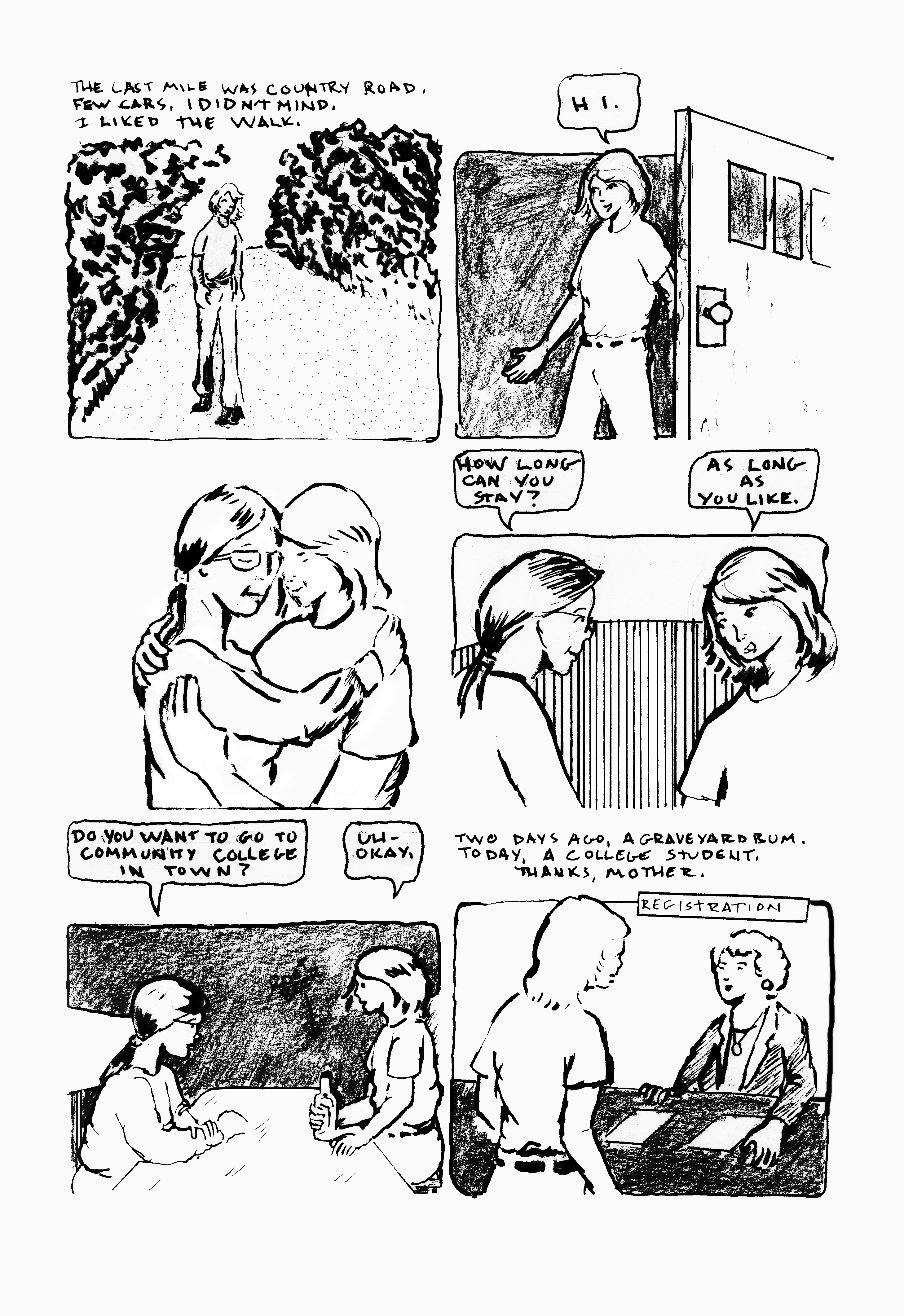
I posted the concluding page of the Cemetery Interlude before, but I have a better scan of it, so am re-posting it, along with another single page interlude.


I've previously posted thoughts on the graveyard to college page. 

Thoughts on the new page: deliberately light to no backgrounds. This is a moment between Mother and me. In that moment, everything else slipped away. 

Tools used on this page:

  • Papers: tracing paper, various sketchbooks, Canson Bristol board
  • Pencils: Lyra 2B graphite stick, 4B lead and holder, 2B Ticonderoga classic, tech pencil and 4B lead
  • Erasers: kneadable, vinyl eraser, Click eraser
  • Hand Tools: 6" and 14" straightedge, triangle, T-square
  • Inking tools: Tight Spot correction brush, Holbein white gouache
  • Markers: Copic 0.25, 0.3, 0.8, 1.0, Faber Castell brush, LePen brush, Copic Brush and Micron small brush
  • And of course, Photoshop


The next three or four pages will conclude this chapter. I need to confer with family on a couple points as we approach the end.


Sunday, May 12, 2024

Original Art Sundays No. 379: Sharp Invitations: Esther's Hands, Interlude, page 3

 Posting a page from the story of Mother on Mother's Day, of course.

When we left our hapless trio, they (we) were sleeping in a cemetery.

Now it's morning.


Again, trying to emulate Bode in some aspects of layout- use of borders and isolation of text, mostly. Much as I like his stuff, my style really isn't much like his.

Story notes: not much to tell. This is pretty much the way it happened. I wouldn't see John and Stu again for about 3 years. No overt trans content in this interlude. I am amused, however, at how shocked people seem to be today by hitchhiking. I don't think I'd do it now unless there was no choice, but back then it was a default method of travel. Either it was harmless or we were oblivious to the risk. Either way, I came through unscathed. There was a running gag between hitchhikers that the fastest way to get a ride was to have a sign that read HOME TO MOTHER.

Process, layout and technique: the challenge is keeping the reader cued with minimal elements. I deliberately avoided overcrowding this page. I pushed the textures on the bush in Panel 3, but I'm not sure if it reads fully. The text block between panels 3 and 4 was originally an open field of white, but in a moment of brilliance, I reversed it in PS. Gives the page a little more weight and helps the text stand out.

The other challenge in this kind of layout is border manipulation. I tried to go with the two principles of Bode borders (say that three times real fast): isolate text and image, and make panel elements part of the border. I like the sparseness of this page, and I think I hit the balance and included not just enough information, but the right information.

We have one more page of this interlude, and then back to the regular Mother story. 

I'm toying with the idea of doing a short print run of the Curt story as a stand alone publication. I have applied to table at a local indy con, and it could be interesting to see if anyone wants it. 

Materials: I did get a couple new brushes recently, but they're not used on this page. Pretty much the same tools as last time, so I will forego the equipment list for now.

Next: I get home.

Sunday, March 17, 2024

Original Art Sundays No. 376: Sharp Invitations: Esther's Hands, p. 14

Well, we're back! It's been hectic, but I have a couple new pages to post. I've had this done for a couple weeks, but there's finally time to post!

First, the next page of Esther's Hands.

Story notes: for most of this chapter, the story is random memories of Mother, mostly related to trans stuff, since that's the main focus of the book. Some other material finds its way in. I suspect I will reorder these pages before going to press. As for the memories, don't we all remember people by random events? Some little thing happens that reminds one of something, which reminds us of...

This moment was quite stirring for me. It was one of those times when you realize that you can always learn from your Mother. I was in my mid 40s and was sure I knew everything.

Craft notes: Kept this one simple. The constant challenge of keeping dialogue heavy pages visually interesting applies here. The personal issue is that the living room looks quite sparse in contrast to its true cluttered/chaotic status. A conscious choice to edit reality for the sake of the narrative. I like the way Mother is drawn in panel 3. Just a few well place lines show so much age. I opted for fabric textures and graphite on clothing to give the page weight. 

Not doing an equipment list on this one. Pretty standard, much like previous lists. Page turned out pretty clean, so minimal Photoshop was used, mostly levels and curves to get the light/dark balance down.

Next: a strange interlude.


Sunday, November 19, 2023

Original Art Sundays No. 372: An Inktober miscellany

Well, that really got away from us! Between midterms, union work, concerts and starting new projects, I only completed about half of Inktober this year and haven't posted for a while. Now that I have a minute to breathe, I'd like to share some of this year's completed works.

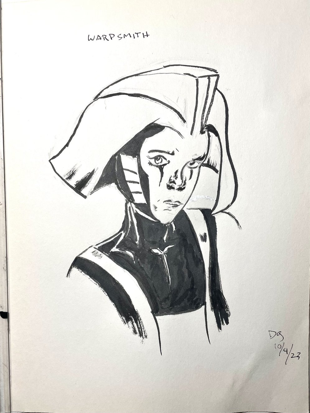
My vision of the Warpsmith, inspired by Neil Gaiman's current run at finishing Miracleman. I have very mixed feelings about how the storyline seems to be resolving, but I'm very pleased with the quality of the work. This is straight pen and ink, with some brush work here and there.


October 5. This was based on a comic cover, a book titled MAMO from Boom Box (2021). This is on gray paper, mostly ink and brush. I'm working with Sumi-e ink here. I like the quiet meditative feel of this.


 October 12. My take on the iconic Sugar & Spike. I revere these characters. Such smart fun! I seldom draw in this less formal style, but I always enjoy it when I do. 

Dc really blew it in reprinting these. It's one of the best kids' books ever done, so yeah, let's bring it out in a $60 hardcover! Good thinking, moguls.


October 13. Another vision of my elusive character Blue Wild Abandon! Black and white ink on colored paper. I came into a stack of miscellaneous colored papers and have been enjoying them no end.


October 15. Brush and Sumi-e ink.Playing with Japanese floating world ideas and having some fun drawing a kitty.

I have quite a few more, but these are the ones I have ready to put in this long overdue post!

Next: either new page or the rest of these.


Sunday, October 1, 2023

Original Art Sundays No. 371: Inktober '23, Day One

 This promises to be a very hectic week: midterms, two concerts and a visit from my sweetheart. Yeah, I know, first world problems. Be that as it may, I did want to get art posted, whether I had time for a new page today or not. As Inktober has begun, here's Day One!

This was inspired by a panel from the Phil Jiminez chapter of Wonder Woman: Historia. Rather than to try to bring my modest skills to the pinnacle of Phil's work, I made a couple modifications to make it my own.

The core concept, poses and basic layout are all Phil's, of course. Somewhere along the way, I garnished a small stack of Canson colored papers. I noticed by sepia inks, which got quite a workout during Inktober last year, and inspiration struck. I've been fascinated by the notion of white color pencil highlights on color stock, so that came into play as well. Not sure if the clouds are working, but they were a whim, and I'm fine with them as such.

Last two years, I made it through the whole month of Inktober. I hope to make it 3:3 this year. As with past years, I don't give two figs about the suggested prompts. I just want to try to stretch myself as an artist, as an inker, and see where it takes me. 

Tools:

  • Canson textured paper
  • 4B lead and holder
  • Rubber eraser
  • 2 shades of sepia ink
  • Pen nib and holder
  • Connoisseur Series  7 Kolinksy brush # 0
  • White colored pencil

Next: More Inktober, the next page of Sharp Invitations, or possibly both!


Sunday, September 24, 2023

Original Art Sundays No. 370: Sharp Invitations: Esther's Hands, p. 12

 Another quick episode this week.

 Another quick gag strip. I like doing these for previously mentioned reasons. They break narrative tension, they inject a little joy into the story, and they're quick and fun to draw. In this case, it's a throwaway moment that implies a lot more. It alludes to the "pink cloud", the freedom to be yourself after having been closeted way too long. In this case, that reflects in exploring, ahem, intimate possibilities. In this case, it also touches on Mother's more reserved nature. It wasn't so much an inhibition as -well, we just don't talk about such things. 
The art is quick and loose. The star here, if there is one, is the facial expression. The eagerness in the first panel, the dreamy look in the second, surprise in the third, and sarcasm in the last. As the strip goes, Mother's expression gets subtly and progressively annoyed.
The background is nonexistent. If the reader looks back at similar pages from earlier in the narrative, this is consistent. Yes, cartoony work (whatever that nebulous terms means) can have more developed backgrounds, as in the case of the classic Sugar & Spike. But that's not what we're after here.
My only concern with this and similar pages is that it might be too much of a tonal jump. But after heavy dramatic moments, I'm ready to take a breath, and I hope my readers share the sentiment.
Simple tools this time:
  • Printer paper
  • T-Square, triangle, straightedge
  • 3B lead and lead holder
  • Tech pens: ,6, .8, 1.0
  • Ballpoint pen
  • Magic rub eraser
Scott McCloud was right. The only tools you need to make comics are a piece of paper and a pen.
Next: Mother is there for The Big Day.

Sunday, September 17, 2023

Original Art Sundays No. 369: Sharp Invitations: Esther's Hands, p. 11

 Once more, here we go! Some delays due to personal issues, now mostly resolved.

When we left, our heroine (me) was on a phone call to Mother, talking about coming out.

Read on.

Sigh.

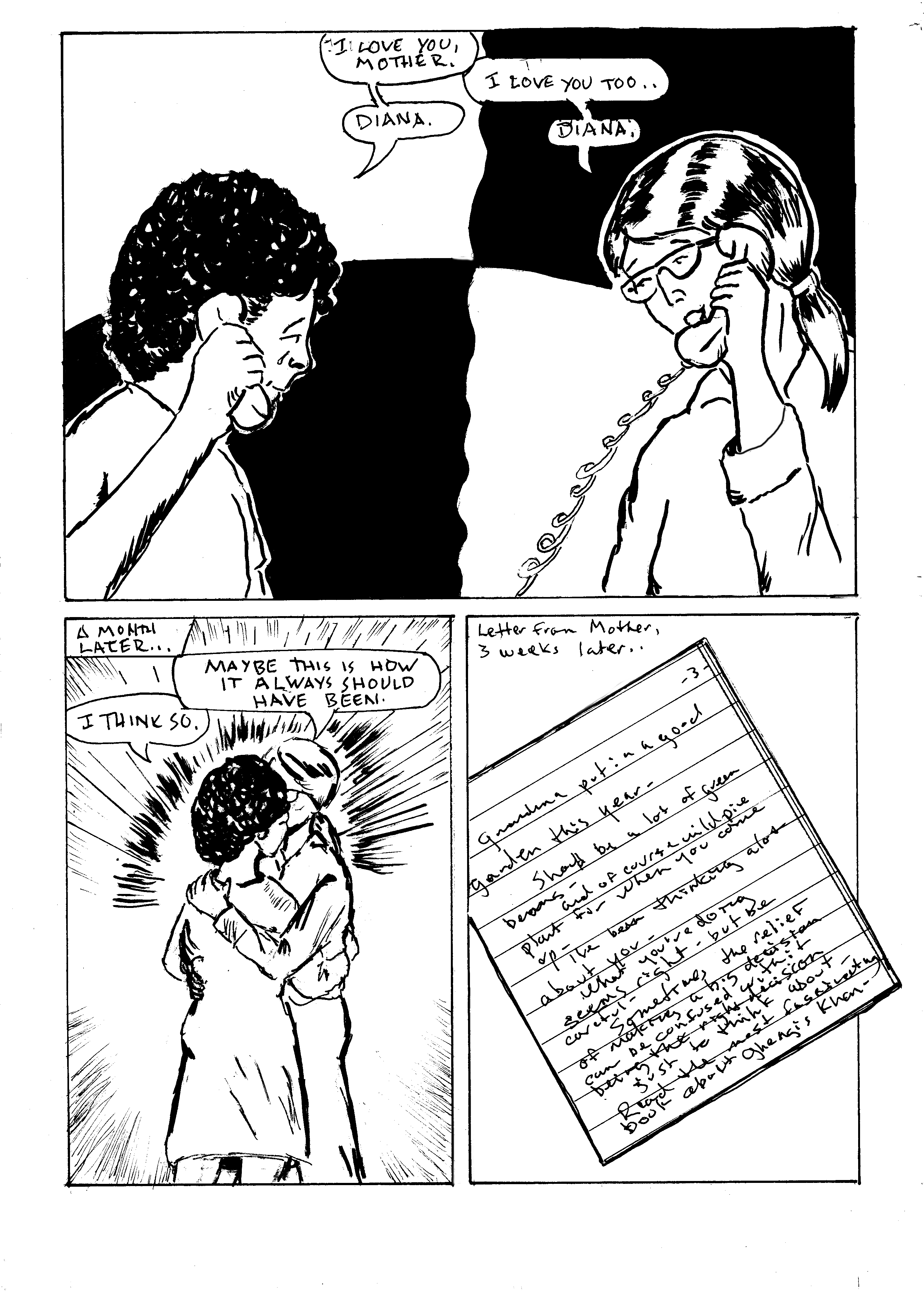
The text of the letter was a challenge. I don't have the original letter any more, but it resonated with me. I tried to simulate Mother's handwriting, which was illegible to anyone but family. I will include the text in a supplement in the finished book, but here it is.

"Grandma put in a good garden this year- Should be a lot of green beans- and of course wild pie plant for when you come up-

I've been thinking a lot about you - what you're doing seems right- but be careful- sometimes the relief of making a big decision can be confused with it being the right decision

Just something to think about-

Read the most fascinating book about Ghengis Khan"

Mother didn't use periods. Everything was dashes. I debated typesetting this, but reproducing her handwriting seemed more - well, proper. 

In narrative and in design terms, this page advances the story well, but the content is static. I toyed with a couple ideas for the first panel. I wanted to convey that we were still in the same phone call without using the same visual devices. I reused the poses from the previous page and just changed the positions and expressions slightly.  I thought the split and reverse of heavy blacks worked well. And I liked the wavy line!

Panel two: I wanted an emotional moment without a close up. Too many close ups lately! The 3/4 shot of me and Mother embracing shows emotion, and shows me out of "boy cosplay" in front of family for the first time. The action lines give it a little weight. Panel 3, the letter, was a strategic narrative choice. It brought the page to a satisfying conclusion, and said something about Mother's thought processes.

Tools used on this page:

  • Papers: tracing paper, various sketchbooks, Canson Bristol board
  • Pencils: Lyra 2B graphite stick, 4B lead and holder, 2B Ticonderoga classic, tech pencil and 4B lead
  • Erasers: kneadable, vinyl eraser, Click eraser
  • Hand Tools: 6" and 14" straightedge, triangle, T-square, French curves
  • Inking tools: Dr.Martin's Black Magic ink, nib and holder, Princeton Deerfoot 1/4" mini detailer brush (can't get enough of this brush!), Kingart 8 Gold Synthetic
  • Markers: Micron 0.25, 0.5, 0.6, 0.8, and Copic 0.25, Copic Brush and Micron small brush
  • And of course, Photoshop

 Next: Mother gets irritated.


Sunday, August 20, 2023

Original Art Sundays No. 368: Sharp Invitations: Esther's Hands, p.10

 Time for the next page!

When we left, our heroine (me) was about to have The Talk with Mother.

Read on...

Well, isn't that the way we all hope it goes? Genuine unconditional acceptance.

To unpack (so to speak) the contents of this page: Coming out to family is one of the scariest things a trans person can do. Though I waited to (ostensible) adulthood and was at no risk of being expelled from my home, as happens to many of us, there's always the risk of losing family. I was lucky. I managed to hold onto much of my family. 

It's always a bit disturbing to draw my old self - "cosplaying male," as someone dear to me says. At this point, I'm beginning to transition, so it's not as unnerving. But it's part of the story and it needs to be told, so that's that.

These moments are so spartan that backgrounds disappear. I considered doing loose pencil backgrounds to give a sense of space, but elected to go sparse instead. This must be the 20th time I've drawn people on the phone, and the hands always give me fits! The thing to remember is that the hand is planar. The bulk of the palm is a big wedge. When you're holding something phone-ish, that plane follows that shape. I got a little carried away with inks on the last panel. That depth shadow on the cheek doesn't read quite right, but I can live with it. Might add it to the list- go back and change later. There were some artifact castes in the image capture- again with the gray tones from the paper! I chose to leave them in on that last panel.

The large black area in panel one is another approach to the challenge of drawing a phone call. I want to imply distance without overusing the old saw of the dividing phone cord- same problem as last week. This solution is new to me. While it gives the panel, and the page, good weight, I don't think it's a visual device I'll be using often. I do like what I've come to call the "Terry Moore arc"- an arc over two panels with a solid area or a texture. He has fallen away from it as a default device, but he used it reguarly in early Strangers in Paradise issues.

I chose to leave in some of the pencil lines. I like the rougher textures sometimes.

I enjoyed scumbling with a bit of dry brush on the hair. I find that technique shows up more and more in my work. I continually sense a potential breakthrough in my work. I'm most happy with my work when it's most flowing and fluid. If I could just have a breakthrough moment! Closer, closer...

Tool list:

  • Papers: tracing paper, various sketchbooks, Canson Bristol board
  • Pencils: Lyra 2B graphite stick, 4B lead and holder, 2B Ticonderoga classic, tech pencil and 4B lead
  • Erasers: kneadable, vinyl eraser, Click eraser
  • Hand Tools: 6" and 14" straightedge, triangle, T-square, French curves
  • Inking tools: Dr.Martin's Black Magic ink, nib and holder, Princeton Deerfoot 1/4" mini detailer brush (love this brush!), Escoda Kolinsky no. 4 brush, Alpine Series 7 Onyx .000
  • Markers: Micron 0.25, 0.5, 0.8, and Copic 0.25, Copic Brush and Micron small brush
  • And of course, Photoshop
Next: support and a caution.


Sunday, August 6, 2023

Original Art Sundays No. 367: Sharp Invitations: Esther's Hands, p. 9

 Here we go with the next page.

When we left our adventure, our heroine (me) had just been introduced to- indoctrinated in?- Tolkein.

Read on.


Lots to unpack on this seemingly simple page. In the first panel, there's a quiet family moment. The younger brother reading the comic, a youthful me with a Beatles haircut reading a teen magazine, sporting the disaffected demeanor of a 14 year old. It felt light, so I added textures to the couch and a holding line to define the corner of the room. One of my Beta readers pointed out that the line also establishes division between me and the rest of the visible family.

The second panel went through several revisions. I had settled on a tight close up of Mother's eyes while she read, but I went with a profile shot of her instead. The scope of a stack of books and a random texture for a background got the message across more clearly. The randomness of the stack foreshadows later events in Mother's life. In a caption, I was able to allude to the passing of years with just a few words. This is an old comic artist's trick. How do you draw an army of 10,000 advancing soldiers? You draw two generals talking. One of them points off panel and says, "Look, here comes an army of 10,000 advancing soldiers!" Of course, if you're Al Williamson or Wally Wood, you just draw the furshlugginer army, to quote Harvey Kurtzman (yay, early MAD!). Yeah, I know it's a Yiddish word that he appropriated and that's not quite the right meaning. I'm okay with that. Hey, if it's good enough for Harvey....

The skipped years will show up in the next chapter, the one on my Father.

The final panel is subdivided. I was looking for a better way to convey an old school phone call. I like the visual device of a phone cord as a panel divider, but I've used it so many times, going back to the Tranny Towers strips (I haven't forgotten about my mad scheme to get those ancient scrolls back into print. Soon, my pretties....).  The device of isolating each speaker within a larger panel seemed to serve. I toyed with the idea of adding weight through a background texture in the white space between the circles, but it proved distracting in tissue overlays, so I again concluded that less is more. Another possibility considered and rejected: dropping the holding border. I also thought about doing a little arrow text box to call out the early 80s perm I briefly sported, but it seemed distracting and redundant. The perm also foreshadows my first tentative steps to being more publicly femme.Technical considerations: the shape and position of word balloons was embarrassingly bad. I was able to move things around in Photoshop with relative ease.

All told, a simple quiet page that advances the story. 

Tool list:

  • Papers: tracing paper, various sketchbooks, Canson Bristol board
  • Pencils: Lyra 2B graphite stick, 4B lead and holder, 2B Ticonderoga classic, tech pencil and 4B lead
  • Erasers: kneadable, vinyl eraser, Click eraser
  • Hand Tools: 6" and 14" straightedge, triangle, T-square, French curves
  • Inking tools: Dr.Martin's Black Magic ink, nib and holder, Princeton Deerfoot 1/4" mini detailer brush (love this brush!), Escoda Kolinsky no. 4 brush, Richeson Kolinsky  no. 2 brush
  • Markers: Micron 0.25, 0.6, 0.8, 1.0 and Copic 0.25
  • And of course, Photoshop
Next page: come out, come out....
 

Sunday, June 25, 2023

Original Art Sundays no. 366: Sharp Invitations: Esther's Hands, p. 8

 This one took a bit of doing. More about that in a minute.

For now, let's resume our story. Mother had just gotten some books, freshly published in the US(o so she thought) . In an unusual move, she offered to pay us to read them, and I took her up on the offer.


The astute Tolkien scholar will be aware that Mother was wrong. The first US publication was in 1954-56, with paprback volumes first appearing in 1965 from Ace Books. Editor Donald Wollheim contended that the works were public domain and printed them without approval. Due to fan pressure, this edition was withdrawn and Tolkien was paid a nominal royalty. The Ballantine paperbacks, the edition Mother got us, appeared in 1966, making the NY Times bestseller list. So Mother's claim was true, sort of, to the best of her knowledge.

I'll talk about my reaction to these books on the next page. These stories intertwine, and focus becomes crucial. I have to keep this chapter of the story about my relationship with Mother, and how it effected my life as a trans woman.

On the mechanics of this page: I had one of those "see the page in my mind" moments. When I started looking closely at the mental image, I realized it was pulled from Hildebrandt illustrations, the first Lord of the Rings movie, and this image by Rowena Morrill.

Sigh. I do love Alfred Bester.

I resolved to push the contrast by working with Coquille paper. This is a texture I love, and during my undergrad, I began a sequel to The Devil and Daniel Webster using this medium (another incomplete work!). I realized my plot was much like William Messner-Loebs' neglected work Welcome to Heaven, Dr. Franklin, so I moved on. But it was time to go back to Coquille, or as it's now marketed, stipple board.

I worked up numerous preliminary sketches, diligently laid out the page, redrew the hand holding the brush and the kid in the corner reading to take advantage of the board's texure, and dove in, working to capture the urgency of the encounter with the Balrog. The result was not without problems.

It works in part. Gandalf's pose is successful. I love the Balog's head, but the proportions of the rest of the critter- yeesh! Also, I dropped his bat wings off somewhere along the way. The bridge and the cavern work, but do not have the impact I hoped for.

What to do?

I mused on other possibilities. Different interpretation of the beast? Different angle? I liked the big dramatic moment aspect of this, but it just wasn't working. It was great fun to draw, but the end result just didn't have it. I had to accept that there was no saving this, at least not within my self-imposed deadline.

I resolved to keep the parts I liked and move on from the rest. 

Around the same time, Mother used to read the work of self-proclaimed psychic Edgar Cayce (but really, aren't all psychics self-proclaimed?). Late in her life, I asked her why, since it was so far afield from her beliefs. She got one of her classic introspective expressions and said, "well, I look at a lot of ideas, keep what's of value, and discard the rest." That's a good philosophy for resolving art and storytelling problems. I also realized that since so many skilled artists have tackled this material over the decades, I was setting myself up by trying to match or exceed them, and resolved to just compete with myself- never easy! I went back to my 64 page outline and looked at the rough for this page. It served as an effective model, a viable alternative. Again using stipple board, I did the primary illustration for the more successful page that leads this post. I composited it with border elements from the less successful Balrog page, and achieved a satisfying result. I could have gone another version, but again, deadlines. 

I wanted to give a sense of both the reader's involvement with Lord of the Rings and the thrill of the work itself. 

I greatly enjoyed working the China marker and scumbling brushes. This page (pages) took much longer than usual, but I was having such fun! I like working in loose flowing lines and textures. The pages and images that satisfy me the most tend to use these. I seldom do battle scenes. I want to be better at them, so I should do more!

Materials list is extensive on these pages.

  • Papers: tracing paper, various sketchbooks, 32 pound stipple paper
  • Pencils: Lyra 2B graphite stick, 4B lead and holder, 2B Ticonderoga classic, China marker
  • Erasers: kneadable, vinyl eraser, Click eraser
  • Hand Tools: 6" and 14" straightedge, triangle, T-square, French curves
  • Inking tools: Dr.Martin's Black Magic ink, nib and holder, Princeton Deerfoot 1/4" mini detailer brush, Escoda Kolinsky no. 4 brush, Richeson Kolinsky  no. 2 brush, red ballpoint pen
  • Markers: Micron 0.6, 0.8, 1.0 and Copic 0.25
  • And of course, Photoshop

Next: book club and a parting of sorts.


Sunday, May 28, 2023

Original Art Sundays No. 362: Sharp Invitations: Esther's Hands, p. 4

 Back in the saddle again, with another page. This one took a while, mostly due to other time commitments. The page itself was a simple enough page, but it gave me fits. For some reason, I couldn't get it to work. It was a serviceable page, but so dull. The first tier was okay, but the second tier- snore.

After several false starts and a collaboration with Kevyn Lenagh, creator of Domino Chance, I came up with a pragmatic approach to the second tier. Split out the right panel into two, and change the perspective on the first panel. I was finally able to put the page to bed today. I was pleasantly surprised that she liked the page more than I did!

When we left off, Mother had four kids, and Dad, who was away on military duty, had just met someone - else.

Narrative notes: At a family reunion recently, I talked with my sister and my cousin about the ethics of naming names in this work. Their view was that if someone is living, they should not be named. I don't completely agree, but when I'm done with this work, before I go to press, I will delete the name of Dad's second wife. In the text of the first panel, I bounced back and forth between "your kids" and "our kids." I landed on the former, thinking it was consistent with his abrogating responsibility while she didn't. A crucial detail, the fact that Mother was pregnant again when Dad made his announcement, was left out of this page, but will be worked into the next page. I alluded to it by having 5 kids instead of 4 at the dining room table.

Visual notes: This page is intended to provide more background. It is, of necessity, a "workhorse" page. With the framework in place, I can be more adventurous on the next page. The top tier is fairly effective- the old saw of the phone cord works on pre cel phone stories. I like the graphite as night in panel 3. Panels 4 and 5 do what they should do and advance the story, but still lack emotional impact. In this case, I reluctantly decided that it was best to let the text carry the story. I kept the original top tier and reworked the second tier on a separate page, then went into Photoshop and mashed them together.

No tool list this time. Pretty straightforward.

Next: the kids grow a bit and Mother starts to find her way out.

Sunday, March 12, 2023

Original Art Sundays No. 361: Sharp Invitiations: Esther's Hands, p. 3

 Here we go with the next page of Mother's story.

This is another text heavy page. There's a need to communicate a lot of information in a short time to get to the part that's essential to this narrative.

While the whole family history is challenging and always full of surprises (as noted by my sisters in their genealogy research), I want to keep this about the prime foci of this book: class issues, trans issues and domestic abuse survival. To tell that story (my story), I must leave out a lot of peripheral matters, no matter how interesting they are. Distill the story to essentials.

There's also the issue of ethics. I talked this chapter over with my sister, who is very private. I will only include the names of siblings and other relatives when absolutely essential to the story. 

Art notes: I could have just used photos again here, but I wanted to spend some time hand rendering from reference. The bar scene is obviously pure speculation, since I only know in very general terms when Dad and Audrey met, and not under what specific circumstances. I debated giving her a pseudonym, but since their subsequent marriage is a matter of public record, I didn't see any point. More about her in the next chapter, the one on Dad. The point here is to quickly establish the foundation for my relationship with my Mother as it pertains to the issues in this book.

Art and process: the old school photo border on the top image isn't part of the original photo, but I think it serves the theme of the page. For the second image, I just hunted up 1950s images of officers' clubs and cocktail parties, and put together something plausible. Basic tools on this page, with almost all the lettering done in Photoshop. I went to an old device for the border on the second panel- hard rule in pencil and freehand the inked border. I haven't used that device a lot in this book, but it works here.

Next: Mother's story meets another story.


Original Art Sundays no. 360: Sharp Invitiations: Crooning (single page story)

 Okay, doing two posts today. I missed a couple weeks, partially due to a positive COVID test and dealing with my health and navigating the health care system. I'm on the mend, and have rallied enough to create more work.

First up, something more from the Curt story, or at least from that time frame. Delia and I were walking downtown in Minneapolis, and....

(giggling at the memory)

Actually, we just traded some lines from Hendrix's Hey Joe, but it works better this way. This was a nice bit of fun. It's been a while since I did a single-page gag story. I broke my own rule and used more formal tools on this: pen and ink, markers, Bristol board. When I've done these in the past, they have been freehand with ballpoint pens on typing paper. But I wanted to be a bit tighter with this one and maintain that loose airy feel. As is often the case, I second guess myself a bit on backgrounds, but I'm pretty happy with this. And it's a good gag, even with the cornball "round of applause" in panel 5. The characters in background in that panel are sketchy, much like those in some panels of Omaha.

I also wanted to give the street person respect. They don't get enough of that.

Next: back to Mother's story.


Sunday, November 13, 2022

Original Art Sundays No. 313: Sharp Invitations: Curt, p. 54

 Court time!

Testifying against the abusive ex!

Narrative notes: As has been happening, this is an abridged version of my testimony. Actual court proceedings are slow and detail oriented, and don't usually make for good storytelling. He really did loudly whisper that to his attorney! I still have that Ankh necklace, and that dress. The dress no longer fits, but I've always loved it and can't bring myself to part with it. The second panel on the top tier could read as abridged testimony, which it is, or as broken phrases due to the raw emotions on the stand. While the former is the truth, both are valid readings.

Art notes: Courtrooms are really kind of boring places, at least visually. They have to be, when you think about it. It's not about the place, it's about what happens there. The backgrounds are sparse and the lighting is very even. Doesn't make for an exciting view. I moved the "camera" a bit, always just on the one axis, to give the page some visual dynamic. This page is completely pen and ink, aside from the corrections. The background completely drops from the bottom tier. This is a deliberate narrative choice. I wanted to push aside everything except the testimony at that point. This page got very messy in scanning for some reason - a ton of little artifacts! I did the usual Photoshop tricks: levels, dust and scratches, threshold. But it came down to tedium with eraser and brush tools. It's not my best page, but it works.

Next: one more page of court, possibly two if I can't resolve a layout challenge, two pages of aftermath,  and a page of goodbye. Then this chapter is done.


Sunday, November 6, 2022

Original Art Sundays No. 312: Sharp Invitations: Curt, p. 53

 Hello all!

I concentrated on Inktober (and midterm grades) during the last month.  I will post my Inktober work as time permits, and I may compile a small book of the last two years of October Inks. Now that I've completed that work for now, it's back to the book.

When we left our heroines, Diana (myself) and Jennifer were en route to Madison, WI. I was going there to testify against Curt, who insisted on a jury trial on disorderly conduct charges, stemming from his attempted attack on me six months earlier. 

Read on.


Story notes: this page provides a small glimpse into Jenny's personality, in her facial expressions and curiosity. It's a necessary step in the story- we have to get there for the trial to happen, of course. I'm always struck by how much you can do with so little in comics. One small caption covers an entire trip! I might have the mileage wrong- didn't bother to double check it, since I've done that particular journey so many times over the years. Side note: 3/4 of the page is devoted to a hair style. Make of that what you will.

Layout and art notes: My photo reference for the Dane County Courthouse was limited, so I extrapolated an exterior from available information. The telescoped perspective (trompe l'oilel) is surface plausible, but hurts if you look at it too long. This page was rather sparse, so I dropped in some Photoshop textures.  It felt weird - good but weird- to be working on comics again after a month of just drawing. There's a slight distortion to the bottom edge. Most of the time, my new trick of taking a phone photo and dropping it into Photoshop on the laptop works fine, but there are idiosyncrasies. I suspect that when the book is complete, prior to a re-edit, I will need to take a couple weeks and just re-scan, re-draw, rewrite...

Lots of artifacts on this week's page! Photoshop cleanup was crucial. I wasn't paying attention to my tools, and grabbed a 6B pencil for most of the layout, making cleanup a challenge. I re-lettered Panel Two in PS, using the Scott McCloud The Sculptor typeface. I recently read that again. It's so good! It reminds me of the possibilities of the form, technical, narrative and spiritual.

During Inktober, I splurged on new brushes, nibs and inks. I've forgotten how much smoother the work is when one doesn't have to fight one's tools.

The tools this week are the usual suspects:

  • Canson Bristol Board
  • T-squares, triangles, straightedges, Ames lettering guide, erasing guide
  • Pencils: Ticonderoga 2B, Derwent 6B and 3B, 0.3 tech pencil and Ebony pencil
  • Inks: Quill nib and holder, Dr. Martin's Black Magic matte ink, Copic Multiliner Brush Small, Microns .005, .02, .03, .05, .08, and 1.0 (lots of Micron use on this page)
  • Kneadable and plastic erasers
  • FW Artists' Acrylic White and Tight Spot correction brush
  • Photoshop

Next: We see Curt again.

Sunday, September 25, 2022

Original Art Sundays no. 310: Sharp Invitations: Curt, p. 51

 Only one page this week, campers. Next several pages are written and next page is laid out and on the board. As mentioned last week, we're coming into the busy season. I'm eager to keep up the pace without driving myself crazy!

A moment of bliss in the previous page, as a new relationship begins. But life never holds still, much as we might want it to... 

Story Notes: Once again, the timeline is condensed for narrative purposes. There were several months between my leaving Curt and courting Jenny, and a few more until we lived together. While it's exciting to live through the growth of a new relationship, it doesn't make for good storytelling. I just discussed this with my students. The 1990s storytelling movement spawned attempts to make books of the oral narratives. The books were failures. What works in daily life and personal interaction doesn't always work on the page.
Art Notes: The scene is the star here. The characters are literally embedded in the setting, using the basic principle of foreground/midground/background. That's a very fun park and walking path, still going strong. The last panel was done on a separate page and imported in Photoshop. The original version showed me running to catch the phone call, and it was just an unreadable mess. There's little actual action on this page, so the rule comes into play: something must always move. If the characters aren't moving, the perspective (camera) must. I'm using a heavier outline on much of this page, especially panel two.
Next: we hit the road.

Sunday, September 18, 2022

Original Art Sundays No. 309: Sharp Invitations: Curt, pp. 49 (rework) and 50

 Back at it, folks!

I corrected the first panel of the last page and am reposting the page to start, followed by the next page. I am very close to completion of the following page, but not quite there. Here are pages 49 and 50.

In the current narrative, we're talking about rebuilding a life. These pages continue that theme.


Not much new to say about the first page after last week's discussion. This is mainly a correction, after all. That first panel is an improvement over last week's posting, using a more direct angle and a tighter shot (and better drawing). Keep it simple! Just rendered on a different piece of Bristol and patched it in with Photoshop. My facial expression in he new version of Panel One is what I was hoping to convey- just barely holding on, but trying to smile anyway.

Page 50 of this chapter is most of what I'm saying about Jennifer in this book. Our relationship had its challenges, as they all do, but she's living her own life now and I want to respect her privacy. We saw each other through some rough times, and I am grateful to her. She had such intense joy! Jenny was also trans, which will be discussed a bit in a future page. After I wrote this page, I realized that I had lifted the last line from my man Micheal Nesmith. But the sentiment was so right, I decided to let it go. I drew the portrait of us on Coquille board instead of Bristol, using classic pen and ink with China marker (AKA grease pencil). The stuff is really pricey, but I love the look and would like to use it more often! I became attached to it in the 90s when I found out you could get a halftone from it without a stat camera. I do so love old school production art. For this page, I wanted a simple border, vaguely reminiscent of Art Noveau, around the illustration, and floating text above and beneath. It's been a while since I did a decorative border, and it felt nice to flex that particular muscle again. I was, in my small way, emulating the master of the Noveau border in comics, Terry Moore. But it needed to be fairly simple, so I opted for just some nice flowing overlapping curves. The border and text were done on a separate sheet of Canson Bristol board and merged in Photoshop.

I keep saying I'm almost done with this chapter. Yet on it goes. Much like what Alan Moore said about his groundbreaking run on Miracleman, it was a simple idea, but it grew in the telling. The bulk of it is complete. There are three significant events yet to document, and an afterword. Then a brief chapter on each of my parents and a final word. I'm so charged to do the work right now. I'm trying new techniques, revisiting old ones, and embracing the work. If I can manage two pages a week, the bulk of the book could be complete by year end. That's a realistic goal, I think. Of course, I also plan to do Inktober again this year... possibly more Coquille pieces... and I need to grade and teach and... 

Yet the book gets done. I will have faith, and welcome you to do the same.

Next: Things are finally going well for our heroine, and that's unlikely to change, right? Right? Well....


Sunday, September 11, 2022

Original Art Sundays No. 308: Sharp Invitations: Curt, p. 49

 Running a little late tonight! Friday's opening celebration of the MCAD Faculty Biennial was a wonder. So grateful to have my work seen and liked. It's also liberating to present work about trans issues and abuse survival to my colleagues and students. In retrospect, I probably should have combed my hair before the photo was taken!

Now on to this week's page. 

Two weeks ago: homeless shelter and a bus to Minneapolis. Last week: reflection and self-recrimination. What happens next?


Narrative notes: This is necessary but tedious. The process of normalizing a life, crucial as it is, involves stuff that doesn't make for great drama. I've condensed almost half a year's events into this page rather than bog the story down in minutia. I assumed that most people know what a PCA is, so didn't explain in detail. The exchange in the last panel was actually between me and Sara, but I used it as a vehicle to convey that I was back in therapy. That particular therapist was what I needed at the time, but in the long run not a good fit.

Visual notes: That first panel is so clunky! I had a much better idea for it after it was done and scanned, and I will re-post the page with the proper panel in place next week, along with a new page. The rest of the page works okay. It's not a spectacular page, but it serves the story, which is the most important thing. The last panel seems strongest, with solid environments, good character interaction and the interesting little panel border violation.

What happens next? Well, let's just say he's not quite out of the story yet...

Sunday, August 28, 2022

Original Art Sundays: Sharp Invitations: Curt, pp. 46 & 47

 Once more....

Two pages this week, but one is a recap. The astute reader will recall that the previous chapter ended with a preview of this chapter, me getting on a bus. We're at that point in the story, so let's jump in.

When we left our heroine, she was being taken to a homeless shelter.

Read on.

Story notes: That was one lonely, scary night! I was treated well- actually, largely ignored, which under the circumstances, was fine with me. A little artistic license on the collapse in the shower. It did happen, but not so dramatically as all that. I hadn't mentioned the short job I was fired from at this time until now. I hope that doesn't cause confusion in the reader, but aside from getting that last paycheck, it really has nothing to do with the core story. Really, there's so much tedium involved in tearing your life apart that the details seem so unnecessary after the fact.The worker at the shelter was very decent, even setting me up with toiletries when I got there. I disclosed my trans status so it didn't create more problems, and was treated decently.

Art notes: Very light blacks this week. There were a couple places where I considered adding more value, but I was unhappy with my experiments with it. Keep it simple and clean. Almost no brush on this page. Lots of nib work, and a bit of Copic brush marker, along with the usual assortment of Microns.In light of that, I shan't post an equipment list this week.

Shan't. That shows class.

I really like the second panel. That's a case where I played with adding tone to the tiles, as I've done in the past, but decided to keep it simple.

Wow, I've been drawing a lot of bathrooms lately!

The second page is a recap, with just the caption text changed. I considered changing the thought balloon, but hey, if that's what the character thought in the flash forward, that's what she's thinking now. Just a bit of Photoshop on this one for the text and we're good to go.

Side note: I was prepping for my fall teaching load, and I had a chance to preview my work hanging in the MCAD Biennial show. I'm very happy with it. I chose what I think are some of my strongest pages, and the display is very effective. The show will be open before then (it may be now), but the opening ceremony is Friday, September 9. I would be happy to see friendly faces there to share my work. Other MCAD comic creators will also be represented, including Zak Sally, Blue Dellaquanti and Barb Schulz. Delighted to be in such distinguished company!

Next: back to Minneapolis, as we near the completion of this chapter. In the original draft manuscript, this chapter was eleven pages. Looks like the final version will be 60 - 70 pages, almost a book on its own.

Guess I had a little more to say than I thought I did.