Sunday, July 31, 2022

Original Art Sundays No. 302: Sharp Invitations: Curt, p. 42

 Okay, here we go!

When we last saw Curt, he was charging at me, full of rage.

Read on.

This was a tricky layout. The first panel portrays a really clumsy moment (in a physical sense). I almost went full cartoon on this one, since it was so absurd. Then this was going to be silhouette, but it seemed too ominous. I opted for a borderline approach- loose figures, awkward poses and just enough text to clarify the action. I opted for simple pencil for the ground shading, a leadless HB.

The second panel establishes the space from an angle we haven't seen before. For a simple, boring room with tedious 1970s architecture, this space is really challenging to draw! I took half a dozen reference shots of a similar setup in my living room, tried drawing it from six different perspectives. Nothing worked. Finally, I decided to simplify and make it about the characters, then made the environment another character. The anchor points related to other pages are the cabinets on the far wall and the open area where Mother's painting once was. No facial expressions in this panel. I wanted the poses to convey the emotions. Also, that's a really tiny drawing of a human body!

The last panel goes tight on his reaching hand an foreshadows the next page.  There's also the visual device of the hand reaching towards the corner, encouraging the reader to turn the page. Large curved area of black serves to anchor the panel.

I was almost late with this page, as I was also preparing work for the upcoming MCAD Faculty Biennial show this week. Show goes up in late August. Rest assured there will be photos. I reviewed about 30 recent pages and selected 14. The pleasant surprise was how much I liked some of them! My internal .dialogue on my art, my writing, my craft, leans towards lament. I tend to dwell on how much time has slipped by me and how the work suffers from that. That's human, but also very self-indulgent. My consolations/realizations are that the work is stronger than I think it is, and that if I use my time well, I can do 50 - 100 pages a year. If I manage to keep going another 20 years, that's a lot of story!

Tools for this page:

  • Canson Bristol board, plain paper slipsheet, masking tape
  • iPhone for photo reference.
  • T-square, triangle, Ames lettering guide
  • Tech pencil, Paster 6B pencil, HB Woodless pencil
  • Dr. Martin's Black Star Matte Ink
  • Blick #6 Round Brush
  • Pen nib & holder
  • Micron .005, .01, .02, .03, .05, .08, 1.0
  • Faber Castell Brush Tip Marker
  • Plastic eraser
  • Photoshop

Next: things break.

Sunday, July 24, 2022

Original Art Sundays No. 301: Sharp Invitations: Curt, p. 41

 As promised, a little action!

When we left our hapless couple, Curt had just snapped - I mean really snapped - because the phone rang and somebody hung up. 

The story: this is where I finally accepted the truth, that the problem wasn't me, it was him. I'm taking slight liberties with the timeline and omitting some events that bog things down. It all happened, but over a full day and night, and briefly involved some out of town guests, awkward witnesses to some of this miasma. It will take two or three more pages to resolve these events and a few more to deal with the aftermath.

In most abuse narratives, there's a point where the victim finally accepts that they don't deserve to be treated that way. This was that moment for me. All that's left is survival.

Again, sparse backgrounds. The details fall away until nothing is left but the two of us, the crucible of the relationship's ugly truth. Gray values come from Ebony pencil and brush marker (a faded one giving a wispy edge), much more effective than wash or regular marker, I think. Using the old saw of having the panels touch on the top tier to slow time. Then things open up. Violation of the border on the 2/3 splash magnifies the figure and slows time again, despite this being an action driven panel. The distance between the tow of us is, of course, elongated for effect. I adapted the pose from one of my favorite books, Colleen Doran and Derek McCullough's Gone to Amerikay, a later page. There's been relatively little physical action in my story, and it feels good to break that. I recall an MCAD professor, Peter Gross, looking at someone else's page, a big action pose, and saying, "yeah, THAT'S comics!" Light whiteout here and there, mostly nib and Micron on this page. Photoshop used only for light correction on this one.

I noticed as the page evolved that this page was an ironic and bittersweet hint of an earlier page, where he came to visit me in Minneapolis and I ran to him. Here's a reprint of the earlier page for comparison.


More and more I find that my style is becoming itself. An elusive concept, which sounds much more high handed than it is. Every page, every image, is about discovering and rediscovering my natural artistic tendencies, ideally always in service to the story.

Tools:

  • Canson Bristol board
  • Ames Lettering guide
  • Triangle, T-Square
  • Tech pencil, Derwent 3B pencil, Ebony pencil
  • Faber Castell Eraser, kneadable eraser
  • Dr. Martin's Black Star Matte Ink
  • FW Artist's Acrylic White
  • Tight Spot
  • Tech markers: Micron .02, .03, .05, .08 and Faber Castell Brush Tip
  • Slip sheet

Next: the last fight continues. Something gets thrown.


Monday, July 18, 2022

Original Art Sundays (MOnday) no. 300: Sharp Invitations: Curt, pp. 39 and 40

 Posting on Monday this week. I wanted to take the time to make this a double header. Not only is it a crucial moment in the story, but it's post # 300! Something of a milestone that leads me to reflect on my art, my goals and the evolution of my process.

When we left our happy couple, they were in the throes of a very tentative idyllic domestic bliss. Here's what happened next.


That's the way domestic abuse goes. Everything can seem just peachy, and some innocent thing, like a phone ringing, can detonate an explosion. No overt trans content in this part of the narrative.

The backgrounds on p. 39 are tentative but serviceable. I put in a wash background on the first panel, used an old school marker on the third, and blended them out in Photoshop.

I got excited with a couple things on these pages. The last panel of p. 39 is influenced by Alan Davis' work on Miracleman issue 3, page 21, last panel. I got all brave inking this one with just one brush, and was very satisfied with the results. Some Kirby special effects were modified after the fact in Photoshop. The poses reflect the characters' emotional state, a lesson I took to heart from Archie Comics artist Harry Lucey.

The splash page was such fun! A few weeks ago, I was intrigued by an accidental ink smear and the energy the effect gave. I wanted to to incorporate it into this story, and this seemed the perfect opportunity. To get the effect, I used Frisket to mask out a pencil illustration, then masked the live area border. I used a slip sheet to cover the text area, went in with my favorite ink and a big #8 angle brush, let it dry and then just lifted the Frisket. The Frisket is applied using either a brush pre-treated with dish soap, or with adjustable nib ruling pens. This process requires patience. Everything has to dry and fully set up before moving on to the next page. I love this process and will use it again where it serves the story.

The crucial question is always what goes in and what stays out. Editing, especially in your own work, is a three step process: selection, combination and elimination. I love intricate and detailed comic work. But more and more, I find I'm working by Alex Toth's mantra.


I'm very excited that this chapter is so close to resolution. This is the trick middle of the book. Most of the first third is done, and the aftermath of this chapter and the story resolution remain. I greatly appreciate my readers sticking around for this journey!

Tools used on these pages:

  • Canson Bristol Board 
  • Triangle and T-Square, Ames lettering guide, masking tape, slipsheet (printer paper)
  • 3B Derwent Pencil, tech pencil
  • Inkwell dish
  • Ballpoint pen
  • Pen nib and holder
  • Microns: .02, .03, .05, .08, 1.0 and brush tip
  • Prismacolor marker gray 50%
  • Dish soap
  • Adjustable nib ruling pen
  • Faber-Castell plastic eraser
  • Dr. Martin's Black Magic Ink
  • FW Acrylic White
  • Dr. Martin's Acrylic Frisket
  • Rubber Cement Pickup
  • Brushes: Kingart Round 04, 06 & 08, Grumbacher Flat 02, Royal Synthetic Flat Angle 08, Princeton 10 round, Blick 02 & 06 round

Next: it gets more intense.


Sunday, July 3, 2022

Original Art Sundays No. 299: Sharp Invitations: Curt, p. 38

 Another page into the fray.

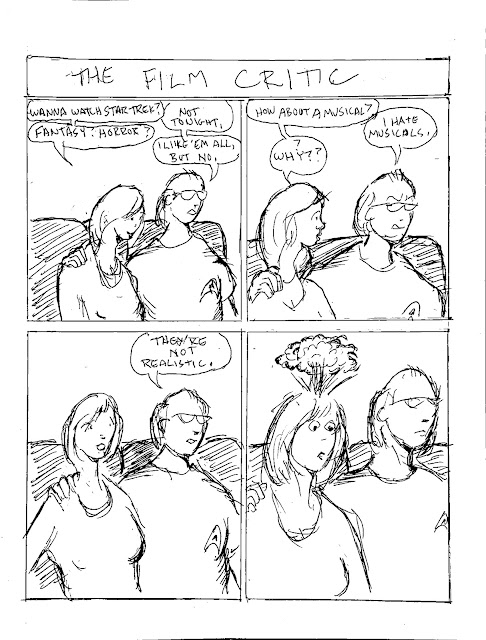
I was originally doing a second page for this week, as a bridge to next week's action, but I did a very similar page to the one planned earlier in the story (the page about him dating me because, as  trans woman, I couldn't get pregnant), so decided to forego.

 
 I do like doing these quick gag strips on occasion. They're a nice break. So fast and loose! They're freeing, and a good way to advance the story by small anecdote. Aside from light cleanup in Photoshop, this is pretty much the original. At one point, I considered doing the whole book this way. I shied away from it because that's the not the kind of work I like doing most of the time, and because Sophie LaBelle already does it so deftly over at Assigned Male Comics!
The astute reader will recall that Curt prided himself on being logical. The incongruity in his opinions on this was a shocker and a bit of a road into his mindset. Also, I love musicals, so this hit me in the gut.
We're entering a period of relative calm before the final storm, so something lighter is called for.
Very simple tools this week.
  • Printer paper
  • 3B Cumberland Derwent pencil, tech pencil
  • Ames lettering guide
  • Staedler Mars plastic eraser
  • Ballpoint pen
  • Photoshop
  • Scan done with IPhone 12
That's it! 
Next: the calm ends, the storm starts.