Sunday, November 28, 2021

Original Art Sundays No. 290: Sharp Invitations: Curt, p. 22

Welcome back, loyal readers.

Much to discuss about today's page, so let's get right to it.

First thing to unpack here: the writing. The last page marked a shift away from the narrative heavy pages leading up to the move. There's a bit of exposition here, but I tried to frame it so it held its weight, without dominating the story. Clearly, layout was crucial to doing this.

We begin with the classic "frog in the frying pan", a metaphor often used to explain enduring abuse to those who haven't experienced it. This is a clear case of "show, don't tell."

My trans stuff doesn't figure overtly into this part of the narrative, but as we'll learn on the next page, it's omnipresent in the relationship.

For the balance of the page, I decided to channel my inner David Mack. I was so impressed with his use of layout and silhouette as narrative devices in Kabuki, Daredevil. and the brutal (but clever and beautifully rendered) COVER. It's thoughtful and still engages the reader. Also, it's fun to look at! And by isolating the text from the image, the idea that I was stuck in my own head with little to no attachment to the outside world is reinforced.

Not to say I didn't have a little fun with this page. The frog (drawn freehand after a quick look at photographic reference) was a delight to draw. The third panel, with simultaneous exercising and cooking, is a playful comment on the idea of the woman who can do it all. In the third silhouette panel,  I took the conceit of using The Best of Both Worlds onscreen. We did watch that one together, but it first aired before the big move. But it's such an iconic episode, I had to give it homage. ST: TNG was still in its initial run during our years together.

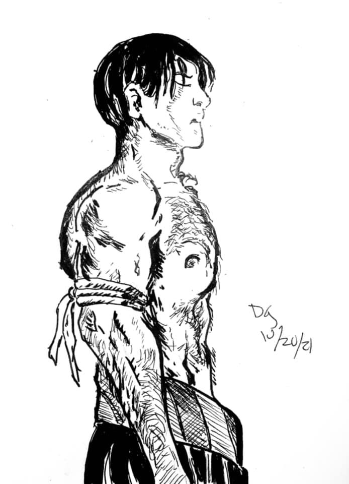
Another layout consideration: gray values are mostly represented in pencil until the last panel, to increase the emotional impact of that image. I freely stole the pose from the iconic Alan Moore/Curt Swan Superman collaboration Whatever Happened to the Man of Tomorrow? 

Minimal Photoshop corrections this time. 

Tools used:

  • Lead holder and 4B leads
  • Ames lettering guide
  • 4B graphite stick
  • Faber Castell Erasers
  • Dr. Martin's Black Star Ink
  • FW Acrylic White 
  • Crow quill and nib
  • Micron nos. .005, .02, .03, .05, .08, 1.0
  • Brushes: Richeson #2 Sable, Tight Spot for corrections
  • Photoshop

Overall, I'm quite proud of this page. 

Next week, Page 23!

I may up the ante to more than a page a week, if my schedule permits.


Sunday, November 21, 2021

Original Art Sundays No. 289: Inktober, Week 3

Day

 Sigh. Next page is done except for cleanup and scanning, and I'm very proud of it. But I'm in grading Hell and don't want to take the two hours to run to MCAD and scan, so just to keep on posting schedule, here's the next week of Inktober. These will be old news to those who are with me on Facebook or Twitter, but I hope they give some pleasure anyway.

Day 15:

From the Surrealist Cowgirls, our old friend the floating whale mule Whalliam. I never get tired of drawing him, and this is iconic- the classic "HI" word balloon (he communicates by thinking one word at a time, always with a period, remember?), him floating on an abstract landscape, and the sun wearing shades, smiling down on him.

I miss the Cowgirls. It's been too long since I had a new story for them. Such a joy to create them!


Day 16:

A friend's labradoodle,  from photo reference.

On this and the above drawing, I did minimal cleanup. I liked the energy of the pencil marks, and the paper texture showing through on the image. These were just shots from my phone, not scans. I like the immediacy, though I would not take them to print for any major project.


Day 17:
When I was a wee tad, there was a Beatles cartoon series. MY mother didn't trust the Beatles' music until this series made them seem more innocuous, so the cartoon was my road in to my lifelong love of the Fab Four.

TV Guide ran an article on the series, including full figure illustrations of each of the boys. I copied those like crazy! I got particularly good at George, but decided to revisit John for this round.

Another quick sketchbook work with minimal cleanup. Just revisiting a childhood drawing joy.


Day 18:

I seldom do anything remotely resembling technical SF drawing. I like some of it, but it's just not where my strength lies. But since Inktober is about pushing yourself, and I had been diving into a re-viewing of the Battlestar Galactica remake, I decided it was Cylon time. 

Still quick, but I spent a little more time on this one. I love all the curvilinear aspects of the design. It's harsh and smooth at the same time. A bit more cleanup on this one too.

I sure got some mileage out of that small sketchbook this month!


Day 19:

I had a request to draw "a Seuss bird."

I spent some time enjoying vintage Seuss art and applied my own style to it.

Everything got curvy and soft in this one. Aside from a straightedge to draw the post, no mechanical tools at all. Another quick thing that was just fun to draw. I did a fair amount of cleanup on this one.

While my regular work is serious, bordering on grave, at times, I do get such joy from doing simple subjects.


Day 20:

Okay, very happy with this one!

I was getting irritated with me. I like the fast and loose drawings I'd been doing, but felt the need for something more... involved.

This is my interpretation of Jaeger from Carla Speed MacNeil's great work Finder.

Mostly a straight copy, but I did take a few small liberties to make it my own. More time on this one, with lots of cleanup and care.

Carla is doing a Patreon now, I guess. I just met her the one time, and found her vibrant and eager to share her work. When the funds are there, I will honor her Patreon and a couple others that are on my radar.


Day 21:

Another straight copy, this time the wonderful Neil the Horse from Katherine Collins!

Just cutting loose a bit. Pencils not removed.

As noted on the Rosa illustration previously posted, there's a misconception that funny animal books are somehow simple. Nothing could be less true. It takes a special technique to pull this stuff off, and Katherine is a master. I haven't talked with her for a couple years. Based on the Afterword in her Neil the Horse collection from Hermes Press (sadly, color covers not included), she went through a bit of a rough patch, but has endured.

Next: the new page, at last!


Sunday, November 14, 2021

Original Art Sundays No. 288: Inktober, Week 2

 Next page of Sharp Invitations is about 3/4 done. Rather than skip a week of posting art, here's some more work from this year's Inktober.

I may make a booklet of these.

 Day eight: Zorro.

So many great inkers have worked on Zorro. I've always been partial to Jesse Marsh, Tom Yeates (there's a definitive collection of the Yeates/McGregor Zorro strip soon- hooray!) and of course, Alex Toth. A perennial favorite, Russ Manning, even did a couple tryout strips! 

Such a great character, romantic and driven by justice.

This is loosely inspired by the recent McGregor Kickstarter comic. Almost no under-drawing here, just some brush work. I do love working with dry brush techniques. One of my goals for this year was to improve my versatility and craft.


Day nine:

Another work in walnut ink. I got this really cool catalog of fashion for the more zaftig woman, and she was the cover and one of the interior pages. 

A little more time on the under-drawing this time. Mostly brush work, but a bit of crow quill. I think the outline on the figure could be a bit more consistent. This is always the question: when does one ink right up to the figure, and when does one leave a silhouette? For me, it's about the quality of the figure's holding line. If I'm pleased with that line, I want to preserve it, and the best way to do that is to leave the ghost space.


Day Ten:

This is my character Blue Wild Abandon, who has never appeared outside my sketchbooks before. She's an intergalactic bounty hunter and seeker of justice. Her symbol is the Jungian icon for hero. I will render it more tightly in her first adventure, tentatively titled "No Beast so Fierce". It will be a while before we see it, since I have two stories ahead of it in the queue!

She looks slightly different from one drawing to another. She's been showing up in my sketches for years, but I only recently realized who she is. Then I tied her to an SF story outline I wrote decades ago, and it clicked.


Day Eleven:

Inspired by Trina Robbins' recent wonder, Flapper Queens: Women Cartoonists of the Jazz Age, I decided to try my hand at fashion illustration.

The proportions are weird. The face is sparse.

But boy, was this fun!

Quick pencil sketch, many corrections on the ink. This was was a little Micron, a lot of crow quill, and a BIG brush for the few heavy inks.


Day Twelve:

Athena from my old Tranny Towers strip.

I haven't drawn her for years.

I would love to do a collection of that strip, and include the related work that appeared at the time- my Gay Comics pages using the characters, the self- published work with her from around that time, my editorial cartoons for 90s trans political magazines. Also some paper dolls I was working on and some background sketches and sundries. Make a nice little book.

But in today's political climate, trans people can't even call themselves tranny without someone taking offense. It makes me sad, but I think I've talked myself out of the collection for now. 

Athena's bra and panty set is inspired by Francine in Terry Moore's Strangers in Paradise #1.


Day Thirteen:

Ray Shulman of Gentle Giant. Taken from a photo in the Italian Super Star compilation album booklet!

Much as I love the band, I seldom draw or write about them. Back when I first started posting my work, about a million years ago, I posted some pages from a comic adaptation of the GG song Little Brown Bag. Gentle Giant comics came up in a discussion of a proposed documentary online recently, so that project, an anthology titled Gentle Giant Comics and Stories, could see life again.


I do already have a lot of projects, but my enthusiasm does not abate.


Day Fourteen:

Usagi Yojimbo

This was just fun to draw. Stan Sakai has a style that is deceptively simple. But when you take a closer look at his technique, it's clear he's a master. Subtle variations in line weight, and facial expressions that tell the whole story.

I tell my writing students that knowing what to leave out is as important as knowing what to put in. Sakai is the master there.

That's all for now. I'll save the last 17 Inktober sketches in case I need them to meet a Deadline Doom here, as the Marvel editors used to call it.

Next: back to Sharp Invitations.


Sunday, November 7, 2021

Original Art Sundays no. 287: Sharp Invitations: Curt, p. 21

 Here we go with the next page!

As you may recall, our heroine (moi) had just arrived at her new home, 600 miles from her old one, and was greeted with less than a ticker tape parade.

Read on.

The events of this period are such a jumble, for reasons that will become obvious on the next page (if they're not already).

Backgrounds were kept sparse deliberately. The encroaching black from panel to panel is a visual cue as to what's going on in this descent.

Beyond me being trans, there's no overt trans content on this page, other than the only slightly veiled "someone like you" comment in the last panel.

Curt's figure gets larger as the panels progress, while mine gets smaller. That's pretty blatant symbolism.

Figures are also kept simple, echoing some of Terry Moore's work on Strangers in Paradise, specifically the sequence where Katchoo is talking to the detective. Figures are stripped down to essentials, and eyes are often just dots. He did the same thing in the panel where Tambi says "I hate working with men!"

It's fascinating how much I emulate Terry's techniques. His work is a Master class in style and emotional resonance. Plus, he tells cool stories.

Timeline: This didn't happen week by week, but it seemed the best way to efficiently indicate the slow burn of someone taking over your life.

This one was mostly ink, very little marker.

Tools:

Bristol board

Lead holder, #3B leads, various erasers

Pelikan Ink

Crowquill nib and holder

Richeson #10 Synthetic brush, #4 synthetic

Micron .05, .08

Next: At the very least, the next page. I have three works worth of Inktober stuff I haven't posted here yet, much of which has made me proud. Either way: back soon!