Saturday, September 15, 2018

Original Art Sundays (Saturday) No. 260: Sharp Invitations: Curt, p. 17

Here's the next page. Discussion will be light- not much time!
I'm satisfied with this page. Good balance of light and dark, nice flow, poses appropriate to mood and action, respectable backgrounds, and it advances the story.The first panel in the third tier has poses stolen from the Sandman issue 20.
It must be said up front that the real Sara has apologized repeatedly and profusely for saying that. We remain friends and it is not an issue between us. Still, it happened.
It speaks to so many issues in the trans community.
Whatever that is.
I'll elaborate on that in the next post. I'm very anxious to get this online, so I'll just give the supply list for now.
Canson Bristol Board
Straightedge, T-sqare, French curves
Ames Lettering guide
Staedtler Pigment Liners .01, .03, .06, .07, .08
Renaissance Silver Sable brush #2
Princeton Round Synthetic Brush #4
Doc Martin's Black Star Walnut Ink
FW Acrylic White ink
Magic Rub erasers
Photoshop for scans and minor cleanups.
Next: a soliloquy page on the issues this page raises.

Monday, July 23, 2018

Original Art Sundays (Monday) No. 259: Sharp Invitations: Curt, sidebar page

Only a day off schedule this week, but pleased with the outcome.
I've been trying to find something to break the tension in the current story. Yes, it was a tense time, but I've read graphic memoirs that are so sad and unrelenting. It's often a rough road. Sometimes, as was the case with Rosalie Lightning, while the book was achingly well done, I couldn't bring myself to finish reading it.
Here I was, considering a way to break the tension, just for a narrative minute. As a result of Emil Ferris' massive and well-earned victory with My Favorite Thing Is Monsters at this year's Eisner awards (I voted for her in every possible category!), I was inspired to reactivate an old idea.
Sidebar: if you haven't read My Favorite Thing Is Monsters yet, do so ASAP.

For a while in the 90s, I was playing with pastiche romance comic covers. One of my favorites involved a cheerleader enrolling at Miskatonic University. I was also tickled by the word play of combining trans and lesbian as a monster thing.
Transylesbian. Ha!
I first worked up a version of this as a self-portrait idea for my senior year at MCAD, but instead I went with a black velvet painting, which I'm a bit sad I no longer have.
The idea for this fake cover resurfaced every now and then. I kept mulling that one day I'd find the right place for the idea to come to life, as it were.
And here we are.
The references in this are all over the place. Of course, there's the EC reference in the formatting and trade dress. I used my Ground Zero Press logo instead of the EC logo. While I'd like to channel some of the more decorative of the EC artists, like Crandall or Williamson, my loose style is more Johnny Craig. Craig told a good story, so I'm fine with that.
Other little things of note: of course, the Witch is wearing a Cheech Wizard hat. The werewolf rendering is inspired by the work of fellow Minnesotan Mike Ploog. He also tended to work in a freer style in his comics. Since the werewolf is supposed to be Curt, I also had to think about drawing a bald werewolf.
I suppose I could have thrown in a background, but for this one, I think simplicity is my friend.
Does it advance the story? Well, as alluded to above, I think perspective is crucial on this stuff. We're two pages away from things getting REALLY bad, and one of the things I've had to come to terms with is the contributions my emotional state made to these problems. Not to say I was at fault, because abuse victims are NEVER at fault, but as a former lover once told me, "you worry too much." So this is a mildly self-deprecating recognition of the inescapable fact that I worry too much.
Technical notes: I neglected to trim this page before starting it, so it's slightly disproportionate to the other pages. I'll either re-do it or scale it down and give it white border to conform to the other pages. The supplies used are pretty much the same as on the previous page:
Canson Recycled Bristol board
No. 3 and 6 Staedler pigment liners
lead holders, leads and graphite sticks
Magic Rub erasers
Crowquill pens
No. 2 and 4 Richeson synthetic brushes
Surprisingly, no white out on this one!
This might need a bit of fine tuning, but I'm pretty pleased with it as is. And I hope the readers have as much fun with it as I did. Even in a tough part of the story, you can't be grim all the time.
Next: back to the narrative, containing an unexpected declaration.

Friday, July 13, 2018

Original Art Sundays (Friday) No. 258: Captain Pinkard!

The next page is coming along well, but I missed Sunday and I wanted to get something posted this week, so here's an older piece.
As might be expected from the other recent work, the dark years with Curt have been on my mind of late. And that's no fun, either to live or to read about.
It's helpful to remember that there was more to him than just his rage and controlling ways. He could laugh and loved to experience life's sensations. That doesn't exonerate him, but it does lead to this piece.
Early in our relationship, our shared love of Star Trek was a big part of our time together. TNG was new then. We'd watch new episodes on first airing together. However, he didn't share my passion for vintage cartoons. But he did love the Pink Panther. So...

He was delighted by this! I had great fun doing it. It's pretty simple, just an under-sketch and markers on marker paper. I was in a two year commercial art program when I did this, and had just completed a class on markers. I still use them for color studies now and then, because they're quick, they blend well and they encourage speed.
Like all the other art I made for him, he gave it back when we parted ways. I found it in a stack of old work and here we are!
A quick diversion and something with a bit more joy than the current story, which has taken a rather dark turn.
Next: back to our story.

Sunday, July 1, 2018

Original Art Sundays: Sharp Invitations: Curt, p. 16

Finally back.
I won't waste time saying why it took me so long to get this page done. It's unprofessional to kvetch, and nobody wants to hear it (and I don't blame them). Suffice to say it's been a tough couple months, with some days of bliss in the mix. I've been spending creative energy on music and writing, plus a whole slew of sketchbook stuff. I'll post some of that soon. For now, it feels so good to get back to The Work, my graphic memoir, Sharp Invitations.
As always, please keep clicking the "older posts" button at  the bottom of the page for more work, or just hit the "Sharp Invitations" label if you want to check out more of The Work.
When we left our heroine (moi), she was in bed with Curt, who had begun choking her as part of their lovemaking. This came directly on the heels of her meeting a trans lesbian, Sara, with whom she developed an immediate fascination. So much to sort out, and being a meat and potatoes guy, Curt's response was...
Read on.
The usual notes, personal and craft.
Personal: Curt had no clue I was afraid after his hands found my throat. He also had no idea about Sara. For my part, I was running blind, still desperately afraid of my own truth, even after surgery, for reasons I'll spell out in greater detail towards the end of this chapter (anticipated in another 7 pages, but it could run a bit longer in a 4th rewrite).
Craft notes: Minor scanning issues per usual. I will rescan everything upon completion of the book and those issues will be resolved.
Let's speak to timing. The part that hung me up was the first panel of the last tier. I toyed with going all silhouette on its ass, but I don't want to overuse that trick. There are some pages in this book that are nothing but silhouette. My mantra from The Wizard of Oz applies. These things must be done delicately or you hurt the spell.
I'm constantly torn between doing something innovative and ornate and just nuts and bolts layouts. I love ornate layouts, but I'm reminded of a favorite comic book history student who loathed J.H. Williams' work on Batwoman. He said it was so decorated that he couldn't see the story. He had a point. I think this page is a good balance between the two, and advances the story reasonably well. I kept the figures lighter and concentrated the blacks and grays in backgrounds and textures. The linear background on the second tier is a trick I picked from Terry Moore's Strangers In Paradise. I was re-watching Terry's DVD last night, trying to garner some fresh insight, or rekindle old insights. My "big takeaway": just keep doing the work.
Well, duh.
For spotting blacks on the bottom tier, I'm rekindling my fascination with dry brush, something American comic artists have underused historically. I do love the way it shows up in British work, especially from the late 80s. The challenge in dry brush is to get all the texture you want before your meager ink supply dries up.
Tools and supplies on this page:
Canson Recycled Bristol Board, rough finish side used.
Lead holder with #4B lead
#4B solid lead pencil
Miscellaneous straightedges, templates and triangles
Crow Quill and nib
#4 Richeson Snapi round synthetic brush
Tight Spot angled brush for corrections
Dr. Martin's Black Star Walnut Ink
FW Acrylic White
Magic Rub eraser
pretty much the stuff I usually use.
I have a HUGE bottle of Yasumoto Sumi Ink. Perhaps I'll give that a go on a page soon, but I do so love the Walnut Ink.
Next: sketchbook pages, then more memoir.

Friday, May 11, 2018

Original Art Sundays (Friday) No. 256: THAIS: MN Opera!

I come and go on Disney stuff. I love the animation and the storytelling is always well-crafted, but sometimes the unsubtle subtext is too creepy for words.
Now and then, however, they get it just right.
There's a number in the animated Hunchback of Notre Dame that sends chills through me. The self-righteously pious Judge Frollo is confessing his obsession with Esmeralda.

His torment and the imagery around sensuality and obsession just captivate me. I found that number to be the best part of that morally haphazard outing.
Spoilers abound from this point on. Read at your own risk.
Pre-show warm-up sketch
This was on my mind as I arrived at Media Night for THAIS. Jules Massenet's 1894 interpretation of Louis Gallet's novel, Thais tells of a sensuous performer, the title heroine, and the Cenobite monk, Athanael, whose obsession with her leads him to attempt the salvation of her soul. Set in Egypt during Roman occupation, the work poses numerous challenges. Staging is complex, costuming is challenging, and most significantly, the title role has a reputation of being one of the most difficult to sing. The roles, especially said title role, are also physically demanding, to the point at which one is exhausted watching the work!
I'm pleased to report that Minnesota's own Kelly Kaduce more than rose to the occasion, in every sense. Her rendition of every theme was achingly beautiful and her physical approach to the role was spot on. I regret that the circumstances of sketching during a dress rehearsal (AKA Media Night) are not conducive to portraiture, so my hasty scrawl does not do her beauty justice.
Lucas Meachem's turn as the obsessed Athaneal was equally moving and profound.  He bought a torment and love to every aspect of the story, from the initial obsession and violation of Cenobite isolation to reform Thais through his own ambivalence as he adopted secular splendor to encounter Thais in that world.
Athaneal's insistence on wearing his hair shirt beneath his camouflage of golden robes, courtesy of the impresario Nacias (also obsessed with the titular heroine), speaks volumes as to who he is and who he must be. The key to drama is the absolute and irrevocable change in values of a character. In that sense, both the principals are classic examples of good drama. Consistent with late 19th Century morality plays, one change arrives too late, as Athaneal learns the converted Thais is dying and resolves that he was wrong to change her soul at the cost of his life.
Thais reflects, in every sense, on the nature of true beauty.
The morality of this work is clearly a challenge for a contemporary audience, as it seems to put piety and the will of a Deity ahead of a woman's self-determination. Perhaps this is a flawed or incomplete reading of the work's complex text. Athaneal truly believes he is putting Thais' best interests at heart as he fights aggressively for her conversion. But isn't conviction true of all zealots? 
Thais dreams as the classic Meditation is exquisitely played.
Once again, MN Opera is remarkable in its staging. Use of transparent/translucent curtains, an angled bed with an impassioned painting on it (!), and delicate use of rains of rose petals and silver shards serve to make the production visually lush. I'm struck by the innovative staging at every new work. Lorenzo Cutuli has earned accolades for this design and its execution. He won the International Opera Award for set design in 2014. If there's justice, he will win again for THAIS. MN Opera is blessed to have him on this production.
As Athaneal and Thais cross the desert to reach the nunnery that is to be her new home, the set is alarmingly sparse. There is only a shiny mound. It took me a minute to realize that the mound was a pile of broken mirrors.
I must write of the impassioned and beautiful dancing that dominates this production. As one of my colleagues from the Black Hat Collective remarked, it felt more like a ballet in spots. This is a compliment. The play within a play model provided wonderful opportunities to explore movement and music. This production took full advantage of them, to my delight.
Usually, just to try to keep balance, I try to find some aspect of a production that was wanting. In MN Opera's current production of THAIS, there is none.  Every facet of the work is impassioned and professional.
Go. I cannot offer any stronger encouragement. This production is beyond language. It will fill and devastate you. THAIS runs 3 hours and 11 minutes, but I was so sorry when it ended.
It is at the MN Opera May 12- 20.
Next: back to the Graphic Memoir.


Saturday, April 21, 2018

Original Art Sundays (Saturday) No. 256: Curt, p. 15

This page was done on Sunday, except for the first panel. For some reason, the comapratively easy first panel took just days.
Overall it's working, but there are some things I'd like address down the line (aren't there always?).
Here we go.
When we left our heroine (me), she had said goodbye to Sara, the trans woman she met at the library and fell for (well, it was mutual, and it was really hot, though we didn't call it that then). A few days later, Diana's (my) boyfriend came to town for his bimonthly weekend date. I confused and terrified myself. Here I was with a guy who was traveling hundreds of miles to see me and talking of marriage. And I had just taken up with a woman, who was more exciting and interesting in every way. What to do? Well, I am a Minnesotan, so the watchword is denial.
Read on.
Here are some technical and narrative considerations.
The page is working well, for the most part. The captions describing our shallow debaucheries are fun.
There are a lot of things here I like visually. The panel progression, leading the reader to the banner panel at the bottom of the page, is an engaging layout.
The darks in the first panel could be a bit stronger, but it's acceptable. I like the way the cozy cuddle between us came out. We did share a fascination with Star Trek (and with Frank Zappa, but he liked the potty humor more, and I liked the experimental music).
The second panel: not sure about this one. The lights and darks are working well. But it's not as clear as I might like what we're really doing. The joint is buried in the dark shadows of the hands. I don't think the viewer can tell we're smoking demon hemp. I think I'll try another version of that panel and cut it in later, probably a close-up two shot with the joint featured more prominently.
Looking back on that night, it's astounding that neither of us were injured by passing something burning between us when we were both nude and stoned. Dumb luck, I guess.
Panel three was a different sort of challenge. Despite my proselytizing for freedoms, I'm a bit of a prude at times, usually odd and unexpected times. While I've known it was on the horizon for a while, the idea of drawing myself having sex turned out to be a bit more daunting than expected. I've drawn my characters, including characters that are obvious stand-ins for me like Athena in Tranny Towers, behaving sexually before. But this is No Excuses time. If you're telling your story, don't leave out anything important. This was not our first time by any stretch, and the story of the first time will be told (briefly) towards the end of the book. For now, just let it be said that we had a powerful sex life. Sometimes that's all we had. Drawing sex is challenging. I think the silhouette is a good option in this case.
The last panel was also a daunting emotional outing. While it was not the only time he choked me while in the (for lack of a better term) throes of passion, it was a shock the first time out. I tried to draw his expression at the time, a combination of passion, ecstasy and rage, but I couldn't get it quite right, so I opted for my reaction instead.
I'll let the reader judge the success of the outcome on that one. I think it works, at least aesthetically.
Thought on structure: the part of the story related to Delia has to come after this, since that's the order in which it happens. There's an allusion to Curt's penchant for choking me in that episode as well, which is why it comes to mind here.
Materials used on this page:
Canson Recycled Bristol
Lead holder
Solid Lead #4B
Magic Rub eraser
Crow Quill and nibs
#4 Richeson synthetic brush
Tight Spot correction brush
Dr. Martin's Black Star Walnut Ink
FW Acrylic White
Micron Markers #3, 4, 6 and 8
Faber Castell Brush Markers
Really, when it comes down to it, that's one of the keys to doing this book. Like any memoir, it's as much about the creator understanding herself as it is about offering something to the reader. I see the pieces of this life in the order in which they happened, but their cumulative impact is non-linear, and the graphic memoir is an attempt to understand how the pieces fit together.
Good or bad or both, these are the events that shaped me, and through me, shaped the people I loved, hated and irritated. Somehow I suspect there are more in the last group than there are in the other two.
Next: more Curt, ideally. I really need to finish this chapter, since it's so emotionally draining. But it shapes so much of what comes later, I don't want to give it short shrift.

Sunday, April 1, 2018

Original Art Sundays No. 255: Curt, p. 14

Hey, look! I'm still here! And yes, Virginia, there is still a graphic memoir in the works.
This page took forever and a day. But we got here.
I have been wrestling with this page for two months. Usually I can do a decent page in a day, or a week if the time is tight. But this one gave me no end of trouble. At first it was an emotional challenge. The events portrayed here were not my shining hour, and recounting them remains more difficult than I anticipated. I finally decided that there's no point in sugar coating this stuff, and resolved to just do the page.
I got to work and the page was about 3/4 done.
I hated it.
With a bright purple passion.
Oh, there was nothing really wrong with it. The drawing was adequate at worst, the writing was tight enough, and the layout was serviceable.  But it was so boring! 2 shot, 2 shot, 2 shot, tight on hands, figure seated and cowboy shot framed in doorway. 6 panel grid, 2 x 3. All straight on. It was a dialogue heavy page where nothing was happening visually.
Between drawing a couple operas and sneaking in a few other pieces to keep my hand in, I got a revised version on the board. And got it done in proper time, once begun, thank you very much.
The final version. Possibly.
This iteration still has it issues, and I'll get to those in a moment. As regular readers know, I'm fairly harsh in evaluating my work.
But the page is working in ways the original version wasn't.
It's about the embrace, whereas the previous version put equal emphasis on everything. Giving the page a focal element gives narrative direction and helps the reader understand what's important.
The isolated quiet moment in panel one: very happy with that.
The open panel two: The embrace works, the figures are slightly elongated (as I tend to do), and the dialogue is fairly well placed.
Panel three, the hands parting: Even though I still have issues with them after all these years, I do love drawing hands. To overcome my issues around rendering hands, I did an entire strip using nothing else during the Tranny Towers days.
Not 100% happy with the figure in Panel 4, but the pose and facial expression are just what I was anticipating.
The last panel gets the character (me) out of her bewildered fantasy and reverie and back into the mess she's making for herself. The last panel is also crucial in that I'm not on camera in that one. Again, variety is the watchword.I like the use of the arched background giving the last panel weight. This page remains a bit light, and deliberately sparse on environments/backgrounds. Still have to work on spotting more heavy blacks, though I'm at ease with not always doing so. I do like the claire ligne style a lot!
Just for information and integrity, Sara was not the first trans woman with whom I was intimate after coming out (none before then, if you're keeping track). But she was the second, and the first one who mattered.
I might try a fourth iteration of this page down the line, when I'm reviewing to for publication. But if I'm ever going to reach that point, I have to move forward. Seeking perfection in this kind of work can be another evasion tactic. Move on with the story.
Tools used on this page:
Canson Recycled Bristol Board
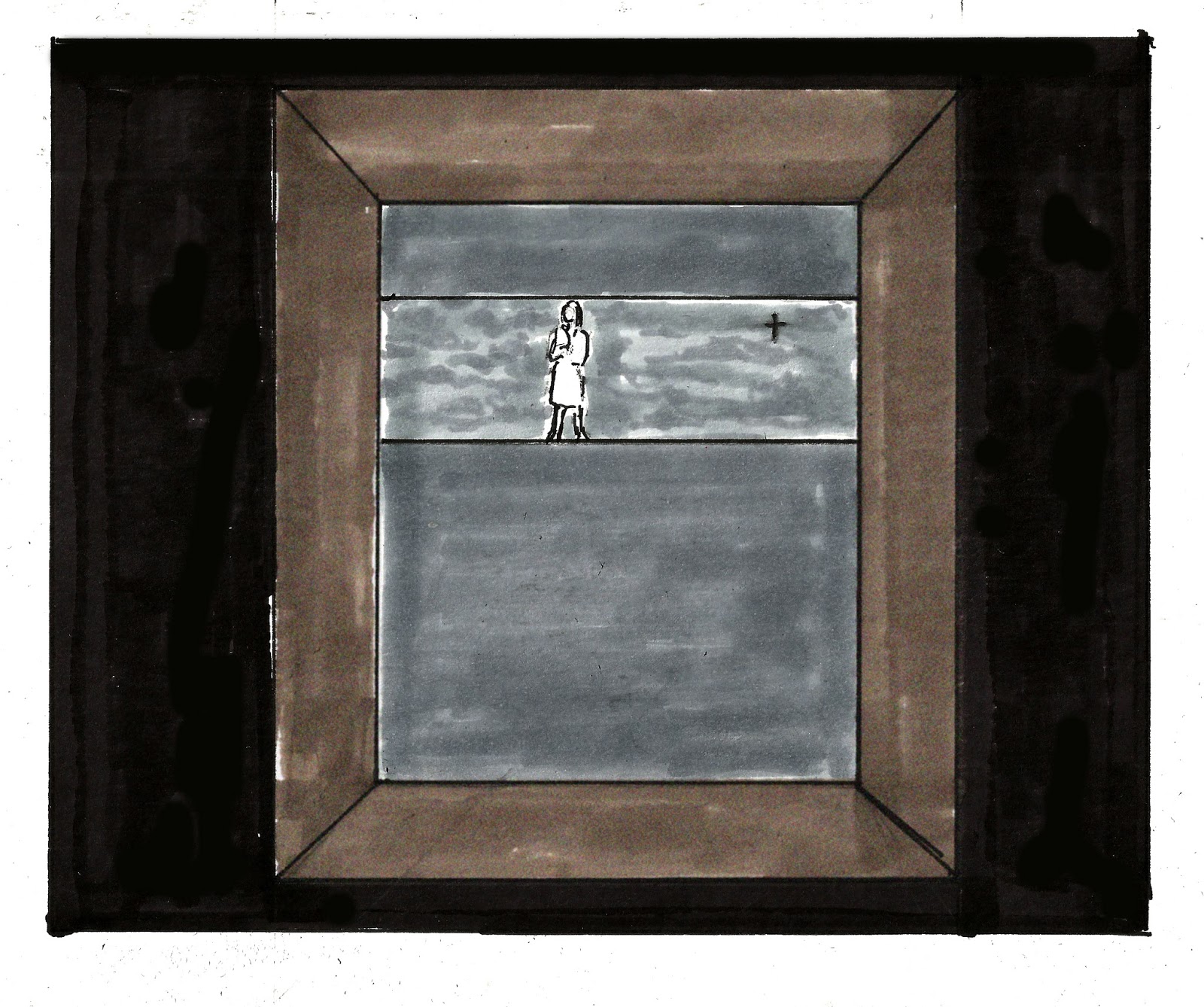
The previous version. Nothing wrong with it,
just blah.
Lead holder, #2 and #4 lead, Magic Rub erasers
Staetler Line Markers, .02 and .06
Faber Castell Small Tip brush marker
Dr. Martin's Black Star Walnut Ink
Various crow quills
 #4 Richeson synthetic brush for spotting heavy blacks
FW Acrylic White and Tight Spot brush for corrections
I'm including the flawed second version as a point of reference. The first version was a sketchbook layout, and we will not speak of it again.
This is an adequate page. It's just not very good storytelling.
Last night I attended a presentation by Venus de Mars, a retrospective of her life and creative career, as much as one can summarize such things in less than an hour. We chatted briefly about our scattered old times- knowing her as long as I have, I'm astounded at how little time we've really spent hanging out. There are reasons and reasons for these things, and after a while they don't matter. I suppose that's part and parcel of working in different art forms, though I also respect her drawing and painting.
No, when you've known someone a while, the other stuff fades. You just remember the joys and marvel at the simple fact that we both survived.
This comes to mind as Venus is also working on a memoir.
Maybe it's just time to do them. Being me, of course, I was intimidated by someone whose life and career have had such incredible highs (at least from the outside) working on something similar to what I'm doing. I sat in awe and deep respect for her unflagging commitment to herself, her love and her career, feeling wholly inadequate.
That, my dears, is self-indulgent twaddle.
I was watching a Neil Gaiman interview a while ago. During the Q & A, someone asked him if fantasy writing was going to go out of fashion. His reply, insightful as always, ended with  (paraphrasing) "literary fashions and trends don't matter. Tell your story as best you can, put it out there and let it find its audience."
Thanks, Neil. I needed that. My natural tendency to judge myself and my work against the work and lives of others, and to find myself wanting in some area or other, remains my worst enemy when it comes to creation. What say we take another stab at knocking that off and just get the work done?
I'll write it and draw it. You just relax and read it.
Next: more Sharp Invitations. I am anxious to move on from the Curt story, but that will only happen when it's all told. I anticipate another 5 - 6 pages before we reach that point.
And yes, there is another opera on the horizon. Thais is about 6 weeks away.

Sunday, March 25, 2018

Original Art Sundays No. 254: Rigoletto

Let me begin with a confession. I have committed a stupidity of immeasurable proportion.
From the drive to Ordway Center, through the performance, and for a couple hours afterwards, I had it stuck in my head that Rigoletto was by Mozart.
Oh, I knew better, and I had the program in front of me to correct my error. But it was just one of those dumb things. Perhaps I was thinking about how wonderful Marriage of Figaro was a few months ago. Perhaps NPR was riffing some Mozart earlier in the week and it got stuck in my head, a little ear worm. Whatever the rationale, I had this stupidity riffing in my mind. Rigoletto, by Mozart.
Let me correct myself, as I write about the MN Opera's performance of Rigoletto by Giuseppe Verdi.
Let's say it again. Rigoletto by Giuseppe Verdi.
And me being an Italian. Oh, the shame, the perfidy.
I hope this absolves me of all mea culpability.
Ahem.
Please note that there will be spoilers.
As the story is centuries old, I don't think it's much of an issue.  My sketches from Media Preview night accompany my remarks.
Pre-opera warm-up
MN Opera does not disappoint. While not as engaging as the aforementioned Mozart work, Rigoletto was well staged, expertly sung and played, and ran an emotional gamut in which the whole was larger than the sum of its parts. Olafur Sigardson took a marvelous turn in the tragic title role, the court jester whose daughter is prey to the Duke. Matt Boehler's performance as the assassin Sparafucile offers an emotional gamut, from the cold precision of the profession to a stubborn pride in his work bordering on the comic- "I'm an assassin, not a thief." I regret that my sketches of him in the role were not up to my standards, and will not be shared.
As has been noted repeatedly in the 267 years (!) since its debut, Rigoletto is an unrelenting work. The arias fold into one another almost seamlessly, offering little respite for performer or audient. It's to the credit of the ensemble that the work remains vibrant throughout its two and a half hour (plus) running time. The story is very much the stuff of soap opera and high drama, consistent with other Victor Hugo works (it's based on a Hugo play). It's over the top and it remains real life, though couched in a fiction.
Sidebar: my favorite Hugo work of those I know, The Man Who Laughs, was adapted for stage six times, three of them as musicals, but was never an opera. So it goes.
Joshua Dennis as the Duke
Even in light of the sometimes over the top plot, the issues the story raises are still sadly relevant. A man with immense power who is willing to destroy anyone who ridicules him, who vows to take whatever women he chooses- sound familiar? Sadly so.
Joshua Dennis brings a fire and torment to the role of the Duke, taking it beyond the dimension of the harrasser or the abuser. That's in the character, to be sure, but Dennis's interpretation shows the intricacies that drive a man to such acts, with depth and precision but without apology.
Gilda and Rigoletto
The interplay between Marie-Eee Munger's Gilda and Olafur Sigudarson's Rigoletto is impassioned and heartbreaking. Both bring an earnest, deep sense of loss and yearning to their roles.
The sets were consistent with those of Dead Man Walking, in that they made effective use of digital lighting for textures and of a multi-tiered set, used more sparingly here.  I somewhat prefer the mobile proscenia of Figaro, but I recognize that it's not right for every production.
The glowing animal masks of the bandits in the forest during Act II were noteworthy, a treat for the eyes.
Rigoletto in repose, defeated,
chiding the cowards who abandoned him to
this fate.


The ultimate tragedy of the narrative plays with devastation.
Rigoletto holds his daughter in a pieta pose. Though overused to the point of cliche, it's very moving here.
There's an inevitability to this ending. I was reminded of a line from one my favorite rock musicals, Phantom of the Paradise: hearts are broken and the bad guys win. Sometimes that's life. Much as we would like it to, good does not always triumph. Is it wrong that our art sometimes reflects that? I think not, else this work would not have endured.
As the pencil lines were so light as to be almost invisible in the last piece, I tried a simple inversion and was pleased enough with the results to post them.
Rigoletto runs at the MN Opera through March 31. You have three more chances.
Go.
You will be glad you did.
Next opera: Thais.
Next art: back to the graphic memoir. Big works are like that. They take a while.

Sunday, January 28, 2018

Original Art Sundays No. 263: Dead Man Walking

Opera season is well upon us again. I was graced to attend Media Preview Night of MN Opera's new production of Dead Man Walking. According to the advance blurbs, this is the most staged modern opera (though there is scant explanation of the criteria for that assertion).
This production had its minor flaws, but was devastating in many ways.
Sister Helen Prejean, on a proscenium. Clouds and crucifix.
Effective use of lighting effects for clouds.
While the performances were all exemplary, the staging stole the show. Canny and effective use of lights, projected backgrounds and digital effects over a sparse multi-leveled set offered impressive versatility. The last opera I attended at MNO, The Magic Flute (I did not make it to Preview Night for that one- a shame, as it was delightful), relied on more traditional sets, with scenics set on rollers for versatility. Quite apropos for a more traditional piece.
In this case, the majority of the piece was set inside a prison. As such, the palette was primarily grays, with costume and lighting offering little relief. Given the subject matter, some relief is necessary. Here, it comes as the aforementioned kinetic staging.
Many cautions were given to attendees about subject matter. The story was filmed many years ago, and there's a well-read book, so I'm not too worried about spoilers here. The opening rape scene was staged subtly, given its content. Still, I winced. The coarse language didn't trouble me. It rarely does if appropriate to the story. The character of the accused Joseph DeRocher (sung with depth and precision by Seth Carico), offered spiritual counsel by Sister Helen Prejean (ably played and sung by Catherine Martin), plays the scene with brutality and lack of reserve. But somehow, despite my cringing at the scene, it has a reduced impact overall.
An attempt to capture the moving "light bars" of the cell block on paper.
One of the most compelling scenes used overlapping linear patterns to simulate cell and prison bars. The inmates moved about them with an urgency that echoed a captive state.
A note about drawing this opera: I usually do a fairly direct setup, trying to be as unobtrusive as possible. I clip a book light to my sketchbook and fill my lap with the most necessary tools, the rest of my drawing kit at the ready.
This night, it all went south.
My book light slipped from my grasp and broke. This left me drawing in relative darkness. It's been a while since I practiced the Zen of blind drawing, and the results were simply horrid. To top it off, probably due to frustration over the turn of events, I kept dropping my favorite inking tool. In selfish terms just of drawing, the night was an unmitigated disaster.
DeRocher's mother.
The only decent drawing done during the preview.
But it's a poor workwoman that blames her tools. After getting a bit of rest, I regrouped and reworked most of the key pieces, from memory and from whatever reference I could gather. I decided to try to work fast, as I would have had to in the original circumstance, and to use the same tools, in an attempt to preserve the integrity of the drawings. I like to post the drawings done during the preview. It probably doesn't matter to anyone but me, but it seems right.
There's a reason I use markers for this sort of work. They encourage speed. I did cheat a bit and spend a bit more time on the straightedge work. Also, I used small Bristol boards rather than Canson sketchbook paper, and worked in French grays rather than the cool grays I used on site.  I stuck to my commitment to allocate no more time for the reworks than I had at the actual preview.
DeRocher's moment of surrender
This opera, this story, is driven by core emotions: rage, sorrow, random and scattered moments of joy and hope, and the possibility of forgiveness. While it would have distracted, there were times I yearned for a close-up, just for the emotional impact.
Even without that option, there were ample moments of emotional clarity. The one drawn here was a moment of silence following a profound and bitter self-realization.
The sparse moment in both score and libretto served well. Terrence McNally (libretto) and Jake Heggie (music) made wise decisions around these issues. While there were several chaotic scenes of cross-talk, rage and grief, many of the principals had moments of clarity, reflected by the reduction and absence of sound.
Sometimes people listen more closely if one talks more softly.
A word on performance dynamics: when I began attending preview nights, there was a stated rule against applause and audience reaction, as it is indeed a rehearsal.
The father, in a moment of rage.
Now it appears the rules have changed. Not only was applause de rigeur between acts, but there were curtain calls. Not an inherently bad thing, just not what I expected, based on past experience.
Howard Boucher, father of the rape victim, was played with remarkable strength and vulnerability by Rob Asklof. His narrative echoes that of DeRocher in surprising ways: unbridled rage and fear, borne in both cases of a fear of redemption and forgiveness.
In marked contrast, Father Grenville (sung by Dennis Petersen) shows an intransigence which does not appear to resolve. His persona seems rigidly static through to the end.
Father Grenville
There's a weariness to the man, as though he's resigned to his failure to save those in his charge as prison Priest.
The internal logic of this is sound. Beyond a core of humanity, no two people are going to respond in the same way to such dire circumstances. Playing these reactions against one another is the core of story.
I came to the work with personal baggage, as one who was raised Catholic but no longer practices. A minor impediment to seeing the work objectively,  but one that deserves to be noted. I suspect that this work pulls on the strings of everyone's faith and upbringing. The issue of capital punishment touches on the one of the core questions of any society. Who has the right to take a life?
Despite my scattered misgivings, I found the production both professional and profound. There are performances scheduled for today, January 30 and the weekend of February 1 and 3. Tickets can be obtained here.
MN Opera is staging a strong season. Next up in mid-March, it's Rigoletto.
I look forward to drawing it.
Next: more of my graphic memoir, Sharp Invitations.