Showing posts with label writing. Show all posts

Thursday, July 16, 2015

Original Art Sundays (Thursday) Nos. 218-219: Speedy Recovery, pp. 14 - 15

Before I teach my Comic Book Writing class tonight, I wanted to update the blog. I've had some decent scanning time, at last!
Here are the next two pages of Speedy Recovery and His All-Girl Orchestra.

This page is the text dump. The back story is explained, and the villain's master plan is revealed.
When doing this kind of page, it's important to keep it visually interesting. The top tier deals with the reality of the situation. The second and third tiers are visualizations of the plan, images that support the text. They're also the character's imagination, so quotation marks are used rather than word balloons, though it's still just Toby talking.
The page has curved panel borders, formed by rolling notes. That rolling rubber stamp was just what I needed to make this story what I wanted!
Sidebar: rubber stamps are cool. In the mid-70s, experimental filmmaker Ken Brown did a short done entirely with rubber stamps, called STAMPEDE. I searched for it online, but came a cropper. Brown is still very active, and occasionally there's a retrospective of his film work.
Ahem. Back to the issue at hand.
Info dump is tricky. How much is too much? In general, it's a good idea to treat text blocks like word balloons. Old school comic writing held that no word balloon should exceed a word count of 30. Let's look at that:
Toby, panel 1: 25 words
Toby (offscreen), panel 2: two balloons, 27 words and 18 words.
Teir 2, sonic explosion text: two captions, 62 words and 18 words.
Bottom tier, ruler of the world fantasy: two captions, 21 words and 13 words.
Clearly , the most problematic is the first caption on the center tier. In retrospect, it would have been better to break that up in thirds. The places for the text breaks are obvious- the ends of each sentence- but that poses some layout challenges if the image is still to read uninterrupted.
On to the next page.
 This page requires almost no text. It's just Toby Continued putting the last steps of his mad plan into action. Visually, I wanted the POV of his hands hitting the keyboards followed by a reverse shot of him in action. The intent of the "eye ellipses" was to show the dimensional portal mentioned on the previous page starting to open. I'm not sure how well it works visually. If the notes emanating from it increased in size as they did so, it might have been more visually clear.
The music in Toby's body was fun to do. I took some of my favorite sheet music, twisted it around on a Xerox, scanned and reversed it, then used a light table to find shapes that matched the form needed. Then it was on to the light table with the x-acto knife, followed by some glue stick work! By finding pieces that echoed the form, I added to the dimensionality of that form.
Was there a faster way to do it? Maybe. But as with the rocks, I wanted to do as much hand work as possible. As Charles Schulz said when asked why he didn't use assistants on Peanuts, I don't want to give up that much fun!
Next: more Speedy, as events build to a crisis.

Sunday, July 21, 2013

Original Art Sundays No. 161: Sketchbook redux

Next page is 3/4 done. With limited scanner access again this week, I opted to concentrate on other work, including the class on Comic Book Writing that I'm currently teaching, and completing an article with a deadline of yesterday (I made the deadline, BTW).
Here are some pages from that same sketchbook to tide us over.

No. 4 pencil, fine line marker and metallic blue marker
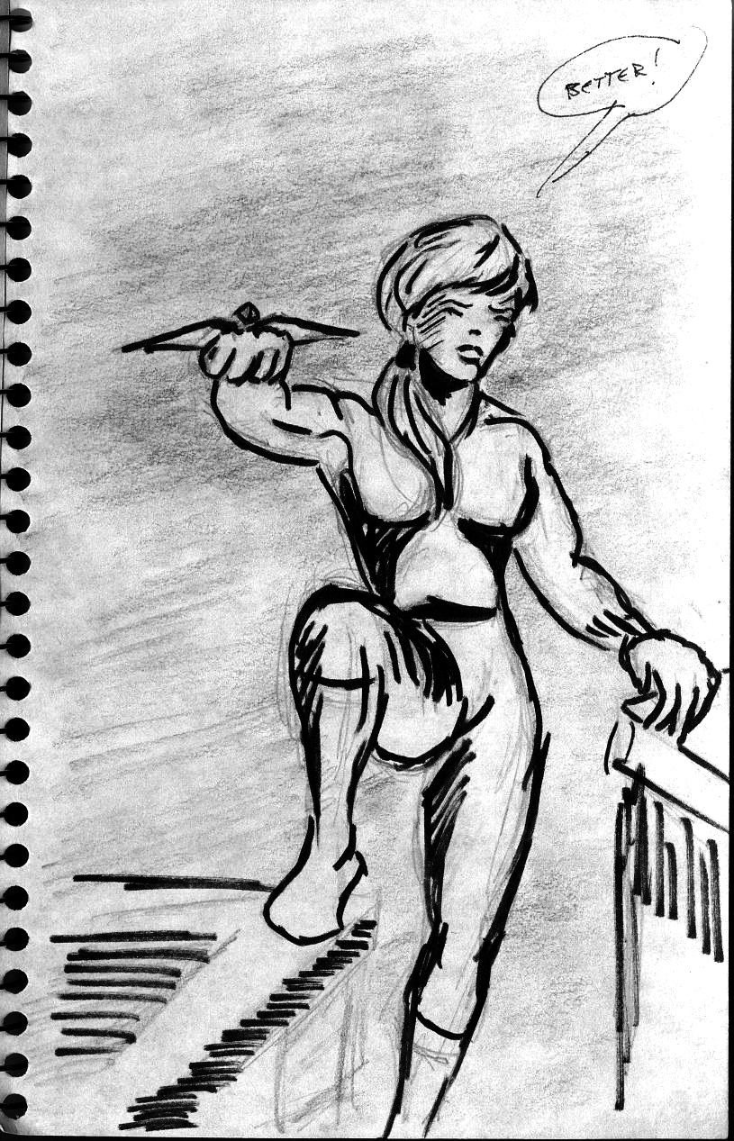
First up, a random stab at a female pirate, inspired by old friend Sarah Cardin's fascination with pirate films. Period piracy has become a bit of a fascination for me. I am vehemently opposed to contemporary piracy in most forms.
Next, an original superhero that was fully developed but whose story was never realized.
No. 2 and No. 4 pencil on sketchbook paper
I had to severely darken the image to get the text to read. I pulled out the area around the figure, upper right, for a bit of contrast. The textured gray that fills most of the image is simply paper texture taken to extremes in Photoshop. In case you can't make them out, the notes in the page are:
  • Practical shoes and boots
  • Costume offers protection (armor?)
  • NOT skin tight
  • Hair- either keep short or in back
  • Mask? NO!!
  • Dark tones hues/ colors/ contrast intensity
  • Eliminate V-
  • Go to hi-strength leotard w/Kelvar
  • Chainmail vest/tunic
  • Knife sheath - Hip? Boot?
  • Whole thing is too medieval
This was an attempt to create a plausible female superhero, based unconsciously in part on the 70s version of the Huntress by Paul Levitz and Joe Staton, also on my meditations on Doc Savage, and inspired by a Tess Gallagher poem titled The Kiss, from whence comes the character's name. I had thought the hand-held crossbow was an original idea, until I realized I'd cobbled it unconsciously from this story- but the notion of the bow being collapsible and wrist-mounted is all mine.
Though I can find no specific record of the Gallagher poem (she wrote several poems about kisses, but I cannot find this one), I do recall hearing her read it on NPR and my fascination with it. The notion she described in the ensuing interview, that a woman's kiss could be a secret agent or a superhero, charmed and inspired me.
The Huntress, from DC Super Stars No. 17,
December 1977
Of course, many of the ideas that I considered crucial to the character have since manifested in other wonderful characters like the Andreyko and Pina Manhunter series and the  Rucka and Williamson work on Batwoman, about which I've gushed in the past. In this context, it's also important to note Ivory Madison's revision of The Huntress. Sadly, she's done only one comic story since then.

Revisions based on previous sketch.
No. 4 pencil and marker
This is my meditation on superheroes, women, and superwomen. I have the storyline plotted out and characters developed in notes- have done for decades- but as I have no shortage of current projects, I wonder if it will ever see fruition. I suspect this is one of those things on which I would write and hand the art off to someone more suited for such work.
As always, I am overwhelmed by the number of projects I start and seldom finish- a common problem, I hope!- but I do take heart in the occasional completion of one.
This is the issue I bring to my writing students. Others only see the finished product as 100% of what it is. The creator sees it as a much smaller figure, sometimes less than1%, of the vision, of what could be.
Next week, back to the Cowgirls!

Sunday, July 14, 2013

Original Art Sundays No. 160: Surrealist Cowgirls, p. 17

Another page on schedule! What's the world coming to?
Well, maybe it's coming to me.
I think I'll rework the second panel before taking this to press. For now, it tells the story just fine.
Lots of elements here I like. The layout is simple yet interesting, it moves the story along nicely, and the morph in the last panel is very compelling. I love working with swirling, flowing lines and patterns.
The "bad Bodhisattva" is a reference to a song by one of the bands of Greg Merdick, a friend trough Kim Matthews. The song is a fun ditty called "Bad Buddha."
I'll put up an extra post of non-Cowgirls stuff this week.
I'm teaching on Monday nights for the next month, a course on comic book writing, so I hope to complete the next page today so I can scan while I'm at work tomorrow. But the story will continue next week either way!

Monday, April 1, 2013

Original Art Sundays No. 151: Surrealist Cowgirls, p. 16

I'm going to have to go back and go over the numbering when the story is a bit closer to done.
After midnight so technically not Sunday any more. But I've written almost 3000 words today, and have 4750 to complete tomorrow for a TIGHT deadline, so I don't care right now. Just glad I have something to post!
Here's the next page:
Quite pleased with this one. The center tier/panel could have a bit more weight, so perhaps before going to press I'll pop in an arc of black or some such. For right now, it more than serves.
The Zen Squirrel is not what he seems.
Next week, either the next page or a Blast From the Past.
Thanks for sticking with me!

Sunday, December 9, 2012

Original Art Sundays no. 144: Surrealist Cowgirls, p. 13

Finally took time to make minor corrections and post this page. I love teaching and writing, but they play hob with my art schedule.
Oh, for balance.
Ahem. The final page.
 I went nuts trying to sort out the layout for this one.
An overhead shot of the top of a ziggurat...
it works fairly well, especially the part with Whalliam and Louise's mule. I cobbled the perspective on the figures from a couple panels in Watchmen, but it might need to be pushed further.
The other frustration I had on this page was that my ink was old and gummy and faded. After the page was done, I tossed it and am switching to ProArt Deep Opaque starting with the next page.
My original layout for this page, seen below and on the back of the final art, involved a less dynamic opening angle and a much larger final panel. The facial expressions were more involving, but it didn't really communicate a proper sense of place.
I'm really eager for the next page!
Next week... ideally the next page. We're coming up on a couple weeks of down time between semesters at MCAD, so I need to complete my scanning ahead if I want to continue to post.

Sunday, January 29, 2012

Placeholder

Just a quick note to let my faithful readers, if such there be, know I've not forgotten to blog. I'm just swamped with encyclopedia entries and teaching. As I am submitting the last of the current batch of entries and revision in the next couple days, and I'm done teaching for the week after Tuesday, Wednesday looks promising for catching up.
Meanwhile, here's the cover of a book due out very soon that includes my essay on homoerotic subtext in EC Comics.
For more about this volume, here's its solicitation at its source, McFarland Press. I'm very excited to see this in print!
I'm sorry! I'll work faster, really!

Wednesday, December 22, 2010

Thoughts on 2010 as it fades away....

As I prepare wildly for Christmas (one of my favorite times, but so hectic!), I'm given to reflect on the last year.
You know, the one that's wrapping up now.
Dickens had a gift for understatement. Times glorious and tragic.
My career was full of opportunities this year. Many of them, such as presenting at both national and regional PCA conferences, were satisfying and promising. However, I had the lowest level of paying work in 2010 that I've had for more than a decade. I won't bore you with the ensuing economic woes. Suffice to say it's been a snug year, at best.
I have three writing jobs to finish by mid-January. All will be published. One pays.
Mind, this is in large part the academic's lot in life. And though I came to this career late in life, I am loath to part with it, despite its continual setbacks. As the Genesis song says, these are the hands we're given. My Deity, I just quoted a post-Peter Gabriel Genesis song. Oh, the shame, the perfidy.
Ahem.
My hope for the scant remaining days of 2010, and for 2011, is that I will complete some or most of (perhaps all?) my projects, and that I find a creative outlet that provides me with much-needed revenue.
I suspect that, for many of us, Alfred Bester's observation will hold true. The future will be like the present, only more so.
Politicians will bring hope and disappointment. We humans will continue to mistrust one another, and on blessed occasion we will put our skepticism and fear aside and allow ourselves to treat each other decently, giving us hope that we can do so again.
And a few more people will decide that art is worth something.
In reading over my class evaluations for this semester, I was struck by the following comment:
"I learned way too much."
What a fascinating variation on Woody Allen's observation that life is full of pain, suffering and misery, and it's all over much too soon.
Sadnesses: a premature end to a promising relationship, career and fiscal setbacks, and the losses of Charlie Beasley and Harvey Pekar.
Joys: Rediscovering old comics artists, rediscovering my older comic art and finding it to be much better than I recall, and seeing the Greenwood Encyclopedia in print with me as an editorial board member.

And I live in the hope that next year is exactly like this one, only more so.
Some rather charming thoughts and images about the possibilities of life from two of my favorite creators:


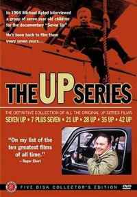
Another goal for 2011: re-view all of the Seven- Up films!