Sunday, January 23, 2022

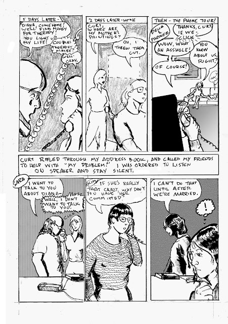
Original Art Sundays No. 289: Sharp Invitations: Curt, p. 27

 As promised, here's a fill-in page to clarify some stuff from the last page.


After my page discussion, I will re-post the three pages in this scene in proper reading order. I should probably do that more often anyway. A week is a long time to wait to see what happens, and we all have full lives.

When the story left off, I had agreed to return to Curt. One of the things that came up was the possibility of therapy, which leads us to the events of this page, followed by the events of the page posted last week.

For this layout, I wanted the page to feel off balance, yet be legible. Hacking off the edges, first alternating, then both, seemed an effective tool to accomplish this. It's a straightforward dialogue page. I kept it visually interesting by just moving the "camera" in. I dropped Photoshop gradients in the first two panels. The astute reader will note the continued absence of my mother's art and the presence of a replacement guitar.

This page got really messy! I don't mean the art itself, though that was hit and miss. For some reason, the art itself got very smeared and dirty. A bit frustrating, since I didn't work it any differently than my usual process. Ah well.

I kept the facial expressions very simple. While I like complexity, my style does seem to lend itself to simplicity. No overt influences on this page, just telling the story.

Here are the three pages in proper order.


Well, I hope that clears things up. I don't often step back and look at the book in progress. It's actually helpful.

Not much brush work on this page. Tool list:

  • Canson Bristol board
  • tech pencil, #2B lead
  • Ames Lettering guide
  • Lead holder, #3B lead
  • Good old Ticonderoga #2B pencil
  • Straightedges, triangles, curves
  • Micron pens .005, .02, .05, .08, 1.0 and brush tip
  • Pen nib and holder
  • Dr. Martin's Black Star Matte ink
  • FW Artist's Acrylic White
  • Faber Castell eraser and kneadable eraser
  • Blick #6 synthetic brush
  • Tight Spot brush for corrections 
  • Photoshop 2019

Next: a stroll through the park.

Sunday, January 16, 2022

Original Art Sundays no. 296: Sharp Invitations: Curt, p. 28

 Here we go again...

The astute reader might notice that I skipped a page in numbering the story pages this week. Last week was p. 25, and this week is p. 27. I showed this page to a Beta reader whose opinion I respect highly. It made no sense to her. I realized that I left out a significant bit of exposition. I will do the missing page for next week. If I can manage it, I will do an extra page for next week as well. We're coming up on a crucial event or two, and it's vital to have things coherent, especially when reporting on an incoherent time. But I'm still eager to resolve this book.

When we left the story, I had agreed to return to Curt in the hope of entering couples therapy and healing our relationship. Read on.


So much to unpack here. First, layout and design considerations. I have wanted to do a reversed out page for some time, and having just finished Alison Bechdel's The Secret of Superhuman Strength, was also reminded of the device of overlaying slices on a master image. I don't think I've done that before, so like you think, you do. This is hand work as far as the reversal- just ink and ink and ink. I wanted to give a sense of the darkness of the time and of his bleakness. The slice panels may be a bit too simplistic, but I didn't want much detail on them. Some of my hand lettering went south in the third panel, so was redone in Photoshop. I considered redoing all the lettering digitally for consistency's sake, and decided against it.

One of the slice panels has a line texture background, and the others are washes. I don't want to overuse wash backgrounds as a crutch, but they work here. Simple guideline: larger panels, more detailed environments. Smaller panels, not so much. Next page (the missing page) will be three banner panels, so more of a chance to explore the environments. After the Curt chapter of this ends, there will also be a chance to draw some outside stuff. So much has been indoors!

Again, I've condensed some events for narrative flow, but everything I'm showing really happened. Him telling a therapist to drop dead was a shocker, even for him. Other than it happening to me, no overt trans content this week. 

One thing a lot of readers ask is why I went along with his demands. So many years later, I still don't have a good answer. I may never have an answer, other than primal emotions. He played on my fears of solitude and being undesirable, and I let him. No excuses, just fear and stupidity.

Pretty bleak, huh? Well, like I told a friend who was learning about this for the first time through this work, it gets a lot worse and then it gets better.

Tools for this page:

  • Canson Bristol board
  • Mechanical pencil
  • Ames lettering guide
  • Lead holder and #3B leads
  • Kneadable and Faber Castell dust free erasers
  • Pen holder and nibs (breaking in a new one - fun!)
  • Misc. triangles, t-squares and straightedges
  • Micron # .02, .03, .05, .08, 1.0 and Brush tip
  • Dr. Martin's Black Star Matte Ink
  • FW Artist's Acrylic White
  • White colored pencil 
  • Plastic paint palette for washes, 12 wells
  • Brushes: Princeton Synthtetic  round No. 10, Blick Wonder White Synthetic round No. 6, Silva Renaissance Sable Cat Tongue No. 2, and Tight Spot for corrections

Again, the astute reader will note some small amendments to past tool lists. I allowed myself a small pilgrimage to the art supply store and was glad I did!

Next: the missing page, then on into the fray.


Sunday, January 9, 2022

Original Art Sundays No. 295: Sharp Invitations: Curt, p. 26

 Hi, all. I hope you got something out of the little piece I did on 1/6 (arguably as important as 9/11, both days when our proud nation was attacked). We're back into it with a challenging page.

At the end of the last page, our heroine was evicted from hearth and home. Read on.

I may have made this page harder than it needed to be, but I'm fairly happy with the result. I played with numerous layout options before deciding on two tiers with exposition block in between. The one drawback is the last panel on tier one comes before the exposition. But I decided there was sufficient context to pull it off.

Strategic considerations: the challenge of land line phones! Though the first hand held independent phone unit was patented in France in 1917 (!), they weren't in common use until many years after the events chronicled here happened. So I used the old saw of phone cords and answering machines, hoping there is sufficient visual context for a modern reader. I also had the issue of showing a missing painting. I opted for a blank wall space with dotted outline. In reality, it didn't look anything like that. I know this page minimizes the impact of someone deliberately destroying family art, or some destroying art in general, but we must choose our moments in this drama. In the third panel, I used the conceit of popping in one of my favorite Surrealist Cowgirls characters. The area needed some weight, so I opted to have some fun with it. The weight in the bottom tier mostly comes from Photoshop patterns and fills. My emotional response to the suggestion that he would have me committed after we were married was not that drastic at the time. I was becoming convinced he was right about me. But I just LOVED Sara's response, just hanging up on him! He made 5 or 6 more calls not included in this page. Going into meticulous detail over such things would bog down the narrative.

The initial panel strategy for this page was so boring! Head shot, head shot, head shot.... blah... then I was re-reading the first run of Paul Chadwick's Concrete, and found a page of phone conversations that used some brilliant and simple visual devices (page 19 of The Complete Concrete). Inspired, I created new layouts for panels 3, 4, 6 and the text block, and popped them in using Photoshop. So this page took two full pages to do! I'm going to tweak a couple little things before this book goes to press, as we used to say.

Not as much pen and brush work as on some pages, but it's always about balance and doing what the page calls for.

Tools used:

  • Canson Bristol (2 sheets)
  • Nib holder and pen nibs
  • Lead holder and no. 3B leads
  • 4B graphite stick
  • Magic Rub eraser
  • Micron No. .02, .03, .05, .08, 1.0 and brush tip
  • Tight Spot for corrections
  • FW Artists White Acrylic 
  • Doc Martin's Black Star Matte India Ink
  • Photoshop. Mountains of Photoshop.
  • Renaissance # 2 Sable Cats Tongue Brush

I picked up a few new tools while I was preparing for next semester's classes, and am eager for the next page, despite the dire place the story is going.


Thursday, January 6, 2022

Original Art Sundays (Thrusday) No. 294: Never Again

 I rarely talk about politics here. My politics are hardly secret, but this is not a forum where I usually give them voice.

But this goes beyond politics. This goes to the heart of our nation. 

Many conservatives seem to hold that we liberals hate our country. Quite the opposite. We really love it so much we want to recognize its faults and correct them. One of my favorite quotes is attributed to Thomas Jefferson: "The purpose of democracy is not to make the nation perfect. It's to make the nation better." I'm unable to find a specific citation, and am working from memory, but the principle is the vital thing. Democracy is a fascinating experiment, a work in progress, which will probably never be completed. And despite everything, we were making progress in fits and starts, until a year ago today.

As we are on the anniversary of the January 6 attempt to overthrow our government, this is very much in my heart and in my thoughts. I am usually a champion of restorative justice over punitive justice. Not in this case. I believe everyone who acted in this shameful attempted revolution should be tried and prosecuted to the full extent of the law. We must also safeguard voting rights. I am forced to agree with Bill Maher that this remains a slow moving coup, which will only be stopped with our vigilance.

I took to Photoshop for a quick work to try to express my passion on this crucial matter. A few simple steps and here we are.


So many of the "patriots" who joined in this disgrace have been claiming innocence, saying they were deluded, brainwashed, or generally disavowing their craven acts. I say some things can't be forgiven. Not many, but some. 

This is one.

We won't heal as a nation unless the body politic is strong enough. That won't happen unless we deal with this. As the American writer Poe contended, "A wrong is unredressed when retribution overtakes its redresser." So must we do for the strength of our nation.

All for now on this.

Next- back to our story.

Sunday, December 19, 2021

Original Art Sundays No. 293: Sharp Invitations: Curt, p. 25

 You know, I didn't think I'd make it this week. It's a good page, but the content... well....


Remember all those times with Delia and Sara before our heroine moved in with Curt? Well, turns out these things are almost always revealed eventually. In the vernacular, I was busted. In most cases, that's the end of the relationship, or the beginning of counseling. In this event, it was the death of my 1972 Picador guitar and my first exile from my new home, with almost no money in my purse and only the clothes on my back.

This was a very difficult page to create from an emotional standpoint. We're starting to get to the really ugly stuff in the relationship. I'm not interested in painting myself a hero, but I do want to show what happened as clearly as I can.

The first layout for this was pure exposition, a talking heads page. Boring! I played with slicing it up in different ways, doing some work with jagged panel edges and lots of little slice panels, but that had no impact. 

This is a big dramatic moment, with lots of action. I realized that his actions had to dominate the page, so settled on the two-column full figure layout. I took some license with his stomping my guitar. It really happened, but it wasn't quite as destructive as shown. He just put his foot through the top and stood there leering shards of the guitar and broken strings tangled stupidly around his foot.

For background consideration, I opted for a simple gray on the panels with me in them, which is repeated in the last panel, to anchor me to the visual space. I referenced the TV, door and windows seen in previous pages showing this space. The gray value comes from ink wash and not a Photoshop solid or texture. I wanted it to look a bit uneven, to echo the emotional content. I like the word balloon effect in the second panel of the right column, the dotted line inside the solid line. I think it emphasizes the smallness of my voice in that moment. I went with a heavier border than usual, again for emphasis. Curt's cast shadow in the last panel was a last minute touch, possibly superfluous, but I don't think it hinders anything.

I still miss that guitar. I've looked into replacing it a few times, but they're very hard to find. I do have other guitars now- more on that in a subsequent page.

The emotional toll of these pages is heavy. The only way I can do it is by focusing on the craft and circling back to be sure the final result isn't too analytical, too cold. Even then, it takes a day after finishing the page to recuperate.

Tools are pretty much the usual with a couple interesting additions:

  • Canson Bristol board
  • Lead holder with 3B leads
  • 3B Castell pencil (good old greenie!)
  • Ames lettering guide
  • Castell eraser
  • Micron numbers .02, .05, .08, 1.0 and brush tip
  • Dr. Martin's Black Star Ink
  • FW Artist's Acrylic White
  • Round 10 well paint palette (for ink washes)
  • Crow Quill and nib
  • Brushes: Blick No. 2 and No. 6 synthetic
  • Tight Spot for corrections
  • And our old friend Photoshop 2019

Next: aftermath

Sunday, December 12, 2021

Original Art Sundays No. 292: Sharp Invitations: Curt, p. 24

 The semester has ended (still some grading to plow through!). This is a mixed blessing. More time to work on The Book, but limited large scanner access. So it's back to scanning in tiers on the Brother printer/scanner for a bit. It actually worked out pretty well today. But I do much prefer a large bed scanner. So much easier, such better results overall.

Into the next page:


Lots to unpack on this one. First, I'm quite pleased with it.

Narrative: Other than it happening to me, transgender identity isn't a significant part of this page. This page is intended as a meditation on Curt's mindset. We're all heroes in our own minds, and I thought a page showcasing some of his philosophies might be useful. It's too easy to just paint someone as a villain and let it go at that. One of my favorite films, Princess Mononoke, has a very complex villain who could be considered a hero in some respects. I've no desire to make him a hero, but showing some of his perspective helps the story, and it's the decent thing to do.

I originally considered carrying the page title's "gospel" theme further and having him preach from a lectern. But it didn't work visually all that well, and I thought it might cause confusion about his character. He was far from religious. He was agnostic and ridiculed people of faith. I considered doing a second, similar page, quoting him talking about the stupidity of other people, but decided that this would suffice. His actions tell the story, more than anything.

Layout and design considerations: usually, I see the finished page in my mind before I start drawing. Not so here. This went through several evolutions, until it became his soliloquy. After abandoning the lectern concept, I wanted to keep the page title (rendered in Photoshop for fun). So the visual theme called for something preacher-ish to reflect that. I thought about televangelists (reminded of Lenny Bruce describing preachers as "those who save -save every penny they can get their hands on."). That led me to the spotlight and arms up pose of the first panel. The quote about emotions in the second panel is something he said quite often. It's so stark and shocking, so cold and sad, it screamed for chiaroscuro. I am fascinated by the shadows in the third panel. The lettering on one line of that panel got away from me- again, Photoshop to the rescue, using my favorite comic body copy typeface, Scott McCloud's The Sculptor! For the last panel, I tried it with and without my face included. Visually, it works better without, but I think it's necessary to remind readers at this point that the character (me) is living with the snakes in this guy's head. Also, I tried to indicate that he was inches from me and screaming so hard his face turned beet red, because that's how it was.

My only layout regret for the page is the lack of substantial backgrounds. But they will be back next week, so no worries. Loving the lights and darks on this page!

Tools:

  • Canson Bristol Board
  • Lead holder and #4B lead
  • Triangle, T-Square, Ames lettering guide
  • Faber Castell eraser
  • Micron markers .02, .05, .08, 1.0 and Brush
  • Dr. Martin's Black Star Matte Ink
  • Brother scanner
  • And our old friend Photoshop

Next: page 25 of this chapter.


Sunday, December 5, 2021

Original Art Sundays No. 291: Sharp Invitations: Curt, p. 23

 Well.

When we left our intrepid heroine (me), she was settling into a repressive routine with her intended future husband. As she settled, she began to realize just how much settling she's done.


 Lots to unpack here. 

First, layout considerations. Slow zoom in from first to second panel, pull out on the last panel. Fairly static page, where the position of the viewer relative to the subject is pretty much the only thing that changes.

I wanted enough detail to be plausible, and to keep the moment as private as possible. I'm happy with the pose and the layout. Inks are okay and serviceable. His hand did something crazy in the last panel, but I touched it up in Photoshop.

Speaking of Photoshop, my original intent was to reverse the last panel for dramatic effect. It looked dumb. I opted to add a gray value to set the time more clearly.

Debating where it goes on the next page. His bombshell here cries for more exposition, but I'm eager to keep the pace, so I suspect I will go on with the action.

This is typical of abusers. They tend to demean and mistrust, and to think their judgment is better than anyone else's. He manipulated my uncertainty about being lovable as trans woman, and here reveals that my trans status is what drew him to me, but not in a positive way. I'm concluding that there's no need to elaborate on that in the narrative, and I can just let events communicate that.

Tools for this page:

  • Canson Bristol board
  • Lead holder with 4B lead
  • Faber Castell eraser
  • Triangle and T-square
  • Ames lettering guide
  • Micron .02, .05, 1.0 and brush
  • FW Artist's Acrylic White
  • Richeson brushes; synthetic no. 6 round, Sable cat tongue no. 2
  • Of course, Photoshop

Next: page 24 of this chapter.


Sunday, November 28, 2021

Original Art Sundays No. 290: Sharp Invitations: Curt, p. 22

Welcome back, loyal readers.

Much to discuss about today's page, so let's get right to it.

First thing to unpack here: the writing. The last page marked a shift away from the narrative heavy pages leading up to the move. There's a bit of exposition here, but I tried to frame it so it held its weight, without dominating the story. Clearly, layout was crucial to doing this.

We begin with the classic "frog in the frying pan", a metaphor often used to explain enduring abuse to those who haven't experienced it. This is a clear case of "show, don't tell."

My trans stuff doesn't figure overtly into this part of the narrative, but as we'll learn on the next page, it's omnipresent in the relationship.

For the balance of the page, I decided to channel my inner David Mack. I was so impressed with his use of layout and silhouette as narrative devices in Kabuki, Daredevil. and the brutal (but clever and beautifully rendered) COVER. It's thoughtful and still engages the reader. Also, it's fun to look at! And by isolating the text from the image, the idea that I was stuck in my own head with little to no attachment to the outside world is reinforced.

Not to say I didn't have a little fun with this page. The frog (drawn freehand after a quick look at photographic reference) was a delight to draw. The third panel, with simultaneous exercising and cooking, is a playful comment on the idea of the woman who can do it all. In the third silhouette panel,  I took the conceit of using The Best of Both Worlds onscreen. We did watch that one together, but it first aired before the big move. But it's such an iconic episode, I had to give it homage. ST: TNG was still in its initial run during our years together.

Another layout consideration: gray values are mostly represented in pencil until the last panel, to increase the emotional impact of that image. I freely stole the pose from the iconic Alan Moore/Curt Swan Superman collaboration Whatever Happened to the Man of Tomorrow? 

Minimal Photoshop corrections this time. 

Tools used:

  • Lead holder and 4B leads
  • Ames lettering guide
  • 4B graphite stick
  • Faber Castell Erasers
  • Dr. Martin's Black Star Ink
  • FW Acrylic White 
  • Crow quill and nib
  • Micron nos. .005, .02, .03, .05, .08, 1.0
  • Brushes: Richeson #2 Sable, Tight Spot for corrections
  • Photoshop

Overall, I'm quite proud of this page. 

Next week, Page 23!

I may up the ante to more than a page a week, if my schedule permits.


Sunday, November 21, 2021

Original Art Sundays No. 289: Inktober, Week 3

Day

 Sigh. Next page is done except for cleanup and scanning, and I'm very proud of it. But I'm in grading Hell and don't want to take the two hours to run to MCAD and scan, so just to keep on posting schedule, here's the next week of Inktober. These will be old news to those who are with me on Facebook or Twitter, but I hope they give some pleasure anyway.

Day 15:

From the Surrealist Cowgirls, our old friend the floating whale mule Whalliam. I never get tired of drawing him, and this is iconic- the classic "HI" word balloon (he communicates by thinking one word at a time, always with a period, remember?), him floating on an abstract landscape, and the sun wearing shades, smiling down on him.

I miss the Cowgirls. It's been too long since I had a new story for them. Such a joy to create them!


Day 16:

A friend's labradoodle,  from photo reference.

On this and the above drawing, I did minimal cleanup. I liked the energy of the pencil marks, and the paper texture showing through on the image. These were just shots from my phone, not scans. I like the immediacy, though I would not take them to print for any major project.


Day 17:
When I was a wee tad, there was a Beatles cartoon series. MY mother didn't trust the Beatles' music until this series made them seem more innocuous, so the cartoon was my road in to my lifelong love of the Fab Four.

TV Guide ran an article on the series, including full figure illustrations of each of the boys. I copied those like crazy! I got particularly good at George, but decided to revisit John for this round.

Another quick sketchbook work with minimal cleanup. Just revisiting a childhood drawing joy.


Day 18:

I seldom do anything remotely resembling technical SF drawing. I like some of it, but it's just not where my strength lies. But since Inktober is about pushing yourself, and I had been diving into a re-viewing of the Battlestar Galactica remake, I decided it was Cylon time. 

Still quick, but I spent a little more time on this one. I love all the curvilinear aspects of the design. It's harsh and smooth at the same time. A bit more cleanup on this one too.

I sure got some mileage out of that small sketchbook this month!


Day 19:

I had a request to draw "a Seuss bird."

I spent some time enjoying vintage Seuss art and applied my own style to it.

Everything got curvy and soft in this one. Aside from a straightedge to draw the post, no mechanical tools at all. Another quick thing that was just fun to draw. I did a fair amount of cleanup on this one.

While my regular work is serious, bordering on grave, at times, I do get such joy from doing simple subjects.


Day 20:

Okay, very happy with this one!

I was getting irritated with me. I like the fast and loose drawings I'd been doing, but felt the need for something more... involved.

This is my interpretation of Jaeger from Carla Speed MacNeil's great work Finder.

Mostly a straight copy, but I did take a few small liberties to make it my own. More time on this one, with lots of cleanup and care.

Carla is doing a Patreon now, I guess. I just met her the one time, and found her vibrant and eager to share her work. When the funds are there, I will honor her Patreon and a couple others that are on my radar.


Day 21:

Another straight copy, this time the wonderful Neil the Horse from Katherine Collins!

Just cutting loose a bit. Pencils not removed.

As noted on the Rosa illustration previously posted, there's a misconception that funny animal books are somehow simple. Nothing could be less true. It takes a special technique to pull this stuff off, and Katherine is a master. I haven't talked with her for a couple years. Based on the Afterword in her Neil the Horse collection from Hermes Press (sadly, color covers not included), she went through a bit of a rough patch, but has endured.

Next: the new page, at last!


Sunday, November 14, 2021

Original Art Sundays No. 288: Inktober, Week 2

 Next page of Sharp Invitations is about 3/4 done. Rather than skip a week of posting art, here's some more work from this year's Inktober.

I may make a booklet of these.

 Day eight: Zorro.

So many great inkers have worked on Zorro. I've always been partial to Jesse Marsh, Tom Yeates (there's a definitive collection of the Yeates/McGregor Zorro strip soon- hooray!) and of course, Alex Toth. A perennial favorite, Russ Manning, even did a couple tryout strips! 

Such a great character, romantic and driven by justice.

This is loosely inspired by the recent McGregor Kickstarter comic. Almost no under-drawing here, just some brush work. I do love working with dry brush techniques. One of my goals for this year was to improve my versatility and craft.


Day nine:

Another work in walnut ink. I got this really cool catalog of fashion for the more zaftig woman, and she was the cover and one of the interior pages. 

A little more time on the under-drawing this time. Mostly brush work, but a bit of crow quill. I think the outline on the figure could be a bit more consistent. This is always the question: when does one ink right up to the figure, and when does one leave a silhouette? For me, it's about the quality of the figure's holding line. If I'm pleased with that line, I want to preserve it, and the best way to do that is to leave the ghost space.


Day Ten:

This is my character Blue Wild Abandon, who has never appeared outside my sketchbooks before. She's an intergalactic bounty hunter and seeker of justice. Her symbol is the Jungian icon for hero. I will render it more tightly in her first adventure, tentatively titled "No Beast so Fierce". It will be a while before we see it, since I have two stories ahead of it in the queue!

She looks slightly different from one drawing to another. She's been showing up in my sketches for years, but I only recently realized who she is. Then I tied her to an SF story outline I wrote decades ago, and it clicked.


Day Eleven:

Inspired by Trina Robbins' recent wonder, Flapper Queens: Women Cartoonists of the Jazz Age, I decided to try my hand at fashion illustration.

The proportions are weird. The face is sparse.

But boy, was this fun!

Quick pencil sketch, many corrections on the ink. This was was a little Micron, a lot of crow quill, and a BIG brush for the few heavy inks.


Day Twelve:

Athena from my old Tranny Towers strip.

I haven't drawn her for years.

I would love to do a collection of that strip, and include the related work that appeared at the time- my Gay Comics pages using the characters, the self- published work with her from around that time, my editorial cartoons for 90s trans political magazines. Also some paper dolls I was working on and some background sketches and sundries. Make a nice little book.

But in today's political climate, trans people can't even call themselves tranny without someone taking offense. It makes me sad, but I think I've talked myself out of the collection for now. 

Athena's bra and panty set is inspired by Francine in Terry Moore's Strangers in Paradise #1.


Day Thirteen:

Ray Shulman of Gentle Giant. Taken from a photo in the Italian Super Star compilation album booklet!

Much as I love the band, I seldom draw or write about them. Back when I first started posting my work, about a million years ago, I posted some pages from a comic adaptation of the GG song Little Brown Bag. Gentle Giant comics came up in a discussion of a proposed documentary online recently, so that project, an anthology titled Gentle Giant Comics and Stories, could see life again.


I do already have a lot of projects, but my enthusiasm does not abate.


Day Fourteen:

Usagi Yojimbo

This was just fun to draw. Stan Sakai has a style that is deceptively simple. But when you take a closer look at his technique, it's clear he's a master. Subtle variations in line weight, and facial expressions that tell the whole story.

I tell my writing students that knowing what to leave out is as important as knowing what to put in. Sakai is the master there.

That's all for now. I'll save the last 17 Inktober sketches in case I need them to meet a Deadline Doom here, as the Marvel editors used to call it.

Next: back to Sharp Invitations.


Sunday, November 7, 2021

Original Art Sundays no. 287: Sharp Invitations: Curt, p. 21

 Here we go with the next page!

As you may recall, our heroine (moi) had just arrived at her new home, 600 miles from her old one, and was greeted with less than a ticker tape parade.

Read on.

The events of this period are such a jumble, for reasons that will become obvious on the next page (if they're not already).

Backgrounds were kept sparse deliberately. The encroaching black from panel to panel is a visual cue as to what's going on in this descent.

Beyond me being trans, there's no overt trans content on this page, other than the only slightly veiled "someone like you" comment in the last panel.

Curt's figure gets larger as the panels progress, while mine gets smaller. That's pretty blatant symbolism.

Figures are also kept simple, echoing some of Terry Moore's work on Strangers in Paradise, specifically the sequence where Katchoo is talking to the detective. Figures are stripped down to essentials, and eyes are often just dots. He did the same thing in the panel where Tambi says "I hate working with men!"

It's fascinating how much I emulate Terry's techniques. His work is a Master class in style and emotional resonance. Plus, he tells cool stories.

Timeline: This didn't happen week by week, but it seemed the best way to efficiently indicate the slow burn of someone taking over your life.

This one was mostly ink, very little marker.

Tools:

Bristol board

Lead holder, #3B leads, various erasers

Pelikan Ink

Crowquill nib and holder

Richeson #10 Synthetic brush, #4 synthetic

Micron .05, .08

Next: At the very least, the next page. I have three works worth of Inktober stuff I haven't posted here yet, much of which has made me proud. Either way: back soon!


Sunday, October 10, 2021

Original Art Sundays No. 286: Inktober 2021, Part 1

HI all;

Next page is nearly done. Rather than post late or skip a week, here are my current efforts for Inktober. 

Day one:


 We start with a swipe from the cover of a swing album I discovered on Apple Music, Naomi and Her Handsome Devils.

More stylized than my work usually is, but such fun! 

I played with BIG brushes filling in the background.

I always love the geometric elements associated with this era, as anyone who recalls my Speedy Recovery and His All-Girl Orchestra comic will attest.


Day Two: 

A pretty straightforward swipe of a panel from Dean Motter's Mr. X.

I'm re-reading this and finding new stuff in it. The design paradoxically feels like both 80s-90s and 1920s.

I adore his facial expressions!

So vibrant with just a few well-placed lines.


Day Three:

Charles Mingus, in Walnut ink. From photo reference.

I didn't quite capture his majesty or exreme coolness, but I like this one anyway.

I was privileged to see Mingus live once. In the middle of the set, some guy in the back yelled out, "Do it, Charlie!"

He peered over his sunglasses and replied, "Ah, do what, man?"


Day Four:

One of my favorite panels from the Don Rosa classic Life and Times of $crooge McDuck.

Honestly, this whole sequence is just so powerful, but this panel, with him chained by his evil rival, as he is ridiculed and informed that his mother is dead, is just so perfect.

I've tried to explain the virtues of funny animal stories to the uninitiated, to no avail. I fear it's one of those things where either you get it or you don't.

Day Five:

A mocking Big Cat from Craig Russell's adaptation of The Jungle Book. 

Russell is another one of those artists whose work leaves me breathless. There's a classic elegance to his work, but when you look at it closely, his lines are almost breathy. I wish I could afford to get some of his video tutorials! I learn so much from such things.


Day Six:

Very loose pen and ink rendering of the sadly demised jazz great Emily Remler. We lost her to heroin some years ago. Her style was her own, but based in the work of Wes Montgomery.

This is deliberately sketchy. I wanted some quiet energy on this one.

Mixture of ink and marker.


Day Seven:

Now this was fun!

There's a little concrete warthog on a stair post in front of a house near MCAD. We all know it and love it. It became a character in my only Surrealist Cowgirls cartoon, now lost to the ages. But it elicits such warm feelings as you walk by!

This is brush work. The background is crow quill, and the background is loosely inspired by Jim Woodring's work.

I have a couple more, but I'll save them for the next posting. The next page will be posted in a couple days, and I'll just sneak in more Inktober throughout the month. I've been crossposting my Inktober work on Facebook and Twitter, if you just can't wait.


Sunday, October 3, 2021

Original Art Sundays No. 285: Sharp Invitations: Curt, p. 20

 Now that the chapter on surgery is complete, we're going back to the Curt narrative already in progress. 

We had 19 pages of our heroine (me) meeting Curt, developing a relationship and having, ahem, intimate moments with others. There was more of that, but rather than make the waters any muddier, it's time to move on, in every sense.

I left out a couple details, and a few events are not quite in the order in which they occurred, but that doesn't disrupt the veracity of the story.

The temp job was much less sophisticated than I made it look here. Nice people and fairly easy work, but pretty mindless, doing document recording and retrieval at an insurance company.

Several things about this page are quite deliberate. The only face the reader sees straight on is Curt's. This is a story about abuse, and like most such narratives, it builds slowly and becomes largely about the abuser.

 Time is very condensed here. This page represents three months. The art is serviceable, but no more. There are some obvious and deliberate exaggerations, like the hyper-extended U-Haul.

I had hoped to add a wood texture to the door, but Photoshop was missing some patterns. Rather than dink around with it, I went with a solid gray for the door.

Design consideration: to give the page a bit more weight, I used the old Terry Moore trick of adding a solid black behind the panels. In a moment of inspiration, I used his How to Draw book as a template for the shape! Just lay the book on the page and make a black outline, fill it in, and you're golden.

The tools for this week are very straightforward. Entirely Micron pens! But I haven't forsworn my beloved inks.

Tools:

  • Canson Bristol
  • T-squares and straightedges
  • Lead holder, #3Bl leads, and erasers
  • Micron .005, .2, .3, .5, .8, 1.0 and brush
  • Photoshop

I'm also doing Inktober this year. Last time I did that, I didn't make it through the whole month, but I have high hopes this year. I have been posting my inks daily on Facebook and Twitter and will post them here weekly.

That said, next week we continue the Curt story. Current plan is to resolve this part of the narrative quick and clean, four or five more pages. Then two or three more short chapters, some hard editing decisions, and we're done with this project. I have two more comic and illustration based projects in the wings, and two text projects in the works.