Sunday, August 28, 2022

Original Art Sundays: Sharp Invitations: Curt, pp. 46 & 47

 Once more....

Two pages this week, but one is a recap. The astute reader will recall that the previous chapter ended with a preview of this chapter, me getting on a bus. We're at that point in the story, so let's jump in.

When we left our heroine, she was being taken to a homeless shelter.

Read on.

Story notes: That was one lonely, scary night! I was treated well- actually, largely ignored, which under the circumstances, was fine with me. A little artistic license on the collapse in the shower. It did happen, but not so dramatically as all that. I hadn't mentioned the short job I was fired from at this time until now. I hope that doesn't cause confusion in the reader, but aside from getting that last paycheck, it really has nothing to do with the core story. Really, there's so much tedium involved in tearing your life apart that the details seem so unnecessary after the fact.The worker at the shelter was very decent, even setting me up with toiletries when I got there. I disclosed my trans status so it didn't create more problems, and was treated decently.

Art notes: Very light blacks this week. There were a couple places where I considered adding more value, but I was unhappy with my experiments with it. Keep it simple and clean. Almost no brush on this page. Lots of nib work, and a bit of Copic brush marker, along with the usual assortment of Microns.In light of that, I shan't post an equipment list this week.

Shan't. That shows class.

I really like the second panel. That's a case where I played with adding tone to the tiles, as I've done in the past, but decided to keep it simple.

Wow, I've been drawing a lot of bathrooms lately!

The second page is a recap, with just the caption text changed. I considered changing the thought balloon, but hey, if that's what the character thought in the flash forward, that's what she's thinking now. Just a bit of Photoshop on this one for the text and we're good to go.

Side note: I was prepping for my fall teaching load, and I had a chance to preview my work hanging in the MCAD Biennial show. I'm very happy with it. I chose what I think are some of my strongest pages, and the display is very effective. The show will be open before then (it may be now), but the opening ceremony is Friday, September 9. I would be happy to see friendly faces there to share my work. Other MCAD comic creators will also be represented, including Zak Sally, Blue Dellaquanti and Barb Schulz. Delighted to be in such distinguished company!

Next: back to Minneapolis, as we near the completion of this chapter. In the original draft manuscript, this chapter was eleven pages. Looks like the final version will be 60 - 70 pages, almost a book on its own.

Guess I had a little more to say than I thought I did.


Sunday, August 21, 2022

Original Art Sundays no. 305: Sharp Invitations: Curt, p.45

 Once more into the breach, dear friends. When we left our intrepid couple, Curt had made his intentions clear. Read on.

First, we discuss the story.

Events unfolded in this way, but there was a 24 hour gap between him telling me to go and my exit. We had out of town company the next day, quite awkward. I do wish I'd put on the other pants! The cop is modeled on a Madison cop who used to work security for Rocky Horror when I was running the Majestic in Madison. Really nice guy. We had long talks about Stephen King. Last time I saw him was after I transitioned and he was still decent to me, something I haven't always experienced from law enforcement. I remember him fondly. I wish all cops were as respectful to trans people as he was to me.

Art notes: I went a bit overboard on the first panel, with a wild pose inspired partially by the Bob Clampett classic The Great Piggy Bank Robbery. I do enjoy that loose style, but it doesn't always serve the story. One of my occasional beta readers suggested that the left (back) arm could swing out a little more. I followed that suggestion and it worked. 

The rest of the page is pretty procedural. It was a lonely, scared night and I wanted to show that without saying it outright. Given where I went, it was fairly easy. 24 hour groceries have mind numbingly even lighting. It's very disconcerting. For the last 5 panels, my goal was to include sufficient detail to communicate and no more. The characters inside the police car are a visual idea I want to work on more - characters seen inside the environment, as opposed to placed atop it or in front of it. Characters behind desks, seen through foliage, wandering through ruins with large bent metal in front of them- you get the idea. It encourages deeper involvement in the story. Some of the lines in the last panel dropped out a bit. I'll push it more in Photoshop, as is my way.

Same equipment list as last week, so I won't repeat it. There is the notable inclusion of a couple new tools: a Copic small brush marker and a Deerfoot 1/4 Mini Detailer brush. It's an angled tip, very chunky, and gives a delightful scumbling line. Very thick handle, feels good to hold. I suspect it will get a lot of use as a dry brush tool. You can see some of it in the "light lines" around the lightpost in panel 3. 

Next week: the shelter.


Sunday, August 14, 2022

Original Art Sundays No. 304: Sharp Invitations: Curt, p. 44

 What a week! Somehow I got the next page done and did a good job, despite attending Autoptic and doing more prep for the MCAD Faculty Biennial show. Autoptic was such a delight! So many people I haven't seen for too long, a couple possible publishers, and bought a bunch of cool comics. There's some works where I like the art, some where I like the writing, and some where both shine. Such events lead me to ponder the possibilities of our chosen art form. In a conversation after the event, I mused on expanding my comics work. I was told I'd never make a lot of money, but that's not the point. I want the same things I always wanted. I want to tell my stories. I want to improve my craft. And I want someone to get something out of them. If I can get a few bucks or some recognition/accolades along the way, that would be great, but that's not why I do it. Events like Autoptic remind you of that, in the best way.

Ahem. The story at hand.

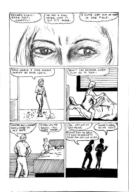
When we left our hapless couple, he had just thrown an ashtray at me. It shattered on the wall behind me. Then he trashed another guitar. 

Read on.


I like a lot about this page. The top banner panel, done in pencil, is quite effective, I think. Breaking up the thoughts in a banner panel is a nice pacing device. I'm sure it's been used before, but I don't recall seeing it anywhere. The next three panels are clean and serviceable, but the silhouette of the strange action in the last panel also works well. So often the simplest things pose the most interesting artistic challenges, like a woman sweeping a floor or getting into bed. He never did use the gun, but it was in my thoughts, so it's part of the story. My line in Panel 2: I was taking a real risk, being that sarcastic when he was escalating like that. He'd knocked me down a couple times before that, but there's a clear and dangerous progression to these things, and he was very close to giving himself permission to physically attack me more intensely.

The moment in the last panel bordered on absurdity. What a weird thing to do. He was pushing me with his torso, so he could claim he didn't lay a hand on me.

Thought on last week's page: one of my readers liked the iris panel of his hand grabbing the guitar neck. That inspired me, so I might put together a small sketchbook of guitar illustrations I've done over the years, and throw in a couple new ones. I don't want to lose sight of my big goal, but there's something to be said for completing a small project along the way.  

Almost no ink brush work on this page.

Tools for this page:

  • Canson Bristol board, Bristol strip slipsheet, masking tape
  • iPhone for photo reference.
  • T-square, triangle, Ames lettering guide
  • Tech pencil, Cumberland 6B pencil, HB, 3B and 4B Woodless pencils
  • Dr. Martin's Black Star Matte Ink
  • Blick #6 Round Brush
  • Pen nib & holder
  • Micron .005, .01, .02, .03, .05, .08, 1.0
  • Faber Castell Brush Tip Marker, Copic Small Brush Tip
  • Plastic eraser
  • FW Artist's Acrylic White
  • Tight Spot correction brush - treated myself to a new one of these this week, along with some papers I plan on experimenting with soon.
Next: one foot out the door in the coldest of winters.


Sunday, August 7, 2022

Original Art Sundays no. 303: Sharp Invitations: Curt, p. 43

 Next page!

When we left our hapless couple, Curt was preparing to throw an ashtray. Anyone taking odds on him following through?

Content notes: This happened, but not quite this way. I didn't see him trash another guitar, but I did see the wrecked guitar afterwards. This guitar, which I also loved, was a replacement he got me for the one he destroyed a couple months prior. That will be covered in the text of the next page.

Craft throughts: Time in comics is so elastic. I can cover months or years in one panel, or cover one night in multiple pages as I'm doing here, or make a single moment so elastic as Scott McCloud does in the exquisite framing sequence for The Sculptor. We're also manipulating perspective here. The first panel is from my POV, the second from his, while the rest of the page is back to my viewpoint.

I would like the darks to have more weight in the first two panels. I like clean lines (the clare ligne technique used in Tintin is so delicious), but it doesn't always serve the narrative. Also, it's not really my style, although I certainly lean towards it! I love the iris on panels three and four. While it was intended as just a design device, the iris on the last panel resembles an eye opening shape- a happy accident. The inks on Curt's face in the final panel went someplace strange, so a bit of Photoshop cleanup was in order. I've been considering trying different illustrative programs, as I sometimes find Photoshop limiting for my purposes and my Illustrator chops are very rusty.

I continue to prepare for the MCAD Faculty Biennial, doing digital prints of some pages, cleaning up others, meeting with the new gallery director to go over the plan for the work's exhibition. Fall semester also looms large, so it is indeed the busy season! But new pages continue to present themselves and evolve on my board, sort of a Petri dish of comic art. I have two comics and an illustrated novella in the hopper after this work is completed. Keeping joy, pace and spirit remain crucial.

Tools for this page:

  • Canson Bristol board, plain paper slipsheet, masking tape
  • iPhone for photo reference.
  • T-square, triangle, Ames lettering guide
  • Tech pencil, Paster 6B pencil, HB Woodless pencil
  • Dr. Martin's Black Star Matte Ink
  • Blick #6 Round Brush
  • Pen nib & holder
  • Micron .005, .01, .02, .03, .05, .08, 1.0
  • Faber Castell Brush Tip Marker
  • Plastic eraser
  • Photoshop
Next: Hang on, dear readers, I'm nearly done with this chapter. But as I told one of my readers last week, these things must be done delicately, or you hurt the spell.