This story is now done, but I'm still posting a page at a time until I get them all out there. Why give away the farm?
Once again, enjoying the local color of the paper as picked up by the scanner.
This page went through several iterations. I tried the resort sign for the first panel, and what is now the last panel was originally larger and on the opposite side of the page.
The level of detail could be higher in places, notably in the woodsy scene in the last panel. I was torn between fleshing out the detail and keeping the energy. Once I have the grant requirements fulfilled, I will go back and take more time on each page.
This page also offers the challenge of being an exposition-heavy page. So much of this work is thoughtful and solitary, it's a real challenge to break up the text!
Right now, my primary concern is getting a completed version of the work done and printed by May 15!
Again, digital lettering using ComicCraft's Colleen Doran typeface. I find it has much more character than the one I had previously used, Clean Cut Kid.
The hawk logo in panel three references Blackhawk, of course, though I think it's actually the Hawkman logo. It comes from a typeface called Hall of Heroes that is just superhero logos!
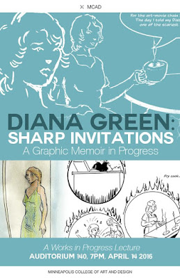
I presented this work last Thursday at MCAD as a work in progress. Attendance was scant, about a dozen people, all fairly receptive. I was honored and humbled to present the work. The meaning and scope of what I'm doing becomes more clear by the day.
Next: page 4.


No comments:
Post a Comment