Thursday, January 3, 2013

Best Comics of 2012: No. 11: Dial H

Okay, this one needs a bit of background for any neophytes.
In 1966, writer Dave Wood, who also co-created Challengers of the Unknown, co-created a new feature in House of Mystery. It involved a boy named Robby Reed, who used an old school telephone dial (no phone, just the dial). By dialing H-E-R-O,  he transformed into a random superhero.
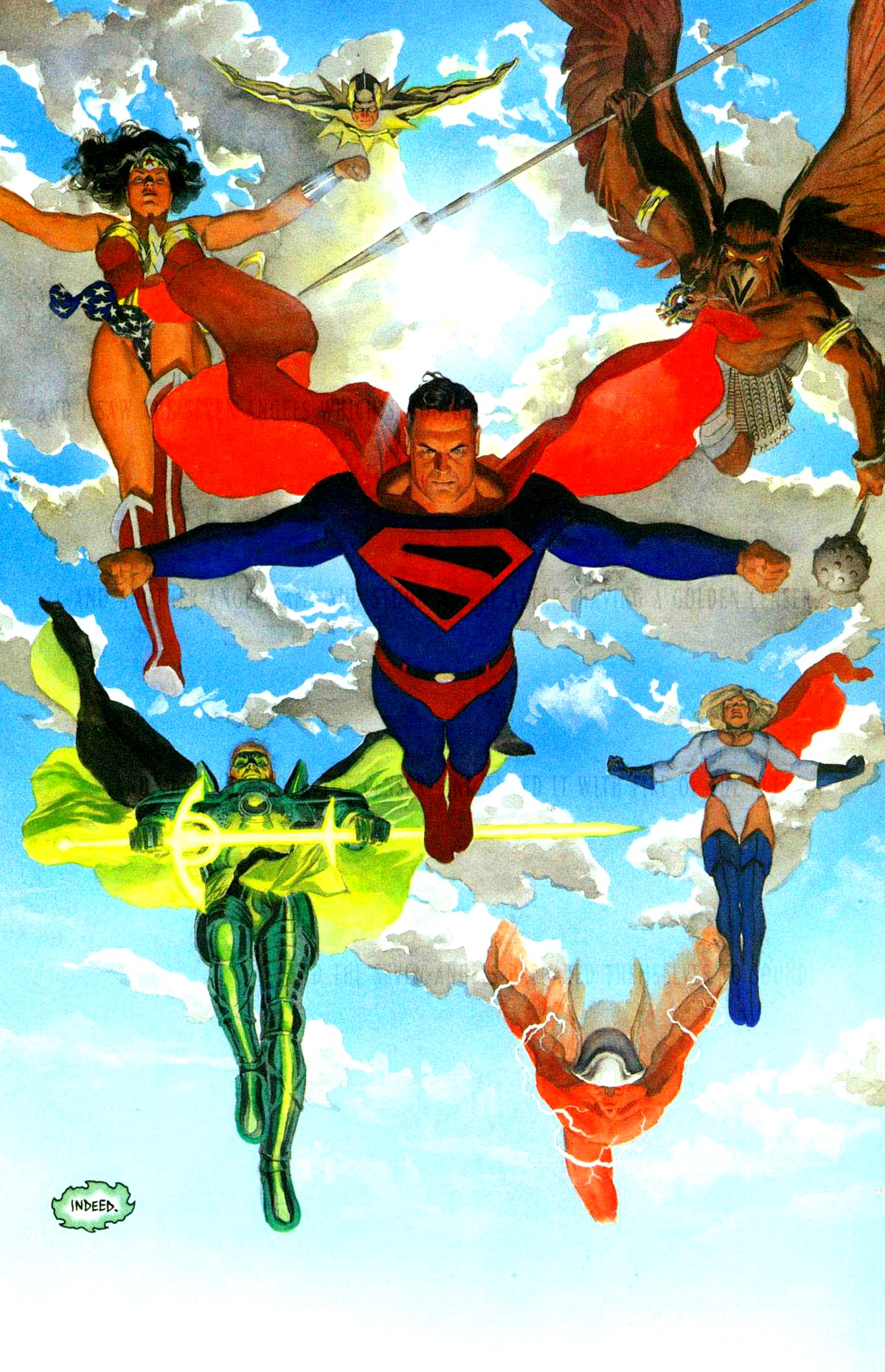
Here's an example of one of his transformations.
And let us not forget his "cuss word", "sockamagee!"
The original storyline ran through 17 issues of insipred silliness, with a couple of random appearances by the character in the 1970s.
The stories were silly fun, fairly imaginative 1960s superhero fare.
One of Robby's transformations was to the classic version of Plastic Man, who had been neglected in comics for many years at that point.
There was a revival of the character in the 1980s, covering eleven issues of Adventure Comics (a title that never should have been canceled).
A couple more spot appearances, then nothing until 2003.
The 2003 H.E.R.O.  series ran for 22 issues. Here the focus was on the dial itself, and its effect on those who used it, reminiscent of the interaction of the Helmet of Nabu and those who become Dr. Fate by wearing it.
This brings us to the current series, Dial H, written by SF writer China Mieville and illustrated by Mateus Santolucco.
Meiville is a scary talented writer. I loved his dense, poetic novel The City and the City, and I'm embarrassed to say I've yet to read his multiple award winner and nominee Perdido Street Station. Meiville is also so politically active and aware he makes me look like a conservative. Scary, that.
His work here is a bit of a departure in some ways.

The story follows the original model: unwitting guy, attempting save his friend from a beating, accidentally dials H-E-R-O, this time in a deserted and ramshackle phone booth, and transforms into a superhero.
This time, the guy is a down on his luck middle-aged slob, jobless, hopelessly obese and depressed, and alone save one friend who's just about had it with him.
Meiville's story is infused with acerbic wit. Now ordinarily I'm not a big fan of snark (unless, of course, it's my snark). But it's to Meiville's credit as a writer that the characters retain their humanity and that we can and do still care about them in the midst of this silliness.
The book maintains genuine excitement and tension in the midst of the silliness. One need only watch the classic Abbot and Costello Meet Frankenstein to see how this is possible. The central plot involves an adversary, Ex Nihilo, who is putting people into comas as part and parcel of an inter-dimensional plot.
Here's a sampling of issue 1's adventure and absurdity.
Captain Lachrymose indeed!
Santolo's art serves the story very well. His imaginative character design is crucial to the story and particularly noteworthy. Part of a wave of talent from Brazil that both Marvel and DC/ Vertigo have used to great effect in recent years (think daytripper, the current Justice League and Green Lantern), this is quite welcome, and reminiscent of the influx of Filipino artists in the 1970s.
This is part of the "second wave" of DC's New 52- a bit disingenuous in my mind. If it's still "new", how can it already have a second wave?
The first issue sold just over 45,000, a little more than half of Batman's current sales averages. Following the current belief that single issue sales are merely loss leaders for TPBs (the first volume of Dial H, titled Into You, is due out in April 2013), the figure is acceptable, and the book seems to be holding its own.
I do have concerns about marketing. After all, there's no central hero costume to sell, and the merchandising? Toy phone dials in the second decade of the 21st century? I don't think so! Can't really use the phone booth itself, it's sort of been done.
So Number 12 was a revisionist  retro book inspired by a 1960s DC trope.
Number 11 was the same.
Tomorrow, we'll look at Number 10, which should sort of end the century. Maybe.

Wednesday, January 2, 2013

Best Comics of 2012: No. 12: Earth 2

Beginning my start of year countdown of the ended year's best.
As stated last year, I have mixed feelings about DC's "New 52" concept. I don't completely see the necessity in narrative terms of scrapping decades of stories just to start over. But I do understand the commercial necessity of attracting new readers, and I know on a practical level that you can't always do that with old stories. I also accept the notion that a mythos needs to be reinvented every generation, and New 52 factors into that.
That said, I've fallen away from most of the New 52 titles. Everything is urgent, fast, and full of so many gritted teeth that I suspect what the new heroes really need is one of the fine laxatives on the market. I also question the frequency of these "cataclysmic" epics. When every story is an Earth shattering new mythology that will change things forever, it rapidly becomes mundane.
There are a couple notable exceptions.
First of these is James Robinson's Earth 2.
This has many of the aforementioned elements I find tedious, but it uses them effectively and consistently rises above them.
This is in no small part due to James Robinson's storytelling. I've made no secret of my admiration for his work on Starman (though I have mixed feelings about his script for the film version of League of Extraordinary Gentlemen). Robinson manages to effectively meld characterization and action with the space opera superheroics that charmed so many us relics in the 1960s.
In some ways this is reminiscent of DC's First Wave of a couple years back- reinventing heroes and their relationships with one another, all while on the move in a nonstop story owning as much to Republic serials as to more recent comic storytelling innovations.
But here we begin by doing away with the Big 3.
In issue 1,  we lose (or possibly just misplace- I'm a couple issues behind) Superman, Batman and Robin and Wonder Woman.


Then things pick up steam.
With no heroes (or as they're called in this narrative, "wonders") left, Earth seems helpless against the onslaught of dual forces. First is an elemental force, building on now decades old concepts in Alan Moore's Swamp Thing. Second comes a "save the world by destroying it" threat in the person of one Terry Sloan.
Robinson's playing with some great concepts here. He crosses some of the origins to create hybridized versions of the heroes with whom we're so familiar. The Atom is a military man with atomic powers, a la Captain Atom. The Flash is granted power by the god Mercury, making him something of a Wonder Woman pastiche. And Green Lantern builds on the Swamp Thing Earth elemental concept.
There was substantial ballyhoo concerning Alan Scott being reinvented as a gay man. It struck me as a tempest in a teaspoon. Robinson has written smart gay characters in the past (again, see Starman) and he handles Green Lantern's personal life with equal aplomb.

More significantly than the character being gay, there is a plot element that plays out involving a choice between Scott's sexuality and his new mission as a wonder.
When tempted by a false image (an echo? a simulacrum?) of his deceased lover, seen at right in his introduction (while still alive in the storyline), Scott chooses to abandon the illusion of contentment for the struggle to do right.
This is Orpheus, this is Christ in the desert, this is the temptation of Doctor Faustus, this is Jabez Stone fighting for his soul.
This is the stuff of myth and faith, dressed up in ecological superhero drag.

And it works.
Unlike Keith Giffen, Robinson knows how to temper the bickering between his protagonists to keep it from becoming tedious, though it does come close at times.
But the interaction of Hawkgirl and the Atom poses a challenging dynamic. Her "I don't have time to teach you this stuff" tutoring of the impulsive Flash is equally engaging.
The most recent issue I read was no. 6, so I'm about 50 pages behind on this story. But rest assured, I will catch up.
I'd be remiss if I failed to note the art of Nicola Scott. Team books tend to be overly busy and loud, but Scott brings subtlety and just the right measure of ornate design to her work.
She manages to maintain a high level of detail and accuracy, even when illustrating crowds and battle scenes.
She also never neglects to show emotion in her faces, and is quite adept at doing so. Others have compared to George Perez, which in turn evokes comparison to Phil Jiminez. I think those are valid analogies, but I'd go a step farther and say that her storytelling chops homage the man I consider the master of superhero art, Curt Swan.
I've enjoyed her past work on both Birds of Prey and Secret Six. Ideally, Earth 2 will increase her recognition and options for work. I'll be keeping up with this Australian artist!
Tomorrow: Number 11 of the Best of 2012,  another entry from the New 52.

Sunday, December 30, 2012

Original Art Sundays No. 146: TNT news

Back after a week off for no reason other than the holidays!
Here are some older editorial pieces.
But first, a brief explanation.
In the early 1990s, there were two magazines on transgender politics that took a slightly more "street level" approach than the academic journal Chrysalis.
One was Davina Anne Gabriel's TransSisters, which we've discussed briefly in the past. Ran ten issues from September 1993 to Summer 1995.
The other was Gail Sondegaard's TNT NEWS. This ran from 1994 to 1997, running eight issues.
If memory serves, that is. I don't have all my files copies of the latter at hand.
At any rate, I did editorial cartoons for both.
One of the TNT cartoons, Pinkette and LaBrainne, has been published here before. I'd like to offer a couple others this week. These are two of my favorites. The art is serviceable, the writing is sharp and on point, if a bit dated for at least one of them, and they come together fairly well.
These will be included in The Complete Tranny Towers, if and when it's done. The first one uses a Tranny Towers character!
Actually these stand up better than I thought they would.
I do have to note that there are a couple others with alarmingly bad art. I will not post those, but will include them in the aforementioned book, with a healthy dash of mea culpa.
The "change for a dollar" gag is adapted/stolen from a Bernie Wrightson poster. See the end of this post.
And the Mr. Haney vibrator line is a classic among us devotees of Green Acres!
The issue of stealth remains significant, but has lost some of its explosively divisive properties over the years.
Still.... a story comes to mind.
My last girlfriend suddenly moved to Texas to care for her mom about a month after her final surgery.
A little odd, but then we all have choices to make and I respected her for caring for her mother, even though we were getting rather close and her handling of the matter hurt me a great deal.
We talked a year or so later, and she was dating a guy. She was quite happy.
Well, good. We all get to be happy.
But he didn't know about her past, and she wasn't going to tell him, and isn't that wonderful?
Well.... no, it's not.
I mean, yeah, it's wonderful that you succeed in the world so well that you have that option. But there's more to it than that.
Deciding when and where you're out about your gender history is a complex issue. It touches on matters of integrity, mental health and physical safety, not to mention just plain wanting to be accepted on your own terms. And every decision around it has to be weighed VERY carefully.
This stuff can drive you up a tree. I used to worry obsessively about who knew, who could tell by looking, who was and wasn't laughing, on and on and on.
That will put a real crimp in your day.
Then after the end of my abusive relationship, about which I've kvetched in the past, I started assuming everyone knew and stopped worrying about it.
The paradox was that many less people knew after I took that tack!
However, in the midst of all that, it must be said that there are some people who have a right to know if you respect them. Close friends, family and partners/lovers/spouses fall into this category. It's their business if you value them in your life. If they can't handle it, that's on them, but those are the people you should trust.
Tuesday is January 1, 2013. and I'll begin my Best Comics of 2012 countdown then.
New art resumes January 6.
Now, here's that Wrightson piece!

See you all next year!

Wednesday, December 19, 2012

Original Art Sundays (Tuesday) no: 145: Surrealist Cowgirls, p. 14

Posting a couple days late, just due to being too busy again. The scan was just sitting there waiting for me.
Now the page.
As you recall, our heroines were standing atop the onyx pyramid looking down into a miles-deep core of solid crystal.
Their plan was to jump in.
And here they go.
I got the idea of falling through solid crystal from Steve Englehart's Silver Dagger storyline in Dr. Strange.
The other inspiration was one of the covers of the Waid-Ross masterpiece Kingdom Come. I don't much care for some of Ross's work- too stiff- but Kingdom Come worked very well, especially in the larger Absolute format that doesn't overcrowd the claustrophobic art.

This is the image I had in mind when I plotted this page:
The notion of someone floating, cascading down through solid glass appeals to me on a very profound level.
No scanner access after Wednesday, but I do have a few images backlogged and I hope to scan an extra one when I'm at the Service Bureau tomorrow putting the finishing touches on some Christmas presents!
Things are building in our current story, and I hope to offer the next page first thing in the New Year!
I'm also building for my Best of 2012 list!
 

Sunday, December 9, 2012

Original Art Sundays no. 144: Surrealist Cowgirls, p. 13

Finally took time to make minor corrections and post this page. I love teaching and writing, but they play hob with my art schedule.
Oh, for balance.
Ahem. The final page.
 I went nuts trying to sort out the layout for this one.
An overhead shot of the top of a ziggurat...
it works fairly well, especially the part with Whalliam and Louise's mule. I cobbled the perspective on the figures from a couple panels in Watchmen, but it might need to be pushed further.
The other frustration I had on this page was that my ink was old and gummy and faded. After the page was done, I tossed it and am switching to ProArt Deep Opaque starting with the next page.
My original layout for this page, seen below and on the back of the final art, involved a less dynamic opening angle and a much larger final panel. The facial expressions were more involving, but it didn't really communicate a proper sense of place.
I'm really eager for the next page!
Next week... ideally the next page. We're coming up on a couple weeks of down time between semesters at MCAD, so I need to complete my scanning ahead if I want to continue to post.

Sunday, November 18, 2012

Original Art Sundays No. 143: Surrealist Cowgirls poster

Back in the saddle yet again.
The next page is done, the following page is on the board and laid out, but I will not be able to scan until tomorrow or Tuesday.
Meanwhile, here's the poster I created for the MCAD faculty show this fall. Nice to see the work so big on the wall! Will amend this post with exhibit photos after the upload.

This was an object lesson in the old saw about screen color vs. print color. There were numerous glitches that didn't appear on screen but were glaring in the printout.
I went through four prints before I got one that met my standards.
A quick job, but I like the dappled look of Whalliam. Unless he's in a fire and completely dried out, he will look this way in all environments.
The story is taking an interesting turn, as you'll all see next week.
Until then- Happy Thanksgiving!

Sunday, October 28, 2012

Original Art Sundays No. 142: oddments: bison and pirates

Still writing like a fiend and a mile behind on grading. I have a total of 26 entries left to complete for the long-overdue Comics Through Time project, and am trying to give it priority without harming my teaching career in the process.
Always a juggling act, this academia.
Also inching along on the next page. One of these days I'll get frustrated enough to take a couple hours and put the finishing touches on it.
Meanwhile, here are a few older pieces for your enjoyment.
First up, a traditional airbrush piece from 1991. I always liked this one, but most folks who have seen it are lukewarm to it, for unspecified reasons.
I like the fact that it's hand work! I really miss my old Badger airbrush- no idea what happened to it. I suspect I lost it in the Great Relationship Disaster of '93.
So it goes.
The grasses could be a little subtler, and the fade to the sunset a bit more gradual, but otherwise this piece really grabs me.
I always thought this would be a nice T-shirt. Please don't steal it!
A few years later, circa 1997, I completed a handful of illustrations for a proposed children's book. I had written it as well. Sadly, most of the text is gone now (though I could rewrite it fairly easily, I suppose) and these illustrations are pretty much all that's left.
The book was an alphabet book on pirates.
There were a couple other pages that I liked, but they were too derivative of other works- in one case, Charles Vess' work on the Marvel graphic novel The Raven Banner, in another, Joe Orlando's pirate pages in Watchmen- so if I ever move farther on this project (big if!), I'll rework those.
Here are the pages and their alphabetical topics:

Women Were Pirates too!

Privateers

Hispaniola, the Pirate Haven

Mostly painted with colored inks on heavy watercolor paper.
Again, there are things that work here and things that don't. I'm most pleased with the image of women pirates, because my research was so spot-on, and because I like the mood of it.
The girls looking on in the bottom corner are the ostensible stars of the book. The blond is exploring the world of pirates and immersing herself in it. She shows up on scattered pages. I thought every page would be a bit much.
Next week- more something. I hope for a new page, but- more something!

Sunday, October 21, 2012

Original Art Sundays no. 141: Surrealist Cowgirls cover!

Back after three weeks away.
Oh my Lord!
This Encyclopedia project is killing me, but I'm almost done. Only 28 entries to go.
Meanwhile...
I've been poking at this whenever I had a couple minutes. You may recall that I posted the black & white art a while back.
I'm not sure if I consider this final- too tired to render a verdict at the moment- but for now, I'm happy with it.
Got WAY hung up on the details, but I think it came out OK. My other big idea was to do a pastiche of the cover for Superman Annual No. 7, with Whalliam sitting in for the Superman statue.
But it struck me as a bit overdone.
Not that this idea is all that fresh, being derivative of Laugh Kills Lonesome by Charlie Russell.
next week: either an oddment or the overdue new page!

Monday, October 1, 2012

Original Art Sundays No. 140: oddment: Broturra!

Haven't posted for a few weeks, after an extended run of meeting my self-imposed deadline.
Now that I'm almost over a nasty bout of shingles and a couple other deadlines have passed, I'm happy to get back to it.
Today's offering is inspired by a bit from the original Beverly Hillbillies series. Jethro, Ellie Mae and their dates were at the drive-in watching Broturra, The Swamp Monster, which was really some clips from the Danish monster movie Repticilicus!

I remember Ellie Mae shouting "yonder comes the swamp monster!" I thought it was a great line, absurd as all get out, and I coupled it with my love of Leave It To Beaver to create this odd little page.

Another little story I never finished, but it was more an exercise in silliness than anything else. Funny thing: I didn't know Reptilicus was Danish when I gave the father figure that name!
I still haven't posted the few images I took at the closing reception for the MCAD Faculty Show, or the new piece done for that show.
The next Cowgirls page is not yet done but is closer.
More art soon!

Monday, September 10, 2012

Original Art Sundays No. 139: oddments: surfer and Whoopi

Bit behind on the next page, but fear not.
Haven't posted oddments for a while, so here are a couple older pieces.
First up, a piece intended for an article on surfing.
The central image was back painted like an animation cel, and the background was a Photoshop manipulation of a scan of a Hawaiian shirt.
I was drawing on obvious Kirby influences, and though I was fairly happy with it, the editor didn't care for it.
The decision to violate the image border for dramatic effect worked against me in this case.
Object lesson: what works in comics doesn't necessarily work in editorial art.


Next up, a piece I thought I had previously posted but cannot locate in a quick search: a coquille board of Whoopi Goldberg, something done just to do a portrait.
I've always really liked this piece. There are only a few of my own works that I'd consider framing and living with them, and this is one.
The textures, the facial features, the pose: it all works. There's a strength and a vulnerability to this piece. Coquille board is such a great medium. It all comes together.
Well, except the smoke.
I could not get the smoke to behave the way I wanted it to.
I tried white colored pencil, but couldn't get it to overlay the ink. I considered scratching it out, but I was leery of ruining the work.
I finally decided on white ink, applied alternately with a small brush and a crowquill pen.
Like my Billie Holiday scratchboard portrait, one of the first pieces I posted here, the emotional resonance of the subject matter comes through.
Next week: the Cowgirls ride back.

Monday, September 3, 2012

Original Art Sundays No. 138: Surrealist Cowgirls, the Lunch Box

A day late for no apparent reason.
New page proceeds apace, but is not there yet.
Meanwhile...
Something I've been meaning to do for a while.
I've had a fascination with lunchboxes for some time. I still have my Pigs in Space lunchbox from the late 70s.
Not my own, but a reasonable facsimile!
I'm usually opposed to the gimmicky stuff, but I'd like to see Surrealist Cowgirls lunchboxes, posters, PJs and beach towels. All done, not necessarily with taste, but with a combination of reverence for the source material and silliness. 
After all, I did make a Surrealist Cowgirls cartoon as part of my undergrad work. If I can get it uploaded from VHS to DVD to digital, I'll post it sometime.
Don't expect miracles. It's an odd under-explained gag, and aside from seeing the characters moving, it's only OK.
Ahem. That said.
As part of the MCAD 2012 Faculty Show (now up but scheduled for Opening Reception this coming Friday, September 14), I prepared a lunchbox.
Not so easy as it sounds.
With my burning desire to do business locally, I wasted five weeks trying to hunt down a blank lunchbox in the Twin Cities. Aside from some half size cheesy yellow plastic ones at the usually reliable wholesaler Axman- nothing.
I found a website, lunchboxes.com. I tried to commission them to do a custom job, which is part of their stock in trade. However, by that point it was early August, which is, of course, their busiest season, what with school starting and all.
So I ordered a blank and set to work on the art.
The Gang!
I still have to name the shapeshifting mule, represented here as a huge puppy.
The piece was done in colored pencil and ink, that the colors were pushed and border added in Photoshop CS6 (the new version, which I'm slowly learning/ relearning).
Design note: in retrospect, the floating Aztec winged light-bulb spire (well, what would you call it?) is a tad too close to the mountain- creates a bit of a merger.
I took the two printouts and did a simple pasteup.
The end result.


 Despite its crudity, I'm fairly happy with the end result.
Please join me in seeing this work, and the rest of the Surrealist Cowgirls exhibit, at the Faculty Art Show this coming Friday!
Next week: either more story or a field report on the opening.

Monday, August 27, 2012

Original Art Sundays no. 137: Surrealist Cowgirls, It Does This, p. 10

This is a very screwy series of events leading up to this page. Owing to the hour, I will simply post the page now and amend with the details tomorrow.  Details below the page.
I began this page in July, while working summer teaching sessions. It's been done for a while now, and now it's time to post it.
The layout of the top tier was based on discussions with my former student and summer co-worker Jack Kotz. Originally I had envisioned it as an overhead high shot in 3 point perspective, but it just wasn't working.
The second tier was easy. I love the tender silliness of the bunny hand holding in the first panel of that tier. It's also telling that Louise is the one who's afflicted and she's helping Maggie.
The last tier wasn't working at all. I pictured a triumph panel.
It was working, but I wasn't completely happy with it. I couldn't get a combination of scale and emotional response that I liked.
While I really like the drawing of Louise's mule (who has yet to be named, probably apropos for a shape-shifter) , it takes up too much real estate. No room for the rest of the case, and with two more girls and the whale-mule Whalliam still left to include, I decided it just wasn't working.
So I stopped in mid-panel.
But I was only blocked for a day.
Near the end of the session, I was talking the problem over with co-worker and longtime friend Rana Raeuchle,  who suggested the long shot with scenic in the foreground.
She also showed me a doodling app for my iPhone, which I've found immensely useful in plotting layouts. I do need to get some form of stylus to use with it for detail work- not that I'll be doing anything that detailed with it, but control is our friend.
I had the brainstorm of adding the boot of our mystery man, who's been following the group clandestinely, and his familiar, the giant snail. Some nice foreshadowing there. It should be noted that this last panel was done in ink, a welcome departure. I've fallen into the habit of working with markers, and I found getting back to inks quite fulfilling, and yielding a better result than I anticipated.
the inked replacement panel!

The original Chiss
It was time to name the snail. I puttered in my bookshelf for a bit, and found Chiss in The Patchwork Girl of Oz, one of my favorite Baum volumes. Chiss is a giant porcupine who can throw quills in multiple directions. I liked the way it sounded, and the implied speed in the name worked well with preconceptions of a snail's slowness.
Even though I've been working with the Surrealist Cowgirls since 1994, I'm still learning who they are. I suppose that's what people mean when they say characters become real, but I'm reminded of the words of Jane Yolen: if you think your characters are real, try borrowing ten dollars from one of them.
The following page is now on the board. Now that the Cowgirls are on top of the ziggurat, the story takes an intriguing turn, as the quest to cure Kay Seurat-Seurat continues.

Sunday, August 19, 2012

Original Art Sundays no. 136: Surrealist Cowgirls, p.9

Damn near killed myself getting the work together for the MCAD Faculty Art Show, but I made the deadline!
I had just finished working on the last piece when I stood up and stumbled on the leg of my drawing table chair, taking a nasty tumble, scraping and twisting my left leg in the process. That was at 5:30 Friday morning and I'm still a bit sore.
What we endure for Art, eh?
Well, here's the next Cowgirls page. It's been done for more than a month, but I wanted to post the rest of the other story first. I have one more page already completed after this one, plus another almost done and three bonus pieces prepared for the show, so we're good to go for a while.
When we left out intrepid party, Maggie and Louise (who was "bunny-fied" by accident) were escorting Kay Seurat-Seurat to a mysterious black structure, on their journey to try to cure her devastating case of rheumatism of the spirit.
The journey continues...
I need to find a fresh visual pun for landscapes. This is the third time I've used "foothills". I like it, but variety is our friend too.
The spring-fed pool gag would work better if the pockets on the pool table were better defined.
Overall, I think this is a durable, fun page that advances the story.
Next week: the next page! Wow! If I can stay organized during teaching fall semester, I should be able to maintain the pace for quite a while.