HI all!
Took a couple minutes to add color to the alternative cover for my current Kickstarter.

HI all!
Took a couple minutes to add color to the alternative cover for my current Kickstarter.
Quick follow up to yesterday's post.
The campaign started slow, but is picking up steam. One of the rewards is an alternative cover by Kevyn Lenagh. I just got the art a couple days ago and did some quick typography.
The astute viewer will note the presence of Kevyn's iconic character Domino Chance!
It's in black and white right now, but I'm adding color. But hey, I really like the B & W!

HI all,
Just a quick announcement. My first Kickstarter, Make 100: Surrealist Cowgirls 80 Page Giant is live through the end of January.

Well, now that the hectic semester is done and my first Kickstarter goes live soon, I can devote more time to posting art.
FYI, the Kickstarter is a Surrealist Cowgirls 80 Page Giant!
Here are a few more Inktober pieces from this year.


My stab at doing The Spirit. Always fond of this character. Eisner's work on this helped shaped my perception of everyday stories being told in comics. Almost all freehand, lots of ink and brush and just a bit of marker.

Oh, I like this one! This is Marie Severin, based on a painting by Johnny Craig. The painting ran in the book Marie Severin- the Mirthful Mistress of Comics. I think Marie's work was sometimes stronger than her brother John's work, and that's saying a lot!

Another one for the guitar book. This was based on a drawing on the inside cover of a Harry Chapin album. Harry's albums often had eloquent illustrations of the lyrics. I could have pushed this farther, but I was happy with where it stopped. Did a quick underdrawing and just went with it, correcting as I went. Lots of Micron markers on this one.

Took a couple stabs at this one. Obvious shot from The Prisoner, a perennial favorite series. It's tricky because of star Patrick McGoohan's almost complete lack of eyebrows! Marker for the mechanical lines only. The rest was nib and brush. The astute observer will note more drybrush at the base of the image.

Thomas Sondegard, artistic director of the MN Orchestra. I haven't gone very much this season, and I do miss it. This was a copy from a promo mailing. I took a couple minor design liberties. This is almost all brush work.
Well, that really got away from us! Between midterms, union work, concerts and starting new projects, I only completed about half of Inktober this year and haven't posted for a while. Now that I have a minute to breathe, I'd like to share some of this year's completed works.
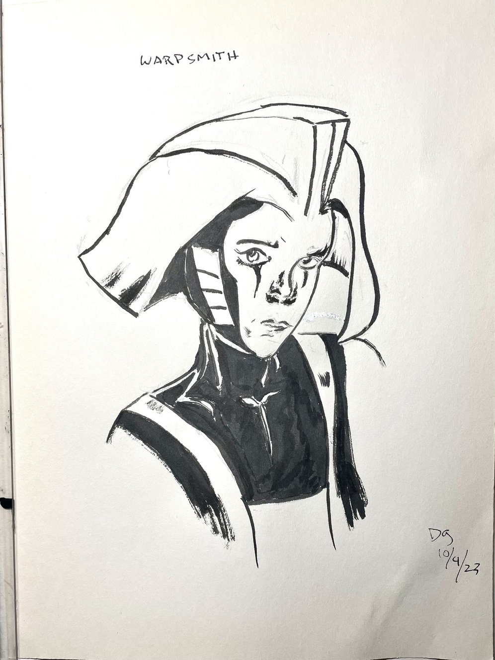
My vision of the Warpsmith, inspired by Neil Gaiman's current run at finishing Miracleman. I have very mixed feelings about how the storyline seems to be resolving, but I'm very pleased with the quality of the work. This is straight pen and ink, with some brush work here and there.


Dc really blew it in reprinting these. It's one of the best kids' books ever done, so yeah, let's bring it out in a $60 hardcover! Good thinking, moguls.

October 13. Another vision of my elusive character Blue Wild Abandon! Black and white ink on colored paper. I came into a stack of miscellaneous colored papers and have been enjoying them no end.

October 15. Brush and Sumi-e ink.Playing with Japanese floating world ideas and having some fun drawing a kitty.
I have quite a few more, but these are the ones I have ready to put in this long overdue post!
Next: either new page or the rest of these.
This promises to be a very hectic week: midterms, two concerts and a visit from my sweetheart. Yeah, I know, first world problems. Be that as it may, I did want to get art posted, whether I had time for a new page today or not. As Inktober has begun, here's Day One!

This was inspired by a panel from the Phil Jiminez chapter of Wonder Woman: Historia. Rather than to try to bring my modest skills to the pinnacle of Phil's work, I made a couple modifications to make it my own.
The core concept, poses and basic layout are all Phil's, of course. Somewhere along the way, I garnished a small stack of Canson colored papers. I noticed by sepia inks, which got quite a workout during Inktober last year, and inspiration struck. I've been fascinated by the notion of white color pencil highlights on color stock, so that came into play as well. Not sure if the clouds are working, but they were a whim, and I'm fine with them as such.
Last two years, I made it through the whole month of Inktober. I hope to make it 3:3 this year. As with past years, I don't give two figs about the suggested prompts. I just want to try to stretch myself as an artist, as an inker, and see where it takes me.
Tools:
Next: More Inktober, the next page of Sharp Invitations, or possibly both!
Another quick episode this week.

Once more, here we go! Some delays due to personal issues, now mostly resolved.
When we left, our heroine (me) was on a phone call to Mother, talking about coming out.
Read on.
Sigh.
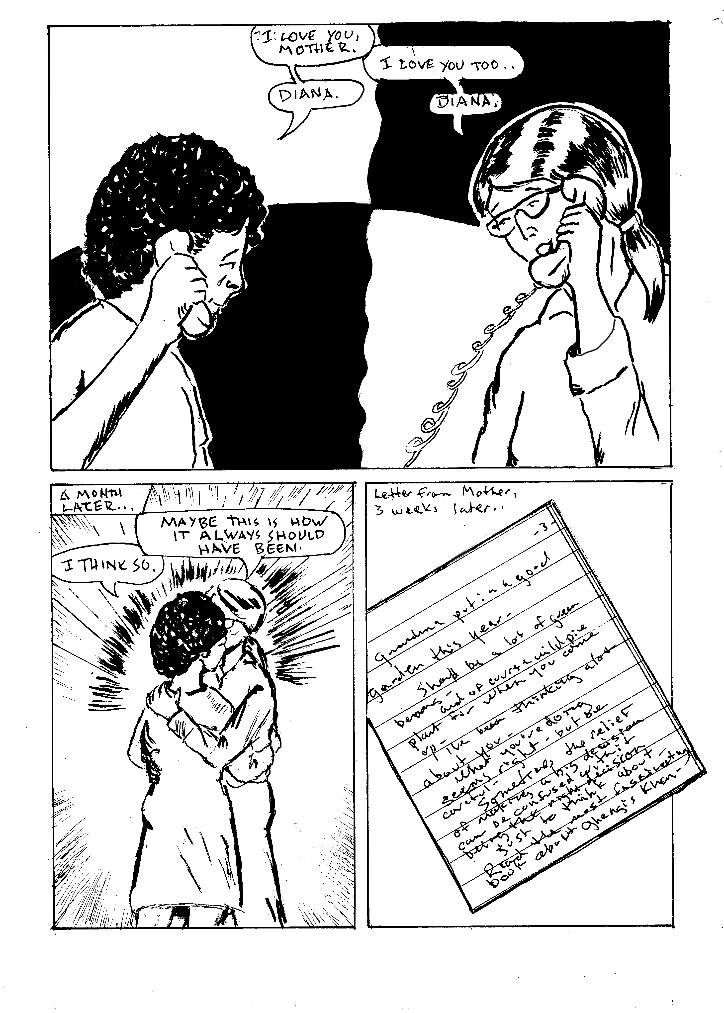
The text of the letter was a challenge. I don't have the original letter any more, but it resonated with me. I tried to simulate Mother's handwriting, which was illegible to anyone but family. I will include the text in a supplement in the finished book, but here it is.
"Grandma put in a good garden this year- Should be a lot of green beans- and of course wild pie plant for when you come up-
I've been thinking a lot about you - what you're doing seems right- but be careful- sometimes the relief of making a big decision can be confused with it being the right decision
Just something to think about-
Read the most fascinating book about Ghengis Khan"
Mother didn't use periods. Everything was dashes. I debated typesetting this, but reproducing her handwriting seemed more - well, proper.
In narrative and in design terms, this page advances the story well, but the content is static. I toyed with a couple ideas for the first panel. I wanted to convey that we were still in the same phone call without using the same visual devices. I reused the poses from the previous page and just changed the positions and expressions slightly. I thought the split and reverse of heavy blacks worked well. And I liked the wavy line!
Panel two: I wanted an emotional moment without a close up. Too many close ups lately! The 3/4 shot of me and Mother embracing shows emotion, and shows me out of "boy cosplay" in front of family for the first time. The action lines give it a little weight. Panel 3, the letter, was a strategic narrative choice. It brought the page to a satisfying conclusion, and said something about Mother's thought processes.
Tools used on this page:
Time for the next page!
When we left, our heroine (me) was about to have The Talk with Mother.
Read on...

Well, isn't that the way we all hope it goes? Genuine unconditional acceptance.
To unpack (so to speak) the contents of this page: Coming out to family is one of the scariest things a trans person can do. Though I waited to (ostensible) adulthood and was at no risk of being expelled from my home, as happens to many of us, there's always the risk of losing family. I was lucky. I managed to hold onto much of my family.
It's always a bit disturbing to draw my old self - "cosplaying male," as someone dear to me says. At this point, I'm beginning to transition, so it's not as unnerving. But it's part of the story and it needs to be told, so that's that.
These moments are so spartan that backgrounds disappear. I considered doing loose pencil backgrounds to give a sense of space, but elected to go sparse instead. This must be the 20th time I've drawn people on the phone, and the hands always give me fits! The thing to remember is that the hand is planar. The bulk of the palm is a big wedge. When you're holding something phone-ish, that plane follows that shape. I got a little carried away with inks on the last panel. That depth shadow on the cheek doesn't read quite right, but I can live with it. Might add it to the list- go back and change later. There were some artifact castes in the image capture- again with the gray tones from the paper! I chose to leave them in on that last panel.
The large black area in panel one is another approach to the challenge of drawing a phone call. I want to imply distance without overusing the old saw of the dividing phone cord- same problem as last week. This solution is new to me. While it gives the panel, and the page, good weight, I don't think it's a visual device I'll be using often. I do like what I've come to call the "Terry Moore arc"- an arc over two panels with a solid area or a texture. He has fallen away from it as a default device, but he used it reguarly in early Strangers in Paradise issues.
I chose to leave in some of the pencil lines. I like the rougher textures sometimes.
I enjoyed scumbling with a bit of dry brush on the hair. I find that technique shows up more and more in my work. I continually sense a potential breakthrough in my work. I'm most happy with my work when it's most flowing and fluid. If I could just have a breakthrough moment! Closer, closer...
Tool list:
Here we go with the next page.
When we left our adventure, our heroine (me) had just been introduced to- indoctrinated in?- Tolkein.
Read on.

Lots to unpack on this seemingly simple page. In the first panel, there's a quiet family moment. The younger brother reading the comic, a youthful me with a Beatles haircut reading a teen magazine, sporting the disaffected demeanor of a 14 year old. It felt light, so I added textures to the couch and a holding line to define the corner of the room. One of my Beta readers pointed out that the line also establishes division between me and the rest of the visible family.
The second panel went through several revisions. I had settled on a tight close up of Mother's eyes while she read, but I went with a profile shot of her instead. The scope of a stack of books and a random texture for a background got the message across more clearly. The randomness of the stack foreshadows later events in Mother's life. In a caption, I was able to allude to the passing of years with just a few words. This is an old comic artist's trick. How do you draw an army of 10,000 advancing soldiers? You draw two generals talking. One of them points off panel and says, "Look, here comes an army of 10,000 advancing soldiers!" Of course, if you're Al Williamson or Wally Wood, you just draw the furshlugginer army, to quote Harvey Kurtzman (yay, early MAD!). Yeah, I know it's a Yiddish word that he appropriated and that's not quite the right meaning. I'm okay with that. Hey, if it's good enough for Harvey....
The skipped years will show up in the next chapter, the one on my Father.
The final panel is subdivided. I was looking for a better way to convey an old school phone call. I like the visual device of a phone cord as a panel divider, but I've used it so many times, going back to the Tranny Towers strips (I haven't forgotten about my mad scheme to get those ancient scrolls back into print. Soon, my pretties....). The device of isolating each speaker within a larger panel seemed to serve. I toyed with the idea of adding weight through a background texture in the white space between the circles, but it proved distracting in tissue overlays, so I again concluded that less is more. Another possibility considered and rejected: dropping the holding border. I also thought about doing a little arrow text box to call out the early 80s perm I briefly sported, but it seemed distracting and redundant. The perm also foreshadows my first tentative steps to being more publicly femme.Technical considerations: the shape and position of word balloons was embarrassingly bad. I was able to move things around in Photoshop with relative ease.
All told, a simple quiet page that advances the story.
Tool list:
This one took a bit of doing. More about that in a minute.
For now, let's resume our story. Mother had just gotten some books, freshly published in the US(o so she thought) . In an unusual move, she offered to pay us to read them, and I took her up on the offer.

The astute Tolkien scholar will be aware that Mother was wrong. The first US publication was in 1954-56, with paprback volumes first appearing in 1965 from Ace Books. Editor Donald Wollheim contended that the works were public domain and printed them without approval. Due to fan pressure, this edition was withdrawn and Tolkien was paid a nominal royalty. The Ballantine paperbacks, the edition Mother got us, appeared in 1966, making the NY Times bestseller list. So Mother's claim was true, sort of, to the best of her knowledge.
I'll talk about my reaction to these books on the next page. These stories intertwine, and focus becomes crucial. I have to keep this chapter of the story about my relationship with Mother, and how it effected my life as a trans woman.
On the mechanics of this page: I had one of those "see the page in my mind" moments. When I started looking closely at the mental image, I realized it was pulled from Hildebrandt illustrations, the first Lord of the Rings movie, and this image by Rowena Morrill.

Sigh. I do love Alfred Bester.
I resolved to push the contrast by working with Coquille paper. This is a texture I love, and during my undergrad, I began a sequel to The Devil and Daniel Webster using this medium (another incomplete work!). I realized my plot was much like William Messner-Loebs' neglected work Welcome to Heaven, Dr. Franklin, so I moved on. But it was time to go back to Coquille, or as it's now marketed, stipple board.
I worked up numerous preliminary sketches, diligently laid out the page, redrew the hand holding the brush and the kid in the corner reading to take advantage of the board's texure, and dove in, working to capture the urgency of the encounter with the Balrog. The result was not without problems.

What to do?
I mused on other possibilities. Different interpretation of the beast? Different angle? I liked the big dramatic moment aspect of this, but it just wasn't working. It was great fun to draw, but the end result just didn't have it. I had to accept that there was no saving this, at least not within my self-imposed deadline.
I resolved to keep the parts I liked and move on from the rest.
Around the same time, Mother used to read the work of self-proclaimed psychic Edgar Cayce (but really, aren't all psychics self-proclaimed?). Late in her life, I asked her why, since it was so far afield from her beliefs. She got one of her classic introspective expressions and said, "well, I look at a lot of ideas, keep what's of value, and discard the rest." That's a good philosophy for resolving art and storytelling problems. I also realized that since so many skilled artists have tackled this material over the decades, I was setting myself up by trying to match or exceed them, and resolved to just compete with myself- never easy! I went back to my 64 page outline and looked at the rough for this page. It served as an effective model, a viable alternative. Again using stipple board, I did the primary illustration for the more successful page that leads this post. I composited it with border elements from the less successful Balrog page, and achieved a satisfying result. I could have gone another version, but again, deadlines.
I wanted to give a sense of both the reader's involvement with Lord of the Rings and the thrill of the work itself.
I greatly enjoyed working the China marker and scumbling brushes. This page (pages) took much longer than usual, but I was having such fun! I like working in loose flowing lines and textures. The pages and images that satisfy me the most tend to use these. I seldom do battle scenes. I want to be better at them, so I should do more!
Materials list is extensive on these pages.
Next: book club and a parting of sorts.
Once more into the adventure!
When we left our hapless/intrepid family, the kids (us) were coming into their own, slowly. Mother had begun taking painting classes on night a week.
One night, she had news.
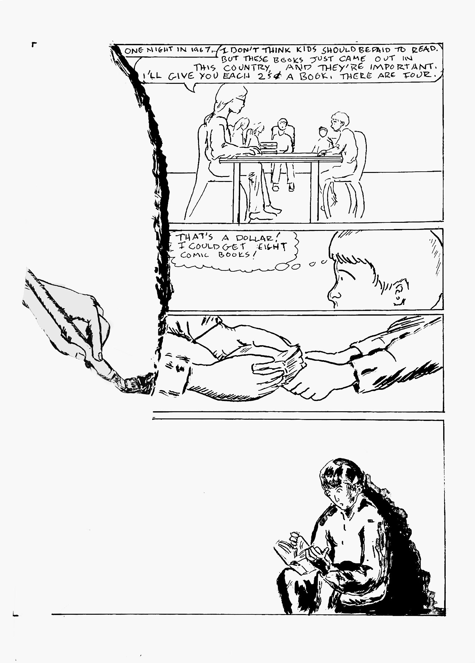
Continuing the brush stroke motif from last page. This motif will carry on for one more page.
Story and art notes intertwine on this page.
The astute observer will note that the hand has moved down the page a bit, but the left panel border is still defined by the implied brush stroke. In the original art, I had the hand a bit higher on the page, but it was too close to the location on the previous page to imply motion. Minimal corrections on this page, primarily eliminating the local color of the paper in Photoshop. I sometimes have luck with the Threshold command in this process, but with the bit of wash on the last panel, that wasn't an option today. Threshold has an almost bitmap effect, making everything rather stark and dropping gray values.
I am reusing the rather static panel with everyone sitting around the dining table as an establishing image for the page, with some minor changes in pose and slight aging of the kids. Perhaps the aging is too subtle, but my Beatles haircut was on point for my age of 14. I don't know if there will be a page in the book for this or not, but I was originally forbidden to listen to The Beatles. Once they got a Saturday morning cartoon show, it was somehow okay.
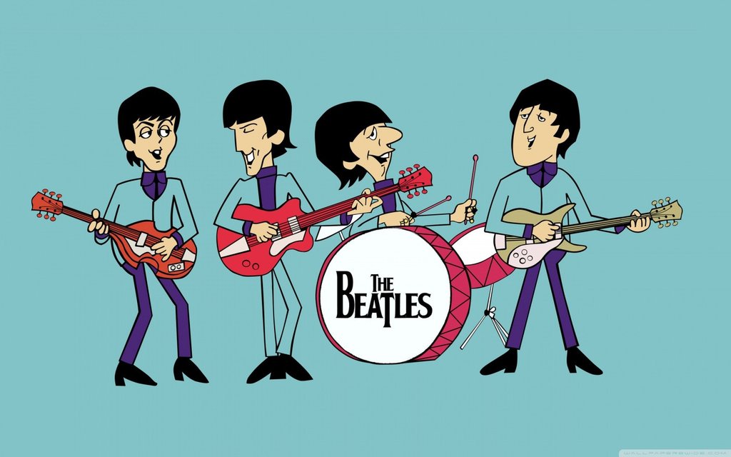 |
| I learned to draw The Beatles in this style by copying a TV Guide article on the cartoon series! |
There may or may not be a chapter on music at some point. It's such a huge part of my life, but I do want to keep this book focused on the main theme (and under 500 pages!). I have to focus on the three things this book is about: growing up relatively poor, trans identity and domestic abuse.
The art in the last panel is slightly more complex than my usual work. This is a lead-in to the next page.
Tool list, just because it's been a while:
On to the next page of our story. I rather like this one.
When we left our family, Esther was starting to pull her life back together while she raised five children alone.
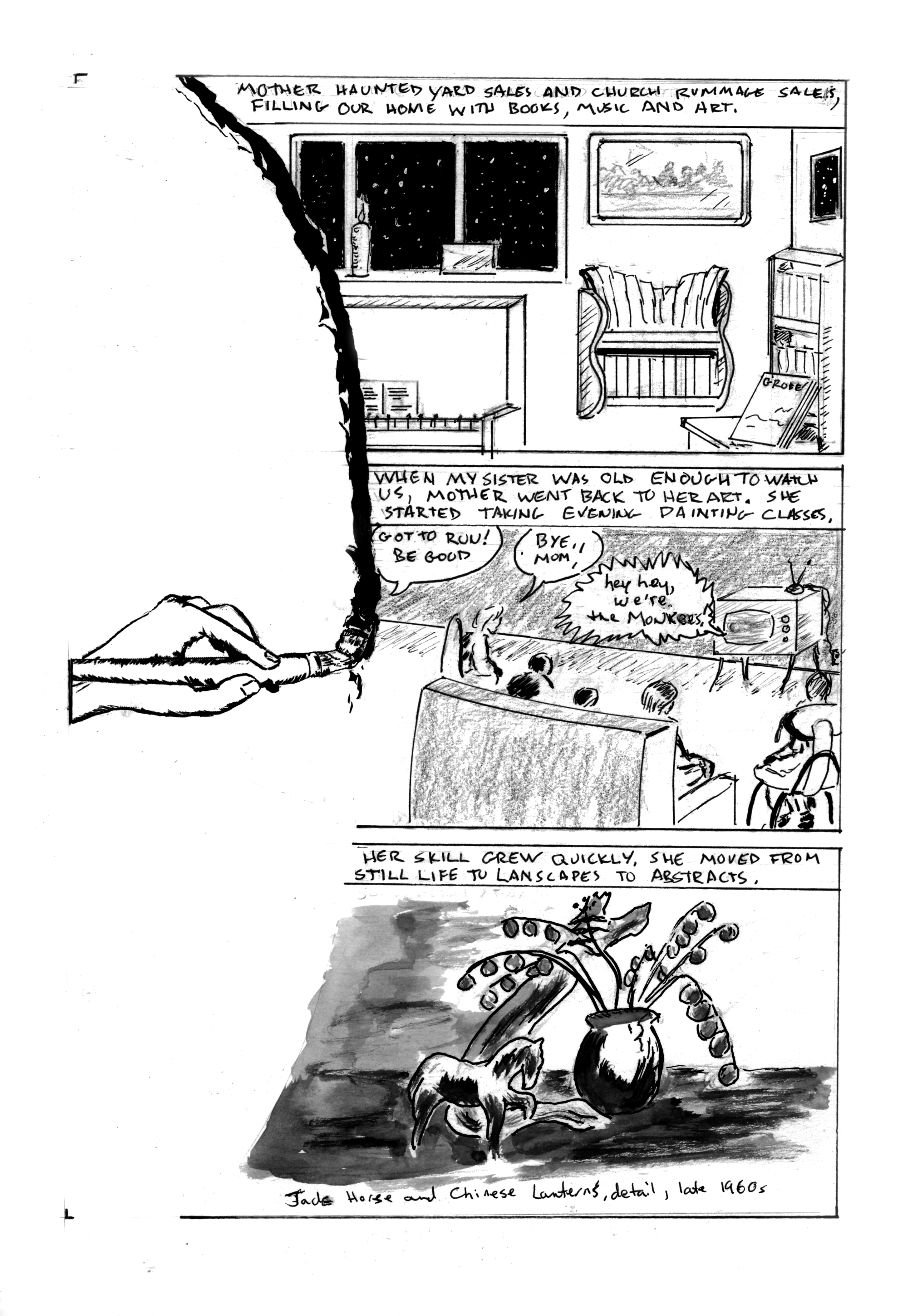
Now that the framework is solidly in place, we can get to the meat of Mother's story.
Story notes: As Mother started to come into her own, so did the kids. We were finding our own voices, developing interests. Like many kids of the mid-late 60s, we bonded over TV. My sisters and I developed a fascination with The Monkees. I stuck with them more fervently than my sisters did. We often took the books, art and music that surrounded us for granted. That was soon to change. More on that on next week's page.
Art notes: The visual device of the brush stroke defining the left border of the panel will be repeated over the next two pages. I worked up a decent sketch of a hand doing a brush stroke, scaled it and printed a few copies. It will serve as a unifying narrative device. The first panel is from photo reference, with some liberties in perspective, intended to show that our lives were full but a bit off-kilter. For the middle panel, I tried 6 different layouts - Mother running out of the room, Mother looking back as she leaves, the closeup of a child's eye with Mother leaving in the eye, and so on. I finally resolved that even though this is her chapter, she doesn't need to appear in the panel at all. In fact, this page is unusual in that there are no face shots of anyone! This is almost like leaving myself out of a page. I've noted before that most graphic memoirs show the creator/subject on every page. Alison Bechdel broke this rule in her two most recent memoirs, but not in her first, Fun Home. I don't know if it's as much a rule as just the way things work out. At any rate, it's refreshing to shake up reader expectations as well as my own.
The astute viewer will note that the furniture and room layout are slightly different than previously represented. This is both artistic license and an acknowledgment that time has passed.
For several years after Mother passed, I made small books reproducing her art and writing for the family. For the last panel, I scoured one of those books, and found a work that was period specific and had a good range of gray values. Rather than incorporating a photo of the actual painting, I opted to do a wash rendering of it.
I'm happiest with my work when I let it flow. A solid layout is a tool, a means to an end, not an end in itself, to paraphrase Robert Fripp. I've been revising the master book, as mentioned last week. In noticing what works best, the most successful pages are those where I just explore visual ideas to advance the story. As an artist, I seem to be escaping the confines of my own expectations, whatever that means!
Finally, I re-titled this chapter from the outline. It's not about hands the same way songs like Bill Withers' Grandma's Hands (which I love even though he sings flat) are about hands. It's not about specific things the hands are doing. I am spotlighting hands throughout this chapter. Their appearance and actions reinforce different parts of the story and character. I hope that's clear. I'm not sure how else to articulate it.
Next: the brush stroke continues.

