Thursday, January 10, 2013

Best Comics of 2012, No. 5: IDW's Popeye

Next item on the list is one of the oldest and newest characters out there.
Under IDW, Popeye is experiencing a remarkable revival.
Though the character never went away to the faithful among us, recent attempts at the character have often fallen short of his potential. The last major take on Popeye that really stood out was Bobby London's run on the strip, which deserves a proper collection.
Here's the cover from the one collection in print to date.
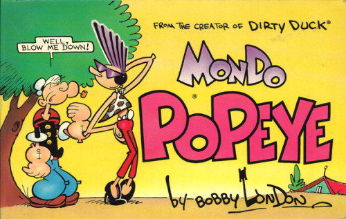
MInd, this is not to take anything away from others who have worked on the character. But Segar, Bud Sagendorf and Bobby London are tough acts to follow!
I was so grateful when Roger Landridge took on the new book.  While I've yet to pick up on Snarked, I'm sure some of you will remember that his take on The Muppet Show made my Best of... list a couple years ago.
And Landridge brings the right tone to the character, echoing Segar's run without simply aping it. Landridge knows his comic history and is not afraid to use it. as evidenced in this cover for issue #1.
If you don't know what comic this references,
you're reading the wrong blog!

As the pages below clarify, this book incorporates numerous elements, not just of the strip but of its original period: black and white films, jalopies, language and phrasing specific to the era and the strip (some of which can be traced to Yiddish ghetto vernacular- I know just enough about that to be dangerous, so corrections are welcome). 
Landridge also pulls in supporting characters from the original Thimble Theater, and sometimes gives them their own strips in the book, as in the examples posted below.
The book is remarkable for its covers, printed on flat (non-gloss) paper! This feels like an old book with new stories. I envy young readers whose first Popeye comics are these!
Our cast!
Beautiful.
As with some of the other picks in the current list, this book is full of energy and charm, but not at the expense of solid storytelling.
Kid's books deserve to be as entertaining and smart as those ostensibly aimed at adults. I'm so fed up with simpering stories that remove all conflict being hailed because they're "safe". How are kids supposed to learn to effectively resolve conflicts if they're not exposed to the process at every opportunity?
I don't mean to say that we should barrage kids with brutality and animosity, but let's face it, conflicts happen. Of what use is a story that denies that reality? I contend that denying reality to kids, lying to them about that reality, is more harmful than letting them face said reality.
And Popeye is a prefect vehicle for that. At heart a pacifist, he's not afraid to face and deal with problems in an up-front manner. When Popeye makes a mistake, he corrects it as best he can, and he tolerates no wrongdoing from others. In short, he has a clear idea of right and wrong, and he lives by it.
See example below of a fight scene.

There's the energy of the original strip that we mentioned before!
Note that there's a fairly high level of detail here, especially relative to Segar's original strips. Segar's backgrounds were light and sketchy- his crowd scenes were often fields of ovals with eyes and noses, for example.
In this page, while Landridge uses solid fields of color as background in panels three through five, the first and last panels have full backgrounds with more than sufficient detail to tell the story and reinforce the two things that sustain a Popeye story: energy and gags.
The stories themselves are as imaginative as Landridge's Muppet work.  In the example below, Landridge riffs on the definitive Fleischer cartoons in a story involving Bluto giving Popeye the business in the process of making a film.


Note the Fleischer style opening title!
Here's an example of a backup story spotlighting one of the other characters from a Segar strip, this one from Sappo.

Note that this "best of" refers to IDW's Popeye and not to Landridge's.
While I defer to none in my admiration of Landridge's work on this and other books, I must note that IDW has been a consistent supporter of classic comics, rivaling Fantagraphics for its quality line of reprints.
We'll see another example of the great IDW reprints in a couple days, but I do want to note that they are also publishing a Popeye reprint book, featuring the work of Bud Sagendorf. Craig Yoe has a book of the Sagendorf material. While I do love my deluxe and too expensive for me (but worth the money) comic reprint volumes, there's a lot to be said for the traditional format.
My one quibble with the format is that they're using a nearly identical cover structure between the two titles, and the same flat paper stock. If you buy your comics in a hurry, as I sometimes do, it's easy to think you've picked up the next issue of one when you really grabbed the other.
The first collection of the Landridge work is due out January 22. The regular title continues on schedule. I was concerned that Landridge might have to sacrifice quality to maintain this pace, but so far I'm pleased to report that such has not happened.
Tomorrow, number four in the Top Comics of 2012, as we ride along.

Wednesday, January 9, 2013

Best Comics of 2012, No. 6: Hawkeye

So Marvel made the list twice this year. Good for them.
Smart writing, clean art and good storytelling.
Glad they're finally getting back to that.
Matt Fraction's Hawkeye brings many things to mind. The most immediate is Eisner's City People and Invisible People, works that peer in the windows of the cliched everyman.
But where Eisner is drawing on the classic model of Jewish tragedy in most of his city narratives, Fraction is channeling the wry wit of American Flagg era Chaykin and tempering it with a healthy dose of old school Frank Capra. It also brings to mind William Messner-Loebs' short-lived series Bliss Alley.
This book depicts Hawkeye as an Avenger who lives in the old neighborhood and cares directly about others who share the place.
While he has the unorthodox option of attempting to solve one of the problems by buying the building in question, Clint addresses the issues fairly head on.
The wit comes in an unusually blunt empathy. Fraction uses captions and parenthetical translations as a vehicle for humor and understanding. As an example, when Clint is released from the hospital early in issue 1, there's a word balloon going out of panel that reads "(some Spanish sounding stuff". The following panel has a character saying "Back off (Russian maybe), I keel you, okay bro?" We read it as Clint hears and sees it.
David Aja's art and Matt Hollingsworth's colors are remarkably effective together. Clean subdued palettes that reinforce sparse, accurate rendering. Can't ask for much better.

 This two page sequence from issue 2 references Clint's past as a criminal and his time in the circus, also showing his protege/partner Kate Bishop.
There's so much to like about this book. Every part of it works. The design elements are obvious without being intrusive, and contribute to the story. The narrative and action build seamlessly. Character dominates throughout. It's an easy read, but not dumbed down. It references the central character's unnecessarily elaborate back story without confusing matters.
It's clean, sharp, and stand up to repeated readings. Volume 1 of the trades, My Life As A Weapon, is out as of March, and well worth the pittance requested for it (lists at $16.99, Amazon for $6.99).
Some vile souls have posted torrents of it. Do as your conscience and pocketbook demand, but the usual mantra applies: support creators and publishers whenever possible. At #3,408 on Amazon's list, it's doing OK, but hey, more sales means more work for the creators, at least ideally.

I've railed against the evils of snark in the past. This book could easily be misread as snide.
But another phrase sums it up nicely.
Joie de vivre.
Reading this , I get the sense that, as hard as they must work to create such a seemingly seamless project, the creative team on Hawkeye are always having the time of their lives.
As are the characters.
Tomorrow: Number 5 of the best of 2012, if you swabbies care to show up for it!

Tuesday, January 8, 2013

Best Comics of 2012, No. 7 (tie): Fashion Beast and Lone Ranger: Snake of Iron

Spoilers abound below. Take heed.
Every year, I come up with a tie.
Usually, this is because there's a worthwhile book I've omitted and I can't decide between it and another. Inevitably, this happens after I've begun posting the entries, so no going back and renumbering.
This time out, the tie is between two disparate works.
First up, Alan Moore's Fashion Beast. It's a bit unfair to call it Alan Moore's work completely. Based on a truncated film collaboration with rock and fashion impresario Malcolm McClaren, this is the story of androgynous boys, girls and those seemingly in-between, desperately scrapping for a place in the arbitrary world of fashion in the early days of a nuclear winter.

The book is co-credited to McClaren, and the adaptation is credited to Antony Johnson, who has adapted several other Moore works for Avatar Press, and who wrote Wasteland for Oni Press.
The art is more than sufficient. Facundo Percio gives us a full world with drastically alternating visions of beauty and despair. Another Avatar staple, his past work includes Warren Ellis' Anna Mercury.
The story owes no small debt to Beauty and the Beast. The mysterious master designer and his minions are clear parallels to the Beast and his castle lackeys. There's also a parallel to the villagers hunting Beauty, this time in the form of an angry politicized mob attacking our heroine.
As to the heroine...
At first we're given to presume she's a cross dresser, or a drag queen, possibly a pre-op or non-op transsexual.
However, we learn in issue 3 that she's female.
We learn this from an acerbic dresser, very dykey but of undisclosed sexuality as of issue 3 (again, I'm a couple issues behind on this).
So it's a world of dry wit and desperation, coupled with hope and legend. The latter two run a bit thin, and the urgency runs high.
So many mysteries yet to unfold. We've met the true gender of our heroine, Doll (or have we?), and we may or may not know something of the elusive sharp witted dresser. Here's Doll in action from issue one!


In the follwoing sequence (sequins?), Doll is confronted by the mysterious designer.


Doll stands proud and defiant on the runway. No tie in to the stream of thought, I just found it to be a cool page!
Even in the hopelessness and nihilism, there are many kinds of beauty to be had here. I'm reminded of Moore's Halo Jones (oh, for him to finish that one day!), and can't help but wonder if Doll will save the world through fashion.
A very different kind of woman dominates the second book discussed today: a camel riding explorer of the American West.

I've made no secret of my admiration for Dynamite's Lone Ranger series, espeically the 25 issue origin series. While I've been less pleased with the current run, largely due to the new artist being less satisfying to me then Sergio Cariello, the stories are still strong.
But the miniseries have really picked up the slack.
From last year's Lone Ranger: Death of Zorro to the current Snake of Iron, these shorter cycles are more satisfying than the current longer arcs. Tighter action, stronger character development, and better stories overall.
This outing offers Tonto and Scout (Tonto's horse, in case you've forgotten) rescuing a train in a storm. Meanwhile, the Ranger is serving as protector for a headstrong young woman, the aforementioned explorer.
While this may seem an absurdity, there was a US Camel Corps in the American West, and it's been revived in Texas, primarily for education and entertainment. Camels played a relatively small but still significant role in "taming" the American West. Some, however, regard this as myth, even invoking the infamous ghost camels. This ties into the "ghost horse spirit" that dirves the Kiowa to jump the reservation, one of the key plot points of this narrative.
Our heroine, and camel, encounter a threat!

I like this story a great deal.
This is surprising, in that I don't usually much care for Chuck Dixon's writing- too much machismo, too much smug, all that self-important "guy" swagger leaves me cold and full of contempt. But here, he's written sympathetic characters in a wide variety of situations, and even the most absurd aspects of it have a gravitas that make it worthwhile.
While i enjoyed Dixon's work on Birds of Prey, his Man With No Name reeks of testosterone, and he will always be remembered as the writer who broke Batman's back in the Knightfall storyline.
But then there's his successful adaptation of The Hobbit (as far as I know, the only official comic adaptation of Tolkien to date). And there's this. So perhaps I've been too harsh in my judgment of his work.
There's some wonderful insight into Tonto here, and while the story risks racism at times, it manages to retain the complexity of all characters, even in the cliched scalping scene shown at right. Scalping was not as widely practiced as often assumed, and is not the sole province of native Americans- ancient Celts also practiced scalping- but Dixon is accurate in the locale and timeframe of use of the practice in this story.
Artist Esteve Polls is Spanish, and began working in European adventure books in the early 1990s. In addition to drawing some Gene Simmons written comics (!), he's done other Zorro and Lone Ranger work, including the aforementioned Death of Zorro series.
Oh, yeah, and he drew this.
I mean really. How cool is that?
Since I'm posting this a day late, I'll post the next installment in Best of 2012 later today.
Ah, the slings and arrows....

Monday, January 7, 2013

Best Comics of 2012, No. 8: Night Force

What, another book that builds on older concepts? That's all we've had so far!
Patience, folks. There are books based on original ideas coming up in the list.
Which is not to say that Night Force is not original.
The third series using this name and concept, Night Force is written by Marv Wolfman, best known as the creator of Blade in the 1970s series Tomb of Dracula.
The latter ended in 1979 and Night Force began in 1982, but I always felt it was overshadowed by its predecessor. This is due in no small part to the use of the same creative team- writer Wolfman and artist Gene Colan.
The first series ran fifteen issues, including its preview appearance in New Teen Titans no. 21.
The second series of twelve issues began in 1996 and featured art by Brent Anderson of Astro City fame. Solid storytelling, but not as compelling as the original collaboration.
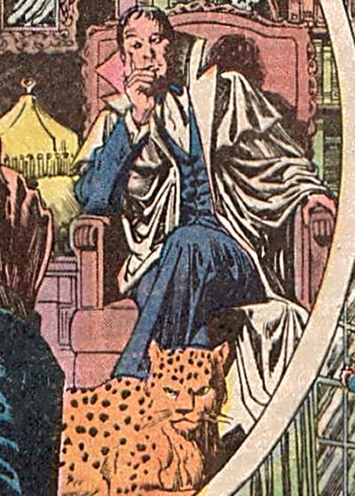
In all cases, the premise remains constant. Baron Winters, a cryptic figure with a questionable reputation the world of magic, recruits teams of disparate losers to serve his cause. While he does everything in his power to protect his hand-picked team, Winters is perfectly willing to use less than ethical methods, and will sacrifice his team members if need be. Sadly, this is a need that arises on a regular basis.
There are two other constants in this.
Winters has a leopard familiar named Merlin. It's been suggested several times that the leopard may actually BE the original Merlin.
Also, Winters never leaves his mansion. The doors to the mansion often lead to other locales and times when leaving than they do when upon entering.

In addition to these series, some variations on the Night Force team have randomly appeared in DC books over the years. Baron Winters was host to Harry Potter Tim Hunter when John Constantine was shuffling him about in Neil Gaiman's original Books of Magic mini series.
I had hoped to present the delightful dinner scene, but was unable to find it on the Interwebs at the ready. There's a marvelously tense and humorous  exchange between young Master Hunter and Baron Winters involving the rudeness of the Baron not addressing the young mage with sufficient respect, and the passing of tomato ketchup in a silver chalice.
Ahem.
Moving right along.
The current miniseries is a scant seven issues. This time, the art chores  go to the capable Joe Kubert School graduate Tom Mandrake. Though he's done a substantial amount of superhero and adventure work over the years, including a noteworthy run on First Comics' GrimJack and DC's underrated The Kents miniseries, Mandrake is at his best illustrating the supernatural.  His 1990s run on The Spectre and the underrated Fringe comic stand out in this arena.
Here, Mandrake and Wolfman (how's that for a team on a horror book?) tell of an attempt to stop the birth of an Antirchist/ Cthulu/ multi- generational demon child, cheered on by a centuries old cult. And wouldn't you know the Baron's prison/home, Wintersgate, is the ideal locale to focus such a birth?
The cult musters their forces inside the Baron's center of strength.
And all Hell breaks loose.
Perhaps.
I shan't reveal the ending.
In light of the numerous horror and horror influenced books that have succeeded since the original series- 30 Days of Night, The Walking Dead, Hellboy, even the quirky Chew has some elements of horror- does Night Force still stand up?
In a word, yes. It's not a bloodbath, but it has its horrific aspects. The horror is not only palpable but intellectually challenging. This is a book the reader has to work at understanding, but it's worth the effort.
My biggest quibble is that they changed the Baron's hair and updated his dress. I prefer the provincial cut and classic suit with bowtie and cape that he had in the first two series to the current metrosexual, stringy quasi-trendy look.
The "Old" Baron, from Moore's Swamp Thing run

Tom Mandrake's "new look" Baron


That aside, this is a fresh and welcome take on a tested concept. Sadly, Night Force has not always been well received by readers. First issue sales of this year's miniseries were just over 13,000. Hardly memorable. And the 2011 hardcover of the first series appears to already be out of print, which does not bode well for a TPB collecting this run.
My recommendation: haunt the back issue bins or check your local shop for a package deal. The search, and the series, are both well worth the effort.
Tomorrow: an odd double header for Number Seven in the Best of 2012, a beast and a snake.

Sunday, January 6, 2013

Best Comics of 2012, No. 9: Daredevil by Mark Waid

As much great work as they've produced over the decades, I've not been a huge Marvel fan for the last couple decades.
A couple recent titles have bought me around a bit on this.
The first of these is Mark Waid's current run on Daredevil.

Everybody knows Daredevil by now: blinded by a radioactive isotope while saving a blind man about to be hit by a truck, young Matt Murdock assumes the mantle of Derdevil to avenge the death of his boxer father at the hands of The Fixer.
Sort of Batman meets Kid Galahad with a dollop of Shakespearean tragedy,  later supplemented by Miller with noir and manga pastiches.
I've been a fan of Old Hornhead since the early issues. I recall reading the Wally Wood stories, and the Romita and Colan followups, when they first came out.
I stuck with the character. I was captivated by the Miller run and some of the followups, but lost interest.
I returned sporadically. The Marvel Knights runs by Joe Qeusada and David Mack were particularly successful, and the Bendis/Alex Maleev run was spellbinding, if derivative of Bendis' noir themed independent comics.
Heck, I even liked it when DD was interviewed for Rolling Stone in no. 100.
So I know my Daredevil.
But I've not read it for a few years.
I think creators got carried away with the maudlin/tragic aspects of the character. While these were always present, there was more of a soap opera aspect to them in the 60s and 70s. I blame and credit Frank Miller for bringing out Matt's Catholicism as a focus of the character.
At any rate, I'd walked away and didn't pay attention when Waid began writing Daredevil in July 2011.
More fool me. I should have known better.
I love Waid's Astro City, and his "Unthinkable" storyline in Fantastic Four is some of the best superhero stuff ever. I'd like to see him revitalize his Potter's Field, but I'm pretty sure he's done with it.
In the current Daredevil run, Waid and artists Chris Samnee and Marc Checetto successfully meld recent events in the Marvel Universe with the tone of the original stories, without being condescending or overly impressed by their own cleverness. There's no wry "this is a comic" wink to the reader here, only well-crafted adventure.
The stories incoproate contemporary versions of staple characters, including Dr. Doom, Spidey, the Punisher- heck, the whole crowd, pretty much. The central storyline involves a flash drive made of unstable molecules from a stolen shred of a Fantastic Four uniform. This drive contains information that could take down any or all of the most powerful criminal organizations in the world, collectively called Megacrime.
Daredevil has it and everyone wants it.
The art is highly reminiscent of the Wood/Layton run, from issues 5  to 11, still one of the highlights of the character's run, especially issue 7, the battle with Namor.
I see that quality in the current Daredevil run.
No Earth shattering, cataclysmic "the Marvel Universe will never be the same!" bombast here. Just a solid, intelligent adventure.
I read a review of Star Trek: Insurrection in Fantasy & Science Fiction magazine. It warmly talked of the film as a clever chance to spend a couple hours with old friends.
That's kind of the way I feel about the current Daredevil run. Since I'm reading it in trades, I'm a bit behind the floppies storyline. I've read through Book 3, which culminates with issue 15. The current issue is no. 22.
But I don't expect the issues I've yet to read will disappoint.
Tomorrow: No. 8 in the Best Comics of 2012, a book which will never leave its house.

Saturday, January 5, 2013

Best Comics of 2012: No. 10: League of Extraordinary Gentlemen, Century 2009

Now we begin the Top Ten, with an Alan Moore book.
Spoiler abound. Proceed accordingly.
Supposedly concluding Volume III of Alan Moore's League of Extraordinary Gentlemen (hereafter referred to as LOEG to save my fingers), Century 2009 deals with the remnants of the League enlisted by the time-wandering Norton to stop the birth of the Antichrist. Failing that, they are charged with stopping the Apocalypse itself.
When Moore began this series of serieses (serieses?), he created a charming and occasionally perverse yet witty pastiche of pop culture and literature references. Most of these were of British origin, but there was great fun to be had in decoding all his subtle (and less so) allusions and applying meaning to them, all while riding the high adventure merry go round.
The first story involved Allan Quatermain, Mina Harker, the Invisible Man, Captain Nemo and Mr. Hyde in an uneasy alliance to save England from a fiendish plot involving Moriarty and the denizens of Fu Manchu. H.G. Wells' cavorite puts in an appearance, as do Holmes and his brother. Rollicking good fun infused with wit, sex, opium addiction and smart writing.
This is the one upon which the film was ostensibly based. The film was lacking in the views of many. There are aspects of it I find enjoyable. The introduction of Dorian Gray seemed superfluous. The character of Tom Sawyer, despite being wholly out of place, is well written and acted. And the painting showing an earlier League including my childhood favorite, Dr. Syn, the Scarecrow of Romney Marsh, is too cool for words. The painting appears in a different form in the original text.


Book II is my favorite of the series so far. Herein Griffin, the Invisible Man, colludes with invading Martians until the rest of the League intervenes. This affords Moore the opportunity to give the reader tastes of John Carter, Gullivar Jones, H.G. Wells' Martians, and a vicious yet extremely pragmatic sendup of Teddy Ruxpin by way of Dr. Moreau.

During this outing, two League members die, one at the hands (well, not hands really, a bit closer to home) of a teammate, the other in an orgy of brutality taking down some of the Martian adversaries.
As a transitional device, this is followed by The Black Dossier, which propels our Victorians, or what's left of them, to 1959. Here's the stuff of spies and Cold Wars, coupled with Orwell and Tijuana Bibles. Herein James Bond is shown as the insufferable twit I always thought he was in the films (though I rather liked the few Bond books I read).
In the midst of it all, our team (now a trio of Quatermain, Harker and Orlando, all immortal by now) enters the Blazing World of magic and a deeper view of reality, and suddenly the heroics and cultural pastiches are in a time share with Moore's bent for mysticism.
This is followed by the Century trilogy, of which the final (?) volume appeared in 2012. Cultural and literary references still leap about- Brecht, more Jules Verne, Brit SF comic strips, punk rock, psychedelia, and Alesteir Crowley, to run the short list.
The trilogy bogs down a bit in the 1969 volume, as the Magic gets a bit obscure (but makes sense on careful reading). But its conclusion, spotlighted by the deftly handled death of Alan Quatermain, is both noble and tragic. The Judeo-Christian God is seen as a Mary Poppins pastiche walking through the sky and dealing directly with the childlike Antichrist. The whole thing echoes and mourns the demise of a society of wonder, epitomized in the scene of a rusting Martian shell, ignored by almost everyone.
The death of Quatermain is most significant. It requires a hero to overcome his most dreaded demons, to make the decision to be alive rather than simply living, even if the price is death. Although his death by electrified mystic urine is, shall we say, less than dignified, it requires the hero to be honest about the thing that defeats most heroes- the truth of their own lives. IN the name of love, Quatermain faces evil, deciding to chance dying to finally live on the right terms- "you read about me when you were a little girl and that's who I am. I'm not this fucking mess. That's not how I want to go out. I'm somebody good."
God has a great speech too.
But we are left with shards of the League, and tentatively a new member.
Though this is supposed to conclude the trilogy, there are allusions to more stories in the text, and Alan Moore has promised some one off stories, beginning with LOEG: Nemo this March. Ostensibly this will fill in bit of the legend of the compelling Captain Nemo and his heirs. The cover implies his daughter, who assumes command of the Nautilus in Century 1910, though we may learn more of the grandson, in command in Century 2009.
O'Neill's art is much like the series itself. It varies from crude and vulgar to elegantly profound. There's a verve to it that's compelling even when illustrating crude content, which is often. There's addiction, messy sex between a great many people, distortions of the human form, and all manner of body functions accompanying the literature and culture lessons and all the daring do.
LOEG leaves me frustrated, challenged, intrigued, bemused, angered, entertained and ultimately satisfied.
Comics could do, and have done, worse.
Tomorrow: Best of 2012 number nine: if you can see it.

Thursday, January 3, 2013

Best Comics of 2012: No. 11: Dial H

Okay, this one needs a bit of background for any neophytes.
In 1966, writer Dave Wood, who also co-created Challengers of the Unknown, co-created a new feature in House of Mystery. It involved a boy named Robby Reed, who used an old school telephone dial (no phone, just the dial). By dialing H-E-R-O,  he transformed into a random superhero.
Here's an example of one of his transformations.
And let us not forget his "cuss word", "sockamagee!"
The original storyline ran through 17 issues of insipred silliness, with a couple of random appearances by the character in the 1970s.
The stories were silly fun, fairly imaginative 1960s superhero fare.
One of Robby's transformations was to the classic version of Plastic Man, who had been neglected in comics for many years at that point.
There was a revival of the character in the 1980s, covering eleven issues of Adventure Comics (a title that never should have been canceled).
A couple more spot appearances, then nothing until 2003.
The 2003 H.E.R.O.  series ran for 22 issues. Here the focus was on the dial itself, and its effect on those who used it, reminiscent of the interaction of the Helmet of Nabu and those who become Dr. Fate by wearing it.
This brings us to the current series, Dial H, written by SF writer China Mieville and illustrated by Mateus Santolucco.
Meiville is a scary talented writer. I loved his dense, poetic novel The City and the City, and I'm embarrassed to say I've yet to read his multiple award winner and nominee Perdido Street Station. Meiville is also so politically active and aware he makes me look like a conservative. Scary, that.
His work here is a bit of a departure in some ways.

The story follows the original model: unwitting guy, attempting save his friend from a beating, accidentally dials H-E-R-O, this time in a deserted and ramshackle phone booth, and transforms into a superhero.
This time, the guy is a down on his luck middle-aged slob, jobless, hopelessly obese and depressed, and alone save one friend who's just about had it with him.
Meiville's story is infused with acerbic wit. Now ordinarily I'm not a big fan of snark (unless, of course, it's my snark). But it's to Meiville's credit as a writer that the characters retain their humanity and that we can and do still care about them in the midst of this silliness.
The book maintains genuine excitement and tension in the midst of the silliness. One need only watch the classic Abbot and Costello Meet Frankenstein to see how this is possible. The central plot involves an adversary, Ex Nihilo, who is putting people into comas as part and parcel of an inter-dimensional plot.
Here's a sampling of issue 1's adventure and absurdity.
Captain Lachrymose indeed!
Santolo's art serves the story very well. His imaginative character design is crucial to the story and particularly noteworthy. Part of a wave of talent from Brazil that both Marvel and DC/ Vertigo have used to great effect in recent years (think daytripper, the current Justice League and Green Lantern), this is quite welcome, and reminiscent of the influx of Filipino artists in the 1970s.
This is part of the "second wave" of DC's New 52- a bit disingenuous in my mind. If it's still "new", how can it already have a second wave?
The first issue sold just over 45,000, a little more than half of Batman's current sales averages. Following the current belief that single issue sales are merely loss leaders for TPBs (the first volume of Dial H, titled Into You, is due out in April 2013), the figure is acceptable, and the book seems to be holding its own.
I do have concerns about marketing. After all, there's no central hero costume to sell, and the merchandising? Toy phone dials in the second decade of the 21st century? I don't think so! Can't really use the phone booth itself, it's sort of been done.
So Number 12 was a revisionist  retro book inspired by a 1960s DC trope.
Number 11 was the same.
Tomorrow, we'll look at Number 10, which should sort of end the century. Maybe.

Wednesday, January 2, 2013

Best Comics of 2012: No. 12: Earth 2

Beginning my start of year countdown of the ended year's best.
As stated last year, I have mixed feelings about DC's "New 52" concept. I don't completely see the necessity in narrative terms of scrapping decades of stories just to start over. But I do understand the commercial necessity of attracting new readers, and I know on a practical level that you can't always do that with old stories. I also accept the notion that a mythos needs to be reinvented every generation, and New 52 factors into that.
That said, I've fallen away from most of the New 52 titles. Everything is urgent, fast, and full of so many gritted teeth that I suspect what the new heroes really need is one of the fine laxatives on the market. I also question the frequency of these "cataclysmic" epics. When every story is an Earth shattering new mythology that will change things forever, it rapidly becomes mundane.
There are a couple notable exceptions.
First of these is James Robinson's Earth 2.
This has many of the aforementioned elements I find tedious, but it uses them effectively and consistently rises above them.
This is in no small part due to James Robinson's storytelling. I've made no secret of my admiration for his work on Starman (though I have mixed feelings about his script for the film version of League of Extraordinary Gentlemen). Robinson manages to effectively meld characterization and action with the space opera superheroics that charmed so many us relics in the 1960s.
In some ways this is reminiscent of DC's First Wave of a couple years back- reinventing heroes and their relationships with one another, all while on the move in a nonstop story owning as much to Republic serials as to more recent comic storytelling innovations.
But here we begin by doing away with the Big 3.
In issue 1,  we lose (or possibly just misplace- I'm a couple issues behind) Superman, Batman and Robin and Wonder Woman.


Then things pick up steam.
With no heroes (or as they're called in this narrative, "wonders") left, Earth seems helpless against the onslaught of dual forces. First is an elemental force, building on now decades old concepts in Alan Moore's Swamp Thing. Second comes a "save the world by destroying it" threat in the person of one Terry Sloan.
Robinson's playing with some great concepts here. He crosses some of the origins to create hybridized versions of the heroes with whom we're so familiar. The Atom is a military man with atomic powers, a la Captain Atom. The Flash is granted power by the god Mercury, making him something of a Wonder Woman pastiche. And Green Lantern builds on the Swamp Thing Earth elemental concept.
There was substantial ballyhoo concerning Alan Scott being reinvented as a gay man. It struck me as a tempest in a teaspoon. Robinson has written smart gay characters in the past (again, see Starman) and he handles Green Lantern's personal life with equal aplomb.

More significantly than the character being gay, there is a plot element that plays out involving a choice between Scott's sexuality and his new mission as a wonder.
When tempted by a false image (an echo? a simulacrum?) of his deceased lover, seen at right in his introduction (while still alive in the storyline), Scott chooses to abandon the illusion of contentment for the struggle to do right.
This is Orpheus, this is Christ in the desert, this is the temptation of Doctor Faustus, this is Jabez Stone fighting for his soul.
This is the stuff of myth and faith, dressed up in ecological superhero drag.

And it works.
Unlike Keith Giffen, Robinson knows how to temper the bickering between his protagonists to keep it from becoming tedious, though it does come close at times.
But the interaction of Hawkgirl and the Atom poses a challenging dynamic. Her "I don't have time to teach you this stuff" tutoring of the impulsive Flash is equally engaging.
The most recent issue I read was no. 6, so I'm about 50 pages behind on this story. But rest assured, I will catch up.
I'd be remiss if I failed to note the art of Nicola Scott. Team books tend to be overly busy and loud, but Scott brings subtlety and just the right measure of ornate design to her work.
She manages to maintain a high level of detail and accuracy, even when illustrating crowds and battle scenes.
She also never neglects to show emotion in her faces, and is quite adept at doing so. Others have compared to George Perez, which in turn evokes comparison to Phil Jiminez. I think those are valid analogies, but I'd go a step farther and say that her storytelling chops homage the man I consider the master of superhero art, Curt Swan.
I've enjoyed her past work on both Birds of Prey and Secret Six. Ideally, Earth 2 will increase her recognition and options for work. I'll be keeping up with this Australian artist!
Tomorrow: Number 11 of the Best of 2012,  another entry from the New 52.

Sunday, December 30, 2012

Original Art Sundays No. 146: TNT news

Back after a week off for no reason other than the holidays!
Here are some older editorial pieces.
But first, a brief explanation.
In the early 1990s, there were two magazines on transgender politics that took a slightly more "street level" approach than the academic journal Chrysalis.
One was Davina Anne Gabriel's TransSisters, which we've discussed briefly in the past. Ran ten issues from September 1993 to Summer 1995.
The other was Gail Sondegaard's TNT NEWS. This ran from 1994 to 1997, running eight issues.
If memory serves, that is. I don't have all my files copies of the latter at hand.
At any rate, I did editorial cartoons for both.
One of the TNT cartoons, Pinkette and LaBrainne, has been published here before. I'd like to offer a couple others this week. These are two of my favorites. The art is serviceable, the writing is sharp and on point, if a bit dated for at least one of them, and they come together fairly well.
These will be included in The Complete Tranny Towers, if and when it's done. The first one uses a Tranny Towers character!
Actually these stand up better than I thought they would.
I do have to note that there are a couple others with alarmingly bad art. I will not post those, but will include them in the aforementioned book, with a healthy dash of mea culpa.
The "change for a dollar" gag is adapted/stolen from a Bernie Wrightson poster. See the end of this post.
And the Mr. Haney vibrator line is a classic among us devotees of Green Acres!
The issue of stealth remains significant, but has lost some of its explosively divisive properties over the years.
Still.... a story comes to mind.
My last girlfriend suddenly moved to Texas to care for her mom about a month after her final surgery.
A little odd, but then we all have choices to make and I respected her for caring for her mother, even though we were getting rather close and her handling of the matter hurt me a great deal.
We talked a year or so later, and she was dating a guy. She was quite happy.
Well, good. We all get to be happy.
But he didn't know about her past, and she wasn't going to tell him, and isn't that wonderful?
Well.... no, it's not.
I mean, yeah, it's wonderful that you succeed in the world so well that you have that option. But there's more to it than that.
Deciding when and where you're out about your gender history is a complex issue. It touches on matters of integrity, mental health and physical safety, not to mention just plain wanting to be accepted on your own terms. And every decision around it has to be weighed VERY carefully.
This stuff can drive you up a tree. I used to worry obsessively about who knew, who could tell by looking, who was and wasn't laughing, on and on and on.
That will put a real crimp in your day.
Then after the end of my abusive relationship, about which I've kvetched in the past, I started assuming everyone knew and stopped worrying about it.
The paradox was that many less people knew after I took that tack!
However, in the midst of all that, it must be said that there are some people who have a right to know if you respect them. Close friends, family and partners/lovers/spouses fall into this category. It's their business if you value them in your life. If they can't handle it, that's on them, but those are the people you should trust.
Tuesday is January 1, 2013. and I'll begin my Best Comics of 2012 countdown then.
New art resumes January 6.
Now, here's that Wrightson piece!

See you all next year!

Wednesday, December 19, 2012

Original Art Sundays (Tuesday) no: 145: Surrealist Cowgirls, p. 14

Posting a couple days late, just due to being too busy again. The scan was just sitting there waiting for me.
Now the page.
As you recall, our heroines were standing atop the onyx pyramid looking down into a miles-deep core of solid crystal.
Their plan was to jump in.
And here they go.
I got the idea of falling through solid crystal from Steve Englehart's Silver Dagger storyline in Dr. Strange.
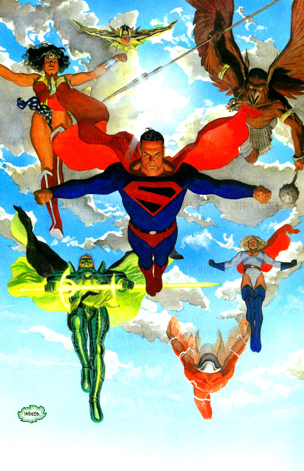
The other inspiration was one of the covers of the Waid-Ross masterpiece Kingdom Come. I don't much care for some of Ross's work- too stiff- but Kingdom Come worked very well, especially in the larger Absolute format that doesn't overcrowd the claustrophobic art.

This is the image I had in mind when I plotted this page:
The notion of someone floating, cascading down through solid glass appeals to me on a very profound level.
No scanner access after Wednesday, but I do have a few images backlogged and I hope to scan an extra one when I'm at the Service Bureau tomorrow putting the finishing touches on some Christmas presents!
Things are building in our current story, and I hope to offer the next page first thing in the New Year!
I'm also building for my Best of 2012 list!
 

Sunday, December 9, 2012

Original Art Sundays no. 144: Surrealist Cowgirls, p. 13

Finally took time to make minor corrections and post this page. I love teaching and writing, but they play hob with my art schedule.
Oh, for balance.
Ahem. The final page.
 I went nuts trying to sort out the layout for this one.
An overhead shot of the top of a ziggurat...
it works fairly well, especially the part with Whalliam and Louise's mule. I cobbled the perspective on the figures from a couple panels in Watchmen, but it might need to be pushed further.
The other frustration I had on this page was that my ink was old and gummy and faded. After the page was done, I tossed it and am switching to ProArt Deep Opaque starting with the next page.
My original layout for this page, seen below and on the back of the final art, involved a less dynamic opening angle and a much larger final panel. The facial expressions were more involving, but it didn't really communicate a proper sense of place.
I'm really eager for the next page!
Next week... ideally the next page. We're coming up on a couple weeks of down time between semesters at MCAD, so I need to complete my scanning ahead if I want to continue to post.

Sunday, November 18, 2012

Original Art Sundays No. 143: Surrealist Cowgirls poster

Back in the saddle yet again.
The next page is done, the following page is on the board and laid out, but I will not be able to scan until tomorrow or Tuesday.
Meanwhile, here's the poster I created for the MCAD faculty show this fall. Nice to see the work so big on the wall! Will amend this post with exhibit photos after the upload.

This was an object lesson in the old saw about screen color vs. print color. There were numerous glitches that didn't appear on screen but were glaring in the printout.
I went through four prints before I got one that met my standards.
A quick job, but I like the dappled look of Whalliam. Unless he's in a fire and completely dried out, he will look this way in all environments.
The story is taking an interesting turn, as you'll all see next week.
Until then- Happy Thanksgiving!