Finally found and scanned all those originals! Huzzah!
I will post corrected scans later this week. It was good reading the story as one unit, and I think my regular readers, if such there be, deserve that opportunity as well.
Right now, let's get to the next chapter.
I really like this one. The backgrounds could use more detail (or some), but the emotional content is there, and I think it's carried by the illustrative choices.
The Shot-Reverse Shot in Tier 2, tight on the eyes, is intended to serve as an anchor to the character's emotions- eyes as windows to the soul and all that. They're seeing the best in each other as they say goodbye.
I don't think I swiped the street sign motif from anyone in particular(possibly some Eisner reference in the back of my head? Not sure), but it's hardly a new concept, and the idea of of the street sign melding with the borders references both Vaughn Bode's use of panel content as border element and Paul Chadwick's more subtle use of the same technique in the Concrete storyline Fragile Creature.
This page serves to resolve a storyline, and as often happens, the resolution implies the dawning of a new day for Dena's character. Originally the flighty pre-op obsessed with looks, clothes, makeup, estrogen and men, she's now had a taste of the - well, not exactly DOWN, but more real, side of the life sh'es accepted as her own.
Simply put, she got hurt a lot and grew up a little. Well, maybe more than a little.
Nobody behaved nobly in this scenario. Both the principals were at fault in different ways. But this gave them both the chance to see each other, and themselves, for who they really were, both good and bad.
In other terms, this is what screenwriter Robert McGee talks of in his lectures on developing character. Both principals have undergone an absolute and irrevocable value shift. They can no longer be who they were before.
Like most such stories, this one is based on a personal experience that I took very badly at the time, but have come to see with a bit more kindness, for myself and for the man involved. It's not our story note for note, but there's enough of our (to torture the metaphor) personal symphony in the storyline that the themes have similar cadences.
And let's face trans and queer folk hardly have a monopoly on lost love, betrayal and their aftermath. It is a fairly universal theme.
Reading over these has made me eager to see the work in a collected volume. I'm developing some old material that was never complete for inclusion to round out the book, and I'm tossing around either doing it as POD or as a Kickstarter.
Tough call, though. I've not forgotten about my two other works in progress, one of which will have some work included in the Fall 2012 MCAD Faculty Art Show.
The work takes the time it takes. It's just a question of doing it.
Next: the final Tranny Towers storyline begins.
Insights about comics, prog rock, classic cartoons and films, higher education, sexuality and gender, writing, teaching, whatever else comes to mind, and comics. I know I said comics twice. I like comics!
Sunday, June 24, 2012
Sunday, June 17, 2012
Original Art Sundays no. 127: Tranny Towers, Ch. 29
Making it on time for the fifth week in a row, and one new page already done. It promises to be a good run for my readers this summer!
Before I break my arm patting myself on the back, here's the next chapter of Tranny Towers.
Okay, I really like this one. The layout works, the background is less sparse, and the action is pretty well handled.
And it was really fun to draw!
Again, this page is from a tearsheet, and will be rescanned from the original art after I dig all those pages up this week!
Swipe file notes: aside from the obvious Joan Crawford line, the biggest swipe/homage here is in the masthead. The hand lettering of the title is inspired by the cover for Arlo Guthrie's album of classic country songs, Son of the Wind.
This chapter struck me as very macho, something I'm not usually fond of. There are two kinds of machismo that I find really interesting: cowboy stuff (though I do like cowgirl stuff better) and boxing films.
I was listening to this album as I worked up my final layout for this page, and a glance at the cover made this a no-brainer.
I've seen Arlo perform twice, and join in with many other music fans in gratitude that he was spared inheriting the Huntington's Chorea that killed his father, the late great Woody Guthrie.
Next week: the conclusion of this storyline, and a hint at the followup.
Wednesday, June 13, 2012
Comic Book Comics Reviewed
I've read more histories of comics than some folks have had hot breakfasts. The books all have their errors and omissions, some better than others. But there's been a gradual sophistication of the study, to the point we are now at, where a sufficient body of research has accumulated that it's beginning to take cohesive form. This results in a sort of canon of accepted notions, things taken as verbatim and rarely questioned outside academia.
Enter The Comic Book History of Comics.
A history done in comic book format. Nice. This has been appearing sporadically in single issue format over the last few years. I used the first two issues, covering Bronze and early Golden Ages, as a text in my Comic Book History class shortly after they came out. I was frustrated by the books' arriving three months after they were ordered(!), making them fundamentally useless for aiding in that portion of the course.
Now, however, there's a spiffy, gosh-wow no-sarcasm-intended really cool collected edition of this, from our friends at IDW Publishing, who have been doing some wonderful work, both with new comics and with reprints - would that I had the funds for any of their Artist's Edition series - and publishing this as a collection continues that trend.
I will be using this for a textbook in Comic History class, now that it's available in a decent uniform edition, if I get the opportunity.
However, it's not without its flaws. I list these while recognizing that the creators of the book have requested notification of errors and omissions, for correction in future volumes. However, I wrote them about a couple of the things I'm discussing here prior to the work being collected, and the errors I wrote about are still there.
The first line of the first (disclaimer) text page reads, "this comic book is a work of historical scholarship."
Really?
Then where's the index?
Scholarship on history implies use as reference. You'd think an index would be a no-brainer. In fairness, the book does include a decent section of Notes on Sources, with more on the book's web page, which is always a useful tool in research and citation.
There are some other problems here. Right off the bat, Fred van Lente (writer) and Ryan Dunlavey (artist) jump in with the Yellow Kid's 1896 debut in Hogan's Alley, citing it as the first comic strip. This completely ignores Ally Sloper's Half Holiday, a British strip that began in 1874.
I'm not going to pick the book apart page by page. Most of it is quite good, if a little heavy on the sarcasm and snark for my taste.
But there are some omissions and factual errors that are too glaring to ignore.
The coup d'etat involving Major Malcolm Wheeler-Nicholson being underhandedly bought out by Harry Dondenfeld and Jack Liebowicz, covered in depth in Geeks, Guns and Gangsters and in Larry Tye's recent volume Superman, is reduced to one line on page 32. Since these events lead directly to the formation of DC Comics as we now know it (and are exacerbated by a Wheeler-Nicholson story appearing in Action Comics no.1, the book being discussed herein), it does deserve more than one line, especially a line that dismisses all the nuance of the facts.
Similarly, although The Shield is shown on page 58, there's no mention of his creation predating that of Captain America. Indeed, The Shield isn't even mentioned by name. This pattern recurs in other parts of the book. Cheech Wizard appears on page 206, inexplicably in a section on the early 1990s speculation market (which, given that Cheech is something of huckster, is somewhat apropos), but neither Cheech nor his creator Vaughn Bode' are mentioned in the section on undergrounds.
In fact, the entire New York underground scene is only mentioned,and the Comix from Wisconsin's Kitchen Sink Press and the Chicago underground scene are ignored.
The discussion of Wertham and the Comics Code is accurate as far as it goes, but it leaves out the Code's two major precursors: The Association of Comic Magazine Publishers Code of 1948 (which also had a seal used on covers!), and the in-house editorial code of Fawcett Comics, shown in Chip Kidd's book SHAZAM!
The section on graphic novels mentions the early work of Lynd Ward and Franz Maesreel but neglects Milt Gross's 1930 classic He Done Her Wrong, in print from Fantagraphics. But Sabre, a graphic novel from Eclipse, Sabre, whose publication predates that of A Contract With God (albeit only by a few months) is ignored.
They do manage to cite Gil Kane's Blackmark and His Name is Savage in this context, and rightly so, along with the 1950 It Rhymes With Lust. However, the followup paperback The Case of the Winking Buddha, is overlooked. In fairness, the latter work is of lesser quality, but we're talking history here, not aesthetics.
Some of these things might seem a tad nit-picky. Maybe so. They're significant to me, but not necessarily to the average reader. Still if this is the average reader's first exposure to comics history, that reader might take these things as Gospel unquestioningly.
But the most glaring error is almost an insult.
There are no female creators mentioned in the entire book. Not one.
I usually don't do the big text thing, but it seems correct to do so here.
No mention of Lily Renee', Marie Severin, Ramona Fradon, Lee Mars, Colleen Doran, Jan Duuresema, Trina Robbins, Shelby Sampson, Alison Bechdel, Mary Wings, Roberta Gregory, Selby Kelly, or the great neglected Shary Fleniken, whose work was in at least one of the Air Pirates books, though she wasn't named in the suit.
And that list was just off the top of my head. There are so many more that could be recognized, especially in the last 30 years.
The only mention of women cartoonists in the entire book is in the section on romance comics, page 60: "Though through our allegedly more enlightened "modern" eyes, romance comics may be seen as simply re-inscribing the more patriarchal aspects of American society (as 99.99% of them were written and drawn by men)..."
That's it. A backhanded acknowledgment of the supposed .01% of comic artists and writers of the 1940s who were female. That's the whole of the discussion of female creators of comics in this history.
Again, that doesn't invalidate the book. Neither does it make the book inherently bad. It's mostly really good. What is here is reasonably well-researched and presented in an entertaining (if often drenched in fanboy attitude ) fashion.
I will use this as a text, but I will expect my students to pore over it with a microscope.
No history of anything can be perfect, but this one has a few really big holes.
Sunday, June 10, 2012
Original Art Sundays No. 126: Tranny Towers, Ch. 28
One more from a tearsheet. As always, click on the strip to see it larger.
This cleaned up fairly well, but will still need a rescan once I dig the originals out of the vault, as it were.
Notes on this chapter: decent action, adequate backgrounds, straight-up 2 x 3 classic panel layout, useful for action and humor pages (though for some reason, a 2 x 4 layout works better with most comedy stories). I seldom write action-heavy stories, and I wanted to push myself a bit in that area, as you'll see next week.
I think the Art Deco typeface in the banner is from a public domain book of Deco faces. I do love hand rendering mastheads!
The title "Let's You and Him Fight" is my favorite Wimpy line from Popeye. I also like, "I would gladly have you over for a duck dinner. You bring the ducks."
The line about "all glitter and no go" in the last panel is from Mike Baron's Badger no. 1.
There are 35 strips in the series, plus a few appearances in political strips from TransSisters and TNT News magazines in the early 90s. So we have about 7 weeks until the basic strip is completely posted. I'll save the editorial strips for the book, and I have an undrawn script somewhere that was intended as a collaboration with Katherine Collins (creator of Neil the Horse) before she fell off the radar. So there will be some bonus material in the book. More on that later. I have this habit of planning a lot and doing a fraction of it. I know, I'm the only creative person to have that problem...
Next week: the street fight.
Wednesday, June 6, 2012
RIP Ray Bradbury: a comic book memory
As most of you have heard, we lost Ray Bradbury yesterday. He was 91. It's a good run.
Anyone versed in science fiction, fantasy and horror knows his work. Many of us (like me) begin with it.
I found a copy of R is for Rocket in my grade school library. Coupled with the short story The Man in a Boy's Life SF anthology I got somewhere, I developed a fascination with his sensitivity and use of language, even if I didn't fully understand it at age 8.
But as I did with Lord of the Rings and The Stars My Destination, I kept coming back to the work(s), finding new treats and possibilities every time.
My favorite works of his remain unchanged over the last ten years or so: his screenplay for John Huston's Moby Dick, the novel Something Wicked This Way Comes, The Martian Chronicles, and some of his SF poetry.
Not one, not one
Of all the creatures on this world
In all the ages since the sands
First touched the wind,
Not one, not one,
No beast of all the beasts has stood
On meadowland or plain or hill
And known the thrill of looking at those fires.
Our soul admires what they,
Oh, they, have never known.
Five billion years have flown
In turnings of the spheres,
But not once in all those years
Has lion, dog, or bird that sweeps the air
Looked there, oh, look. Looked there.
Ah, God, the stars. Oh, look, there!
It is as if all time had never been,
Nor Universe or Sun or Moon
Or simple morning light.
Those beasts, their tragedy was mute and blind,
And so remains. Our sight?
Yes, ours? to know now what we are.
But think of it, then choose. Now, which?
Born to raw Earth, inhabiting a scene,
And all of it no sooner viewed, erased,
As if these miracles had never been?
Vast circlings of sounding fire and frost,
And all when focused, what? as quickly lost?
Or us, in fragile flesh, with God's new eyes
That lift and comprehend and search the skies?
We watch the seasons drifting in the lunar tide
And know the years, remembering what's died.
But what I'd really like to talk about is his work in comics.
This is not intended to be exhaustive. It's a retrospective of my experience of the man's work.
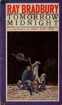
The story of his bemused chiding of EC publisher Max Gaines and editor Al Feldstein is pretty common knowledge. My first exposure to these stories, given the lack of reprints in the late 1960s and early 1970s, was in the form of a couple Ballantine paperback collections of the EC stories, Tomorrow Midnight and The Autumn People. Both had Frazetta covers.
In 1978, when Russ Cochran's EC Reprint series of slip-cased hardcover editions began to come out, I had a subscription. In devouring the supporting material, I learned of the infamous letter to EC, politely chiding them for neglecting to pay his royalties on a story of his that they'd actually lifted!
The upshot, of course, was that he agreed to further adaptations. One of these, The Flying Man, contains eloquent art by one of my personal favorites, Bernard Krigstein.
I'm sure I read other Bradbury adaptations in comics over the years, but the next one that triggers in my memory is a poem on Viking Lander I that was included in Mike Frederich's "ground level" comic experiment, Star Reach, issue 6. The idea behind the "ground level" movement was that comics could take the energy and freedom of the undergrounds and temper it with more, ahem, lucid storytelling of overground, or mainstream comics. Sometimes it worked, sometimes not. The issue containing the Bradbury poem was particularly strong overall, incorporating a delightfully aggressive and melancholy Elric story by old Madison acquaintance Steven Grant and illustrator Bob Gould. The Bradbury poem in that issue was framed by an Alex Nino illustration, enhancing my burgeoning fascination with Fillipino comic artists.
Bradbury slipped in and out of my radar over the ensuing years. I was fascinated by the film adaptation of Something Wicked This Way Comes, despite the depiction of rolling hills in Illinois!
The next comic book work involving Bradbury that I remember reading was the 1985 adaptation of Frost and Fire, part of a series of ambitious graphic novel SF adaptations of classic SF(and some noteworthy newer works, like Arthur Byron Cover's Space Clusters, again illustrated by Alex Nino!). Frost and Fire was illustrated by veteran inker Klaus Janson, most celebrated at the time for his work with Frank Miller on Miller's initial Daredevil run. It's a successful collaboration, seamless in most places. The Bill Sienkiewicz cover art is well suited to the tone of the story.
Following that, there were the Topps adaptations of Bradbury's work. Topps was a short-lived but ambitious 1990s comic book publisher, an extension of the Topps bubblegum card company. As you might expect from that, most of their line consisted of licensed properties, including The Lone Ranger, The X-Files and Xena. I recall two series, Ray Bradbury Comics (collected as multiple volumes of The Ray Bradbury Chronicles), a serialized version of The Martian Chronicles, and a one-shot of The Illustrated Man. As an anthology, the latter was uneven but usually worthwhile. I recall a particularly sensitive collaboration with P. Craig Russell on the story The Visitor. I've gushed over Russell's work in the past. Suffice to say that despite some printing issues, the work is worth searching out.
Those are my memories of Ray Bradbury's work in comics. I know it's far from a comprehensive list of comic book work , if such a thing exists.
And it's not intended to be complete.There must be a Bradbury comic book bibliography, but I've not found one. I note with some sadness that there's no Bradbury entry at Lambiek, a site I've come to regard as a source of record on comic matters.
I did have one last comic book related Bradbury encounter. My colleague Dana Andrews and I were haunting the dealer's floor, down by Artist's Alley at SDCC a few years ago. We heard a loud shout behind us- "Make way, make way! Make way for Ray Bradbury!" His honor guard forming a snowplow wedge, Ray Bradbury was wheeled by us, generating spontaneous applause as he passed. I gave him a smile, which I remember him returning. No way of knowing if that smile came from his head or my wishful thinking, but he did have a reputation as having a bit of an eye for the ladies.
Sad to think there will never be another Ray Bradbury story, barring printings of works already scheduled, if such there be. But like his peers, the other humanists of SF (Sturgeon, Simak, and Kress come to mind in this context), I think the line the fictional version of Twain uttered in an episode of ST: TNG comes to mind: "All I am is in my books."
His eloquence shows in this classic scene. Goodbye, Grand Master of Science Fiction.
And then the son saves him, and then he saves his son, and they live to the happy ending.
Anyone versed in science fiction, fantasy and horror knows his work. Many of us (like me) begin with it.
I found a copy of R is for Rocket in my grade school library. Coupled with the short story The Man in a Boy's Life SF anthology I got somewhere, I developed a fascination with his sensitivity and use of language, even if I didn't fully understand it at age 8.
But as I did with Lord of the Rings and The Stars My Destination, I kept coming back to the work(s), finding new treats and possibilities every time.
My favorite works of his remain unchanged over the last ten years or so: his screenplay for John Huston's Moby Dick, the novel Something Wicked This Way Comes, The Martian Chronicles, and some of his SF poetry.
THEY HAVE NOT SEEN THE STARS
They have not seen the stars,Not one, not one
Of all the creatures on this world
In all the ages since the sands
First touched the wind,
Not one, not one,
No beast of all the beasts has stood
On meadowland or plain or hill
And known the thrill of looking at those fires.
Our soul admires what they,
Oh, they, have never known.
Five billion years have flown
In turnings of the spheres,
But not once in all those years
Has lion, dog, or bird that sweeps the air
Looked there, oh, look. Looked there.
Ah, God, the stars. Oh, look, there!
It is as if all time had never been,
Nor Universe or Sun or Moon
Or simple morning light.
Those beasts, their tragedy was mute and blind,
And so remains. Our sight?
Yes, ours? to know now what we are.
But think of it, then choose. Now, which?
Born to raw Earth, inhabiting a scene,
And all of it no sooner viewed, erased,
As if these miracles had never been?
Vast circlings of sounding fire and frost,
And all when focused, what? as quickly lost?
Or us, in fragile flesh, with God's new eyes
That lift and comprehend and search the skies?
We watch the seasons drifting in the lunar tide
And know the years, remembering what's died.
But what I'd really like to talk about is his work in comics.
This is not intended to be exhaustive. It's a retrospective of my experience of the man's work.
The story of his bemused chiding of EC publisher Max Gaines and editor Al Feldstein is pretty common knowledge. My first exposure to these stories, given the lack of reprints in the late 1960s and early 1970s, was in the form of a couple Ballantine paperback collections of the EC stories, Tomorrow Midnight and The Autumn People. Both had Frazetta covers.
In 1978, when Russ Cochran's EC Reprint series of slip-cased hardcover editions began to come out, I had a subscription. In devouring the supporting material, I learned of the infamous letter to EC, politely chiding them for neglecting to pay his royalties on a story of his that they'd actually lifted!
The upshot, of course, was that he agreed to further adaptations. One of these, The Flying Man, contains eloquent art by one of my personal favorites, Bernard Krigstein.
Bradbury slipped in and out of my radar over the ensuing years. I was fascinated by the film adaptation of Something Wicked This Way Comes, despite the depiction of rolling hills in Illinois!
The next comic book work involving Bradbury that I remember reading was the 1985 adaptation of Frost and Fire, part of a series of ambitious graphic novel SF adaptations of classic SF(and some noteworthy newer works, like Arthur Byron Cover's Space Clusters, again illustrated by Alex Nino!). Frost and Fire was illustrated by veteran inker Klaus Janson, most celebrated at the time for his work with Frank Miller on Miller's initial Daredevil run. It's a successful collaboration, seamless in most places. The Bill Sienkiewicz cover art is well suited to the tone of the story.
Those are my memories of Ray Bradbury's work in comics. I know it's far from a comprehensive list of comic book work , if such a thing exists.
And it's not intended to be complete.There must be a Bradbury comic book bibliography, but I've not found one. I note with some sadness that there's no Bradbury entry at Lambiek, a site I've come to regard as a source of record on comic matters.
I did have one last comic book related Bradbury encounter. My colleague Dana Andrews and I were haunting the dealer's floor, down by Artist's Alley at SDCC a few years ago. We heard a loud shout behind us- "Make way, make way! Make way for Ray Bradbury!" His honor guard forming a snowplow wedge, Ray Bradbury was wheeled by us, generating spontaneous applause as he passed. I gave him a smile, which I remember him returning. No way of knowing if that smile came from his head or my wishful thinking, but he did have a reputation as having a bit of an eye for the ladies.
Sad to think there will never be another Ray Bradbury story, barring printings of works already scheduled, if such there be. But like his peers, the other humanists of SF (Sturgeon, Simak, and Kress come to mind in this context), I think the line the fictional version of Twain uttered in an episode of ST: TNG comes to mind: "All I am is in my books."
His eloquence shows in this classic scene. Goodbye, Grand Master of Science Fiction.
And then the son saves him, and then he saves his son, and they live to the happy ending.
Sunday, June 3, 2012
Original Art Sundays No. 125: Tranny Towers, Chapter 27
After midnight, so technically Sunday. Here we go.
The next chapter:
Another scan from a tearsheet. I need to rescan this from the original as well. The Moire' pattern on the title comes from Zipatone that was not properly put into the printer's file on their end- I gave them clean copy- and it reappears in the environments in panels three and five.
So many plot devices are, if not cliche', standards in queer and TS comics: bashing, being outed, suicide. I managed to include most of them in Tranny Towers, but I hope there was a freshness to them, or at least my own spin.
Cutesy notes: the business named Ruby's Slippers is a pretty obvious OZ reference, also an indirect nod to my home town of Grand Rapids, MN, from whence hails Judy Garland. The neighboring business, Pelican Parts, is just a bit of silliness.
The passenger in the threatening vehicle is inspired by a former assistant manager from my movie theater days, who screamed homophobic and transphobic insults and threats at me so loud that the Rocky Horror audience inside the theater was silenced. Of course, he had just been fired for doing a lousy job, but still...
The extreme tailfins on the car are obviously 1950s inspired.
Overall, I think this was a pretty successful page.
Next: Chapter 28.
Sunday, May 27, 2012
Original Art Sundays No. 124: Tranny Towers, Ch. 26
Once more into the breach with the next chapter!
Another tearsheet scan. This one definitely needs to be rescanned from the original art. There are dropouts in the bar in the bottom left panel, and the big text in the center tier is actually 50% gray outlined in black.
Plot notes: this is the point where the Agnes Nixon axiom comes into play. The strip is fundamentally a soap opera, and Nixon, who created some of the best (including the sorely missed Ryan's Hope), once noted that soap opera plotting consists of people doing all the wrong things for all the right reasons.
There's also some wish fulfillment here. This is how part of me wishes I would have behaved in a similar situation. Though it accomplishes nothing, telling off someone who's humiliated you in that singular way (not having the courage to let you know what's going on and making you find out the hard way) does have a bitter satisfaction, however Pyrrhic and short-lived the victory.
Simply put, it's one of those times when you REALLY want to tell someone off, though you know it will do no good at all, just for your own pride.
Swipe file notes: the title is properly credited to Howard Cruse, whose gentle wit inspires me. The masthead text is copied freehand from a book of Art Deco typefaces (a Dover book, I think). The line "dishonorable and gutless" comes from the powerful film Cutter's Way.
Next: Chapter 27, the street fight.
Monday, May 21, 2012
Original Art Sundays No. 123: Tranny Towers, p.25
Posting a tad late, technically Monday.
Got in from MNCBA exhausted, slept on the couch for five hours after getting in (!), but our table raised close to $500 for the Comic Book Legal Defense Fund, not counting monies raised at the art auction. Yay volunteering! Yay free speech! More about this later this week.
Right now, it's time to post the next chapter of Tranny Towers.
Again scanned from a tearsheet. Some dropouts in this one, notably the lines on the pole.
Quirky little things to notice: Rick's last name is O'Shay, a nod to the classic Western comic strip by Stan Lynde. Tigger is on drums!
This was foreshadowed by the poster on the wall in the phone conversation chapter ("Duke Ellingtoon") which set the stage, so to speak, for Rick as a jazz man.
Brings to mind Marge's lines in the early Simpsons episode: "Lisa, stay away from that jazzman!" (then speaking to Bleeding Gums Murphy) "Nothing personal, I just have deep fear of the unknown."
Ahem.
Back to the page.
The rendering of the bar doesn't stand up to scrutiny very well, but it's a plausible environment. Had real fun drawing the jazz combo and the design-y hipster poster on the phone pole. I didn't notice till after I saw it in print that I just plain forgot to put cars on the street!
The panel break intruding on the stage between the second and third tiers on the left is a little disconcerting once you notice it, but it scans fairly well.
As regards the narrative, the climactic moment is the instant of pure dread in a doomed relationship, where you realize that the object of your desire not only does not reciprocate your affection, but offers it to another. In Dena's case, this pain is exacerbated by her competition being cisgendered, or as we used to say, a genetic female.
As the tag line indicates, the magazine skipped a week for Christmas.
Thanks for holding out a few extra hours, and we'll be back next week with the next chapter.
Sunday, May 13, 2012
Original Art Sundays no. 122: Tranny Towers, p. 24
I'm going to finish posting these all before moving on to something else. Putting Tranny Towers to bed will feel good, and it will be nice to give my faithful readers (if such there be) some continuity after a long and shoddy period of irregular output.
The strips we're getting into now come after the book submitted for the Xeric Grant, so they have not been reprinted since their original appearance. Please note that we are currently in the final grant cycle for comics!
This is scanned from a tear-sheet in Lavender magazine, known at the time as Lavender Lifestyles. I've done some light cleanup and re-sized the scan. I will rescan from the original before going to press, but this scan provides an unexpected opportunity to discuss a related issue (see below).
This page sets up what turned out to be the final two story arcs, with Dena's love life as the first story, and Trina's relationship coming next.
I like the masthead quite a bit, and there's a fair amount of story for such an introspective page.
As always, still a bit of work to do here, but it will serve until we go to press, yes?
Logistics issues: the dual-column narrative is not as effective as I hoped. I'll add a white divider down the meridian pre-press. The text needs re-lettering, particularly on the crowded central panel of column two. My font of choice for this remains Clean Cut Kid, purchased last year during the font sale at Comicraft for cheap. I like their stuff, but even on sale, it's usually a tad rich for my blood.
The other issue I alluded to above relates to the original printing of these strips.
Here's a full page scan of the original tear-sheet. I've blurred out the ads, but left the neighboring strip, The Wet Ones, which I rather liked, intact.
This is actually a bit of an improvement from past print runs. The early strips ran at 1/4 of a printed page, roughly 8 1/2" x 11", so the strip occupied a space of roughly 2 3/4" x 4 3/4 ". Around this time, the magazine was giving a full page to Alison Bechel's Dykes to Watch Out For. Now, I love Alison's work, always have, but come on. The other strips are crammed in like this?
Around this time I began asking for increased space. About six strips later, they increased my allotted space, but reformatted the strip without my knowledge or consent. After finally getting to talk in person with the designer, we settled on a new format that ran for the balance of the strip. That format begins about eight strips from now.
For purposes of completeness, I will show the reformatted strips along with their originals when we get to them.
Next Sunday: Tranny Towers, chapter 25.
Sunday, May 6, 2012
Original Art Sundays No. 121: A Private Myth, p. 24
Finally.
I've been wrestling with this page for a month now.
Here's why. Take a look at the page rough.
Working up the rough, I was never happy with the first panel. I wanted the page to move through a lot of action very quickly, beginning with the moment to which this has been building.
I tried the slap from several angles and was happy with none. It just didn't work!
Her reaction was never quite powerful enough, there was no indication of the emotions of the aggressor. It was all too static.
But I didn't realize that.
I got hung up on getting the physical dynamics of the slap right.
I like looking to other artists and comic creators for suggestion and inspiration. It's an excuse to use my collection as a swipe file.
But there are very few slaps in comics, much to my surprise.
I looked at some 40s crime stuff, my copy of Romance Without Tears, and some superhero stuff. Lots of slugfests, even some planets being tossed about, but not slaps.
In frustration, I started re-reading Strangers in Paradise to take my mind off the problem.
And there it was.
But I still couldn't make it quite work.
That's when I realized, as my Dad used to say, I was putting the ac-CENT on the wrong syl-LA-ble.
The crucial thing wasn't the technical accuracy of the slap, but the slap itself.
It's a big moment, and I had it crammed into a corner.
So worrying less about detail, I turned the Bristol over and drew the final.
Better. Not perfect, but better.
The energy comes through, and the poses and expressions are, if not spot on, plausible. As David Chelsea observed in his book on perspective in comic art, it gives a sense of where things are, physically and emotionally.
This was an emotionally difficult page, but since it's been almost two decades since I endured something similar, it was a tad easier this time than it was as a story element in an earlier Tranny Towers strip.
This is also the first full splash page I've used in this story. Since it's such a key moment, I think that's apropos.
My classes end Tuesday night, my final grades are due at the Records office next Monday. I have a bit more time to work on my storytelling, though the deadline for the next volume of the Comic Encyclopedia looms large.
Long and short, new art next week.
And as I tell my students, thank you for your time and indulgence.
Sunday, April 29, 2012
Original Art Sundays no. 120: oddment: photography
Well, the next page of A Private Myth is done. No time to scan today, but will be spending the day at work tomorrow and will make time then. So next week we're good to go.
Every time this issue comes up, I wrestle with the practicality of a home scanner. It's more a space consideration than anything else.
Meanwhile, I'd like to share a photograph from The Old Days. You know, film.
This is the man I almost married (there but for the grace of the Deity and all that), standing by a stone bison near an insurance office down by the Walker Art Center. All are gone now for various reasons. I do miss the bison.
The sun washes it out, but he's wearing an Omaha the Cat Dancer button.
While I originally took this for the subject matter, I find the variety of textures compelling. The composition is a little on the nose, but it serves.
I find the wide variety of angles in this seemingly simple composition fascinating. The textures are equally intriguing in a subtle way. Stone, glass, carved stone, varying fabrics, leather, hair, skin, branches- this thing is all about the texture.
I resisted the temptation to try to correct this image. I find more is lost than gained in that process at times, especially when working with varied textures. Not to say it can't be done, but there's something to say for letting the original speak for itself.
Again, despite having worked with some high end equipment and taught digital photography several times, I still find the nuances of film and laboratory much more satisfying than digital. But times change, and our choices remain to adapt or to die aesthetically.
Next: the next page of A Private Myth, for real, on Sunday, May 6, the first day of the last week of class.
Monday, April 23, 2012
Original Art Sundays no. 119: The Pirate Alphabet
The next page of A Private Myth is still giving me fits, but I think I know what's wrong now.
Meanwhile, rather than keep readers waiting indefinitely, here are some images from yet another uncompleted project.
I was working on an alphabet book based on pirates, more than a decade before the Pirates of the Caribbean films (which I rather enjoy). The book used the framework of a couple young girls gleefully talking about pirates.
Here are a couple of the pieces, done in watercolor technique using colored inks and dyes.
This piece was about Privateers, the licensed pirates of the British and Spanish crowns.
The colors are a bit off, and my control of background around people and objects was a bit lacking- still hadn't mastered masking!
And the foreground figure is a bit stiff, and the color of his coat is too close to the background sky.
So it goes.
This piece, which I much prefer, is an illustration for a page devoted to women pirates, who span all nationalities. I particularly like the one in white with the blue kerchief.
I love the subdued tones, and the interplay of inks and paper texture pleases me.
I went out of my way to get the weaponry and boats right, but I suspect I made some errors despite my best efforts.
This is another one of those "I'll go back and finish it some day" projects. Such a big pile of those!
Then again, it may have been rendered unnecessary. The market may be glutted with pirate stuff now. More's the pity, as the relative percentage of good pirate stuff to total pirate stuff is rather low. Still, I did like the last Pirates of the Caribbean film, the one loosely based on Tim Powers' novel On Stranger Tides, even if it didn't clean up the loose plot threads from the previous film in the series.
Next week: something....
Saturday, April 21, 2012
One for Felix
Haven't posted for a while. But April 20 is my other birthday. 23 years ago today I had my final gender reassignment surgery.
Some well-meaning friends don't get it that I want to celebrate this day, in my own quiet way. After all, it's done now, why live in the past?
Well, in the first place, hushing it up implies lying about the past, and I think lying about who you were is the same thing as lying about who you are. Mind, I'm not going to stand in the middle of a biker bar and shout it out, nor am I going to ramble incessantly about it like a silly schoolgirl. But no more shame, not of who I was, not of who I am.
Second, the people who tell me to keep mum about my past sometimes seem more ashamed of it than I am. Paradoxically, many of them are people who've outed me to others to show off how open-minded they are to have me as a friend (sorry, but my private life is not your trophy), or people who know my business but have never had the decency to discuss it with me directly. Maybe they have their own stuff to deal with, but I try to be there for the hard stuff for my friends, and I hope for the same from them. It disappoints me when that reciprocation is missing.
If I sound a little bitter about some of that, we have a bingo, please hold your cards.
But as frustrating as all that can be, if someone else has a problem with my life, that's just what it is: their problem. It's up to them to solve it.
This day also gives me pause to remember all the things I've done in those years.
The bad comes from trusting the wrong people and not trusting myself: an abusive relationship, bad financial decisions, too hesitant to act in advancing my career.
The good comes from taking chances related to knowing I'm worth taking a chance on: randomly recording original music, published articles, a newspaper strip, self-published comics, a technical college diploma, a BFA, a Master's, and a twelve- year (so far) teaching career.
I'm still fighting to stay motivated on my own work. What creative person doesn't share that fight? But I learn from watching others who simply do the work, without conceit or complaint.
The first of these I observed during these years was a teacher who shared my original birthday, Felix Ampah.
I first encountered this bright smile and dark voice in a Drawing and Painting course at Minneapolis Community & Technical College. I'd had surgery less than three months prior to starting the Commercial Art program there, and was still quite unsteady on my feet, in every sense. But it would be disingenuous to say Felix made me feel at home, since he had that effect on everyone.
We began talking about comic art as he taught me basic techniques, later built on in Airbrush and Portfolio classes. Even when we were not in his classes, we sought him out for advice on art and career, and we looked to the way he conducted himself as an example of what an artist could do with his/her own life.
We didn't know how rich that life was until later.
I bragged about having seen Hendrix, and that really got Felix going. He was a huge hendrix fan, studying his guitar technique and lyrics scrupulously. When Felix talked to me about learning to play Hendrix licks on homemade guitars in Ghana, I had no idea that he was actually a Ghanan prince, and got special permission from his father to study art in the States.
Life isn't a contest and there's enough to go around, as long as people are willing to share and trust. But I still find myself in awe of what people are willing to give up to get the lives they want, and how happy they often are with those choices.
Felix maintained his joy teaching in a place where some of the teachers seemed rather unhappy with their lots in life. In time, his successful career as a painter led him to open his own gallery, Ampah Gallery.
I was driving a different route home from teaching one February night when I noticed the sign for Ampah Gallery. Thinking that it might be "our Felix", as we called him, I made a mental note of stopping by during regular hours.
But I was too late. A couple weeks later, I saw his obituary in Insight, a local paper dedicated to news of the Black community.
I did stop in a couple weeks later, to look about and sign the guest book in Felix's memory in thanks for all he'd given me.
Felix's critiques bordered on Zen but were always eminently practical. Every now and then some overly regimented student would gripe about his criticisms not being specific enough, but the rest of us got it. He was giving us room to explore, and pointing in the right direction. Only the best teachers can pull that off.
He also taught adjunct at U of MN, and has had a scholarship in design named for him at MTC.
I miss him on my other birthday, Feb. 19. As I mentioned, it was his day too.
I hope this inspires me rather than intimidating. Looking at the scope of the accomplishments of others contributes greatly to a sense of inadequacy, which immobilizes creativity.
But I also remember Felix working at a dozen different projects- posters, prints, lesson plans, inventions (!), a pilot for an unproduced PBS series on airbrushing (screened in class for fun). He just kept working.
That's the challenge, and the only way to do it is to do it.
As Steve Rude once said, hey, what else you got to do with your life?
Some well-meaning friends don't get it that I want to celebrate this day, in my own quiet way. After all, it's done now, why live in the past?
Well, in the first place, hushing it up implies lying about the past, and I think lying about who you were is the same thing as lying about who you are. Mind, I'm not going to stand in the middle of a biker bar and shout it out, nor am I going to ramble incessantly about it like a silly schoolgirl. But no more shame, not of who I was, not of who I am.
Second, the people who tell me to keep mum about my past sometimes seem more ashamed of it than I am. Paradoxically, many of them are people who've outed me to others to show off how open-minded they are to have me as a friend (sorry, but my private life is not your trophy), or people who know my business but have never had the decency to discuss it with me directly. Maybe they have their own stuff to deal with, but I try to be there for the hard stuff for my friends, and I hope for the same from them. It disappoints me when that reciprocation is missing.
If I sound a little bitter about some of that, we have a bingo, please hold your cards.
But as frustrating as all that can be, if someone else has a problem with my life, that's just what it is: their problem. It's up to them to solve it.
This day also gives me pause to remember all the things I've done in those years.
The bad comes from trusting the wrong people and not trusting myself: an abusive relationship, bad financial decisions, too hesitant to act in advancing my career.
The good comes from taking chances related to knowing I'm worth taking a chance on: randomly recording original music, published articles, a newspaper strip, self-published comics, a technical college diploma, a BFA, a Master's, and a twelve- year (so far) teaching career.
I'm still fighting to stay motivated on my own work. What creative person doesn't share that fight? But I learn from watching others who simply do the work, without conceit or complaint.
The first of these I observed during these years was a teacher who shared my original birthday, Felix Ampah.
![]() |
| Photo used for MTC Catalog dedicated to Felix |
We began talking about comic art as he taught me basic techniques, later built on in Airbrush and Portfolio classes. Even when we were not in his classes, we sought him out for advice on art and career, and we looked to the way he conducted himself as an example of what an artist could do with his/her own life.
We didn't know how rich that life was until later.
I bragged about having seen Hendrix, and that really got Felix going. He was a huge hendrix fan, studying his guitar technique and lyrics scrupulously. When Felix talked to me about learning to play Hendrix licks on homemade guitars in Ghana, I had no idea that he was actually a Ghanan prince, and got special permission from his father to study art in the States.
| Felix and his wife Sylvia |
Felix maintained his joy teaching in a place where some of the teachers seemed rather unhappy with their lots in life. In time, his successful career as a painter led him to open his own gallery, Ampah Gallery.
| A Felix painting, reminiscent of Reginald Marsh |
But I was too late. A couple weeks later, I saw his obituary in Insight, a local paper dedicated to news of the Black community.
I did stop in a couple weeks later, to look about and sign the guest book in Felix's memory in thanks for all he'd given me.
Felix's critiques bordered on Zen but were always eminently practical. Every now and then some overly regimented student would gripe about his criticisms not being specific enough, but the rest of us got it. He was giving us room to explore, and pointing in the right direction. Only the best teachers can pull that off.
He also taught adjunct at U of MN, and has had a scholarship in design named for him at MTC.
I miss him on my other birthday, Feb. 19. As I mentioned, it was his day too.
I hope this inspires me rather than intimidating. Looking at the scope of the accomplishments of others contributes greatly to a sense of inadequacy, which immobilizes creativity.
But I also remember Felix working at a dozen different projects- posters, prints, lesson plans, inventions (!), a pilot for an unproduced PBS series on airbrushing (screened in class for fun). He just kept working.
That's the challenge, and the only way to do it is to do it.
As Steve Rude once said, hey, what else you got to do with your life?
Subscribe to:
Posts (Atom)