Wednesday, December 31, 2014

Best Comics of 2014, No. 14: Miracleman: A Dream of Flying

Well, as the song says, another year older and a new one just begun.
So let's begin our annual countdown of the best comics of 2014.
Curmudgeonly disclaimer: I do these one a day for two weeks, rather than all at once as most folks do. I also wait until the year has actually ended to begin posting them. I mean really, how can you encapsulate something that hasn't ended yet?
That said, here we go.
Number 14 on the list is a book I've taught several times in Comic Book History class, Alan Moore's Miracleman: A Dream of Flying. Together with Watchmen, Miracleman sums up Moore's take on superheroes in the real world: they would either be hunted to extinction, or if they survived the hunt, they'd create an enforced utopia.
Miracleman is the latter story.


This Marvel reprint of the legendary Alan Moore meditation on the superhero is long overdue, but not lacking in problems. The classic tale of Michael Moran, who becomes Miracleman and eventually creates an enforced utopia (before you start wailing about spoilers, come on now, this book has been around online for over 30 years- anybody who hasn't read it hasn't been trying) is given a serviceable treatment at worst and a stellar treatment at best by Quesada and Company. I find the politics of the matter chafing. Marvel has had the rights to this for years now, and has been milking it with reprints of the Mick Anglo late 50s/early 60s British material, which, while fun and highly inventive in its way, is basically watered down C.C. Beck Captain Marvel.Then Marvel does the annoying multiple covers thing. Some of the covers, like this playful one by Skottie Young, are spot on! This book should be exciting above all else. Granted, some of Moore's strongest ideas on the superhero are within these pages, but still, exciting fun first!
But others, like this Neal Adams cover, are just the wrong tone for the series, making it seem like just another superhero book.
And all the gimmicks of multiple covers, coupled with the absurdity of the writing credit to "the original writer"- well, it just chafes. Better to leave off the writing credits entirely than to indulge in that backhanded, feeble attempt to pick at the open wound that is Alan Moore's war on reprinting his past work. Come on, just do as Zack Snyder did in the embarrassing Watchmen film- just credit the artist as the creator and be done with it.
But that's got nothing to do with the contents. The story stands up quite well, these decades later. And while I don't care much for the new coloring, the printing is better. Perhaps it's the nostalgic aspect that gets to me. I like to see this on dimmer paper, despite the storytelling benefiting (sometimes) from the crisper printing.
In fairness, there are moments where the new colors are strikingly effective, as is the case in the first page of the narrative proper:

A very mixed bag. Kudos to Marvel for reprinting The Yesterday Gambit, the story from the original Warrior (UK SF comics magazine where the character first appeared as Marvelman) run not reprinted by Eclipse in the 80s, but frustration at their placement of the story in the wrong place, both in reprint order and in the narrative. Also, with no color guides to work from, Marvel did a rather shoddy job coloring this story, in my less than humble opinion.
But much of this is more about presentation than about the work itself. Marvel has wisely made few, if any, editorial alterations to the source texts, and the story stands on its own merits, even with Marvel brashly boasting about the wonders of all the extras in the collected edition. At least they did that after the story proper, so if these come out in TPB, there will be an opportunity to cut that material from them all, move it to the back and re-bind the books in a more proper form.
And I eagerly await the unpublished Neil Gaiman issues, probably to be printed after the original 23 issue run is reprinted. There's also a new Miracleman Annual out December 31, which I've not yet had a chance to read. 
Hope springs eternal.
Tomorrow: No. 13 of the best of 2014 fades in....


Monday, December 29, 2014

Original Art Sundays (Monday) No. 203: Rock History Sketches!

Posting a day late, largely due to working 50 + hours last week and again this week.
In a bit of a holding pattern over the next story, now that the most recent Surrealist Cowgirls story is complete. I did do a small print run of a Beta version of the comic for family & friends. It had a couple burps and blemishes, but I was still quite proud of it.
For this week, something light and a bit different.
As I believe I mentioned before, I was teaching History of Rock & Roll this semester. As the semester proceeded, I got in the habit of doing small sketches on the attendance sign-in sheets. Now that we're done, I've compiled them into one piece. Nothing fancy, none of these took more than a minute or so to execute- just quick ballpoint pen energy!
I've blurred out the student names, which makes for an okay background.


Again, just a fun thing. If I had considered compiling them in advance, I would have rendered some of them in the other orientation! I suppose I could have flipped them in Photoshop, but there's something disinengenuous about overworking doodles!
Next: I do have a smaller Cowgirls project that I've been poking at for a few months. Maybe it's time to finish and post that one. We'll see.

Sunday, December 21, 2014

Original Art Sundays No. 202: Surrealist Cowgirls: Maggie's Bedtime Story, conclusion

As promised, the final page.
I feel like I've been telegraphing my punches on this story, but I hope someone is surprised by the ending!

The strange thing is that I picked the names Phoebe and Nicholas at random, and had no idea where the story was going when I started it. I just knew I had to use that image of the bird and the flame-headed dude and build a story around it.
I wanted the Phoenix image to reference Tezuka's work without aping it. I took select elements (wig span, body type, head feathers) and just drew her freehand.I think I got the effect I for which I was hoping!
This story has careened from hand text to digital text and back, here on the same page. The exposition inside the fairy tale is, for the most part, digital. I'm coming around to digital as a way to letter. It worked well on the story for the Russian comic, which is now out! But you have to be in Russia to read it. I'll post a link to the ordering page after I get my copies.
Not sure what happens from here. I have a germ of an idea for another Cowgirls story, but am toying with some other stuff as well.
Next: we'll see....

Thursday, December 18, 2014

Original Art Sundays (Thursday) No. 201: Surrealist Cowgirls: Maggie's Bedtime Story, page 9

This was done by Sunday, but with classes ending today, I haven't had time to post.
The next page of the story is done, concluding the tale, and the final page will post on Sunday, December 21.
Here we go:


This layout is exactly what I wanted. In terms of the figures, I fudged a bit to get them laying down next to each other and still looking at the child. Also, the placement of the "dying names" word balloons was crucial.
Debated whether Phoebe and Nicholas' speeches were over the top, but when you're dying and have something to say, you just say it.
Sunday: the conclusion of this story.

Monday, December 8, 2014

Original Art Sundays (Monday) No. 200: Surrealist Cowgirls: Maggie's Fairy Tale, p. 8

Done on time, posting a day late. Still working too much! Getting the story done anyway.

Very simple, fast page. The intent is that the closed broken set of panels framed by the splash slow the time of the egg falling.
Phoebe's face can be seen either as a death mask expression or her staring in horror at the fallen egg. While the original intent was the former, I elected to leave it ambiguous, rather than adding a  few lines to clarify. 
One, possibly two pages left to this story. If my other plans are to be fruitful, this must be done this week.

Sunday, November 30, 2014

Original Art Sundays no. 199: Surrealist Cowgirls: Maggie's Fairytale, p. 7

As promised, here's the next page of the story!


Blogger continues to give me problems uploading, but I've found a work-around, so not an immediate issue. As to the page itself, an inevitable plot development. I've told a couple friends the whole story, and when I get to this part, they're really shocked. It made me sad to do the page, but not so much, as I knew there was no choice for the story to resolve as planned. Still one little plot point I'm ironing out for the final pages.
Craft notes: a simple page once again. That seems to be my favorite way of working, simple and fast. I do like detail pages, but they seldom turn out as I hoped. This one is Copic markers and Proart heavy, thick India ink for the spotted blacks.
Next week (next month, same thing): page 8.

Saturday, November 29, 2014

Original Art Sundays (Saturday) No. 198: Surrealist Cowgirls: Maggie's Fairytale, p.6

For some reason, I've had incredible issues with posting. See below for screed!
But here's the next page. The following page will post tomorrow, Sunday, November 30.


Sigh. Okay, numerous issues delayed this, mostly time and my own stubbornness. I really wanted to post the rest of the story all at once, but that proved impractical. The story is so close to done I can taste it. And I want to finish up a big batch of Cowgirls stuff in the next two weeks- no mean feat as I work 30 - 50 hours a week, not counting teaching and end of the semester testing and grading! Whew!
But it's time for this project to come together, at least in a Beta version.
Now thoughts on this page.
I like the top tier a lot. Simple and to the point. I really fought with the war panel. I'm very unhappy with it as it is. It has incredible energy but no focus. I'd like to rework it, but I'm still intimidated by the prospect of showing a whole war in one panel! I'm drawing inspiration from EC war comics and a recent reading of the Harlem Hellfighters graphic novel, which impressed me a great deal.
Still, the work and the joy of the Cowgirls continues. So close... so close...

Sunday, October 19, 2014

Original Art Sundays No. 197: Surrealist Cowgirls: Maggie's Fairytale, p. 5

Well, posting on schedule!
Before I break my arm patting myself on the back, let's get right to the page.
 This is the page that sat fully done on the side of the board for weeks, while I completed the story posted last week (to be published in the Russian language!). I'm happy to be back at this story, which means a lot to me. It started out as something trivial, a bit of fun using a childhood creation (the flaming people), but it's become something more. Not sure if it's two or three more pages.
On this page, I wanted to convey a contrast between the peace Phoebe and Nicholas are enjoying and the impending chaos caused by their spontaneous absence. The background in Panel One is freely swiped from the Joni Mitchell For the Roses album cover. I'm still using the same technique for the borders- a fine ruled line with a freehand line over it for texture. It's not appropriate for every story, but I like it for this one!
I'm considering getting a set of word balloons from our friends at ComicCraft. As discussed last week, I like the idea of variety in them. While my hand rendered balloons, such as those on this page, are adequate, there are times when a more, shall we say, honed style is right for the page.
That's the key: what's right for the page. Sometimes digital lettering and precise balloons are out of place in a freely rendered page, as some of mine are.
Next: page 6 of the fairy tale.


Wednesday, October 15, 2014

Original Art Sundays (Thursday) Nos. 191 - 196: Get A Job!

Been more than a month since I posted! I got a call to contribute a comic story to an anthology for the Side By Side Film Festival in Russia. Given the current political climate there, the idea of being part of a Russian GLBT film festival in any way was too much of an honor to pass up.
I did notice a while ago in the stats that this blog does have some readers in Russia. I hope my work gives them some pleasure.
Now, a few weeks after deadline (but apparently still acceptable to them, since they asked for it again today and they now have it, barring catastrophe), I can share it with you. I'm counting it as 6  posts, since it's 6 pages that took me 5 weeks to do.
I also have the next page of the Surrealist Cowgirls story done.
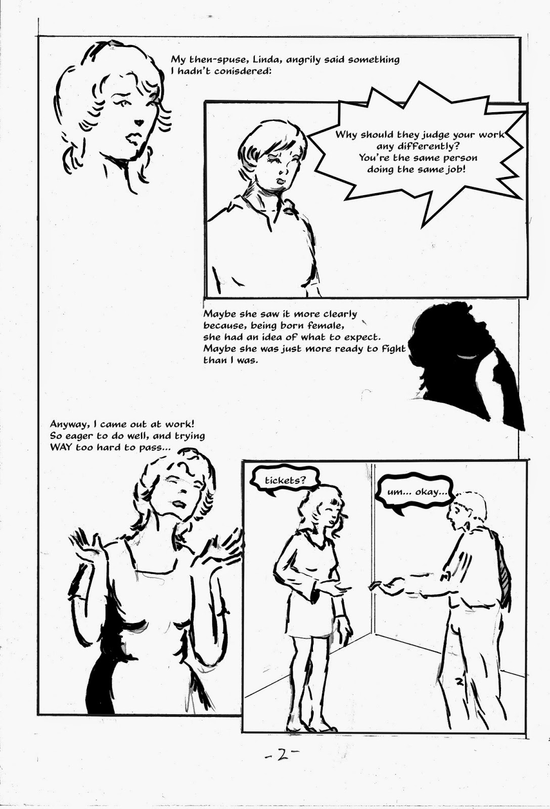
Here's a piece of my coming out story, titled Get A Job! This work will be included in The Sharp Invitation. The current total for that book is approximately 20 pages, with several more shorts in the planning stage. The book will be a series of titled chapters/shorts, telling the whole story, or as much of it as I think people want to hear. As I was discussing with another teacher at MCAD today, there's a fine line in memoir. You have to tell people enough that they give a rip about what they're reading, but it's a balancing act as to how much of yourself you put out there. The three biggest chapters currently planned are titled Sex, Drugs and Rock & Roll. I sigh with apprehension just writing the chapter titles here!
Now, the new chapter.

Some thoughts on process: I worked these up in the sketchbook, then did finishes on Bristol, scanned and lettered digitally. I deliberately avoided some of my usual clean-up. I like the slightly loose, more informal look on these pages. Some of the visual devices, like the text dropped out of brush stroke silhouette on the last page, may see use again.
The image at the top of page 5 is my illustration of Katchoo from Strangers in Paradise. I lifted it from a 90s sketchbook and dropped it in; it seemed perfect for the piece.
I'm using the Shape tool in Photoshop for word balloons, but I don't like the limited options, so I'm going to pick up a word balloon set from our friends at ComicCraft!
This was also an emotionally wrenching piece. I don't like to remind myself how close I came to doing porn. I know people who do it and are fine with it, and I bear them no disrespect, but it's not me.
Next: the new page of Maggie's Fairy Tale, a Surrealist Cowgirls adventure!

Sunday, August 24, 2014

Original Art Sundays: Surrealist Cowgirls: Maggie's Bedtime Story, p. 4

Well, I don't know how I did it, with another 45 hour work week and prep for teaching next week, but here's the next page!
Mostly very happy with this one. I want to do some photos and some serious mechanical drawing next time I do a restaurant scene. This is okay, but I'd like to do one that's stunning. Possibly in more of a "real people" story....
This was done in Copic ink markers. I did invest in some new brushes, but I want to make time to practice with them before using them on a page. And while markers do lend themselves to speed, these feel like ink and have very little fade to them.
The page:

Again, scanned in tiers in the interests of time. Rescan is mandated before going to press.
When working on the last panel, I kept thinking about the Mary Jane and Sniffles stories from the 1940s, with Walt Kelly-ish art from Al Hubbard. These stories, upon which I occasionally stumbled in my comic reading youth, have long enchanted me and are long overdue for a collection! Here's a sample page:
So elegant, so imaginative!
Next: page 5. Despite my original script, this is shaping up to be a 6 or 7 page story. I'm very eager to see this one completed. I think it's a really strong story, something I seldom say about my own work.

Sunday, August 17, 2014

Original Art Sundays No. 189: The Pirate Alphabet, supplement

Next Cowgirls page is nearly done. Since I just put in over 100 hours in two weeks, I hope you'll understand a slight delay! The page is more detailed than some of late, and I want to take the time to do this one to my full satisfaction.
Meanwhile, as I was putting some originals in order, I found another page from the aborted Pirate Alphabet project I started in 1999. This one was on the subject of women as pirates!


This was done on 300# deckle edge watercolor paper. The media were watercolors (a bit), colored inks and dyes (mostly) and crowquill and ink (a touch for outlining). I had a great time researching these ladies! Stylistically, the main figures work very well and Penny and her friend (lower right corner) are rendered in a style consistent with their appearance in the rest of the book, but there's a bit of a detach between the two styles. 
Of all the projects I've left unfinished, I think this is one I'd like to complete most. It should go back on the list....
Next, back to the Cowgirls bedtime story!

Saturday, August 16, 2014

Review: Gentle Giant: The Power and the Glory 5.1 Remix

Considering the vast role music has played in my life, I've usually had sound systems that range from adequate to slipshod. Part of this is my being a technophobe. Part of it is me being miserly about big ticket investments (to this day, I put off buying shoes as long as I can due to the cost of decent ones!). Another factor is that I can't always tell the difference between the moderately priced systems and the high-end stuff.
Currently I'm primarily using a Crosley combined turntable and CD player. I like the look of it and the sound serves. I can burn CDs from LPs. It doesn't kick out the jams the way some of my past systems have, but living in a modest space in a garden apartment, having a compact unit with decent sound is okay.
So in light of that, what business do I have reviewing a 5.1 mix of any album, let alone one as iconic as Gentle Giant's The Power and the Glory?
Well, it speaks to the quality of the work that even on this modest system, the difference is noticeable and remarkable. The instruments are distinct, yet the work retains its cohesion. This doesn't come across as five masters playing their instruments as much as five masters playing TOGETHER. There are some subtle changes, extended intros and exits on certain numbers, and the added instrumental track of Aspirations (a perennial favorite) just shines. This album, which I've heard countless times and revered for over 30+ years, has taken on new life for me. The intertwining vocal lines on No God's A Man are clear and precise like never before, but none of the magic of Giant hocketing is lost.
This album has been held in high regard as much for its lyrics as its complex music. When I saw the booklet containing NO lyrics, I was quite let down. But then I popped the DVD into my player. And there they were, embedded in some (mostly) clever and effective animation of every song on the album!

Ironically, the animation I find most disappointing is the one for the aforementioned Aspirations. By associating the song with a fairly generic family, it loses some of its impact for me. The other pieces are all either animated text and symbols or silhouettes, and the universal aspect of that makes them compelling.
In contrast, my favorite animated bit is associated with the album's original closer, Valedictory. Using simple lines and shapes in appropriate position for each of the instruments, it feels like a performance by an invisible band. Very compelling!
Credit where it's due: the animation was done by Gentle Giant founding member Ray Shulman, who's made a respectable career in sound and DVD production.
A word must be said as regards packaging. The original LP had die-cut top corners, reinforcing the image of the playing card. Sadly, not the case here. Despite a lavish gatefold box for the CD/DVD set (slightly different image on the Blu-Ray DVD than on my plain old one, according to some fellow GG aficionados) and a booklet containing a comprehensive and engaging interview/essay, the the cover was not properly, ahem, rounded. In fairness, that might have caused a great many production issues. There's only been one CD release that actually had the rounded corners, the one on Derek Shulman's own DRT Records a few years back (though the Japanese mini-LP set also, ahem, followed suit). The album does come with a charming promotional postcard, which I'll scan and add to this post when I get home from work I'm happy to post here.

Like many GG fans, I eagerly await the next Steve Wilson 5.1 mix of a Gentle Giant album. I'd love to see him do justice to the group's final album, Civilian, an album I've always held was a neglected masterpiece.

Sunday, August 10, 2014

Original Art Sundays No. 188: Surrealist Cowgirls: Maggie's Bedtime Story, p.3

Again, page done on time, but extra work at the day gig created delays in posting. Still, the story goes well. Here's the next page.
Light on text this time, trying to let the story speak for itself a bit more. Clearly a love story, but I hope the turns of events offer some surprises!
Very light Photoshop on this one- just levels and cleaning up some errant marks. I invested in some new brushes this week, and am eager to break them in. This page is entirely brush tip markers, but I'll use some inks on Page 4.
Reviewed past pages in the process of scanning this. I'm much happier with the Cowgirls stuff as a whole than I am with the pages individually, if that makes any sense.
Next week: page 4!

Sunday, July 27, 2014

Original Art Sundays No. 187: Maggie's Bedtime Story, p.2

Back again! So many weeks of overtime, along with having a very stubborn creative block on this relatively simple page.
Ah, well. Bitch, bitch, bitch, that's all I am.
I have a very clear vision of this story now, and have it mapped out. I did the first page with no idea where it was going.
Here's page two.
A couple details to resolve, notably the scanner shadow on the left of the last panel. My hand lettering on this page was strictly from hunger, very, very bad, so I reworked it digitally. 
The name "firedrake"is a German mythological term that I first encountered in Alan Moore's Miracleman. I use it here as homage to Moore, because I like the sound of it, and because the mythic overtones figure prominently into the overall story.
The firedrakes are modeled on a tribe I designed in seventh grade, based on the then-new handheld disposable cigarette lighters. I had all these wild nonsense stories of these flame-headed Native Americans running around saving stupid white people from their own folly. The white people, of course, were afraid of them. I never carried these stories to the inevitable conclusion of the white idiots killing off the cigarette lighter people. The last one of those stories I did was about the Lighter Tribe encountering a rock band called The Antz. Maybe I'll see if I can still draw The Antz, and add a sketch to next week's art offering for fun.
This story has three more pages to run. Look for the next page in this space in 168 hours or so!

Sunday, June 29, 2014

Original Art Sundays No. 186: Dead Dog Comics Tryout page

Posting on time this week (actually starting a few minutes before midnight, so technically early!). Worked a 51 hour week, so no time to complete either of the current Surrealist Cowgirls projects, but progress has been made on both.
Meanwhile, one more from the vaults.
This was also a colorist tryout page, like last week's, but this time I got the job! It didn't pay, but I got the job.
While completing my BFA, I found an internship with a new publisher out of Hopkins, MN. They were called Dead Dog Comics, and run by the very optimistic and friendly Chazz deMoss. As part of the tryout package, I was asked to color a page from a forthcoming monster book (all of the line was horror books at first). This was the result.
Ooh, scary! Sort of.
This was done in late 1999 or early 2000, so I'm guessing Photoshop 6 or 7. In retrospect, it would have worked just as well as a hand painted piece, but they wanted digital.
I tried to keep it vibrant but not overbearing (though the image doesn't demand subtlety, anyone who know the work of Bernie Wrightson knows it's possible to do sublime horror illustration). The piece doesn't show it, but it is more than 50% gray values.  The light sources are a bit inconsistent (the only visible light sources in the scene are the candle and the window, but much is brightly front lit). In my defense, my first priority was to be consistent with the cast shadows placed by the inker. Not sure if this ever saw print. I also did some spot inking and digital lettering for them.  
The best of the job: genuinely nice people, very enthusiastic about their work.
The worst: the day I showed up early and the place smelled odd. I opened the microwave and was swarmed by fruit flies. Someone had left a dirty plate, food still on it, in the microwave over a long weekend. Once I was able to hold down my cookies, I cleaned it up and got out of there- no more work for me that day! Yikes!
The only real problem I had with the horror books was that one of them was blatantly misogynistic- a slutty woman being chained in a dungeon by the monster, who "eyed with bad intent" as the song goes. This was in one of the stories I lettered for them, and I did very little work for them after that.
Dead Dog continued for a few years. Last time I saw their stuff at MNCBA's Spring Con, they were branching into cop books, and the line looked more polished. I've not heard anything about them for several years, but I do wish them well.
next: Cowgirls!

Monday, June 23, 2014

Original Art Sundays (Monday) No. 185: Supergirl coloring tryouts!


Another week of too much work, but still plugging away at the Cowgirls fairy tale and the other long-promised Cowgirls project. I really am plugging away at these things, as my energy allows.
Soon, my pretties, soon....
Meanwhile.
As I was filing papers, I found some pieces I thought long lost.  The first of these was a tryout page from the early 2000s. I thought I'd posted this ages ago, but a search of the blog says otherwise. Friend and sister Venus de Mars approached me and a few other folks to join a team of Photoshop colorists. The project was recoloring pages for DC's Archives series. I was given pages of Supergirl to recolor, along with scans of the original page for reference and a shared swatch palette. I completed three pages, but only this one survived in print, and that computer is long gone!
The process is pretty straightforward.
First, isolate the black in a separate channel.
Also isolate in a separate layer.
Use as baseline for making coloring selections.

Then go layer by layer, adding basic color. Go from large areas to specific.
Keep effects to a minimum. You're duplicating an existing color scheme,
not making a new one! Flatten colors to one layer when complete, but save other layers
until the page is approved, to make changes easier. The process for flattening:
make a new layer and press Command-Option-Shift-E to merge visible.
Be sure the black layer is not visible when you do this step!
Turn the black layer (line art) back on, do another Merge Visible and a Save As... Final.
Send to the boss and receive your accolades!
While the whole team worked very hard on these tryout pages and did some great work, ultimately DC gave the job to a different team. Still, a great experience, and it honed my Photoshop coloring skills (not to mention my attention to detail) a great deal.
Next: who knows? I'd love to get back to the Cowgirls, if I can get enough time off work! If not, I have more of these newly discovered backup pieces for your reading pleasure...

Monday, June 16, 2014

Original Art Sundays (Monday) No. 184: MIllie the Model Meets Mad Men!

After a month of overtime, I finally found a couple minutes to go back to the drawing board.
Funny story on this one. I put a new page on the board, and grabbed 14 x 17" Bristol instead of the 11 x 14" I had been using for the Surrealist Cowgirls. I decided to leave it there and do something different.
One of my regrets about current comics is that there are very few licensed books, especially relative to the 1950s and 60s, when Dell/Gold Key had contracts to adapt movies and TV series as issues of Four-Color Comics. Though we've had decent comics of The Muppets, Star Trek, Star Wars, Dr. Who and Fringe, it's a pretty safe bet to do Sf and kid-oriented material. I've always contended that we'd benefit from comic book versions of House, Harry Potter, Brisco Country Jr., even Law and Order: Criminal Intent comics!
In that spirit, here's a pastiche cover involving a favorite series that's now winding down: Mad Men.


This was a fair amount of work, but it was fun! The final render of Mr. Hanover is a bit crude, and Millie's figure here owes something to Mad Men's Joan Harris, as portrayed by Christina Ross. In the comics, Millie was not QUITE so zaftig!
Also, I appear to have the color of Don's eyes wrong. I rather like the rendering of Don other than that.
Lettered digitally rather than by hand. The trade dress is also digital.
While centered in the 1960s, this is all over the place. Marvel Pop Art Productions was a logo that was used for a couple years in the mid-sixties, and Millie the Model was a soap-opera title from the late 60s into the early 70s. However, Millie had gone back to being a humor book by the time Marvel Team-Up had begun, which was long after the Pop Art logo!
I'm looking forward to seeing the resolution of Mad Men. I'm cheering for Peggy Olson to make it, more than anyone else on the series!
That's all for now. I will work on being a better correspondent!

Tuesday, May 13, 2014

Original Art Sundays (Tuesday) No. 183: Surrealist Cowgirls: Maggie's Bedtime Story, p.1

Posting a couple days late this week, only because of working extra and not having time to complete the page.
First page of a new story. Haven't mapped it in detail yet, but it will probably be 6 or 7 pages when completed.
I'm going for a kind of dreamy feel on this one. Lost of things on this page I like. The environment in the first panel works well. I think Maggie's "sick hair" in Panel 3 is effective.
Maggie is usually the one who's more serious and together. In most of the Surrealist Cowgirls stories to date, she's been the caretaker when one's been needed. Like most people who give aid, she's not all that good at receiving it! It's also an opportunity for Louise to show there's more to her than her sporadic "ditz" role.
Constructing the bid and fire villages was fun. Birdhouses: well, that's obvious. But the firehouses are always burning, which will be made more clear later in the story.
A few technical issues remain. I will rescan before going to press.
Next: either page two, or that four-page thing I'm doing on the side.

Sunday, May 4, 2014

Original Art Sundays No. 182: Surrealist Cowgirls: A Margo Short Story

As promised, here's the newest Surrealist Cowgirls short story!
Just a little two pager, giving some background on Margo, the Shape-shifting Mule. I see this as a sort of a Fleischer cartoon feeling, that strangely tense humor and surrealism, reminiscent of the Koko shorts.
I'm trying to flesh out the world of the Cowgirls without making it too heavy or complex. I want it to be acceptable to the reader, but I really don't care if it makes absolute sense. Carl Barks once remarked that his ducks were only characters in his stories. "The ducks and mice and Pegleg Petes of Disney's menagerie are all fairy tale creatures. To humanize them to the extent of explaining their parental origins detracts from their mystique." That's sort of the way I see the Cowgirls. I want their stories to be enjoyable and coherent, but if the world's magic doesn't follow some arbitrary set of rules, I don't care.
With that in mind, here's a bit of the story of Margo!

Louise's top is loosely based on Leetah's top from the first Elfquest story.
The scanner seems to be behaving well, aside from some ongoing logistic issues. Most of my work is larger than the scanner bed, so I can either scan in tiers and match them, as I did here, or reduce them on a Xerox and then scan.
In either case, we seem to be on track for posting work on a regular basis again. I have two more Cowgirls projects going right now, and a couple other things are tickling me as I work. So thanks for sticking with me through the drought!

Sunday, April 27, 2014

Original Art Sundays No. 181: An Oz Sketchbook

TheBack in the saddle again. I picked up a cheap scanner. It will serve.
Today's offering: more sketchbook work. In 1998, I toyed with the idea of an Oz alphabet book for children. I was discouraged from pursuing it by peers who foresaw copyright problems, but did complete a handful of preliminary work.
loose sketch done while watching 1939 film
As a former resident of Judy Garland's home town, Oz has always been near and dear to my heart. My Mother had an old edition (but not a first printing) of Ozma of Oz, and the John Neill illustrations fascinated me. although it has my sister's name in it, the booke ended up in my library- quel suprise!
Somewhere along the way, Mother  also got an older edition of Rinkitink in Oz, which further inspired my young mind and heart. John Neill has remained a primal artistic influence. The grace of his line, couple with the energy of his figures, was quite a shock.
It does need to be said that the 1939 film was my first exposure to Oz on film. As has been documented elsewhere, it is far from faithful to the Baum book in many ways- plot lines dropped out, characters omitted, the silver slippers exchanged for ruby, and so on. Despite this, the film also had a profound effect on me, though I didn't see it in color until I was in college- we only had a black and white TV set!
A more successful sketch
from the same session
I was never a huge fan of Denslow's work on Oz, compared to Neill (and later to Eric Shanower and Skottie Young). I found Denslow's stylization odd and distracting, though it has grown on me, as evidenced by the sketch on the left. I think the Lion's expression works very well here. I also like the "big sleeve" design of the Tin Woodsman.
Really, more a playful take on a rather menacing moment from the film than anything else.
Over the years, I became more invested in Oz lore (not as much as some, but it remains a significant fascination). While my Oz library is incomplete, it does include such curiosities as Roy Krenkel's illustrated version of the first novel, Philip Jose´ Farmer's A Barnstormer In Oz, the Shanower collection of First graphic novels, and the oversize Marvel adaptation of The Land of Oz.
In planning the aforementioned Oz alphabet book, I completed a few roughs. Here they are.
Layout rough, proportions clearly need work!
The most successful pieces in this lot are the Glass Cat pages, one of which appears here. When I dig it up, I'll post the Photoshop and Illustrator created version of the Glass Cat page!
Another layout rough
of a favorite character


A sketchbook piece, more successful than its digital successor!
I love the Glass Cat's attitude! I wrote text to accompany these pages, long gone (aside from the digital version of the Glass Cat page, wherever that is now in my mountain of old work).
I completed a mockup for a pirate alphabet as an alternative to the Oz project. This was also in 1998, five years before the first Pirates of the Caribbean film. There have been quite a few pirate books for children since then. So though the project was ahead of its time, it's now dated. Go figure.
Next: back to the Surrealist Cowgirls!


Monday, April 7, 2014

Original Art Sundays No 180: The Sharp Invitation

Well, technically after midnight, so not really Sunday any more. But I won't complain if you don't.
Worked a 55 hour week this week, so did not make it to the library to scan.
Here's a story I completed a while back to promote a class on Graphic Memoir that I was set to teach. The class was cancelled due to low enrollment, which made me rather sad.  However, even in this very rough stage, I felt like I was on to something. This work was previously published at the Loft Literary Center blog in relation to the proposed class.
I'd like to complete this work (I know, there are so many projects I've already said that about). Part of me considers much of my previous work- Tranny Towers, A Private Myth (not forgotten, only stalled), TranScending, the Squirell, Cat and Car short story- as prelude to this.


This art in this is beyond crude, deliberately. I've been irritated for some time by the praises afforded to "loose" artists like Christopher Iriving and Rich Burlew, creator of Order of the Stick. I now my work has its, ahem, uneven properties, but some artists don't appear to even try and have praise lavished on them. I mean, come on, stick figures are popular? So I thought I'd try to work a little looser, let go of some of the control. This is the result. A bit too far the other way, I think. I suspect my answer lies somewhere in the middle.
As for the story, I plan to execute sporadic short pieces and work towards assembling them. That seems to be my strength anyway, so why not? 
Soon: the long-promised Surrealist Cowgirls short, which has been completed for weeks now.

Sunday, March 30, 2014

Original Art Sundays No. 179: An Unexamined Life

Wow, more than a month away. This new job really kicks my butt -working overnights as a caregiver for AIDS patients.
I have completed the aforementioned Surrealist Cowgirls short, but it turned out to be two pages, not four. I will be able to scan later this week.
As a placeholder, here's an editorial page I did for TransSisters Magazine, just under 20 years ago!
The emotions are a bit raw in this one. I was still mending from that abusive relationship I've mentioned in the past.
In general, I rather like this page. It was done oversize and was a bit of an experiment. The editor asked me stick to humorous material after this one, but as a direct result of this page, I also became staff cartoonist for the other major political transgender zine of the 90s, TNT News.

The craft on this one is all over the place. I particularly like the last image of the second tier, but the one before it is aesthetically painful. The lettering is wildly uneven. At this point, it was still more about getting the work - any work - out there than about any measure of craft, though I was too stubborn to accept that at the time.
I'll post some catch-up images later this week!

Sunday, February 16, 2014

Original Art Sundays No. 178: The funny animal/comic strip/comic book Enterprise

Missed last week's post. I was preoccupied with preparing for a new job. Many logistic difficulties- government forms, meetings, etc. Well, the job orientation is tomorrow, so we're back in the saddle again!
Working on a 4 page Surrealist Cowgirls story (and a couple fun Cowgirls side projects), but they're not ready to post yet.
As a placeholder, here's an airbrush piece from 1990!

The craft is rather crude, but it's a fun piece anyway. It grew out of my then-partner's love of both Star Trek and the Pink Panther.
Starting top left and going counter-clockwise:
The Little Mermaid as Dr. Beverly Crusher
The Tasmanian Devil as Lt. Worf
Omaha the Cat Dancer as Counselor Troi
Opus as Lt. Commander Data
Calvin and Hobbes as Acting Ensign Wesley Crusher
Pepe lePew and Commander Riker
center: the Pink Panther as Captain Picard (Captain Pinkard!)
So there it is. More pure silliness.
Next week: back to the Cowgirls!

Wednesday, February 5, 2014

Original Art Sundays (Wednesday) No. 177: Surrealist Cowgirls, the Recipe!

Completed my blog post for another institution by deadline, details to follow. I'm finally making time to post a piece I finished over a week ago.
My vision for the Surrealist Cowgirls comic is much like the old Sugar & Spike comics: a great variety of content. So far, I have short stories, slightly longer stories, and paper dolls. I'm considering adding an illustrated text piece, more paper dolls and another surprise I hope to post soon.
Meanwhile, here's today's contribution.
As I've discussed in the past, I'm quite fond of comic book cookbooks, and of recipes in comics. To that end, here's a recipe I got from my late Mother, one I make a lot, for papaya and pumpkin stew!
There are a number of fun things about this page.

  • The Cowgirls get to wear slightly different clothes. I've pretty much had them in the same shirts, jeans and vests for all their stories so far. 
  • This was all done in marker, fast and loose.
  • I created the recipe card in Photoshop, rather than doing a printout and pasteup of it. If I do another, I'll try it the other way. This was OK, but had its frustrations.
  • I also worked a bit smaller on this one, on 11 x 14 board rather than on 14 x 17. The proportionate live area is 9" x 14"- I got to use my old proportion wheel! Hooray for traditional production tools!

Mother always called this Brain Stew, but I prefer to just call it papaya-pumpkin stew. I love it. I've served it at a couple potlucks, and people seem polarized on it- either you love it or you hate it.
Next: either more Cowgirls, or...

Tuesday, January 21, 2014

Original Art Sundays (Tuesday) No. 175: Surrealist Cowgirls, last page

As promised, I was able to correct the scanning issue today.
Here's the last page of It Does This When I Hurt. It's an aftermath sort of page, where everyone says their goodbyes.
There was a slight drift on the board as I inked the borders, so there's a hinky angle to the last two panels. I don't mind it. If I didn't say anything, you might not even notice it.
The little dude holding the "The End" sign is a loose swipe of a Joe Orlando character from a late issue of Weird Science.
I debated a different ending, foreshadowing a new threat, but I thought, nah. Let's give them all some time to be happy.
I have a one-page Cowgirls thing, just a little fun thing, on the board right now. There's another short Cowgirls story I have in mind, probably three pages, and I want to do paper doll pages of Tolcanan and Kay Seurat-Seurat.
But after I finish the page I have on the board now, I have a short assignment that's due February 3, a 3 or 4 page story unrelated to my usual cast of characters.
It feels good to have this one done. The idea for it grew out of a pun I sang whimsically in 1987, while watching the second version of  Hitchcock's The Man Who Knew Too Much. I added the pun, and the character it inspired, to another story idea ten years later. After doing four pages, I put it aside, only to come back to it a couple years ago. So the story is either 37, 27 or two years old, or else it's brand new. Take your pick.
Don't you just love time?
Next: the one-pager.

Monday, January 20, 2014

Best Comics of 2013, No. 4: Mind Mgmt.

The National Lampoon once ran an article purporting to discuss the nature of pornography. One of the examples given was a single panel gag depicting dogs humping while a policeman watched and recited political slogans. The article said, "this is not pornography. Anyway, we're not sure what's going on here."
That's the way I felt when I began reading Matt Kindt's Mind Mgmt. (the not sure what's going on aspect, not the porn question) - a bit nonplussed, but in a great way. I've been an admirer of well-crafted solipsistic paranoia since The Prisoner first ran on American TV.
A plane lands with everyone aboard, save one girl, afflicted with amnesia.
The girl in question becomes a reluctant celebrity as a result of the incident. She authored a bestseller based on her experiences, but her career since then has been precarious at best.
Her daily life as an investigative journalist is hampered by her insistence on delving into The Event, as it comes to be known, at the expense of her current assignments.
As you might surmise, there's more going on here than even those cryptic events imply.
Our heroine, Meru, is propelled into an international journey of discovery, searching for the mysterious figure known only as The Manager.
The obvious comparisons apply. The work evokes Kafka, Phillip K. Dick, the aforementioned The Prisoner, and in some senses, more mainstream paranoia like The X-Files and its predecessor Kolchak, the Night Stalker, though the paranormal plays a diminished role in Mind Mgmt. 
Note the border elements/story!
As the narrative unfolds, we are drawn deeper into it in almost Machiavellian ways. The pages are bordered with text that unfolds a related story and offers excerpts from the Mind Mgmt. manual. These become inside messages to the reader, clues to what may really be going on. And in an aspect that's frustrating to those of us who sometimes prefer to read these stories as collections, there's a third (or fourth) story unfolding on the inside front covers of the individual issues. This sub-story is not included in the first collection (I've yet to read the second). So there's a piece of the story that you can only get by buying the back issues, at least as of this writing. Grr.
 I've had sporadic and passing acquaintance with Kindt's other work. I enjoyed his work on the New 52 Justice League series, but an earlier solo work, 2 Sisters, left me cold.  Very well crafted, but just too melancholy and too detached for my tastes. In contrast, though it also has its morose aspects, his work on Frankenstein, Agent of S.H.A.D.E. is an over-the-top romp through the best chaos that escapist fiction has to offer. He also contributed some material to Jeff Lemire's wonderful Sweet Tooth. Kindt's 3 Story: The Secret History of the Giant Man is on my short list for catching up on my reading, and has been optioned for filming.
Meanwhile, back at the story:
Kindt's design and color sense
are also vital parts of the story.
Even here, Meru is more a cipher than a fully fleshed-out character at times. While she does drive events, she is more driven than she is the driver, if you get my drift. There's an undertone that even within the story, her life has been scripted for her, and she's struggling to care about it. But there's enough of her here that we do care what happens to her (which I did not experience reading 2 Sisters), and I will revisit the narrative when Vol. 2 makes its way to the library. The regular series is ongoing from Dark Horse, with issue no. 18 due out this Wednesday. Again, kudos to Dark Horse. Their business model is a comic line that maintains an effective balance of licensed and more mainstream titles and ambitious experiments. Mind Mgmt. is a challenging and worthwhile example of the latter.
Next: Best Comics of 2013, No. 3: a tie!