Sunday, December 29, 2013

Original Art Sundays No.172: traditional airbrush: The Addams Family poster

Next Cowgirls page is written and penciled, will get to the inks and the scans directly now that the holidays are over. It's a very fun but very strange page.
Here's a very old piece. Done as a teaser poster for the first Universal Addams Family film, circa 1991 or so, this was pre-Photoshop. The illustration is traditional airbrush, and the text and logo are white stats (for those who remember stat cameras!) dry transferred to a mylar overlay.
I've said it before and I'll say it again. I'm glad I know Photoshop, but I'm just as glad I know something about traditional methods.


Very simple technique: large matte with soft edges, a few lines using a handheld mask a la burn and dodge, and some soft lines for the backlight, then the overlay and a soft gray matte.
Of course, in the film it was Christopher Lloyd, not Jackie Cooper, but I worked with the images I had, pulling a photo from a book on science fiction TV as a reference.
Next week: Surrealist Cowgirls!

Sunday, December 22, 2013

Original Art Sundays No. 171: Surrealist Cowgirls Cover

I'm really not trying to stall the end of the story! I'm really not!
But last week, I was thinking about the Cowgirls and the cover for the collection when I happened to open Evergreen's 2000 Edition of Little Nemo. There was an ad from September 2, 1911, promoting the strip moving to Hearst's papers. Regrettably, I did not think to scan the ad for this entry. This delightful little ad had the layout, and more importantly, the spirit of the Cowgirls: exciting, inviting and somewhat silly.
With that in mind, I drew up a quick cover. Then it was off to the scanner and into Photoshop for the coloring. Parts of the drawing, like Maggie's raised hand, were quite off, but I fixed them in Photoshop rather than going back to the drawing board. I'm quite happy with the final product.
I might do this yet again, just to try it as hand coloring.


I'm not 100% happy with the text block, and I still need to add the Ground Zero Press logo.But the colors work, I like the design and, most importantly, the mood.
No matter what else, the Surrealist Cowgirls are about joy.
Production notes: I think I have an end-run around my scanner issues that will not cost me anything (I am so stingy these days!). Also, next week I'll begin my annual review of the year's best comics!
See you then, if not before!

Sunday, December 15, 2013

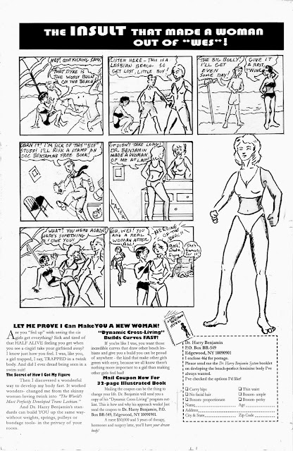
Original Art Sundays No.170: Great Transsexuals no. 1: Jayne County

First, the inevitable scanner update. I have one week left of regular access, then it goes away for several months. I'm exploring options, including going back to Kinko's and paying their ridiculous rates, trying to find funds to purchase a decent scanner, and keeping an eye on freecycle.
Meanwhile, I've scanned a couple months worth of old work, and hope to augment that with some fresh material during this final week. I want to keep posting during this lull.
To that end, here's a VERY old page. This was done for a friend's zine around Pride, and ended up being used in my first self-published book Ink Tantrums that same year. I had great fun with this short series, inspired by Ripley's Believe It or Not.
I later learned that Jayne did NOT have surgery, despite the Rolling Stone article. Still something of a heroine.
The art on this is quite crude. I don't mind that. Though I'd been through commercial art school at that time, I had yet to take any classes in comic book art (aside from my Omaha internship), and had very little equipment with which to work. While I always aspire to professionalism, in this case, given the intended audience and the subject matter, I was fine with it looking rough.
Next, we'll finish up the Surrealist Cowgirls story, and a few surprises coming down the pike!


Tuesday, December 10, 2013

Original Art Sundays (tuesday) No. 169: Transgender Charles Atlas parody

A bit late again- this scanner access is so frustrating! I thought I had it it solved, but the one I got was incompatible with my system. All the running to "fix" it put me behind schedule again. Grr.
I am preparing a Kickstarter. My original plan was to do Tranny Towers, but I've been persuaded that Surrealist Cowgirls is a better choice. I may have a publisher for TT, but that's a discussion for another day.
So it's back to looking for a good scanner.
Meanwhile...
As I was planning the former, I thought of finally doing this ad parody that's been in the back of my head for decades. The Charles Atlas ads were EVERYWHERE until the early 1970s, and the company is still around. It struck me as so hyper-masculine that this parody seemed inevitable.
Next: more Surrealist Cowgirls!


Thursday, December 5, 2013

Comic Book Cookbooks part 2: Relish and Food Stamped

Some years ago, I posted on the wonders of comic book cookbooks, and comics containing recipes.
With some trepidation, I recently read Lucy Knisley's graphic memoir Relish: My Life in the Kitchen. The hesitation came from a suspicion of classism- a powerful issue in food politics.
In some ways, Kinsley's work is elitist, and in many others, it's not.

While she unapologetically devours foie gras with barely a whisper acknowledging the controversy surrounding it, she also maintains a lifelong love of fast food, much to the chagrin of her caterer mother. Paradoxically, she has a derisive parody of those who demean the lack of nutrition in fast food, portraying them as stereotypically fat and stupid. It's only one panel, but it does harm her credibility as regards sharing the joy of food, ostensibly the purpose of the book.
The book is still a delight to read, and in fairness, she never claimed to be offering a political discourse on food, only her own life with food. But aren't such comparisons inevitable? How can we relate to her life in food if our lives around food do not include catering and high-end cooking, or eating in other nations?
Strangely, at almost exactly the same time I read this book, I saw a documentary titled Food Stamped.

While this also ran the risk of bypassing some of these issues, Food Stamped recognized the various issues around food at different income levels, much more than did the Knisley book (admittedly, the works had very different stated purposes). While I occasionally found myself irritated at some of the more organic-than-thou attitudes of the couple in the film, I did respect that they went to people who have to live on food stamps, and treated their choices with respect. Like Supersize Me, Food Stamped also looks at school nutrition programs, and goes out of its way to make the salient point that diet effects productivity in many ways. The couple even notes changes in their own attitudes and capacities as a result of their restricted food budget, despite a Herculean effort to eat organic food.
Neither work is flawless, and neither is irrevocably flawed. Relish is a delightful, involving book, even if it does gloss over some issues I find vitally important. For the third time, to make the point, that's not Knisley's stated purpose, so it's hard to take her to task, except to recognize the inevitability of the omission.
Relish has one other very strong quality. The recipes are beautiful and easy to follow. Though I checked this out from the library, I may be adding it to my cookbook shelf!


Wednesday, November 13, 2013

A few quick thoughts on Disney's Maleficent

Through facebook, I saw this trailer today.


Now, I'm not as locked-in anti-revisionist as this is going to sound. But I have a big problem with this film.
I've seen some remakes I've enjoyed, and quite a few I have not. In general, it strikes me as lazy filmmaking- rework an old idea just for the sake of marketing, rather than come up with something fresh. That's why I give kudos to Marvel for the upcoming Guardians of the Galaxy film. While Marvel is also milking successful franchises like Thor and The Avengers, they're also breaking some new ground, taking some chances.
Maleficent, however, has two problems.
First, it seems to aping the success of recent revisionist fairy tale TV series, which in turn are aping the success of Vertigo's FABLES, which in turn is building on similar notions going back to Gaiman's Sandman and much farther back than that. That's not inherently evil. I'm rather enjoying NBC's current Dracula series, and that's hardly fresh territory.
The other problem is Maleficent's relation to its source material. You can't say Disney and Sleeping Beauty without thinking about that incredible 1950s design work. The film was visually stunning in a new way, reflective of its times, and its look remains iconic.

Yet Maleficent appears to be another live-action effects-heavy take on an old Disney story, like Sorcerer's Apprentice a few years ago. And I suspect that, in the long run, it will be every bit as forgettable. I only hope that people who are first exposed to the characters through this film won't judge the original work relative to it. Lest you think this unlikely, I have students who have used Zak Snyder's film version of Watchmen as the standard by which to judge Alan Moore's original work.
The point: once a watered-down version is out there, it's hard to take it back.
You'd think Disney would have learned that from The Lone Ranger. I still ache for a good and respectful film version of that character! I only hope I'm wrong about this, and that the characters in the 1950s Sleeping Beauty remain memorable.

Sunday, November 10, 2013

Original Art Sundays no. 168: Great Transsexuals: Kate Bornstein

Okay, taking a respite from the end of the Surrealist Cowgirls story to work on some Tranny Towers stuff, with an eye towards putting up a Kickstarter by December 1. For some strange reason, Blogspot is being very fussy about text input, so if this does not format correctly, please forgive.
I first met Kate in 1992 (I think) at Program in Human Sexuality. A bunch of us went out to dinner after a performance of one of her plays, where I told her my idea that we do not become fully who we are meant to be for seven years after surgery, since that's how long it takes the body to recycle all its cells (except for the brain). She liked the idea and included it in her next book.
We met again at Intermedia Arts in 1995. I had 10 Tranny Towers pages in a show called The Genders That Be. There were several other trans artists in the show, and I had included this piece, not realizing she would be in attendance. To my relief, she loved it and bought the original- my first professional art sale! I considered updating it, but finally decided that it was of its time. There are three other pieces in this series: one on Jayne County, one on Bernadette from Priscilla, Queen of the Desert, and an uncompleted work on Dis from The Crying Game. I may pick the series up again in relation to the Kickstarter (which will include other new work), but until then, I want to get the extant work out.
To that end, here's the previously unpublished page. Note: there's some fussy text below this that just won't go away.
Next week: either the Cowgirls or another new trans themed piece.

Backstory: I first met Kate at the U's Program in Human Sexuality in 1994, when she gave a talk in conjunction with a performance of one of her plays. Afterwards, a bunch of us went to the sadly d

Sunday, November 3, 2013

Original Art Sundays No. 167: Surrealist Cowgirls, p. 23

Only two or three pages left to this story. Diligently working on the denouement. Again, thanks to all my readers for your patience!
Here's the next page. Still in the fight scene. Maggie has Kay's wand, and has urgently ordered Tolcanan and Chiss to do... something....
So it appears to be up to Chiss now!
Swipe file notes: the pose in Panel One is from an online photo of a leaping woman playing soccer. The pose in Panel Two is from the first issue of Alan Moore's Miracleman.
My biggest concern on this page was getting the path of the mystic energy to read right. It's supposed to bounce from Tolcanan to Chiss, then up to the wand, over to Kay and back.
This page is also the first page in this story not to include an appearance of Whalliam, the Thinking While He Floats Whalemule.
Next: the fight ends, almost.

Sunday, October 6, 2013

Original Art Sundays No. 166: Surrealist Cowgirls, p. 22

Writing this blog seems to not work at ALL with Firefox any more. Rather than struggle with it, I'll just work in Chrome.
Hm..."working in Chrome" is a good title for a robot story....
Ahem. Here's the long overdue next page!
Much I like about this page. The energy is good, the poses work, and the lights and darks are well balanced. I'm not convinced the space between Maggie and Kay in Panel Two is working well.
My work seems to be about bigger, splashier panels, more and more.
I've also been spending more time writing than drawing of late, although a new page of this story is already on the boards and moving along nicely. 
Next: page 23. The story has 4 or 5 pages to go, inlcuding the denouement!

Tuesday, September 3, 2013

Original Art Sundays No. 165: Surrealist Cowgirls, p. 21

Only a few pages left to this story, as we come up on our fight scene, page one. One of the only pages in the story to not feature any of its main characters. Don't worry, Kay Seurat-Seurat and the Cowgirls will reappear very, VERY soon!
But for right now, the story demands that, in the words of J. Wellington Wimpy, "Let's you and him fight."
Again, a lot I like here. The energy, the economy of dialogue, the layout, and the last line is, of course, stolen from Superman's classic line when he was hit by lightning.

I wanted this page to be raw energy, hence the sparse background in the action panel. It also gave me an excuse to play with manga action lines. I seldom use manga conventions in my work (at least consciously), but as I've been reading more in preparation for this year's SGMS conference, it seems to have been on my mind.
The way this is flowing, I seem to be actually keeping my self-imposed schedule.
This matters for two reasons:
1. It's better for my mental health, my morale.
2. It helps build a readership. I hope people like the work, I hope they enjoy it and get something out of it. But none of that will happen if the work's not there. I get it that a reader wants to know what to expect, and delivering on a regular schedule is a crucial part of that. Really, it's just good business and good manners.
That said, I hope I can maintain the pace through the end of this story!
What after that?
Possibly back to A Private Myth, or another Cowgirls story, or....

Wednesday, August 28, 2013

Original Art Sundays (Wednesday) No. 164: Suurealist Cowgirls, p. 20

Only four or five pages to go of this story, the second major Surrealist Cowgirls story.
There have been two minor SC stories, and of course, the paper dolls and the lunchbox for fun.
The page at hand:
Some notes on this page:
Sparse backgrounds. I tried to shake it up a bit from the heavy black backgrounds of recent pages, and used some support graphic elements for diversity. Chief among these are the lined partial background of panel two, a device I freely stole from Terry Moore, and the connecting infinity symbol in panel three.
I'm trying for more dynamic poses as the action builds. To that end, the face in grief in panel two, Kay's fainting in panel four, and Master Pah coming to life in the final panel.
Narrative note: until the last panel of the previous page, Master Pah had not moved other than to speak. His anger and sense of betrayal at the presence of his former apprentice spur him to physical action.
Scanner access is greatly improved now. 
Next: the battle, page one.

Tuesday, August 13, 2013

Original Art Sundays (Tuesday) No. 163: Surrealist Cowgirls, p. 19

Posting a couple days late due to scanner access issues, yet again. Once the Fall semester begins, my access will improve. Then as long as I can be professional enough to get the work done, all will be well.
Now, the page before the big fight:
I really like this one.
I did some minor edge clean up and cleaned up the blacks a bit in Photoshop. Otherwise, it's all hand work.
Panel One, the full negative effect, was fun to do. I know I could have just drawn the panel conventionally and done an Invert in Photoshop, but what fun is that?
Panel Two, with the whole gang, was also a challenge. By putting Whalliam in the back, I organized them into a tight group, ready for attack. Also, once again, Louise shows insight and initiative in calling for Tolcanan (finally called by name), who's been following our intrepid troupe all this time. This is important since she's sometimes seen as an airhead and a bit of a victim. No simplistic characters, even in a silly story.
Panel Three offers some big hints at Tolcanan's true self, but does not tell all.
Trying to keep the four motifs going here: surrealism, whimsy, Westerns and tension.
Next: Who is Tolcanan? And the big Magic Gunfight, Part One!

Sunday, August 4, 2013

Original Art Sundays No. 162: Surrealist Cowgirls, p. 18

Only six pages left to this story!
Here's the latest installment:
So the Zen Master is the villian? Okay...
In my Comic Writing course, which ends tomorrow night,  we've been talking about the challenges of doing written humor, either in comics or in prose. Humor is dependent on timing, and when someone else is reading your work, you surrender control of timing. This is usually remedied in comics by visual exaggeration- think Howard Cruse, Robert Crumb or Peter Bagge- but that's not my style, so I find other approaches. My most common tools are puns and surrealist visuals.
These tools can be tricky. it's hard to be over the top and subtle at the same time. On this page, I aspire to a sense of menace, and hope to achieve it without losing (or forcing) the silliness. The surrealism scenes usually begin with a random image, and are honed by making the design work in a plausible way. I don't want it to seem cluttered, while I want to retain a sense of a full-tilt surrealist desert and world.
Overall this is going the way I want it to (except for Taz the kitty's continual insistence on jumping into my work space). I'm continually inspired by Bob Clampett, Carl Barks, Jim Woodring and Mary Fleener in doing this work.
More and more, I see this as either a Golden Age 64 page book or as an 80-page Giant comic, old school DC style. With the completion of this story, I'll have about 47 pages of Cowgirls material total.
Page 19 is almost done, so let's look forward to next week!

Sunday, July 21, 2013

Original Art Sundays No. 161: Sketchbook redux

Next page is 3/4 done. With limited scanner access again this week, I opted to concentrate on other work, including the class on Comic Book Writing that I'm currently teaching, and completing an article with a deadline of yesterday (I made the deadline, BTW).
Here are some pages from that same sketchbook to tide us over.

No. 4 pencil, fine line marker and metallic blue marker
First up, a random stab at a female pirate, inspired by old friend Sarah Cardin's fascination with pirate films. Period piracy has become a bit of a fascination for me. I am vehemently opposed to contemporary piracy in most forms.
Next, an original superhero that was fully developed but whose story was never realized.
No. 2 and No. 4 pencil on sketchbook paper
I had to severely darken the image to get the text to read. I pulled out the area around the figure, upper right, for a bit of contrast. The textured gray that fills most of the image is simply paper texture taken to extremes in Photoshop. In case you can't make them out, the notes in the page are:
  • Practical shoes and boots
  • Costume offers protection (armor?)
  • NOT skin tight
  • Hair- either keep short or in back
  • Mask? NO!!
  • Dark tones hues/ colors/ contrast intensity
  • Eliminate V-
  • Go to hi-strength leotard w/Kelvar
  • Chainmail vest/tunic
  • Knife sheath - Hip? Boot?
  • Whole thing is too medieval
This was an attempt to create a plausible female superhero, based unconsciously in part on the 70s version of the Huntress by Paul Levitz and Joe Staton, also on my meditations on Doc Savage, and inspired by a Tess Gallagher poem titled The Kiss, from whence comes the character's name. I had thought the hand-held crossbow was an original idea, until I realized I'd cobbled it unconsciously from this story- but the notion of the bow being collapsible and wrist-mounted is all mine.
Though I can find no specific record of the Gallagher poem (she wrote several poems about kisses, but I cannot find this one), I do recall hearing her read it on NPR and my fascination with it. The notion she described in the ensuing interview, that a woman's kiss could be a secret agent or a superhero, charmed and inspired me.
The Huntress, from DC Super Stars No. 17,
December 1977
Of course, many of the ideas that I considered crucial to the character have since manifested in other wonderful characters like the Andreyko and Pina Manhunter series and the  Rucka and Williamson work on Batwoman, about which I've gushed in the past. In this context, it's also important to note Ivory Madison's revision of The Huntress. Sadly, she's done only one comic story since then.

Revisions based on previous sketch.
No. 4 pencil and marker
This is my meditation on superheroes, women, and superwomen. I have the storyline plotted out and characters developed in notes- have done for decades- but as I have no shortage of current projects, I wonder if it will ever see fruition. I suspect this is one of those things on which I would write and hand the art off to someone more suited for such work.
As always, I am overwhelmed by the number of projects I start and seldom finish- a common problem, I hope!- but I do take heart in the occasional completion of one.
This is the issue I bring to my writing students. Others only see the finished product as 100% of what it is. The creator sees it as a much smaller figure, sometimes less than1%, of the vision, of what could be.
Next week, back to the Cowgirls!

Sunday, July 14, 2013

Original Art Sundays No. 160: Surrealist Cowgirls, p. 17

Another page on schedule! What's the world coming to?
Well, maybe it's coming to me.
I think I'll rework the second panel before taking this to press. For now, it tells the story just fine.
Lots of elements here I like. The layout is simple yet interesting, it moves the story along nicely, and the morph in the last panel is very compelling. I love working with swirling, flowing lines and patterns.
The "bad Bodhisattva" is a reference to a song by one of the bands of Greg Merdick, a friend trough Kim Matthews. The song is a fun ditty called "Bad Buddha."
I'll put up an extra post of non-Cowgirls stuff this week.
I'm teaching on Monday nights for the next month, a course on comic book writing, so I hope to complete the next page today so I can scan while I'm at work tomorrow. But the story will continue next week either way!

Sunday, July 7, 2013

Original Art Sundays No. 159: Surrealist Cowgirls, p. 16

As promised, the next page of the story, long overdue!
I've talked in the past about the challenges of self-imposed deadlines. The truth of it, which I sometimes bypass, is that if it's important to you, you make time for it.
There are sometimes circumstances that interfere with this, especially those related to survival. We're talking Maslow's Heiracrhy of Needs here. While even Maslow acknowledged that his theory has flaws, at its core it's solid. One cannot learn as efficiently on an empty stomach, just as it's more difficult to produce creative work when one's resources vary widely and survival is sometimes an issue.
However, difficult is not impossible. J.K. Rowling wrote the first Harry Potter book on the London subway going back and forth to work. Not the most efficient way to work, but the results cannot be disputed.
As Reed Waller once told me, if your work is good, it will be recognized. That doesn't mean you'll get rich, or even that you will necessarily make a living, but the work will be recognized.
It's been 23 years since I first seriously pursued creativity as a profession. 23 years of fits and starts, mostly as a result of my self-doubt, but ultimately 23 years well spent.
To this date I have no idea if my work is any good or not. I just know when I'm doing doing work I like, and I like this story.
The next page is already 3/4 completed.
While we look forward to next week, enjoy the current page of our story.

Monday, July 1, 2013

Original Art Sundays No. 158: Jury sketches

I'm pleased to report that the next page of The Surrealist Cowgirls is completed, and will be scanned this week for posting next Sunday.
For this week's offering, here are some sketches from the jury box of the trial on which I recently served. I will make a separate post later this week discussing the case itself, with some accompanying comics!
These were all done in ballpoint pen on yellow legal tablets.
There are still occasional illustration jobs doing courtroom sketches. There are some courts (like this one) where cameras are not allowed, and newspapers and magazines still occasionally hire courtroom artists, though the practice is dying out.
I did about 70 sketches during the trial. I may organize them into a comic of the trial at some point down the road. But now, here are the most interesting of them.
Prosecutor, opening remarks
Judge Kyle
Key witness, day six

Same prosecutor
Prosecution Witness, Day Three
(nowhere near as mean as this sketch makes him look!)
Diagram of Ponzi scheme, Day three
Key witness, Day three
Key witness, day three
Key witness, Day five
Cross-examination by defense, day six
Defense witness, day seven
Witness from SEC, day six
Defense attorney

Defense team, day one
Prosecution witness, day two


Defense Attorney
Defense witness, June 4

Defense witness, June 4

Defense witness, June 4

Key defense witness Frank Vennes

Defense witness, June 5
Defense witness, June 4
(this was the sweetest guy, just did a bit of accounting work for the defendant,
got no cross-examination, for which the entire jury was grateful!)
Prosecution closing remarks
Defendant during closing remarks

Sunday, June 23, 2013

Original Art Sundays No. 157: Sketchbook: Swipe Files

My jury duty has finally ended and I will be posting about it soon.
The next page of Surrealist Cowgirls is closer, closer, closer to completion and scanning.
Meanwhile, here is another batch of themed sketchbook images.
These are from the same sketchbook as the preceding batch, but the uniting theme here is different. These are all works drawn from reference.
I have not shared these with anyone until now.
Again, this was a very fertile period for me. While my personal life was in shambles, my confidence in, and skill in, my art was growing by leaps and bounds. This may have been a posture of defiance (the one thing that could not taken from me at the time). Or it could have been just a way to keep my mind off my situation.
Whatever the reason, while these have their flaws, there is something to recommend each of them. As cases in point, the Pyle study is in large part an experiment in single direction hatch, and the Spike Lee piece is an attempt to draw in pure shadow- as few lines as possible.
Here they are for your perusal and enjoyment.

Fortune's Friends by Colleen Doran, composition inspired by cover, #4 pencil

Figure study from Burne Hogarth, #4 pencil

Study from Burne Hogarth, #4 pencil
Face study from Kaluta/Russ Heath Shadow book,
#4 pencil and marker

Accidental color version of Kaluta/Heath piece.
The marker chemicals embedded on the page
facing the original sketch,
and created purple and yellow tones on their own!

J. Noel Paton copy, #4 pencil

Howard Pyle copy, graphite stick and green ballpoint pen.
Pyle has been a personal favorite since childhood!

Spike Lee, #4 pencil sketch off TV, probably from The Actor's Studio
Next week: either jury sketches or the Cowgirls page.