Sunday, October 6, 2024

Original Art Sundays No. 375: Inktober '24, part 1


Crossposting this from my Substack. 

We’re in the throes of Inktober!

3 of the last 4 years, I’ve made it through the entire month. Two of those years have been compiled in the book Spatters. I have 7 copies left, and it will be available at Queer and Trans Zine Fest next weekend.

Here are this year’s Inktober drawings so far.

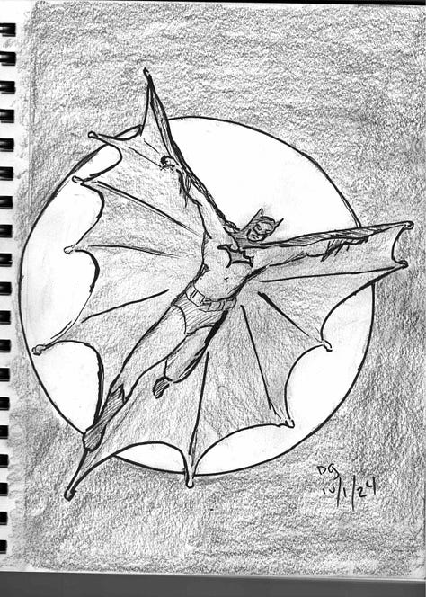
  • Day One: Batman inspired by John Cassaday

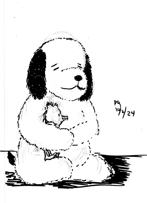
  • Day Two: my stuffed Snoopy (that I got the day I met the man) in honor of Charles Schulz’s birthday.

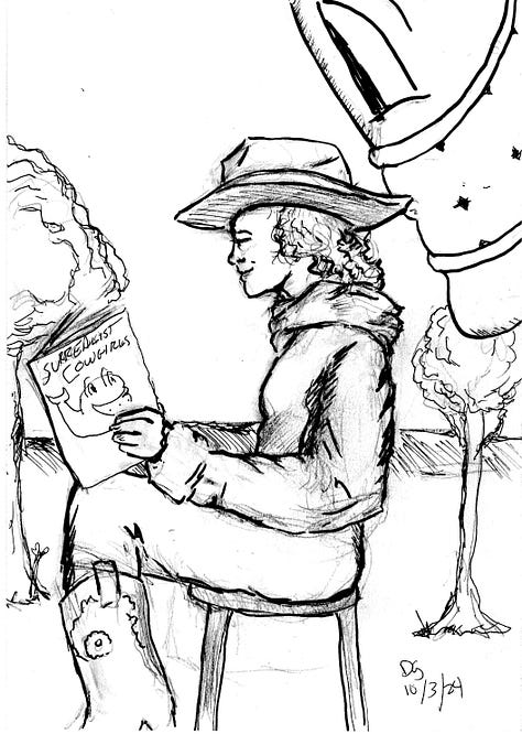
  • Day Three: an unusual take on my favorite creations, the Surrealist Cowgirls.

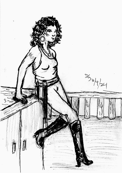
  • Day Four: Pirate girl, inspired by my love of Gil Elvgren’s inviting poses.

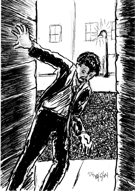
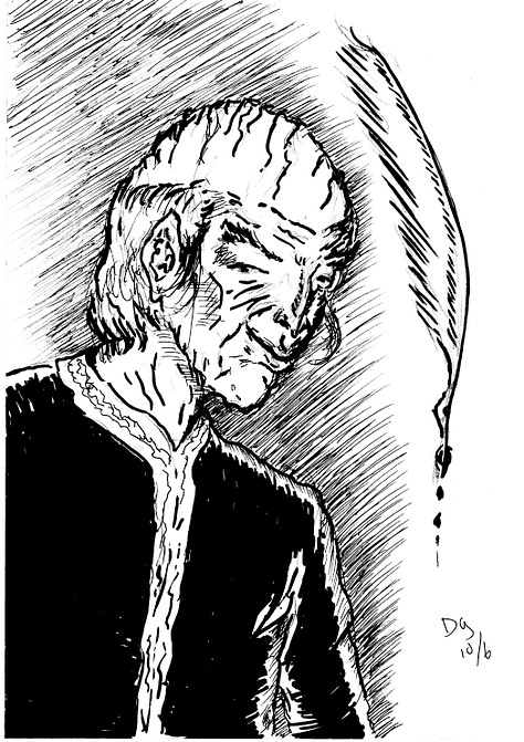
  • Days Five and Six: Moments from the work in progress Captives of Imagination.

I do love Inktober. I never follow the prompts. To me, it’s an opportunity to stretch as an inker, and I don’t like having too many terms dictated to me. However, it does offer something very useful, almost invaluable: deadlines.

Deadlines get things done.

Lecture is given on Wednesdays. Next lecture is on Fridays. Midterm grades are due soon. Zine Fest happens on October 19 and 20. Inktober is every day of the month. If the book is to be done by the holidays, there are printing deadlines.

Deadlines will drive one crazy, but they are so valuable. As Palpatine said about anger and the Dark Side, it gives you focus. And if you have something that has to be done today and a long project with no deadline, you tend to give your time and energy to the former.

But they can be traps too. If one has too many deadlines, everything collapses. I’ve gone through that a couple times. For me, the razor’s edge is having just a LITTLE more to do than I can handle.

However, it’s not just about methodically doing the work and dutifully meeting the deadlines.

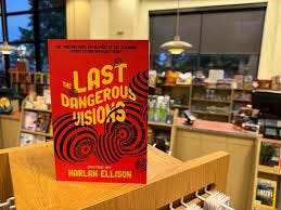
A couple days ago, I picked up a copy of Harlan Ellison’s Last Dangerous Visions, published poshtumously, with final edits completed by J. Micheal Straczynski.

The Last Dangerous Visions is finally here , six years after Harlan  Ellison's passing, spearheaded by J. Michael Straczynski, & featuring a  bunch of rad stories from folks like Cecil Castellucci. Insta-buy.

I sat up and read JMS’s Introduction and Exegsis, in which he gives personal insights into his relationship to Harlan and into Harlan’s private life, in a respectful but honest way. He revealed Harlan’s mental challenges over his lifetime, and how those challenges inhibited the creation of this volume for five decades.

This shook me. I had the honor of meeting and speaking with Harlan twice, and while I’m sure he wouldn’t know me from Eve, I clung to the conceit of calling him a friend. Some of that also stems from the artifice of intimacy resulting from liking someone’s work. Much of Harlan’s writing was brutally honest, and left the reader feeling like an invitation into the writer’s mind and heart had been offered and accepted. Ellison often wrote of such presumed familiarity as inappropriate, to say the least. I got that, but I still felt it. As such, I was shocked to discover that he wasn’t who I thought he was - or perhaps who HE thought he was. Mental illness is like that, I suppose.

But by choice or design, he got in his own way in completing this work, a work he saw as so important. Too many deadlines, not enough Harlan to meet them. And he took himeslf to task for that, in rather severe terms.

Do we all do that? Mental health is clearly a factor, but I think it’s not the only factor involved. Even creators without mental health issues face what Marvel used to call the Dreaded Deadline Doom.

I hold great rerevence for creators who methodically produce smart, impassioned work. As I discussed previously, I often hold the work in such reverence that I’m afraid to get it done. Sometimes that’s a conceit or an excuse. The deadline comes and you meet it (well, most of the time. I’ve missed more than a few, but made most).

I suspect that my truth is like that of many other creators. The Work is never as good as I aspire to it being, but it’s often better than I think it is.

I’ve been drawing, writing and teaching for so long. I hope to get The Big Work done while I still can. I will never be another Harlan Ellison, but that’s okay.

We’ve already got one, and I am forever grateful for that.

Thank you, Harlan.

Next: the work continues on both Inktober and Sharp Invitations. One or the other coming you way soon...
Sunday, August 25, 2024

Original Art Sundays No. 374: Sharp Invitations: Esther's Hands, Interlude conclusion

 Back from Autoptic! That was quite a success in my book. I talked to many old friends, made some new ones and had decent sales. I'm already deep into prep for the new semester, but I still had time to work on some pages from the book.

I posted the concluding page of the Cemetery Interlude before, but I have a better scan of it, so am re-posting it, along with another single page interlude.


I've previously posted thoughts on the graveyard to college page. 

Thoughts on the new page: deliberately light to no backgrounds. This is a moment between Mother and me. In that moment, everything else slipped away. 

Tools used on this page:

  • Papers: tracing paper, various sketchbooks, Canson Bristol board
  • Pencils: Lyra 2B graphite stick, 4B lead and holder, 2B Ticonderoga classic, tech pencil and 4B lead
  • Erasers: kneadable, vinyl eraser, Click eraser
  • Hand Tools: 6" and 14" straightedge, triangle, T-square
  • Inking tools: Tight Spot correction brush, Holbein white gouache
  • Markers: Copic 0.25, 0.3, 0.8, 1.0, Faber Castell brush, LePen brush, Copic Brush and Micron small brush
  • And of course, Photoshop


The next three or four pages will conclude this chapter. I need to confer with family on a couple points as we approach the end.


Wednesday, August 14, 2024

Original Art Sundays (Wednesday) no. 373: new Surrealist Cowgirls cover!

 In preparing a fresh edition of Surrealist Cowgirls for print for Autoptic, I found a preliminary for a different cover. I forgot I did this one, and I love it!


Nice. Just clean simple line art. I decided to use this one as a B  & W cover. It's very striking!

There will be four different Cowgirls covers available at Autoptic. I've posted the original and the Kevyn Lenagh version here before. This is the third. The fourth will be a sketch cover option. You can draw your own, or put me to work! While the Cowgirls have been in print before, this is a different compilation and the first time the work is available to the general public.

Autoptic is very close and I'm very excited. Looking forward to seeing you there!

Tuesday, August 13, 2024

Original Art Sundays (Tuesday) no. 372: Final Tranny Towers collection cover

 Another piece related to Autoptic '24.

As I've mentioned here in the past, I had some reservations about collecting my old Tranny Towers strips, largely because I thought the title might give offense. My Comic History students last semester encouraged me to give it a go.

I have collected all the strips, with a few extras, and am offering them publicly for the first time this coming Saturday. This is not the "Omnibus" collection. For that, I need to collect related works from other publications and create some new work to finalize the storyline. But it is all the strips, plus a few cool extras.

In reviewing the material, I was reminded of those times, and of how much I really had to say. While my craft was still maturing, my creativity was ablaze in these strips! My awareness of trans issues of the time was evident in these strips. It was a great time, and I hope that comes across in the work.

Some time ago, I did a new cover, based on the concept of "getting the band back together." I finished adding color to it, and here we go!


I hope this wraparound cover makes you as happy as it does me. Hope to see you Saturday!

Monday, August 12, 2024

Original Art Sundays (Monday) No. 371: Last Sharp Invitation covers

 Been a few weeks, yes? I've been obsessively preparing for tabling at Autoptic this coming weekend. I have tabled numerous cons, but this is the first time I've tabled my own work. It's exciting and a bit intimidating.

To that end, I've been printing books like a madwoman. Formatting, reformatting, conferring with my printer. Where did that file go? Oh yeah, here it is. All done!

Since the 64 page chapter on Curt in Sharp Invitations is complete, I have decided to print it as a stand-alone book. In case you don't recall, this is the chapter on domestic abuse and survival. It is titled The Last Sharp Invitation, and it will still be included in the larger book.

I did two covers for it. Here was the first thought.


This was inspired by a Coles Phillips painting. It's a combination of ink, walnut ink, colored pencil and marker. There was a lot I liked about it, but it didn't have a direct connection to the story, so I decided to go in a different direction.


This is more intimate. Possibly it's too quiet for a cover image, but it does relate to a scene in the book. I used the first image as an annotated back cover. Typography and trade dress were added in InDesign.

The book has been printed and will be available at Autoptic on Saturday, August 17 at Coffman Union. I'm proud of it and eager to share it with you. Come on by!

Sunday, June 16, 2024

Original Art Sundays no. 370: Sharp Invitations: Esther's Hands: Interlude, last page

 And now for the conclusion of the graveyard interlude.


So I made it home after a mostly homeless summer, and started another chapter. How I came to the homeless status is part of the Dad story, coming after the Mother story. College was completely unexpected, a new adventure. 

While working on this, I'm prepping several projects for print and sale at Autoptic in August. Quite excited about this!

Story notes: there were other people there when I walked in the door, notably Grandma and a cousin I'm particularly fond of- almost a sister, really. But in the interest of narrative flow, I streamlined it a bit. Again, no overt trans content this week, though that remains the overarching theme of the book.

Along those lines, I'm only including one page of my junior college years. That's next week, a moment of timidity. 

Art notes: used gouache for the whiteout where necessary. Graphite stick for gray values.The scan is- what's the technical term? - oh, yeah. Crap. A lot of the subtle graphite textures are washing out.  I will rescan on better equipment ASAP. Restore gray values and pump the background tones. The lines are very light. This page is all graphite and markers.I worked from photo reference on panels 1 and 3, and took poses from the graphic novel Left Turns by Joshua Ross on panels 5 and 6. If you haven't read that book, do yourself a favor. It's a great study of quiet intimacy and introspection. 

I really like the embrace in panel 3. Overall, I'm pleased with this page. Decent flow, tight storytelling for such a simple yet eloquent moment.

Tools used on this page:

  • Papers: tracing paper, various sketchbooks, Canson Bristol board
  • Pencils: Lyra 2B graphite stick, 4B lead and holder, 2B Ticonderoga classic, tech pencil and 4B lead
  • Erasers: kneadable, vinyl eraser, Click eraser
  • Hand Tools: 6" and 14" straightedge, triangle, T-square, French curves
  • Inking tools: Tight Spot correction brush, Holbein white gouache
  • Markers: Copic 0.25, 0.3, 0.8, 1.0, Faber Castell brush, LePen brush, Copic Brush and Micron small brush
  • And of course, Photoshop
Next: a moment of cowardice watching TV.

Sunday, May 12, 2024

Original Art Sundays No. 379: Sharp Invitations: Esther's Hands, Interlude, page 3

 Posting a page from the story of Mother on Mother's Day, of course.

When we left our hapless trio, they (we) were sleeping in a cemetery.

Now it's morning.


Again, trying to emulate Bode in some aspects of layout- use of borders and isolation of text, mostly. Much as I like his stuff, my style really isn't much like his.

Story notes: not much to tell. This is pretty much the way it happened. I wouldn't see John and Stu again for about 3 years. No overt trans content in this interlude. I am amused, however, at how shocked people seem to be today by hitchhiking. I don't think I'd do it now unless there was no choice, but back then it was a default method of travel. Either it was harmless or we were oblivious to the risk. Either way, I came through unscathed. There was a running gag between hitchhikers that the fastest way to get a ride was to have a sign that read HOME TO MOTHER.

Process, layout and technique: the challenge is keeping the reader cued with minimal elements. I deliberately avoided overcrowding this page. I pushed the textures on the bush in Panel 3, but I'm not sure if it reads fully. The text block between panels 3 and 4 was originally an open field of white, but in a moment of brilliance, I reversed it in PS. Gives the page a little more weight and helps the text stand out.

The other challenge in this kind of layout is border manipulation. I tried to go with the two principles of Bode borders (say that three times real fast): isolate text and image, and make panel elements part of the border. I like the sparseness of this page, and I think I hit the balance and included not just enough information, but the right information.

We have one more page of this interlude, and then back to the regular Mother story. 

I'm toying with the idea of doing a short print run of the Curt story as a stand alone publication. I have applied to table at a local indy con, and it could be interesting to see if anyone wants it. 

Materials: I did get a couple new brushes recently, but they're not used on this page. Pretty much the same tools as last time, so I will forego the equipment list for now.

Next: I get home.

Sunday, April 14, 2024

Original Art Sundays no. 378: Sharp Invitiations: Esther's Hands: Interlude, page 2

 The next page of our interlude, in which the meaning of the title becomes apparent.

Continuing to work in Vaughn Bodé mode. The primary factors are the isolation of text and image, and the use of panel elements as parts of the borders. I wanted to keep the lettering loose but legible. To get the deep night effect, I toyed with a deep graphite over the inks, but finally decided on a deep wash, going for a misty effect.

The first panel went through several images. The problem was that it was too static. I mean, a bunch of people eating. I finally decided to concentrate on the emotions, to try to convey the sense of being fed after a long trip. This is the third or fourth time I've included a cemetery in a story. The challenge is that, despite usually strong upkeep, they are often desolate looking places. There's also a variety to tombstones and monuments that the casual observer overlooks. The 1987 Concrete story Now is Now is an excellent example of a well-drawn cemetery narrative. Leave it to the great Paul Chadwick! As regards the cemetery in THIS story, I'm pretty happy with the final result, but as I often do, I might tweak it before going to press. I looked up the actual cemetery, but it's visually boring, so I worked with memory and my renewed artistic license.

Including the rest of this interlude, there's less than 10 pages less to the Mother story. Then comes Daddy's Song, approximately the same length, 15 - 20 pages. I'm incorporating some smaller but significant story elements into these two chapters, so the book doesn't drag. I hope they're not offended, but several significant people in my life are mentioned only in passing, in the interest of advancing the narrative.

The final chapter is currently planned for 20 pages.

Foregoing tool list again this week. Suffice to say, nothing not frequently used before except a 1/4" Windsor Newton flat brush used for washes. I've had that brush forever- no idea where I got it! It's very floppy and works quite playfully.

Next: morning in the graveyard.


Sunday, March 24, 2024

Original Art Sundays No. 377: Sharp Invitiations: Esther's Hands, Interlude, page 1

 Hi again!

This is a short interlude. I almost left this out, but my girlfriend said it was an engaging story. On review, I decided it belonged in The Book.

As always, notes on content and process follow.

Read on.


The title alludes to the focus of this little story, planned to run four pages. While it doesn't deal with trans stuff directly, it says a lot about Mother and shows something of where I was at just after high school: aimless, drifting. The three of us- John, Stu and me. Sigh. There's a book in that too, but some stories deserve privacy.

I wince a bit at drawing myself pre-transition. It's sometimes necessary for the story, but... brr. I was downright scrawny in my post high school years, and I've tried to show that here,

Stylistically, I'm paying loose homage to my man Vaughn Bodé in this story. This is a tremendous opportunity to play with borders like he did. I love the use of ground elements -foreground, midground and background - to define panel borders. It works better in color, but it's an effective tool here too.

I'm just going to get the key moments of my relationship with Mother, especially those related to trans stuff, down, then reorder the story.

Foregoing equipment list on this one.

Next: arrival and an unwelcome turn of events.

Sunday, March 17, 2024

Original Art Sundays No. 376: Sharp Invitations: Esther's Hands, p. 14

Well, we're back! It's been hectic, but I have a couple new pages to post. I've had this done for a couple weeks, but there's finally time to post!

First, the next page of Esther's Hands.

Story notes: for most of this chapter, the story is random memories of Mother, mostly related to trans stuff, since that's the main focus of the book. Some other material finds its way in. I suspect I will reorder these pages before going to press. As for the memories, don't we all remember people by random events? Some little thing happens that reminds one of something, which reminds us of...

This moment was quite stirring for me. It was one of those times when you realize that you can always learn from your Mother. I was in my mid 40s and was sure I knew everything.

Craft notes: Kept this one simple. The constant challenge of keeping dialogue heavy pages visually interesting applies here. The personal issue is that the living room looks quite sparse in contrast to its true cluttered/chaotic status. A conscious choice to edit reality for the sake of the narrative. I like the way Mother is drawn in panel 3. Just a few well place lines show so much age. I opted for fabric textures and graphite on clothing to give the page weight. 

Not doing an equipment list on this one. Pretty standard, much like previous lists. Page turned out pretty clean, so minimal Photoshop was used, mostly levels and curves to get the light/dark balance down.

Next: a strange interlude.


Sunday, January 21, 2024

Original Art Sundays No. 375: Surrealist Cowgirls Sheet Music Cover!

As my first Kickstarter continues (ten days left!), I'm working on new classes and plotting on the *BIG* graphic memoir, while I expand writing on a rekindled older project.

One of the items in the Surrealist Cowgirls book is sheet music for a ditty I composed as their theme.

Here's the B & W version of the sheet music cover.


I will add color to this and use it as the back cover for the book.

Lots of stuff here I like. Of course, my beloved Cowgirls. Maggie in a skirt, which we've never seen before. Homage to the vintage sheet music covers I adore so. I had some fun rendering the envirnonment, which I think is successful. The balloon sailing across the moon is a small homage to a neglected film, OZ the Great and Powerful, evoking my passion for all things Oz.

No need for an equipment list on this one. It's pretty much the same as last week's.

I plan to get the coloring done mid-week and will post it then. Expect something completely new in the next Original Art Sundays!

Sunday, January 14, 2024

Original Art Sundays no. 374: Sharp Invitations: Esther's Hands, p. 14

Back with the next page of my graphic memoir.

Trans stuff comes and goes in this chapter. Mother had accepted me as her daughter, even if I didn't always behave as she might have liked. But what about her?


 This was a tricky page from a narrative standpoint. Static storyline, just one or two old ladies sitting around in a cluttered house. I broke out some new Copic markers that I rather like, and used some Faber Castell gray markers on some of the values, along with the pencils.

Drawing clutter is tricky. How does one render chaos in a believable way? I worked from memory and the scant photo reference I had on hand. The solution is to include some plausible objects that are out of context. The image in Panel 5 is a reasonably accurate approximation of the house. In a page or two, I'll be drawing part of the kitchen. That will be a challenge!

The idea of Mother fading away as her life became more - let's say sequestered by choice and design - was the impetus for panels two, four and six. It's very close to my original vision for this page. I have to remind myself of my aphorism for my students. You never get 100% of your vision into the work, but sometimes you close in on it.

Tools used on this page:

  • Papers: tracing paper, various sketchbooks, Canson Bristol board
  • Pencils: Lyra 2B graphite stick, 4B lead and holder, 2B Ticonderoga classic, tech pencil and 4B lead
  • Erasers: kneadable, vinyl eraser, Click eraser
  • Hand Tools: 6" and 14" straightedge, triangle, T-square, French curves
  • Inking tools: Dr.Martin's Black Magic ink, nib and holder, Princeton Deerfoot 1/4" mini detailer brush (can't get enough of this brush!), Kingart 8 Gold Synthetic
  • Markers: Copic 0.25, 0.3, 0.8, 1.0, Faber Castell gray brush, Copic Brush and Micron small brush
  • And of course, Photoshop
Next: Mother puts up with me. Not always an easy feat!
 

Saturday, January 6, 2024

Kickstarter Follow-up 2: Surrealist Cowgirls, Kevyn Lenagh cover colored!

 HI all!

Took a couple minutes to add color to the alternative cover for my current Kickstarter.

I might play with the text a bit more. I like the Western feel of it, but I'm not sure it reads.  But overall, I'm very happy with this. I've had few other artists draw my beloved Cowgirls, and Kevyn's work charms me! Also, this is the first time I've colored Domino Chance!