Saturday, February 13, 2010

Couple pre-Valentine's images

An hour early, but what the hey.
Usually this day doesn't bother me, but this year it's a bit of an irritant.
Valentine's Day. Grr. A paean to straight people, many of whom also chafe at its baggage and expectations. 
Years ago, Jenny and I went to a Valentine's screening of CRUMB. It began with some great Betty Boop cartoons, then a wonderful set by the Penguin Cafe' Orchestra. During the intermission, the manager made a short announcement. "You may wonder why we're showing this film for Valentine's Day. Well, we think that most people's relationships are at least a little messed up, no matter how hard they try. And we thought that no matter how bad your personal relationships were, they had to be better than Crumb's, so we wanted to give you hope."
I can't quite hang with that level of cynicism about the whole thing, but my usual idealism about love and romance has been a bit tattered of late.
So I hope my ambiguity on this issue doesn't deter your enjoyment of the day. Please enjoy these images that reflect my current antipathy towards romance.


I love the Art Deco typography on that one! But I'll let the next two speak for themselves...


And then there's...


Now that's better.

Charm School gives me hope.
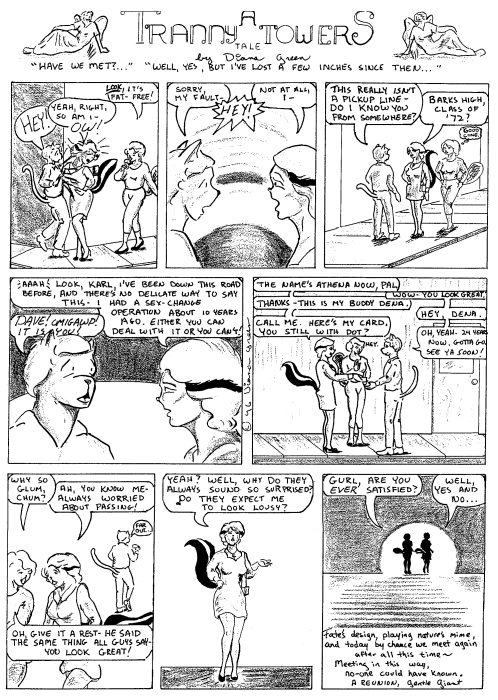
This delightful comic from about 8 years ago tells of the romantic contest between a gorgeous butch vampire, a mortal and a witch.
And it's a book that openly acknowledges the lesbian relationships but treats them as a matter of course.
So refreshing.
Full of songs, spirit and passion, this book is just plain fun. I need to dig out my copies and get them to the binder, so the volume can hold a place of honor on my shelf, like it deserves!
Quite honestly, I had no idea what I was going to say when I started writing this. My love life has been mostly theoretical for the last 5 years. But even with all the frustrations relationships bring, I still want one.
I guess as messed up as romance can be, we still need it, and at its best, it's so amazingly joyous as to be worth the rest of the craziness.


There you have it. Hope springs eternal!

Sunday, February 7, 2010

Original Art Sundays, No. 28: TranScending, pp. 3 & 4

A bit off schedule this week. The next page of A Private Myth is on the board, but I had some time issues. Also having issues coming up with an interesting layout, as it's a dialogue heavy page.
A rough week. I also didn't make Foot in the Door, but my commitment to it was flagging, so I suppose it's just as well.
Meanwhile, please enjoy these pages from the start-and-stop epic TranScending.
 
These pages of TranScending were done for the PRISM Guide a few years ago. They said no sex, and I went a bit too far in making them tame. Still, I rather like the last panel on p. 3, and the tabloid on p. 2 is an homage to both Daria and Omaha the Cat Dancer.
I have approximately 12 more pages of this done and scattered about. This is a carryover from my attempt at emulating Omaha. Originally the central character, Athena, was a skunk. That's how she appeared in the Tranny Towers strips from 1994-95. 
Just for fun, here's an old Tranny Towers strip. This one appeared in GAY Comix #25.


Note the Gentle Giant quote in the last panel. 
I should post the rest of these just to get them out there.
New page again next week, for sure, and thank you all for your patience!

Monday, February 1, 2010

Original Art sundays Amendment: repost of yesterday's page

Okay, made some corrections, saved that "happy accident" (thanks for the fun comment, I get so few!) in Tier 2.
I'm planning on pushing the detail in the originals from here on out rather than fight with digital equipment to get what I want. I know what to do with Photoshop and all that, but it's much more direct to put it into the inks to start with.
It also feels more real.
I elected to not re-ink the borders in Photoshop and not to re-letter digitally this time. I'm happy with the outcome and hope it suits the final product.
 
On the issue of nudity: I once had S. Clay Wilson playfully accuse me of being timid with my rendering of body parts. Not necessarily so. I think titillation is much more effective than outright bawdiness in most circumstances. Look at the distinctions between pinup art and hardcore porn.
I'd rather be invited somewhere than dared to come in.

Sunday, January 31, 2010

Original Art Sundays, No. 27: A Private Myth, p. 5

The scanner was not my friend today. All those lovely drybrush notes - gone.
Panel one is barely legible. Shame, that,  as the art turned out rather well!I was so enjoying the inking process this time.
I will rescan and repost tomorrow, but I wanted to stay on track with my self-imposed deadline, so am posting now. I'd run back and do it now, but I have other deadlines to consider.

 
There are several things about this page I really like. The feeling of our as-yet unnamed heroine (I know what her name is, we just haven't gotten there yet) being trapped and isolated in the last panel is quite compelling. The open panel center page is clean, and I love the way panel 3 turned out. The tone on panel 3 is a scanner artifact, but I might keep it. Trying to lose it drops the drybrush tones off her temple, and I think it works with the mood of the panel.
Relettered in Photoshop except for panels 2 and 6.
In terms of narrative, this serves to reinforce the point that lesbian and gay relationships are no easier than straight ones.
Again, a better version tomorrow.

Saturday, January 30, 2010

Fall into May?

So the Minneapolis/St. Paul FallCon is now in May.
Luckily, they changed the name.
I always see a lot of friends there, and there's always a party of favorites!


This is a very fun local con, and has had great luck in getting guest stars of note. It also has a track record of getting Golden and Silver Age creators to show, making it a tremendous opportunity for those of us working in comic studies. I was delighted to meet Michael T. Gilbert this fall, and to give him a copy of this paper.
I had glimmers of hope that I'd have a booth this fall. This date change makes that problematic. I could put out a Surrealist Cowgirls book by May, and do The World in Love as a one-off, reworking just that one awful page. I have some back inventory of Speedy Ricuvveri (about 10 copies left) and about 75 copies of the 1994 Ink Tantrums #1. I think I'd just give Ink Tantrums away to any grownups who might buy something at this point. It was one of those "I have to do something right now to prove I still can" things, and it shows. There are a couple stories in it I really like, but the best one was a prototype for The World In Love. Ideas from the old story may show up in TWIL #2, which is percolating in my cranium.
I could also get off my fanny and finish The Street Giveth, the Street Taketh Away. I don't know if it's normal to have 4 or 5 books in various stages of completion, but that seems to be the way it is with me, normal or not.
Anyway, other than the stability, normal is boring.
So in theory I could have 4 or 5 books, but so much of it is older work.
To booth or not to booth? That is the quandary.

Tuesday, January 26, 2010

Survival, the Interwebs, and Moses

Heidi McDonald over at the Beat (see links to the left) quotes this article on survival concerns of creative types in a free consumer market, the Net.
While it's hardly a new concern, this piece expresses it with admirable clarity.
There are two concerns here. The first concern is for the ethics of the situation. Why should a creator work for free, as the net audience tends to expect? The second concern, which directly relates, is the issues of survival in a free or low-cost per unit economy.
So the creator's concerns range from "this is wrong" to the inevitable "adapt or die".
It is in the latter that the future lies. I'd like to suggest that there's another possibility evolving.
In Reinventing Comics, Scott McCloud talks of the micro-economy for paid comic downloads. While it did not play out at the level McCloud anticipated, the options for print-on-demand have opened up distribution and micro-economies to creators in numerous but similar markets, ranging from Cafe' Press to Kablam and Indy Planet.
While these new markets have their downsides,  they do accomplish something wonderful. They afford the opportunity for anyone with Net access- 75% as of six years ago, and I think it's raised slightly and plateaued there for a while- to sell their wares. A variation on the old vanity press model.
The downside of this is that not everything that people put out is salable.
Another downside is that things are not vetted by the same publication cycle, which means you are your own editor.  Not always a wise choice.
Inevitably, an online presence and distribution model with a formal editing structure will evolve. It's begun through the majors already, and Dark Horse has been at the forefront of this process for years.
Jenni Gregory experimented with a creator-owned online publishing venture- doing POD for the books of others, which she edited- but it appears to have died, since her Dreamwalker book is now at IndyPlanet. 

Some creators, like Carla Speed Macneil, whose Finder I adore (site has been on low activity for a bit- hope all is well!), thrive in the online and self-publishing models, putting out trades after they've amassed a body of work. Tyler Page has had great critical and at least modest commercial success with his Nothing Better, a great read.
Needless to say, I've toyed with this idea for some of my own work from time to time.
But overall, the model will find its own direction. Similar models will evolve for musicians, photographers, writers, illustrators, possibly even sculptors, anyone with a creative endeavor to offer the world.
How long will it take?
It's already begun.
When Moses led the tribes out of Egypt, they wandered for 40 days and 40 nights. But according to many Judaic scholars, the days in that are a metaphor for years. The reason it took that long was that a generation had to come to maturity not knowing slavery to perceive freedom as real.
Along the same lines, as soon as a generation has grown expecting to remunerate creative people for their online work, and that work has an online vetting process that's matured the same way, the world will once again see such payments for creativity as real.
At least, as much as they did before, which is a topic for another day.

Sunday, January 24, 2010

Original Art Sundays, No. 26: A Private Myth, pp. 1 - 4

As today marks the half year mark for Original Art Sundays, I'm tickled that my scanner access at my favorite school to teach has kicked in!
Therefore, I am re-presenting the first three pages of this work, along with the new page, # 4.

Scanning these helped me realize that I need to change the way I work to get the results I want. I like working in markers because, as my former sensei/ confidante  Reed Waller points out, they encourage speed. But if you have to  labor over every page to get a good rich black after the fact in Photoshop, are you really moving faster?
So I'm going back to inks for most of my heavy blacks.
The markers just plain fade too much.
My brush control with inks is not as strong as it might be, but I have a good hand with a crowquill, so I'm not too worried about losing anything stylistically in the switch back.
I do want to spend a bit more time on detail and include more heavy blacks.
I got lucky with the last page and was able to get some very rich blacks, between pushing the markers and hitting just the right scanner levels. But rather than count on that, I'm going to work in richer blacks from the get go. I will continue to use marker for borders and for some of my gray values.
Sidebar: The white area on the left side of the last panel is not on the original art. I had meant to have that symmetry, but got carried away and filled in the whole area on that side!
So I pulled the old gag: select the white spot, do a layer via copy, flip it and move it into position. And we're golden!

Wednesday, January 20, 2010

I really want this to be good, but the odds are against us.

Why do they do stuff like this?


The Phantom is one of the first superheroes, a sort of jungle Zorro/Batman type character. The suit is a bit busy, to say the least, but as his best The Phantom drips atmosphere and adventure.


This cover is by the late great Don Newton, for my money the best Phantom artist ever, as is this one:


The story in this issue is a wonderful pastiche of the Maltese Falcon, as evidenced by the Sydney Greenstreet character.
See, they don't need to fix or retro-fit The Phantom. He already has it all- legacy, wolves, pirates, jungles, all the stuff of adventure and legend. The Ghost Who Walks, the Man Who Cannot Die.
So why do this?
I get it that every creator wants to make a work or story their own. But these don't feel like creator driven decisions. The secret society training the reluctant hero. Vengenance for slain parents. The wisecracking girlfriend. From Batman Begins to The Hulk the studio cut of Daredevil (the director's cut is wonderful), these things have become so formulaic that I could write one without trying, as I suspect could many other people.
Anybody want to place money on the archenemy being responsible for the death of the parents? They use that one a lot, too.
Formulas often come from corporations and a perception of what's salable, as opposed to what makes a good story. While it's possible to create a good story that's salable, bear in mind that formula is something you feed babies until they're ready for soemthing more substantial.
The Phantom has been filmed numerous times. There was the 40s serial, a cameo in Yellow Submarine, the Defenders of the Earth cartoon, and the 1996 Billy Zane film, featuring the late great Patrick McGoohan as The Phantom's predecessor and father. Flawed as well, but a much better film than is often acknowledged. For one thing, it was a period piece, which added to its charm. For another, it was tightly written, smart and fun to watch. The creators managed to be faithful to their source text and still tell a good story.


So as we face yet another round of superhero remakes and sequels, beginning with Iron Man II (in fairness, the first Iron Man film was much better than it should have been, much like Twain's comment that Wagner's music is better than it sounds), let's hope for true creativity.
Ars long, vita bevis and all that.
As a case in point, here's a scene from what I still consider the best superhero film ever made.

Sunday, January 17, 2010

Original Art Sundays, No. 25: A Private Myth, p. 3

One more week until my scanner access kicks in. Until then, I continue to work from photos off the drawing board, doing my best to correct lens distortion and white point after the fact. I know I have a cheesy 8-year old digital camera and all that, but it's a poor workwoman blames her tools.

I'm happy with this for the most part. The background is serviceable. The characters in bed echo one of my favorite Frank Miller pieces, from Images of Omaha (again, will be posted once I have scanner access). My confidence is up on this page, which is not to say there's not more work to be done!
next week: page 5, unless something horrible happens.

Sunday, January 10, 2010

Original Art Sundays, No. 24: A Private Myth, p. 2

Page two of the latest stab at a Magnum Opus, whatever that is. All I know is that this story is important to me and I think it's worth telling.

I'm having no end of problems with gray values in my shots. This is from a photo again, and not from a scan.  I will have scanner access back by this time next week, and will scan and properly repost these pages at that time.
Until then, we forge ahead.
The mottled gray in Panel Two comes from those same markers that I used in The World In Love, with a Box Blur applied in PS CS3.
I like the division of time implied the frozen figure and manipulations of scale and repetition of the rose-flower-thing. But it's a gag I've used a lot, and I'd like to branch out more in this work.I want to really stretch on this one.
I want to stick to a page a week, but if the quality suffers, I will post other work to fill and not fall behind my self-imposed posting schedule.

Top 10 Comics of 2009: #1

The whole notion of "best" is spurious. Best according to whom? In what way?
Rather than give myself fits trying to define the undefinable, I decided to go with the practical. These are the works I like the best, the works that take greatest advantage of the possibilities of integrating text and image, the ones I'd likely to re-read over the years (I considered putting the end of 100 Bullets on the list, but it was crowded out by Bonds).
Simple. Clean. I can live with it.
To recap the top 10, then:
10. ECHO
9. Lone Ranger #18
8. Black Jack Book 3 hardcover
7. Brave and the Bold #29
6. Sweet Tooth
5. Bonds #3
4. Whatever Happened to the World of Tomorrow?
3. Sandman: The Dream Hunters
2. The Unwritten
And the #1 comic of 2009:


Planetary #27!
Part superhero, part SF pastiche (past issues have incorporated characters representing Doc Savage and the Fantastic Four, and have joyfully incorporated Japanese monster movie motifs), all high-tech dystopia, this story, along with The Authority, expand on Alan Moore's concept (articulated in Watchmen and Miracleman) that superbeings will either be hunted to extinction or create an enforced utopia, whether we mere humans like it or not.
This issue, appearing some 2 1/2 years after the previous issue, wraps up the storyline, at least for now. Our hero finds a way to enter a time bubble and rescue a comrade long thought fallen. But the risk is reality itself.


John Cassaday's art on this is spellbindingly precise, as is most of his work. His work kept me coming back to Desperadoes through a rather bleak  storyline. He reminds me of the silver and golden age masters of precision, Curt Swan and George Perez.
I must confess that I've only read about a third of Planetary. But I have found a fair amount of the work of Warren Ellis that grabs me. He infuses impossibly bleak scenarios with characters who act with undying hope.
A couple cases in point. First, the graphic novel Orbiter, about the death of the space program after the disappearance of a manned shuttle, and the rebirth of possibility in its reappearance years later, with only one of its occupants aboard, in perfect health (physically). Elegant, strong art by Colleen Doran, whose A Distant Soil blog is linked to elsewhere on this page.


Then there's Global Frequency. An autonomous worldwide network of specialists in the impossible, responding on a central frequency to dangers, operating apart from government structures. Ellis wrote a chilling, convincing SF/horror story of bionics for the best of the 12-issue run.


Then there's Fell, a detective with hope living in a hopeless city. This was done by Image as a cheap title run. I'm using one of the collections as a text in my upcoming Comics History course at Minneapolis College of Art and Design, to represent the sensibilities of the modern era of comics.


That sums up the best of Ellis.
"No one can help me."
"Help me."
I was never the fan of Transmetropolitan that most were, but looked at in light of this model, as a character more brittle than cynical, I owe Spider Jerusalem another chance.
So it's time to put the old year away at long last- hold onto the best and learn from the worst, as we always try to do.
It was a hellish year for me in personal terms, but family, good friends, teaching and finding work of this caliber helped me make it through.
I suspect there will be comics aplenty this year. The demise of the comic book has been predicted since its creation, yet it has endured and thrived. The retail models for floppies are tentative, but graphic novels, online comics, TBP collections and hugely spiffy and pricey archive editions are holding their own, even in this treacherous economy.
So here's to Warren Ellis, a force of nature in comics writing whose stories and their denizens always find something noble in the most desperate, cynical situations.
Now back to writing syllabi, cleaning house and reading funnybooks.
As Nexus artist Steve Rude once said, it's a lot of work, but hey, what else you got to do with your life?


Saturday, January 9, 2010

Top 10 Comics of 2009: # 2: The Unwritten

I always look at new Vertigo titles, but rarely pick them up. I've lost faith in cynicism, I guess.
But this one, coming in at $1 for the first issue (a stunt they also used for Sweet Tooth) roped me in.


The Unwritten is the story of Tom Taylor, whose father ostensibly used him as the model for the Tommy Taylor novels (think Harry Potter on that one).
Problem is, the father is long gone, presumed dead, and Tom is forced to scrape out a living doing fantasy conventions, trading on his father's name and work.


A fan asks him an unnerving question.

Whereupon it is revealed that Tom's parentage, hence his livelihood,  is questionable.
Shortly thereafter, when visiting his childhood home, also the place where both Frankenstein and Paradise Lost were written (Tom's father insisted that Tom be well-versed in literary geography), Tom is set up for the multiple murder of a gaggle of horror and fantasy writers.
As Tom is taken to prison, in France no less, it is revealed that his father was but one in a line of authors who worked in thrall to a powerful paranormal cabal, the parameters of which are not yet fully revealed. But we readers are shown that this group had Kipling's child destroyed in retaliation for his rebellion, and that Twain's refusal to do business with them had its price in his life as well.


The bloody henchman of the literary cabal is alluded to being behind Kipling's son's demise is the same being responsible for the murders our Tom is accused of some 75 years later, and looks to be the same age as he was at that time.
While in prison, tom has one of a series of conversations with the Frankenstein monster.

In this talk, the monster states quite directly that Tom himself is a fictional character and is unaware of his own nature and power.
This book is revelation on revelation. Along with Sweet Tooth, the best things to come out of Vertigo for a long time.
The writing is an improvement over Mike Carey's past work. I've always like his plotting but found that his characters tend to have the same voice. That is hardly the case in this book. The character of the warden is noteworthy- fiercely loyal to his children and defending and fostering their imaginations, yet sere in his approach to his inmates.
There's a device used to advance the plot that's getting a bit old. Pages are meant to represent chat rooms and blogs, seeing events unfold online from the public's perspective. There are several of these per issue, and it makes for some frustrating pacing at times, switching between simulated screens and more conventional comic pages. It works, but is a bit overused.
The art moves the story along well. In full disclosure, I did study under the artist, Peter Gross, for two years while completing my undergraduate degree, and have a larger sense of his narrative technique as a result. Also, his assistant on the first issue or two (uncredited) was a former comics history student of mine and coworker in SES, Evan Palmer. So my view of the art is slightly tainted by Old Home Week.
But let that not distract us from the quality here. Though more spare than someone like Craig Russell, Peter Gross's work is fluid, imaginative and works cleanly in service to the story.
Issue 9 is schedule to come out this week. I await it eagerly. What began as a mildly interesting Harry Potter pastiche immediately turned the corner and ventured into challenging territory.
I mean, where else can you see the knight Roland materialize outside a 21st century prison?
 
Tomorrow: the #1 comic book of 2009, and all the worlds it sets free.

Friday, January 8, 2010

Top 10 Comics of 2009: # 3: Sandman: the Dream Hunters

In spring 1973, a Marvel anthology title, Amazing Adventures, debuted a storyline extending the concepts of H.G. Wells' War of the Worlds. The story of the same title concerned the Martians returning to Earth and winning the war (a concept revised even further in the syndicated TV series of the same name from the late 80s/early 90s). The Martians had human gladiators engage in arena combat for their amusement. What should have been a silly space opera was redeemed by Don McGregor's smart characterization and by the art of relative newcomer P. Craig Russell.


Russell, who trained formally in painting at Ohio State University and apprenticed under 60s comic artist Dan Adkins, bought a delicate line and visual flourishes reminiscent of the Raphealites to his work. His fascination with opera, which resulted in numerous comic adaptations of operas, also showed in his staging of the work.
35 years after that run, Russell is established as a comics master. Some of his most successful collaboartions have been with Neil Gaiman.
This year, Russell adapted Gaiman's story Sandman: The Dream Hunters.


Spread out over four issues and recently collected as a HC, this is an adaptation of a Sandman story  published in HC years ago as an illustrated text, with illustrations by Yoshitaka Amano.


This delightful story involves a fox who falls in love with a monk. Knowing her love will remain unrequited unless she acts, she takes her case to the Lord of Dreams, who...
But that would be telling. The book is in print and well worth a trip to your bookstore, comic store or library.
When the book was first published, admirers scurried to find the original Japanese fairy tale. Gaiman subsequently revealed that there wasn't one. No big scandal, as he never claimed there was!
My admiration for Gaiman and Russell notwithstanding, I was a bit nonplussed at first to see this. The original was fine, why adapt?
But as was the case with Russell's GN adaptation of Gaiman's Coraline, the images add a new dimension to the story, a welcome one that does not detract from the original.


And hey, it's P. Craig Russell. An artist who I've admired for decades, and the first out gay comics artist in the mainstream.
The old saw that a picture is worth a thousand words is dead wrong. Great pictures, like these, telling great stories, leave me wordless in reverent apprecitation.
Tomorrow: Top 10 Comics # 2 will be written. Or it won't, but you'll be able to read it anyway.