Showing posts with label graphic design. Show all posts

Sunday, May 12, 2024

Original Art Sundays No. 379: Sharp Invitations: Esther's Hands, Interlude, page 3

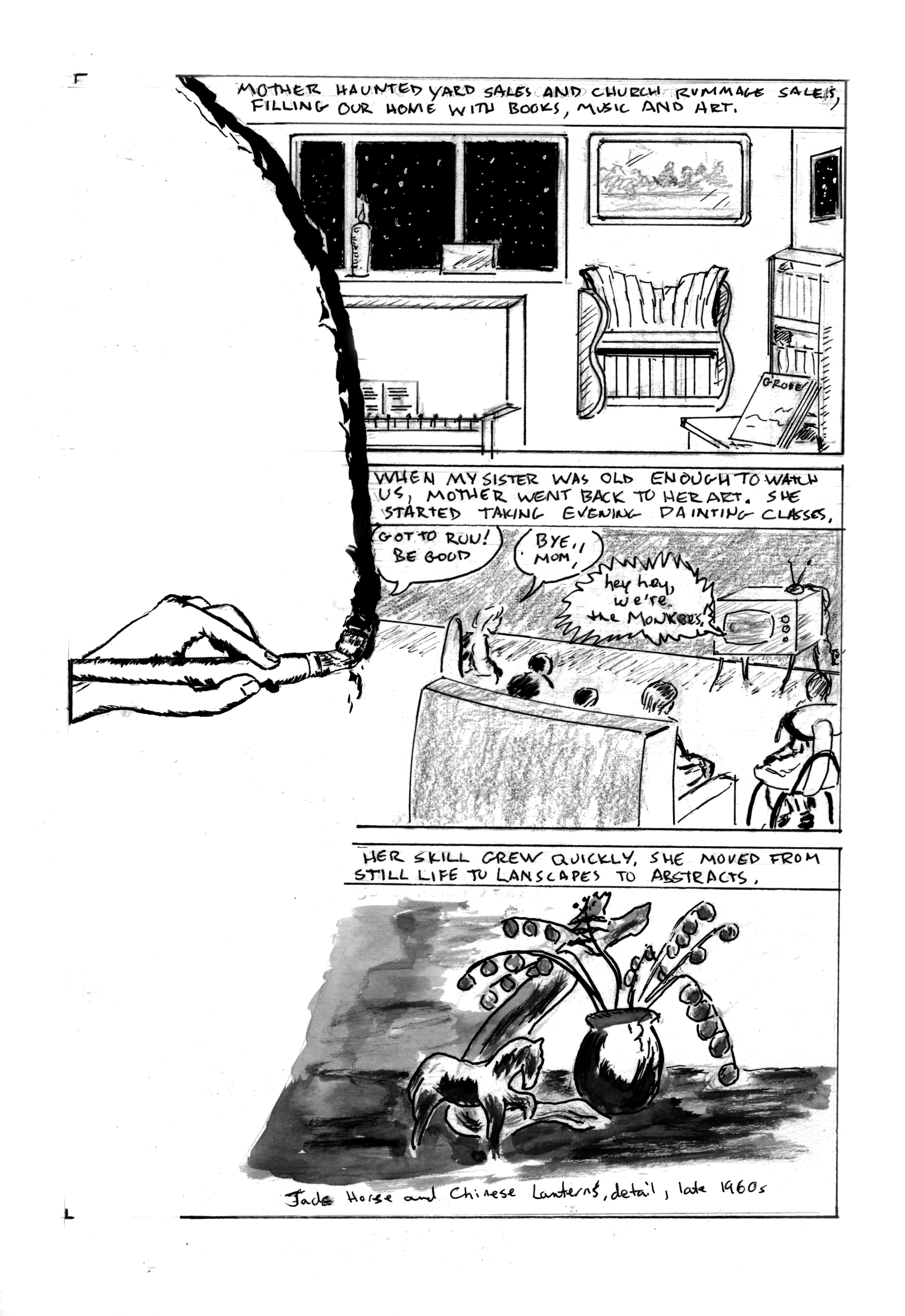
 Posting a page from the story of Mother on Mother's Day, of course.

When we left our hapless trio, they (we) were sleeping in a cemetery.

Now it's morning.


Again, trying to emulate Bode in some aspects of layout- use of borders and isolation of text, mostly. Much as I like his stuff, my style really isn't much like his.

Story notes: not much to tell. This is pretty much the way it happened. I wouldn't see John and Stu again for about 3 years. No overt trans content in this interlude. I am amused, however, at how shocked people seem to be today by hitchhiking. I don't think I'd do it now unless there was no choice, but back then it was a default method of travel. Either it was harmless or we were oblivious to the risk. Either way, I came through unscathed. There was a running gag between hitchhikers that the fastest way to get a ride was to have a sign that read HOME TO MOTHER.

Process, layout and technique: the challenge is keeping the reader cued with minimal elements. I deliberately avoided overcrowding this page. I pushed the textures on the bush in Panel 3, but I'm not sure if it reads fully. The text block between panels 3 and 4 was originally an open field of white, but in a moment of brilliance, I reversed it in PS. Gives the page a little more weight and helps the text stand out.

The other challenge in this kind of layout is border manipulation. I tried to go with the two principles of Bode borders (say that three times real fast): isolate text and image, and make panel elements part of the border. I like the sparseness of this page, and I think I hit the balance and included not just enough information, but the right information.

We have one more page of this interlude, and then back to the regular Mother story. 

I'm toying with the idea of doing a short print run of the Curt story as a stand alone publication. I have applied to table at a local indy con, and it could be interesting to see if anyone wants it. 

Materials: I did get a couple new brushes recently, but they're not used on this page. Pretty much the same tools as last time, so I will forego the equipment list for now.

Next: I get home.

Sunday, June 11, 2023

Original Art Sundays no. 364: Sharp Invitations: Esther's Hands, p. 6

 On to the next page of our story. I rather like this one.

When we left our family, Esther was starting to pull her life back together while she raised five children alone.

Now that the framework is solidly in place, we can get to the meat of Mother's story. 

Story notes: As Mother started to come into her own, so did the kids. We were finding our own voices, developing interests. Like many kids of the mid-late 60s, we bonded over TV. My sisters and I developed a fascination with The Monkees. I stuck with them more fervently than my sisters did. We often took the books, art and music that surrounded us for granted. That was soon to change. More on that on next week's page.

Art notes: The visual device of the brush stroke defining the left border of the panel will be repeated over the next two pages. I worked up a decent sketch of a hand doing a brush stroke, scaled it and printed a few copies. It will serve as a unifying narrative device. The first panel is from photo reference, with some liberties in perspective, intended to show that our lives were full but a bit off-kilter. For the middle panel, I tried 6 different layouts - Mother running out of the room, Mother looking back as she leaves, the closeup of a child's eye with Mother leaving in the eye, and so on. I finally resolved that even though this is her chapter, she doesn't need to appear in the panel at all. In fact, this page is unusual in that there are no face shots of anyone! This is almost like leaving myself out of a page. I've noted before that most graphic memoirs show the creator/subject on every page. Alison Bechdel broke this rule in her two most recent memoirs, but not in her first, Fun Home. I don't know if it's as much a rule as just the way things work out. At any rate, it's refreshing to shake up reader expectations as well as my own.

The astute viewer will note that the furniture and room layout are slightly different than previously represented. This is both artistic license and an acknowledgment that time has passed. 

For several years after Mother passed, I made small books reproducing her art and writing for the family. For the last panel, I scoured one of those books, and found a work that was period specific and had a good range of gray values. Rather than incorporating a photo of the actual painting, I opted to do a wash rendering of it. 

I'm happiest with my work when I let it flow. A solid layout is a tool, a means to an end, not an end in itself, to paraphrase Robert Fripp. I've been revising the master book, as mentioned last week. In noticing what works best, the most successful pages are those where I just explore visual ideas to advance the story. As an artist, I seem to be escaping the confines of my own expectations, whatever that means!

Finally, I re-titled this chapter from the outline. It's not about hands the same way songs like Bill Withers'  Grandma's Hands (which I love even though he sings flat) are about hands. It's not about specific things the hands are doing. I am spotlighting hands throughout this chapter. Their appearance and actions reinforce different parts of the story and character. I hope that's clear. I'm not sure how else to articulate it.

Next: the brush stroke continues.


Sunday, August 29, 2021

Original Art Sundays No. 282: The Third Sharp Invitation, p.4

 Here we go with another new page. 

To recap, the book's title, Sharp Invitations, refers to the things that you want that cause you pain. You're pulled towards them and afraid of them, even though you want them.

In case you've lost track, here's what's gone before, documented in previous chapters. My first sharp invitation was my impulse to touch the blade of a push lawn mower when I was five. My second was my attempt to hang myself when I was eleven over being trans, though I didn't yet have the language for it.

My third sharp invitation was gender confirming surgery. That's where we are now, in the aftermath of the surgery, still in the hospital, with me drifting in and out of awareness.


Tried to keep this one simple. I finally got back into real ink! My walnut ink is lighter than I recall from my last bottle, even with darkening medium added. So I fell back on my monster sized bottle of Sumi-E ink.

The textures in the last panel are simple Photoshop fills. A couple minor fixes are necessary before going to press, but this one is pretty much there.

I just made up the skyline in the window. It's very much like the skyline I used as a background/environment on the cover of my first self-published work, Ink Tantrums, about a hundred years ago.

The middle tier feels a little light, which is common in my work. In this case, I'm okay with it, because it's balanced by the weight of the images around it, and because coming out of anesthetic is a very soft experience. 

The face in the last panel really got away from me! Grr! I compensated by re-drawing it, but still wasn't happy with it. My ultimate solution was to just take the face from the top tier, copy into a new Photoshop layer and goose it a bit. It works now.

Materials for this page:

  • T-Square, Ames lettering guide, Canson Bristol board
  • Lead holder, #3B leads, eraser
  • Black Walnut ink and darkening medium, Sumi-E ink
  • Crow quill pen and nib
  • Brushes: No. 2 Kolinsky, No. 4 Richeson synthetic, Tight Spot for corrections
  • Chartpak black marker
  • Tech markers: .01, .05, .08, 1.0 
  • And of course, Photoshop 2019

There are two pages left to this chapter. It segues into the chapter on Curt. I've already published 19 + pages of that chapter, so I will do some editing before concluding it. The chapter, in many ways the core of the book, has evolved considerably from its original 5 pages of crude sketches in the draft version!

Next: the penultimate page of this chapter.

Monday, October 19, 2015

Original Art Sundays No. 225: Table of Contents Designs

Wow, what a rough couple months! Working two FT jobs and preparing to move!
I have a little time to breathe now. No comic work to speak of to post (about 10 or so pages in the rough stage, too crude for public consumption). I'm working on a large work, ideally to be funded by the Faculty Support Grant at the art college where I continue to teach as an adjunct.
Meanwhile, I've been working on binds- preparing some comic books to be sent out to be turned into hardcover books. The end result can be quite satisfying. I've been designing some Tables of Contents to go along with the books, and I'd like to offer some now.
 Night Force is a book I've been wanting to collect for some time now. Very smart horror title, it had its third incarnation a couple years ago, but the original run by Marv Wolfman and Gene Colan will never be eclipsed. Since the logo has that big blocky style, I opted to keep the text centered and use only a small support illustration. There will be a full page B & W illustration facing the title page.
When planning these, it's important to allow for trim. Most comic binds are trimmed by the binder (at the option of the person placing the order, of course!), which means one can lose any text or image that crowds the border. I have a clean printout of this, and I'm reasonably certain I've given it enough air.
The central character, Baron Winters, made a couple small appearances in other titles, but since this book is already 35 issues thick (about 10 over standard), I decided to omit them. Is it cheating to call it an Omnibus then? Perhaps so, but it's my book!


The Roger Rabbit Table of Contents was just fun! Here, the image was more important than the credits, so I opted for simple listing of the titles involved. Again, there were editorial decisions as to what got included. I could have scanned and reprinted the graphic novels Return of Doom and Tummy Trouble at comic book size, along with the handful of Roger Rabbit stories that ran in Disney Adventure Digest, but it seemed counterproductive. I went with what we call a "straight bind" of just the two primary titles. Taking the masthead from the letters pages in the main title, and the dancing image from one of the stories, the layout suggested itself easily.


This is a book I've been working on for years. It won't be a particularly thick book, only about 4 or 5 issues worth of material, but it's a very important book to me. The Scarecrow of 
Romney Marsh has fascinated me ever since I first saw him on Disney's Sunday night show (which aired the same day the Beatles first appeared on Ed Sullivan!). I stumbled on the Blevins comics in Disney Adventure Digest, took about three years to find them all, and through a friend who attended a con where Blevins was appearing, commissioned a Scarecrow piece, which is used here as the primary illustration.
This will be a gilt-edged book with custom art on the cover. It will be housed in a shadow box, which will also contain a DVD case, which will hold the Disney Scarecrow films, the Hammer film Night Creatures (another take on the character) and a CD of music from the TV episodes. I have this one about 2/3 of the way ready to bind.
My mad plan is to send a bunch of these out in the next couple weeks, so the finished binds arrive at my new place, making one less box to pack. I currently have 12 books I'm almost ready to send out, including Night Force and Roger Rabbit. The ideal is that one replaces a library of difficult to file and manage floppies with a handsome library of bound editions!
Next: sketchbook work or finished pages...