Showing posts with label Trina Robbins. Show all posts

Sunday, November 14, 2021

Original Art Sundays No. 288: Inktober, Week 2

 Next page of Sharp Invitations is about 3/4 done. Rather than skip a week of posting art, here's some more work from this year's Inktober.

I may make a booklet of these.

 Day eight: Zorro.

So many great inkers have worked on Zorro. I've always been partial to Jesse Marsh, Tom Yeates (there's a definitive collection of the Yeates/McGregor Zorro strip soon- hooray!) and of course, Alex Toth. A perennial favorite, Russ Manning, even did a couple tryout strips! 

Such a great character, romantic and driven by justice.

This is loosely inspired by the recent McGregor Kickstarter comic. Almost no under-drawing here, just some brush work. I do love working with dry brush techniques. One of my goals for this year was to improve my versatility and craft.


Day nine:

Another work in walnut ink. I got this really cool catalog of fashion for the more zaftig woman, and she was the cover and one of the interior pages. 

A little more time on the under-drawing this time. Mostly brush work, but a bit of crow quill. I think the outline on the figure could be a bit more consistent. This is always the question: when does one ink right up to the figure, and when does one leave a silhouette? For me, it's about the quality of the figure's holding line. If I'm pleased with that line, I want to preserve it, and the best way to do that is to leave the ghost space.


Day Ten:

This is my character Blue Wild Abandon, who has never appeared outside my sketchbooks before. She's an intergalactic bounty hunter and seeker of justice. Her symbol is the Jungian icon for hero. I will render it more tightly in her first adventure, tentatively titled "No Beast so Fierce". It will be a while before we see it, since I have two stories ahead of it in the queue!

She looks slightly different from one drawing to another. She's been showing up in my sketches for years, but I only recently realized who she is. Then I tied her to an SF story outline I wrote decades ago, and it clicked.


Day Eleven:

Inspired by Trina Robbins' recent wonder, Flapper Queens: Women Cartoonists of the Jazz Age, I decided to try my hand at fashion illustration.

The proportions are weird. The face is sparse.

But boy, was this fun!

Quick pencil sketch, many corrections on the ink. This was was a little Micron, a lot of crow quill, and a BIG brush for the few heavy inks.


Day Twelve:

Athena from my old Tranny Towers strip.

I haven't drawn her for years.

I would love to do a collection of that strip, and include the related work that appeared at the time- my Gay Comics pages using the characters, the self- published work with her from around that time, my editorial cartoons for 90s trans political magazines. Also some paper dolls I was working on and some background sketches and sundries. Make a nice little book.

But in today's political climate, trans people can't even call themselves tranny without someone taking offense. It makes me sad, but I think I've talked myself out of the collection for now. 

Athena's bra and panty set is inspired by Francine in Terry Moore's Strangers in Paradise #1.


Day Thirteen:

Ray Shulman of Gentle Giant. Taken from a photo in the Italian Super Star compilation album booklet!

Much as I love the band, I seldom draw or write about them. Back when I first started posting my work, about a million years ago, I posted some pages from a comic adaptation of the GG song Little Brown Bag. Gentle Giant comics came up in a discussion of a proposed documentary online recently, so that project, an anthology titled Gentle Giant Comics and Stories, could see life again.


I do already have a lot of projects, but my enthusiasm does not abate.


Day Fourteen:

Usagi Yojimbo

This was just fun to draw. Stan Sakai has a style that is deceptively simple. But when you take a closer look at his technique, it's clear he's a master. Subtle variations in line weight, and facial expressions that tell the whole story.

I tell my writing students that knowing what to leave out is as important as knowing what to put in. Sakai is the master there.

That's all for now. I'll save the last 17 Inktober sketches in case I need them to meet a Deadline Doom here, as the Marvel editors used to call it.

Next: back to Sharp Invitations.


Sunday, April 23, 2017

Original Art Sundays, No. 242: Queers and Comics Drink and Draw

After months of working two, sometimes three, jobs and dealing with writing assignments, I'm back in the art saddle, so to speak!
These illustrations happened as a result of my attending and participating in the Queers and Comics conference in San Francisco last weekend, which was possibly the best conference I've ever attended. In addition to my contributions to the Queers and Underground Comics and Trans Cartoonists Navigating the Industry panels being well received, I got to spend some time with old and dear friends, including Trina Robbins and Roberta Gregory, and make some unexpected new ones. The Queers and Undergrounds panel was satisfying in that I thought I had little to contribute compared to some of the luminaries on the panel, like Howard Cruse and Vaughn Fricke (with whom I later had a wonderful chat), but I held my own. And after the Trans panel, some folks asked where they could buy my books, so courtesy of the Dealer's Room, I sold come copies of Surrealist Cowgirls and the draft edition of Sharp Invitations.
The first night, Thursday, had an opening ceremony I passed on to share a couple drinks with my gracious host Noel in a Castro bar. However, I did attend an opening at Strut, a community health and wellness space for Gay, Bi, and Trans men that doubles as a gallery space.The opening of the work of Salvador Hernandez culminated in a Drink & Draw. The models were bears and leather boys. 
All the poses were short.

This was done before the poses had officially begun.
I was a bit apprehensive, as it's been a while since I've done live model drawing, but the key remains constant.
Remember the basics. Build the figure from the inside out, rather than trying to do an outline drawing. Looking around between sketches, I was surprised and dismayed to find so may artists trying to do an outline. The teacher in me wanted to take over, but I held myself back.
This was one of the most relaxed and easiest sketches. The subject sat relatively still for most of five minutes, enough to get a sense of mass and proportion and a sense of place.


The first official pose involved two models. This posed some foreshortening challenges, as one subject was prone while the other kneeled. I struggled with proportion issues on the feet for a while, then made the deliberate decision to concentrate on overall mass.
It was a special challenge to map lights and darks, since the light was gallery light- very bright and even, and offering few cast shadows! Still, something as simple as a hint of a cast shadow beneath a chair can do wonders in this arena.
As the note indicates, this was a 10 minute pose.
I wasn't particularly interested in facial expressions on these, but I did want to get a reasonably accurate sense of facial features and proportions.
This was part of the penultimate pose, another duo. I found the pose intriguing and the relative size variations of the two men a fun challenge.
I found myself losing my place in mapping the relative features and seemingly simple, yet not really so, proportions of the front and back gents. To try to remedy this, I went in with a brush tip marker and did some outlining in spot color. I think the decision to stick to one additional color was wise. Had I more time, I could have done some fun things with pushing background tones in both graphite and rust tones.
It should be mentioned that, aside from this one, these pieces are all done on marginal tooth sketchbook paper with #3 and #4 graphite pencils.
I was also the only person I saw using an eraser!
Please. It's not cheating to correct as you go. It's smart.
I took out quite a few construction lines, but elected to leave some in, as they add to the overall feel and energy of a piece sometimes.
The final pose of the evening was a complex interlocking of all the models- eight, I believe. The alternated facing front and back and linked arms behind the backs of the gent next to them.
I found this pose impossible. It was a fairly long pose, 15 minutes if memory serves, but I started three times and grew increasingly displeased with my results each time.
I made a deliberate decision to edit, and concentrated on a head shot of one of the leather men.
In retrospect, while this would have benefited from some background tone, I'm pretty happy with it as it is. There's a sense of confidence and repose in the face that I find very satisfying and reassuring. It's nice to end a session on a good note. While some might find it cheating to do a head shot in a figure drawing session, the reminder that this isn't a class applies to me too. The only people I'm answerable to in making my art are me and any clients/readers I may have.
Additionally, this is a good sketch, especially for the three minutes I took for it. Since photography was verboten during the session, you'll have to take my word that this is a reasonably accurate representation of the model's face.
At one point, I got frustrated by the barrage of testosterone I was drawing. This is not to disparage the models or the venue. I just wanted variety. At that point, I started drawing another artist, a young lesbian who was sitting directly across from me.
This is the first of two drawings I did of her. The second, which I liked much better, I gave to her. She left almost immediately after I did so!
When I saw her at the conference the next day, I apologized for my presumption and said I hoped I hadn't freaked her out. She replied no, she had to leave at that time as her girlfriend was picking her up. She added that both of them loved the drawing!
I'm very sad that this conference doesn't happen again for two years. I talked with one of the organizers, Jennifer Camper, about having one in the Midwest, ideally in Minneapolis. She opined that a smaller one might be a possibility. After watching her run about madly for three days, I could see her point. I still think it's a good idea. Not that I need another project, but I plan to bring this up to some friends and see if it goes anywhere.
Next new art: the anniversary sketch.

Wednesday, March 1, 2017

Best Comics of 2016, Nos. 11 - 6

An extra heavy period at the day gig slowed my writing, so I'm going back to the model I used last year: multiple books in every post. I will expedite matters, since I had originally planned on being done with these on the 16th of January. This is time-sensitive material, after all. In response, I am writing all the entries in three posts before making them public.
11. Backstagers
Despite all the backlash snobbery of the 90s, comics can be for kids. It takes nothing away from comics to have some dedicated to younger audiences. Regardless of the target audience, quality will out.
The Boom Box line has been producing  genuinely smart kids' comics for a while now. Their biggest success, Goldie Vance, has been on my radar for a while, and in addition to the title we're discussing now, I'm reading the trade of Help Us, Great Warrior, which is wonderful fun.
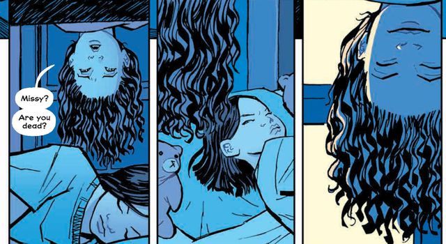
Backstagers is a very clever and humane comic about young adult theater. The book goes behind the scenes of a high school play, and discovers a world of magic, wonder and danger in the nether regions of the props archives. If you have to have labels, think of elements of Narnia combined with A Chorus Line. A profoundly inadequate description, to be sure, but it serves to get the conversation rolling.
Stars Kevin and Blake
at their self-congratulatory
best.

The characters, even the self-absorbed and cruel show stars, are wonderfully engaging.  There's a mystery and excitement to every issue.
The colors are lush and vibrant. The book is smartly laid out. One of the things that chafes me is any creative team dumbing down their work, pandering to readers. This is particularly insulting when you're treating kids this way.
When I started teaching high school age kids, I quickly learned to respect their intelligence. Yes, yes, we've heard the arguments- kids' brains aren't fully formed, they lack sufficient experience to make informed decisions. What excuses do adults use? So many so-called grown-ups make much worse decisions than kids do, and with farther reaching consequences. The kids in Backstagers understand strategies, motivations and their own desires much more clearly than many who claim to be adults. Yet they're clearly still kids.
This is one smart book. I'm sticking with it.

10. Bombshells
Some surprisingly good comics have come out of marketing gimmicks. The 1960s  Captain Action book, the 70s (and 90s revival) Micronauts and Rom, Space Knight come to mind. DC created Bombshells as a way to sell statues, glasses and posters. In fairness, it's pretty cool merchandise, but we're here to talk about the story.
Bombshells shouldn't work but it does.This WWII alternate reality pastiche of DC superheroines and villianesses recast in curious ways is full of verve, smart art and impassioned writing. I'm sure a lot of people are buying the book just to look at the girls/women. In fairness, that's on my list too. I love the evocation of classic pin-up art that dominates the book. As one who's often waxed effusive about the virtues of pin-ups as opposed to porn, the art in the series delights me.
The take on Wonder Woman, usually my favorite, is good but not great here. I like Mera!
The plotting is a bit on the nose at times. Batgirl as a baseball player- get it? She uses a bat! Look at us, we're being clever!
Even with that, the story remains engaging. I was taken aback by the Stargirl storyline.The Russian aspect, coupled with the heartfelt self-sacrifice really resonated with me.
I continue to enjoy this book. I picked up the newest issue just today. Since it's a bit gimmicky, I had my doubts about how well it would sustain, but so far it's remained worth the money.
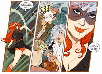
Batgirl in action, pre-hero!

9. Wimmen's Comix
My favorite cover from the series!
One of the frustrations of comic book binding is that sometimes you bind a book that later gets reprinted. Though I accumulated all the issues of Wimmen's Comix with a bind in mind, this collection came out before I could complete the project. I'm glad.
The blurb from the Fantagraphics website:
"In the late ’60s, underground comix changed the way comics readers saw the medium — but there was an important pronoun missing from the revolution. In 1972, ten women cartoonists got together in San Francisco to rectify the situation and produce the first and longest-lasting all-woman comics anthology, Wimmen’s Comix. Within two years the Wimmen’s Comix Collective had introduced cartoonists like Roberta Gregory and Melinda Gebbie to the comics-reading public, and would go on to publish some of the most talented women cartoonists in America — Carol Tyler, Mary Fleener, Aline Kominsky-Crumb, Dori Seda, Phoebe Gloeckner, and many others. In its twenty-year run, the women of Wimmen’s tackled subjects the guys wouldn’t touch with a ten-foot pole: abortion, menstruation, masturbation, castration, lesbians, witches, murderesses, and feminists."
So much work here to love! From the welcome inclusion of It Ain't Me Babe, the first all-woman comic, through #18, so many brilliant artists are included here. 
The good: the collection is very well archived and edited. There was a slight variation in format between some issues. This is rectified by allowing luxury margins for the art. There was also a wide range of quality in the printing of the original comics. Here, the art is cleaned up and printed on decent bright paper, with very good separations for the covers and the 3D issue (glasses included, of course!). They were even nice enough to include a 2D version of the 3D issue at the end of the book!
The bad: This thing is a brick. Two hardcovers, over 700 pages on heavy paper in a slipcase, weighing in at just over 7 pounds! I've questioned the formatting, which set the list price at $100, several times. This is 18 comics, plus the Babe issue and the 2D/3D issue, for a total of 20 comics. I have several custom binds of just over 20 issues, including some underground stuff. They fit neatly into one book. Did the reformatting demand the luxury treatment? I'm not sure.
Aside from the inconvenience for people who aren't avid bibliophiles, the price point of a deluxe volume might keep some people away from this collection. If it were in paperback at half the price, would more people buy it? This ranks at #436 in Amazon's Fantragraphics sales ranking, while the cheaper and smaller (and admittedly collecting less work and having been in print longer) Inner City Romance ranks at #328. That's hardly conclusive evidence. I do note that Fantagrphics did a paperback reprint of its Usagi Yojimbo 2 book slipcased set. It continues to sell briskly, while the HC is long out of print.
There's little material aside from the comics- one essay and some photos.
Either way, I hope for a more accessible printing, even though I do so love a well-made book, which this clearly is.
There's also a strange practical incongruity. The spines are flipped. The spine that reads "The Complete Wimmen's" is on book two, while the spine that reads "Comix" is on volume one! This puts the avid owner of a comic library in the awkward position of having it wrong no matter what she does. Either the spines are in the slipcase out of order, or the books are. Grr.
But the descender on the N in "Wimmen's" links with the ascender on the X in "Comix", making such a wonderful design touch, it's almost mandatory to leave the spines in that order.
Retrospective volumes are often given the prize/curse of being "important". This is more than an important book or a reflection of decades of feminist evolution. It's a fun and compelling collection of comics.
8. Paper Girls
Brian Vaughan has been a fixture on the comics scene for some time now. His first comic work appeared 21 years ago. Despite the unrelentingly downbeat ending, I adored Ex Machina, and found his take on Doctor Strange, The Oath, refreshing and surprisingly optimistic. I may be the only person in comic readership not drooling over Saga. Frankly, I find it too cynical, and its "fresh" ideas are reminiscent of things Philip Jose Farmer was writing 50 years ago.
That said, Paper Girls cheers me.
A Vaughan comic with bleeped out
swear words!
Maybe it's the support text, the letters pages dedicated to the delightful myth of being a paper girl, echoing the supporting text in Lumberjanes. Maybe it's that these girls prove to be so capable when they're catapulted into a nightmare world that's part future dystopia and part mythological realm. Maybe it's just that, for a change, Vaughan doesn't let cynicism and snark dominate the narrative, though there's still enough of both.
This book is cleanly drawn, fast paced, complex enough to engage the mind and a roller coaster ride. Having teen girls as protagonists without pandering to the stereotype of the month is also quite refreshing! In fairness, Vaughan's work on Runaways also handled teen girls well (I didn't mean that the way it sounded - ick!)
Cliff Chiang's art is clean, energetic and on point. He composes frames seamlessly, and has a clean line that brings Geoff Darrow to mind. Yet he's very much his own artist.
I've only discussed the plot in vague terms. This is a chronic condition with me. I want to give you enough to want to read the book. The book in question has time travelers encountering their younger selves, strange monsters from another dimension, and tons of late 80s nostalgia. Is that enough to whet your appetite?


7. Art Ops
Here's a clever idea. A spy agency dedicated to keeping subjects in their respective artworks. Of course, things go wrong, like Mona Lisa escaping and getting in a family way. Oh, and the son of the lead Art operative loses an arm, which is replaced with living artwork.
Art Ops is a lot of fun, but is a bit on the nose at times. It plays with reality, suing tones that echo Grant Morrison's Doom Patrol, but lacks the subtlety and nuance of Morrison's work. Writer Shaun Simon brings a decent knowledge of art history to the book, but the story rarely goes much deeper than well-known and well-trod grand masters. It's a chaotic ride, but it doesn't go any place too scary once the reader adapts to the premise.
And really, it's not all that chaotic. There's an inevitability bordering on cliche to some aspects of this. The expatriated artworks take haven at the Chelsea Hotel? My, how novel. Nobody's ever used that setting as a metaphor for escape of tortured  souls before. Please.
Mike Allred's art, however, is expressive and on point. I'm on record as liking good fundamental comic art (and one of these days I'll try to define that), and Allred has long championed comparatively simple and anarchic comic art. Sometimes it works well. I  loved his work on X-Static. Sometimes it doesn't. His Fantastic Four run left me cold. Here, it's very effective, and just plain fun to look at. Rob Davis' fill-in on the penultimate issue, #11, lacked some of Allred's verve.
As alluded to above, the series is concluded at 12 issues. The first half is out in trade now. This chafes me a bit. This is a short series. Why break it into two books? Apparently marketing is more important that reader satisfaction.
Perhaps that's the crux of the biscuit. The underlying cynicism of this book is irritating, not because there's no place for cynicism in comics, but because of what it says about how the creators value art in the world. It's well worth reading, but there are other comics about art that tell better stories.
6. Electric Sublime
In contrast, here's a surreal adventure comic about art that shows a deeper understanding of art.
As far back as Frederic Pohl's novel Drunkard's Walk, and more recently the play and film The Caveman's Valentine, we have narratives dealing with the challenge of the mentally ill person who sees things as they truly are. Add Electric Sublime to that mix. While I have major issues with the whole "tortured artist" syndrome, it's used here in an interesting way, echoing the lost and lamented series Millennium. A central character is pulled from an asylum to use special abilities to solve an inexplicable puzzle- in this case, a winking Mona Lisa.
Main characters are trapped in the winking painting. In the so-called real world, mass suicides complicate matters.
Evoking many of the usual suspects of art history, this book strikes many of the same notes as Art Ops. But where the latter uses amplified guitars and buzzsaws, Electric Sublime uses a string quartet playing a Berlioz string quartet that sneaks in some Philip Glass riffs on the sly. In short, this is a much more elegant and nuanced look at art and its place in society.
Electric Sublime manages to address the whole "crazy artist" cliche while treating artists with a measure of respect. And the book is much more visually intriguing than Art Ops, using a controlled palette where necessary, and evocation of numerous styles from both comics and the "legitimate" art world. The book reminds me of artists ranging from Hannes Bok to Ben Templeton in places. And the use of the artist's pose-able wooden mannequin as a Greek chorus of sorts is quite charming.
The first mini of four books recently concluded. While there was a sense of resolution, it was clearly left open for a new series. I'd like to see more, and like to see writer Maxwell Prince and artist Martin Morazzo play with even more art history - tropes, memes, riffs, chose your visual motif. I just want more.
Klimt, anyone?
Next: entries 5 - 2.

Sunday, August 30, 2015

Original Art Sundays No. 224: Speedy Recovery denouement (and a Neil Gaiman review!)

Once more, here we go! Last time around for this particular Speedy Recovery book!
The Speedy story is done, at least as far as posting it. But there are some tidbits that were included in the first printing of the comic that I wanted to share here.


Here's the original idea for the front  cover, and the usual somewhat self-congratulatory afterword page. I'll let the text speak for itself for better or worse, rather than second guess copy I wrote 25 years ago(!).
I do like the original cover plan, in some ways better than the final. I would have had to redraw the car/plane to match the final version inside the book. But even though this version is more dynamic, it served as the basis for the last story page (see previous blog post).


And here's the back cover- an ad for the Packard Tesseract! I've been fascinated with Packards ever since I saw Harlan Ellison sitting in his on an episode of the old Anti-Gravity Room, a fun SF Channel series that was mostly young geeks sitting and talking comics. Clearly, part of the inspiration for the Packard was the TARDIS. Bear in mind that at this point in time, the Sylvester McCoy series was just ending in the UK and was only being sporadically broadcast on PBS in the states, so it was a much less known commodity then than it is today.
Process: This was printed out on colored paper, with the illustration down directly on the paper with colored pencil and markers.The cheesy frame on the illustration is just Photoshop stock. The Packard Tesseract is a great idea. I love the conceit that you need a mechanic, a quantum physicist and a poet to build one!
And I did get some reviews of the completed book. I got a kind note from Howard Cruse, who had also liked the Tranny Towers mockup I put together for a Xeric Grant (didn't win- much sadness!), and a brief note from Trina Robbins, who didn't much care for it. However, I'm pleased to report that we developed a friendship in later years.
And I got a postcard from Neil Gaiman.
This may have been one of the last such reviews Neil did. His career was entering a MUCH larger phase, and shortly after this, he stopped reviewing everything that was handed to him (perfectly understandable). But I cherish this postcard (with Charles Vess Stardust art, no less!) and the kind words Neil had for my work at the time.
Charles Vess!

In Neil's own hand!
I find Neil's handwriting quite legible, but just in case you can't make it out, here's what it says:
"Hi Diana-
Thanks for "Speedy"- I enjoyed it (especially the pun names- some were worthy of Will Eisner)- my only real problem was that it seemed uncertain what it was- a parody, a pastiche, a retro-story, a superhero thing, or what, and the storytelling seemed to lurch a bit: right now they aren't yet people- you have to believe in them too.
Congrats on the degree! 
Looking forward to the next Speedy Ricuvveri-
love
Neil Gaiman"
A generous and fair review, I think.
(That's a very old address, by the way. Don't write me; I'm not there.)
A former department chair who became a friend, Tom Haakenson, once said you should never go back. But I don't think that applies here. I do like these characters, I think there fun and exciting, and I need to do more stories featuring them. I just need to take Neil's advice, and make the execution live up to the promise. These are good characters, and they deserve another day on the page.
Next: we'll see.... back to an older story, work on something new... I'm rather enjoying this getting things completely done stuff. I'll see if I can keep that horse galloping!

Wednesday, June 13, 2012

Comic Book Comics Reviewed

I've read more histories of comics than some folks have had hot breakfasts. The books all have their errors and omissions, some better than others. But there's been a gradual sophistication of the study, to the point we are now at, where a sufficient body of research has accumulated that it's beginning to take cohesive form. This results in a sort of canon of accepted notions, things taken as verbatim and rarely questioned outside academia.
Enter The Comic Book History of Comics
A history done in comic book format. Nice. This has been appearing sporadically in single issue format over the last few years. I used the first two issues, covering Bronze and early Golden Ages, as a text in my Comic Book History class shortly after they came out. I was frustrated by the books' arriving three months after they were ordered(!), making them fundamentally useless for aiding in that portion of the course.
Now, however, there's a spiffy, gosh-wow no-sarcasm-intended really cool collected edition of this, from our friends at IDW Publishing, who have been doing some wonderful work, both with new comics and with reprints - would that I had the funds for any of their Artist's Edition series - and publishing this as a collection continues that trend.
I will be using this for a textbook in Comic History class, now that it's available in a decent uniform edition, if I get the opportunity.
However, it's not without its flaws. I list these while recognizing that the creators of the book have requested notification of errors and omissions, for correction in future volumes. However, I wrote them about a couple of the things I'm discussing here prior to the work being collected, and the errors I wrote about are still there.
The first line of the first (disclaimer) text page reads, "this comic book is a work of historical scholarship."
Really?
Then where's the index?
Scholarship on history implies use as reference. You'd think an index would be a no-brainer. In fairness, the book does include a decent section of Notes on Sources, with more on the book's web page, which is always a useful tool in research and citation.
There are some other problems here. Right off the bat, Fred van Lente (writer) and Ryan Dunlavey (artist) jump in with the Yellow Kid's 1896 debut in Hogan's Alley, citing it as the first comic strip. This completely ignores Ally Sloper's Half Holiday, a British strip that began in 1874.
I'm not going to pick the book apart page by page. Most of it is quite good, if a little heavy on the sarcasm and snark for my taste.
But there are some omissions and factual errors that are too glaring to ignore.
The coup d'etat involving Major Malcolm Wheeler-Nicholson being underhandedly bought out by Harry Dondenfeld and Jack Liebowicz, covered in depth in Geeks, Guns and Gangsters and in Larry Tye's recent volume Superman, is reduced to one line on page 32.  Since these events lead directly to the formation of DC Comics as we now know it (and are exacerbated by a Wheeler-Nicholson story appearing in Action Comics no.1, the book being discussed herein), it does deserve more than one line, especially a line that dismisses all the nuance of the facts.
Similarly, although The Shield is shown on page 58, there's no mention of his creation predating that of Captain America. Indeed, The Shield isn't even mentioned by name. This pattern recurs in other parts of the book. Cheech Wizard appears on page 206, inexplicably in a section on the early 1990s speculation market (which, given that Cheech is something of  huckster, is somewhat apropos), but neither Cheech nor his creator Vaughn Bode' are mentioned in the section on undergrounds.
In fact, the entire New York underground scene is only mentioned,and the Comix from Wisconsin's Kitchen Sink Press and the Chicago underground scene are ignored.
The discussion of Wertham and the Comics Code is accurate as far as it goes, but it leaves out the Code's two major precursors: The Association of Comic Magazine Publishers Code of 1948 (which also had a seal used on covers!), and the in-house editorial code of Fawcett Comics, shown in Chip Kidd's book SHAZAM! 
The  section on graphic novels  mentions the early work of Lynd Ward and Franz Maesreel  but neglects Milt Gross's 1930 classic He Done Her Wrong,  in print from Fantagraphics. But Sabre, a graphic novel from Eclipse, Sabre, whose publication predates that of A Contract With God (albeit only by a few months) is ignored.
They do manage to cite Gil Kane's Blackmark and His Name is Savage in this context, and rightly so, along with the 1950 It Rhymes With Lust. However, the followup paperback The Case of the Winking Buddha, is overlooked. In fairness, the latter work is of  lesser quality, but we're talking history here, not aesthetics.
Some of these things might seem a tad nit-picky. Maybe so. They're significant to me, but not necessarily to the average reader. Still if this is the average reader's first exposure to comics history, that reader might take these things as Gospel unquestioningly.
But the most glaring error is almost an insult.
There are no female creators mentioned in the entire book. Not one.
I usually don't do the big text thing, but it seems correct to do so here.
No mention of Lily Renee', Marie Severin, Ramona Fradon, Lee Mars, Colleen Doran, Jan Duuresema, Trina Robbins, Shelby Sampson, Alison Bechdel, Mary Wings, Roberta Gregory, Selby Kelly, or the great neglected Shary Fleniken, whose work was in at least one of the Air Pirates books, though she wasn't named in the suit.
And that list was just off the top of my head.  There are so many more that could be recognized, especially in the last 30 years. 
The only mention of women cartoonists in the entire book is in the section on romance comics, page 60: "Though through our allegedly more enlightened "modern" eyes, romance comics may be seen as simply re-inscribing the more patriarchal aspects of American society (as 99.99% of them were written and drawn by men)..."
That's it. A backhanded acknowledgment of the supposed .01% of comic artists and writers of the 1940s who were female. That's the whole of the discussion of female creators of comics in this history.
Again, that doesn't invalidate the book. Neither does it make the book inherently bad. It's mostly really good. What is here is reasonably well-researched and presented in an entertaining (if often drenched in fanboy attitude ) fashion.
I will use this as a text, but I will expect my students to pore over it with a microscope.
No history of anything can be perfect, but this one has a few really big holes. 


Friday, February 10, 2012

Best Comics of 2011: no. 1

Finally.
To recap:
14. Sailor Twain
13. The Lions of Valletta
12. FF/ Fantastic Four no. 600
11. Rachel Rising/ Terry Moore's How to Draw series
10. Batwoman
9.  Star Trek
8. Scapled, Book 8
7. Ruse: The Victorian Guide to Murder
6. Sugar & Spike Archives
5. The Shade miniseries
4. Kevin Keller/ The Simpsons no. 183
3. Habibi
2. Pogo Vol. 1: Through the Wild Blue Yonder
And the No. 1 comic of last year:
This thing is a monster, in every way. Close to 40 years in the making, this is the only comic I know of that contains work by Vaughn Bode', C.C. Beck, Fellini, Frank Zappa, Will Eisner, Barry Smith, Wally Wood, Trina Robbins and Tom Wolfe, which is but a small sampling, to give you an idea of the book's scope.
The volume measures a hefty 5.7 x 11.8 x 0.9 inches and weighs over four pounds. The initial concept as proposed to Rolling Stone was to have cartoonists create work that summarized their views of the 1960s as the decade drew to a close. The project was tabled for a labyrinth of reasons, and just finally saw print this last November from Abrams Books.
Another noteworthy touch: the editor, Micheal Chocquette, asked that the creators leave blank space in each of their stories. He then returned to the stories and filled in those holes, illustrating his escapades in getting the book out in panels contained in the other narratives.
I had a hard time deciding which pieces to include in this entry, but here's the Frank Zappa page.
And I'll brook no complaints about the pages being crooked. Given the size of this bear, it's a miracle I got it on the scanner!
And here's the Eisner story, always a welcome treat.

 A new Spirit story.
That alone is an event worth celebrating.
In addition to the aforementioned benefits, the text of the foreign language strips is printed in the original text, with a section in the back devoted to translations. And the editor even has the courtesy to refer to the late Jeffrey Catherine Jones by her proper name and pronoun, despite her work having been submitted before she came out.
So what does it say that the two best comics of the year were reprints? Was there really such a dearth of worthwhile new material? Did I just not see the best stuff? Did my limited exposure for the first half of the year taint my judgment?
Or was that just the way it worked out?
Some combination of those factors, I suspect.
2012 looks to be a promising year for comics. I'm enjoying the stuff I've been reading all along- CHEW, Unwritten, Terry Moore's stuff- and some old favorites are reappearing- the first new issue of The Twelve for almost two years- so I have hope for a good year in comics.
Thanks for sticking with me through this painfully protracted process. Much faster next year!

Friday, June 10, 2011

Even later: Minnesota Spring Con Part II

Okay, I know I said next day. I've been waiting for some photos to be emailed by friends.
Enough with the waiting. Here's the rest of SpringCon.
Here's Terry Beatty, longtime comics pro, on-and-off MCAD teacher, rockabilly maven, Karaoke Ninja, and generally cool guy.
The book he's holding, Batman and Robin, is a custom bind belonging to my friend James Friel. James sent me a batch for books for signing and sketching, and Terry was glad to accommodate!
We're losing Terry soon. His wife got a great job in Kansas City, MO, so he's off to an even more mid- middle America.
Terry just completed work on the next GN in the Road to Perdition series, written by his old Ms. Tree partner, Max Alan Collins! He's also been doing box cover art for monster model kits, and taking on new commissions. His blog, Scary Terry's World, is linked to your left.

Also on board for this convention: former students from my Comic Book History course, Asby Utting and Andrew Herbst!
Ashby graduated a year or so ago, and Andrew completed his devoirs this January. Andrew gave me a copy of their joint effort, GROTTO, last year, and I enjoyed it immensely. Very professional, energetic work. The "for students" disclaimer does not apply. This work is professional by any standard.You can see it here.
Ashby is planning an on-again, off-again trip to Korea to study manhwa.  He plans to take his toddler son along with him. Now that's bringing a kid up right!

Another former student showing at the Con: Toe Vue!
Toe's paintings are remarkably powerful. I suspect he was a little under-appreciated at this Con, but I was very happy to see him there. The work at his blog, Create Chaos, shows his range and his influences.
I see elements of street art, Paul Pope, Ryan Kelly (well, you can't really talk about Paul Pope without talking about Ryan Kelly, can you?), Boticelli and Jack Kirby in Toe's work. An eclectic mix with a deliberate, singular style that wouldn't work for anyone else, I done't think, but for Toe, it's very effective.
Finances have stopped me from getting his comic GHETTORISTIC, but don't let my problems be yours. Check out the link and spend a fin on a good comic!
Other former MCAD students presenting at this year's con included Evan Palmer, Anna Bongiovanni, Jesse Haller, and Will Schar. Sorry I didn't get photos of you guys, and I hope I didn't leave anyone out!
Very happy to chat briefly with Seamus Burke, whose first collection of Oh Goodie! is now available in Dead Tree, or as we used to call it, TPB format.
Very excited to see this book out, as Yours Truly wrote the Foreword!
Seamus' work has evolved considerably.  He works in the model of Doonesbury, using scathing wit and somewhat static images to advance his narratives. With the evolution of the band in his strip, which updates 5 times a week over at his blog, he's broken out of that pattern.
The band in the strip is called the Filthy F@#$ing Fairies!
I didn't talk to Seamus for very long this time around. Usually I get him to fork over his guitar so I can tear off a number, but not today.
Another personal highlight was getting a wedding invitation from the vibrant and scary talented Ursula Murray Husted and her intended, Bryan Bornmuller.
Ursula and Bryan are in contention with Trina and Steve for the title of Cutest Couple in Comics.
You be the judge.
'oo's cute then?
More book signings:
Jose Luis Garcia Lopez
Len Strazewski, who was moved to tears that someone would bind his work!


Me hanging with Len
Peter Krause, who was so astounded by the SHAZAM! collections that he volunteered to do a sketch, and it was a beauty!
Following the Con, a bunch of us went out for Girls' Comics Dinner at the always enjoyable Jasmine 27. In attendance, Frenchy Lunning, Barb Guttman (who is currently assisting Peter Gross on art for The Unwritten), Barb Schultz, Jesse Haller (who was an honorary girl for the occasion), Rana Rauechle, Trina, Steve Leialoha (can't really have Trina without Steve!), myself, and Roberta Gregory. I haven't mentioned Roberta's presence till now. I still get a little tongue-tied around her after meeting her twice and spending several hours accepting that she's just Regular Folks. Her work set the bar for women's comics for years, and her honesty and craft remain benchmarks. She's currently working full time for the Seattle Opera and Children's Theater, unless memory fails me.
At the end of every con, I think I'll pull together a body of creative work for the next one and get a table.
perhaps, perhaps not.
I like the idea of having a body of work to offer, but I have no problem with being a fan. If that remains what MN Springcon is about for me, I can live with that.

Sunday, December 12, 2010

More paper dolls! (catch- up No. 1 of 3)

Now that grading is done and I can concentrate on getting a new fill-in gig and putting this year's design projects to bed, I can catch up on my blogging a tad.
First up, those new paper doll finds I promised last week!
The first is a jam paper doll series, the center spread from Wimmen's Comics No. 11.
Included in this delightful piece, clockwise from top left:
Bugs Herbert
Aline & Sophie Crumb
Trina
Dori Seda
Lee Binswager
Caryb (?) 
Diane Noomin
This may be the first time I mentioned the late, great Dori Seda here. Her work has this compelling combination of raw raunchiness and innocent vulnerability.
Next up, another Trina Robbins paper doll, this one from Gay Comics No. 25.
This piece is noteworthy in a couple ways.
First, it's a sort of redemption for Trina. Her story "Sandy Comes Out", from Wimmen's No. 1, was one of the first, if not the first, comic story about lesbians, dated 1970. Mary Wings took exception to the story, and followed with her 1974 book Come Out Comix. It should be noted that Trina and Mary remain friends and that Trina's subsequent work in this arena has been very well recieved.
Second, Gay Comics No. 25 was the last issue, and featured most of the creators who had appeared in the title prior. To the best of my knowledge, it's the only time Trina and I had work in the same comic! I posted my Tranny Towers page from that issue some time back.
It's possible Gay Comics will return, but I've heard nothing of that possibility for almost two years now.
Tomorrow: Catch- up Post No. 2.