Showing posts with label Alan Moore. Show all posts

Sunday, September 18, 2022

Original Art Sundays No. 309: Sharp Invitations: Curt, pp. 49 (rework) and 50

 Back at it, folks!

I corrected the first panel of the last page and am reposting the page to start, followed by the next page. I am very close to completion of the following page, but not quite there. Here are pages 49 and 50.

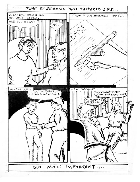
In the current narrative, we're talking about rebuilding a life. These pages continue that theme.


Not much new to say about the first page after last week's discussion. This is mainly a correction, after all. That first panel is an improvement over last week's posting, using a more direct angle and a tighter shot (and better drawing). Keep it simple! Just rendered on a different piece of Bristol and patched it in with Photoshop. My facial expression in he new version of Panel One is what I was hoping to convey- just barely holding on, but trying to smile anyway.

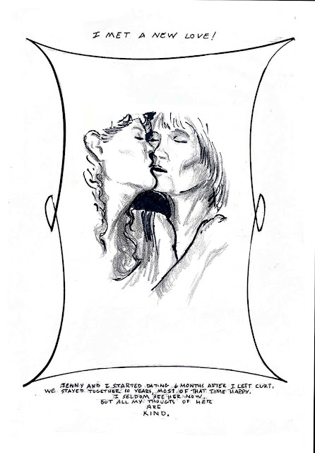
Page 50 of this chapter is most of what I'm saying about Jennifer in this book. Our relationship had its challenges, as they all do, but she's living her own life now and I want to respect her privacy. We saw each other through some rough times, and I am grateful to her. She had such intense joy! Jenny was also trans, which will be discussed a bit in a future page. After I wrote this page, I realized that I had lifted the last line from my man Micheal Nesmith. But the sentiment was so right, I decided to let it go. I drew the portrait of us on Coquille board instead of Bristol, using classic pen and ink with China marker (AKA grease pencil). The stuff is really pricey, but I love the look and would like to use it more often! I became attached to it in the 90s when I found out you could get a halftone from it without a stat camera. I do so love old school production art. For this page, I wanted a simple border, vaguely reminiscent of Art Noveau, around the illustration, and floating text above and beneath. It's been a while since I did a decorative border, and it felt nice to flex that particular muscle again. I was, in my small way, emulating the master of the Noveau border in comics, Terry Moore. But it needed to be fairly simple, so I opted for just some nice flowing overlapping curves. The border and text were done on a separate sheet of Canson Bristol board and merged in Photoshop.

I keep saying I'm almost done with this chapter. Yet on it goes. Much like what Alan Moore said about his groundbreaking run on Miracleman, it was a simple idea, but it grew in the telling. The bulk of it is complete. There are three significant events yet to document, and an afterword. Then a brief chapter on each of my parents and a final word. I'm so charged to do the work right now. I'm trying new techniques, revisiting old ones, and embracing the work. If I can manage two pages a week, the bulk of the book could be complete by year end. That's a realistic goal, I think. Of course, I also plan to do Inktober again this year... possibly more Coquille pieces... and I need to grade and teach and... 

Yet the book gets done. I will have faith, and welcome you to do the same.

Next: Things are finally going well for our heroine, and that's unlikely to change, right? Right? Well....
Sunday, November 28, 2021

Original Art Sundays No. 290: Sharp Invitations: Curt, p. 22

Welcome back, loyal readers.

Much to discuss about today's page, so let's get right to it.

First thing to unpack here: the writing. The last page marked a shift away from the narrative heavy pages leading up to the move. There's a bit of exposition here, but I tried to frame it so it held its weight, without dominating the story. Clearly, layout was crucial to doing this.

We begin with the classic "frog in the frying pan", a metaphor often used to explain enduring abuse to those who haven't experienced it. This is a clear case of "show, don't tell."

My trans stuff doesn't figure overtly into this part of the narrative, but as we'll learn on the next page, it's omnipresent in the relationship.

For the balance of the page, I decided to channel my inner David Mack. I was so impressed with his use of layout and silhouette as narrative devices in Kabuki, Daredevil. and the brutal (but clever and beautifully rendered) COVER. It's thoughtful and still engages the reader. Also, it's fun to look at! And by isolating the text from the image, the idea that I was stuck in my own head with little to no attachment to the outside world is reinforced.

Not to say I didn't have a little fun with this page. The frog (drawn freehand after a quick look at photographic reference) was a delight to draw. The third panel, with simultaneous exercising and cooking, is a playful comment on the idea of the woman who can do it all. In the third silhouette panel,  I took the conceit of using The Best of Both Worlds onscreen. We did watch that one together, but it first aired before the big move. But it's such an iconic episode, I had to give it homage. ST: TNG was still in its initial run during our years together.

Another layout consideration: gray values are mostly represented in pencil until the last panel, to increase the emotional impact of that image. I freely stole the pose from the iconic Alan Moore/Curt Swan Superman collaboration Whatever Happened to the Man of Tomorrow? 

Minimal Photoshop corrections this time. 

Tools used:

  • Lead holder and 4B leads
  • Ames lettering guide
  • 4B graphite stick
  • Faber Castell Erasers
  • Dr. Martin's Black Star Ink
  • FW Acrylic White 
  • Crow quill and nib
  • Micron nos. .005, .02, .03, .05, .08, 1.0
  • Brushes: Richeson #2 Sable, Tight Spot for corrections
  • Photoshop

Overall, I'm quite proud of this page. 

Next week, Page 23!

I may up the ante to more than a page a week, if my schedule permits.


Monday, August 14, 2017

Original Art Sundays No. 253: Sharp Invitations: Curt, p. 11

Before we begin, one of my Windsor Newton Red Sable brushes died during completion of this page. We will now observe a moment of silence.
...
Ahem.
After a couple weeks of false starts (one due to exhaustion following completion of teaching my Graphic Memoir course, the other due to a mercifully brief but intense bout of immobilizing depression), we're back with the next page. It's been a long time since I've missed a week, and two in row really grates on me! I'm planning a trip for October, and will work ahead to be sure I don't miss a week!
This is the seventh page of story culled from the two lines of text on the rough draft page. When this chapter is done, I'll post the whole story with that draft page in relation to it, just to make the point of how much story was left out of the draft edition.
This poses a daunting aspect in the telling of the story. As Alan Moore said about Miracleman, the story is growing in the telling. That's good in the sense that it's a better story if fully told, provided it's judiciously edited. However, it's frustrating in terms of the time it's taking to tell the story. My self-imposed completion deadline of the end of November does not seem plausible right now, and I am eager to complete this. I have a couple other projects I'd like to get going on, and I am reluctant to undertake them before completing at least a more fleshed out (so to speak) edition of this one. Besides- hey, it's my magnum opus and all that.
When we left our heroine (me), she had just married Delia without knowing it. Now we jump back a couple months, still within the time frame of the chapter on Curt.
Read on:
Story: unlike the woman that served as the basis for Delia, I AM still in contact with the real Sara. She remains a good and trusted friend, all these years later. I've changed her name and altered her appearance as she requested. If she wants to out herself as this character, she is of course free to do so. No pressure either way, my dear.
This is pretty much the way it happened. She ran after me out of the Library, outed herself and asked me to follow suit, then we started talking. Pretty gutsy, lady!
My outfit was easy. I was wearing the short denim skirt that was required at the time (as was she), and a black top that I still have!
Technical aspects:The challenging part of the backgrounds on this page was finding accurate reference for the OLD downtown Library, with that odd sculpture in front of it! I had to do the checkout station from memory, As with many libraries, checkout in the Hennepin County system is automated now, so no more checkout clerks!
My backgrounds remain a blend of loose and sketchy and technically accurate. For a while, when I was working on A Private Myth (another project yet to see completion in comic form, though the script is done), I had evolved a trick of penciling tight backgrounds, then inking them in free hand to keep the feel consistent with the art. That works on backgrounds, but not as well. In general, I'm being more aware of the background/environment as a story device. It's crucial, and I'm improving at using it effectively.
So many pages to rescan. This business of scanning in tiers and matching up the halves is tedious at best.
I really like the old trick of using continuous background with dynamic characters as a way of advancing time, used here in panels two and three. The second tier is tied together by the old Terry Moore trick of an arc of black as a weight/background element. Also, we move in from 3/4 shot to cowboy shot to medium close up. Once I got over my usual intial inhibitions about inking, I had real fun doing her hair and my top.
Materials used on this page:
Canson XL recycled 96 pound Bristol
Graphite holder with #2 and #4 leads
#0, #2 and #4 Synthetic and Sable Brushes
Crowquill nib and handle
Dr. Martin's High Carbon India Ink (this stuff is great!)
FW Acrylic White
Magic Rub eraser
And a plain old ballpoint pen for touch-ups!
Next: more Sara, as the Curt story continues

Thursday, January 8, 2015

Best Comics of 2014, No. 10: Nemo: The Roses of Berlin

For someone whose most pub publicly recognized works, Watchmen and V For Vendetta,  appeared around 30 years ago, Alan Moore is having a pretty good year. Not only are the reprints of Miracleman proceeding apace (which Moore may not care for), but his Electricomics site is up and running (if a bit challenging to navigate), and his work with Top Shelf proceeds swimmingly, including reprinting his neglected Bojeffries Saga..
In the latter arena, Moore and cohort Kevin O'Neill continue to hash out League of Extraordinary Gentlemen one-shots. Last year's offering, Heart of Ice, was the first to spotlight Janni Nemo, daughter of THE Captain Nemo, who was killed and left his legacy to her in Century: 1910. In March 2015, we will be graced with Nemo: River of Ghosts, creating a trilogy. I hope for an omnibus hardcover.
The central piece of the trilogy, 2014's Nemo: The Roses of Berlin, is typical Moore, if there is such a thing.
The story is, as always, a pastiche of cultural references. Some of these, such as the use of Chaplin's Hinkel character from The Great Dictator, are rather obvious. Others, references to Lang's Metropolis, Verne's Master of the World, H. Rider Haggard's SHE (a recurring theme/character in the League stories), and Robert Wiene's Cabinet of Dr. Caligari, are sometimes less blatant.
All the references, fun as they are, take a back seat to adventure in Roses of Berlin. This thing is the Indiana Jones of the League stories, nonstop action from the onset. A quick overview shows a total of six of its 56 pages are exposition driven (exclusive of the obligatory text piece at the book's end). It should be noted in passing that the first of these pages is entirely in German, with no translation offered. That's fine with me, but it irritated some critics. I don't see that. Few expressed frustration with untranslated Martian in the second volume of the League stories.
Ahem. Be that as it may. The majority of the book is a long, well-executed fight scene.
Chaplin's Hinkel with She Who Must Be Obeyed!
Other critics have contended that Moore's writing takes a back seat to Kevin O'Niell's art here. Taking nothing away from Mr. O'Neill's work, I have to disagree here. Anyone who's seen an Alan Moore script is aware of the immense detail put into descriptions for the artist. Given that the script for the first panel of Watchmen is a full page of rather dense text, it seems likely that O'Neill is decoding a rather dense script here, and that Moore is hardly slacking off.
The story involves Nemo and her husband Jack attempting a rescue of their daughter and her husband from the fallen airship of Robur, the Conqueror.
Their efforts take them deep into a Berlin replete with robotic soldiers, chaotic architecture, Rotwang's robotic Maria, and a new adventure, television, all the while fighting and killing with deliberation, and sometimes with glee.
This is also a powerful love story between Captain Nemo and her husband Jack, whose tenderness towards her is only matched by his deliberation in defending her and the rest of his family.
It's worth remembering that despite their forays into popular literature, the League tales were begun as pastiches of adventure, science fiction, fairy and horror stories, either aimed at or embraced by young readers, especially young lads. So there should always be this element of high adventure.
It's to Moore's credit that he's able to inject a smart feminist subtext into what have historically been rollicking tales for pre-pubescent lads. Even the villain of the piece, Ayesha, is a fairly complex character, one whose motivations have been shaped by centuries of life and a drive to continue that life.
In terms of the book itself, it's a slight volume but well-appointed, having endpapers that frame the story (first depicting the attack on Robur's vessel, then Captain Nemo's devastation of Berlin after the rescue attempt- don't worry, there are still plenty of surprises despite that spoiler). It's a sewn volume, with tight binding. Due to its thinness, the spine is not rounded, which may effect its longevity. I suspect the collected edition will remedy this flaw. The volume is priced reasonably at $14.95 US, though I read a library edition and will wait to purchase the inevitable collection of the trilogy.
The first end papers!
 As always in Moore's work, it's vital to read the text piece. It fleshes out the story, particularly significant in this case.
But above all, it remains a love story.


Next: Best Comics of 2014, No. 9, a scarred work.

Wednesday, December 31, 2014

Best Comics of 2014, No. 14: Miracleman: A Dream of Flying

Well, as the song says, another year older and a new one just begun.
So let's begin our annual countdown of the best comics of 2014.
Curmudgeonly disclaimer: I do these one a day for two weeks, rather than all at once as most folks do. I also wait until the year has actually ended to begin posting them. I mean really, how can you encapsulate something that hasn't ended yet?
That said, here we go.
Number 14 on the list is a book I've taught several times in Comic Book History class, Alan Moore's Miracleman: A Dream of Flying. Together with Watchmen, Miracleman sums up Moore's take on superheroes in the real world: they would either be hunted to extinction, or if they survived the hunt, they'd create an enforced utopia.
Miracleman is the latter story.


This Marvel reprint of the legendary Alan Moore meditation on the superhero is long overdue, but not lacking in problems. The classic tale of Michael Moran, who becomes Miracleman and eventually creates an enforced utopia (before you start wailing about spoilers, come on now, this book has been around online for over 30 years- anybody who hasn't read it hasn't been trying) is given a serviceable treatment at worst and a stellar treatment at best by Quesada and Company. I find the politics of the matter chafing. Marvel has had the rights to this for years now, and has been milking it with reprints of the Mick Anglo late 50s/early 60s British material, which, while fun and highly inventive in its way, is basically watered down C.C. Beck Captain Marvel.Then Marvel does the annoying multiple covers thing. Some of the covers, like this playful one by Skottie Young, are spot on! This book should be exciting above all else. Granted, some of Moore's strongest ideas on the superhero are within these pages, but still, exciting fun first!
But others, like this Neal Adams cover, are just the wrong tone for the series, making it seem like just another superhero book.
And all the gimmicks of multiple covers, coupled with the absurdity of the writing credit to "the original writer"- well, it just chafes. Better to leave off the writing credits entirely than to indulge in that backhanded, feeble attempt to pick at the open wound that is Alan Moore's war on reprinting his past work. Come on, just do as Zack Snyder did in the embarrassing Watchmen film- just credit the artist as the creator and be done with it.
But that's got nothing to do with the contents. The story stands up quite well, these decades later. And while I don't care much for the new coloring, the printing is better. Perhaps it's the nostalgic aspect that gets to me. I like to see this on dimmer paper, despite the storytelling benefiting (sometimes) from the crisper printing.
In fairness, there are moments where the new colors are strikingly effective, as is the case in the first page of the narrative proper:

A very mixed bag. Kudos to Marvel for reprinting The Yesterday Gambit, the story from the original Warrior (UK SF comics magazine where the character first appeared as Marvelman) run not reprinted by Eclipse in the 80s, but frustration at their placement of the story in the wrong place, both in reprint order and in the narrative. Also, with no color guides to work from, Marvel did a rather shoddy job coloring this story, in my less than humble opinion.
But much of this is more about presentation than about the work itself. Marvel has wisely made few, if any, editorial alterations to the source texts, and the story stands on its own merits, even with Marvel brashly boasting about the wonders of all the extras in the collected edition. At least they did that after the story proper, so if these come out in TPB, there will be an opportunity to cut that material from them all, move it to the back and re-bind the books in a more proper form.
And I eagerly await the unpublished Neil Gaiman issues, probably to be printed after the original 23 issue run is reprinted. There's also a new Miracleman Annual out December 31, which I've not yet had a chance to read. 
Hope springs eternal.
Tomorrow: No. 13 of the best of 2014 fades in....


Sunday, July 27, 2014

Original Art Sundays No. 187: Maggie's Bedtime Story, p.2

Back again! So many weeks of overtime, along with having a very stubborn creative block on this relatively simple page.
Ah, well. Bitch, bitch, bitch, that's all I am.
I have a very clear vision of this story now, and have it mapped out. I did the first page with no idea where it was going.
Here's page two.
A couple details to resolve, notably the scanner shadow on the left of the last panel. My hand lettering on this page was strictly from hunger, very, very bad, so I reworked it digitally. 
The name "firedrake"is a German mythological term that I first encountered in Alan Moore's Miracleman. I use it here as homage to Moore, because I like the sound of it, and because the mythic overtones figure prominently into the overall story.
The firedrakes are modeled on a tribe I designed in seventh grade, based on the then-new handheld disposable cigarette lighters. I had all these wild nonsense stories of these flame-headed Native Americans running around saving stupid white people from their own folly. The white people, of course, were afraid of them. I never carried these stories to the inevitable conclusion of the white idiots killing off the cigarette lighter people. The last one of those stories I did was about the Lighter Tribe encountering a rock band called The Antz. Maybe I'll see if I can still draw The Antz, and add a sketch to next week's art offering for fun.
This story has three more pages to run. Look for the next page in this space in 168 hours or so!

Wednesday, November 13, 2013

A few quick thoughts on Disney's Maleficent

Through facebook, I saw this trailer today.


Now, I'm not as locked-in anti-revisionist as this is going to sound. But I have a big problem with this film.
I've seen some remakes I've enjoyed, and quite a few I have not. In general, it strikes me as lazy filmmaking- rework an old idea just for the sake of marketing, rather than come up with something fresh. That's why I give kudos to Marvel for the upcoming Guardians of the Galaxy film. While Marvel is also milking successful franchises like Thor and The Avengers, they're also breaking some new ground, taking some chances.
Maleficent, however, has two problems.
First, it seems to aping the success of recent revisionist fairy tale TV series, which in turn are aping the success of Vertigo's FABLES, which in turn is building on similar notions going back to Gaiman's Sandman and much farther back than that. That's not inherently evil. I'm rather enjoying NBC's current Dracula series, and that's hardly fresh territory.
The other problem is Maleficent's relation to its source material. You can't say Disney and Sleeping Beauty without thinking about that incredible 1950s design work. The film was visually stunning in a new way, reflective of its times, and its look remains iconic.

Yet Maleficent appears to be another live-action effects-heavy take on an old Disney story, like Sorcerer's Apprentice a few years ago. And I suspect that, in the long run, it will be every bit as forgettable. I only hope that people who are first exposed to the characters through this film won't judge the original work relative to it. Lest you think this unlikely, I have students who have used Zak Snyder's film version of Watchmen as the standard by which to judge Alan Moore's original work.
The point: once a watered-down version is out there, it's hard to take it back.
You'd think Disney would have learned that from The Lone Ranger. I still ache for a good and respectful film version of that character! I only hope I'm wrong about this, and that the characters in the 1950s Sleeping Beauty remain memorable.

Tuesday, January 8, 2013

Best Comics of 2012, No. 7 (tie): Fashion Beast and Lone Ranger: Snake of Iron

Spoilers abound below. Take heed.
Every year, I come up with a tie.
Usually, this is because there's a worthwhile book I've omitted and I can't decide between it and another. Inevitably, this happens after I've begun posting the entries, so no going back and renumbering.
This time out, the tie is between two disparate works.
First up, Alan Moore's Fashion Beast. It's a bit unfair to call it Alan Moore's work completely. Based on a truncated film collaboration with rock and fashion impresario Malcolm McClaren, this is the story of androgynous boys, girls and those seemingly in-between, desperately scrapping for a place in the arbitrary world of fashion in the early days of a nuclear winter.

The book is co-credited to McClaren, and the adaptation is credited to Antony Johnson, who has adapted several other Moore works for Avatar Press, and who wrote Wasteland for Oni Press.
The art is more than sufficient. Facundo Percio gives us a full world with drastically alternating visions of beauty and despair. Another Avatar staple, his past work includes Warren Ellis' Anna Mercury.
The story owes no small debt to Beauty and the Beast. The mysterious master designer and his minions are clear parallels to the Beast and his castle lackeys. There's also a parallel to the villagers hunting Beauty, this time in the form of an angry politicized mob attacking our heroine.
As to the heroine...
At first we're given to presume she's a cross dresser, or a drag queen, possibly a pre-op or non-op transsexual.
However, we learn in issue 3 that she's female.
We learn this from an acerbic dresser, very dykey but of undisclosed sexuality as of issue 3 (again, I'm a couple issues behind on this).
So it's a world of dry wit and desperation, coupled with hope and legend. The latter two run a bit thin, and the urgency runs high.
So many mysteries yet to unfold. We've met the true gender of our heroine, Doll (or have we?), and we may or may not know something of the elusive sharp witted dresser. Here's Doll in action from issue one!


In the follwoing sequence (sequins?), Doll is confronted by the mysterious designer.


Doll stands proud and defiant on the runway. No tie in to the stream of thought, I just found it to be a cool page!
Even in the hopelessness and nihilism, there are many kinds of beauty to be had here. I'm reminded of Moore's Halo Jones (oh, for him to finish that one day!), and can't help but wonder if Doll will save the world through fashion.
A very different kind of woman dominates the second book discussed today: a camel riding explorer of the American West.

I've made no secret of my admiration for Dynamite's Lone Ranger series, espeically the 25 issue origin series. While I've been less pleased with the current run, largely due to the new artist being less satisfying to me then Sergio Cariello, the stories are still strong.
But the miniseries have really picked up the slack.
From last year's Lone Ranger: Death of Zorro to the current Snake of Iron, these shorter cycles are more satisfying than the current longer arcs. Tighter action, stronger character development, and better stories overall.
This outing offers Tonto and Scout (Tonto's horse, in case you've forgotten) rescuing a train in a storm. Meanwhile, the Ranger is serving as protector for a headstrong young woman, the aforementioned explorer.
While this may seem an absurdity, there was a US Camel Corps in the American West, and it's been revived in Texas, primarily for education and entertainment. Camels played a relatively small but still significant role in "taming" the American West. Some, however, regard this as myth, even invoking the infamous ghost camels. This ties into the "ghost horse spirit" that dirves the Kiowa to jump the reservation, one of the key plot points of this narrative.
Our heroine, and camel, encounter a threat!

I like this story a great deal.
This is surprising, in that I don't usually much care for Chuck Dixon's writing- too much machismo, too much smug, all that self-important "guy" swagger leaves me cold and full of contempt. But here, he's written sympathetic characters in a wide variety of situations, and even the most absurd aspects of it have a gravitas that make it worthwhile.
While i enjoyed Dixon's work on Birds of Prey, his Man With No Name reeks of testosterone, and he will always be remembered as the writer who broke Batman's back in the Knightfall storyline.
But then there's his successful adaptation of The Hobbit (as far as I know, the only official comic adaptation of Tolkien to date). And there's this. So perhaps I've been too harsh in my judgment of his work.
There's some wonderful insight into Tonto here, and while the story risks racism at times, it manages to retain the complexity of all characters, even in the cliched scalping scene shown at right. Scalping was not as widely practiced as often assumed, and is not the sole province of native Americans- ancient Celts also practiced scalping- but Dixon is accurate in the locale and timeframe of use of the practice in this story.
Artist Esteve Polls is Spanish, and began working in European adventure books in the early 1990s. In addition to drawing some Gene Simmons written comics (!), he's done other Zorro and Lone Ranger work, including the aforementioned Death of Zorro series.
Oh, yeah, and he drew this.
I mean really. How cool is that?
Since I'm posting this a day late, I'll post the next installment in Best of 2012 later today.
Ah, the slings and arrows....

Saturday, January 5, 2013

Best Comics of 2012: No. 10: League of Extraordinary Gentlemen, Century 2009

Now we begin the Top Ten, with an Alan Moore book.
Spoiler abound. Proceed accordingly.
Supposedly concluding Volume III of Alan Moore's League of Extraordinary Gentlemen (hereafter referred to as LOEG to save my fingers), Century 2009 deals with the remnants of the League enlisted by the time-wandering Norton to stop the birth of the Antichrist. Failing that, they are charged with stopping the Apocalypse itself.
When Moore began this series of serieses (serieses?), he created a charming and occasionally perverse yet witty pastiche of pop culture and literature references. Most of these were of British origin, but there was great fun to be had in decoding all his subtle (and less so) allusions and applying meaning to them, all while riding the high adventure merry go round.
The first story involved Allan Quatermain, Mina Harker, the Invisible Man, Captain Nemo and Mr. Hyde in an uneasy alliance to save England from a fiendish plot involving Moriarty and the denizens of Fu Manchu. H.G. Wells' cavorite puts in an appearance, as do Holmes and his brother. Rollicking good fun infused with wit, sex, opium addiction and smart writing.
This is the one upon which the film was ostensibly based. The film was lacking in the views of many. There are aspects of it I find enjoyable. The introduction of Dorian Gray seemed superfluous. The character of Tom Sawyer, despite being wholly out of place, is well written and acted. And the painting showing an earlier League including my childhood favorite, Dr. Syn, the Scarecrow of Romney Marsh, is too cool for words. The painting appears in a different form in the original text.


Book II is my favorite of the series so far. Herein Griffin, the Invisible Man, colludes with invading Martians until the rest of the League intervenes. This affords Moore the opportunity to give the reader tastes of John Carter, Gullivar Jones, H.G. Wells' Martians, and a vicious yet extremely pragmatic sendup of Teddy Ruxpin by way of Dr. Moreau.

During this outing, two League members die, one at the hands (well, not hands really, a bit closer to home) of a teammate, the other in an orgy of brutality taking down some of the Martian adversaries.
As a transitional device, this is followed by The Black Dossier, which propels our Victorians, or what's left of them, to 1959. Here's the stuff of spies and Cold Wars, coupled with Orwell and Tijuana Bibles. Herein James Bond is shown as the insufferable twit I always thought he was in the films (though I rather liked the few Bond books I read).
In the midst of it all, our team (now a trio of Quatermain, Harker and Orlando, all immortal by now) enters the Blazing World of magic and a deeper view of reality, and suddenly the heroics and cultural pastiches are in a time share with Moore's bent for mysticism.
This is followed by the Century trilogy, of which the final (?) volume appeared in 2012. Cultural and literary references still leap about- Brecht, more Jules Verne, Brit SF comic strips, punk rock, psychedelia, and Alesteir Crowley, to run the short list.
The trilogy bogs down a bit in the 1969 volume, as the Magic gets a bit obscure (but makes sense on careful reading). But its conclusion, spotlighted by the deftly handled death of Alan Quatermain, is both noble and tragic. The Judeo-Christian God is seen as a Mary Poppins pastiche walking through the sky and dealing directly with the childlike Antichrist. The whole thing echoes and mourns the demise of a society of wonder, epitomized in the scene of a rusting Martian shell, ignored by almost everyone.
The death of Quatermain is most significant. It requires a hero to overcome his most dreaded demons, to make the decision to be alive rather than simply living, even if the price is death. Although his death by electrified mystic urine is, shall we say, less than dignified, it requires the hero to be honest about the thing that defeats most heroes- the truth of their own lives. IN the name of love, Quatermain faces evil, deciding to chance dying to finally live on the right terms- "you read about me when you were a little girl and that's who I am. I'm not this fucking mess. That's not how I want to go out. I'm somebody good."
God has a great speech too.
But we are left with shards of the League, and tentatively a new member.
Though this is supposed to conclude the trilogy, there are allusions to more stories in the text, and Alan Moore has promised some one off stories, beginning with LOEG: Nemo this March. Ostensibly this will fill in bit of the legend of the compelling Captain Nemo and his heirs. The cover implies his daughter, who assumes command of the Nautilus in Century 1910, though we may learn more of the grandson, in command in Century 2009.
O'Neill's art is much like the series itself. It varies from crude and vulgar to elegantly profound. There's a verve to it that's compelling even when illustrating crude content, which is often. There's addiction, messy sex between a great many people, distortions of the human form, and all manner of body functions accompanying the literature and culture lessons and all the daring do.
LOEG leaves me frustrated, challenged, intrigued, bemused, angered, entertained and ultimately satisfied.
Comics could do, and have done, worse.
Tomorrow: Best of 2012 number nine: if you can see it.

Sunday, July 10, 2011

Original Art Sundays No. 94: Surrealist Cowgirls, It Does This, p. 7

Back in the saddle again (me or the Cowgirls?).
Either way, here we go with the next page.

I'm a tad concerned that this page is too light, but other than that,  I'm pretty happy with it.
I really like the transparency I got on the sneeze sound effect.
The story is going some  dangerous places in the next few pages. But I have some basic rules for the Cowgirls: the story must always be at least a bit silly, it must have a fair amount of action, and it must always be a romance at its core.
I try not to use too many sound effects. I agree with Alan Moore- you can't see sound. Look how effective the jailbreak scene is Watchmen is - no words or sound effects visible in the panel, yet it's a very loud image.
I've been thinking a lot about the way I work lately. My friend Tyler Page plots out and thumbnails an entire issue of  his delightful book Nothing Better, then methodically begins rendering each page.
By contrast (and this is difficult to describe accurately), when I plot a comic story,  I see myself holding the finished book of my work. As I read it, I "see" each page. Sometimes the page changes because there were necessary changes to the previous page (or pages), but mostly I just try to write and draw the book as I see it in my mind.
I might have something to gain from applying a bit more structure a la Tyler, but I don't want to lose the spontaneity, especially in the Cowgirls material.
Hrm, as Rorschach might say.
Food for thought. I've studied, interpreted and taught storytelling techniques enough that I've internalized many of the basics, and although it's a bit of a conceit, I'd like to think I apply those basics as I go about working in my less conventional manner. But there's never harm in questioning your own methods, so long as you keep working!
Next, a new page of A Private Myth.
Note that we are six installments away from Original Art Sundays No. 100! I have a little something planned for that week, which, if I keep to the schedule, should fall right before I start teaching Comic History again this fall!

Sunday, January 10, 2010

Top 10 Comics of 2009: #1

The whole notion of "best" is spurious. Best according to whom? In what way?
Rather than give myself fits trying to define the undefinable, I decided to go with the practical. These are the works I like the best, the works that take greatest advantage of the possibilities of integrating text and image, the ones I'd likely to re-read over the years (I considered putting the end of 100 Bullets on the list, but it was crowded out by Bonds).
Simple. Clean. I can live with it.
To recap the top 10, then:
10. ECHO
9. Lone Ranger #18
8. Black Jack Book 3 hardcover
7. Brave and the Bold #29
6. Sweet Tooth
5. Bonds #3
4. Whatever Happened to the World of Tomorrow?
3. Sandman: The Dream Hunters
2. The Unwritten
And the #1 comic of 2009:


Planetary #27!
Part superhero, part SF pastiche (past issues have incorporated characters representing Doc Savage and the Fantastic Four, and have joyfully incorporated Japanese monster movie motifs), all high-tech dystopia, this story, along with The Authority, expand on Alan Moore's concept (articulated in Watchmen and Miracleman) that superbeings will either be hunted to extinction or create an enforced utopia, whether we mere humans like it or not.
This issue, appearing some 2 1/2 years after the previous issue, wraps up the storyline, at least for now. Our hero finds a way to enter a time bubble and rescue a comrade long thought fallen. But the risk is reality itself.


John Cassaday's art on this is spellbindingly precise, as is most of his work. His work kept me coming back to Desperadoes through a rather bleak  storyline. He reminds me of the silver and golden age masters of precision, Curt Swan and George Perez.
I must confess that I've only read about a third of Planetary. But I have found a fair amount of the work of Warren Ellis that grabs me. He infuses impossibly bleak scenarios with characters who act with undying hope.
A couple cases in point. First, the graphic novel Orbiter, about the death of the space program after the disappearance of a manned shuttle, and the rebirth of possibility in its reappearance years later, with only one of its occupants aboard, in perfect health (physically). Elegant, strong art by Colleen Doran, whose A Distant Soil blog is linked to elsewhere on this page.


Then there's Global Frequency. An autonomous worldwide network of specialists in the impossible, responding on a central frequency to dangers, operating apart from government structures. Ellis wrote a chilling, convincing SF/horror story of bionics for the best of the 12-issue run.


Then there's Fell, a detective with hope living in a hopeless city. This was done by Image as a cheap title run. I'm using one of the collections as a text in my upcoming Comics History course at Minneapolis College of Art and Design, to represent the sensibilities of the modern era of comics.


That sums up the best of Ellis.
"No one can help me."
"Help me."
I was never the fan of Transmetropolitan that most were, but looked at in light of this model, as a character more brittle than cynical, I owe Spider Jerusalem another chance.
So it's time to put the old year away at long last- hold onto the best and learn from the worst, as we always try to do.
It was a hellish year for me in personal terms, but family, good friends, teaching and finding work of this caliber helped me make it through.
I suspect there will be comics aplenty this year. The demise of the comic book has been predicted since its creation, yet it has endured and thrived. The retail models for floppies are tentative, but graphic novels, online comics, TBP collections and hugely spiffy and pricey archive editions are holding their own, even in this treacherous economy.
So here's to Warren Ellis, a force of nature in comics writing whose stories and their denizens always find something noble in the most desperate, cynical situations.
Now back to writing syllabi, cleaning house and reading funnybooks.
As Nexus artist Steve Rude once said, it's a lot of work, but hey, what else you got to do with your life?


Saturday, November 21, 2009

Singing for our lives

Last night, the choir I belong to, Trans Voices, sang as part of the Transgender Day of Remembrance ceremony at Spirit of the Lakes Church in Minneapolis. Though this event has occurred annually for a decade and takes place in major cities around the world, this was my first time attending, due to prior work conflicts.
The point of the event is to remember the trans folk who have been murdered in the previous year.
The 2008 ceremony celebrated approxiamtely 36 lives.
This year's ceremony, with a couple last minute additions offered by people in attendance, commemorated 170.
One hundred and seventy.
The way the ceremony worked: our moderator, Barbara Satin, made opening remarks. A poem was read. The Chorus sang two songs, and did quite well, I thought, much more confident than we were in rehearsal. The songs were This Is Me and Here's Where I Stand.
Then we took turns reading the names and ages of the victims, if known (many were not), date and method of death. After we read our names, we lit a candle for each of them, as the next person read the names.
Due to a momentary dearth of people to step forward for reading (out of a crowd of well over 100), I read twice. I was stopped cold when I got to the this poor girl:
Carol de Souza
17
Died Sept, 13, 2009
location of death: Caratinga, Brazil (by a brook)
Cause of death: stabbed
Seventeen. She was only seventeen. Barely knowing life, yet already knowing who she is, and dying for it.
But what choice is there?
During the open mic portion of the program that followed, I said that we must have great power, we must really scare them, if they're willing to do all this (shootings, stabbings, beatings, mutilations, dismemberment, decapitations and more atrocities) to us.
I am reminded of this scene from V for Vendetta. The comic is better than the film, but the film is still worthwhile.


Following the reading of the names and the open mic forum, our choir closed the event with a rendition of the full version of Somewhere Over the Rainbow. Everyone in attendance joined in for the final verse.
I am hardly an American Idol fan, but this is the only version of the song I could find that includes the intro we performed.


There was a photographer from Lavender magazine in attendance. I will post photos when they become available.
All in all, a powerful, empowering, rage-inducing night that somehow reinforced my belief in our own strength.
This image from one of last year's events says it all.


Thursday, April 23, 2009

First time at Bat!


Well, here we go.
Not much to say first time out- I'm eager for my paper presentation at ComicCon in San Diego this summer, and hopeful that summer work will continue apace. Oh, the life of an adjunct! Must needs grade papers and work on summer syllabi, have office hours and lunch with a former student tomorrow.
I also have a mad scheme to post new comics work as it's created, and get my creative juices flowing again.
So delighted to have Greg Ruth as a guest in my Graphic Novel class online this week! Reading his Sudden Gravity on the flight home from San Diego last summer was a revelation.
Something I'm fond of bragging about: I was the model Gene Ha! used to illustrate the character Irma Geddon in Alan Moore's Top 10. Gene was kind enough to give me a drawing of me & Irma together!
Kind of went link crazy this time out, folks. Don't worry, I'll calm down a tad.
Expect posts on music from time to time, and commentary on matters of crucial import.