Showing posts with label pencils. Show all posts

Sunday, March 17, 2024

Original Art Sundays No. 376: Sharp Invitations: Esther's Hands, p. 14

Well, we're back! It's been hectic, but I have a couple new pages to post. I've had this done for a couple weeks, but there's finally time to post!

First, the next page of Esther's Hands.

Story notes: for most of this chapter, the story is random memories of Mother, mostly related to trans stuff, since that's the main focus of the book. Some other material finds its way in. I suspect I will reorder these pages before going to press. As for the memories, don't we all remember people by random events? Some little thing happens that reminds one of something, which reminds us of...

This moment was quite stirring for me. It was one of those times when you realize that you can always learn from your Mother. I was in my mid 40s and was sure I knew everything.

Craft notes: Kept this one simple. The constant challenge of keeping dialogue heavy pages visually interesting applies here. The personal issue is that the living room looks quite sparse in contrast to its true cluttered/chaotic status. A conscious choice to edit reality for the sake of the narrative. I like the way Mother is drawn in panel 3. Just a few well place lines show so much age. I opted for fabric textures and graphite on clothing to give the page weight. 

Not doing an equipment list on this one. Pretty standard, much like previous lists. Page turned out pretty clean, so minimal Photoshop was used, mostly levels and curves to get the light/dark balance down.

Next: a strange interlude.


Sunday, August 14, 2022

Original Art Sundays No. 304: Sharp Invitations: Curt, p. 44

 What a week! Somehow I got the next page done and did a good job, despite attending Autoptic and doing more prep for the MCAD Faculty Biennial show. Autoptic was such a delight! So many people I haven't seen for too long, a couple possible publishers, and bought a bunch of cool comics. There's some works where I like the art, some where I like the writing, and some where both shine. Such events lead me to ponder the possibilities of our chosen art form. In a conversation after the event, I mused on expanding my comics work. I was told I'd never make a lot of money, but that's not the point. I want the same things I always wanted. I want to tell my stories. I want to improve my craft. And I want someone to get something out of them. If I can get a few bucks or some recognition/accolades along the way, that would be great, but that's not why I do it. Events like Autoptic remind you of that, in the best way.

Ahem. The story at hand.

When we left our hapless couple, he had just thrown an ashtray at me. It shattered on the wall behind me. Then he trashed another guitar. 

Read on.


I like a lot about this page. The top banner panel, done in pencil, is quite effective, I think. Breaking up the thoughts in a banner panel is a nice pacing device. I'm sure it's been used before, but I don't recall seeing it anywhere. The next three panels are clean and serviceable, but the silhouette of the strange action in the last panel also works well. So often the simplest things pose the most interesting artistic challenges, like a woman sweeping a floor or getting into bed. He never did use the gun, but it was in my thoughts, so it's part of the story. My line in Panel 2: I was taking a real risk, being that sarcastic when he was escalating like that. He'd knocked me down a couple times before that, but there's a clear and dangerous progression to these things, and he was very close to giving himself permission to physically attack me more intensely.

The moment in the last panel bordered on absurdity. What a weird thing to do. He was pushing me with his torso, so he could claim he didn't lay a hand on me.

Thought on last week's page: one of my readers liked the iris panel of his hand grabbing the guitar neck. That inspired me, so I might put together a small sketchbook of guitar illustrations I've done over the years, and throw in a couple new ones. I don't want to lose sight of my big goal, but there's something to be said for completing a small project along the way.  

Almost no ink brush work on this page.

Tools for this page:

  • Canson Bristol board, Bristol strip slipsheet, masking tape
  • iPhone for photo reference.
  • T-square, triangle, Ames lettering guide
  • Tech pencil, Cumberland 6B pencil, HB, 3B and 4B Woodless pencils
  • Dr. Martin's Black Star Matte Ink
  • Blick #6 Round Brush
  • Pen nib & holder
  • Micron .005, .01, .02, .03, .05, .08, 1.0
  • Faber Castell Brush Tip Marker, Copic Small Brush Tip
  • Plastic eraser
  • FW Artist's Acrylic White
  • Tight Spot correction brush - treated myself to a new one of these this week, along with some papers I plan on experimenting with soon.
Next: one foot out the door in the coldest of winters.


Sunday, July 24, 2022

Original Art Sundays No. 301: Sharp Invitations: Curt, p. 41

 As promised, a little action!

When we left our hapless couple, Curt had just snapped - I mean really snapped - because the phone rang and somebody hung up. 

The story: this is where I finally accepted the truth, that the problem wasn't me, it was him. I'm taking slight liberties with the timeline and omitting some events that bog things down. It all happened, but over a full day and night, and briefly involved some out of town guests, awkward witnesses to some of this miasma. It will take two or three more pages to resolve these events and a few more to deal with the aftermath.

In most abuse narratives, there's a point where the victim finally accepts that they don't deserve to be treated that way. This was that moment for me. All that's left is survival.

Again, sparse backgrounds. The details fall away until nothing is left but the two of us, the crucible of the relationship's ugly truth. Gray values come from Ebony pencil and brush marker (a faded one giving a wispy edge), much more effective than wash or regular marker, I think. Using the old saw of having the panels touch on the top tier to slow time. Then things open up. Violation of the border on the 2/3 splash magnifies the figure and slows time again, despite this being an action driven panel. The distance between the tow of us is, of course, elongated for effect. I adapted the pose from one of my favorite books, Colleen Doran and Derek McCullough's Gone to Amerikay, a later page. There's been relatively little physical action in my story, and it feels good to break that. I recall an MCAD professor, Peter Gross, looking at someone else's page, a big action pose, and saying, "yeah, THAT'S comics!" Light whiteout here and there, mostly nib and Micron on this page. Photoshop used only for light correction on this one.

I noticed as the page evolved that this page was an ironic and bittersweet hint of an earlier page, where he came to visit me in Minneapolis and I ran to him. Here's a reprint of the earlier page for comparison.


More and more I find that my style is becoming itself. An elusive concept, which sounds much more high handed than it is. Every page, every image, is about discovering and rediscovering my natural artistic tendencies, ideally always in service to the story.

Tools:

  • Canson Bristol board
  • Ames Lettering guide
  • Triangle, T-Square
  • Tech pencil, Derwent 3B pencil, Ebony pencil
  • Faber Castell Eraser, kneadable eraser
  • Dr. Martin's Black Star Matte Ink
  • FW Artist's Acrylic White
  • Tight Spot
  • Tech markers: Micron .02, .03, .05, .08 and Faber Castell Brush Tip
  • Slip sheet

Next: the last fight continues. Something gets thrown.


Sunday, February 20, 2022

Original Art Sundays No. 292: Arrowsmith sketch cover

 Hi, all.

I had a better idea for the next page partway into it. I was planning a single page gag filler, because I had a great one and haven't done one in a while.  But then I was re-reading Buseik and Pacheho's Arrowsmith: Behind Enemy Lines #1, and I noticed that there were almost no women in it. 

Busiek has written some very good stories with women in prominent roles, so I wasn't particularly offended by this. And it's been a while since I read the first series, so I didn't remember if this was addressed there. But since the copy I picked up was a sketch cover, I decided to give it a whirl.


Okay, I'm pretty happy with this. Just a #2 Ticonderoga pencil, a kneadable eraser and a bit of Photoshop tweaking. Photoshop was just levels and threshold, and some use of the Fade command, which I love. That's the whole tool list!

I thought about inking, or adding color, or putting in a background. But I enjoyed it so much the way it is, I decided to leave well enough alone. I had real fun drawing the little dragon! Not usually my thing, but once in a while...

I do enjoy these sketch covers, though I almost never buy floppies any more. 

Next: back to our story.


Sunday, November 21, 2021

Original Art Sundays No. 289: Inktober, Week 3

Day

 Sigh. Next page is done except for cleanup and scanning, and I'm very proud of it. But I'm in grading Hell and don't want to take the two hours to run to MCAD and scan, so just to keep on posting schedule, here's the next week of Inktober. These will be old news to those who are with me on Facebook or Twitter, but I hope they give some pleasure anyway.

Day 15:

From the Surrealist Cowgirls, our old friend the floating whale mule Whalliam. I never get tired of drawing him, and this is iconic- the classic "HI" word balloon (he communicates by thinking one word at a time, always with a period, remember?), him floating on an abstract landscape, and the sun wearing shades, smiling down on him.

I miss the Cowgirls. It's been too long since I had a new story for them. Such a joy to create them!


Day 16:

A friend's labradoodle,  from photo reference.

On this and the above drawing, I did minimal cleanup. I liked the energy of the pencil marks, and the paper texture showing through on the image. These were just shots from my phone, not scans. I like the immediacy, though I would not take them to print for any major project.


Day 17:
When I was a wee tad, there was a Beatles cartoon series. MY mother didn't trust the Beatles' music until this series made them seem more innocuous, so the cartoon was my road in to my lifelong love of the Fab Four.

TV Guide ran an article on the series, including full figure illustrations of each of the boys. I copied those like crazy! I got particularly good at George, but decided to revisit John for this round.

Another quick sketchbook work with minimal cleanup. Just revisiting a childhood drawing joy.


Day 18:

I seldom do anything remotely resembling technical SF drawing. I like some of it, but it's just not where my strength lies. But since Inktober is about pushing yourself, and I had been diving into a re-viewing of the Battlestar Galactica remake, I decided it was Cylon time. 

Still quick, but I spent a little more time on this one. I love all the curvilinear aspects of the design. It's harsh and smooth at the same time. A bit more cleanup on this one too.

I sure got some mileage out of that small sketchbook this month!


Day 19:

I had a request to draw "a Seuss bird."

I spent some time enjoying vintage Seuss art and applied my own style to it.

Everything got curvy and soft in this one. Aside from a straightedge to draw the post, no mechanical tools at all. Another quick thing that was just fun to draw. I did a fair amount of cleanup on this one.

While my regular work is serious, bordering on grave, at times, I do get such joy from doing simple subjects.


Day 20:

Okay, very happy with this one!

I was getting irritated with me. I like the fast and loose drawings I'd been doing, but felt the need for something more... involved.

This is my interpretation of Jaeger from Carla Speed MacNeil's great work Finder.

Mostly a straight copy, but I did take a few small liberties to make it my own. More time on this one, with lots of cleanup and care.

Carla is doing a Patreon now, I guess. I just met her the one time, and found her vibrant and eager to share her work. When the funds are there, I will honor her Patreon and a couple others that are on my radar.


Day 21:

Another straight copy, this time the wonderful Neil the Horse from Katherine Collins!

Just cutting loose a bit. Pencils not removed.

As noted on the Rosa illustration previously posted, there's a misconception that funny animal books are somehow simple. Nothing could be less true. It takes a special technique to pull this stuff off, and Katherine is a master. I haven't talked with her for a couple years. Based on the Afterword in her Neil the Horse collection from Hermes Press (sadly, color covers not included), she went through a bit of a rough patch, but has endured.

Next: the new page, at last!


Sunday, March 25, 2018

Original Art Sundays No. 254: Rigoletto

Let me begin with a confession. I have committed a stupidity of immeasurable proportion.
From the drive to Ordway Center, through the performance, and for a couple hours afterwards, I had it stuck in my head that Rigoletto was by Mozart.
Oh, I knew better, and I had the program in front of me to correct my error. But it was just one of those dumb things. Perhaps I was thinking about how wonderful Marriage of Figaro was a few months ago. Perhaps NPR was riffing some Mozart earlier in the week and it got stuck in my head, a little ear worm. Whatever the rationale, I had this stupidity riffing in my mind. Rigoletto, by Mozart.
Let me correct myself, as I write about the MN Opera's performance of Rigoletto by Giuseppe Verdi.
Let's say it again. Rigoletto by Giuseppe Verdi.
And me being an Italian. Oh, the shame, the perfidy.
I hope this absolves me of all mea culpability.
Ahem.
Please note that there will be spoilers.
As the story is centuries old, I don't think it's much of an issue.  My sketches from Media Preview night accompany my remarks.
Pre-opera warm-up
MN Opera does not disappoint. While not as engaging as the aforementioned Mozart work, Rigoletto was well staged, expertly sung and played, and ran an emotional gamut in which the whole was larger than the sum of its parts. Olafur Sigardson took a marvelous turn in the tragic title role, the court jester whose daughter is prey to the Duke. Matt Boehler's performance as the assassin Sparafucile offers an emotional gamut, from the cold precision of the profession to a stubborn pride in his work bordering on the comic- "I'm an assassin, not a thief." I regret that my sketches of him in the role were not up to my standards, and will not be shared.
As has been noted repeatedly in the 267 years (!) since its debut, Rigoletto is an unrelenting work. The arias fold into one another almost seamlessly, offering little respite for performer or audient. It's to the credit of the ensemble that the work remains vibrant throughout its two and a half hour (plus) running time. The story is very much the stuff of soap opera and high drama, consistent with other Victor Hugo works (it's based on a Hugo play). It's over the top and it remains real life, though couched in a fiction.
Sidebar: my favorite Hugo work of those I know, The Man Who Laughs, was adapted for stage six times, three of them as musicals, but was never an opera. So it goes.
Joshua Dennis as the Duke
Even in light of the sometimes over the top plot, the issues the story raises are still sadly relevant. A man with immense power who is willing to destroy anyone who ridicules him, who vows to take whatever women he chooses- sound familiar? Sadly so.
Joshua Dennis brings a fire and torment to the role of the Duke, taking it beyond the dimension of the harrasser or the abuser. That's in the character, to be sure, but Dennis's interpretation shows the intricacies that drive a man to such acts, with depth and precision but without apology.
Gilda and Rigoletto
The interplay between Marie-Eee Munger's Gilda and Olafur Sigudarson's Rigoletto is impassioned and heartbreaking. Both bring an earnest, deep sense of loss and yearning to their roles.
The sets were consistent with those of Dead Man Walking, in that they made effective use of digital lighting for textures and of a multi-tiered set, used more sparingly here.  I somewhat prefer the mobile proscenia of Figaro, but I recognize that it's not right for every production.
The glowing animal masks of the bandits in the forest during Act II were noteworthy, a treat for the eyes.
Rigoletto in repose, defeated,
chiding the cowards who abandoned him to
this fate.


The ultimate tragedy of the narrative plays with devastation.
Rigoletto holds his daughter in a pieta pose. Though overused to the point of cliche, it's very moving here.
There's an inevitability to this ending. I was reminded of a line from one my favorite rock musicals, Phantom of the Paradise: hearts are broken and the bad guys win. Sometimes that's life. Much as we would like it to, good does not always triumph. Is it wrong that our art sometimes reflects that? I think not, else this work would not have endured.
As the pencil lines were so light as to be almost invisible in the last piece, I tried a simple inversion and was pleased enough with the results to post them.
Rigoletto runs at the MN Opera through March 31. You have three more chances.
Go.
You will be glad you did.
Next opera: Thais.
Next art: back to the graphic memoir. Big works are like that. They take a while.

Saturday, September 16, 2017

Original Art Sundays (Saturday) NO. 256: Bugs meets Gargantua

So much running, but I'm actually getting somewhere and very happy about it!
I'm deep in the throes of a new semester of teaching, plus my continuing workload at the other job, which I still love. I'm also on Faculty Senate this year, and taking the time to enjoy life in the midst of it all.
There's also a new Big Project, along with the previous Big Project. I'm behind on the first Big Project not because of that, but due to being stymied on layout revisions for the next page. I had a breakthrough before work Friday, so I should be able to post Sunday or Monday.
Meanwhile, something else.
Though they show up in the name of the blog, I seldom mention Gentle Giant here.Well, I'm planning on attending GORGG in two weeks. This will be my tenth GORGG, and the first time I've ever gone for the entire event. The planning is complex and incredibly stressful and fun, all at the same time. This is a wonderful bunch of people, and I'm excited to see them again, and to play on the big jam night!
In anticipation of being in Albuquerque on matters Gentle Giant, I came up with a quick sketch inspired by the classic Bugs Bunny line: "I knew I should have taken a left turn at Albuquerque!"
Enjoy!
Materials:
Canson sketch pad
# 4 lead in holder
#4 solid lead pencil
Brush tip marker
Magic Rub eraser
Next: back to Sharp Invitations.

Monday, May 22, 2017

Original Art Sundays, No, 244: Sharp Invitations: Curt, p. 3

Well, here we are, on schedule!
Had a great two days at Twin Cities Spring Con. I came home exhausted, but inspired, both by the con and by a concert I attended Saturday night (more on that later if appropriate).
I had a blank page on the board, and after resting for a bit, started drawing, based on the rough in the draft version of the work.
Here's the draft version.
It's legible, but the art is barely there. Many scan artifacts not removed, text layout is static, and those facial expressions- ouch!
I decided to stick with the pencil for the final version, for two reasons. First and foremost, the other pages in this section have been based in pencil, so I thought it might be jarring to switch media within a chapter. Such a switch does occur at the end, but that's a closure thing, and I think it works. We're 8 or 9 pages away from that yet, so some time remains to resolve the issue, if necessary.
8 or 9? I'm considering adding a page right before this one. This is a key event that built for five years, so a little more background on such matters could help clarify things.
Here's the (possibly) final version.
The text integrates more successfully with the image. I'm also trying to use the advice of that old Archie illustrator. Don't have your characters just standing wooden. Have their poses reflect action.
In the first panel, I've gone for greater emotional intimacy. The text says a lot of that. It was my moment of greatest triumph. I had accomplished one of the major goals of my life, possibly the most important one. And there was no acknowledgment from family (to be fair, my Mother did call).
I rendered the hospital bed from memory rather than reference. Since I work with them in my AIDS caregiver job, I'm pretty clear on the basic structures.
I'm rendering Curt pretty much the way he looked. After 5 years with someone,  you get to know their nooks and crannies. I think the loving/bedraggled look I gave my face in the first panel is just right.
The second panel is one of my favorites. Though I do love realistic rendering, the flowing lines of a loosely structured, almost gestural pair of figures is somehow emotionally satisfying. As I was writing this, I noticed that the figures form an ersatz heart shape, which was NOT my intention.
I made a conscious  decision to delete the white from the word balloons and let the pencils show through. I'm happy with that.
The only thing I wonder about on these pencil pages is weight. I don't push the blacks far enough when working in graphite.
I may rescan this. It retains a few more artifacts than I like, there's a slight disjoint where the two scans of the half pages don't match up, and there are some cloying shadow lines at the base of the page. I fret a bit about having to re-enter the type, but I could just copy and paste those parts of the image to the new file.
I still have large format scanner access at my other job, even though I don't have a summer contract, so it's just a question of better time management.
In general, the page works, but there's some fine print to address.
Materials used: Canson XL Recycled 90# Bristol, soft lead in holder, #4 solid lead stick, #4 solid lead pencil, Magic Rub erasers, HP Deskjet 1510 scanner, Photoshop cc 2015.
Next: page four of this story. I have a couple short pieces tickling the back of my brain, but I'd like to stick this story out.

Monday, November 14, 2016

Original Art Sundays (monday) No. 241: Inktober, days 3 - 10

Posting a bit late again. Two jobs will do that. The work is long done, but due to doing the work catch as catch can, at my drawing board or on break at work (either job), the work was scattered and it took me a bit to get it together and find time to post.
October 3
This was done at break at work, from online photo reference. It's simple ballpoint pen on 20# printer paper. One of my Inktober goals was to push myself stylistically. While I've done nature drawing in the past and have a moderate affinity for it, it's not the first place I think of taking my art. Besides, as backgrounds/environments remain a bit of a shortcoming in my comics, working on this type of art will improve my comics as well.
That's a bit of a sophistry, as working on any art will improve your comics.
October 4
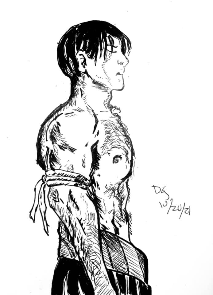
Copying from the masters!
This is a copy from a Hugo Pratt Corto Maltese story.
Materials: previously mentioned ink paper, #6 round flat synthetic brush and India ink.
Pratt's work is so compelling. He can take the simplest line, even a very crude line, and make it ring with the poetry of a desert or of an ocean. Like the best of the so-called simple artists, his work is elusive. As soon as you try to copy it, you begin to realize just how insightful those scrawls can be.
October 5
 Done straight from imagination, thinking about Sheena and about the power of really good Tarzan comics. Such variety, ranging from the Jesse Marsh stuff to Joe Kubert to Hogarth!
I'm not convinced this piece is successful, but I look at it as a draft.I went straight to ink, no under-drawing. Started with a quick sketch at work, bought it home and completed.
Materials:
Copy paper, 20#
Ballpoint pen
Sumi-e ink
#6 round/flat brush
#20 flat brush
Brush Faber Castell tip ink marker


October 6
This one was fun!
Straight copy from the Archie Meets the Ramones one-shot, a comic that's a lot better than it should be. Gisele's art on this one is spot-on. I loved the combination of tight control and rock energy!
Though it is weird, after reading Archie comics for decades, to think of Fred Andrews as a punker....
I did a quick underdrawing on this one, then jumped in.
Materials: Small sketch pad, #4 lead holder, Magic Rub eraser, Sharpie. That's right, Sharpie. As part of this is about control for me, working with crude tools to get specific results is part of the process.
October 7
For this one, I inked an old sketchbook piece.
This was originally done as a proposal for an album cover. A friend of mine was assembling a tribute to the Welsh band Man, and I offered to do some cover art. I took this to pencils, scanned it and sent it off for comments. He had forgotten our conversation and did something completely different!
Ah, well, at least I had the art.
I just inked this up with my reliable Faber Castell brush tip marker. I had some of my usual scanning issues, what with the scanner picking up unwanted gray tones, but for the most part it's successful. I did NOT want this to be a tight mechanical drawing. I wanted the aggression to come through. The guitar strung with barbed wire is a variation on the barbed wire harp that Dali made for Harpo Marx.
October 8
This was just a sketchbook experiment. The original was done in China marker in a 9 x 12 sketchbook with a rather rough tooth.
I went over it with my reliable Faber Castell brush tip ink marker. That's it.
I honestly don't know if this piece works or not. There was a vibrancy and urgency to the original sketch. I'm not sure it's still there after the inking. I was reluctant to push it too far, and chose to keep the underlying sketch intact behind the inks.
October 9
Okay, this one was fun.
I was watching music videos on Amazon Prime and thinking about the Archie Meets the Ramones comic. I thought about Archie as a badass, and for some reason thought about Harlan Ellison's rock novel Rockabilly (AKA Spider Kiss). This image came to mind.
I did a quick pencil sketch and jumped into the inks.
It's all freehand, folks. Even the spotlight behind him is rough and ragged.
Materials: I have an extensive list of the materials used at home, which I will post later. For right now, it's the standards:
lead holder & Magic Rub eraser
Faber Castell brush tip marker
India ink
various brushes
This may be my favorite of the month. Maybe.


October 10
I was thinking about a couple things on this one. I had noticed a tendency to be more blunt in my recent Inktober pieces. While I like the energy and the confidence that comes from not holding back, I do miss doing detail work at times. As I had been thinking about the bullfight my dad took my mother to on their honeymoon (yes, really), and my dad telling me to read Collins and Lapierre's story of the matador El Cordoba, Or I'll Dress You In Mourning, inspiration struck. On break at work, I did a quick search for matador and found some images from which I assembled this piece. Very simple materials. No pencils, straight to inks with this one! Ballpoint pen on printer paper, that's all!
I have a couple more pieces to locate for the next batch, but should be able to post again soon.

Tuesday, August 2, 2016

Original Art Sundays (Tuesday) No. 238: Sharp Invitations: Curt, p. 2

Taking this week off work to complete more of the graphic memoir and prepare for the upcoming MCAD faculty art show. Gotta love Paid Time Off- what a concept!
In light of that, I finally scanned the most recent page, which has been done for a while now. This page was included in (very) rough version in the printing of the first draft in May.

I'm pretty happy with this. Since the first page of this story is a pencil page, I let that serve as the template for the whole story.
The scan came out very well. As I've discussed in the past, the issue with scanning pencils is getting decent dark areas without picking up unwelcome artifacts. If you push your black point too far, the scanner does indeed darken the pencils, but it also picks up every invisible smudge on the page!
Lettering in Photoshop, using Comic craft's Clean Cut Kid, my favorite typeface for comic book body copy. Still using their Zap word balloons too. The shapes are a bit limited, but sufficient for my immediate purposes. If necessary, I'll do some digging and find a greater variety. I can always hand-render too. While this is working reasonably well, I take the comments of my friend Kim Matthews very seriously, and she contends that tightly rendered type is out of place on my looser art. However, since this is a more finished version of the page, I think it serves well, or at least better.
This part of the story is emotionally challenging, in some ways more than the rest. When I screwed up something in my life before I came out, I could always rationalize that it was because I wasn't being my "authentic self", whatever that is. But after coming out, you don't have that excuse, or at least you think you're not supposed to. But as will be discussed later in the book, there's more than one step, however big that step may be, in becoming authentic.
Just for comparison, here's the original rough for this page.
Layout was loosened up a bit, and the addition of the ticket booth gives the page a bit more depth. I think the kiss works in both, but the final version is much clearer. It also shows that despite people somehow seeing him as physically small, Curt was just over 6' tall and had decent musculature!
In preparation for the show, I'm adding a few (ideally all the rest, but that may be overly ambitious within the time frame) chapters to the book. Those will probably be in fairly rough form, akin to what is presented here screen right. I've been thinking about publishers, but it's premature to talk about that in depth.
My reading has turned back to queer comics. I just got my Kickstarter of the Alphabet anthology from Prism, and am enjoying it a great deal. Such works inspire me to be a larger part of that world again. I've felt damned by faint praise from the queer comics community, whatever that is, and would like to be a more accepted part of it. I hope this work serves that end, as well as the larger end of getting the story out there.
Next: more Sharp Invitations, sooner than later.

Tuesday, May 24, 2016

Original Art Sundays (Tuesday) No. 236: The Last Sharp Invitiation (Curt), p. 1

A bit late posting this week, due to exhaustion. But we are back in the saddle again!
I've decided to jump to one of the last stories in the book and then double back to the rest. This is a very important story (not that the rest aren't), and I want to develop it farther than it made it in the rough draft.
This page should set the tone for this story. I happened on this piece in an old sketchbook, and immediately realized that it was the perfect splash for this story.
This story brings many of the problems encountered by some (certainly not all) trans women in relationship into focus. The key, as you'll see as the story evolves, is self-worth, deciding we deserve decent love.
This page is rendered in pencil, with minimal clean-up. In talking with my comic teaching peer Dr. Ursula Murray Husted at SpringCon last week, I was pleasantly surprised at how much she liked my tighter pencil pages. While my inking skills are constantly improving (and more so when I work on a regular schedule!), I've always obtained great satisfaction from good tight pencils, or as in the original Sharp Invitation story, pencils with Conte' crayon. The problem is that I like working on Bristol board, and it lacks sufficient tooth to get the textures I like in resolved pencils. As such, I suspect the final version of this story will be a pastiche of pencils and inks. The very last page of it will be a B & W photograph- good old 35MM film!
The gentleness of this image serves as marked contrast to what follows, and is typical of my idealizing people with whom I'm in relationship (nobody else does that, right?).
My summer schedule being lighter, I have more time to develop this work before my next deadline, the fall faculty show. I'm wrestling with doing a more complete printed version for that show as well. Since I'm lettering digitally, I also have to resolve some presentation issues. Possibilities include originals presented next to printed pages, or printing original-sized copies and posting those. There's something disingenuous about posting printouts in shows, though I did it at Intermedia Arts and nobody said boo.
Another issue that came up in printing the draft version was that the images fit to the InDesign pages were VERY tight to the border! I'll have to tweak that before going back to press, even for a short run of one or two.
But the immediate goal remains a more realized version of this story. I also have another of those one-page quickies in the hopper, one I just thought of earlier today.
Next: more Curt.

Tuesday, January 25, 2011

Original Art Sundays #76 (late): Art like it's 1994!

One original art post after this one and I'm current again,
I know these deadlines are self-imposed and arbitrary. I also know that making them public in any way carries a measure of responsibility.
In sorting some books for Ebay sales, I found a calendar I made for my Mother in 1994. It consists of sketchbook pieces and work completed during my two years of Commercial Art education (1989 - 1991).
I cringe at some of it now, but there are some pieces that still have a charm, I think.
I was really getting into pencil when this one happened. I had a couple little statues- one pewter, and one bronze, and I just came up with a playful composition. Not so much into the fairies and dragons these days, but no harm.


Yow, look how that text baseline jumps! This was done for a class teaching now-obsolete production art skills.


This was a sketchbook swipe of a Maxfield Parrish painting. I still revere Parrish, but I've not paid much attention to him over the last few years. This is more interesting to me now for its texture than any other aspect.

This was intended as spot illustration for a book ad. Another class project. I loved this one, but nobody else seemed to. In retrospect, the clothing and hair are wrong for the era of the book. The girl is based on Simone Simon, star of the original Cat People, as well as the incubus in The Devil and Daniel Webster, one of my favorite films. She has an elusive beauty that always appealed to me.


Another piece intended for commercial use. I was getting pretty good at stipple for a while. I go back to it every now and then.

Lots of technical issues with this piece, but I do so love its attitude!
A lot of artists wince at the thought of old works, but I feel about old work much as I do old lovers. Looking back can help you understand some things, provided you don't spend too much time doing it, and you may find they still have something to teach you.
Next: Caught up!

Sunday, July 25, 2010

Original Art Sundays #51: A Private Myth, p. 15

At least I think it's p. 15. I'll go back and recount during the week.
Although the page is not complete, I'm posting it anyway. I left this one as pencils rather than do inks on it- my inks are not what they might be at times, though I have done some good ink work over the years.
I need to add a tier of panels and dialogue along the top and a word balloon associated with the main image.
I'm rather happy with this one. I may elect to leave more pages as pencil if they turn out this well.
I think that, even without the text, you can get a pretty clear sense of what's going on in this page.
Next week: more.