Showing posts with label Omaha the Cat Dancer. Show all posts

Sunday, March 12, 2023

Original Art Sundays no. 360: Sharp Invitiations: Crooning (single page story)

 Okay, doing two posts today. I missed a couple weeks, partially due to a positive COVID test and dealing with my health and navigating the health care system. I'm on the mend, and have rallied enough to create more work.

First up, something more from the Curt story, or at least from that time frame. Delia and I were walking downtown in Minneapolis, and....

(giggling at the memory)

Actually, we just traded some lines from Hendrix's Hey Joe, but it works better this way. This was a nice bit of fun. It's been a while since I did a single-page gag story. I broke my own rule and used more formal tools on this: pen and ink, markers, Bristol board. When I've done these in the past, they have been freehand with ballpoint pens on typing paper. But I wanted to be a bit tighter with this one and maintain that loose airy feel. As is often the case, I second guess myself a bit on backgrounds, but I'm pretty happy with this. And it's a good gag, even with the cornball "round of applause" in panel 5. The characters in background in that panel are sketchy, much like those in some panels of Omaha.

I also wanted to give the street person respect. They don't get enough of that.

Next: back to Mother's story.


Sunday, October 2, 2022

Original Art Sundays No. 311: Sharp Invitations: Curt, p. 52

 As alluded to, we're not done with him yet. The nature of the ominous phone call is revealed...

So... off to court! I'd only been in court once before (car trouble- the police found marijuana in the glove box). I really wasn't sure what to expect. And yes, there was a drastic haircut involved, which will be covered on our next page. This trip really forged my relationship with Jenny, and gave me a much-needed fresh perspective on Curt.

Logistically, this page was fun. I looked at several road trip comics: the 70s Green Lantern/Green Arrow run, some moments in Omaha the Cat Dancer (especially the scene where she's taking a bus to Wisconsin!), The Archies miniseries (which was so good!) and the last issue of JMS's Midnight Nation, which I've been re-reading a lot lately. I got the framework for this page from that last book, and was able to modify it to suit my narrative. The faces elongated just a bit, but it's okay, as I was quite thin when I got done with him- so much so that at least one friend thought I had some ailment causing weight loss. Well, in a way, I suppose I did. Layout is pretty direct. Weight in the top tier comes from a background texture. The inset slice panel of tier 2 reestablishes the scene, and we cut to car interiors for the bottom tier. After the info dump in panel four, there's a slow buildup to an introspective moment. We go closer on the face, then tight on one feature, the eyes (an old film trick that usually works). I love the reduction of the rest of the car interior to silhouette in panels five and six. This page condenses approximately three weeks of real time. Many necessary legal logistics are left out of the narrative.

Materials:

  • Basic tools: Drawing Board, T-square, triangle, straightedge, Ames lettering guide
  • Pencils: Ticonderoga 2B, Cumberland 3B, Pasler 6B, lead holder with 4B lead, and tech pencil with 3B lead.
  • Erasers: Staedtler Mars plastic and kneadable erasers
  • Dr. Martin's Black Matte Ink, FW Artists' Acrylic White
  • ALL the Micron tech markers (.005 to 1.0) and Copic Brush Tip Marker
  • Brushes: Grumbacher no. 2 flat,  Princeton 1/4" mini-detailer, Tight Spot
  • Photoshop (minimal corrections this time! Mostly I do Threshold and Levels work, sometimes Curves)

Next: Testify!


Sunday, June 26, 2022

Original Art Sundays No. 298: Sharp Invitations: Curt, pp. 36 and 37

 Hello again!

Two pages this week instead of one! I was having fun with it and decided to push a bit. 

This is my response to Curt's reaction to my attempt to slit my wrists.


Well, out of the fire and into surrender! Really, I tried running away, I tried escaping into death (however halfheartedly). The only thing left to try was surrender. Plus, part of me always wanted to be the little housewife. I don't think it's every trans woman's dream, but it was one of mine. However, I myopically believed I wouldn't have to surrender my autonomy to fulfill it.

Also, as anyone who's been involved in domestic abuse will tell you, it's a labyrinth, a tangled mess of conflation and subversion. It's jarring to live through, but excessive detail on such things makes for a convoluted and uninteresting story. Better to condense and summarize.

Soliloquy and paper dolls seemed a good way to sum up this turn of events. This story is a bit heavy, and an occasional respite is called for. Plus- paper dolls, what fun! I've done paper dolls of most of my other characters, so why not me? In my research, I discovered that the Cleavers' home town of Mayfield isn't in a specific state, hence the USA locale. All the costumes are period, evoking the 1960s housewife cliche, except the Omaha lingerie, which is there in homage to sensei Reed Waller. They're also all things I really enjoy.

Layout is pretty direct on these. I've done soliloquy pages earlier in this story, and followed the same pattern of reversal/reversal. I love the high five in the last panel on that page. 

Tools for these two pages:

  • Canson Bristol Board, tracing paper
  • Pencils: Tech pencil, 2B Ticonderoga, 3B and 6B Cumberland Derwent, 4B Graphite stick
  • Holder & Nib, ballpoint pen
  • Triangle, straightedge, T-square
  • Dr. Martin's Black Star Matte ink
  • Brushes: Blick #6 Synthetic Round, Escoda Kolinsky Sable Flat #4. Tight Spot for corrections
  • Microns: .03, .05, .08, Brush Tip
  • FW Artist's Acrylic White
  • Photoshop

Next: Domestic tranquility moments, the calm before the final storm.

Sunday, July 2, 2017

Original Art Sundays No. 249: Sharp Invitations: Curt, p.7

The next page is done, so here we go.
When last we left our heroine (me), she was happily surprised to find that Delia had told her boyfriend she was spending the night with her.
Read on.
Much I like here, a few things I don't. There's enough background/environment to give a sense of place, but not so much as to detract from the action. Just a hint of a dresser and a lamp (which I still have but now sits on my desk) to give a sense of place. I did some preliminaries in which my usual dresser top clutter was included, but decided it was too much of a distraction. This page is about one thing, and the dresser ain't it.
The layout is simple. Two panels without dividers, split by shift in viewpoint and in action, implying closely timed moments. I'm using the old trick of dropping borders to slow action, but using a partial overall border to contain and define the area.
I thought a lot about how raw to make the sex scene. I shied away from showing The Act, partially out of my own modesty (which will be blasted out of the water in upcoming pages anyway), and partially out of respect for Delia. If the real Delia is reading this, she's probably howling with laughter at that. Then again, maybe not. She always could surprise me.
I stole a bit of a Frank Miller trick in the first panel. In his image for the Images of Omaha collection, Miller used cast shadows on the bedding to define the form beneath. I could have pushed it further, but my art tends to be of the less is more school, and I'm good with where it ended up. The shadow creeping on the wall from the lamp still needs a bit of clarity- possibly I'll just use Photoshop, since everything else on the page is working very well.
After much consternation, I elected to completely remove the dark background on the two-shot in the bottom tier to concentrate on us girls.
Delia's comment was very telling. In the next page, I'll tell a bit more of her story, but not much, because it is HER story. While she once laughingly told me she'd share her story with anybody, that's her choice, not mine. Here, you get just enough that it helps define our relationship.
Again electing to work in ink rather than pencil. Curt's story (of which this is still part) will be told in pencils, inks, and photography. I just hope the bouncing between media doesn't detract from the flow.
Materials used on this page:
Canson XL Recycled Bristol.
#4 and #2 lead and lead holders
Magic Rub eraser
Pro-4100 India Ink. This stuff clogs my crow quill nibs like crazy, but it's great for brush work.
#1 Sable brush and #4 synthetic brush
Ames Lettering Guide (yes, really), 0.3, 0.5 and 0.7 tech markers
Ellipse template
I'm emotionally raw today, as I prepare for a new class I'm teaching starting Wednesday night and am writing a very emotional postscript to the current work, possibly the most honest part of the whole book. Still, it feels good to stay on self-imposed schedule with this.
Next: more of Delia by way of Curt's story.

Sunday, January 8, 2017

Best Comics of 2016, No. 12: The Children of Captain Grant

I used to love those live action Disney movies when I was a wee tad. Now they seem a bit of a cornball, but they still stand up well for the most part. Many of them, like The Incredible Journey, The Miracle of the White Stallions and The Three Lives of Thomasina are about survival and search against impossible odds.
And thanks to Dell/Gold Key, a lot of them got their own comics too! Many were illustrated by Dan Speigle. I didn't realize it at the time, but his art influenced me almost as much as that of Curt Swan.
This book is an adaptation of a film of a Jules Verne novel, one of a very LONG series of adventure books he wrote. Though Disney played fast and loose with the novel, the resulting film (and comic, and I think there was a paperback novelization as well) was very engaging and exciting.
I had forgotten all about it, until I was reading the recent reprint of the French adaptation of the original novel, The Children of Captain Grant. As I was reading it, I found the pacing a bit off-putting, as it has that Victorian air about it that can slow the telling of a story in its deliberation. But I found the story itself oddly familiar. It wasn't until I did some background research for this piece that I made the connection back to this earlier adaptation from my childhood- a "well, duh!" moment.
I may have been misled by the subgenre in which the graphic novel is recast.
The story is retold using the furry motif.
All the characters are humanized animals- or if you prefer, anthropomorphized  humans. There's no real reason given for this. It's just assumed that that's the world in which these characters endure. The same as ours, except that everyone has fur, or feathers, or scales, or fins or some such.
Longtime readers will know of my affinity for such stories, both in consuming and in creating. From my early exposure to Barks' Duck books to my apprenticeship on Reed Waller's Omaha the Cat Dancer (a short chapter in my life that I never tire of bringing up), funny animals have been an integral part of my worlds. And I've seen all stripe (so to speak) of art in these books, ranging from the crude to the energetic and elegant (Katherine Collins' Neil the Horse comes to mind). There are some funny animal stories (to use Reed's preferred term) that take the art more seriously than others- the mechanical precision of Martin Wagner's Hepcats comes to mind here.
But I don't think I've ever seen as lushly painted a furry book as this, with the possible exceptions of Blacksad and the Grandville stories.
Every page explodes with meticulously controlled color. Landscapes, ships, architecture, different cultures, all exquisitely rendered.
Once again, I'll rely on the publisher (in this case, Super Genius) to provide a plot overview: "In this adaptation of the classic novel, the entire cast of characters has been transformed into anthropomorphic animal! It begins with a message-actually three water-damaged messages-found in a bottle removed from the belly of a shark. Written in three different languages the messages reveal that the long-missing Captain Grant was shipwrecked and is being held hostage. The only clue from the messages that might be of any help, will lead Lord Glenarvan and Captain Grant’s children on an adventure literally around the world!"
The story has the requisite elements: quirky characters, burgeoning romance, yearning for a lost parent, and so much adventure and derring-do you could plotz.
Though published in the US in 2016, this book was originally published in three volumes in France between 2009 and 2013. Its creator, Alexis Nesme, is well established as a children's comic illustrator in France. Here's an interview with him (in French- I can make out about half of it, not enough to provide an accurate translation, so I'll leave you to your own devices).

This book was a bit of a slog at times. My tolerance for quaint period writing is not high, so it took me a while to get through it. But that's a failing in me, not in the work. It was worth the effort. This book is exciting, lush and ultimately very satisfying.
Next: Best Comics No. 11, behind the scenes...

Wednesday, March 25, 2015

Original Art Sundays (Wednesday) Nos. 210- 211: Speedy Recovery, pp. 6 - 7

Back in the saddle again!
Here are the next two pages of the "Speedy" Recovery and his All-Girl Orchestra story.


The circular layout to introduce a large cast of characters is a very old device. I don't remember where I first saw it, but I remember being impressed with it in Bizarre Sex #9, the first Omaha the Cat Dancer story.
This also sets up the puns that wreak havoc throughout this story (and any following Speedy stories, of which there are none so far).
The backgrounds vary widely here, but they are still much more sparse than they really should be.
Setting up the girls as musicians with other jobs echoes Doc Savage's Fabulous Five, each of whom has a career as a leader in their field, but drops everything to join Doc on his missions.
So it is with Speedy and his band.
Some rather obvious (to me, at least) plot setups here- Mae Aswell's inability to carry a tune in a bucket, as we used to say, will figure prominently later.
Also, the nation of Runnovia, whose name is inspired by my fondness for the writing in the classic Rocky & Bullwinkle cartoons, plays a big part in this adventure, beyond the quest for the ruby slippers.
In general, I love using curved lines and wave forms as design elements, something I got away from a bit in some of my later work. But hey, it's always there, and I can always go back to it.
Next: more Speedy, as the adventure picks up speed (so to speak)!

Monday, January 19, 2015

Best Comics of 2014, No. 4: Tooth & Claw

Grinding away at these, despite continuing to work 45-50 hour weeks while I do class prep. I love doing these pieces, but finding the time remains a challenge.
Today's entry is another fine work by Kurt Busiek, whose Astro City made the list previously. I also loved Arrowsmith, and would be tickled to see its return. At any point! Print it, I'll buy it!
Plot development woven with
magic action!
Tooth & Claw has been described by others as "Game of Thrones with animals". While that's a bit on the nose, Busiek does use the animal mythos to tell his tale. It's a world of magic, run by sentient and slightly anthropomorphized critters. The species tend to go with their character types. As a lover of bison, I was a bit saddened to see them portrayed as aggressive and warmongering, basically dumb working class stiffs.
An early Issue 1 page, using art and
design elements to advance story
and build character.
That aside, there are several traditions that come into play here. It relates peripherally to the Omaha the Cat Dancer school of funny animal comics, in which the characters are more human than animal and species is used a shorthand for character type, as noted above. Other significant offerings in this area include Bryan Talbot's Grandville series and the Blacksad series, both of which had new books out in 2014 as well. There's also the mythology of humanity being succeeded by sentient animals- not much of a spoiler, really. As soon as the Colloquy started talking about the mythical Great Champion, it was pretty obvious it would prove to be a human, despite the red herring at the end of Issue 1. But that was a great red herring! A fox astride a saddled cricket- brilliant!
Ahem. Past precedents for sentient animals surviving humanity's demise include Clifford Simak's CITY and the classic MGM Christmas cartoons Peace on Earth and Goodwill to Men, the latter being the last MGM cartoon in CinemaScope. So it's not really a new concept, but the execution is fresh and uniformly professional. If it loads properly, here's the first of the two.

I've not seen Ben Dewey's art prior to this book, and the art integrates so cleanly with the text that I can't imagine a better fit. His work has verve and just the right amount of detail, plus plenty of the ornate flourishes that fantasy fans crave.
The revised cover for issue 1
The first Tooth & Claw trademark.
Butt floss riding up the tail? Really?

It needs to be noted that an unintentional trademark infringement required a title change to The Autumn Lands: Tooth & Claw. Two things come to mind.
1. Does this mean my copy of the first printing bearing the original title will be (gasp!) collectible? Oh, big whoop. Actually, I rather hope not. I've beat my copy up so much by repeated readings that it's worthless to anyone but me now.
2. Given the nature of the original work bearing said trademark, Busiek & co. are better off not having any association with it. I've included a cover of the earlier work bearing the title to prove my point.
All that said, Tooth & Claw remains a compelling story. Like the best of Busiek's work, it's rousing adventure coupled with smart, sensitive characterization and a storyline that, though walking a well-trod path, remains innovative and engaging, well worth the reader's effort.


Next: Best of 2014, No. 3, one that was left out.

Sunday, February 16, 2014

Original Art Sundays No. 178: The funny animal/comic strip/comic book Enterprise

Missed last week's post. I was preoccupied with preparing for a new job. Many logistic difficulties- government forms, meetings, etc. Well, the job orientation is tomorrow, so we're back in the saddle again!
Working on a 4 page Surrealist Cowgirls story (and a couple fun Cowgirls side projects), but they're not ready to post yet.
As a placeholder, here's an airbrush piece from 1990!

The craft is rather crude, but it's a fun piece anyway. It grew out of my then-partner's love of both Star Trek and the Pink Panther.
Starting top left and going counter-clockwise:
The Little Mermaid as Dr. Beverly Crusher
The Tasmanian Devil as Lt. Worf
Omaha the Cat Dancer as Counselor Troi
Opus as Lt. Commander Data
Calvin and Hobbes as Acting Ensign Wesley Crusher
Pepe lePew and Commander Riker
center: the Pink Panther as Captain Picard (Captain Pinkard!)
So there it is. More pure silliness.
Next week: back to the Cowgirls!

Wednesday, January 8, 2014

Best Comics of 2013, No. 10: Omaha the Cat Dancer, Vol. 8

This one should come as a complete surprise to nobody. I've made no secret of my admiration for Omaha the Cat Dancer, or of my past associations with its creative team, over the years. While there's the usual talk of narratives and techniques, this one also get a bit mushy, so feel free to skip it if you're not into that.
There will be a few spoilers in this entry, but hey, the work's been out for months, and my few words will not detract from any pleasure you might take in the reading of this work.
This year saw the publication of the final pages of the Omaha saga, first in Sizzle magazine, then as a collection (which I've yet to pick up, though I was able to keep up with the story through the magazine, the rest of which is silly at best).
While not all storylines are fully resolved, those whose denouement is not directly discussed are alluded to pretty directly, like Rob and his boyfriend attending the wedding. I would have liked to see some follow-up on Shelley's personal trainer Dave Allen, whose character was intriguing but sort of faded away quite a while ago, but most everyone else gets a long-overdue resolution, if not an ending.
Endings are overrated. Resolutions give chances at new beginnings.
Reed's color sense, seen on this cover and not seen in print since the 2004 cover that launched the conclusion in Sizzle, remains strong and at least rivals that of the late Kate Worley, who colored the covers on the old Kitchen Sink and Fantagraphics runs. His placement and shaping of shadows occasionally troubles me, but that's just a question of taste, not of accuracy - his way works just fine, I'd just handle it differently, that's all.
Reed's art took several turns in these final chapters, spread over almost ten years (!). Working with Kate as a writer, his backgrounds were precise, to the point of architectural accuracy. In contrast, with James Vance taking over as writer, Reed's backgrounds got looser, and the art became even more about the characters. Neither approach is wrong, but it was fascinating to watch Reed again deeply embrace some of the "takes" and other expressive elements of the funny animal stuff that got him started.
I'm walking on eggshells a bit here. Even though it's been more than twenty years since Reed let me apprentice under his tutelage (and there's an awkward phrase for you!), I still tend to see him as the Master, and the Student does not speak ill of the Master. Yeah, I know, get over it. No, I don't think so. I learned a great deal from Reed, about art and about life, and while I may and do disagree with him on some things, I will not disrespect him or his work.
First page of this volume,
with Kate Worley writing
The aforementioned Sizzle cover showed Omaha reaching for an alarm clock that was chiming 2005, a charming recognition of time slipping away.
Some of the things that were revolutionary about Omaha in its heyday are now commonplace. Funny animal work comes and goes in comics. The furry community slogs on, arguably supplanted (or enhanced?) by Bronies- a tentative relationship, but an interesting idea! The rights of GLBT people are now discussed in the Supreme Court, and there are sixteen or seventeen states where the rights of GLBT people to marry are recognized (we'll have to see what happens in Utah). We have mechanisms in place for legal protections of comic creators working in volatile areas (again with no small thanks to Reed and Kate), though the fight continues (note to self- renew CBLDF membership!). Disability rights and depictions of the disabled are more common, and more realistic, in comics now. So in light of all that, how does the new work stand up?
Quite well, thank you. As is the case with many of the titles we've discussed so far in this year's countdown, it's a bit like getting back together with old friends. They will say and do things that annoy and frustrate you, but you still care a great deal what happens to them.
Again, yeah, I know. Fictional characters. So what? They may not matter as much as the three-dimensional carbon based life forms in the long run, but they still matter. And it's a note of respect for the creators that they matter to us as much as they do.
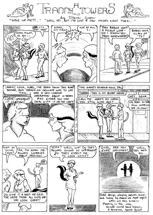
Panel from the later chapters written by James Vance.
Note the level of background detail.
We finally learn who's behind the A Block scandals, and of course, Bonner's murder (I should note that I was wrong about this every step of the way). Chuck is given the opportunity to come to terms with his family, and as the cover of Volume 8 implies, resolves his relationship with Omaha. Again, it would have been nice to see Rob and Geoff marry, but there just wasn't time, I guess. Also, gay marriage wasn't legally recognized in MN until after the story was concluded.
Conclusion and resolution are words that recur in this piece. That's the nature of this story, and that's me. I am such a sentimentalist slob, I am reluctant to let go of any of the good things in my life. And my association with Reed Waller, Kate Worley, James Vance, and Omaha the Cat Dancer and her associates, despite troubles and distances, remains A Good Thing. Naturally, my perception of the work is influenced by that, but that doesn't effect the intrinsic quality of the work. I'd like to paraphrase one of the last lines of Somerset Maugham's The Razor's Edge: and in the end, they all got exactly what they wanted. This applies to the characters in Omaha and to the people involved, I hope.
Thanks to the Omaha team for more than 30 years of a great comic. It wasn't always easy, but what that's worthwhile is?
Next: Best Comics of 2013, No. 9, courtesy of the WPA.
Afterthought: when Reed and Kate returned from Disneyland (it might have been Disney World), they had picked up some of those giant cartoon mouse hands. As I left my internship duties at their place one afternoon, Reed held out a hand encased by a four-fingered glove. We shook paws, grinning from ear to ear.
Now that's a nice goodbye.

Sunday, June 2, 2013

Original Art Sundays No. 155: Sketchbooks: Omaha the Cat Dancer, 1993

Next page of Surrealist Cowgirls is still evolving. I may take a day and finish it next weekend.
Always wrestling with the fine line between taking my time to do it right and just dinking around!
Meanwhile, some older sketchbook stuff.
In 1992-1993, I was living with a man who was, ahem, less than pleasant much of the time. I've talked about this in the past and will not rehash, other than to provide context here.
During this time, I found solace in healthy eating and in exercise (I lost over 30 pounds, and when I next saw Reed, he said I was too thin- something nobody else has ever said to me, before or since!) and in my art. I couldn't tell the stories I wanted to tell, since my actions were being closely scrutinized and obsessively criticized, but I filled several sketchbooks. He didn't seem to mind what I sketched too much.
These are all from one sketchbook from that period.
Though these clearly have their flaws, there are many things about them I find pleasing. The anatomy is still lacking in many places, but there's an energy and attitude to them I like to this day.
These were random in the sketchbook. I tried many things artistically during this time, some of which I may post later.
But given that Reed and James Vance recently completed the Omaha storyline, and that Reed may be attending San Diego this year to promote the final volume, this seems as good a time as any to post these.
I'll post a review and final thoughts on Omaha at year's end.
Enjoy!
Marker sketch

Marker and #4 pencil

Metallic marker

Marker and #4 pencil

Marker

Marker (no tail!)

Pencil & marker w/notes

Monday, January 14, 2013

Original Art Sundays No. 147: The Source Cards

Back to post some art in the midst of the final Best of 2012 posts.
And as promised, it's new work, though possibly not what you expected.
At MN's SpringCon last year, the organizers gave creators cards to illustrate. This year being an anniversary, the 25th, they wanted to put together a set of cards. These will be redistributed randomly to attendees. They did this five years ago for the 20th- it's a lot of fun!
So I did my part.
After leaving the card blanks laying on the drawing table to annoy me for months while I completed other work, I finally just sat down and did them right at the turn of the year.
The work is loose and sketchy- hey, they ARE sketch cards- and colored in pencil, though it looks like marker in the scans. I considered correcting the colors and doing some fancy footwork in Photoshop (what we used to call "production art"), then thought, "naaah."
I decided on four of my favorite characters.
First, Dr. Strange.
I was going for a more urgent tone than this conveys. It's OK, but more mood would have been good. Possibly grayscale/monochrome if I work with the Doctor again?
Next, Omaha, of course.
I might like this one best. While it's much looser than Reed's best work, or even some of my own scattered pieces using the character, I think the tone is right. I freely stole the design and palette from one of the final cover variants of Terry Moore's Strangers in Paradise.

Next, Concrete.
Mildly frustrated by this one. I included the title since not everyone knows the character and the cards are being distributed randomly to attendees, but I think it really hampers the overall tone of the piece. The lettering is too cartoony/ baloony. I deliberately left in most of the pencil marks. I think the intent of the cast shadow in the floor stones doesn't work as well as it might.
Still, I've begun to see Concrete as something of a Buddha figure, and this plays into that, obviously.
The whole thing is grayscale, though it looks blue in the scan.
Finally, CHEW!

The Omaha card elicits the strongest idyllic expression from me, but this just makes me smile! I'm about three issues behind, but CHEW remains one of the funniest and most demented comics out there. The earth tones got seriously bumped into the red in the scan. It was much browner in the original. So be it.
Join us tomorrow (actually later today) for the final installment of Best Comics of 2012.

Sunday, April 29, 2012

Original Art Sundays no. 120: oddment: photography

Well, the next page of A Private Myth is done. No time to scan today, but will be spending the day at work tomorrow and will make time then.  So next week we're good to go.
Every time this issue comes up, I wrestle with the practicality of a home scanner. It's more a space consideration than anything else.
Meanwhile, I'd like to share a photograph from The Old Days. You know, film.


This is the man I almost married (there but for the grace of the Deity and all that), standing by a stone bison near an insurance office down by the Walker Art Center. All are gone now for various reasons. I do miss the bison.
The sun washes it out, but he's wearing an Omaha the Cat Dancer button.
While I originally took this for the subject matter, I find the variety of textures compelling. The composition is a little on the nose, but it serves.
I find the wide variety of angles in this seemingly simple composition fascinating.  The textures are equally intriguing in a subtle way. Stone, glass, carved stone, varying fabrics, leather, hair, skin, branches- this thing is all about the texture.
I resisted the temptation to try to correct this image. I find more is lost than gained in that process at times, especially when working with varied textures. Not to say it can't be done, but there's something to say for letting the original speak for itself.
Again, despite having worked with some high end equipment and taught digital photography several times, I still find the nuances of film and laboratory much more satisfying than digital.  But times change, and our choices remain to adapt or to die aesthetically.
Next: the next page of A Private Myth, for real, on Sunday, May 6, the first day of the last week of class.

Wednesday, August 3, 2011

A birthday card for Reed Waller

Today is the birthday of Omaha the Cat Dancer creator Reed Waller.
I've occasionally written here about working with Reed. To say Omaha was an inspiration for Tranny Towers is a bit of an understatement, though I like to think I put my own spin on the whole funny animal soap opera thing.
I have no idea how Reed is doing these days. I've not talked to him or corresponded, aside from reading the occasional post on the Yahoo Omaha boards, for more than six years now. To the best of my knowledge, he's well and his job is treating him decently.
We hope for the best.
New work on Omaha proceeds apace, appearing in the otherwise unappealing Sizzle magazine. Actually, the last issue of Sizzle I read, issue 50, had gone from painful to tedious (aside from the Omaha stuff, of course), so I guess that's an improvement. The next Omaha installment is currently scheduled for issue 51, due out in September.
While reading Bryan Talbot's superb funny-animal Sherlock Holmes Steampunk pastiche Grandville, I noticed a guest appearance by Omaha!

Here is the image in context on the page proper.

 Here's a short video trailer for Grandville.


I suspect that Reed would be honored to have one his pieces included in a Bryan Talbot book, and next to a Mucha at that!
I can't tell if Talbot redrew these or pasted them in. His Photoshop chops are evident throughout the book, but he certainly has the skill to do it either way.
I've been tinkering with posting this for a while now, and the occasion of Reed's birthday seems an appropriate time to do so.
The rest of you: check out Grandville. Either volume. They stand alone, but there is a continuity, so you're probably better off reading them in publication order.
Steampunk funny animal noir. No reason it should work, but it does. It's smart, exciting work. But then, what else would you expect from Bryan Talbot?
There are currently two books in the series, Grandville and Grandville Mon Amour, with a third, Grandville Bete Noir in the works. The publisher is Dark Horse.
Here's looking at you, Reed D. Waller! Happy birthday!
May the next year be kind to you!
(image at left: portrait of the protagonist from Grandville, Detective Inspector LeBrock).

Thursday, January 20, 2011

Best comics of 2010: No. 1 (tie) : Blacksad

In 1990, I interned with Reed Waller on Omaha the Cat Dancer for six months.
Or as I put it these days, it was for about 5 minutes a hundred years ago.
It was one of the most catalytic (pun unintended) experiences of my life, both personally and professionally.
This experience, in tandem with my childhood of reading Barks Duck stories, before I had a clue who Barks was, and my 80s and 90s love of Don Rosa's work (note that my affections for these works continue to this day), has given me quite an affinity for the funny animal genre, despite it being a very loosely defined genre.
I mean really. Look at this Omaha image and this Duck image, and tell me where their commonalities lie, beyond the animal-as-person device.
Caveat: this work is not for the young in maturity. Adults only, please, in every sense. It involves people enjoying their bodies, and children can't see that until they're not children any more.  I think it's a little screwy, but that's the way we roll in this society.

Okay,the other similarity is solid storytelling. But that's as far as it goes.
Two points:
1. Waller and Worley did a more Barks-style funny animal story, the wonderful Speakingstone, which ran in two issues of Fantagraphic's Critters and was never completed.
2. I would also be remiss if I didn't mention that this Omaha page is one of the ones I worked on. My work was inking heavy blacks in the background, in this case.
Ahem.
 In any event, as a result of the work of Barks and Rosa, Waller, Worley and Vance, Talifero, Freddy Milton, and so many more that don't come to mind as readily, the notion of humanized animals, or animals with human traits, has been a part of comics ever since there have been comics. What do you think Krazy and Ignatz are, after all?
A new character entered this delightful mix in the early 2000s, from Spanish creators published by the French company Dargaud. Writer Juan Díaz Canales and artist Juanjo Guarnido collaborated on the three graphic volumes of Blacksad. Sporadically printed in the US (the third book only recently appeared as part of this collection), they developed a reputation akin to Corto Maltese among devoted comics lover.
This year, Dark Horse published a goregeous volume of all three stories. That volume is my tie choice for Number One comic of the year 2010.

Another caveat: as always, these choices are based on personal criteria and quite arbitrary. If you have your own list, I welcome it!
Blacksad is a private detective. The story is set in 1950s America.

The level of detail is stunning and appropriate. The palette is precise and reinforces the mood, which ranges from gripping to hilarious to tragic.
In short, this work is beautiful in very sense, even when it's recounting ugly events.

The trappings of noir, or what the casual student thinks of as noir (I'm a bit more than casual, but still a student) are all here. The femmes fatale, the levels of fear, greed and corruption, the broken hearts, the sense of unrelenting desperation. There are also some odd male bonds- not so odd as in the classic Gilda, but Blacksad's repulsion/friendship with the reporter Weekly is a rather odd but serviceable bond.
Blacksad is very much a loner, though. His friendships are tenuous at best, and as in the final tale, Red Soul, making its first US appearance in this volume. This story deals with Communism, blacklisting, and unanticipated betrayals.

That's the final story in this volume. The first, Somewhere Within the Shadows, is an eloquent noir with the traditional trappings, skillfully handled. The middle story, Arctic Nation, plays up the animal aspect by using polar bears as white supremacists a la the KKK.

The use of the stylized snowflake as stand-in for the KKK cross is brilliant.
There's one aspect of noir that I question in this book.
Common wisdom on noir holds that there are no heroes, only villains, victims and survivors. And the character who has the best-defined moral code and lives up to it despite damning evidecne of the pointlessness of doing so is the closest we come to a hero.
Well, in reading this, I can't help thinking that Blacksad is a hero, and that's all there is to it.
So is it still noir? In most ways, yes. But no matter. It's a damn good comic, no matter how it's classified.
I'm pleased to note that the creators have two more volumes of bandes desinee coming out. Dark Horse, are you paying attention?


Tomorrow, the best comic of 2010. Ever.

Sunday, August 22, 2010

Original Art Sundays #55: Tranny Towers strips 4 & 5

This week was full of prep for my Comic Book History class (I start teaching again tomorrow, which always feels like coming back to life!), and writing my article on GLBT portrayals in underground comics for the Midwest PCA.
As such, no new work again this week.
I've allocated a whole day for studio this week. This should allow me to finish the partial page posted a few weeks ago, and to complete the new page I've been laying out in my sketchbook du jour.
Meanwhile, please enjoy two more pages of Tranny Towers. The Valentine's ceremony depicted took place at Metropolitan Community Church, one of two local GLBT Christian churches. The text comes from the original ceremony. The male/female couple in the front are a quick loose riff on Reed Waller and Kate Worley of Omaha fame.
Please view full size for a better reading experience!

Sunday, August 15, 2010

Original Art Sundays #54: Tranny Towers strips 2 & 3

Much time spent prepping for comic book history class (does the fall semester really start in one week? Wow!).
So I thought I'd post some stuff that's been on my mind for a bit, material I planned to post last week.
Here are the first two continuity based episodes of Tranny Towers.

Image presented as originally printed, aside from redrawn Photoshop borders and the title type of the first strip being re-lettered digitally.
As you read these, bear in mind that each strip was originally presented as 1/4 page on a fairly standard magazine size page. Until I got the hang of dialogue placement and pacing, those aspects of the early strips were, well, not stellar.
Once again, please click to see the image at full size.
I had such ambitions around this strip! I had thought I'd set the queer comic strip world on fire with a funny animal transsexual strip. I had also hoped to draw on my experiences as an intern on Omaha The Cat Dancer, to bring the sensibilities of Kate Worley's wit and humanity to bear. The other queer-related comics that greatly influenced me, the work of Alison Bechdel and Howard Cruse, figure in with my attempts at subtle wit. Both their blogs are linked elsewhere on this page, but I've provided embedded links as well for your clicking convenience!
Next week: back to A Private Myth!

Tuesday, March 2, 2010

Original Art Sundays # 31:revision: A Private Myth, p. 7

Well, finally got the scan done. Looks like the new Alvin tech markers are the short-term answer to my scanning woes, though I may take a friend's advice and go to the disposable tech pen.
Still need more darks!
Ahem.
The page:
 
Not mad for that last tier. The middle  tier is doing what I want it to, but it may seem ambiguous until more of the plot is revealed.
I'm using the old form of overlapping multiple plot elements, all revolving around the central character. Reed Waller and Kate Worley were/are Zen masters of this process/style in their work on Omaha.
On Sunday: page 8.

Sunday, February 7, 2010

Original Art Sundays, No. 28: TranScending, pp. 3 & 4

A bit off schedule this week. The next page of A Private Myth is on the board, but I had some time issues. Also having issues coming up with an interesting layout, as it's a dialogue heavy page.
A rough week. I also didn't make Foot in the Door, but my commitment to it was flagging, so I suppose it's just as well.
Meanwhile, please enjoy these pages from the start-and-stop epic TranScending.
 
These pages of TranScending were done for the PRISM Guide a few years ago. They said no sex, and I went a bit too far in making them tame. Still, I rather like the last panel on p. 3, and the tabloid on p. 2 is an homage to both Daria and Omaha the Cat Dancer.
I have approximately 12 more pages of this done and scattered about. This is a carryover from my attempt at emulating Omaha. Originally the central character, Athena, was a skunk. That's how she appeared in the Tranny Towers strips from 1994-95. 
Just for fun, here's an old Tranny Towers strip. This one appeared in GAY Comix #25.


Note the Gentle Giant quote in the last panel. 
I should post the rest of these just to get them out there.
New page again next week, for sure, and thank you all for your patience!