Showing posts with label Alison Bechdel. Show all posts

Sunday, June 11, 2023

Original Art Sundays no. 364: Sharp Invitations: Esther's Hands, p. 6

 On to the next page of our story. I rather like this one.

When we left our family, Esther was starting to pull her life back together while she raised five children alone.

Now that the framework is solidly in place, we can get to the meat of Mother's story. 

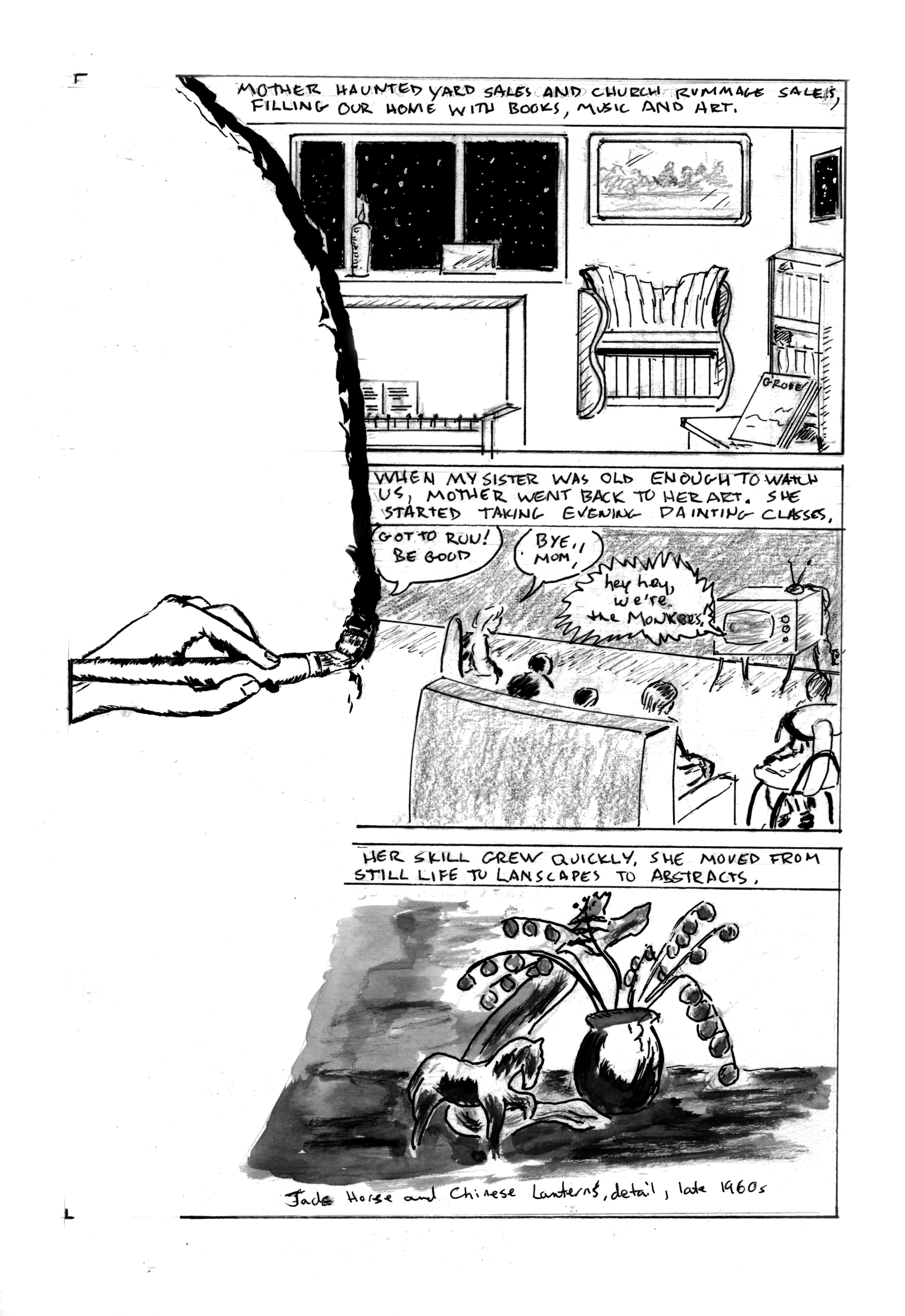
Story notes: As Mother started to come into her own, so did the kids. We were finding our own voices, developing interests. Like many kids of the mid-late 60s, we bonded over TV. My sisters and I developed a fascination with The Monkees. I stuck with them more fervently than my sisters did. We often took the books, art and music that surrounded us for granted. That was soon to change. More on that on next week's page.

Art notes: The visual device of the brush stroke defining the left border of the panel will be repeated over the next two pages. I worked up a decent sketch of a hand doing a brush stroke, scaled it and printed a few copies. It will serve as a unifying narrative device. The first panel is from photo reference, with some liberties in perspective, intended to show that our lives were full but a bit off-kilter. For the middle panel, I tried 6 different layouts - Mother running out of the room, Mother looking back as she leaves, the closeup of a child's eye with Mother leaving in the eye, and so on. I finally resolved that even though this is her chapter, she doesn't need to appear in the panel at all. In fact, this page is unusual in that there are no face shots of anyone! This is almost like leaving myself out of a page. I've noted before that most graphic memoirs show the creator/subject on every page. Alison Bechdel broke this rule in her two most recent memoirs, but not in her first, Fun Home. I don't know if it's as much a rule as just the way things work out. At any rate, it's refreshing to shake up reader expectations as well as my own.

The astute viewer will note that the furniture and room layout are slightly different than previously represented. This is both artistic license and an acknowledgment that time has passed. 

For several years after Mother passed, I made small books reproducing her art and writing for the family. For the last panel, I scoured one of those books, and found a work that was period specific and had a good range of gray values. Rather than incorporating a photo of the actual painting, I opted to do a wash rendering of it. 

I'm happiest with my work when I let it flow. A solid layout is a tool, a means to an end, not an end in itself, to paraphrase Robert Fripp. I've been revising the master book, as mentioned last week. In noticing what works best, the most successful pages are those where I just explore visual ideas to advance the story. As an artist, I seem to be escaping the confines of my own expectations, whatever that means!

Finally, I re-titled this chapter from the outline. It's not about hands the same way songs like Bill Withers'  Grandma's Hands (which I love even though he sings flat) are about hands. It's not about specific things the hands are doing. I am spotlighting hands throughout this chapter. Their appearance and actions reinforce different parts of the story and character. I hope that's clear. I'm not sure how else to articulate it.

Next: the brush stroke continues.


Sunday, January 30, 2022

Original Art Sundays No 290: Sharp Invitations: Curt, p. 29

 Taking a break from Comics History class prep to post this week's page.

This one came together pretty quickly and went pretty well.

As you recall, Curt reluctantly agreed to therapy, provided he get tapes of the sessions to review afterwards for "inaccuracies and lies". Needless to say, this arrangement wasn't conducive to good therapy and led to this.

This is common in an abusive situation. Abusers take perverse joy in manipulating someone's thoughts, making them doubt themselves. Why are people so shocked after the fact to learn that it worked?

Again, aside from being a trans woman's story, no overt trans content on this page.

Lots to like about this page. Sometimes I really struggle with pages, but this one just fell together. The layout device is inspired by several things. I thought the story was getting a little claustrophobic, with all the interiors (physical and mental), and I wanted to break it up a little. It's also important to remind the reader that even in this confining situation, the rest of the world is still out there waiting. It makes the denial of the world to the abused all the more poignant.

I wanted to play with rendering parks in gray scale after reading Alison Bechdel's Secret of Superhuman Strength (which I'm teaching in Graphic Novel class this semester). And I'm not sure where I encountered the idea of slice panels inside a larger panel to imply a motion path, but I like it. The borders of the primary panel were rendered in pencil and drawn freehand with a brush tip marker, a device I used on A Private Myth about a hundred years ago.

The bottom tier is all about expression and pose. I always want more heavy blacks than I end up using in such situations, but it's working. Minimal Photoshop corrections on this one.

More and more, I'm coming to think of my poses and characters as Hitchcock actors. Hitchcock is famous for saying he trusted his actors would know to move and act like their characters. So it is with my art. I trust that as long as I give them my best, my characters will look and pose the way they should. A bit disingenuous, but useful. Trusting your own art is vital.

Tools used:red

  • Canson Bristol Board
  • Lead holder, tech pencil, solid lead #3B and Ticonderoga pencil #2
  • Kneaded eraser and Faber Castell dust free eraser
  • 10 well inking/watercolor dish
  • Dr. Martin's Dark Star Matte black ink
  • FW Artist's Acrylic White
  • Brushes: Princeton #10 Round Synthetic, Blick #6 round synthetic, Renaissace Silver Sable #2 Cat's Tail
  • Tight Spot Detailer for corrections
  • Photoshop 2019

Next: closer to the main event.


Sunday, January 16, 2022

Original Art Sundays no. 296: Sharp Invitations: Curt, p. 28

 Here we go again...

The astute reader might notice that I skipped a page in numbering the story pages this week. Last week was p. 25, and this week is p. 27. I showed this page to a Beta reader whose opinion I respect highly. It made no sense to her. I realized that I left out a significant bit of exposition. I will do the missing page for next week. If I can manage it, I will do an extra page for next week as well. We're coming up on a crucial event or two, and it's vital to have things coherent, especially when reporting on an incoherent time. But I'm still eager to resolve this book.

When we left the story, I had agreed to return to Curt in the hope of entering couples therapy and healing our relationship. Read on.


So much to unpack here. First, layout and design considerations. I have wanted to do a reversed out page for some time, and having just finished Alison Bechdel's The Secret of Superhuman Strength, was also reminded of the device of overlaying slices on a master image. I don't think I've done that before, so like you think, you do. This is hand work as far as the reversal- just ink and ink and ink. I wanted to give a sense of the darkness of the time and of his bleakness. The slice panels may be a bit too simplistic, but I didn't want much detail on them. Some of my hand lettering went south in the third panel, so was redone in Photoshop. I considered redoing all the lettering digitally for consistency's sake, and decided against it.

One of the slice panels has a line texture background, and the others are washes. I don't want to overuse wash backgrounds as a crutch, but they work here. Simple guideline: larger panels, more detailed environments. Smaller panels, not so much. Next page (the missing page) will be three banner panels, so more of a chance to explore the environments. After the Curt chapter of this ends, there will also be a chance to draw some outside stuff. So much has been indoors!

Again, I've condensed some events for narrative flow, but everything I'm showing really happened. Him telling a therapist to drop dead was a shocker, even for him. Other than it happening to me, no overt trans content this week. 

One thing a lot of readers ask is why I went along with his demands. So many years later, I still don't have a good answer. I may never have an answer, other than primal emotions. He played on my fears of solitude and being undesirable, and I let him. No excuses, just fear and stupidity.

Pretty bleak, huh? Well, like I told a friend who was learning about this for the first time through this work, it gets a lot worse and then it gets better.

Tools for this page:

  • Canson Bristol board
  • Mechanical pencil
  • Ames lettering guide
  • Lead holder and #3B leads
  • Kneadable and Faber Castell dust free erasers
  • Pen holder and nibs (breaking in a new one - fun!)
  • Misc. triangles, t-squares and straightedges
  • Micron # .02, .03, .05, .08, 1.0 and Brush tip
  • Dr. Martin's Black Star Matte Ink
  • FW Artist's Acrylic White
  • White colored pencil 
  • Plastic paint palette for washes, 12 wells
  • Brushes: Princeton Synthtetic  round No. 10, Blick Wonder White Synthetic round No. 6, Silva Renaissance Sable Cat Tongue No. 2, and Tight Spot for corrections

Again, the astute reader will note some small amendments to past tool lists. I allowed myself a small pilgrimage to the art supply store and was glad I did!

Next: the missing page, then on into the fray.


Sunday, May 28, 2017

Original Art Sundays No. 245: Sharp Invitations: Curt, p.4

Despite having a drunk total my car and bruise my poor body last night, I am delighted that I can post the next page today. I finished it last night about 2 hours before work, so all is good.
If you recall, our hapless heroine (me) was just getting to know her new boyfriend, but had a feeling something was wrong.
Hey, it's a relationship, so there's usually SOMETHING wrong at some point but this was ...different.
Next page:
 There's a lot that I like here, artistically and in terms of narrative.
One of the big issues I have with graphic memoir (which I'm teaching as a Continuing Education course at MCAD in a few weeks!) is the tendency to what Chuck Jones called "illustrated radio". The Master was referring to animation, of course, but the principle applies here. It's a text narrative in which the illustrations are either redundant or superfluous. This can lead to very static images, or worse yet, images that serve no purpose whatever. I've seen this in some very well-received graphic memoirs. The art is considered an afterthought.
The ideal, which was achieved in Special Exits, MAUS, Stuck Rubber Baby and Fun Home, is a hybrid of text and image that moves the reader along with the subject, rather than placing the reader outside the subject.
In this page, I've chosen a related action scene, which is actually a composite of two real world events, to offer an example of the threat alluded to in the text box. The second panel was originally a lovemaking scene, but I decided that this moment of anticipation and greeting had better action and conveyed a fuller sense of the relationship, such as it was.
For comparison, here's the original rough for this page:
Head shots convey relatively little emotion, despite having the face to work with. I'm constantly reminded of the philosophy of that Archie comics writer. Characters are always on stage, and should always be in a pose that suggests mood or action. Spear carriers should do more than carry spears.
Aesthetic concerns:
I elected to stick with pencils again, but it was a MUCH harder decision for this page. I had to really push to get the darks and weight I wanted from the panels. In retrospect, I could have done more with the background on the restaurant panel. What's there works, but it might work better with a bit more of an environment. The primary poses and attitudes in this panel are freely lifted from Scott McCloud's The Sculptor, page 20, but changed sufficiently that I can call them my own and maintain integrity.
Panel Two is all me. I've played with the Shadows in Open Doorways thing in my work as far back as Tranny Towers. I like the idea of a girl running to her lover- it's a classic- and in that moment, everything else disappears.
Drawing yourself is a challenge. I've represented my figure and hair more or less as I remember them from that time. Drawing that left arm gave me fits! Looking at it now, I can see it's still a bit long/big, but nowhere near as much as it was at first. I spent an hour trying to get the left hand right. Sometimes hands are easy for me, sometimes I just can't draw them. After combing several books for reference, I finally just went to the bathroom mirror, made the gesture and took a shot with my cel phone. It gave me sufficient resources to render a plausible hand.
That's it for this week, unless something comes up that I want to say before the next art entry. I'm on the mend from the aforementioned car crash, and foresee no obstacle to keeping on track with the next page.
I've also started a new story which will serve as an afterword to the completed book, but that's some 120+ pages away.
A suivre...

Monday, August 13, 2012

Original Art Sundays no. 135: Tranny Towers, Final Chapter

When my editor told me the strip had been cancelled (on the deadline, when I came in to submit the next strip), I informed him that I was unsure of the paper's intent and had prepared one more just in case.
They agreed to run it, which was actually rather gracious.
I'm glad. I think it's one of the better strips of the run.

The banner is made from scratch, no overt swipes (at least none I can remember). I took my enthusiasm for pinup art, especially the work of Gil Elvgren, and did some work I think was rather inspired.
The title is an obvious Streisand reference.
Simple layout, a bit more background than in some of the past strips, and a closing "in-joke."
For the last few months of the strip's run, Lavender decided to also run a new strip called "Fabulous Fabio". It was the worst of gay comic strips- bad art, cliches, sloppy lettering and lazy writing. Though it died shortly after this strip, I was quite annoyed at its presence, and wanted to take a little shot at its creator's seeming lack of training and effort. I mean really, not so much that this was running next to my work, but running such a mediocrity near Dykes to Watch Out For or Jennifer Camper's Sub Grrlz? Sad. I was relieved when "Fabulous Fabio" faded into oblivion a few strips later.
I had set this up for one of the next storylines, involving Dan coming to terms with just how deep his drag persona did or didn't go. Trying to leave the door open and all that.
The Dolly Parton reference brings the strip full circle to the original Tranny Towers, a Section 8 building where 6 of the 14 units were occupied by MtF transfolk. Several of my neighbors were huge country fans, and I'd hear drunken singalongs of this song well into the wee hours. Once in a while I joined in. Ah, memories.
I still have a bunch of strips I did as editorial cartoons for TransSisters and TNT News Magazines. I'll run those as a unit after taking a break from this work to get back to the Surrealist Cowgirls. MY work on that for the faculty art show is due on or by Friday, and is about 2/3 done.
For right now, I'm going to do as the song says, and try to look better than a body has a right to.

Sunday, May 13, 2012

Original Art Sundays no. 122: Tranny Towers, p. 24

I'm going to finish posting these all before moving on to something else. Putting Tranny Towers to bed will feel good, and it will be nice to give my faithful readers (if such there be) some continuity after a long and shoddy period of irregular output.
The strips we're getting into now come after the book submitted for the Xeric Grant, so they have not been reprinted since their original appearance. Please note that we are currently in the final grant cycle for comics!
This is scanned from a tear-sheet in Lavender magazine, known at the time as Lavender Lifestyles. I've done some light cleanup and re-sized the scan. I will rescan from the original before going to press, but this scan provides an unexpected opportunity to discuss a related issue (see below).

This page sets up what turned out to be the final two story arcs, with Dena's love life as the first story, and Trina's relationship coming next.
I like the masthead quite a bit, and there's a fair amount of story for such an introspective page.
As always, still a bit of work to do here, but it will serve until we go to press, yes?
Logistics issues: the dual-column narrative is not as effective as I hoped. I'll add a white divider down the meridian pre-press. The text needs re-lettering, particularly on the crowded central panel of column two. My font of choice for this remains Clean Cut Kid, purchased last year during the font sale at Comicraft for cheap. I like their stuff, but even on sale, it's usually a tad rich for my blood.
The other issue I alluded to above relates to the original printing of these strips.
Here's a full page scan of the original tear-sheet. I've blurred out the ads, but left the neighboring strip, The Wet Ones, which I rather liked, intact.


This is actually a  bit of an improvement from past print runs. The early strips ran at 1/4 of a printed page, roughly 8 1/2" x 11", so the strip occupied a space of roughly 2 3/4"  x 4 3/4 ". Around this time, the magazine was giving a full page to Alison Bechel's Dykes to Watch Out For. Now, I love Alison's work, always have, but come on. The other strips are crammed in like this?
Around this time I began asking for increased space. About six strips later, they increased my allotted space, but reformatted the strip without my knowledge or consent. After finally getting to talk in person with the designer, we settled on a new format that ran for the balance of the strip. That format begins about eight strips from now.
For purposes of completeness, I will show the reformatted strips along with their originals when we get to them.
Next Sunday: Tranny Towers, chapter 25.


Sunday, August 15, 2010

Original Art Sundays #54: Tranny Towers strips 2 & 3

Much time spent prepping for comic book history class (does the fall semester really start in one week? Wow!).
So I thought I'd post some stuff that's been on my mind for a bit, material I planned to post last week.
Here are the first two continuity based episodes of Tranny Towers.

Image presented as originally printed, aside from redrawn Photoshop borders and the title type of the first strip being re-lettered digitally.
As you read these, bear in mind that each strip was originally presented as 1/4 page on a fairly standard magazine size page. Until I got the hang of dialogue placement and pacing, those aspects of the early strips were, well, not stellar.
Once again, please click to see the image at full size.
I had such ambitions around this strip! I had thought I'd set the queer comic strip world on fire with a funny animal transsexual strip. I had also hoped to draw on my experiences as an intern on Omaha The Cat Dancer, to bring the sensibilities of Kate Worley's wit and humanity to bear. The other queer-related comics that greatly influenced me, the work of Alison Bechdel and Howard Cruse, figure in with my attempts at subtle wit. Both their blogs are linked elsewhere on this page, but I've provided embedded links as well for your clicking convenience!
Next week: back to A Private Myth!