Showing posts with label MCAD. Show all posts

Sunday, September 4, 2022

Original Art Sundays No 307: Sharp Invitiations: Curt, p. 48

 Time, time, time, see what's become of me...

Sorry, in a bit of a Simon & Garfunkel mood. I do love that song.

We're on the overnight bus in a bitter winter, contemplating and regretting.


Went through some real changes on this one. Originally it was going to be a "putting your life back together" page, but that seemed a bit abrupt. We need a moment to consider everything that's happened before moving on. I suddenly remembered that Francine painting in Vol. 3 book 6, the one where she's quasi-fetal, holding her foot and looking ruefully to the side. I started off trying to copy that, then made the pose my own. I liked the idea of a contained nude pose, all lost and vulnerable. My initial concept was to do ink wash over the figure, progressively darker as we go down, with rough torn edges between gradations. Then I thought about masking the figure and using ink wash through rough burlap. Both ideas have merit, but not for this page. Besides, my frisket seems to have dried up.

As I drew the figure, the concept of a flashback collage came to me. So it was back to the old files and Photoshop to the rescue! Yay, layers and masks!

No need for an equipment list this week.

One of the questions I'm asked often by people who read this work is the obvious one: why did I stay around? There's no simple answer, and it's a question I continue to ask myself. I suspect that any abuse survivor has a similar internal dialogue. I don't know if it's easier or harder being trans when it comes to abuse. I suspect abuse is abuse. Trans is just one more thing they can use against you in that context.

On a more positive note, the MCAD Faculty Biennial has its official opening this Friday! There are 14 pages from this work in the show, along with a banner created for the show. I hope to see many friends there. So much great art to celebrate....

Next: TCB.

Sunday, August 28, 2022

Original Art Sundays: Sharp Invitations: Curt, pp. 46 & 47

 Once more....

Two pages this week, but one is a recap. The astute reader will recall that the previous chapter ended with a preview of this chapter, me getting on a bus. We're at that point in the story, so let's jump in.

When we left our heroine, she was being taken to a homeless shelter.

Read on.

Story notes: That was one lonely, scary night! I was treated well- actually, largely ignored, which under the circumstances, was fine with me. A little artistic license on the collapse in the shower. It did happen, but not so dramatically as all that. I hadn't mentioned the short job I was fired from at this time until now. I hope that doesn't cause confusion in the reader, but aside from getting that last paycheck, it really has nothing to do with the core story. Really, there's so much tedium involved in tearing your life apart that the details seem so unnecessary after the fact.The worker at the shelter was very decent, even setting me up with toiletries when I got there. I disclosed my trans status so it didn't create more problems, and was treated decently.

Art notes: Very light blacks this week. There were a couple places where I considered adding more value, but I was unhappy with my experiments with it. Keep it simple and clean. Almost no brush on this page. Lots of nib work, and a bit of Copic brush marker, along with the usual assortment of Microns.In light of that, I shan't post an equipment list this week.

Shan't. That shows class.

I really like the second panel. That's a case where I played with adding tone to the tiles, as I've done in the past, but decided to keep it simple.

Wow, I've been drawing a lot of bathrooms lately!

The second page is a recap, with just the caption text changed. I considered changing the thought balloon, but hey, if that's what the character thought in the flash forward, that's what she's thinking now. Just a bit of Photoshop on this one for the text and we're good to go.

Side note: I was prepping for my fall teaching load, and I had a chance to preview my work hanging in the MCAD Biennial show. I'm very happy with it. I chose what I think are some of my strongest pages, and the display is very effective. The show will be open before then (it may be now), but the opening ceremony is Friday, September 9. I would be happy to see friendly faces there to share my work. Other MCAD comic creators will also be represented, including Zak Sally, Blue Dellaquanti and Barb Schulz. Delighted to be in such distinguished company!

Next: back to Minneapolis, as we near the completion of this chapter. In the original draft manuscript, this chapter was eleven pages. Looks like the final version will be 60 - 70 pages, almost a book on its own.

Guess I had a little more to say than I thought I did.


Sunday, August 7, 2022

Original Art Sundays no. 303: Sharp Invitations: Curt, p. 43

 Next page!

When we left our hapless couple, Curt was preparing to throw an ashtray. Anyone taking odds on him following through?

Content notes: This happened, but not quite this way. I didn't see him trash another guitar, but I did see the wrecked guitar afterwards. This guitar, which I also loved, was a replacement he got me for the one he destroyed a couple months prior. That will be covered in the text of the next page.

Craft throughts: Time in comics is so elastic. I can cover months or years in one panel, or cover one night in multiple pages as I'm doing here, or make a single moment so elastic as Scott McCloud does in the exquisite framing sequence for The Sculptor. We're also manipulating perspective here. The first panel is from my POV, the second from his, while the rest of the page is back to my viewpoint.

I would like the darks to have more weight in the first two panels. I like clean lines (the clare ligne technique used in Tintin is so delicious), but it doesn't always serve the narrative. Also, it's not really my style, although I certainly lean towards it! I love the iris on panels three and four. While it was intended as just a design device, the iris on the last panel resembles an eye opening shape- a happy accident. The inks on Curt's face in the final panel went someplace strange, so a bit of Photoshop cleanup was in order. I've been considering trying different illustrative programs, as I sometimes find Photoshop limiting for my purposes and my Illustrator chops are very rusty.

I continue to prepare for the MCAD Faculty Biennial, doing digital prints of some pages, cleaning up others, meeting with the new gallery director to go over the plan for the work's exhibition. Fall semester also looms large, so it is indeed the busy season! But new pages continue to present themselves and evolve on my board, sort of a Petri dish of comic art. I have two comics and an illustrated novella in the hopper after this work is completed. Keeping joy, pace and spirit remain crucial.

Tools for this page:

  • Canson Bristol board, plain paper slipsheet, masking tape
  • iPhone for photo reference.
  • T-square, triangle, Ames lettering guide
  • Tech pencil, Paster 6B pencil, HB Woodless pencil
  • Dr. Martin's Black Star Matte Ink
  • Blick #6 Round Brush
  • Pen nib & holder
  • Micron .005, .01, .02, .03, .05, .08, 1.0
  • Faber Castell Brush Tip Marker
  • Plastic eraser
  • Photoshop
Next: Hang on, dear readers, I'm nearly done with this chapter. But as I told one of my readers last week, these things must be done delicately, or you hurt the spell.

Sunday, July 24, 2022

Original Art Sundays No. 301: Sharp Invitations: Curt, p. 41

 As promised, a little action!

When we left our hapless couple, Curt had just snapped - I mean really snapped - because the phone rang and somebody hung up. 

The story: this is where I finally accepted the truth, that the problem wasn't me, it was him. I'm taking slight liberties with the timeline and omitting some events that bog things down. It all happened, but over a full day and night, and briefly involved some out of town guests, awkward witnesses to some of this miasma. It will take two or three more pages to resolve these events and a few more to deal with the aftermath.

In most abuse narratives, there's a point where the victim finally accepts that they don't deserve to be treated that way. This was that moment for me. All that's left is survival.

Again, sparse backgrounds. The details fall away until nothing is left but the two of us, the crucible of the relationship's ugly truth. Gray values come from Ebony pencil and brush marker (a faded one giving a wispy edge), much more effective than wash or regular marker, I think. Using the old saw of having the panels touch on the top tier to slow time. Then things open up. Violation of the border on the 2/3 splash magnifies the figure and slows time again, despite this being an action driven panel. The distance between the tow of us is, of course, elongated for effect. I adapted the pose from one of my favorite books, Colleen Doran and Derek McCullough's Gone to Amerikay, a later page. There's been relatively little physical action in my story, and it feels good to break that. I recall an MCAD professor, Peter Gross, looking at someone else's page, a big action pose, and saying, "yeah, THAT'S comics!" Light whiteout here and there, mostly nib and Micron on this page. Photoshop used only for light correction on this one.

I noticed as the page evolved that this page was an ironic and bittersweet hint of an earlier page, where he came to visit me in Minneapolis and I ran to him. Here's a reprint of the earlier page for comparison.


More and more I find that my style is becoming itself. An elusive concept, which sounds much more high handed than it is. Every page, every image, is about discovering and rediscovering my natural artistic tendencies, ideally always in service to the story.

Tools:

  • Canson Bristol board
  • Ames Lettering guide
  • Triangle, T-Square
  • Tech pencil, Derwent 3B pencil, Ebony pencil
  • Faber Castell Eraser, kneadable eraser
  • Dr. Martin's Black Star Matte Ink
  • FW Artist's Acrylic White
  • Tight Spot
  • Tech markers: Micron .02, .03, .05, .08 and Faber Castell Brush Tip
  • Slip sheet

Next: the last fight continues. Something gets thrown.


Sunday, October 10, 2021

Original Art Sundays No. 286: Inktober 2021, Part 1

HI all;

Next page is nearly done. Rather than post late or skip a week, here are my current efforts for Inktober. 

Day one:


 We start with a swipe from the cover of a swing album I discovered on Apple Music, Naomi and Her Handsome Devils.

More stylized than my work usually is, but such fun! 

I played with BIG brushes filling in the background.

I always love the geometric elements associated with this era, as anyone who recalls my Speedy Recovery and His All-Girl Orchestra comic will attest.


Day Two: 

A pretty straightforward swipe of a panel from Dean Motter's Mr. X.

I'm re-reading this and finding new stuff in it. The design paradoxically feels like both 80s-90s and 1920s.

I adore his facial expressions!

So vibrant with just a few well-placed lines.


Day Three:

Charles Mingus, in Walnut ink. From photo reference.

I didn't quite capture his majesty or exreme coolness, but I like this one anyway.

I was privileged to see Mingus live once. In the middle of the set, some guy in the back yelled out, "Do it, Charlie!"

He peered over his sunglasses and replied, "Ah, do what, man?"


Day Four:

One of my favorite panels from the Don Rosa classic Life and Times of $crooge McDuck.

Honestly, this whole sequence is just so powerful, but this panel, with him chained by his evil rival, as he is ridiculed and informed that his mother is dead, is just so perfect.

I've tried to explain the virtues of funny animal stories to the uninitiated, to no avail. I fear it's one of those things where either you get it or you don't.

Day Five:

A mocking Big Cat from Craig Russell's adaptation of The Jungle Book

Russell is another one of those artists whose work leaves me breathless. There's a classic elegance to his work, but when you look at it closely, his lines are almost breathy. I wish I could afford to get some of his video tutorials! I learn so much from such things.


Day Six:

Very loose pen and ink rendering of the sadly demised jazz great Emily Remler. We lost her to heroin some years ago. Her style was her own, but based in the work of Wes Montgomery.

This is deliberately sketchy. I wanted some quiet energy on this one.

Mixture of ink and marker.


Day Seven:

Now this was fun!

There's a little concrete warthog on a stair post in front of a house near MCAD. We all know it and love it. It became a character in my only Surrealist Cowgirls cartoon, now lost to the ages. But it elicits such warm feelings as you walk by!

This is brush work. The background is crow quill, and the background is loosely inspired by Jim Woodring's work.

I have a couple more, but I'll save them for the next posting. The next page will be posted in a couple days, and I'll just sneak in more Inktober throughout the month. I've been crossposting my Inktober work on Facebook and Twitter, if you just can't wait.


Sunday, May 28, 2017

Original Art Sundays No. 245: Sharp Invitations: Curt, p.4

Despite having a drunk total my car and bruise my poor body last night, I am delighted that I can post the next page today. I finished it last night about 2 hours before work, so all is good.
If you recall, our hapless heroine (me) was just getting to know her new boyfriend, but had a feeling something was wrong.
Hey, it's a relationship, so there's usually SOMETHING wrong at some point but this was ...different.
Next page:
 There's a lot that I like here, artistically and in terms of narrative.
One of the big issues I have with graphic memoir (which I'm teaching as a Continuing Education course at MCAD in a few weeks!) is the tendency to what Chuck Jones called "illustrated radio". The Master was referring to animation, of course, but the principle applies here. It's a text narrative in which the illustrations are either redundant or superfluous. This can lead to very static images, or worse yet, images that serve no purpose whatever. I've seen this in some very well-received graphic memoirs. The art is considered an afterthought.
The ideal, which was achieved in Special Exits, MAUS, Stuck Rubber Baby and Fun Home, is a hybrid of text and image that moves the reader along with the subject, rather than placing the reader outside the subject.
In this page, I've chosen a related action scene, which is actually a composite of two real world events, to offer an example of the threat alluded to in the text box. The second panel was originally a lovemaking scene, but I decided that this moment of anticipation and greeting had better action and conveyed a fuller sense of the relationship, such as it was.
For comparison, here's the original rough for this page:
Head shots convey relatively little emotion, despite having the face to work with. I'm constantly reminded of the philosophy of that Archie comics writer. Characters are always on stage, and should always be in a pose that suggests mood or action. Spear carriers should do more than carry spears.
Aesthetic concerns:
I elected to stick with pencils again, but it was a MUCH harder decision for this page. I had to really push to get the darks and weight I wanted from the panels. In retrospect, I could have done more with the background on the restaurant panel. What's there works, but it might work better with a bit more of an environment. The primary poses and attitudes in this panel are freely lifted from Scott McCloud's The Sculptor, page 20, but changed sufficiently that I can call them my own and maintain integrity.
Panel Two is all me. I've played with the Shadows in Open Doorways thing in my work as far back as Tranny Towers. I like the idea of a girl running to her lover- it's a classic- and in that moment, everything else disappears.
Drawing yourself is a challenge. I've represented my figure and hair more or less as I remember them from that time. Drawing that left arm gave me fits! Looking at it now, I can see it's still a bit long/big, but nowhere near as much as it was at first. I spent an hour trying to get the left hand right. Sometimes hands are easy for me, sometimes I just can't draw them. After combing several books for reference, I finally just went to the bathroom mirror, made the gesture and took a shot with my cel phone. It gave me sufficient resources to render a plausible hand.
That's it for this week, unless something comes up that I want to say before the next art entry. I'm on the mend from the aforementioned car crash, and foresee no obstacle to keeping on track with the next page.
I've also started a new story which will serve as an afterword to the completed book, but that's some 120+ pages away.
A suivre...

Sunday, October 2, 2016

Original Art Sundays No. 240: Inktober, days 1 and 2

Back in the art game! I decided to do Inktober, so I will be posting my ink sketches every day or so on Facebook and doing weekly compilations here.
For those not familiar, Inktober is self-explanatory. You do an ink piece every day in October.
We're only two days in, so a light week.
First up, a Star Trek pastiche- a quasi-Vulcan lady with overtones of Kes from Voyager.
 The light ink wash I did to set the character apart from the background a bit served primarily to wrinkle the paper and mess up the scan. I suppose I could have waited until tomorrow and scanned it on the good scanners at MCAD after teaching, but I was eager to post, so I'm letting the ugly stuff show a bit. Giving an allusion to setting with the star field window.
I've been enjoying Star Trek a great deal lately, but still haven't seen the latest film. From the friends I've talked to, it may be just as well, but as always, I'm trying to keep an open mind on it.
Materials on this one:
  • Faber Castell India ink artist pen (ink marker)
  • crowquill and No. 6 synthetic brush
  • Pro Art India ink
  • FW artist's acrylic white
  • Canson 55 lb. paper sketch pad
  • Preliminary done with lead holder, #4B lead and Magic White eraser. 

That was yesterday. Today was this.
This one is a stylistic departure for me. This is a preliminary for a piece that's been tickling the back of my mind for a LONG time,  and I want to fully realize it before I comment on it in any depth. Yeah, it's a pastiche of a young Blackhawk, but I'm not saying any more about it right now, at least as far as content.
Materials used:
  • Faber Castell India ink artist pen (ink marker)
  • crowquill and No. 6 synthetic brush
  • FW artist's acrylic white
  • Pentalic Corporation Paper for Pens. I've had this tablet forever. I don't even remember where or when I got it. I've never used it before, but I really like it! It's strong, durable, takes well to erasing and drybrush, especially since it has no discernible tooth. I'll be using this a lot more! Tough, responsive paper!
  • Preliminary done with lead holder, #4B lead and Magic White eraser.
I do hope I can keep up with Inktober. I like it. It feels good to just do art again, for its own sake. The graphic memoir is important, but the content weighs on me, making it difficult to get anywhere. I understand why Stuck Rubber Baby and Fun Home each took years! I've not abandoned Sharp Invitations- far from it. Scripting for the Daddy's Song chapter has had a breakthrough, and my revisiting of the Curt story is coming better than its absence here would imply. Re-pacing it from the rough version proved elusive, since it was such a complex time. It's hard to clarify the elaborate without boring a reader, but I think the improvements to the script and pacing will prove worthwhile.
Next: either more Inktober, some Sharp Invitations, revisiting the Blackhawk thing, or a miscellany I have laying about.

Sunday, May 1, 2016

Original Art Sundays No. 233: Next Sharp Invitation, p. 5

Two weeks today until the grant deadline! It's going to be close! I will have SOMETHING completed and printed, but certainly not the final version. Given that I hope to be working with an editor on this down the line, that's probably for the best.
Here, then, is the next page of the current story.
When we left our hapless lad, he had just gotten on the bus.
Again, I worked through several versions of this page. A couple were dialogue-heavy, but it soon became clear that wordless was the way to go with this one.
Backgrounds: sparse to nonexistent.
The space was established in the previous page and I wanted a sense of openness, a complete lack of control implied by a lack of place.
The floating jeering heads in the bottom tier are a summary of the way I felt and a reuse of a fairly effective panel from Speedy Recovery No. 1.
I would have liked the dry brush edges to be more pronounced in the final version. In re-reading some of my texts on pencils and inks, I've rekindled my fondness for, if not my mastery of, drybrush. I may give this page a fourth (fifth? sixth? I've lost track) go before the final version of the book sees print.
The borders were hard-ruled in pencil and then rendered free-hand in ink.
This is not one incident. I was tormented ("bullied" does not do it justice) by the kids on that bus for four years. The frequency and vehemence decreased, but the threat was always there. That's why I was so proud to lobby on MN's anti-bullying legislation a couple years back.
A rather bitter turn of events: there was a recent failed attempt by more conservative members of the MN legislature to introduce anti-trans bathroom use legislation this year. One of the self-righteous MN legislators talked about how businesses were "being bullied" into letting trans citizens use the bathroom of their appropriate gender. Yet another example of the abuser claiming to be the victim, I suppose.
Luckily, I have a light week at the FT job this week, and the semester is almost over, so the demands on my time from teaching at MCAD are somewhat reduced. All I need to do is summon the emotional strength to write about these painful and sometimes shameful events in my past.
And I must get it done in two weeks.
Yeah, that's all.
The upside is that I will have ample blogging material for the foreseeable future!
Next week: page 6.

Tuesday, April 19, 2016

Original Art Sundays (Tuesday) No. 231: Next Sharp Invitation, p.3

This story is now done, but I'm still posting a page at a time until I get them all out there. Why give away the farm?
Once again, enjoying the local color of the paper as picked up by the scanner.
This page went through several iterations. I tried the resort sign for the first panel, and what is now the last panel was originally larger and on the opposite side of the page.
The level of detail could be higher in places, notably in the woodsy scene in the last panel. I was torn between fleshing out the detail and keeping the energy. Once I have the grant requirements fulfilled, I will go back and take more time on each page.
This page also offers the challenge of being an exposition-heavy page. So much of this work is thoughtful and solitary, it's a real challenge to break up the text!
Right now, my primary concern is getting a completed version of the work done and printed by May 15!
Again, digital lettering using ComicCraft's Colleen Doran typeface. I find it has much more character than the one I had previously used, Clean Cut Kid.
The hawk logo in panel three references Blackhawk, of course, though I think it's actually the Hawkman logo. It comes from a typeface called Hall of Heroes that is just superhero logos!
I presented this work last Thursday at MCAD as a work in progress. Attendance was scant, about a dozen people, all fairly receptive. I was honored and humbled to present the work. The meaning and scope of what I'm doing becomes more clear by the day.
Next: page 4.

Friday, May 29, 2015

Original Art Sundays (Friday) Nos. 212 - 215: Speedy Recovery, pp. 8 - 11

Finally back! Working so much. New story on the board, a very ambitious 2 or 3 page thing, but I want to finish posting this one first.
When we left our stalwart group, they were planning to go to Runnovia for a gig, playing big band music for royalty.
Read on...

Notes on these pages:
I love the name Runnovia. It's so Rocky and Bullwinkle!
Page 8 (the airport scene) REALLY would have benefitted from more background in the first two panels. I was going for a remote airfield feel, but there's just too much left out for it to fully read. I do like the flying Packard. It was inspired by Harlan Ellison talking about his Packard on the old Anti-Gravity Room series and by the flying sedan Will Eisner used in a couple very early Spirit stories.
Page 9 (the grand ballroom scene) resolves much better. I had real fun inking those arched cathedral ceilings! I don't know enough about architecture to get every detail, so this is pure swipe file stuff.
Page 10 (the lead-in to the next big moment) also resolves nicely, I think. Speedy's kneeling and the reflections in the floor tiles in Panel One are nice touches. I love Speedy's little "not now" out of the corner of his mouth in Panel Two!
I'm not completely happy with the way the vibrations on the valet are rendered, but I wanted it to be less obvious than simply drawing in a ghost image and speed lines between the two of him. After all, if it were blatantly obvious, Speedy would have seen it right away!

Page 11, the cube dropping over the band, is exactly what I wanted it to be. I particularly like Sandy Beaches, the drummer, passed out over her kit. I like rendering transparencies. We learned in commercial art school that those streaky lines indicating glass or plastic just aren't right, but darn if they don't look right in something like this!
I'm stopping there because the next pages start off with a two-age spread, and rather than cobble it together from multiple scans, I want to wait until I can get to the MCAD large format scanner and get a clean scan of the whole thing. I have a mountain of scans I need to take care of, and will make time for it Tuesday or Wednesday of next week, I think. 
For this section of the book, I had a great confidence in the work, and a conviction that I really controlled my storytelling. That held for most of the rest of the book (posted soon), and was very satisfying. I look back at this whenever I lose confidence in craft. While there are always things that can be improved, looking at your strengths can help you through rough patches, even if they come from 16 years ago!
Next: more Speedy Recovery.


Sunday, November 18, 2012

Original Art Sundays No. 143: Surrealist Cowgirls poster

Back in the saddle yet again.
The next page is done, the following page is on the board and laid out, but I will not be able to scan until tomorrow or Tuesday.
Meanwhile, here's the poster I created for the MCAD faculty show this fall. Nice to see the work so big on the wall! Will amend this post with exhibit photos after the upload.

This was an object lesson in the old saw about screen color vs. print color. There were numerous glitches that didn't appear on screen but were glaring in the printout.
I went through four prints before I got one that met my standards.
A quick job, but I like the dappled look of Whalliam. Unless he's in a fire and completely dried out, he will look this way in all environments.
The story is taking an interesting turn, as you'll all see next week.
Until then- Happy Thanksgiving!

Monday, September 3, 2012

Original Art Sundays No. 138: Surrealist Cowgirls, the Lunch Box

A day late for no apparent reason.
New page proceeds apace, but is not there yet.
Meanwhile...
Something I've been meaning to do for a while.
I've had a fascination with lunchboxes for some time. I still have my Pigs in Space lunchbox from the late 70s.
Not my own, but a reasonable facsimile!
I'm usually opposed to the gimmicky stuff, but I'd like to see Surrealist Cowgirls lunchboxes, posters, PJs and beach towels. All done, not necessarily with taste, but with a combination of reverence for the source material and silliness. 
After all, I did make a Surrealist Cowgirls cartoon as part of my undergrad work. If I can get it uploaded from VHS to DVD to digital, I'll post it sometime.
Don't expect miracles. It's an odd under-explained gag, and aside from seeing the characters moving, it's only OK.
Ahem. That said.
As part of the MCAD 2012 Faculty Show (now up but scheduled for Opening Reception this coming Friday, September 14), I prepared a lunchbox.
Not so easy as it sounds.
With my burning desire to do business locally, I wasted five weeks trying to hunt down a blank lunchbox in the Twin Cities. Aside from some half size cheesy yellow plastic ones at the usually reliable wholesaler Axman- nothing.
I found a website, lunchboxes.com. I tried to commission them to do a custom job, which is part of their stock in trade. However, by that point it was early August, which is, of course, their busiest season, what with school starting and all.
So I ordered a blank and set to work on the art.
The Gang!
I still have to name the shapeshifting mule, represented here as a huge puppy.
The piece was done in colored pencil and ink, that the colors were pushed and border added in Photoshop CS6 (the new version, which I'm slowly learning/ relearning).
Design note: in retrospect, the floating Aztec winged light-bulb spire (well, what would you call it?) is a tad too close to the mountain- creates a bit of a merger.
I took the two printouts and did a simple pasteup.
The end result.


 Despite its crudity, I'm fairly happy with the end result.
Please join me in seeing this work, and the rest of the Surrealist Cowgirls exhibit, at the Faculty Art Show this coming Friday!
Next week: either more story or a field report on the opening.

Sunday, August 19, 2012

Original Art Sundays no. 136: Surrealist Cowgirls, p.9

Damn near killed myself getting the work together for the MCAD Faculty Art Show, but I made the deadline!
I had just finished working on the last piece when I stood up and stumbled on the leg of my drawing table chair, taking a nasty tumble, scraping and twisting my left leg in the process. That was at 5:30 Friday morning and I'm still a bit sore.
What we endure for Art, eh?
Well, here's the next Cowgirls page. It's been done for more than a month, but I wanted to post the rest of the other story first. I have one more page already completed after this one, plus another almost done and three bonus pieces prepared for the show, so we're good to go for a while.
When we left out intrepid party, Maggie and Louise (who was "bunny-fied" by accident) were escorting Kay Seurat-Seurat to a mysterious black structure, on their journey to try to cure her devastating case of rheumatism of the spirit.
The journey continues...
I need to find a fresh visual pun for landscapes. This is the third time I've used "foothills". I like it, but variety is our friend too.
The spring-fed pool gag would work better if the pockets on the pool table were better defined.
Overall, I think this is a durable, fun page that advances the story.
Next week: the next page! Wow! If I can stay organized during teaching fall semester, I should be able to maintain the pace for quite a while.

Friday, June 10, 2011

Even later: Minnesota Spring Con Part II

Okay, I know I said next day. I've been waiting for some photos to be emailed by friends.
Enough with the waiting. Here's the rest of SpringCon.
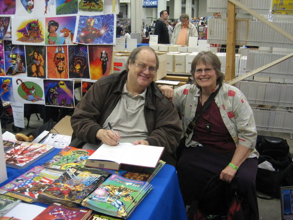
Here's Terry Beatty, longtime comics pro, on-and-off MCAD teacher, rockabilly maven, Karaoke Ninja, and generally cool guy.
The book he's holding, Batman and Robin, is a custom bind belonging to my friend James Friel. James sent me a batch for books for signing and sketching, and Terry was glad to accommodate!
We're losing Terry soon. His wife got a great job in Kansas City, MO, so he's off to an even more mid- middle America.
Terry just completed work on the next GN in the Road to Perdition series, written by his old Ms. Tree partner, Max Alan Collins! He's also been doing box cover art for monster model kits, and taking on new commissions. His blog, Scary Terry's World, is linked to your left.

Also on board for this convention: former students from my Comic Book History course, Asby Utting and Andrew Herbst!
Ashby graduated a year or so ago, and Andrew completed his devoirs this January. Andrew gave me a copy of their joint effort, GROTTO, last year, and I enjoyed it immensely. Very professional, energetic work. The "for students" disclaimer does not apply. This work is professional by any standard.You can see it here.
Ashby is planning an on-again, off-again trip to Korea to study manhwa.  He plans to take his toddler son along with him. Now that's bringing a kid up right!

Another former student showing at the Con: Toe Vue!
Toe's paintings are remarkably powerful. I suspect he was a little under-appreciated at this Con, but I was very happy to see him there. The work at his blog, Create Chaos, shows his range and his influences.
I see elements of street art, Paul Pope, Ryan Kelly (well, you can't really talk about Paul Pope without talking about Ryan Kelly, can you?), Boticelli and Jack Kirby in Toe's work. An eclectic mix with a deliberate, singular style that wouldn't work for anyone else, I done't think, but for Toe, it's very effective.
Finances have stopped me from getting his comic GHETTORISTIC, but don't let my problems be yours. Check out the link and spend a fin on a good comic!
Other former MCAD students presenting at this year's con included Evan Palmer, Anna Bongiovanni, Jesse Haller, and Will Schar. Sorry I didn't get photos of you guys, and I hope I didn't leave anyone out!
Very happy to chat briefly with Seamus Burke, whose first collection of Oh Goodie! is now available in Dead Tree, or as we used to call it, TPB format.
Very excited to see this book out, as Yours Truly wrote the Foreword!
Seamus' work has evolved considerably.  He works in the model of Doonesbury, using scathing wit and somewhat static images to advance his narratives. With the evolution of the band in his strip, which updates 5 times a week over at his blog, he's broken out of that pattern.
The band in the strip is called the Filthy F@#$ing Fairies!
I didn't talk to Seamus for very long this time around. Usually I get him to fork over his guitar so I can tear off a number, but not today.
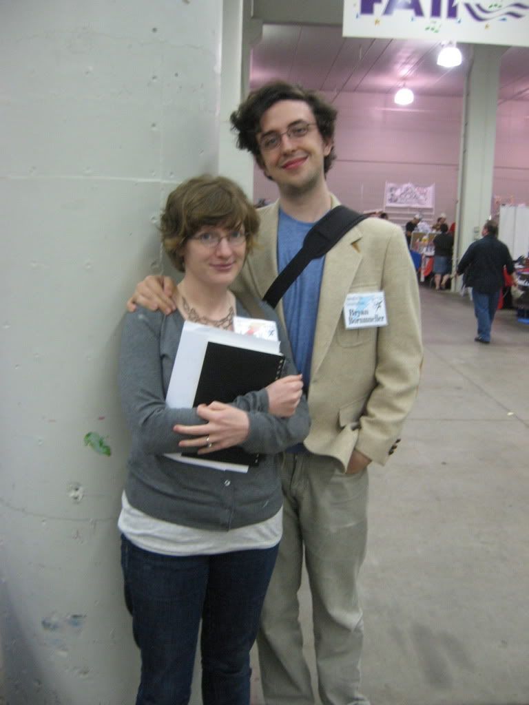
Another personal highlight was getting a wedding invitation from the vibrant and scary talented Ursula Murray Husted and her intended, Bryan Bornmuller.
Ursula and Bryan are in contention with Trina and Steve for the title of Cutest Couple in Comics.
You be the judge.
'oo's cute then?
More book signings:
Jose Luis Garcia Lopez
Len Strazewski, who was moved to tears that someone would bind his work!


Me hanging with Len
Peter Krause, who was so astounded by the SHAZAM! collections that he volunteered to do a sketch, and it was a beauty!
Following the Con, a bunch of us went out for Girls' Comics Dinner at the always enjoyable Jasmine 27. In attendance, Frenchy Lunning, Barb Guttman (who is currently assisting Peter Gross on art for The Unwritten), Barb Schultz, Jesse Haller (who was an honorary girl for the occasion), Rana Rauechle, Trina, Steve Leialoha (can't really have Trina without Steve!), myself, and Roberta Gregory. I haven't mentioned Roberta's presence till now. I still get a little tongue-tied around her after meeting her twice and spending several hours accepting that she's just Regular Folks. Her work set the bar for women's comics for years, and her honesty and craft remain benchmarks. She's currently working full time for the Seattle Opera and Children's Theater, unless memory fails me.
At the end of every con, I think I'll pull together a body of creative work for the next one and get a table.
perhaps, perhaps not.
I like the idea of having a body of work to offer, but I have no problem with being a fan. If that remains what MN Springcon is about for me, I can live with that.

Sunday, August 1, 2010

Original Art Sundays #52: A Private Myth, cover

Well, here we are. A year since I started being audacious enough to post my own work.
In that year, I've posted a whole Surrealist Cowgirls story, The World in Love, a few Tranny Towers pages and a cover, about a dozen photos, a couple so-so music videos featuring my art and guitar playing, and a bunch of sketches and older work in weeks where I lacked time or organization to complete a new piece.
The big work, of course, remains A Private Myth.
I have high hopes for this project. My immediate goal is its completion, page by page. Within that are smaller goals, like preparing each chapter as a stand-alone comic, and choosing eight of the current pages for the fall MCAD Faculty Art Show in a couple weeks.
To all these ends, I decided to do the cover this week.
Or A cover. This might not be THE cover.
I don't consider this final, though I am rather happy with it. Again, pencils without inks, painted in Photoshop.

Almost entirely drawn freehand, hence the uneven edges and slightly skewed angles. I rather like that quality but question it from a standpoint of professionalism. The palette works, but I might reconsider it.
After some debate, I chose to retain the water-stain on the lower right corner. I think it adds a sense of age and use.
My original idea for this, an old map with Katherine's features as one of the continents, just didn't work. But it may show up as a cover for one of the chapters/issues if I can resolve its problems.
The work is inspired by those vintage sheet music covers I love so much! I wanted a sense of something vintage that has an enduring quality. Painting over white in the Color layer mode, often used for recoloring vintage B & W photos, lends to a more muted palette as well. It also shows the texture of the paper, a pleasant effect!
The tragedy and comedy lanterns in the upper corners are freely stolen from a classic Winsor McCay illustration.
So there you have it. Original art, one year in.
On to the next one!

Friday, May 21, 2010

Eddie hits town

In 2008, I was in San Diego to present a paper at ComicCon.
While walking through the Top Shelf booth (more like a small store inside a big one, very impressive booth), this tall gent with a shock of white hair starts talking to me in the most delightful accent- British, but yet not.
After a couple minutes, it dawns on me- holy sh*t,  I'm talking to Eddie Campbell.
Needless to say, I picked up a couple books- his then-new one, Monsieur Leotard, and the new hardback reissue of From Hell.

Delightful gent. Such a fun, unexpected chat. Well, that's Comic Con for you!
Flash forward to the start of this semester. During the Liberal Arts meeting, my chair asked if there were any other suggestions for next year's guest artist/speaker. Without thinking, I said, "Oh, Eddie Campbell!" This was met with puzzled looks from everyone except Frenchy Lunning, who went nuts over the idea.
Well, after a vote and some wrangling, we got him.
Eddie Campbell is coming to the Minneapolis College of Art & Design next spring.
I count this as personal coup and hope to be able to introduce him when he gives his mandated lecture.
Rather than footage of Eddie speaking (he's quite engaging), here's an odd little film he made.

Sunday, April 11, 2010

Original Art Sundays # 37: I Am A Camera (Jack)

New page next week, time permitting. This week was eaten by meetings, grading and writing.
This week's art comes to us from the world of photography. It's an image of my first photography teacher, Jack Mader.


This is not done in Photoshop.
This is traditional photography. You know, film, negatives, paper developing, the works, old school.
I took an image of Jack with half the lens masked. Then I rotated the mask and took an upscaled shot of a Nikon 35MM camera. For the second negative, I took a shot of a broken mirror, shattered from the center out.
Then, projecting the negative through the enlarger, I cut a mask of the projected area of the Jack/camera composite.
Masking first the mirrored area and then the composite negative, I exposed both areas of the paper. The mask was slightly off-register, which gave the nifty solarized edging.
I've always been rather proud of this one. When I applied for credit transfer at MCAD, this was the only photo I showed in my portfolio, and they accepted my photo credits.
It remains a favorite.
There are at least three songs titled I Am A Camera: one by the Buggles, one by Gentle Giant, and one in the musical Cabaret.
next week, more of A Private Myth.

Sunday, September 20, 2009

The masochist says "hurt me". The sadist says "no".

So here I am all crispy from 2 days of very little sleep.
What do I do?
Sign up for the 2009 24 Hour Comics Challenge!
I hope to do 24 pages AND A COVER in the 24 hours. Going to try working a little smaller this time. I think I was the only one working at 11" x 17" at MCAD last year!
And my dilemma over going to MCAD or Open Book was solved, as MCAD students are joining the fun at Open Book this year!
Here's another shot Barb Shultz took of me at the '08 event....

Wednesday, September 9, 2009

It begins anew....

My Digital Photo student didn't make it in today, ostensibly due to a job interview, so I am well caught up on grading and such. Having a minute, I contemplated the future of my darlings, The Surrealist Cowgirls.

In my musings, I checked and discovered that the next 24 hour comic challenge is a mere 3 weeks hence!

As I will have just finished posting the current story at the point, perchance I'll participate again. Let's not kid ourselves, of course I'll jump in.

Since I'm not teaching there this semester, I don't know if it would be appropriate for me to attend the MCAD shindig. But I'll go again, and I'll get another odd little story out of it. The Cowgirls, maybe a Speedy Ricuverri story, maybe the Flameheads (no Flameheads stories have been told since 8th grade- yikes!).... There are so many other stories to tell!


Here's a shot the impressively smart and talented Barb Schultz took of me at last year's MCAD event!

Thursday, July 2, 2009

More on SES


I promised more on SES, and here it is.
SES stands for Summer Expressions Seminar. It's Art School Camp for College credit. Takes place at Minneapolis College of Art & Design. Two sessions, two weeks each, one week in between. I've been teaching it for ten years now. The upcoming SES II, which starts this coming Sunday, will be my 16th session.
In session one, we teach graphic design, web, rock video, documentary, photo and sound.
In session two, we teach painting, animation, comics and game design.
I have pretty much free rein when teaching in this program. When the strictures are removed, the focus quickly shifts from "how do I satisfy my employer?" to "what are the needs of the students?"
It's a humbling experience to be in service to something bigger than yourself.
We only have them for two weeks, but during that time, they get a taste of art school- the real thing, not the romanticized version put forth by people who aren't artists. It's a baptism of fire, and I'm honored to be part of it.
My courses are more concerned with the how than the why. I teach courses in the nature of performance and in constructing and deconstructing text and image.
The above sketch was done by an SES II student last year while I was lecturing. I was so taken with it, I asked if I could keep it.
More than anything, those surprises are what make it worthwhile.