Sunday, January 20, 2013

Original Art Sundays No. 148: Fall Into A Book!

On this cold blustery day, I should have a Pooh image for you!
Instead, we're going with an older piece.
I don't often work in gouache, but I do like its richness and versatility- it has some of the advantages of oils with less hassle and cleanup.
This was a blind submission, intended for a Barnes & Noble fall ad campaign. Obviously unused, or  you'd have seen it before.

I like the idea of leaves reading- pages of books being sometimes called leaves and all- and the space left for the logo has a nice ornate, woodsy feel to it.
The palate is limited, and based in the blue paper I had on hand to use as a frame for the deckle edge heavy watercolor paper.
Again, I think my art is at its best when I try not to be too precise.
While I'm not really set up to paint right now, I am feeling the itch a bit.
But then, that might just be dry winter skin!
Next: scanner access is back, so probably another Surrealist Cowgirls page. Between now and then, that neglected Wolverton post!

Tuesday, January 15, 2013

Best Comics of 2012: No. 1

Time to announce the Best Comic of 2012.
This has it all. Spellbinding beautiful art, three compelling stories woven into one, serious subjects including immigration and gay issues, and spirit. So much spirit.
I haven't read the author's book PUG yet, but I used Derek McCullough's Stagger Lee as a textbook in my recently ended Graphic Novel class (the students loved it), so I'm familiar with his deft handling of music as a narrative vehicle.
In Gone to Amerikay he ties together the stories of two Irish immigrants separated by ninety years with the tale of the wealthy descendant of one who's searching for his musical heritage, forty years after the fact.
In many ways it's a classic Irish tale, full of ghosts, ballads, drinking, joy, sex and life, set against the backdrop of New York. The dialects are spot on without being demeaning. The stories flow well and intertwine cleanly, though there are a couple points where less than astute readers will have to double back and check on something.
On matters Irish: the art is by Colleen Doran, who shares my love for the band Horslips, and who keeps up a "No Irish Need Apply" sign in her studio, as a reminder of hard times and harder people past.
I've been following Colleen's work since A Distant Soil debuted as a preview in the Pini's Elfquest. I've enjoyed her work on J. Michael Straczynski Book of Lost Souls, some key issues of Sandman, Wonder Woman, Legion of Super-Heroes, one of my favorite graphic novels, Warren Ellis' Orbiter (I happened on a signed and sketched copy in a used store, more fool the anonymous "Curt" who got rid of it) and of course, A Distant Soil, which she is closing in on finishing. She's a canny businesswoman, informed and strengthened by the hard knocks life has given her (mostly in the form of creeps trying to take advantage of her in some way).
Sidebar: I purchased a Book of Lost Souls page from Colleen last year, but neglected to ask for one featuring that wonderful cat, so I guess I'm as much a fool as that "Curt"was.
Back to Colleen:
She's produced a formidable body of work over the decades (has it really been that long?), and though she chooses her material carefully to balance time, deadlines and the likelihood of the person or organization promising her payment honoring that commitment, she does continue to create, and just gets better.
Ahem. Case in point.
Can Colleen draw beautiful men or what?
Also, the precise illustrations of mundane daily activities, like shaving, enhance visual storytelling no end.
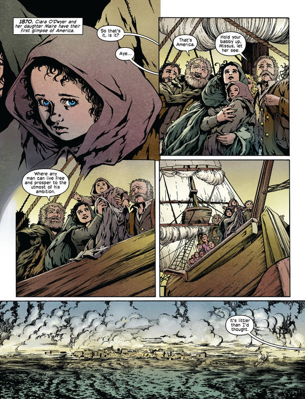
Here's a page from the sequence set back in time. Remember, while each story is told chronologically, they are intertwined in the book.

Lewis Healy, the magnate
whose search connects the stories
Sometimes I read things with too critical an eye, noticing structure, editing, artistic flourishes and so on. while this has its uses, it can be demoralizing, like that moment after you realize that cartoons are thousands of drawings, and the time afterwards where all you can see is the individual drawings, before cartoons get their magic back. The best stories are the ones in which I forget to critically dissect the content and get sucked into the story's world. Gone to Amerikay is one of those stories.

So we have the tale of Clare O'Dwyer, 1870;
Folk singer Johnny McCormack, 1960;
and Irish billionaire Lewis Haely, 2010. It's his search for the music he loves that ties them together.
But there's also a tie between Clare and Johnny.
Through a meeting with the ghost of her lover, Johnny learns the song he wrote for Clare, and finding her granddaughter quite by accident, learns that Clare's daughter is still alive. He meets her and is able to return the song to its family.
Having just watched What Lies Beneath on TCM tonight, it's nice to see a ghost story with a happy ending.
Being who I am, I have to mention the book itself- a slim but handsome hardcover, apparently PVC bound with black head and tail bands. And the cover of the book beneath the dust jacket holds a lovely blind stamp.

The coloring, by Jose Villarubia, whose work I've loved on Promethea and the bound edition of Alan Moore's The Mirror of Love, is subtle and suits the art perfectly.
So congratulations to the Gone to Amerikay team.
You made my year.
I'm taking a couple days off posting to deal with work matters, but will return by week's end with some thoughts on Basil Wolverton.

Monday, January 14, 2013

Original Art Sundays No. 147: The Source Cards

Back to post some art in the midst of the final Best of 2012 posts.
And as promised, it's new work, though possibly not what you expected.
At MN's SpringCon last year, the organizers gave creators cards to illustrate. This year being an anniversary, the 25th, they wanted to put together a set of cards. These will be redistributed randomly to attendees. They did this five years ago for the 20th- it's a lot of fun!
So I did my part.
After leaving the card blanks laying on the drawing table to annoy me for months while I completed other work, I finally just sat down and did them right at the turn of the year.
The work is loose and sketchy- hey, they ARE sketch cards- and colored in pencil, though it looks like marker in the scans. I considered correcting the colors and doing some fancy footwork in Photoshop (what we used to call "production art"), then thought, "naaah."
I decided on four of my favorite characters.
First, Dr. Strange.
I was going for a more urgent tone than this conveys. It's OK, but more mood would have been good. Possibly grayscale/monochrome if I work with the Doctor again?
Next, Omaha, of course.
I might like this one best. While it's much looser than Reed's best work, or even some of my own scattered pieces using the character, I think the tone is right. I freely stole the design and palette from one of the final cover variants of Terry Moore's Strangers in Paradise.

Next, Concrete.
Mildly frustrated by this one. I included the title since not everyone knows the character and the cards are being distributed randomly to attendees, but I think it really hampers the overall tone of the piece. The lettering is too cartoony/ baloony. I deliberately left in most of the pencil marks. I think the intent of the cast shadow in the floor stones doesn't work as well as it might.
Still, I've begun to see Concrete as something of a Buddha figure, and this plays into that, obviously.
The whole thing is grayscale, though it looks blue in the scan.
Finally, CHEW!

The Omaha card elicits the strongest idyllic expression from me, but this just makes me smile! I'm about three issues behind, but CHEW remains one of the funniest and most demented comics out there. The earth tones got seriously bumped into the red in the scan. It was much browner in the original. So be it.
Join us tomorrow (actually later today) for the final installment of Best Comics of 2012.

Sunday, January 13, 2013

Best Comics of 2012 No. 2: Doug Wildey's RIO

Again, back to a book of reprints.
But there's so much new work here, and the old work is reprinted with such skill, it all feels new.
A bit of background:
Doug Wildey was a real life cowboy and adventurer who just just happened to be one of the best damn comic artists to come down the pike. While he's drawn and written war comics, The Saint comic strip, Tarzan, Archie, romance, mystery and horror, he's best known for two things: creating Jonny Quest and doing spectacular Westerns.
Oh, he was also the inspiration for the character of Peavey in The Rocketeer. Creator Dave Stevens was a friend and a huge fan.
Some of his work, like his characters for the short-lived Atlas/Seaboard line in the early 1970s, Kid Cody and the Comanche Kid, had short runs with sad distribution- odd in this particular case, when you consider that the Atlas company was started and run by Stan Lee's brother Larry Leiber.
After Wildey's strip Ambler folded in 1974, he returned to work on his Western magnum opus, Rio.
The first of three published graphic novels (at the time called "continuing stories") appeared in Eclipse Magazine no. 1, August 1983. The sequel appeared in Eclipse Comics, the followup anthology. This story was later reprinted by Comico, another spectacular 80s comic company that died too soon. A third story was later printed by Dark Horse as two single comics.
Wildey worked on two more Rio stories that never saw print. Until now.
There are a total of five stories in this book, plus some brilliantly handled supplemental material.


The new volume, a delight for those of us who love books (more on that below), is printed almost entirely from the original art. The colors are so much more vibrant than in the original printings. I suspect Wildey was working in color marker and watercolors over inks, based on the markmaking visible on some pages.
Rio is a mystery man, a reformed outlaw pardoned by President Grant, an ex-lawman, making his way in a matter-of-fact manner. He doesn't bemoan his fate. He just lives it.
The stories are classic Western stuff: buffalo hunts, railroads, mining, gambling, and a cast of supporting characters including incredibly fleshed out interpretations of Jesse James, Doc Holliday, and the Earp Brothers, who act like real jerks this time around.
Here's a choice bit of the Jesse James story.
In this story, Wildey shows contempt for the hypocrisy of the "civilized" people in the West. After Jesse is exposed and forced to leave town, it is revealed that the late sheriff had a clandestine arrangement with Jess to protect the town in return for safe haven. After gunslingers and ne'er-do-wells invade the town, the righteous folk who drove Jesse out beg Rio to help them. Given their shabby treatment of both Jesse and him, Rio simply rides on.
Two of the tales in this book are incomplete, and are presented in their state at the time of Wildey's death in 1994. Below are samples from those stories.

Even in this rough state, the quality of the art, writing and overall storytelling is readily apparent. I'm particularly charmed by the silhouette of the dog following Rio in the last page, the one that ends the stories in the book.
The book also contains some lovely portrait work of the title character.
The design of the book itself deserves comment. One of the challenges of reprinting older material is getting it right, and this is an arena in which IDW shines. While their Artist's Edition series is out of my price range, I do drool every time one is announced or released. One of the local stores (sadly, one that never seems to have a sale) has a copy of the Simonson Thor volume, and I get to visit it longingly every time I stop in.
But the Rio volume is comparatively affordable, especially if you do as we cheap bitches do and combine discounts until it's 30% off. Still able to patronize local comic stores and save a buck at the same time- yeah!
Rio, the Complete Saga is very well designed. The border elements on the above plates are just the tip of the proverbial iceberg. The above front cover scan doesn't show it, but there are decorative elements on the cover that reinforce the tone of the book. See this more complete image of the back cover for an idea of what I mean.

The right choice for a typeface. Nicely handled background pattern. Edge stripping reinforced by faux straps, simulating an old trunk. Clipped corners simulating an old school photo album (ask your mother or grandmother about those!).
And that's just the cover. The inside is even more striking, as alluded to in the above pages.
When choosing the Best of... annually, I try to avoid the traps to which many other such lists seem to fall prey. I don't list what I think are the most important, artistic (whatever that means) or profound books. I don't care about cutting edge stuff, unless it's well done. And I am SO bored by adults who deliberately try to draw like little kids!
What I care about is a book that will continue to pull me back to it a year, two years, five years or more later.
Since I've been reading my copies of the original Rio albums since they first came out, it's clear to me that this is such a book.
Tomorrow: The Best Comic of 2012.
Oh, and here's Wildey's interpretation of Jonny Quest, from a Comico miniseries offering his interpretations of classic TV episodes, just because it's so cool!


Best Comics of 2012, No. 3: The Moon Moth

Only three to go for this year's countdown.
I was first epxosed to the work of SF writer Jack Vance in the Canadian groundlevel SF title Andromeda #4, edited by Dean Motter.
I must apologize for not having the foresight to scan my copy of the cover for this post. You're denied the lovely wraparound cover!But here's half the image...

The title also featured stories by A.E. van Vogt and James Tiptree, who we came to know as Alice Sheldon before her tragic suicide.
At any rate, Andromeda was one of a handful of ambitious and mostly successful titles in the groundlevel movement of the 1970s and 1980s.
I had no idea what to expect when I picked up this issue; I'd been buying the series and elected to stick with it. What I found- well, here's a synopsis from an Amazon review:
"The Narrow Land" (1967): Ern the crested water baby, having hatched from an egg, must try to find his way in a strange world, consisting of a strip of land and sea bordered by a wall of storm and a wall of night. Unusual for Vance in that the protagonist is not human.
The elaborate world and flowing language blew me away. I resolved to read more Vance but let it slip.
Don't pelt me with rocks and garbage. I'll get there. I just finished Cornell Woolrich's The Bride Wore Black, which has been on my list just as long!
I was both pleased and curious to see this new adaptation of a Vance work on the shelves at The Source in St. Paul. Being a poor woman, I got it from the library.
And I was enthralled with what I read and saw.


A murder mystery set on a world bound by a strict caste system, the story is compelling. Our hero is tasked with solving the murder without violating the complex social taboos of the society into which he is plunged.
The caste is twofold. The status of an individual is set by the mask worn and by the instrument played. Each has a specific meaning and the violation of either or both is an offense of the highest order.
Here are some of the instruments and their meanings:

And some exposition showing the tension of the writing:
Moon Moth is one the masks worn by the offworlder as he tries to solve the mystery and bring the killer to justice.
It's a very clever device. How can you know for whom you search when everyone is masked? Similar to the telepathic device in Alfred Bester's The Demolished Man in some respects....
Illustrator Humayoun Ibrahim brings a wonderful blend of pragmatism and imagination to his storytelling. A BFA graduate of School of Visual Arts, this is his first mainstream professional work. His work shows infulences of classic SF illustration, notably the work of Frank R. Paul. His next book, Decelerate Blue, is due out in September 2013.
While this book demands attention of the reader, if the reader engages, it's more than worth it.
This spread offers more exposition on the structure of the societal structure of the planet Sirene, our setting. There's a nice empathetic device here- the protagonist struggles to learn the elusive system as the readers do.
The publisher, First Second, is the graphic novel imprint of Macmillan, and offers a wide range of stories. Many of their titles are aimed at younger readers, but they also include some Eddie Campbell works in their catalog, along with the collected edition of Sailor Twain, listed in last year's Best of...series.
I hope more Vance adaptations are forthcoming. This is quality work in every way. And the only credited author is  Vance himself. Though 97 years of age(!), Mr. Vance is still with us, and may well be the last surviving Grand Master from the Golden Age of Science Fiction (I consider Harlan Ellison to be a Silver Age or New Wave author, depending on which set of arbitrary terms you choose to use).
But I digress yet again. This is a fulfilling, challenging read, illustrated with panache and great control, well worthwhile.
Tomorrow, No. 2 in the Best of 2012, high adventure from the Old West, finally given its due!


Friday, January 11, 2013

Best Comics of 2012, No.4: Cow Boy

Most of this year's list to date is material that revisits past glories of comics in new ways.
While I respect this material a great deal, there's still plenty of noteworthy new work.
Case in point: Cow Boy.
This is one of the funniest and saddest books I've read in years.
This is the story of a boy roaming the West trying to bring a bad man to justice.

Problem is, the bad man is his father. And he rides grim, alone and lonely, with a child's vision of the West tempered by the perceptions of the adults he meets along the way.

And, of course, he finds, captures, and confronts the father.

The book confronts the challenges of parent/child relationships in a way that's all too real, but takes nothing away from the child's perception. It also doesn't become a therapy session. It's just honest, and you  know I'm a fan of honest.
 The creative team of Nate Cosby (Jim Henson's The Storyteller) and Chris Eliopoulos (Pet Avengers, Franklin Richards) is well versed in the fantastic comic involving children or children's material.
I'm a sucker for profound emotions, clearly expressed without pelting the reader with bags of saccharine or venom.
Arachia did their usual beautiful job on the production of this book. As of this writing, there is no TPB edition, and while the price tag of $19.95 is hardly outrageous, it might do the disservice of keeping it out of the hands of some younger readers, which would be a real shame.
Cow Boy plays on many Western tropes- it reads as part Spaghetti Western, part John Ford, and has hints of the dying West that are echoed in Jarmsuch's Dead Man. But none of this is so overbearing as to make the story too unrelenting for kids or impressionable so-called grownups.
This also echoes Don McGregor and Gene Colan's Ragamuffins strip from Eclipse in its attempt to understand the feelings of a child, though not quite so pedantic.

In looking at this work, be mindful that it was printed and colored from Colan's pencils. So if it looks a bit soft, that's why. A flawed experiment by today's standards, but remarkable for the pre-digital age.
Of course, I can't read any comic that deals with the world from a child's point of view without recalling one of my all-time favorites: Sheldon Mayer's Sugar and Spike!
A refresher: Sugar & Spike are neighboring babies who speak baby language and have their own view of the world. If this sounds like Rugrats, it should. The animation studio Klasky-Csupo freely stole the idea from Sugar & Spike.
In the cover shown below, note the presence of Grandpa Plumm. All babies, regardless of species, speak baby talk. And Grandpa, being in his second childhood, communicates fluently in baby talk, but adults see this as senility. Also, his cowboy regalia is on point with today's theme!

Ahem.
Back to our book.
There are a couple framing stories in Cow Boy, unrelated other than by tone. It's reasonable to assume they're set in the same, or a similar, world.
One of these, depicted below,  deals with a lady gunslinger and her penguin sidekick, or is it the other way around?


This is the work of Mike Maihack, whose other delightful work can be found at this link.
This is a style I've often wondered about cultivating- not this specifically, because it's Mike's but something looser. My own work is so, ahem, informal, that I sometimes think forcing it to bend to  taut precision works to its, and my, determent.
Hm. I guess I just need to let go a bit more.
Food for thought, but Cow Boy will certainly inspire me, and any other creators who are still open to the paradox of insightful innocence, to consider it.
Tomorrow: put on your masks as we jump to another planet for Best of 2012, No. 4.


Thursday, January 10, 2013

Best Comics of 2012, No. 5: IDW's Popeye

Next item on the list is one of the oldest and newest characters out there.
Under IDW, Popeye is experiencing a remarkable revival.
Though the character never went away to the faithful among us, recent attempts at the character have often fallen short of his potential. The last major take on Popeye that really stood out was Bobby London's run on the strip, which deserves a proper collection.
Here's the cover from the one collection in print to date.
MInd, this is not to take anything away from others who have worked on the character. But Segar, Bud Sagendorf and Bobby London are tough acts to follow!
I was so grateful when Roger Landridge took on the new book.  While I've yet to pick up on Snarked, I'm sure some of you will remember that his take on The Muppet Show made my Best of... list a couple years ago.
And Landridge brings the right tone to the character, echoing Segar's run without simply aping it. Landridge knows his comic history and is not afraid to use it. as evidenced in this cover for issue #1.
If you don't know what comic this references,
you're reading the wrong blog!

As the pages below clarify, this book incorporates numerous elements, not just of the strip but of its original period: black and white films, jalopies, language and phrasing specific to the era and the strip (some of which can be traced to Yiddish ghetto vernacular- I know just enough about that to be dangerous, so corrections are welcome). 
Landridge also pulls in supporting characters from the original Thimble Theater, and sometimes gives them their own strips in the book, as in the examples posted below.
The book is remarkable for its covers, printed on flat (non-gloss) paper! This feels like an old book with new stories. I envy young readers whose first Popeye comics are these!
Our cast!
Beautiful.
As with some of the other picks in the current list, this book is full of energy and charm, but not at the expense of solid storytelling.
Kid's books deserve to be as entertaining and smart as those ostensibly aimed at adults. I'm so fed up with simpering stories that remove all conflict being hailed because they're "safe". How are kids supposed to learn to effectively resolve conflicts if they're not exposed to the process at every opportunity?
I don't mean to say that we should barrage kids with brutality and animosity, but let's face it, conflicts happen. Of what use is a story that denies that reality? I contend that denying reality to kids, lying to them about that reality, is more harmful than letting them face said reality.
And Popeye is a prefect vehicle for that. At heart a pacifist, he's not afraid to face and deal with problems in an up-front manner. When Popeye makes a mistake, he corrects it as best he can, and he tolerates no wrongdoing from others. In short, he has a clear idea of right and wrong, and he lives by it.
See example below of a fight scene.

There's the energy of the original strip that we mentioned before!
Note that there's a fairly high level of detail here, especially relative to Segar's original strips. Segar's backgrounds were light and sketchy- his crowd scenes were often fields of ovals with eyes and noses, for example.
In this page, while Landridge uses solid fields of color as background in panels three through five, the first and last panels have full backgrounds with more than sufficient detail to tell the story and reinforce the two things that sustain a Popeye story: energy and gags.
The stories themselves are as imaginative as Landridge's Muppet work.  In the example below, Landridge riffs on the definitive Fleischer cartoons in a story involving Bluto giving Popeye the business in the process of making a film.


Note the Fleischer style opening title!
Here's an example of a backup story spotlighting one of the other characters from a Segar strip, this one from Sappo.

Note that this "best of" refers to IDW's Popeye and not to Landridge's.
While I defer to none in my admiration of Landridge's work on this and other books, I must note that IDW has been a consistent supporter of classic comics, rivaling Fantagraphics for its quality line of reprints.
We'll see another example of the great IDW reprints in a couple days, but I do want to note that they are also publishing a Popeye reprint book, featuring the work of Bud Sagendorf. Craig Yoe has a book of the Sagendorf material. While I do love my deluxe and too expensive for me (but worth the money) comic reprint volumes, there's a lot to be said for the traditional format.
My one quibble with the format is that they're using a nearly identical cover structure between the two titles, and the same flat paper stock. If you buy your comics in a hurry, as I sometimes do, it's easy to think you've picked up the next issue of one when you really grabbed the other.
The first collection of the Landridge work is due out January 22. The regular title continues on schedule. I was concerned that Landridge might have to sacrifice quality to maintain this pace, but so far I'm pleased to report that such has not happened.
Tomorrow, number four in the Top Comics of 2012, as we ride along.

Wednesday, January 9, 2013

Best Comics of 2012, No. 6: Hawkeye

So Marvel made the list twice this year. Good for them.
Smart writing, clean art and good storytelling.
Glad they're finally getting back to that.
Matt Fraction's Hawkeye brings many things to mind. The most immediate is Eisner's City People and Invisible People, works that peer in the windows of the cliched everyman.
But where Eisner is drawing on the classic model of Jewish tragedy in most of his city narratives, Fraction is channeling the wry wit of American Flagg era Chaykin and tempering it with a healthy dose of old school Frank Capra. It also brings to mind William Messner-Loebs' short-lived series Bliss Alley.
This book depicts Hawkeye as an Avenger who lives in the old neighborhood and cares directly about others who share the place.
While he has the unorthodox option of attempting to solve one of the problems by buying the building in question, Clint addresses the issues fairly head on.
The wit comes in an unusually blunt empathy. Fraction uses captions and parenthetical translations as a vehicle for humor and understanding. As an example, when Clint is released from the hospital early in issue 1, there's a word balloon going out of panel that reads "(some Spanish sounding stuff". The following panel has a character saying "Back off (Russian maybe), I keel you, okay bro?" We read it as Clint hears and sees it.
David Aja's art and Matt Hollingsworth's colors are remarkably effective together. Clean subdued palettes that reinforce sparse, accurate rendering. Can't ask for much better.

 This two page sequence from issue 2 references Clint's past as a criminal and his time in the circus, also showing his protege/partner Kate Bishop.
There's so much to like about this book. Every part of it works. The design elements are obvious without being intrusive, and contribute to the story. The narrative and action build seamlessly. Character dominates throughout. It's an easy read, but not dumbed down. It references the central character's unnecessarily elaborate back story without confusing matters.
It's clean, sharp, and stand up to repeated readings. Volume 1 of the trades, My Life As A Weapon, is out as of March, and well worth the pittance requested for it (lists at $16.99, Amazon for $6.99).
Some vile souls have posted torrents of it. Do as your conscience and pocketbook demand, but the usual mantra applies: support creators and publishers whenever possible. At #3,408 on Amazon's list, it's doing OK, but hey, more sales means more work for the creators, at least ideally.

I've railed against the evils of snark in the past. This book could easily be misread as snide.
But another phrase sums it up nicely.
Joie de vivre.
Reading this , I get the sense that, as hard as they must work to create such a seemingly seamless project, the creative team on Hawkeye are always having the time of their lives.
As are the characters.
Tomorrow: Number 5 of the best of 2012, if you swabbies care to show up for it!