Showing posts with label Inktober. Show all posts

Sunday, October 6, 2024

Original Art Sundays No. 375: Inktober '24, part 1


Crossposting this from my Substack. 

We’re in the throes of Inktober!

3 of the last 4 years, I’ve made it through the entire month. Two of those years have been compiled in the book Spatters. I have 7 copies left, and it will be available at Queer and Trans Zine Fest next weekend.

Here are this year’s Inktober drawings so far.

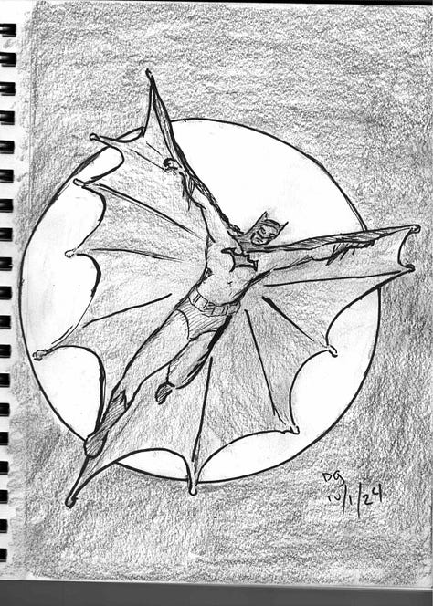
  • Day One: Batman inspired by John Cassaday

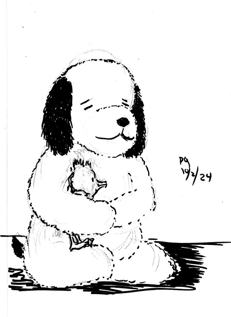
  • Day Two: my stuffed Snoopy (that I got the day I met the man) in honor of Charles Schulz’s birthday.

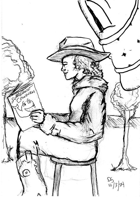
  • Day Three: an unusual take on my favorite creations, the Surrealist Cowgirls.

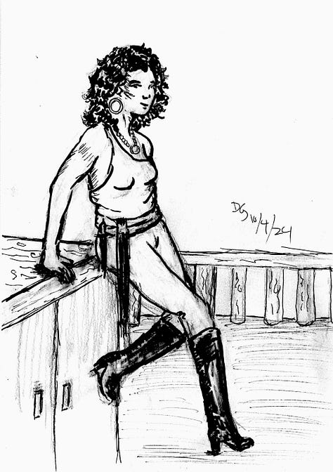
  • Day Four: Pirate girl, inspired by my love of Gil Elvgren’s inviting poses.

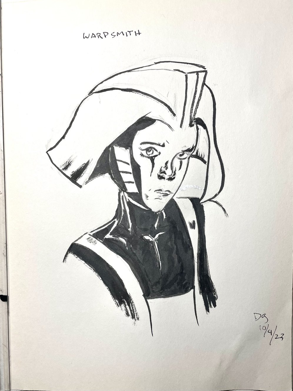
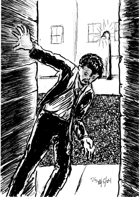
  • Days Five and Six: Moments from the work in progress Captives of Imagination.

I do love Inktober. I never follow the prompts. To me, it’s an opportunity to stretch as an inker, and I don’t like having too many terms dictated to me. However, it does offer something very useful, almost invaluable: deadlines.

Deadlines get things done.

Lecture is given on Wednesdays. Next lecture is on Fridays. Midterm grades are due soon. Zine Fest happens on October 19 and 20. Inktober is every day of the month. If the book is to be done by the holidays, there are printing deadlines.

Deadlines will drive one crazy, but they are so valuable. As Palpatine said about anger and the Dark Side, it gives you focus. And if you have something that has to be done today and a long project with no deadline, you tend to give your time and energy to the former.

But they can be traps too. If one has too many deadlines, everything collapses. I’ve gone through that a couple times. For me, the razor’s edge is having just a LITTLE more to do than I can handle.

However, it’s not just about methodically doing the work and dutifully meeting the deadlines.

A couple days ago, I picked up a copy of Harlan Ellison’s Last Dangerous Visions, published poshtumously, with final edits completed by J. Micheal Straczynski.

The Last Dangerous Visions is finally here , six years after Harlan  Ellison's passing, spearheaded by J. Michael Straczynski, & featuring a  bunch of rad stories from folks like Cecil Castellucci. Insta-buy.

I sat up and read JMS’s Introduction and Exegsis, in which he gives personal insights into his relationship to Harlan and into Harlan’s private life, in a respectful but honest way. He revealed Harlan’s mental challenges over his lifetime, and how those challenges inhibited the creation of this volume for five decades.

This shook me. I had the honor of meeting and speaking with Harlan twice, and while I’m sure he wouldn’t know me from Eve, I clung to the conceit of calling him a friend. Some of that also stems from the artifice of intimacy resulting from liking someone’s work. Much of Harlan’s writing was brutally honest, and left the reader feeling like an invitation into the writer’s mind and heart had been offered and accepted. Ellison often wrote of such presumed familiarity as inappropriate, to say the least. I got that, but I still felt it. As such, I was shocked to discover that he wasn’t who I thought he was - or perhaps who HE thought he was. Mental illness is like that, I suppose.

But by choice or design, he got in his own way in completing this work, a work he saw as so important. Too many deadlines, not enough Harlan to meet them. And he took himeslf to task for that, in rather severe terms.

Do we all do that? Mental health is clearly a factor, but I think it’s not the only factor involved. Even creators without mental health issues face what Marvel used to call the Dreaded Deadline Doom.

I hold great rerevence for creators who methodically produce smart, impassioned work. As I discussed previously, I often hold the work in such reverence that I’m afraid to get it done. Sometimes that’s a conceit or an excuse. The deadline comes and you meet it (well, most of the time. I’ve missed more than a few, but made most).

I suspect that my truth is like that of many other creators. The Work is never as good as I aspire to it being, but it’s often better than I think it is.

I’ve been drawing, writing and teaching for so long. I hope to get The Big Work done while I still can. I will never be another Harlan Ellison, but that’s okay.

We’ve already got one, and I am forever grateful for that.

Thank you, Harlan.

Next: the work continues on both Inktober and Sharp Invitations. One or the other coming you way soon...

Sunday, December 31, 2023

Original Art Sundays No 373: More Inktober

 Well, now that the hectic semester is done and my first Kickstarter goes live soon, I can devote more time to posting art.

FYI, the Kickstarter is a Surrealist Cowgirls 80 Page Giant! 

Here are a few more Inktober pieces from this year.


 Another one for the guitar book- good old Judy Jetson! Done on a backing board. Combination of ink and marker. Fast, loose and fun (the art, not Judy).


My stab at doing The Spirit. Always fond of this character. Eisner's work on this helped shaped my perception of everyday stories being told in comics. Almost all freehand, lots of ink and brush and just a bit of marker.


Oh, I like this one! This is Marie Severin, based on a painting by Johnny Craig. The painting ran in the book Marie Severin- the Mirthful Mistress of Comics. I think Marie's work was sometimes stronger than her brother John's work, and that's saying a lot!


Another one for the guitar book. This was based on a drawing on the inside cover of a Harry Chapin album. Harry's albums often had eloquent illustrations of the lyrics. I could have pushed this farther, but I was happy with where it stopped. Did a quick underdrawing and just went with it, correcting as I went. Lots of Micron markers on this one.


Took a couple stabs at this one. Obvious shot from The Prisoner, a perennial favorite series. It's tricky because of star Patrick McGoohan's almost complete lack of eyebrows! Marker for the mechanical lines only. The rest was nib and brush. The astute observer will note more drybrush at the base of the image.


Thomas Sondegard, artistic director of the MN Orchestra. I haven't gone very much this season, and I do miss it. This was a copy from a promo mailing. I took a couple minor design liberties. This is almost all brush work.


Sunday, November 19, 2023

Original Art Sundays No. 372: An Inktober miscellany

Well, that really got away from us! Between midterms, union work, concerts and starting new projects, I only completed about half of Inktober this year and haven't posted for a while. Now that I have a minute to breathe, I'd like to share some of this year's completed works.

My vision of the Warpsmith, inspired by Neil Gaiman's current run at finishing Miracleman. I have very mixed feelings about how the storyline seems to be resolving, but I'm very pleased with the quality of the work. This is straight pen and ink, with some brush work here and there.


October 5. This was based on a comic cover, a book titled MAMO from Boom Box (2021). This is on gray paper, mostly ink and brush. I'm working with Sumi-e ink here. I like the quiet meditative feel of this.


 October 12. My take on the iconic Sugar & Spike. I revere these characters. Such smart fun! I seldom draw in this less formal style, but I always enjoy it when I do. 

Dc really blew it in reprinting these. It's one of the best kids' books ever done, so yeah, let's bring it out in a $60 hardcover! Good thinking, moguls.


October 13. Another vision of my elusive character Blue Wild Abandon! Black and white ink on colored paper. I came into a stack of miscellaneous colored papers and have been enjoying them no end.


October 15. Brush and Sumi-e ink.Playing with Japanese floating world ideas and having some fun drawing a kitty.

I have quite a few more, but these are the ones I have ready to put in this long overdue post!

Next: either new page or the rest of these.


Sunday, October 1, 2023

Original Art Sundays No. 371: Inktober '23, Day One

 This promises to be a very hectic week: midterms, two concerts and a visit from my sweetheart. Yeah, I know, first world problems. Be that as it may, I did want to get art posted, whether I had time for a new page today or not. As Inktober has begun, here's Day One!

This was inspired by a panel from the Phil Jiminez chapter of Wonder Woman: Historia. Rather than to try to bring my modest skills to the pinnacle of Phil's work, I made a couple modifications to make it my own.

The core concept, poses and basic layout are all Phil's, of course. Somewhere along the way, I garnished a small stack of Canson colored papers. I noticed by sepia inks, which got quite a workout during Inktober last year, and inspiration struck. I've been fascinated by the notion of white color pencil highlights on color stock, so that came into play as well. Not sure if the clouds are working, but they were a whim, and I'm fine with them as such.

Last two years, I made it through the whole month of Inktober. I hope to make it 3:3 this year. As with past years, I don't give two figs about the suggested prompts. I just want to try to stretch myself as an artist, as an inker, and see where it takes me. 

Tools:

  • Canson textured paper
  • 4B lead and holder
  • Rubber eraser
  • 2 shades of sepia ink
  • Pen nib and holder
  • Connoisseur Series  7 Kolinksy brush # 0
  • White colored pencil

Next: More Inktober, the next page of Sharp Invitations, or possibly both!


Sunday, October 10, 2021

Original Art Sundays No. 286: Inktober 2021, Part 1

HI all;

Next page is nearly done. Rather than post late or skip a week, here are my current efforts for Inktober. 

Day one:


 We start with a swipe from the cover of a swing album I discovered on Apple Music, Naomi and Her Handsome Devils.

More stylized than my work usually is, but such fun! 

I played with BIG brushes filling in the background.

I always love the geometric elements associated with this era, as anyone who recalls my Speedy Recovery and His All-Girl Orchestra comic will attest.


Day Two: 

A pretty straightforward swipe of a panel from Dean Motter's Mr. X.

I'm re-reading this and finding new stuff in it. The design paradoxically feels like both 80s-90s and 1920s.

I adore his facial expressions!

So vibrant with just a few well-placed lines.


Day Three:

Charles Mingus, in Walnut ink. From photo reference.

I didn't quite capture his majesty or exreme coolness, but I like this one anyway.

I was privileged to see Mingus live once. In the middle of the set, some guy in the back yelled out, "Do it, Charlie!"

He peered over his sunglasses and replied, "Ah, do what, man?"


Day Four:

One of my favorite panels from the Don Rosa classic Life and Times of $crooge McDuck.

Honestly, this whole sequence is just so powerful, but this panel, with him chained by his evil rival, as he is ridiculed and informed that his mother is dead, is just so perfect.

I've tried to explain the virtues of funny animal stories to the uninitiated, to no avail. I fear it's one of those things where either you get it or you don't.

Day Five:

A mocking Big Cat from Craig Russell's adaptation of The Jungle Book

Russell is another one of those artists whose work leaves me breathless. There's a classic elegance to his work, but when you look at it closely, his lines are almost breathy. I wish I could afford to get some of his video tutorials! I learn so much from such things.


Day Six:

Very loose pen and ink rendering of the sadly demised jazz great Emily Remler. We lost her to heroin some years ago. Her style was her own, but based in the work of Wes Montgomery.

This is deliberately sketchy. I wanted some quiet energy on this one.

Mixture of ink and marker.


Day Seven:

Now this was fun!

There's a little concrete warthog on a stair post in front of a house near MCAD. We all know it and love it. It became a character in my only Surrealist Cowgirls cartoon, now lost to the ages. But it elicits such warm feelings as you walk by!

This is brush work. The background is crow quill, and the background is loosely inspired by Jim Woodring's work.

I have a couple more, but I'll save them for the next posting. The next page will be posted in a couple days, and I'll just sneak in more Inktober throughout the month. I've been crossposting my Inktober work on Facebook and Twitter, if you just can't wait.


Sunday, October 2, 2016

Original Art Sundays No. 240: Inktober, days 1 and 2

Back in the art game! I decided to do Inktober, so I will be posting my ink sketches every day or so on Facebook and doing weekly compilations here.
For those not familiar, Inktober is self-explanatory. You do an ink piece every day in October.
We're only two days in, so a light week.
First up, a Star Trek pastiche- a quasi-Vulcan lady with overtones of Kes from Voyager.
 The light ink wash I did to set the character apart from the background a bit served primarily to wrinkle the paper and mess up the scan. I suppose I could have waited until tomorrow and scanned it on the good scanners at MCAD after teaching, but I was eager to post, so I'm letting the ugly stuff show a bit. Giving an allusion to setting with the star field window.
I've been enjoying Star Trek a great deal lately, but still haven't seen the latest film. From the friends I've talked to, it may be just as well, but as always, I'm trying to keep an open mind on it.
Materials on this one:
  • Faber Castell India ink artist pen (ink marker)
  • crowquill and No. 6 synthetic brush
  • Pro Art India ink
  • FW artist's acrylic white
  • Canson 55 lb. paper sketch pad
  • Preliminary done with lead holder, #4B lead and Magic White eraser. 

That was yesterday. Today was this.
This one is a stylistic departure for me. This is a preliminary for a piece that's been tickling the back of my mind for a LONG time,  and I want to fully realize it before I comment on it in any depth. Yeah, it's a pastiche of a young Blackhawk, but I'm not saying any more about it right now, at least as far as content.
Materials used:
  • Faber Castell India ink artist pen (ink marker)
  • crowquill and No. 6 synthetic brush
  • FW artist's acrylic white
  • Pentalic Corporation Paper for Pens. I've had this tablet forever. I don't even remember where or when I got it. I've never used it before, but I really like it! It's strong, durable, takes well to erasing and drybrush, especially since it has no discernible tooth. I'll be using this a lot more! Tough, responsive paper!
  • Preliminary done with lead holder, #4B lead and Magic White eraser.
I do hope I can keep up with Inktober. I like it. It feels good to just do art again, for its own sake. The graphic memoir is important, but the content weighs on me, making it difficult to get anywhere. I understand why Stuck Rubber Baby and Fun Home each took years! I've not abandoned Sharp Invitations- far from it. Scripting for the Daddy's Song chapter has had a breakthrough, and my revisiting of the Curt story is coming better than its absence here would imply. Re-pacing it from the rough version proved elusive, since it was such a complex time. It's hard to clarify the elaborate without boring a reader, but I think the improvements to the script and pacing will prove worthwhile.
Next: either more Inktober, some Sharp Invitations, revisiting the Blackhawk thing, or a miscellany I have laying about.