Showing posts with label Concrete. Show all posts

Sunday, April 14, 2024

Original Art Sundays no. 378: Sharp Invitiations: Esther's Hands: Interlude, page 2

 The next page of our interlude, in which the meaning of the title becomes apparent.

Continuing to work in Vaughn Bodé mode. The primary factors are the isolation of text and image, and the use of panel elements as parts of the borders. I wanted to keep the lettering loose but legible. To get the deep night effect, I toyed with a deep graphite over the inks, but finally decided on a deep wash, going for a misty effect.

The first panel went through several images. The problem was that it was too static. I mean, a bunch of people eating. I finally decided to concentrate on the emotions, to try to convey the sense of being fed after a long trip. This is the third or fourth time I've included a cemetery in a story. The challenge is that, despite usually strong upkeep, they are often desolate looking places. There's also a variety to tombstones and monuments that the casual observer overlooks. The 1987 Concrete story Now is Now is an excellent example of a well-drawn cemetery narrative. Leave it to the great Paul Chadwick! As regards the cemetery in THIS story, I'm pretty happy with the final result, but as I often do, I might tweak it before going to press. I looked up the actual cemetery, but it's visually boring, so I worked with memory and my renewed artistic license.

Including the rest of this interlude, there's less than 10 pages less to the Mother story. Then comes Daddy's Song, approximately the same length, 15 - 20 pages. I'm incorporating some smaller but significant story elements into these two chapters, so the book doesn't drag. I hope they're not offended, but several significant people in my life are mentioned only in passing, in the interest of advancing the narrative.

The final chapter is currently planned for 20 pages.

Foregoing tool list again this week. Suffice to say, nothing not frequently used before except a 1/4" Windsor Newton flat brush used for washes. I've had that brush forever- no idea where I got it! It's very floppy and works quite playfully.

Next: morning in the graveyard.


Sunday, January 9, 2022

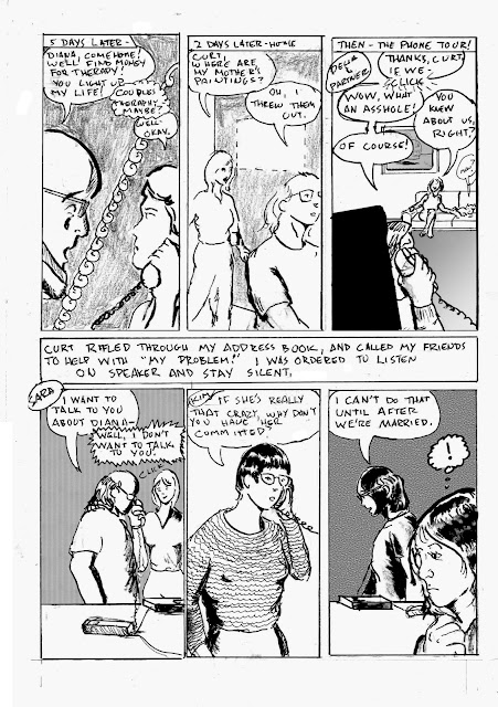
Original Art Sundays No. 295: Sharp Invitations: Curt, p. 26

 Hi, all. I hope you got something out of the little piece I did on 1/6 (arguably as important as 9/11, both days when our proud nation was attacked). We're back into it with a challenging page.

At the end of the last page, our heroine was evicted from hearth and home. Read on.

I may have made this page harder than it needed to be, but I'm fairly happy with the result. I played with numerous layout options before deciding on two tiers with exposition block in between. The one drawback is the last panel on tier one comes before the exposition. But I decided there was sufficient context to pull it off.

Strategic considerations: the challenge of land line phones! Though the first hand held independent phone unit was patented in France in 1917 (!), they weren't in common use until many years after the events chronicled here happened. So I used the old saw of phone cords and answering machines, hoping there is sufficient visual context for a modern reader. I also had the issue of showing a missing painting. I opted for a blank wall space with dotted outline. In reality, it didn't look anything like that. I know this page minimizes the impact of someone deliberately destroying family art, or some destroying art in general, but we must choose our moments in this drama. In the third panel, I used the conceit of popping in one of my favorite Surrealist Cowgirls characters. The area needed some weight, so I opted to have some fun with it. The weight in the bottom tier mostly comes from Photoshop patterns and fills. My emotional response to the suggestion that he would have me committed after we were married was not that drastic at the time. I was becoming convinced he was right about me. But I just LOVED Sara's response, just hanging up on him! He made 5 or 6 more calls not included in this page. Going into meticulous detail over such things would bog down the narrative.

The initial panel strategy for this page was so boring! Head shot, head shot, head shot.... blah... then I was re-reading the first run of Paul Chadwick's Concrete, and found a page of phone conversations that used some brilliant and simple visual devices (page 19 of The Complete Concrete). Inspired, I created new layouts for panels 3, 4, 6 and the text block, and popped them in using Photoshop. So this page took two full pages to do! I'm going to tweak a couple little things before this book goes to press, as we used to say.

Not as much pen and brush work as on some pages, but it's always about balance and doing what the page calls for.

Tools used:

  • Canson Bristol (2 sheets)
  • Nib holder and pen nibs
  • Lead holder and no. 3B leads
  • 4B graphite stick
  • Magic Rub eraser
  • Micron No. .02, .03, .05, .08, 1.0 and brush tip
  • Tight Spot for corrections
  • FW Artists White Acrylic 
  • Doc Martin's Black Star Matte India Ink
  • Photoshop. Mountains of Photoshop.
  • Renaissance # 2 Sable Cats Tongue Brush

I picked up a few new tools while I was preparing for next semester's classes, and am eager for the next page, despite the dire place the story is going.


Tuesday, January 14, 2014

Best Comics of 2013, No. 7: 7 Against Chaos

Really, when Harlan Ellison and Paul Chadwick collaborate, how could the result not make the list?
Chadwick's Concrete remains one of my two favorite superheroes (the other, oddly, is Herbie, the Fat Fury, with James Robinson's Starman as runner-up). And Ellison is - well, Ellison. I'm relieved his health appears to be holding, despite reports of his imminent demise a couple years ago.
Concurrent with the Strange Armor storyline, a Concrete short story appeared in which our heroes visited the home of Dwayne Byrd, a not so thinly veiled reference to Ellison's preferred nom de plume, Cordwainer Bird. The story, Byrdland's Secret, used Ellison's life, work and philosophies as a starting point to muse on the role of art and literature in our lives, and the urgent, almost primal need to cling to a spirit of adventure in those lives.


This story appears at first blush to be old-school space opera- some fun ideas and elaborate trappings. However, as is the case with most of Ellison's work, it quickly becomes something larger than the sum of its parts. An aggregate of strange beings, given singular abilities by the perversion of their forms in the names of profit, politics, power and entertainment, is off on a quest to do - well, something. Only one of them knows their mission at its outset. At this point, it feels a bit like a fairly conventional superhero narrative, albeit a smartly written one.
The plot and its implications quickly thicken.
The stakes are no less than the nature of existence, as a reptilian life form is trying to rewrite not only history, but evolution. Unbeknownst to the rest of the universe, this group of rejects is fighting for the existence of everyone, and should they succeed, nobody will know.
There are several Ellison themes that come into play here. Of course, the humanizing of those considered rejects dates back to his civil rights work, and the classic short story The Discarded. And the tragedy of great work going unrecognized has been a recurring theme in Ellison interviews for decades.
Ellison's proprieties: Sugar & Spike rightly rank with Mount Rushmore in the scope of human achievement!
Paul Chadwick's work here is as strong as anything else he's done. While I cherish the populist notions in Concrete, his vivid imagination is seen in other works, including his The World Below mini-series and one issue of the classic Dr. Strange mini-series, The Flight of Bones. In 7 Against Chaos, he's given the opportunity to stretch thematically and offer some beyond cool science fiction illustration, and he rises to both challenges admirably. The work is reminiscent of the best of the 1960s DC science fiction stories in terms of pure imagination and joy, while holding to a contemporary quality. This is not a nostalgia piece, but it does recognize the value of past works, a challenging balancing act, well executed.
And it's cool to see, and a great adventure to read!
7 Against Chaos begins with a fairly direct, albeit elaborate, scenario and sweeps the reader along to ask complex questions about the nature and purpose of life, all while riding an interstellar roller coaster. In addressing the best of 2013, I've talked about works that have value as pure enjoyment, and works that say something deeper and challenge the reader. This is both. I pray that Ellison and Chadwick collaborate again!
Next: Best Comics of 2013, No. 6, gets lost.

Monday, January 14, 2013

Original Art Sundays No. 147: The Source Cards

Back to post some art in the midst of the final Best of 2012 posts.
And as promised, it's new work, though possibly not what you expected.
At MN's SpringCon last year, the organizers gave creators cards to illustrate. This year being an anniversary, the 25th, they wanted to put together a set of cards. These will be redistributed randomly to attendees. They did this five years ago for the 20th- it's a lot of fun!
So I did my part.
After leaving the card blanks laying on the drawing table to annoy me for months while I completed other work, I finally just sat down and did them right at the turn of the year.
The work is loose and sketchy- hey, they ARE sketch cards- and colored in pencil, though it looks like marker in the scans. I considered correcting the colors and doing some fancy footwork in Photoshop (what we used to call "production art"), then thought, "naaah."
I decided on four of my favorite characters.
First, Dr. Strange.
I was going for a more urgent tone than this conveys. It's OK, but more mood would have been good. Possibly grayscale/monochrome if I work with the Doctor again?
Next, Omaha, of course.
I might like this one best. While it's much looser than Reed's best work, or even some of my own scattered pieces using the character, I think the tone is right. I freely stole the design and palette from one of the final cover variants of Terry Moore's Strangers in Paradise.

Next, Concrete.
Mildly frustrated by this one. I included the title since not everyone knows the character and the cards are being distributed randomly to attendees, but I think it really hampers the overall tone of the piece. The lettering is too cartoony/ baloony. I deliberately left in most of the pencil marks. I think the intent of the cast shadow in the floor stones doesn't work as well as it might.
Still, I've begun to see Concrete as something of a Buddha figure, and this plays into that, obviously.
The whole thing is grayscale, though it looks blue in the scan.
Finally, CHEW!

The Omaha card elicits the strongest idyllic expression from me, but this just makes me smile! I'm about three issues behind, but CHEW remains one of the funniest and most demented comics out there. The earth tones got seriously bumped into the red in the scan. It was much browner in the original. So be it.
Join us tomorrow (actually later today) for the final installment of Best Comics of 2012.

Sunday, July 29, 2012

Original Art Sundays no. 133: Tranny Towers, ch. 35

Two more after this one.

Notes:
Took the black and white motif of the chapter title and played with a typeface I liked to create the logo for this chapter.
It felt good to draw the building exterior again, not seen on-panel since the first strip. I went back to that strip, and to the Little Nemo page I took the basic design from, to be sure I got it right.
It looks a bit like Ricky standing frame right in Panel 3, but it's not intended to be him. Also, note Concrete being shoved aside by Sonia. He shows up again in the last panel.
Yeah, I screwed up and had Sonia shouting her own name instead of her ex-partner Trina's. I can either rationalize it by saying she was distraught (chalk it up to trauma), or I can fix it later, before going to press with the collection. I might just let it be as it is.
The "heat lines" in panel one frustrated me. I put them in, I took them out. It was printed without them, but I put them back for this presentation. I think I'll leave them in.
I'm quite fond of the broken border in Panel 2.
This whole page is about your life being torn apart by something so large it seems elemental (fire, water, earth, air). And she's been one of the two more together ones of our little funny animal trans cadre, so having it happen to her is much more dramatic/turbulent.
Ironically, as I was driving in to work yesterday, there was an SUV in flames at the intersection of Hennepin & Lake in Uptown Minneapolis. Smoke filled the cab, flames licked at the undercarriage of the once- white body. I was thinking about posting this strip right before I saw it.
Next week: after the fire...

Sunday, June 24, 2012

Origina; Art Sundays No. 128: Tranny Towers, Ch. 30

Finally found and scanned all those originals! Huzzah!
I will post corrected scans later this week. It was good reading the story as one unit, and I think my regular readers, if such there be, deserve that opportunity as well.
Right now, let's get to the next chapter.
I really like this one. The backgrounds could use more detail (or some), but the emotional content is there, and I think it's carried by the illustrative choices.
The Shot-Reverse Shot in Tier 2, tight on the eyes, is intended to serve as an anchor to the character's emotions- eyes as windows to the soul and all that. They're seeing the best in each other as they say goodbye.
I don't think I swiped the street sign motif from anyone in particular(possibly some Eisner reference in the back of my head? Not sure), but it's hardly a new concept, and the idea of of the street sign melding with the borders references both Vaughn Bode's use of panel content as border element and Paul Chadwick's more subtle use of the same technique in the Concrete storyline Fragile Creature.
This page serves to resolve a storyline, and as often happens, the resolution implies the dawning of a new day for Dena's character. Originally the flighty pre-op obsessed with looks, clothes, makeup, estrogen and men, she's now had a taste of the - well, not exactly DOWN, but more real, side of the life sh'es accepted as her own.
Simply put, she got hurt a lot and grew up a little. Well, maybe more than a little.
Nobody behaved nobly in this scenario. Both the principals were at fault in different ways. But this gave them both the chance to see each other, and themselves, for who they really were, both good and bad.
In other terms, this is what screenwriter Robert McGee talks of in his lectures on developing character. Both principals have undergone an absolute and irrevocable value shift. They can no longer be who they were before.
Like most such stories, this one is based on a personal experience that I took very badly at the time, but have come to see with a bit more kindness, for myself and for the man involved. It's not our story note for note, but there's enough of our (to torture the metaphor) personal symphony in the storyline that the themes have similar cadences.
And let's face trans and queer folk hardly have a monopoly on lost love, betrayal and their aftermath. It is a fairly universal theme.
Reading over these has made me eager to see the work in a collected volume. I'm developing some old material that was never complete for inclusion to round out the book, and I'm tossing around either doing it as POD or as a Kickstarter.
Tough call, though. I've not forgotten about my two other works in progress, one of which will have some work included in the Fall 2012 MCAD Faculty Art Show.
The work takes the time it takes. It's just a question of doing it.
Next: the final Tranny Towers storyline begins.

Tuesday, April 6, 2010

Thoughts on PCA

As promised, I'm taking a minute away from grading to offer some observations on the PCA National Conference in St. Louis, MO, this past weekend.
Highlights:
Meeting and chatting with Kim Munson, whose body of knowledge on comics art exhibition and legal matters is formidable. She's also great fun to hang out with. Her paper on the NY show was quite revealing! Here's Kim with Trina Robbins from last year's San Diego con!

Photo credit goes to Micheal Dooley!
A bit sad that this was the same weekend as WonderCon. I have much more fun at WonderCon than I do at San Diego, but it's better for my career to attend and present at PCA, so if it remains a scheduling and monetary choice, there's my mandate. It may be better in other ways too- see below.
I also rather enjoyed getting to know Jacque Nodell a bit better. Like Kim's, her blog is linked on this blog. I was quite embarrassed as a comics scholar to not have made the connection to her name, and that her grandfather was the creator of the original Green Lantern! Jaque's paper on the romantic aspects of 70s Supergirl, Wonder Woman and Lois Lane comics was quite engaging.
Here's Jacque at San Diego last year. Not the best vid I've ever seen, but it does give a sense of her energy.


Of course, my old and dear friend Frenchy Lunning made the whole thing possible for me, both by offering an affordable (to say the least) room share and by being a constant support for my career, my work and my ideas. I have such a blast hanging out with her, but I get it that her time is at a premium, so I'm always grateful for what I can get.
Frenchy always finds a different approach to the material, and her view of Ranma 1/2 as a horror text was certainly no exception!
I mean, really. It takes a very flexible mind to see this as a horror story. But Frenchy made a very compelling case!


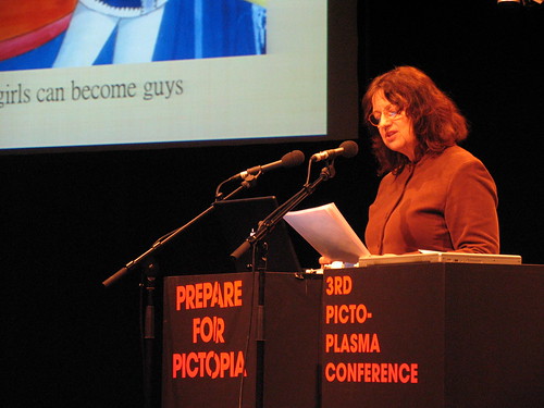
Here's Frenchy in her milieu at the Picto-Plasma conference, one of dozens she routinely attends and at which she offers presentations. In addition, she is the editor and spearhead of the academic journal Mechademia.


Also a pleasure to meet fat studies scholar and performance artist Cindy Baker, whose piece I was sorry to miss.
Some great papers on aspects of Grecian legend in Watchmen, issues of identity in Persepolis, Wendy Goldberg's delightful paper on The Rabbi's Cat, contemporary noir comics, superhero musicals and their failure, the usual spate of papers on MAUS, and Randy Duncan's excellent piece on 17th century Ethiopian manuscript as comic form.
My own piece on hypermasculinity in superheroes as a catalyst for relationship failure and Concrete as a repudiation of that notion was fairly well-received, though I think I could have fleshed out my ideas quite a bit more.
However, I will have the opportunity to do so if my conversation with the rep from U Mississippi press bears fruit and I am able to do an analytical tome on Concrete!
There's much talk about how academic conferences like PCA are more about professionalism and career advancement, and fan-oriented conventions like WonderCon and SDCC are more about fun and industry schmoozing.  But not only did I feel like I advanced my career more at PCA, but I think overall I had more fun than I usually do at comic cons to which I travel (as opposed to our local one, which I quite like).
But possibly the venue is not as important as the opportunity to, in the words of the Wizard, "confer, converse and otherwise hobnob with my fellow Wizards."

Sunday, April 4, 2010

Original Art Sundays # 36: A Private Myth, p. 9

After taking time at PCA to present a paper on the wonders of Concrete, I am delighted to post the next page in this story.

Mostly happy with this one. It advances the narrative, the backgrounds are adequate, and it does some interesting things with the light. Not as successful as I hoped, but better than I thought when I finished it!
At PCA, I discovered that there are more people reading this than I had thought. I'm grateful for that, and hope to post stuff that's worth your time.
I will post more on the wonders of PCA on Tuesday, after I've dispensed with my primary teaching duties for the week and am no longer trying to type with a purring cat on my breast.
Next week, page 10 or a photo with some surprising aspects.