Here we go with the next page.
When we left our adventure, our heroine (me) had just been introduced to- indoctrinated in?- Tolkein.
Read on.

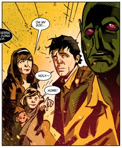
Lots to unpack on this seemingly simple page. In the first panel, there's a quiet family moment. The younger brother reading the comic, a youthful me with a Beatles haircut reading a teen magazine, sporting the disaffected demeanor of a 14 year old. It felt light, so I added textures to the couch and a holding line to define the corner of the room. One of my Beta readers pointed out that the line also establishes division between me and the rest of the visible family.
The second panel went through several revisions. I had settled on a tight close up of Mother's eyes while she read, but I went with a profile shot of her instead. The scope of a stack of books and a random texture for a background got the message across more clearly. The randomness of the stack foreshadows later events in Mother's life. In a caption, I was able to allude to the passing of years with just a few words. This is an old comic artist's trick. How do you draw an army of 10,000 advancing soldiers? You draw two generals talking. One of them points off panel and says, "Look, here comes an army of 10,000 advancing soldiers!" Of course, if you're Al Williamson or Wally Wood, you just draw the furshlugginer army, to quote Harvey Kurtzman (yay, early MAD!). Yeah, I know it's a Yiddish word that he appropriated and that's not quite the right meaning. I'm okay with that. Hey, if it's good enough for Harvey....
The skipped years will show up in the next chapter, the one on my Father.
The final panel is subdivided. I was looking for a better way to convey an old school phone call. I like the visual device of a phone cord as a panel divider, but I've used it so many times, going back to the Tranny Towers strips (I haven't forgotten about my mad scheme to get those ancient scrolls back into print. Soon, my pretties....). The device of isolating each speaker within a larger panel seemed to serve. I toyed with the idea of adding weight through a background texture in the white space between the circles, but it proved distracting in tissue overlays, so I again concluded that less is more. Another possibility considered and rejected: dropping the holding border. I also thought about doing a little arrow text box to call out the early 80s perm I briefly sported, but it seemed distracting and redundant. The perm also foreshadows my first tentative steps to being more publicly femme.Technical considerations: the shape and position of word balloons was embarrassingly bad. I was able to move things around in Photoshop with relative ease.
All told, a simple quiet page that advances the story.
Tool list:
- Papers: tracing paper, various sketchbooks, Canson Bristol board
- Pencils: Lyra 2B graphite stick, 4B lead and holder, 2B Ticonderoga classic, tech pencil and 4B lead
- Erasers: kneadable, vinyl eraser, Click eraser
- Hand Tools: 6" and 14" straightedge, triangle, T-square, French curves
- Inking tools: Dr.Martin's Black Magic ink, nib and holder, Princeton Deerfoot 1/4" mini detailer brush (love this brush!), Escoda Kolinsky no. 4 brush, Richeson Kolinsky no. 2 brush
- Markers: Micron 0.25, 0.6, 0.8, 1.0 and Copic 0.25
- And of course, Photoshop