I like this approach of doing slightly larger batches. Doing one a day gets tedious after a while, no matter how rich the material. While these take me a couple days to get out, it's still faster than taking 2 weeks to finish them off one at a time.
Here are the next five on our hit parade!
10.
Story of My Tits
I'm not always a fan of the graphic memoir/confessional, which is rather odd since I'm working on one now. I read
Story of My Tits grudgingly, expecting some stereotyped housewife heart wringing done by someone who didn't know about comics and didn't care about comics, someone who didn't know how to say something in the form, someone whose perspective was coming from privilege, the way I felt about Lucy Knisley's
Relish. I hate it when people dabble in something that matters to me, and I assumed this was one of those cases.
I was wrong. Oh, I was so wrong.
This is brilliant.
This is Jennifer Hayden's first full-length work. She's a member of the NY webcomics collective ACT-IVATE (currently dormant) and has a collection of her shorter pieces,
Underwire, also from Top Shelf. Her art has that neotenic quality that I often find annoying, but here it works. I think that's because, as in the work of Lynda Barry, there's an underlying awareness of basic artistic principles that influences the work. Hayden comes to comics from the trenches of freelancing in writing and in art, as she details inside this book. Hayden traces her life through her breasts and through breasts in general, talking about her mother's health concerns and then her own.
Hayden doesn't pull her punches, but then she doesn't lionize her suffering either. She has a way of bringing you right there, creating genuine empathy when dealing with cancer and all its implications. She's able to draw on her cerebral and spiritual sides without seeming didactic. In short, she cares about all aspects of her art and craft, and it shows in the final product.
 |
| Ms. Hayden in repose! |
This review is a bit dry in contrast to the emotional impact of Hayden's work.
The Story of My Tits is moving and compelling at all times. Its 352 pages move along at a perfect pace. I once told a department chair that one of two proposed textbooks was thinner and had more in it than the other. That's the way I feel reading Hayden's pages. There's a clear economy, nothing unnecessary, but everything necessary is there.
If the work has a drawback, it's that the reader can see the craft evolving as the work progresses. This is not the end of the creative world, it's just that earlier pages appear to be slightly less resolved than later ones. I suspect that some later pages were done before some earlier ones, based on the relative skill levels of these pages. As Hayden points out in the text, there's much more to doing comics than there is to either writing or art as solitary disciplines.
But please don't infer from that that the earlier pages don't work. They're successful, just less successful than later pages. I'd like to see Hayden break out of her 4-panel page grid and give less "luxury border" margins. There's a lot of air on those pages, Ms. Hayden!
Those minor quibbles aside, this is a strong work, grounded in tough material. I eagerly await future volumes.
9.
Wuvable Oaf
 |
| Ed Luce at Autoptic |
I met Ed Luce at Autoptic this year, and we had a brief but intriguing talk about challenges of diversity in queer communities. I picked up the Fantagraphics hardcover of
Wuvable Oaf, thinking to support a fellow queer comics creator and not expecting much in the work to engage me. After all, I'm not into bears (a term Ed does NOT care for) or punk rock, which are two of the three focal points of the series (the third being cats!).
As was the case with some other works on this year's list, I was delightfully surprised. This story of a huge man who's deeply into boyfriends, punk rock and kitties is one of the tenderest, most human stories I've read in a long time.
There are some pages that squeal with strangeness, but the overall vulnerability of every major character comes through. This is surprisingly most true of Eiffel, Oaf's on-again, off-again boyfriend (the relationship is much more complex than that simplistic description suggests).
 Wuvable Oaf
 is about frailty and strange humor. The cat with the strange dreams and the ailment that cannot be diagnosed, Pavel, is off-putting and empathetic at the same time.
Luce's art is engaging. I can't really describe it properly, but for want of more accurate descriptors, it reminds me in spots of some of Mark Beyer's surrealism coupled with the clean cartooning of Jerry Mills' great strip
POPPERS. I doubt if that's how Luce would describe it, but that's how I see it. Others, notably
the Comics Journal, have compared his work to Jaime Hernandez and Bryan Lee O'Malley. I confess to not knowing O'Malley's work, but I don't really see the Hernandez comparison.
Wuvable Oaf has a sort of stream of consciousness aspect. It is, after all, a series of short pieces that (mostly) tell one larger story.
 |
| Eiffel in all his diminutive glory |
One drawback is that there are very few women in this book. Is Luce required to put women in his book? Certainly not. That doesn't mean I don't want to see more of them. In
Kyle's Bed & Breakfast, a perennial favorite online strip in the blog list at screen right, women only show up every now and then, but I'm delighted when they do.
I can't find any indication that Luce has new work out, but I hope he does. There are still dangling plot threads and the work is so engaging that I want more.
8.
Lady Killer
Lady Killer was another great surprise, a clever, compassionate book about a 1060s housewife/assassin for hire. Joëlle Jones' book draws heavily on cliche´s of the passive housewife. I mean, come on, she takes out the first victim seen in the book by trying to sell her Avon products. If you must have a standard elevator pitch, think
My Little Margie meets
Kill Bill.
It's good to see Dark Horse branching out. As previously mentioned, DH took a bit hit when they lost the Star Wars franchise, and they've rebounded with some very creative books. I don't know if the sales have echoed the innovation of the work, but I do know a second series has been announced for this year. To

quote Jones from a Mary Sue interview: " The family has relocated to Florida and Josie has decided to go into business for herself. That’s it. That’s all I’m saying."
The art is precise, jagged and engaging. Jones does the art and shares the writing credits with Jamie S. Rich.
It's also good to see women doing noir, even satirical noir. I had a frustrating conversation with James Ellroy during a radio call-in show. Ellory contended that it was impossible for women to write noir, that noir was a male genre by definition and necessity. I didn't yet know Patricia Highsmith's work at that time, so I didn't have a proper rebuttal. If I could talk to Ellroy again, I'd throw Jones at him as well.
Lady Killer, already out in trade and available from your local bookstore and library, approaches the genre with wit and verve. The adrenaline pumps reading this one, folks.
7.
Invisible Ink
A surprise, to be sure. I always detected an undertone of melancholy in Bill Griffith's wit, and this memoir goes a long way to showing why.
Invisible Ink starts slowly and quickly builds to a maze of ideas and possibilities.
 |
| Griffith and Lariar in session! |

The story of Griffith's mother's longtime affair with cartoonist Lawrence Lariar, known for his "peanut" figures and books on cartooning,
Invisible Ink is a meditation on the complex relationship between mother and son, a comment on the nature of cartooning as an art form and as a profession, and an unanswered question: what if this man had been my father?
Griffith begins the story with some detective work following a funeral. He quickly jumps to the most frustrating and elusive type of detective work, discovering one's self.
While Griffith never fully abandons his own style, and spends time coming to terms with his own characters, including the neglected Mr. the Toad, he does have some fun playing with Lariar's style and musing about incorporating it into his own work.
Like Griffith's early work in
Young Lust Comix, this book is a surprise, and a welcome one. Most of Griffth's work of late has built on the success of the Zippy comic strip- a deserved success, to be sure, but one that has become a bit predictable of late, after almost 30 years!
Invisible Ink resonates with such emotional force and introspection that it's difficult to contemplate the fact that this was his "evenings and weekends" project. I am quite eager for his next long-form work, a biography of Schlitzie, the microcephalic from Tod Browning's
FREAKS who was a primary inspiration for Zippy.
The last few pages of
Invisible Ink are silent, a remarkable and fitting way to end such a thoughtful book.
 |
| Griffith at the Billy Ireland Cartoon Museum, October 2015 |
6.
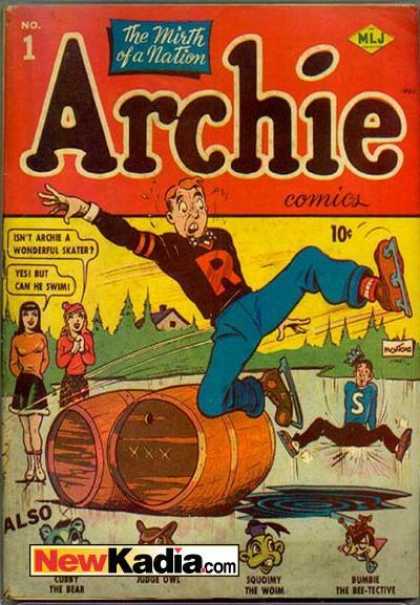
Archie
There was a bit of a tempest in a teaspoon earlier this year when Archie comics tried running a Kickstarter to fund their new comic line. Now, several well-established creators and businesses have used crowdfunding platforms since their inception, but the Archie one touched a nerve. There was a hue and cry on the Interwebs, O my brethren, and much gnashing of teeth about the effrontery of this corporate giant intruding into the realm of crowdfunding. About two weeks into it, the campaign was pulled, with apologies from the instigators.
However, true to their word, the Archie publishers bought out their latest new take on their main character, begun 75 years ago(!), on schedule.
And it was good.
Mark Waid, whose work I've respected on many titles including a great
Dr. Strange miniseries and "Unthinkable", arguably the best Fantastic Four storyline since Stan Lee stopped writing the book, has made Archie Andrews plausible without losing the character's Henry Aldrich universal appeal. Fiona Staples' art is just right, a compelling realism with just a touch of the cartoony quality we've come to expect from the Archie line.
It needs to be said here that I make no apologies for liking Archie comics and I never have. While they are insipid when they're at their worst, they are, more often than not, fun and exciting, and reflect the times in which they are created. Since the character was created as a sort of Everyman response to Superman, it could be argued that Archie Comics are precursors to the underground comix movement.
This Archie is every bit as hapless as earlier interpretations of the character, but with a touch more vulnerability. In previous Archie incarnations, even in the recent
Married Life and
Death of Archie storylines, there was always a sense that Archie would prevail in some odd way. In the Waid
Archie series, there's less certainty about that. And that's somehow very reassuring. Archie's relationship with Betty is much more complex, and Veronica has just been whisked into town by her father, there for business reasons. All the pieces are in place, and the story is unfolding briskly but gradually. As of this writing, the second story arc is due to start any week now.
I'd be remiss to pass up mention of Chip Zdarsky's fine work writing
Jughead. As ongoing characters, the best vehicles for imagination in the Archie line have been Little Archie (especially the Bob Bolling issues) and Jughead. The cynic/dissident/iconoclast figure, Jughead has consistently been used for fantasy. There was even a brief title,
Jughead's Fantasy, that dealt with nothing but that. In the current title, originally featuring art by Squirrel Girl's Erica Henderson, a delicious pattern has evolved. Jughead is confronted by corrupt authority (also a theme in the current
Archie book, as Principal Weatherbee has been replaced by a nefarious authoritarian), has a fantasy that ties back to the crisis at hand, and has a revelation that leads neatly to the next chapter.
Though I was glad to see
Cosmo, the Merry Martian revitalized briefly, most of the recent updates of the Archie line were less aesthetically successful than the current one. I hope the creators can sustain the high level they've set for these titles.
I've always thought Archie was kind of cool. It's nice that these books give the rest of the comic world a chance to catch up with me.
Next: Best Comics of 2015, Numbers 5 - 2.


