Sunday, June 25, 2023

Original Art Sundays no. 366: Sharp Invitations: Esther's Hands, p. 8

 This one took a bit of doing. More about that in a minute.

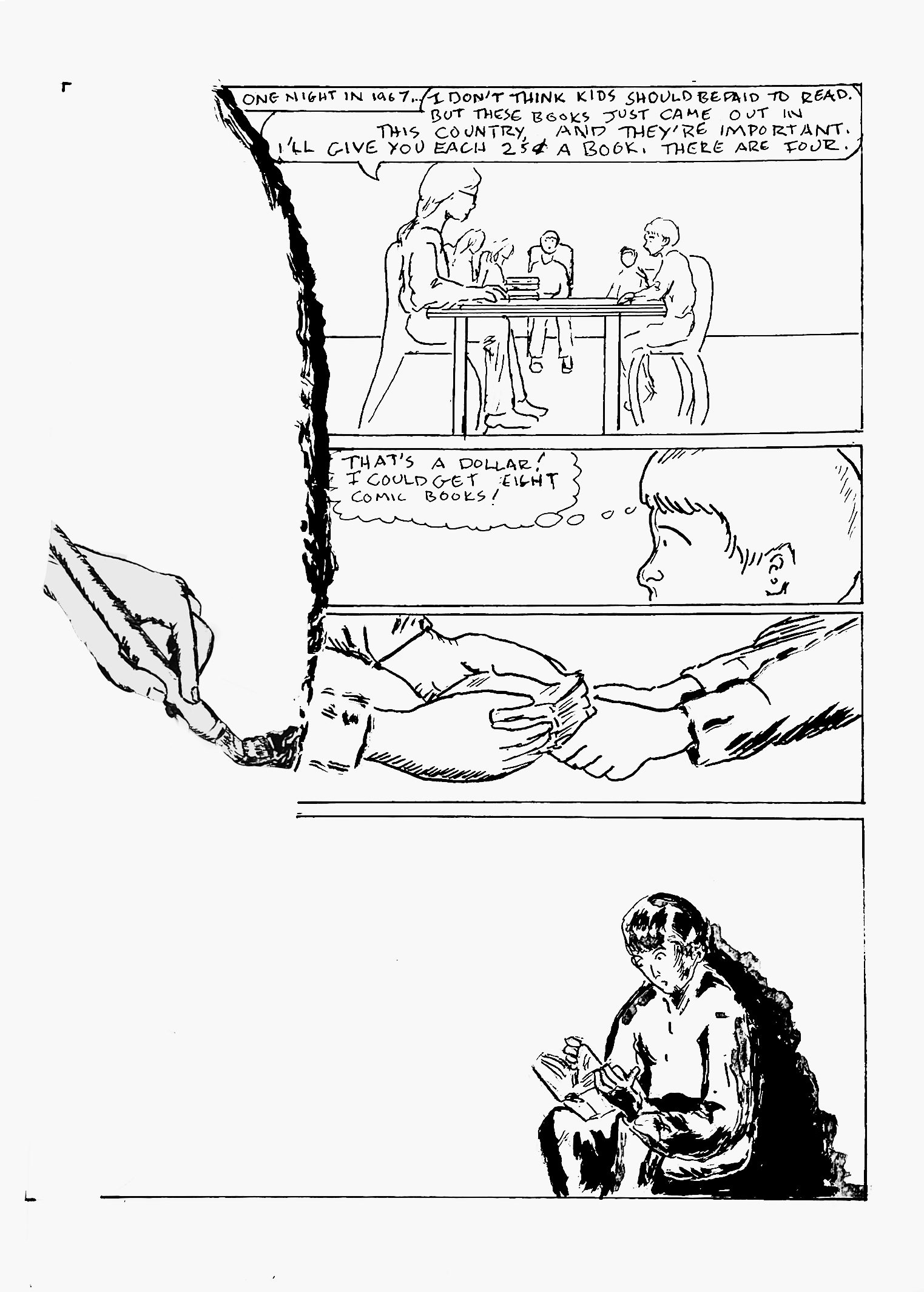
For now, let's resume our story. Mother had just gotten some books, freshly published in the US(o so she thought) . In an unusual move, she offered to pay us to read them, and I took her up on the offer.


The astute Tolkien scholar will be aware that Mother was wrong. The first US publication was in 1954-56, with paprback volumes first appearing in 1965 from Ace Books. Editor Donald Wollheim contended that the works were public domain and printed them without approval. Due to fan pressure, this edition was withdrawn and Tolkien was paid a nominal royalty. The Ballantine paperbacks, the edition Mother got us, appeared in 1966, making the NY Times bestseller list. So Mother's claim was true, sort of, to the best of her knowledge.

I'll talk about my reaction to these books on the next page. These stories intertwine, and focus becomes crucial. I have to keep this chapter of the story about my relationship with Mother, and how it effected my life as a trans woman.

On the mechanics of this page: I had one of those "see the page in my mind" moments. When I started looking closely at the mental image, I realized it was pulled from Hildebrandt illustrations, the first Lord of the Rings movie, and this image by Rowena Morrill.

Sigh. I do love Alfred Bester.

I resolved to push the contrast by working with Coquille paper. This is a texture I love, and during my undergrad, I began a sequel to The Devil and Daniel Webster using this medium (another incomplete work!). I realized my plot was much like William Messner-Loebs' neglected work Welcome to Heaven, Dr. Franklin, so I moved on. But it was time to go back to Coquille, or as it's now marketed, stipple board.

I worked up numerous preliminary sketches, diligently laid out the page, redrew the hand holding the brush and the kid in the corner reading to take advantage of the board's texure, and dove in, working to capture the urgency of the encounter with the Balrog. The result was not without problems.

It works in part. Gandalf's pose is successful. I love the Balog's head, but the proportions of the rest of the critter- yeesh! Also, I dropped his bat wings off somewhere along the way. The bridge and the cavern work, but do not have the impact I hoped for.

What to do?

I mused on other possibilities. Different interpretation of the beast? Different angle? I liked the big dramatic moment aspect of this, but it just wasn't working. It was great fun to draw, but the end result just didn't have it. I had to accept that there was no saving this, at least not within my self-imposed deadline.

I resolved to keep the parts I liked and move on from the rest. 

Around the same time, Mother used to read the work of self-proclaimed psychic Edgar Cayce (but really, aren't all psychics self-proclaimed?). Late in her life, I asked her why, since it was so far afield from her beliefs. She got one of her classic introspective expressions and said, "well, I look at a lot of ideas, keep what's of value, and discard the rest." That's a good philosophy for resolving art and storytelling problems. I also realized that since so many skilled artists have tackled this material over the decades, I was setting myself up by trying to match or exceed them, and resolved to just compete with myself- never easy! I went back to my 64 page outline and looked at the rough for this page. It served as an effective model, a viable alternative. Again using stipple board, I did the primary illustration for the more successful page that leads this post. I composited it with border elements from the less successful Balrog page, and achieved a satisfying result. I could have gone another version, but again, deadlines. 

I wanted to give a sense of both the reader's involvement with Lord of the Rings and the thrill of the work itself. 

I greatly enjoyed working the China marker and scumbling brushes. This page (pages) took much longer than usual, but I was having such fun! I like working in loose flowing lines and textures. The pages and images that satisfy me the most tend to use these. I seldom do battle scenes. I want to be better at them, so I should do more!

Materials list is extensive on these pages.

  • Papers: tracing paper, various sketchbooks, 32 pound stipple paper
  • Pencils: Lyra 2B graphite stick, 4B lead and holder, 2B Ticonderoga classic, China marker
  • Erasers: kneadable, vinyl eraser, Click eraser
  • Hand Tools: 6" and 14" straightedge, triangle, T-square, French curves
  • Inking tools: Dr.Martin's Black Magic ink, nib and holder, Princeton Deerfoot 1/4" mini detailer brush, Escoda Kolinsky no. 4 brush, Richeson Kolinsky  no. 2 brush, red ballpoint pen
  • Markers: Micron 0.6, 0.8, 1.0 and Copic 0.25
  • And of course, Photoshop

Next: book club and a parting of sorts.


Sunday, June 18, 2023

Original Art Sundays No. 365: Sharp Invitations: Esther's Hands, p. 7

 Once more into the adventure!

When we left our hapless/intrepid family, the kids (us) were coming into their own, slowly. Mother had begun taking painting classes on night a week.

One night, she had news.

Continuing the brush stroke motif from last page. This motif will carry on for one more page.

Story and art notes intertwine on this page.

The astute observer will note that the hand has moved down the page a bit, but the left panel border is still defined by the implied brush stroke. In the original art, I had the hand a bit higher on the page, but it was too close to the location on the previous page to imply motion. Minimal corrections on this page, primarily eliminating the local color of the paper in Photoshop. I sometimes have luck with the Threshold command in this process, but with the bit of wash on the last panel, that wasn't an option today. Threshold has an almost bitmap effect, making everything rather stark and dropping gray values.

I am reusing the rather static panel with everyone sitting around the dining table as an establishing image for the page, with some minor changes in pose and slight aging of the kids. Perhaps the aging is too subtle, but my Beatles haircut was on point for my age of 14. I don't know if there will be a page in the book for this or not, but I was originally forbidden to listen to The Beatles. Once they got a Saturday morning cartoon show, it was somehow okay.


I learned to draw The Beatles in this style by copying a TV Guide article on the cartoon series!

There may or may not be a chapter on music at some point. It's such a huge part of my life, but I do want to keep this book focused on the main theme (and under 500 pages!). I have to focus on the three things this book is about: growing up relatively poor, trans identity and domestic abuse.

The art in the last panel is slightly more complex than my usual work. This is a lead-in to the next page. 

Tool list, just because it's been a while:

  • Sketchbooks
  • Canson Bristol Board
  • Lead holder with 4B leads, 4B pencil, graphite stick
  • Plastic eraser, Click Eraser
  • Whiteout pen
  • Dr. Martin's Black Star Matte ink (full concentrate and wash)
  • Pen nibs and holders
  • Brushes:  Grumbacher no. 2 flat, Escoda no.4 Kolinsky, Princeton 1/4" mini detailer
  • X-Acto #11 blade, cutting matte
  • Photoshop
Next: the books being read.


Sunday, June 11, 2023

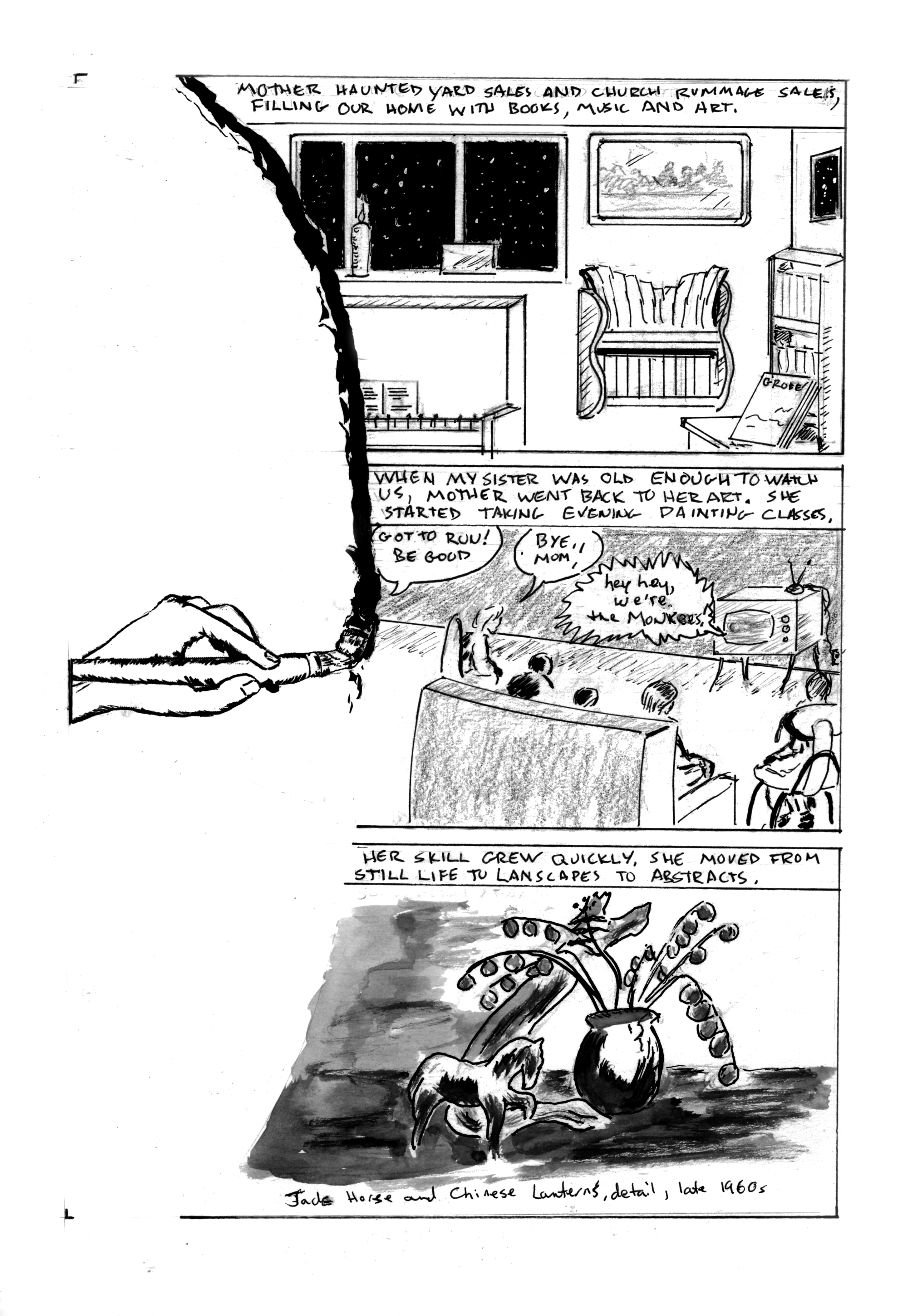
Original Art Sundays no. 364: Sharp Invitations: Esther's Hands, p. 6

 On to the next page of our story. I rather like this one.

When we left our family, Esther was starting to pull her life back together while she raised five children alone.

Now that the framework is solidly in place, we can get to the meat of Mother's story. 

Story notes: As Mother started to come into her own, so did the kids. We were finding our own voices, developing interests. Like many kids of the mid-late 60s, we bonded over TV. My sisters and I developed a fascination with The Monkees. I stuck with them more fervently than my sisters did. We often took the books, art and music that surrounded us for granted. That was soon to change. More on that on next week's page.

Art notes: The visual device of the brush stroke defining the left border of the panel will be repeated over the next two pages. I worked up a decent sketch of a hand doing a brush stroke, scaled it and printed a few copies. It will serve as a unifying narrative device. The first panel is from photo reference, with some liberties in perspective, intended to show that our lives were full but a bit off-kilter. For the middle panel, I tried 6 different layouts - Mother running out of the room, Mother looking back as she leaves, the closeup of a child's eye with Mother leaving in the eye, and so on. I finally resolved that even though this is her chapter, she doesn't need to appear in the panel at all. In fact, this page is unusual in that there are no face shots of anyone! This is almost like leaving myself out of a page. I've noted before that most graphic memoirs show the creator/subject on every page. Alison Bechdel broke this rule in her two most recent memoirs, but not in her first, Fun Home. I don't know if it's as much a rule as just the way things work out. At any rate, it's refreshing to shake up reader expectations as well as my own.

The astute viewer will note that the furniture and room layout are slightly different than previously represented. This is both artistic license and an acknowledgment that time has passed. 

For several years after Mother passed, I made small books reproducing her art and writing for the family. For the last panel, I scoured one of those books, and found a work that was period specific and had a good range of gray values. Rather than incorporating a photo of the actual painting, I opted to do a wash rendering of it. 

I'm happiest with my work when I let it flow. A solid layout is a tool, a means to an end, not an end in itself, to paraphrase Robert Fripp. I've been revising the master book, as mentioned last week. In noticing what works best, the most successful pages are those where I just explore visual ideas to advance the story. As an artist, I seem to be escaping the confines of my own expectations, whatever that means!

Finally, I re-titled this chapter from the outline. It's not about hands the same way songs like Bill Withers'  Grandma's Hands (which I love even though he sings flat) are about hands. It's not about specific things the hands are doing. I am spotlighting hands throughout this chapter. Their appearance and actions reinforce different parts of the story and character. I hope that's clear. I'm not sure how else to articulate it.

Next: the brush stroke continues.


Sunday, June 4, 2023

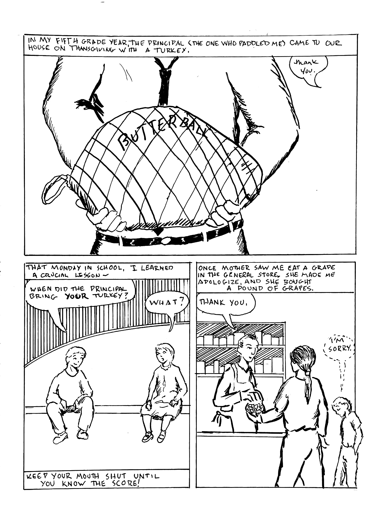
Original Art Sundays no. 363: Sharp Invitiations: Esther's Hands, p. 5

Next page of the story. For continuity, this story comes after the squirrel story and before the job story. I've been reorganizing the book. While there's still much work to do, I'm pleasantly surprised by the progress I've made. 

When we left, Mother was patching together a life for herself and her five kids.

I made a text change to the previous page, throwing in a line about my baby brother. I am reposting that before the new page.


Hm. Posting multiple pages reinforces narrative. I've made this observation before, but it's easy to forget. 

When I started this book, I prepared a 64 page outline/template. This part of the story was a point where things were about to change for the better. I reviewed the outline, and found I was about to leave out some vital background information. After a couple experiments, I found the layout in the outline was almost exactly what was needed. This page sets up the evolution of the family and builds on my childhood. It also shows Mother's character in the grape incident! To this day, I try not to "sample" in stores.

Art notes: This page is sparse, but it works. I'd like to push these pages a bit farther in terms of light/dark, but my work tends to be fairly bright. More dark on upcoming pages, so perhaps balance is a good thing. I made a layout gaffe in setting up the page, but was able to make it work anyway. Fortunate, since I didn't discover the problem until I was almost done! Using the old saw of adding line for background texture in panels two and three. First panel: maybe it could be darker. I tried a couple things on overlays, wasn't happy with the results, and decided to leave well enough alone.

In the original layout, the turkey panel was another group shot. I didn't want to overuse that, especially as we had a full family shot on the previous page, so decided to just do the bird, so to speak. In general, a pretty straightforward page. Necessary to the story, but not stunning. I'm happy with it anyway.

New tools this week: Added a .25 Copic marker and a Pentel click eraser to the toolbox. Otherwise, largely the same as on past pages.

Next: the brush.

Sunday, May 28, 2023

Original Art Sundays No. 362: Sharp Invitations: Esther's Hands, p. 4

 Back in the saddle again, with another page. This one took a while, mostly due to other time commitments. The page itself was a simple enough page, but it gave me fits. For some reason, I couldn't get it to work. It was a serviceable page, but so dull. The first tier was okay, but the second tier- snore.

After several false starts and a collaboration with Kevyn Lenagh, creator of Domino Chance, I came up with a pragmatic approach to the second tier. Split out the right panel into two, and change the perspective on the first panel. I was finally able to put the page to bed today. I was pleasantly surprised that she liked the page more than I did!

When we left off, Mother had four kids, and Dad, who was away on military duty, had just met someone - else.

Narrative notes: At a family reunion recently, I talked with my sister and my cousin about the ethics of naming names in this work. Their view was that if someone is living, they should not be named. I don't completely agree, but when I'm done with this work, before I go to press, I will delete the name of Dad's second wife. In the text of the first panel, I bounced back and forth between "your kids" and "our kids." I landed on the former, thinking it was consistent with his abrogating responsibility while she didn't. A crucial detail, the fact that Mother was pregnant again when Dad made his announcement, was left out of this page, but will be worked into the next page. I alluded to it by having 5 kids instead of 4 at the dining room table.

Visual notes: This page is intended to provide more background. It is, of necessity, a "workhorse" page. With the framework in place, I can be more adventurous on the next page. The top tier is fairly effective- the old saw of the phone cord works on pre cel phone stories. I like the graphite as night in panel 3. Panels 4 and 5 do what they should do and advance the story, but still lack emotional impact. In this case, I reluctantly decided that it was best to let the text carry the story. I kept the original top tier and reworked the second tier on a separate page, then went into Photoshop and mashed them together.

No tool list this time. Pretty straightforward.

Next: the kids grow a bit and Mother starts to find her way out.

Sunday, March 12, 2023

Original Art Sundays No. 361: Sharp Invitiations: Esther's Hands, p. 3

 Here we go with the next page of Mother's story.

This is another text heavy page. There's a need to communicate a lot of information in a short time to get to the part that's essential to this narrative.

While the whole family history is challenging and always full of surprises (as noted by my sisters in their genealogy research), I want to keep this about the prime foci of this book: class issues, trans issues and domestic abuse survival. To tell that story (my story), I must leave out a lot of peripheral matters, no matter how interesting they are. Distill the story to essentials.

There's also the issue of ethics. I talked this chapter over with my sister, who is very private. I will only include the names of siblings and other relatives when absolutely essential to the story. 

Art notes: I could have just used photos again here, but I wanted to spend some time hand rendering from reference. The bar scene is obviously pure speculation, since I only know in very general terms when Dad and Audrey met, and not under what specific circumstances. I debated giving her a pseudonym, but since their subsequent marriage is a matter of public record, I didn't see any point. More about her in the next chapter, the one on Dad. The point here is to quickly establish the foundation for my relationship with my Mother as it pertains to the issues in this book.

Art and process: the old school photo border on the top image isn't part of the original photo, but I think it serves the theme of the page. For the second image, I just hunted up 1950s images of officers' clubs and cocktail parties, and put together something plausible. Basic tools on this page, with almost all the lettering done in Photoshop. I went to an old device for the border on the second panel- hard rule in pencil and freehand the inked border. I haven't used that device a lot in this book, but it works here.

Next: Mother's story meets another story.


Original Art Sundays no. 360: Sharp Invitiations: Crooning (single page story)

 Okay, doing two posts today. I missed a couple weeks, partially due to a positive COVID test and dealing with my health and navigating the health care system. I'm on the mend, and have rallied enough to create more work.

First up, something more from the Curt story, or at least from that time frame. Delia and I were walking downtown in Minneapolis, and....

(giggling at the memory)

Actually, we just traded some lines from Hendrix's Hey Joe, but it works better this way. This was a nice bit of fun. It's been a while since I did a single-page gag story. I broke my own rule and used more formal tools on this: pen and ink, markers, Bristol board. When I've done these in the past, they have been freehand with ballpoint pens on typing paper. But I wanted to be a bit tighter with this one and maintain that loose airy feel. As is often the case, I second guess myself a bit on backgrounds, but I'm pretty happy with this. And it's a good gag, even with the cornball "round of applause" in panel 5. The characters in background in that panel are sketchy, much like those in some panels of Omaha.

I also wanted to give the street person respect. They don't get enough of that.

Next: back to Mother's story.


Sunday, February 19, 2023

Original Art Sundays No. 359: pin-up page: Blue Wild Abandon

 Taking a day away from the big story. It's my birthday today, and I felt an impulse. Yeah, the graphic memoir is important and I like doing it, but as anyone who's worked in nonfiction (even creative nonfiction) knows, there are certain constraints. Some things HAVE TO BE RIGHT, which can stall the creative drive. Plus, have fun with your art!

There's this character who has been popping into my sketchbooks and ideas in various forms for years. She's starting to take shape, but she's elusive! It started with the title van Dyke Parks song from Clang of the Yankee Reaper. The song includes the line "out in the blue wild abandon." I was charmed by the line and thought it would make a great character name. Eventually, she tied into the random sketches. An idea tickled me. I came to see that was the name of that character, and finally the story takes shape. I did post a sketch of her during Inktober this year.

I won't say a ton about the story here, other than that it's an homage to a favorite Western, Have Gun Will Travel. I particularly like the moral challenges in the episodes written by Harry Julian Fink, and I hope to capture that tone and energy in Ms. Abandon's stories.

I thought about making this a book cover, but soon realized that it was an old-school pin-up page, like they used to do in 60s Marvel comics. So fun, so exciting!

So many decisions! I have a very specific look for her. I need to work up some model sheets. This is very close, but not quite it. Her assistant is Marilyn, the robot who also debuted in this year's Inktober scrawling. That's vital. The assistant character in the source series is Kim Chang, called Hey Boy for much of the series. While the show made a genuine effort to overcome the racism of the era, it's still there, and Blue's helper cannot be such a character. The robot with a personality is also a tired trope, but I have schemes to make Marilyn a fresh character.

So much fun playing in Photoshop on this. I want to do some hand painted pieces of her, but that's another day. The first book is plotted and preliminary character sketches are in place. The book will be B & W with color covers. And there may be paper dolls in her future....

Mostly conventional tools on this. Bristol, pen and ink, brushes, erasers, straightedge, a little whiteout. It turned out well.

Next, back to the memoir.

Sunday, February 5, 2023

Original Art Sundays no. 358: Sharp Invitations: Esther's Hands, pp. 1 and 2

 Into the next chapter!

This will be a bit faster and less emotionally charged than the Curt chapter. Planned and drafted at 10 pages, probably come in around 20. This chapter deals with my relationship with my mother, and with how she handled my transition.

This chapter comes before the chapters on work, surgery and Curt in the final book.


Very open layout on these. I plan to use her style in drawing this as much as possible. Since her style and mine are similar anyway, this shouldn't be a challenge. These pages are necessary background. I toyed with just doing the first panel, the horseback shot, in pencil, and finally decided to leave the soft background in pencil and do minimal erasing. The wedding party photo is not my work, of course, but it does belong here. I considered re-drawing it, and opted for straight photography instead. Both schools of thought are valid. In Fun Home, Alison Bechdel renders photographs, but The Magical Tack of Long Tack Sam uses photos, objects, collages.... it's a memoir. Go with what works.

Pretty much the standard tool list on these, a bit heavy on the Photoshop. I did use a new #1 brush on that first panel. 

Next: marriage to a serviceman, kids, complications....

Sunday, January 22, 2023

Original Art Sundays No. 357: Sharp Invitations: Curt, final pages

 Hi again.

Took an extra week to complete these pages. I hope you'll find the wait worthwhile!

When we left Diana and Jenny, they (we) were motoring back from Curt's trial in Madison. Please join us for the aftermath.


That concludes this chapter. 

It was such a humbling experience to have the people who survived all this with me, the women who put up with this nonsense, beside me at its culmination. Like Pete Townshend said in Somebody Saved Me, all I know is I've been making it- there have been times I didn't deserve to. I really don't know if I believe in ritual power or not. But whether we were invoking outside forces or giving me a healing moment of catharsis, it worked. And I'm sure his dying shortly after the ritual, 250 miles away and unknown to me for 10 years, was coincidence. Really, pure coincidence. You can't prove a thing. You got nothing on me, coppers!

I'm tempted to include a section on repercussions, to talk about how these effects scarred me in unexpected ways over the years. But I have other things to say before the book is done, and some of that will present itself in the coda.

My original outline, based on the ten chapters in my 64 page draft edition, was to deal with this as a small part of my life. This chapter comprised 10 pages of the outline. Turns out I had more to say about it than about some other parts. Ultimately, the book is about three things: trans stuff, class issues (to a small degree), and surviving in general, with surviving abuse as a specific aspect of that.  One of the original ten chapters is gone. It's a good story, but not for this book. The remaining chapters will cover my mother (6 - 10 pages), my father (about the same), sex and sexuality coupled with gender concerns (another 12 pages as now planned), and the coda, which ran 12 pages in a recent rewrite. About 50 pages, give or take.

Then it's done, aside from edits (assuming I get a publisher).

My big concern about the book is that it not be too grim, sad, or unrelenting. I've known plenty of joy along the way, and I want that to come across too.

Art notes: 

Getting a handle on these pages was a challenge, the second page more than the first. These are fairly static, minimal action pages. On the ritual page, there was one big action that served as the focal point. I'm not a big fan of sound effects in my work. I played with adding something here, but it didn't really gel. Technique is pretty straightforward on these, with minimal Photoshop corrections. I'm developing my own set of tools as the work evolves: sparse backgrounds, use of gray value from pencil to weight the visuals of more airy pages and panels, and a deliberate sense of framing. That last drawn panel on the second page turned out okay- everyone sitting around the table celebrating quietly. The final page is lifted verbatim from the draft edition. What can I say? Sometimes it's right the first time. I just took a traditional 35mm photograph from back in the day, scanned it and added text.

The tools used here are much the same as on the previous posted pages, so no updates necessary. I did get a porcelain escargot dish to use for inking, based on the recommendation of Terry Moore, and it's pretty cool.

Next: the chapter on Mother begins. I will need to find a better title for that one! In the draft the title was Esther and Gandalf, and I don't care for that at all now!

Sunday, January 8, 2023

Original Art Sundays No. 356: Sharp Invitations: Curt, p. 56

     Now that finals are done and the new semester is a week away (again teaching Comic History and Rock History- what a dream semester!), it's back to our story.

     When we left our heroine, the trial of her abuser was winding down.

    Read on...


This page gave me fits. So simple, yet it proved so elusive. Not much happens here in terms of story. The big moment was the verdict, of course. I've condensed that phone conversation to a few lines in two panels. In the real world, we talked for about 20 minutes.

My friend John, seen for the first and possibly only time in this book, is John Sinks. John was my dearest friend in high school, and taught me so much of life. He instilled love of prog rock and film art in me, and went on to do sound for King Crimson until his untimely death a couple years ago. 

The art.... aagh. So simple yet so frustrating. I had a major block on the simplest things on this page. I think I was just overworked by extra demands at semester's end. The page felt so visually light! I turned to some classic devices to give it a little weight, and while hardly my best work, I think the end result is serviceable. Lots of visual cliches on this page, but in this context, that's okay. I'm just happy to have the page resolved cleanly.

I've done a bit of other work in the interim, and will post some of it soon.

The equipment list is pretty much the same as the last page, so no real need to repost this week.

Next: two pages, closing this chapter.

Sunday, November 27, 2022

Original Art Sundays no. 355: Sharp Invitations: Curt, p. 55

 Back in the saddle, so to speak! Last week was just too hectic, but we're back on track.

Last week, we saw my court testimony against Curt. He was on trial for disorderly conduct (reduced charge) after his actions against me the previous December.

Read on.


Courtrooms are pretty bland places, visually. This is intentional, to a large extent. Neutral surroundings give advantage to neither side in a conflict.

This courtroom is reconstructed from memory and a few photo references. I added the painting on the wall to give the panel a little weight.

Other art considerations: Panel one is partially open. This is to slow the pace a bit. The full figure echoes the first page of the narrative. The very first panel of the story is me full figure. The kitchen setting and me drinking tea (or is it coffee?) was a whim. The open cupboards are another opportunity to give weight to a very light page, visually. I used the heavy blacks in panels 3 and 5 as counterbalances- one on reader left, one on reader right. I got sick of not being able to control my whiteout, so I got some more options, including a whiteout pen that gives great coverage and is very easy to work with. The texture behind him in panels 4 and 5 was the same thing, just to add a little weight and texture. Very light Photoshop this week. Just some Levels and Curves work, and a slight correction for distortion in the scan.This one was pretty clean.

Focus is never my long suit. I'm thinking about my classes for next semester, while I wrap up the current semester (3 weeks to go!). Along the same lines, I have sketches and notes on the next two major projects, and I'm putting together a small book of completed works. All the while, I'm planning and re-planning the completion of this book.

Here's this week's tool list.

  • Canson Bristol Board
  • T-squares, triangles, straightedges, Ames lettering guide, erasing guide
  • Pencils: Ticonderoga 2B, Derwent 6B and 3B, 0.3 tech pencil and Ebony pencil
  • Inks: Quill nib and holder, Dr. Martin's Black Magic matte ink, Copic Multiliner Brush Small, Microns .005, .02, .03, .05 and .08
  • Kneadable and plastic erasers
  • FW Artists' Acrylic White and Tight Spot correction brush, Whiteout pen
  • Photoshop


Next: the verdict is in.

Sunday, November 13, 2022

Original Art Sundays No. 313: Sharp Invitations: Curt, p. 54

 Court time!

Testifying against the abusive ex!

Narrative notes: As has been happening, this is an abridged version of my testimony. Actual court proceedings are slow and detail oriented, and don't usually make for good storytelling. He really did loudly whisper that to his attorney! I still have that Ankh necklace, and that dress. The dress no longer fits, but I've always loved it and can't bring myself to part with it. The second panel on the top tier could read as abridged testimony, which it is, or as broken phrases due to the raw emotions on the stand. While the former is the truth, both are valid readings.

Art notes: Courtrooms are really kind of boring places, at least visually. They have to be, when you think about it. It's not about the place, it's about what happens there. The backgrounds are sparse and the lighting is very even. Doesn't make for an exciting view. I moved the "camera" a bit, always just on the one axis, to give the page some visual dynamic. This page is completely pen and ink, aside from the corrections. The background completely drops from the bottom tier. This is a deliberate narrative choice. I wanted to push aside everything except the testimony at that point. This page got very messy in scanning for some reason - a ton of little artifacts! I did the usual Photoshop tricks: levels, dust and scratches, threshold. But it came down to tedium with eraser and brush tools. It's not my best page, but it works.

Next: one more page of court, possibly two if I can't resolve a layout challenge, two pages of aftermath,  and a page of goodbye. Then this chapter is done.