Wednesday, January 7, 2015

Best Comics of 2014, no. 11 (tie): Doomboy and Sing No Evil

Posting a day late. When I got done with work yesterday, all I could do was sleep! I took an extra day to recoup my energies, and am now catching up.
Today's adventure is a bit musical.
That's like saying the Chicago Fire was a weenie roast.
Since I saw The Monkees, Dave Brubeck, Steppenwolf and Jimi Hendrix, in that order, between the ages of 14 and 15, music, especially rock music, has been almost as big a part of my life as comics. So it's no surprise that I'm fascinated with the overlap of the two.
There have been some wonderful moments in this arena. Steve Leialoha's story of his experience at the Altamont fiasco (I believe from the Gates of Eden one-shot) is fascinating. There is a spate of stories featuring The Beatles and Beatles pastiches, and great stuff like the Sienkiewicz/Green biography of Jimi Hendrix, Voodoo Child (long overdue to be back in print!) and the graphic memoir Freddie Mercury and Me.
Well, two graphic novels appeared this year that expand this body of work. I was hard pressed to pick between them, so I didn't. Besides, ties are a great way to expand the list!
First up is Doomboy byTony Sadnoval, translated by Mike Kennedy.
The story of an enraged guitarist whose girlfriend dies, Doomboy is ultimately about the unleashing of creativity for its own sake. D, the young man in question, goes from literally beating people up with his guitar to performing solo on a beach, touching on something powerful in the process. His confederate records and tacitly broadcasts D's performances under the name Doomboy.
All the characters are rendered in a fairly neotenic manner. It took a bit of a read to realize they were intended to be young adults. This is apparently a universal trait in Sandoval's work, with which I was not familiar prior to this book.

The broadcasts create a flurry of interest in the anonymous player, which leads to some inevitable, and a couple surprising, plot developments. Sorry to be cryptic, but I want you to read this for yourself!
There are three factors that deserve mentioning in addition to the plot and to Sandoval's remarkably energetic art. First, there's a surprisingly effective gay relationship involving a couple unlikely minor characters. Second, Sandoval's approach to the singular challenge of illustrating music is remarkably effective. Rather than fall back on the cliches of floating notes and people dancing he... well.... brings life into it. Ranging from floating sea creatures accompanying dead girlfriends to bombastic Norse storms filling the skies, the music comes to life quite effectively in this book. This elegant use of "show, don't tell" makes the melodramatic aspects of the storyline just, for want of a better term, sing!
Finally, the cover itself contains a spot varnish of a D monogram. No reason to put it there, other than for pure style. As a devotee of the art form of the book, this touch really bowled me over.
The monogram is much more blatant here than it is on the actual book cover!
For the second part of today's double header, we have the Finnish team of J.P. Anohen and K.P. Alare presenting Sing No Evil.

The trials of a prog-metal band in Finland, this is by turns charmingly funny and achingly profound. The story has elements of the mystic, some incredible art and a rather diverse band. The bass player is either a 60s burnout or a 632- year old cleric/mystic, depending on how much of his stories you want to believe. I find Kervinen, the bassist/mystic/janitor more interesting than the rest of the band, but perhaps that's just me. His character has more nuance than the others.
The guitarist and former lead singer (more on that momentarily), Ahskel, is the musical visionary of the group, frustrated that nobody hears the music he makes as he wants it to be heard (a common plaint of musicians, and of artists in general, yes?).  Lily, the keyboard player, patiently tries to hold the whole mess together, and discovers the group's new vocalist, Aydin, delivering pizzas.
Why do they need a new singer? Well...
Finally, there's the drummer, Bear. Bear is a bear. No more, no less. Just a bear, and a damn fine drummer. There's even discussion of their gig schedule being inhibited by his impending hibernation cycle.
After many trials and tribulations, the band Perkeros (for which I could not find a translation) gets the dream gig, at Rocktoberfest.
Everything is here. The obligatory dream sequences, the battles of the various bands, the seemingly over the top (but actually tightly controlled, once viewed more closely) art and coloring, and all the strum und drang you can handle.
As the big event approaches, events whip to a fever pitch . The band gives a stellar performance, but Askel refuses to see it. He's so locked into his arbitrary vision of musical perfection that he cannot abide anyone's improvisations imposing on that vision.
Following the show and Askel's inevitable blowup, Askel finds himself in the woods where he encounters...
... but that would be telling.

As mentioned in the Doomboy review/overview, the illustration of music is a huge challenge.  While Sing No Evil uses more conventional  tools to render sound, like notes and clichéd postures, it does so very effectively, with verve, passion and artistry.
Perkeros in action!
Sing No Evil is a delightful romp, full of the stuff that makes prog metal, and prog rock in general, work- profundity, beauty, intricacies, an occasionally exaggerated sense of its own importance, and above all, passion. Ahonen and Alare work in Finland (which has a very rich musical life, according to some of my progressive rock pals who live there) as comic strip artists and graphic designers. I hope this isn't the last long form work we see from them, as Sing No Evil is a delight.
Next: Number 10 on our hit parade, as a veteran comic writer visits Germany during a challenging period.

Saturday, January 3, 2015

Best Comics of 2014 No. 12 (tie) Astro City and Sensation Comics

Continuing our countdown of 2014's best, I'm padding the count a bit with a double header.
Both these books are takes on the 1960s -1980s superhero model. Often called The Silver Age, this is a period in comics history when writing began to improve, continuity came into play in a larger way, and there was still a spirit of optimism in comics, in tandem with the increased "realism" of early Marvel heroes. My love for this age is not just because these were the comics of my youth, but because they offered a more confident, positive world view.
Cover art for most recent issue
The first of these, Astro City, is now a Vertigo book. Given that Vertigo was begun as an experimental/horror line, this is mildly amusing. Kurt Busiek and Brent Anderson's Astro City is a place of real superheroes. Begun in the early 1990s, the book has retained both its quality and its popularity over the years. The book deals in fairly common themes- legacy heroes, intergalactic threats, the nature of villainy, possibilities of redemption. There's also a tantalizing back story building in the current arc involving a character named The Broken Man that promises to explode any issue now.
Fans read this book for its in-jokes and references as much as for its superb, exciting stories. A character in issue 15 attends Oksner College, a reference to DC artist Bob Oksner. The character Samaritan is an obvious Superman (or throw in your favorite ubermensch superhero) parallel. It goes on and on, but not knowing all the inside stuff doesn't interfere with enjoyment of the stories.
But the strongest aspect of the series is its humanity. Many of the stories concern themselves with the common citizen's relation to super beings. It's sort of a cross between Hitchcock's ordinary man caught in extraordinary circumstances and a Capra-esque everyman sensibility.
Even when the beings are paranormal, there's a sense of human frailty. Issue 17, a story titled "Wish I May", deals with a tormented genius cum mad scientist and his high school protector, who naturally becomes his superhero adversary. In an act of self-sacrifice, the hero Starbright dies, allowing the villain, one Simon Says, to come to terms with being a transgendered woman. After completing the transformation, of course she assumes the mantle of Starbright. It's nice to read a story about a transgendered individual that isn't a farce or a tragedy.
The second half of today's tie is even more traditional. Many wags have dubbed 2014 "the year of the woman" in comics, largely due to the excellent work on DC's Batgirl and Marvel's Captain Marvel and Ms. Marvel books. Those books didn't make this list simply because I haven't read them consistently enough to give a solid opinion.

However, in a painful bit of irony, the character that arguably paved the way for all super-powered females, Wonder Woman, has been going through a series of stories that both disappoint and frustrate. The bastard child of Zeus? The Goddess of War? Please.
Despite this, DC has done us all a great service. Available in both online and hard-copy formats, the anthology title Sensation Comics gives us Wonder Woman die-hards hope. I've only been reading the hard copy version, so I'm not sure how one translates into the other. In the floppy version, there are three or four stories per issue, each being a short Wonder Woman tale. In issue 1, there's a nicely done story of Diana taking on Batman's rogue's gallery in Gotham. Issue 2 has a nearly book-length story featuring Dr. Psycho and Cheetah, with strong, graceful art by Marcus Cho.
However, the book shines in the lead story of # 3. Beginning with the final number of a concert by Wonder Woman's band Bullets and Bracelets (which is actually a pretty good name for a band), the story takes in a meeting with two young female fans, which is followed by a conflict with an adolescent male bent on proving his own juvenility. The art in this story, by Margeruite Sauvage, is spot on for theme and tone. It should be noted that the creative chores in Sensation Comics seem fairly evenly divided between males and females!
Strangely, the story in #3 and #4 that everyone else seemed to adore, the Gilbert Hernandez story, left me cold. I'm a great admirer of the work of Los Brothers Hernandez, but this one just didn't work for me.
The aforementioned adolescent jerk from the concert story
Well, there you have it. At least transitory proof that optimism isn't dead, and that you can tell a smart, exciting story and still not be so Godawful grim about everything!
Tomorrow: Best of No. 12 rocks out!

Best Comics of 2014, No. 13: The Fade Out

After midnight, so technically this post is late by the arbitrary standard I've set for myself. However, I'll post the next one shortly, to get back on schedule. Not that anyone but me is keeping track, but it's good to have these things on the record.
No. 13 in our hit parade is Ed Brubaker and Sean Phillips' The Fade Out.
I'm on record as a devotee of noir in many forms, from Patricia Highsmith's work to Chandler's novels, and to films as far-ranging as Remember My Name, Blood Simple, The Big Carnival and Who Framed Roger Rabbit? The latter, of course, is actually one of the most cynical films Disney's ever done. In comics, there's been some wonderful noir, ranging from some Eisner Spirit stories to Steranko's Chandler and the conspiracy epic 100 Bullets. I also particularly like the Parker adaptations.
Then there's Brubaker and Phillips, masters of the craft.
I've admired Brubaker's crime comics for some time. I recently got a custom made Sleeper Omnibus from one of my comic binding buddies, and will add a photo to this post when I get home. His superhero work, while strong, doesn't appeal to me as much. Brubaker and Phillips work so symbiotically that the pages seem to pulse!
Brubaker's writing manages to retain the misogyny and hyper-masculinity of noir and still portray all involved as real, sympathetic people, rather than the self-parody that accompanies the worst of noir comics, like Frank Miller's All-Star Batman and Robin.
In The Fade Out, we have a classic noir, set in the world of film. How utterly perfect!
The story of a drunken screenwriter and a murdered starlet, this work evokes everything from Spillane to Barton Fink. The players could easily be stock characters-  the studio head, the security goon, the sleazy agent, the actresses vying for the same spot, the bookish and efficient PR girl, the smarmy leading man and the hot-blooded Latino musician- but they rise above the cliches to be more fleshed out. This is a neat trick, since the book is told from the POV of the writer, Charlie Parrish. The reader learns of events as Parrish does. This trick is a bit elusive in issue 2, as the narration is third person, making the POV thing less clear at times. The story is set in 1948, making the Hollywood Ten part of the plot. The scene in book two that mentions this dovetails nicely into Charlie's writer's block and accompanying alcoholism.
The insights into character are more apparent in book 3, especially in the scenes that focus on aspiring actress Maya Silver.
As always, Silver's art is spot on. His backgrounds, very loose when closely scrutinized, have exactly the right amount of details and are always period and location specific.
Brewster's colors in action!
It's also important to mention Elizabeth Brewster's colors. Her palette is subtle and accurate, as if someone had subdued the tones in a Douglas Sirk film just a tad for atmosphere. The tension is also consistent with a Sirk film, though Sirk characters are usually so bound by convention that they would never let loose the way Brubaker's characters do.
It's unclear whether The Fade Out is an ongoing series or a miniseries. Much as I've enjoyed the first three issues, I'm hoping for miniseries. I don't think there's enough meat on the bones of the scandal ridden studio to plausibly sustain more than one or two story lines. I'd be happy to be wrong, of course, and if anyone can pull it off, it would be this team!
Another factor is worth noting. The series'  film motif is enhanced by articles on film scandals as backups (the Fatty Arbuckle piece in issue 2 is particularly nice), and by fake lobby cards from Victory Street Pictures, the scandal ridden production house of our story, on the back covers. I could pick nits and point out that the height/width ratio of the lobby cards is off from real lobby cards, but it's such a fun touch, I can't get too worked up about it.
Next up: Best Comics of 2014 No. 12, a sensational outing!

Wednesday, December 31, 2014

Best Comics of 2014, No. 14: Miracleman: A Dream of Flying

Well, as the song says, another year older and a new one just begun.
So let's begin our annual countdown of the best comics of 2014.
Curmudgeonly disclaimer: I do these one a day for two weeks, rather than all at once as most folks do. I also wait until the year has actually ended to begin posting them. I mean really, how can you encapsulate something that hasn't ended yet?
That said, here we go.
Number 14 on the list is a book I've taught several times in Comic Book History class, Alan Moore's Miracleman: A Dream of Flying. Together with Watchmen, Miracleman sums up Moore's take on superheroes in the real world: they would either be hunted to extinction, or if they survived the hunt, they'd create an enforced utopia.
Miracleman is the latter story.


This Marvel reprint of the legendary Alan Moore meditation on the superhero is long overdue, but not lacking in problems. The classic tale of Michael Moran, who becomes Miracleman and eventually creates an enforced utopia (before you start wailing about spoilers, come on now, this book has been around online for over 30 years- anybody who hasn't read it hasn't been trying) is given a serviceable treatment at worst and a stellar treatment at best by Quesada and Company. I find the politics of the matter chafing. Marvel has had the rights to this for years now, and has been milking it with reprints of the Mick Anglo late 50s/early 60s British material, which, while fun and highly inventive in its way, is basically watered down C.C. Beck Captain Marvel.Then Marvel does the annoying multiple covers thing. Some of the covers, like this playful one by Skottie Young, are spot on! This book should be exciting above all else. Granted, some of Moore's strongest ideas on the superhero are within these pages, but still, exciting fun first!
But others, like this Neal Adams cover, are just the wrong tone for the series, making it seem like just another superhero book.
And all the gimmicks of multiple covers, coupled with the absurdity of the writing credit to "the original writer"- well, it just chafes. Better to leave off the writing credits entirely than to indulge in that backhanded, feeble attempt to pick at the open wound that is Alan Moore's war on reprinting his past work. Come on, just do as Zack Snyder did in the embarrassing Watchmen film- just credit the artist as the creator and be done with it.
But that's got nothing to do with the contents. The story stands up quite well, these decades later. And while I don't care much for the new coloring, the printing is better. Perhaps it's the nostalgic aspect that gets to me. I like to see this on dimmer paper, despite the storytelling benefiting (sometimes) from the crisper printing.
In fairness, there are moments where the new colors are strikingly effective, as is the case in the first page of the narrative proper:

A very mixed bag. Kudos to Marvel for reprinting The Yesterday Gambit, the story from the original Warrior (UK SF comics magazine where the character first appeared as Marvelman) run not reprinted by Eclipse in the 80s, but frustration at their placement of the story in the wrong place, both in reprint order and in the narrative. Also, with no color guides to work from, Marvel did a rather shoddy job coloring this story, in my less than humble opinion.
But much of this is more about presentation than about the work itself. Marvel has wisely made few, if any, editorial alterations to the source texts, and the story stands on its own merits, even with Marvel brashly boasting about the wonders of all the extras in the collected edition. At least they did that after the story proper, so if these come out in TPB, there will be an opportunity to cut that material from them all, move it to the back and re-bind the books in a more proper form.
And I eagerly await the unpublished Neil Gaiman issues, probably to be printed after the original 23 issue run is reprinted. There's also a new Miracleman Annual out December 31, which I've not yet had a chance to read. 
Hope springs eternal.
Tomorrow: No. 13 of the best of 2014 fades in....


Monday, December 29, 2014

Original Art Sundays (Monday) No. 203: Rock History Sketches!

Posting a day late, largely due to working 50 + hours last week and again this week.
In a bit of a holding pattern over the next story, now that the most recent Surrealist Cowgirls story is complete. I did do a small print run of a Beta version of the comic for family & friends. It had a couple burps and blemishes, but I was still quite proud of it.
For this week, something light and a bit different.
As I believe I mentioned before, I was teaching History of Rock & Roll this semester. As the semester proceeded, I got in the habit of doing small sketches on the attendance sign-in sheets. Now that we're done, I've compiled them into one piece. Nothing fancy, none of these took more than a minute or so to execute- just quick ballpoint pen energy!
I've blurred out the student names, which makes for an okay background.


Again, just a fun thing. If I had considered compiling them in advance, I would have rendered some of them in the other orientation! I suppose I could have flipped them in Photoshop, but there's something disinengenuous about overworking doodles!
Next: I do have a smaller Cowgirls project that I've been poking at for a few months. Maybe it's time to finish and post that one. We'll see.

Sunday, December 21, 2014

Original Art Sundays No. 202: Surrealist Cowgirls: Maggie's Bedtime Story, conclusion

As promised, the final page.
I feel like I've been telegraphing my punches on this story, but I hope someone is surprised by the ending!

The strange thing is that I picked the names Phoebe and Nicholas at random, and had no idea where the story was going when I started it. I just knew I had to use that image of the bird and the flame-headed dude and build a story around it.
I wanted the Phoenix image to reference Tezuka's work without aping it. I took select elements (wig span, body type, head feathers) and just drew her freehand.I think I got the effect I for which I was hoping!
This story has careened from hand text to digital text and back, here on the same page. The exposition inside the fairy tale is, for the most part, digital. I'm coming around to digital as a way to letter. It worked well on the story for the Russian comic, which is now out! But you have to be in Russia to read it. I'll post a link to the ordering page after I get my copies.
Not sure what happens from here. I have a germ of an idea for another Cowgirls story, but am toying with some other stuff as well.
Next: we'll see....

Thursday, December 18, 2014

Original Art Sundays (Thursday) No. 201: Surrealist Cowgirls: Maggie's Bedtime Story, page 9

This was done by Sunday, but with classes ending today, I haven't had time to post.
The next page of the story is done, concluding the tale, and the final page will post on Sunday, December 21.
Here we go:


This layout is exactly what I wanted. In terms of the figures, I fudged a bit to get them laying down next to each other and still looking at the child. Also, the placement of the "dying names" word balloons was crucial.
Debated whether Phoebe and Nicholas' speeches were over the top, but when you're dying and have something to say, you just say it.
Sunday: the conclusion of this story.

Monday, December 8, 2014

Original Art Sundays (Monday) No. 200: Surrealist Cowgirls: Maggie's Fairy Tale, p. 8

Done on time, posting a day late. Still working too much! Getting the story done anyway.

Very simple, fast page. The intent is that the closed broken set of panels framed by the splash slow the time of the egg falling.
Phoebe's face can be seen either as a death mask expression or her staring in horror at the fallen egg. While the original intent was the former, I elected to leave it ambiguous, rather than adding a  few lines to clarify. 
One, possibly two pages left to this story. If my other plans are to be fruitful, this must be done this week.

Sunday, November 30, 2014

Original Art Sundays no. 199: Surrealist Cowgirls: Maggie's Fairytale, p. 7

As promised, here's the next page of the story!


Blogger continues to give me problems uploading, but I've found a work-around, so not an immediate issue. As to the page itself, an inevitable plot development. I've told a couple friends the whole story, and when I get to this part, they're really shocked. It made me sad to do the page, but not so much, as I knew there was no choice for the story to resolve as planned. Still one little plot point I'm ironing out for the final pages.
Craft notes: a simple page once again. That seems to be my favorite way of working, simple and fast. I do like detail pages, but they seldom turn out as I hoped. This one is Copic markers and Proart heavy, thick India ink for the spotted blacks.
Next week (next month, same thing): page 8.

Saturday, November 29, 2014

Original Art Sundays (Saturday) No. 198: Surrealist Cowgirls: Maggie's Fairytale, p.6

For some reason, I've had incredible issues with posting. See below for screed!
But here's the next page. The following page will post tomorrow, Sunday, November 30.


Sigh. Okay, numerous issues delayed this, mostly time and my own stubbornness. I really wanted to post the rest of the story all at once, but that proved impractical. The story is so close to done I can taste it. And I want to finish up a big batch of Cowgirls stuff in the next two weeks- no mean feat as I work 30 - 50 hours a week, not counting teaching and end of the semester testing and grading! Whew!
But it's time for this project to come together, at least in a Beta version.
Now thoughts on this page.
I like the top tier a lot. Simple and to the point. I really fought with the war panel. I'm very unhappy with it as it is. It has incredible energy but no focus. I'd like to rework it, but I'm still intimidated by the prospect of showing a whole war in one panel! I'm drawing inspiration from EC war comics and a recent reading of the Harlem Hellfighters graphic novel, which impressed me a great deal.
Still, the work and the joy of the Cowgirls continues. So close... so close...

Sunday, October 19, 2014

Original Art Sundays No. 197: Surrealist Cowgirls: Maggie's Fairytale, p. 5

Well, posting on schedule!
Before I break my arm patting myself on the back, let's get right to the page.
 This is the page that sat fully done on the side of the board for weeks, while I completed the story posted last week (to be published in the Russian language!). I'm happy to be back at this story, which means a lot to me. It started out as something trivial, a bit of fun using a childhood creation (the flaming people), but it's become something more. Not sure if it's two or three more pages.
On this page, I wanted to convey a contrast between the peace Phoebe and Nicholas are enjoying and the impending chaos caused by their spontaneous absence. The background in Panel One is freely swiped from the Joni Mitchell For the Roses album cover. I'm still using the same technique for the borders- a fine ruled line with a freehand line over it for texture. It's not appropriate for every story, but I like it for this one!
I'm considering getting a set of word balloons from our friends at ComicCraft. As discussed last week, I like the idea of variety in them. While my hand rendered balloons, such as those on this page, are adequate, there are times when a more, shall we say, honed style is right for the page.
That's the key: what's right for the page. Sometimes digital lettering and precise balloons are out of place in a freely rendered page, as some of mine are.
Next: page 6 of the fairy tale.


Wednesday, October 15, 2014

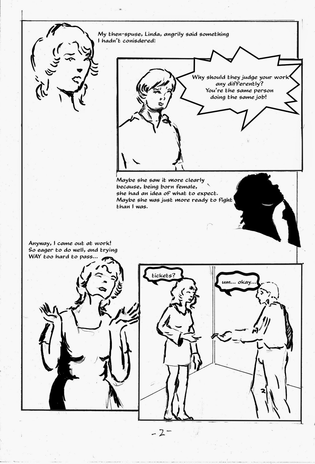
Original Art Sundays (Thursday) Nos. 191 - 196: Get A Job!

Been more than a month since I posted! I got a call to contribute a comic story to an anthology for the Side By Side Film Festival in Russia. Given the current political climate there, the idea of being part of a Russian GLBT film festival in any way was too much of an honor to pass up.
I did notice a while ago in the stats that this blog does have some readers in Russia. I hope my work gives them some pleasure.
Now, a few weeks after deadline (but apparently still acceptable to them, since they asked for it again today and they now have it, barring catastrophe), I can share it with you. I'm counting it as 6  posts, since it's 6 pages that took me 5 weeks to do.
I also have the next page of the Surrealist Cowgirls story done.
Here's a piece of my coming out story, titled Get A Job! This work will be included in The Sharp Invitation. The current total for that book is approximately 20 pages, with several more shorts in the planning stage. The book will be a series of titled chapters/shorts, telling the whole story, or as much of it as I think people want to hear. As I was discussing with another teacher at MCAD today, there's a fine line in memoir. You have to tell people enough that they give a rip about what they're reading, but it's a balancing act as to how much of yourself you put out there. The three biggest chapters currently planned are titled Sex, Drugs and Rock & Roll. I sigh with apprehension just writing the chapter titles here!
Now, the new chapter.

Some thoughts on process: I worked these up in the sketchbook, then did finishes on Bristol, scanned and lettered digitally. I deliberately avoided some of my usual clean-up. I like the slightly loose, more informal look on these pages. Some of the visual devices, like the text dropped out of brush stroke silhouette on the last page, may see use again.
The image at the top of page 5 is my illustration of Katchoo from Strangers in Paradise. I lifted it from a 90s sketchbook and dropped it in; it seemed perfect for the piece.
I'm using the Shape tool in Photoshop for word balloons, but I don't like the limited options, so I'm going to pick up a word balloon set from our friends at ComicCraft!
This was also an emotionally wrenching piece. I don't like to remind myself how close I came to doing porn. I know people who do it and are fine with it, and I bear them no disrespect, but it's not me.
Next: the new page of Maggie's Fairy Tale, a Surrealist Cowgirls adventure!

Sunday, August 24, 2014

Original Art Sundays: Surrealist Cowgirls: Maggie's Bedtime Story, p. 4

Well, I don't know how I did it, with another 45 hour work week and prep for teaching next week, but here's the next page!
Mostly very happy with this one. I want to do some photos and some serious mechanical drawing next time I do a restaurant scene. This is okay, but I'd like to do one that's stunning. Possibly in more of a "real people" story....
This was done in Copic ink markers. I did invest in some new brushes, but I want to make time to practice with them before using them on a page. And while markers do lend themselves to speed, these feel like ink and have very little fade to them.
The page:

Again, scanned in tiers in the interests of time. Rescan is mandated before going to press.
When working on the last panel, I kept thinking about the Mary Jane and Sniffles stories from the 1940s, with Walt Kelly-ish art from Al Hubbard. These stories, upon which I occasionally stumbled in my comic reading youth, have long enchanted me and are long overdue for a collection! Here's a sample page:
So elegant, so imaginative!
Next: page 5. Despite my original script, this is shaping up to be a 6 or 7 page story. I'm very eager to see this one completed. I think it's a really strong story, something I seldom say about my own work.