Insights about comics, prog rock, classic cartoons and films, higher education, sexuality and gender, writing, teaching, whatever else comes to mind, and comics. I know I said comics twice. I like comics!
Three more weeks of inventory (at most), and in early October I should have the studio setup done in my new place. At that point I will have completed two of my current three jobs, with a new one starting in mid-October. Back to the Surrealist Cowgirls and A Private Myth at that point.
Money, time and quality. The three things we always juggle.
This week's experiment, another blast from the past.
The page had sampled text. I took carefully chosen random lines from that week's issue of City Pages and turned them into this story. I'm rather happy with it overall- the motion line in panel one leading to the panel two text, the use of enviornment as framing device in panels 4 - 6, the clean but varied layout.
I also like the variety of grays.
Rendering the title text was fun. Given the choice, I'd rather do display type by hand, just for the fun of it.
Next week, a complete 8 page story.
One of the advantages of moving is also one of its drawbacks. You have to go through all your stuff.
Again and again.
In so doing, I found some comic pages I'd forgotten about, like this one.
This page has a few things to recommend it, and a few issues.
I like the barbed wire borders. I've had a fascination with the look of barbed wire since it was used as a plot device in an episode of the brilliant, neglected Western series Branded in the mid-1960s. Those who are into the Coen Brothers may recall a reference to this series in The Big Lebowski.
I also like the warm grays. I scanned this as a color piece, since the grayscale preview cooled out the warm grays.
What I don't like:
The layout is ambiguous in a few ways. First, the viewer needs more of a frame of reference to get that it's her hand, not his, drawing the gun in Panel Two. Second, the angle of the shot in Panel Three makes it appear that she's shooting herself. Changing that to a POV a la The Great Train Robbery would have made it more clear, I think.
Finally, the direction of the primary light source is unclear in the final panel. Cast shadows from the watering trough and her opponent's hand at rest imply light coming from behind her and to her left, but the edge lighting on her right side is inconsistent with that notion.
The last niggling detail I like on this page is the name on the undertaker's sign: Mortimer Titian. Think about it for a minute.
I have an experimental page from years ago put aside for next week, and an eight-page story, complete, for the week after. Hang in there, faithful readers. I want to tell new stories as soon as possible!
Skipping No. 100, as previously threatened.
Work on the move continues apace. Had a big and fairly successful yard sale yesterday. Will post some photos and thoughts on the issue of Stuff. Lots of fun talking comics with people!
As such, little time for the drawing board or the sketchbook this week. I've not forgotten about A Private Myth, or my sweeties, The Surrealist Cowgirls. Their day will come again.
Meanwhile, more inventory art.
A couple fun pieces that I'm pretty sure I haven't posted yet.
This was done as a self-portrait for an anthology of MCAD student and alum work that never saw print. I'll post the story I did for it soon. It's a fun, bitter little story.
The self-deprecating aspect of this is still kinda charming to me, but also a bit annoying now. I get it that every artist has to work through this insecurity concerning their work repeatedly, but the time it takes to work through it should grow shorter as your skills evolve. That's been my experience anyway.
And a more serious piece...
This was done on a museum outing with some of my drawing students. It's mostly successful, but that foot- yeesh!
I would have liked to push the values farther as well.
Next week- well, we'll see. New classes start tomorrow and I'm still in the throes of the move, so there's going to be SOMETHING here....hmm....
Meanwhile, thanks for your reading loyalty during these hectic times!
The move proceeds apace.
I have a place located, a lease signed, a yard sale coming up, a new teaching job starting on Monday, my second job is picking up steam, and I have begun (by inches) to pack.
And stuff to throw away. So much to throw away!
Still no time to draw! Aargh!
So to tide you over, another Tranny Towers chapter. I'll post something different next time, just for variety.
This one turned out pretty well. If and when I do a definitive print collection of these, I'll probably redo all the lettering digitally.
The geometry and harsh angles of the painting were fascinating to me.
I also really enjoyed playing with the mastheads on these. I guess I got bit by Will Eisner! Then again, who didn't?
Before I present the work, a big mea culpa.
I know this is way late, but a moment, if you will.
Just under two weeks ago, my housemate informed me that she needed to move her ailing mother into the house, so I would need to find another place to live. She gave me a reasonable time, but what with turning cats over for adoption (sob), work picking up on my current job and with new teaching jobs about to start, and with the mania of looking for a place (and looking for the money to move!), I've not had time to post art, let alone make any.
Until the situation settles, I will be posting previously unpublished inventory.
I will skip No. 100 in my numbering and come back to it. I still have a very specific piece in mind for that.
So while the dust is flying, please enjoy another episode of Tranny Towers.
This is one strip where I fear I may have gone too far. Full frontal pre-op TS nudity is more than some people can handle, even in cartoon critters. It's also more than I'm usually comfortable with. Many of us are very private people, and constantly juggle the need for self-expression with the desire for privacy.
Rick's thought balloon is a swipe from a Bode' Cheech Wizard strip, in which Cheech is attempting to escape from a horny nymphet, and thinks "I'll tell her I got to go throw up in the bushes, then I'll make a run for it."
But I thought the art show was a great vehicle for exploring different aspects of the characters.
Today is the birthday of Omaha the Cat Dancer creator Reed Waller.
I've occasionally written here about working with Reed. To say Omaha was an inspiration for TrannyTowers is a bit of an understatement, though I like to think I put my own spin on the whole funny animal soap opera thing.
I have no idea how Reed is doing these days. I've not talked to him or corresponded, aside from reading the occasional post on the Yahoo Omaha boards, for more than six years now. To the best of my knowledge, he's well and his job is treating him decently.
We hope for the best.
New work on Omaha proceeds apace, appearing in the otherwise unappealing Sizzle magazine. Actually, the last issue of Sizzle I read, issue 50, had gone from painful to tedious (aside from the Omaha stuff, of course), so I guess that's an improvement. The next Omaha installment is currently scheduled for issue 51, due out in September.
While reading Bryan Talbot's superb funny-animal Sherlock Holmes Steampunk pastiche Grandville, I noticed a guest appearance by Omaha!
Here is the image in context on the page proper.
Here's a short video trailer for Grandville.
I suspect that Reed would be honored to have one his pieces included in a Bryan Talbot book, and next to a Mucha at that!
I can't tell if Talbot redrew these or pasted them in. His Photoshop chops are evident throughout the book, but he certainly has the skill to do it either way.
I've been tinkering with posting this for a while now, and the occasion of Reed's birthday seems an appropriate time to do so.
The rest of you: check out Grandville. Either volume. They stand alone, but there is a continuity, so you're probably better off reading them in publication order.
Steampunk funny animal noir. No reason it should work, but it does. It's smart, exciting work. But then, what else would you expect from Bryan Talbot?
There are currently two books in the series, Grandville and Grandville Mon Amour, with a third, Grandville Bete Noir in the works. The publisher is Dark Horse.
Here's looking at you, Reed D. Waller! Happy birthday!
May the next year be kind to you!
(image at left: portrait of the protagonist from Grandville, Detective Inspector LeBrock).
This post was delayed by a writing deadline that ate two days more than I expected, and the extra sleep required thereafter.
Here is Chapter 18! As always, click on the image for a larger version.
A couple things about this page:
First, it's necessary for plot development. The lead up to the big event, as it were.
Second, doing a dialogue heavy page and keeping it visually interesting is always a challenge.
And I didn't have a copy of Wally Wood's classic 22 Panels That Always Work on hand to swipe from!
Third, the strip is quite dated. While some households still have land lines, few of them have cords, which is what makes the gag work here.
All that said, there are things about this strip that work well for me. The dialogue taking up the center of the page while still having a panel flow and taking place in two distinct locations is a nice touch.
Next week: Surrealist Cowgirls, It Does This, page 8!
Another blast from the past. But not too blasted out, we hope!
This photo was done using only window light.
I like the textures a lot. The subject's contemplative expression is in quizzical contrast to the brightness of the image, and the textures and folds of the fabric are fascinating. The scan is not completely faithful to the print, but holds most of the texture.
I scanned this in RGB, adjusted levels of each channel individually, then desaturated and faded the desaturation to get maximum range.
When I was teaching a liberal arts course in summer session (high school students going for college credit), I was extolling the virtues of negatives and the darkroom.
Yeah, compared to Photoshop, it's a big clunky mess, but there really is no experience comparable to making art- any art- by hand.
next week: back to Tranny Towers, as we gear up for Original Art Sundays no. 100 in four weeks!
The next post in my sporadic series of comic book antiquities. No. 1 was the first work of Jeffrey Catherine Jones. I've been meaning to post this piece for a while now.
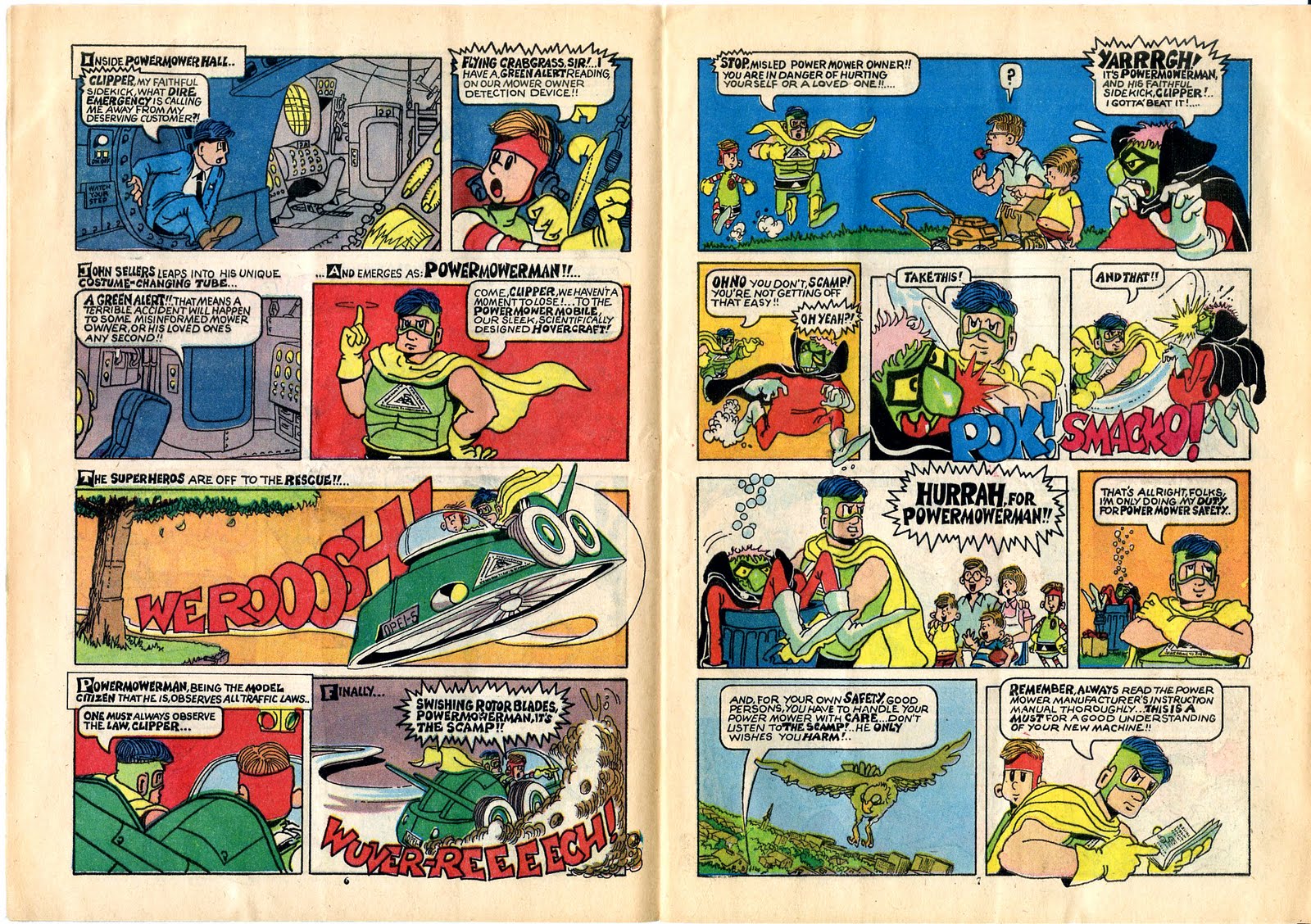
Here's the never reprinted Powermowerman by Vaughn Bode!!
Folks, this thing was a bear to color correct. The cheap paper had yellowed substantially. It's not stapled, it's glued. That's why the spread for pages 9 and 10 looks a bit off. The binding keeps it from opening properly. Also, the "cover" is plain newsprint. And I don't think the printing was so great when the book first came out. But I've tried to correct to the original colors, based solely on my experience of Vaughn's work.
This was one of those comic book giveaways intended as educational. Every year at the County Fair when I was a kid, for example, they had stacks of The True Story of Smokey Bear comics. I'm not sure what the distribution model for this book was, but it sure is hard to find now! My guess is that lawnmower and agricultural equipment stores gave it away as a promotional device, which would explain the space for a store sticker on the back cover.
I count myself lucky to have a copy, and luckier still to be able to share it.
Here's what Vaughn said about it in The Vaughn Bode Index: Folks, don't ever think I didn't try like a son-of-a-bitch to get rich. Alas, every time I went for bucks, my heart started wilting, and soon my cartoons forced me back on the path to harmony. I was given just two weeks to complete the entire book! I had to write, draw and color key all of this while I was an art student at Syracuse University.... PMM made me feel a little sleezy, greenish.
The tentative quality of the work betrays the fact that's it's early in Vaughn's career. Many of the angles used are either straight-on or profile, with some remarkable exceptions, like the aerial shot of the bird in the 6th panel of page 6. The text hints at some of Vaughn's later poetry and wit, with lines like "oh, he really knows how to hurt a cad". And the colors are pure Bode'!
Also, I can't help wondering if the design of The Scamp's vehicle was an influence on the villain's vehicle design here:
I always liked that critter that Obi-Wan was riding in this bit. I just call it a puppy, although it's obviously not.
Not sure what I'll do next in this comic series, hence the term sporadic. I'm trying to reserve the series for obscure works unlikely to be reprinted, and the next one hasn't jumped out at me yet. But it will, and I will.
Until then: enjoy.
Yeah, I know. Last week I was going on about working spontaneously, and here I am posting process.
Well, I want to make Book 1 of A Private Myth as good as I can, and after reviewing the work to date, and noting that I have about 1/3 of the pages to date that I want to rework, I think maybe I can save myself some grief if I do a more consistent job up front.
If that takes more time, that's what it takes.
Here's the rough layout for the next page.
And I'm not kidding when I say rough!
But it's an important step, one that helps the evolution of the page and the story, and reminds me to keep an eye on continuity issues.
I was chatting during breakfast last week with Andrew Dobson of So You're A Cartoonist? fame. Check out his work at the link, it's quite good.
He was adamant in his conviction that in order to build a readership, a Web comic artist needs to post 2 or 3 times weekly.
He has a point. And perhaps I should.
But I have the time I have, and I will tell my stories at my own pace. I mean really, unless it's paying work, what else can I do?
I only hope the story's good enough that people want to stick around for it.
Next week: an oddment.
Back in the saddle again (me or the Cowgirls?).
Either way, here we go with the next page.
I'm a tad concerned that this page is too light, but other than that, I'm pretty happy with it.
I really like the transparency I got on the sneeze sound effect.
The story is going some dangerous places in the next few pages. But I have some basic rules for the Cowgirls: the story must always be at least a bit silly, it must have a fair amount of action, and it must always be a romance at its core.
I try not to use too many sound effects. I agree with Alan Moore- you can't see sound. Look how effective the jailbreak scene is Watchmen is - no words or sound effects visible in the panel, yet it's a very loud image.
I've been thinking a lot about the way I work lately. My friend Tyler Page plots out and thumbnails an entire issue of his delightful book Nothing Better, then methodically begins rendering each page.
By contrast (and this is difficult to describe accurately), when I plot a comic story, I see myself holding the finished book of my work. As I read it, I "see" each page. Sometimes the page changes because there were necessary changes to the previous page (or pages), but mostly I just try to write and draw the book as I see it in my mind.
I might have something to gain from applying a bit more structure a la Tyler, but I don't want to lose the spontaneity, especially in the Cowgirls material.
Hrm, as Rorschach might say.
Food for thought. I've studied, interpreted and taught storytelling techniques enough that I've internalized many of the basics, and although it's a bit of a conceit, I'd like to think I apply those basics as I go about working in my less conventional manner. But there's never harm in questioning your own methods, so long as you keep working!
Next, a new page of A Private Myth.
Note that we are six installments away from Original Art Sundays No. 100! I have a little something planned for that week, which, if I keep to the schedule, should fall right before I start teaching Comic History again this fall!
I've added a few new blogs, including the great Stripper's Guide, to the blog list.
I've also removed some great ones that are defunct:
Gold Key Comics
Kingdom Kane
Comics Comics
are now gone.
I hope their creator is still active, as they were exceptional blogs.
Just for fun, here's a classic image from one of my favorite Gold Key books!
Back in the saddle again!
A recent teaching gig successfully completed, on deadline for four articles due at the end of this month, and a new Surrealist Cowgirls page is on the board!
Let's celebrate with the next chapter of Tranny Towers.
Happy with the layout and the plot advancement in this one. There's a plot thread starting here that resolves near the end of the run, in about 20 episodes or so.
Had to go over a couple of the lines in Photoshop. This one is from the old Xerox book, not the original art, and there was some fading.
The issue of keeping visual interest in a dialogue- heavy page is a central concern of both this and the next chapter. I came up with different resolutions for each. I'm also having a bit more fun with the mastheads here.
Next: Surrealist Cowgirls, p. 7.