Insights about comics, prog rock, classic cartoons and films, higher education, sexuality and gender, writing, teaching, whatever else comes to mind, and comics. I know I said comics twice. I like comics!
Running behind my self-imposed schedule, as I'm prone to do, but we persevere!
Today's entry is a reprint of my review from Goodreads, with a couple points expanded and some cool images thrown in.
Cover art for issue 1, without copy
When I see a Star Trek film, even the embarrassing ones,I feel like I'm revisiting old friends (hey, your friends can embarrass you and still be your friends).
Yeah, I know it's fiction, but there's a level of familiarity and
comfort that welcomes me into the story.
Multiply that by 10 for this book.
If
anything, Serenity: Leaves on the Wind is more meaningful in that respect. We get to catch
up with the lives of characters we've grown to appreciate and care for, characters we've not seen for a while, in a well-written story that's completely consistent with both on screen and in print predecessors. Kudos to Zack Whedon for carrying on Joss's story!
The art is tight yet fluid, and integrates well with the
text.
The story actually began in Dark Horse's 2012 Free Comic Book Day flipbook. The Serenity side was titled "It's Never Easy" and featured a prequel to the events in Leaves on the Wind, including showing Zoe's pregnancy. The prequel art, by the very talented Fabio Moon, is consistent with Georges Jeanty's work on the miniseries proper, though I find Moon's work a bit more quiety aggressive (if that makes sense). I've included representative pages of both in this article. You be the judge!
Moon's art on the FCBD issue
However, from the standpoint of comic binding, this series is somewhat frustrating. Some of Dark Horse's best stories in the Firefly/Serenity arena are only available in small hardcovers. This means they can't be rebound without gutting the book.
But that's a minor concern for most folks. Serenity: Leaves on the Wind is a remarkable achievement. It's touching and tender, action driven and philosophical. It's consistent with its source material while being fresh and new.
My one regret is that Inara is not in this story. We learned during the reunion special that, as many of us suspected, Inara has a fatal disease. In pre-press for this series, Whedon said that was a story that would be told another time. I hope so, as I'd like to see more, but only under the right conditions.
After completing this miniseries, I'm torn on hoping for more. I'd rather see measured doses of quality stories than a glut of mediocrity. As long as they're of this quality, I'll take as many as I can get, but the quality has to come first. If that means we have to wait a while, so be it. I waited months between the final two issues of Watchmen. I can wait for this if I have to, despite my eagerness to learn Inara's fate.
Continuity page from issue 2, spotlighting Jayne's character
Variant cover for issue 1
Note on reading and process: I read this as floppies, not as a trade. While it may pose frustrations for some, I recommend this approach for Firefly/Serenity material. It feels more like watching new episodes, and having to wait to find out what happens is exciting!
It's worth noting that a hardcover was released in November 2014, for those of you who prefer to read it all in one fell swoop!
Next: Best of 2014, No. 5, as the Doctor is in... sort of...
In the last few years, there's been a huge movement towards works of graphic history. Some, like John Lewis' documents of the Civil Rights movement, are primarily memoir. Others, like Derek McCullough's Stagger Lee, are research and speculative fiction. Works like Yossel, Joe Kubert's story of what his childhood might have been if his parents had not left Poland, are clearly fiction with historical trappings. The lines blur.
It also needs to be said that, with a few notable exceptions like Sgt. Rock and The Unknown Solider, I have little interest in most war comics.
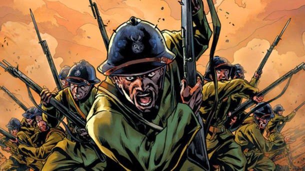
In this melange we get this year's Harlem Hellfighters by Max Brooks, with art by Caanan White.
A note on authorship: I much prefer co-credits to the isolated credits seen here. Brooks is given primary credit. White is credited as "illustrated by". A more equitable listing would be something to the effect of "by Max Brooks (writer) and Caanan White (illustrator)". I dislike either creator taking a secondary role.
I had no interest in Brooks' earlier writings on zombies. Aside from the Simon Garth stories from Marvel in the 70s, Val Lewton's classic I Walked With A Zombie, and The Walking Dead (both the series and the comic), I could not care less about zombies. I'm not familiar with Caanan White's other significant work, Uber, but given the strength of the art here, I'll check it out.
While the roles of blacks in WWII are more comprehensively documented, especially the Tuskegee Airmen, the WWI fighters have not been as publicly recognized. Since 2014 is the centennial of The War to End All Wars, it's come back into the public eye.
As to this book, it engages the reader on every level. The writing is frank and unapologetic, presenting the racism of the 1910s (as opposed to the racism of every time since) without comment. The language used about blacks is harsh and presented without hedging.
The war scenes contain the best writing and art. One of the biggest challenges in war comics is the battle scene, done here to perfection- just the right combination of action, scope and genuine humanity to keep it sympathetic.
Out of print CD compilation of Major Europe recordings
But the revelation for me was the minor plot element on pages 28 -33. The material on jazz pioneer Major James Reese Europe was a real eye-opener, one which I embraced as a music historian. Maybe I'm out of my league calling myself such, since I've never encountered this figure in my readings on jazz history!
Even with the ultimate defeat implicit in the ending, as the Harlem Hellfighters return home to some of the worst treatment of blacks in American history, the book feels like a triumph. Possibly this is because they DID return home, after fighting for a country they loved, one that, needless to say, didn't always love them back.
Next: Best Comics of 2014, No. 6, a series prone to serenity.
Here we go, with the next Best of 2014 Comics entry. It's no secret that I enjoy a good Star Trek story, or that I admire the work of Harlan Ellison. As such, even in its bowdlerized version, City on the Edge of Forever stands as one of my favorite episodes of all the series and films (I also really like Theodore Sturgeon's two episodes, Shore Leave and Amok Time, but sadly, he's no longer with us to create graphic versions of them).
I've read the original screenplay in two previous iterations- its inclusion in the Roger Elwood edited anthology Six Science Fiction Plays and as a stand-alone hardcover many years later, courtesy of the Science Fiction Book Club.
So when IDW, who did such a great job publishing the comic adaptation of Ellison's Phoenix Without Ashes a couple years back, announced this project, I was on board for every issue.
While I doubt Mr. Ellison would have suffered such shenanigans, this could have been bad. It could have been howling, rabid bay-at-the-moon bad. It's such an emotionally wrought story, the potential is there to do great injury with this one.
But it worked.
Starting with the brilliant covers, offered in two basic formats- a painted cover or a retro design evoking period Pelican books, Leo &; Diane Dillon, some of Milton Glaser's work, or possibly Robert McKinnis- working through the haunting final page (which I won't reproduce, as you really need to read it for yourself), this is as perfect as comics get.
The bridge drug scene
The script by Scott and David Tipton is taut and empathetic to all characters, even the irredeemable Beckwith. If you're only familiar with the original broadcast version, suffice to say that this goes into more dangerous territory. The aforementioned Beckwith is a dealer in intergalactic contraband, including the narcotic dream jewels (sidebar: this was not much of an issue when Ellison first penned the tale in 1967, but I am SO tired of writers feeling the compulsion to reinvent the everyday just because it's in outer space, or in the future. So many intergalactic drugs, ranging from Star Wars' Death Sticks to Ketracel-white in Deep Space 9 and Spice in Dune. Now, some of these, like Spice in Dune, are integral to the plot, but others are just mildly annoying. Why not just use any of the vast pharmacy of extant pharmaceutical killers? I'm sure heroin will still exist in a couple centuries, since it's been used on Earth in its current form since 1874, and the opium poppy was first harvested in roughly 300 BC.). His foul deeds lead to the non-existence of the Federation and the Enterprise's replacement with the Condor, seemingly a pirate ship (when I first read this part in the original script, I flashed on the later episode Mirror, Mirror, written by Jerome Bixby).
Kirk and Spock must go back in time to undo the damage done by Beckwith. But in order to do so, Kirk must sacrifice the love of his life.
The best moments here involve a different sort of Spock, one with a greater intensity and, dare I say it, a greater empathy than often shown in the first series.
It would be a crime to overlook the brilliant painted art by J.K. Woodward. I enjoyed his work on Peter David's Fallen Angel series a great deal. He's able to remain faithful to the script while innovating, which shows up well in this series. I particularly like his designs for the Guardians of Forever.
Woodward's inspired designs for the Guardians of Forever.
And that last page just makes me ache.
With Mr. Ellison starting to show his years (he had a stroke earlier in 2014), I feared we would hear less from him. But between his collaborations with IDW (including a hardcover collection of this series coming soon) and his self-publishing imprint, I am relieved that his body of work continues to expand rather than contract.
Next: Best of 2014, no. 7 takes us back to the War to End All Wars.
Once more into the breach with our Best of the Year series.
In 2006, I presented my first academic paper at San Diego Comic Con. Also on the panel were Neil Cohn, who I had met at a previous event, and Durwin Talon, then an adjunct at Savannah College of Art & Design, who gave a fascinating presentation on the psychological uses of color in comics.
page from BONDS
A few months later, Durwin's solo Image book Bonds appeared. Though it would take some time for the whole series to come out, I eagerly bought each of the three issues.
The series dealt with the intersection of creativity and magic as a legacy, with music, and with father/daughter issues.
Much of Talon's art for this book was included in that year's Society of Illustrators Annual. Is Talon a comic artist who does commercial illustration, or the inverse? Does it matter? He's good. He's also done some coloring and covers for the majors.
In Bonds, Talon deals with magic largely as a threat- untapped, uncontrolled, unrecognized power and its implicit dangers. These themes repeat in his newest work, Beautiful Scars, written by his partner Guin Thompson. Not to detract from Talon's earlier work, but I suspect Thompson may have had some voice in shaping Bonds as well, at least on a spiritual level. The themes are not 100% parallel, but there are too many similarities to dismiss the welcome possibility.
Maddie's fairy tales
In Beautiful Scars, Maddie, a young girl, is bored to tears on a family visit. However, her talks with her grandfather open up the stories of his vast and exciting past, through a tour of his scars, each of which has a story. Those stories in turn echo the neotenic renderings of Maddie's fairy tale creations.
As the stories run parallel, Maddie develops a larger awareness of heritage and of the world and her place in it. She also begins to understand the value of the real world, while not abandoning her rich imagination.
She completes a more sophisticated version of her childhood tale and gets it published for her grandfather.
One of the things that Maddie learns about her grandfather is his history in WWI. That this quiet, gentle man could be involved in such matters is a great shock to her, and she begins to understand people a bit better.
The World War I cover done as a commemorative piece, in honor of the war's Centennial, for the SDCC edition of Beautiful Scars
Charmed and mesmerized as I was by this book, the actual story Maddie ended up writing did little for me in contrast to the rest of the book. Featured after the story ends, it's a very polished, professionally done fairy tale, very tightly written and executed. Maybe that's why it didn't resonate with me. I love the verve of the child version, and some of that has dissipated with the maturing of Maddie's creative voice. It's not bad- in fact, it's quite good- it's just not as emotionally satisfying to me as its precursor.
Perhaps there's a story in that idea as well. Hm.
But that's the worst thing I can say about this book, and I feel a bit bad saying that. This book shines, and deserves much more attention than it's recieved. Beautiful Scars is a quiet masterpiece. I read it through the Public Library, but am adding it to my own library directly. It will stand the test of time, and will only improve with repeated readings.
Next: Best of 2014, No. 8: Harlan Ellison strikes again!
For someone whose most pub publicly recognized works, Watchmen and V For Vendetta, appeared around 30 years ago, Alan Moore is having a pretty good year. Not only are the reprints of Miracleman proceeding apace (which Moore may not care for), but his Electricomics site is up and running (if a bit challenging to navigate), and his work with Top Shelf proceeds swimmingly, including reprinting his neglected Bojeffries Saga..
In the latter arena, Moore and cohort Kevin O'Neill continue to hash out League of Extraordinary Gentlemen one-shots. Last year's offering, Heart of Ice, was the first to spotlight Janni Nemo, daughter of THE Captain Nemo, who was killed and left his legacy to her in Century: 1910. In March 2015, we will be graced with Nemo: River of Ghosts, creating a trilogy. I hope for an omnibus hardcover. The central piece of the trilogy, 2014's Nemo: The Roses of Berlin, is typical Moore, if there is such a thing.
The story is, as always, a pastiche of cultural references. Some of these, such as the use of Chaplin's Hinkel character from The Great Dictator, are rather obvious. Others, references to Lang's Metropolis, Verne's Master of the World, H. Rider Haggard's SHE (a recurring theme/character in the League stories), and Robert Wiene's Cabinet of Dr. Caligari, are sometimes less blatant.
All the references, fun as they are, take a back seat to adventure in Roses of Berlin. This thing is the Indiana Jones of the League stories, nonstop action from the onset. A quick overview shows a total of six of its 56 pages are exposition driven (exclusive of the obligatory text piece at the book's end). It should be noted in passing that the first of these pages is entirely in German, with no translation offered. That's fine with me, but it irritated some critics. I don't see that. Few expressed frustration with untranslated Martian in the second volume of the League stories.
Ahem. Be that as it may. The majority of the book is a long, well-executed fight scene.
Chaplin's Hinkel with She Who Must Be Obeyed!
Other critics have contended that Moore's writing takes a back seat to Kevin O'Niell's art here. Taking nothing away from Mr. O'Neill's work, I have to disagree here. Anyone who's seen an Alan Moore script is aware of the immense detail put into descriptions for the artist. Given that the script for the first panel of Watchmen is a full page of rather dense text, it seems likely that O'Neill is decoding a rather dense script here, and that Moore is hardly slacking off.
The story involves Nemo and her husband Jack attempting a rescue of their daughter and her husband from the fallen airship of Robur, the Conqueror.
Their efforts take them deep into a Berlin replete with robotic soldiers, chaotic architecture, Rotwang's robotic Maria, and a new adventure, television, all the while fighting and killing with deliberation, and sometimes with glee.
This is also a powerful love story between Captain Nemo and her husband Jack, whose tenderness towards her is only matched by his deliberation in defending her and the rest of his family.
It's worth remembering that despite their forays into popular literature, the League tales were begun as pastiches of adventure, science fiction, fairy and horror stories, either aimed at or embraced by young readers, especially young lads. So there should always be this element of high adventure.
It's to Moore's credit that he's able to inject a smart feminist subtext into what have historically been rollicking tales for pre-pubescent lads. Even the villain of the piece, Ayesha, is a fairly complex character, one whose motivations have been shaped by centuries of life and a drive to continue that life.
In terms of the book itself, it's a slight volume but well-appointed, having endpapers that frame the story (first depicting the attack on Robur's vessel, then Captain Nemo's devastation of Berlin after the rescue attempt- don't worry, there are still plenty of surprises despite that spoiler). It's a sewn volume, with tight binding. Due to its thinness, the spine is not rounded, which may effect its longevity. I suspect the collected edition will remedy this flaw. The volume is priced reasonably at $14.95 US, though I read a library edition and will wait to purchase the inevitable collection of the trilogy.
The first end papers!
As always in Moore's work, it's vital to read the text piece. It fleshes out the story, particularly significant in this case.
But above all, it remains a love story.
Posting a day late. When I got done with work yesterday, all I could do was sleep! I took an extra day to recoup my energies, and am now catching up.
Today's adventure is a bit musical.
That's like saying the Chicago Fire was a weenie roast.
Since I saw The Monkees, Dave Brubeck, Steppenwolf and Jimi Hendrix, in that order, between the ages of 14 and 15, music, especially rock music, has been almost as big a part of my life as comics. So it's no surprise that I'm fascinated with the overlap of the two.
There have been some wonderful moments in this arena. Steve Leialoha's story of his experience at the Altamont fiasco (I believe from the Gates of Eden one-shot) is fascinating. There is a spate of stories featuring The Beatles and Beatles pastiches, and great stuff like the Sienkiewicz/Green biography of Jimi Hendrix, Voodoo Child (long overdue to be back in print!) and the graphic memoir Freddie Mercury and Me.
Well, two graphic novels appeared this year that expand this body of work. I was hard pressed to pick between them, so I didn't. Besides, ties are a great way to expand the list!
First up is Doomboy byTony Sadnoval, translated by Mike Kennedy.
The story of an enraged guitarist whose girlfriend dies, Doomboy is ultimately about the unleashing of creativity for its own sake. D, the young man in question, goes from literally beating people up with his guitar to performing solo on a beach, touching on something powerful in the process. His confederate records and tacitly broadcasts D's performances under the name Doomboy.
All the characters are rendered in a fairly neotenic manner. It took a bit of a read to realize they were intended to be young adults. This is apparently a universal trait in Sandoval's work, with which I was not familiar prior to this book.
The broadcasts create a flurry of interest in the anonymous player, which leads to some inevitable, and a couple surprising, plot developments. Sorry to be cryptic, but I want you to read this for yourself!
There are three factors that deserve mentioning in addition to the plot and to Sandoval's remarkably energetic art. First, there's a surprisingly effective gay relationship involving a couple unlikely minor characters. Second, Sandoval's approach to the singular challenge of illustrating music is remarkably effective. Rather than fall back on the cliches of floating notes and people dancing he... well.... brings life into it. Ranging from floating sea creatures accompanying dead girlfriends to bombastic Norse storms filling the skies, the music comes to life quite effectively in this book. This elegant use of "show, don't tell" makes the melodramatic aspects of the storyline just, for want of a better term, sing!
Finally, the cover itself contains a spot varnish of a D monogram. No reason to put it there, other than for pure style. As a devotee of the art form of the book, this touch really bowled me over.
The monogram is much more blatant here than it is on the actual book cover!
For the second part of today's double header, we have the Finnish team of J.P. Anohen and K.P. Alare presenting Sing No Evil.
The trials of a prog-metal band in Finland, this is by turns charmingly funny and achingly profound. The story has elements of the mystic, some incredible art and a rather diverse band. The bass player is either a 60s burnout or a 632- year old cleric/mystic, depending on how much of his stories you want to believe. I find Kervinen, the bassist/mystic/janitor more interesting than the rest of the band, but perhaps that's just me. His character has more nuance than the others.
The guitarist and former lead singer (more on that momentarily), Ahskel, is the musical visionary of the group, frustrated that nobody hears the music he makes as he wants it to be heard (a common plaint of musicians, and of artists in general, yes?). Lily, the keyboard player, patiently tries to hold the whole mess together, and discovers the group's new vocalist, Aydin, delivering pizzas.
Why do they need a new singer? Well...
Finally, there's the drummer, Bear. Bear is a bear. No more, no less. Just a bear, and a damn fine drummer. There's even discussion of their gig schedule being inhibited by his impending hibernation cycle.
After many trials and tribulations, the band Perkeros (for which I could not find a translation) gets the dream gig, at Rocktoberfest.
Everything is here. The obligatory dream sequences, the battles of the various bands, the seemingly over the top (but actually tightly controlled, once viewed more closely) art and coloring, and all the strum und drang you can handle.
As the big event approaches, events whip to a fever pitch . The band gives a stellar performance, but Askel refuses to see it. He's so locked into his arbitrary vision of musical perfection that he cannot abide anyone's improvisations imposing on that vision.
Following the show and Askel's inevitable blowup, Askel finds himself in the woods where he encounters...
... but that would be telling.
As mentioned in the Doomboy review/overview, the illustration of music is a huge challenge. While Sing No Evil uses more conventional tools to render sound, like notes and clichéd postures, it does so very effectively, with verve, passion and artistry.
Perkeros in action!
Sing No Evil is a delightful romp, full of the stuff that makes prog metal, and prog rock in general, work- profundity, beauty, intricacies, an occasionally exaggerated sense of its own importance, and above all, passion. Ahonen and Alare work in Finland (which has a very rich musical life, according to some of my progressive rock pals who live there) as comic strip artists and graphic designers. I hope this isn't the last long form work we see from them, as Sing No Evil is a delight.
Next: Number 10 on our hit parade, as a veteran comic writer visits Germany during a challenging period.
Continuing our countdown of 2014's best, I'm padding the count a bit with a double header.
Both these books are takes on the 1960s -1980s superhero model. Often called The Silver Age, this is a period in comics history when writing began to improve, continuity came into play in a larger way, and there was still a spirit of optimism in comics, in tandem with the increased "realism" of early Marvel heroes. My love for this age is not just because these were the comics of my youth, but because they offered a more confident, positive world view.
Cover art for most recent issue
The first of these, Astro City, is now a Vertigo book. Given that Vertigo was begun as an experimental/horror line, this is mildly amusing. Kurt Busiek and Brent Anderson's Astro City is a place of real superheroes. Begun in the early 1990s, the book has retained both its quality and its popularity over the years. The book deals in fairly common themes- legacy heroes, intergalactic threats, the nature of villainy, possibilities of redemption. There's also a tantalizing back story building in the current arc involving a character named The Broken Man that promises to explode any issue now.
Fans read this book for its in-jokes and references as much as for its superb, exciting stories. A character in issue 15 attends Oksner College, a reference to DC artist Bob Oksner. The character Samaritan is an obvious Superman (or throw in your favorite ubermensch superhero) parallel. It goes on and on, but not knowing all the inside stuff doesn't interfere with enjoyment of the stories. But the strongest aspect of the series is its humanity. Many of the stories concern themselves with the common citizen's relation to super beings. It's sort of a cross between Hitchcock's ordinary man caught in extraordinary circumstances and a Capra-esque everyman sensibility.
Even when the beings are paranormal, there's a sense of human frailty. Issue 17, a story titled "Wish I May", deals with a tormented genius cum mad scientist and his high school protector, who naturally becomes his superhero adversary. In an act of self-sacrifice, the hero Starbright dies, allowing the villain, one Simon Says, to come to terms with being a transgendered woman. After completing the transformation, of course she assumes the mantle of Starbright. It's nice to read a story about a transgendered individual that isn't a farce or a tragedy.
The second half of today's tie is even more traditional. Many wags have dubbed 2014 "the year of the woman" in comics, largely due to the excellent work on DC's Batgirl and Marvel's Captain Marvel and Ms. Marvel books. Those books didn't make this list simply because I haven't read them consistently enough to give a solid opinion.
However, in a painful bit of irony, the character that arguably paved the way for all super-powered females, Wonder Woman, has been going through a series of stories that both disappoint and frustrate. The bastard child of Zeus? The Goddess of War? Please.
Despite this, DC has done us all a great service. Available in both online and hard-copy formats, the anthology title Sensation Comics gives us Wonder Woman die-hards hope. I've only been reading the hard copy version, so I'm not sure how one translates into the other. In the floppy version, there are three or four stories per issue, each being a short Wonder Woman tale. In issue 1, there's a nicely done story of Diana taking on Batman's rogue's gallery in Gotham. Issue 2 has a nearly book-length story featuring Dr. Psycho and Cheetah, with strong, graceful art by Marcus Cho.
However, the book shines in the lead story of # 3. Beginning with the final number of a concert by Wonder Woman's band Bullets and Bracelets (which is actually a pretty good name for a band), the story takes in a meeting with two young female fans, which is followed by a conflict with an adolescent male bent on proving his own juvenility. The art in this story, by Margeruite Sauvage, is spot on for theme and tone. It should be noted that the creative chores in Sensation Comics seem fairly evenly divided between males and females!
Strangely, the story in #3 and #4 that everyone else seemed to adore, the Gilbert Hernandez story, left me cold. I'm a great admirer of the work of Los Brothers Hernandez, but this one just didn't work for me.
The aforementioned adolescent jerk from the concert story
Well, there you have it. At least transitory proof that optimism isn't dead, and that you can tell a smart, exciting story and still not be so Godawful grim about everything!
Tomorrow: Best of No. 12 rocks out!
After midnight, so technically this post is late by the arbitrary standard I've set for myself. However, I'll post the next one shortly, to get back on schedule. Not that anyone but me is keeping track, but it's good to have these things on the record.
No. 13 in our hit parade is Ed Brubaker and Sean Phillips' The Fade Out.
I'm on record as a devotee of noir in many forms, from Patricia Highsmith's work to Chandler's novels, and to films as far-ranging as Remember My Name, Blood Simple, The Big Carnival and Who Framed Roger Rabbit? The latter, of course, is actually one of the most cynical films Disney's ever done. In comics, there's been some wonderful noir, ranging from some Eisner Spirit stories to Steranko's Chandler and the conspiracy epic 100 Bullets. I also particularly like the Parker adaptations.
Then there's Brubaker and Phillips, masters of the craft.
I've admired Brubaker's crime comics for some time. I recently got a custom made Sleeper Omnibus from one of my comic binding buddies, and will add a photo to this post when I get home. His superhero work, while strong, doesn't appeal to me as much. Brubaker and Phillips work so symbiotically that the pages seem to pulse!
Brubaker's writing manages to retain the misogyny and hyper-masculinity of noir and still portray all involved as real, sympathetic people, rather than the self-parody that accompanies the worst of noir comics, like Frank Miller's All-Star Batman and Robin.
In The Fade Out, we have a classic noir, set in the world of film. How utterly perfect!
The story of a drunken screenwriter and a murdered starlet, this work evokes everything from Spillane to Barton Fink. The players could easily be stock characters- the studio head, the security goon, the sleazy agent, the actresses vying for the same spot, the bookish and efficient PR girl, the smarmy leading man and the hot-blooded Latino musician- but they rise above the cliches to be more fleshed out. This is a neat trick, since the book is told from the POV of the writer, Charlie Parrish. The reader learns of events as Parrish does. This trick is a bit elusive in issue 2, as the narration is third person, making the POV thing less clear at times. The story is set in 1948, making the Hollywood Ten part of the plot. The scene in book two that mentions this dovetails nicely into Charlie's writer's block and accompanying alcoholism.
The insights into character are more apparent in book 3, especially in the scenes that focus on aspiring actress Maya Silver.
As always, Silver's art is spot on. His backgrounds, very loose when closely scrutinized, have exactly the right amount of details and are always period and location specific.
Brewster's colors in action!
It's also important to mention Elizabeth Brewster's colors. Her palette is subtle and accurate, as if someone had subdued the tones in a Douglas Sirk film just a tad for atmosphere. The tension is also consistent with a Sirk film, though Sirk characters are usually so bound by convention that they would never let loose the way Brubaker's characters do.
It's unclear whether The Fade Out is an ongoing series or a miniseries. Much as I've enjoyed the first three issues, I'm hoping for miniseries. I don't think there's enough meat on the bones of the scandal ridden studio to plausibly sustain more than one or two story lines. I'd be happy to be wrong, of course, and if anyone can pull it off, it would be this team!
Another factor is worth noting. The series' film motif is enhanced by articles on film scandals as backups (the Fatty Arbuckle piece in issue 2 is particularly nice), and by fake lobby cards from Victory Street Pictures, the scandal ridden production house of our story, on the back covers. I could pick nits and point out that the height/width ratio of the lobby cards is off from real lobby cards, but it's such a fun touch, I can't get too worked up about it.
Next up: Best Comics of 2014 No. 12, a sensational outing!
Well, as the song says, another year older and a new one just begun.
So let's begin our annual countdown of the best comics of 2014.
Curmudgeonly disclaimer: I do these one a day for two weeks, rather than all at once as most folks do. I also wait until the year has actually ended to begin posting them. I mean really, how can you encapsulate something that hasn't ended yet?
That said, here we go.
Number 14 on the list is a book I've taught several times in Comic Book History class, Alan Moore's Miracleman: A Dream of Flying. Together with Watchmen, Miracleman sums up Moore's take on superheroes in the real world: they would either be hunted to extinction, or if they survived the hunt, they'd create an enforced utopia. Miracleman is the latter story.
This Marvel reprint of the legendary Alan Moore meditation on the superhero is long overdue, but not lacking in problems. The classic tale of Michael Moran, who becomes Miracleman and eventually creates an enforced utopia (before you start wailing about spoilers, come on now, this book has been around online for over 30 years- anybody who hasn't read it hasn't been trying) is given a serviceable treatment at worst and a stellar treatment at best by Quesada and Company. I find the politics of the matter chafing. Marvel has had the rights to this for years now, and has been milking it with reprints of the Mick Anglo late 50s/early 60s British material, which, while fun and highly inventive in its way, is basically watered down C.C. Beck Captain Marvel.Then Marvel does the annoying multiple covers thing. Some of the covers, like this playful one by Skottie Young, are spot on! This book should be exciting above all else. Granted, some of Moore's strongest ideas on the superhero are within these pages, but still, exciting fun first!
But others, like this Neal Adams cover, are just the wrong tone for the series, making it seem like just another superhero book.
And all the gimmicks of multiple covers, coupled with the absurdity of the writing credit to "the original writer"- well, it just chafes. Better to leave off the writing credits entirely than to indulge in that backhanded, feeble attempt to pick at the open wound that is Alan Moore's war on reprinting his past work. Come on, just do as Zack Snyder did in the embarrassing Watchmen film- just credit the artist as the creator and be done with it.
But that's got nothing to do with the contents. The story stands up quite well, these decades later. And while I don't care much for the new coloring, the printing is better. Perhaps it's the nostalgic aspect that gets to me. I like to see this on dimmer paper, despite the storytelling benefiting (sometimes) from the crisper printing.
In fairness, there are moments where the new colors are strikingly effective, as is the case in the first page of the narrative proper:
A very mixed bag. Kudos to Marvel for reprinting The Yesterday Gambit, the story from the original Warrior (UK SF comics magazine where the character first appeared as Marvelman) run not reprinted by Eclipse in the 80s, but frustration at their placement of the story in the wrong place, both in reprint order and in the narrative. Also, with no color guides to work from, Marvel did a rather shoddy job coloring this story, in my less than humble opinion.
But much of this is more about presentation than about the work itself. Marvel has wisely made few, if any, editorial alterations to the source texts, and the story stands on its own merits, even with Marvel brashly boasting about the wonders of all the extras in the collected edition. At least they did that after the story proper, so if these come out in TPB, there will be an opportunity to cut that material from them all, move it to the back and re-bind the books in a more proper form.
And I eagerly await the unpublished Neil Gaiman issues, probably to be printed after the original 23 issue run is reprinted. There's also a new Miracleman Annual out December 31, which I've not yet had a chance to read.
Posting a day late, largely due to working 50 + hours last week and again this week.
In a bit of a holding pattern over the next story, now that the most recent Surrealist Cowgirls story is complete. I did do a small print run of a Beta version of the comic for family & friends. It had a couple burps and blemishes, but I was still quite proud of it.
For this week, something light and a bit different.
As I believe I mentioned before, I was teaching History of Rock & Roll this semester. As the semester proceeded, I got in the habit of doing small sketches on the attendance sign-in sheets. Now that we're done, I've compiled them into one piece. Nothing fancy, none of these took more than a minute or so to execute- just quick ballpoint pen energy!
I've blurred out the student names, which makes for an okay background.
Again, just a fun thing. If I had considered compiling them in advance, I would have rendered some of them in the other orientation! I suppose I could have flipped them in Photoshop, but there's something disinengenuous about overworking doodles!
Next: I do have a smaller Cowgirls project that I've been poking at for a few months. Maybe it's time to finish and post that one. We'll see.
As promised, the final page.
I feel like I've been telegraphing my punches on this story, but I hope someone is surprised by the ending!
The strange thing is that I picked the names Phoebe and Nicholas at random, and had no idea where the story was going when I started it. I just knew I had to use that image of the bird and the flame-headed dude and build a story around it.
I wanted the Phoenix image to reference Tezuka's work without aping it. I took select elements (wig span, body type, head feathers) and just drew her freehand.I think I got the effect I for which I was hoping!
This story has careened from hand text to digital text and back, here on the same page. The exposition inside the fairy tale is, for the most part, digital. I'm coming around to digital as a way to letter. It worked well on the story for the Russian comic, which is now out! But you have to be in Russia to read it. I'll post a link to the ordering page after I get my copies.
Not sure what happens from here. I have a germ of an idea for another Cowgirls story, but am toying with some other stuff as well.
This was done by Sunday, but with classes ending today, I haven't had time to post.
The next page of the story is done, concluding the tale, and the final page will post on Sunday, December 21.
Here we go:
This layout is exactly what I wanted. In terms of the figures, I fudged a bit to get them laying down next to each other and still looking at the child. Also, the placement of the "dying names" word balloons was crucial.
Debated whether Phoebe and Nicholas' speeches were over the top, but when you're dying and have something to say, you just say it.
Done on time, posting a day late. Still working too much! Getting the story done anyway.
Very simple, fast page. The intent is that the closed broken set of panels framed by the splash slow the time of the egg falling.
Phoebe's face can be seen either as a death mask expression or her staring in horror at the fallen egg. While the original intent was the former, I elected to leave it ambiguous, rather than adding a few lines to clarify.
One, possibly two pages left to this story. If my other plans are to be fruitful, this must be done this week.